4.2 HTML 元素默认显示模式总结
HTML元素默认显示模式
block 块级
inline 行内
inline-block 行内块
h1~h6 标题
p 段落
div 通用容器
ul ol li 列表
pre hr 其他
form option 表单
span 通用行内
a 超链接
strong em 强调
label 表单标签
img 图片
input 输入框
button 按钮
textarea 文本域
select 下拉框
4.3 修改元素的显示模式
名词解释:
display属性
display是 CSS 中最重要的属性之一,用于控制元素的显示模式。通过修改display,可以改变元素的排列方式和尺寸行为。
css
/* display 常用值 */

/* 设置为块级:可设宽高,独占一行 */
display: block;

/* 设置为行内:不可设宽高,与其他行内元素同行 */
display: inline;

/* 设置为行内块:可设宽高,与其他元素同行 */
display: inline-block;

/* 隐藏元素(不占位)*/
display: none;

/* 弹性布局(现代布局首选)*/
display: flex;

/* 网格布局 */
display: grid;
css
/* 实际应用示例 */

/* 将 a 标签变成块级,方便设置宽高(导航菜单常用)*/
nav a {
    display: block;
    width: 120px;
    height: 50px;
    line-height: 50px;
    text-align: center;
    color: #333;
    text-decoration: none;
}

/* 将 li 变成行内块,实现水平导航栏 */
nav li {
    display: inline-block;
    margin: 0 10px;
}

/* 将 div 变成行内,文字中嵌入小标记 */
.tag {
    display: inline;
    background-color: #ff4d4f;
    color: white;
    padding: 2px 6px;
    border-radius: 4px;
    font-size: 12px;
}
html
<!DOCTYPE html>
<html lang="zh-CN">
<head>
  <meta charset="UTF-8">
  <title>display 属性演示</title>
  <style>
    * { margin: 0; padding: 0; box-sizing: border-box; }
    body { font-family: "Microsoft YaHei", sans-serif; padding: 20px; }

    /* ① a 改为 block:整块可点击,方便设置宽高 */
    .nav-list { list-style: none; background: #001529; width: 200px; border-radius: 6px; overflow: hidden; }
    .nav-list li a {
        display: block;          /* 关键:变成块级 */
        color: rgba(255,255,255,0.7);
        text-decoration: none;
        padding: 13px 20px;
        font-size: 14px;
        transition: all 0.2s;
    }
    .nav-list li a:hover { background: #1677ff; color: white; }

    /* ② li 改为 inline-block:水平导航栏 */
    .top-nav { list-style: none; background: #fff; border-bottom: 1px solid #e8e8e8; padding: 0 20px; margin-top: 20px; }
    .top-nav li { display: inline-block; }  /* 关键:变成行内块 */
    .top-nav li a {
        display: block;
        padding: 14px 16px;
        color: #333;
        text-decoration: none;
        font-size: 14px;
    }
    .top-nav li a:hover { color: #1677ff; border-bottom: 2px solid #1677ff; }

    /* ③ display: none 隐藏/显示 */
    .dropdown { position: relative; display: inline-block; margin-top: 20px; }
    .dropdown-btn {
        padding: 8px 20px; background: #1677ff; color: white;
        border: none; border-radius: 4px; cursor: pointer; font-size: 14px;
    }
    .dropdown-menu {
        display: none;           /* 默认隐藏 */
        position: absolute;
        top: 36px; left: 0;
        background: white;
        border: 1px solid #e8e8e8;
        border-radius: 4px;
        min-width: 120px;
        box-shadow: 0 4px 12px rgba(0,0,0,0.1);
        list-style: none;
    }
    .dropdown:hover .dropdown-menu { display: block; }  /* hover 显示 */
    .dropdown-menu li a {
        display: block;
        padding: 10px 16px;
        color: #333;
        text-decoration: none;
        font-size: 14px;
    }
    .dropdown-menu li a:hover { background: #f5f5f5; color: #1677ff; }

    .section-label { font-size: 12px; color: #999; margin: 16px 0 6px; }
  </style>
</head>
<body>
  <div class="section-label">① display:block --- 侧边导航(a 变块级,整行可点击)</div>
  <ul class="nav-list">
    <li><a href="#">首页</a></li>
    <li><a href="#">商品管理</a></li>
    <li><a href="#">订单管理</a></li>
    <li><a href="#">用户中心</a></li>
  </ul>

  <div class="section-label">② display:inline-block --- 顶部水平导航(li 变行内块)</div>
  <ul class="top-nav">
    <li><a href="#">首页</a></li>
    <li><a href="#">产品</a></li>
    <li><a href="#">解决方案</a></li>
    <li><a href="#">关于我们</a></li>
  </ul>

  <div class="section-label">③ display:none / block --- 下拉菜单(hover 切换显示)</div>
  <div class="dropdown">
    <button class="dropdown-btn">鼠标悬停 ▾</button>
    <ul class="dropdown-menu">
      <li><a href="#">个人资料</a></li>
      <li><a href="#">我的订单</a></li>
      <li><a href="#">退出登录</a></li>
    </ul>
  </div>
</body>
</html>
经典使用场景:
display: block--- 将<a>变为块级,实现全区域可点击的导航项(淘宝左侧分类菜单)display: inline-block--- 实现水平导航栏(百度、Google 顶部导航)display: none--- 实现下拉菜单的显示/隐藏(hover 时改为block)
5. CSS 字体样式
字体属性总览
字体样式 font
font-size 字体大小
font-weight 字体粗细
font-style 斜体
font-family 字体族科
font 复合属性
px em rem
normal / bold / 100-900
normal / italic
字体列表 + 后备字体
style weight size family
5.1 字体属性详表
| 属性名 | 作用 | 常用值 | MDN 说明 |
|---|---|---|---|
font-size |
字体大小 | px、em、rem、% |
设置字体的大小,浏览器默认 16px |
font-weight |
字体粗细 | normal(400)、bold(700)、100~900 |
100300细体,400500正常,600+粗体 |
font-style |
斜体字 | normal、italic、oblique |
italic 使用字体自带斜体;oblique 强制倾斜 |
font-family |
字体族科 | 字体名称列表 | 按顺序查找可用字体,最后建议填通用族科 |
font |
复合属性 | 多值组合 | 至少需要 size 和 family |
① font-size 字体大小
名词解释:
font-size设置字体的大小。浏览器默认字体大小为
16px。可以使用px、em、rem、%等单位。
css
/* px:最常用,固定大小 */
p { font-size: 16px; }

/* em:相对于父元素字体大小 */
.small { font-size: 0.875em; }  /* 14px(16 × 0.875)*/
.large { font-size: 1.25em; }   /* 20px(16 × 1.25)*/

/* rem:相对于根元素(html)字体大小,更好控制 */
html { font-size: 16px; }
h1 { font-size: 2rem; }    /* 32px */
h2 { font-size: 1.5rem; }  /* 24px */
p  { font-size: 1rem; }    /* 16px */

/* 常用字号 */
.font-xs   { font-size: 12px; }  /* 辅助文字 */
.font-sm   { font-size: 14px; }  /* 小文字 */
.font-base { font-size: 16px; }  /* 正文基础 */
.font-lg   { font-size: 18px; }  /* 较大文字 */
.font-xl   { font-size: 20px; }  /* 大标题 */
.font-2xl  { font-size: 24px; }  /* 更大标题 */
html
<!DOCTYPE html>
<html lang="zh-CN">
<head>
  <meta charset="UTF-8">
  <title>font-size 演示</title>
  <style>
    body { font-family: "Microsoft YaHei", sans-serif; padding: 20px; line-height: 2; }
    .row { display: flex; align-items: baseline; gap: 20px; margin-bottom: 4px; }
    .label { font-size: 12px; color: #999; width: 80px; flex-shrink: 0; }
  </style>
</head>
<body>
  <div class="row"><span class="label">12px 辅助</span> <span style="font-size:12px">这是12px的字体大小(辅助文字、版权信息)</span></div>
  <div class="row"><span class="label">14px 小字</span> <span style="font-size:14px">这是14px的字体大小(百度正文、商品描述)</span></div>
  <div class="row"><span class="label">16px 正文</span> <span style="font-size:16px">这是16px的字体大小(知乎、掘金正文,浏览器默认值)</span></div>
  <div class="row"><span class="label">18px 大字</span> <span style="font-size:18px">这是18px的字体大小(副标题、导语)</span></div>
  <div class="row"><span class="label">24px 标题</span> <span style="font-size:24px">这是24px的字体大小(小标题)</span></div>
  <div class="row"><span class="label">32px 大标题</span> <span style="font-size:32px">这是32px的字体大小(页面主标题)</span></div>
  <div class="row"><span class="label">2em 相对</span>
    <span style="font-size:16px">父元素16px,子元素
      <span style="font-size:2em;color:#1677ff">2em = 32px</span>
    </span>
  </div>
</body>
</html>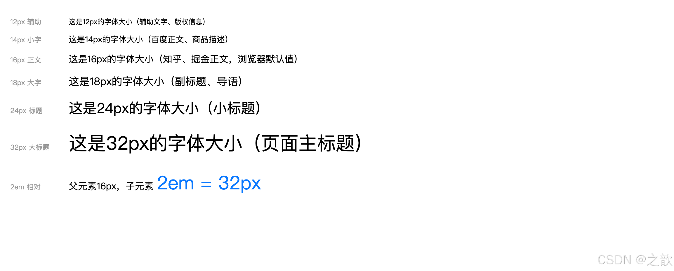
经典使用场景:
- 正文:
14px或16px(百度、知乎、微信网页版)- 标题:
20px~32px- 辅助说明:
12px
② font-weight 字体粗细
名词解释:
font-weight(字体粗细/字重)控制字体的粗细程度。数值越大字体越粗,
400等于normal,700等于bold。
css
/* 关键字值 */
font-weight: normal;    /* 正常(等同于400)*/
font-weight: bold;      /* 粗体(等同于700)*/
font-weight: lighter;   /* 相对父元素更细 */
font-weight: bolder;    /* 相对父元素更粗 */

/* 数值(更精确,100~900)*/
font-weight: 100;  /* Thin 极细 */
font-weight: 200;  /* ExtraLight 特细 */
font-weight: 300;  /* Light 细体 */
font-weight: 400;  /* Normal 正常 */
font-weight: 500;  /* Medium 中等 */
font-weight: 600;  /* SemiBold 半粗 */
font-weight: 700;  /* Bold 粗体 */
font-weight: 800;  /* ExtraBold 特粗 */
font-weight: 900;  /* Black 极粗 */

/* 实际应用 */
h1 { font-weight: 700; }      /* 标题粗体 */
.subtitle { font-weight: 500; }  /* 副标题中等 */
p { font-weight: 400; }          /* 正文正常 */
.caption { font-weight: 300; }   /* 说明文字细体 */
html
<!DOCTYPE html>
<html lang="zh-CN">
<head>
  <meta charset="UTF-8">
  <title>font-weight 演示</title>
  <style>
    body { font-family: "Microsoft YaHei", sans-serif; padding: 20px; }
    .row { margin-bottom: 8px; display: flex; align-items: center; gap: 12px; }
    .label { font-size: 12px; color: #999; width: 100px; flex-shrink: 0; }
  </style>
</head>
<body>
  <div class="row"><span class="label">100 极细</span>   <span style="font-size:20px;font-weight:100">CSS 字体粗细演示 font-weight</span></div>
  <div class="row"><span class="label">300 细体</span>   <span style="font-size:20px;font-weight:300">CSS 字体粗细演示 font-weight</span></div>
  <div class="row"><span class="label">400 正常</span>   <span style="font-size:20px;font-weight:400">CSS 字体粗细演示 font-weight</span></div>
  <div class="row"><span class="label">500 中等</span>   <span style="font-size:20px;font-weight:500">CSS 字体粗细演示 font-weight</span></div>
  <div class="row"><span class="label">600 半粗</span>   <span style="font-size:20px;font-weight:600">CSS 字体粗细演示 font-weight</span></div>
  <div class="row"><span class="label">700 粗体</span>   <span style="font-size:20px;font-weight:700">CSS 字体粗细演示 font-weight</span></div>
  <div class="row"><span class="label">900 极粗</span>   <span style="font-size:20px;font-weight:900">CSS 字体粗细演示 font-weight</span></div>

  <!-- 实际网页中的应用 -->
  <hr style="margin:16px 0;border:none;border-top:1px solid #eee">
  <div style="max-width:400px;padding:16px;border:1px solid #e8e8e8;border-radius:8px">
    <div style="font-size:18px;font-weight:700;color:#1a1a1a;margin-bottom:6px">商品标题(700)</div>
    <div style="font-size:14px;font-weight:400;color:#666;margin-bottom:10px">这是商品副标题描述文字(400 正常)</div>
    <div style="font-size:24px;font-weight:700;color:#ff4400">¥299</div>
    <div style="font-size:12px;font-weight:300;color:#999;margin-top:4px">已售 1,234 件(300 细体)</div>
  </div>
</body>
</html>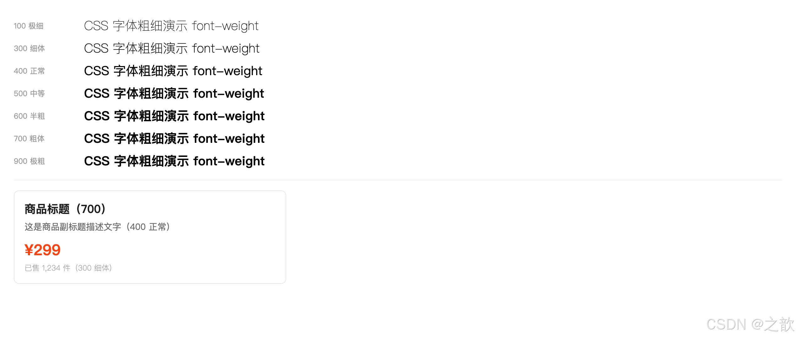
③ font-style 斜体
名词解释:
font-style控制字体是否斜体。
italic使用字体文件中自带的斜体版本;若字体无斜体版本,oblique会强制倾斜显示。
css
font-style: normal;   /* 正常(默认)*/
font-style: italic;   /* 斜体(字体自带)*/
font-style: oblique;  /* 强制倾斜 */

/* 注意:默认斜体的 em、i 标签可以用这个还原 */
em, i {
    font-style: normal;  /* 去掉默认斜体 */
}

/* 引用块使用斜体 */
blockquote {
    font-style: italic;
    color: #666;
    border-left: 4px solid #ddd;
    padding-left: 16px;
}
html
<!DOCTYPE html>
<html lang="zh-CN">
<head>
  <meta charset="UTF-8">
  <title>font-style 演示</title>
  <style>
    body { font-family: "Microsoft YaHei", sans-serif; padding: 20px; line-height: 1.8; }

    /* 去掉 em 默认斜体 */
    em.no-italic { font-style: normal; background: #fff3cd; padding: 0 4px; }

    /* 引用块使用斜体 */
    blockquote {
        font-style: italic;
        color: #555;
        border-left: 4px solid #ddd;
        padding: 12px 20px;
        background: #f9f9f9;
        border-radius: 0 4px 4px 0;
        margin: 16px 0;
    }
  </style>
</head>
<body>
  <p>正常文字 <span style="font-style:normal">font-style: normal</span></p>
  <p>斜体文字 <span style="font-style:italic;color:#1677ff">font-style: italic(使用字体自带斜体)</span></p>
  <p>强制倾斜 <span style="font-style:oblique;color:#ff4d4f">font-style: oblique(强制倾斜,无自带斜体时)</span></p>

  <p>默认斜体的 em 标签:<em>这是 em 默认斜体效果</em></p>
  <p>取消 em 斜体:<em class="no-italic">font-style: normal 还原 em 为正常</em></p>

  <!-- 引用块经典用法 -->
  <blockquote>
    "不积跬步,无以至千里;不积小流,无以成江海。" ------ 荀子《劝学》
  </blockquote>

  <blockquote>
    "Talk is cheap. Show me the code." ------ Linus Torvalds
  </blockquote>
</body>
</html>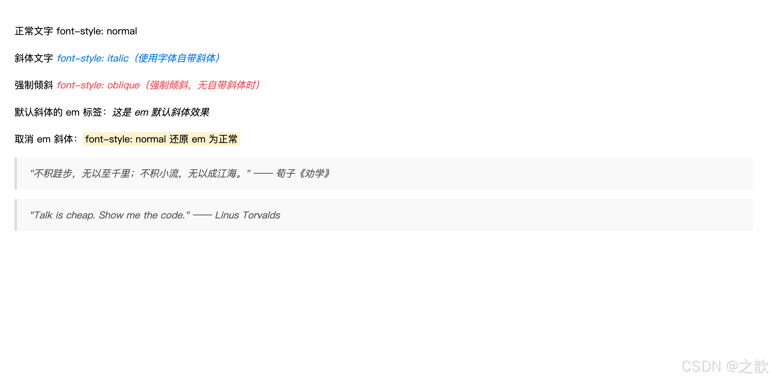
④ font-family 字体族科
名词解释:
font-family(字体族科 / 字体家族)指定元素使用的字体名称列表。浏览器会按顺序查找系统中已安装的字体,找到第一个可用字体即使用。最后应填写通用字体族名作为后备。
字体族分类:
字体族分类
serif 衬线字体
sans-serif 非衬线字体
monospace 等宽字体
cursive 手写字体
宋体 Times New Roman
笔画粗细不一 有衬线装饰
微软雅黑 Helvetica Arial
笔画粗细一致 无装饰
Courier 等宽字体
代码编辑器常用
css
/* 基本语法 */
font-family: 字体名称;
font-family: "字体名称";   /* 有空格时必须加引号 */

/* 字体列表(推荐写法:多个字体,最后是通用族)*/
/* 从左到右优先级依次降低,找到可用的就使用 */
font-family: "Microsoft YaHei", 微软雅黑, 宋体, sans-serif;

/* 更完整的跨平台字体方案 */
font-family: -apple-system, BlinkMacSystemFont, "Segoe UI",
             "PingFang SC", "Hiragino Sans GB",
             "Microsoft YaHei", sans-serif;

/* 知名网站字体设置参考 */

/* GitHub */
font-family: -apple-system, BlinkMacSystemFont, "Segoe UI",
             Helvetica, Arial, sans-serif;

/* 淘宝/天猫 */
font-family: "PingFang SC", "Lantinghei SC", "Helvetica Neue",
             Helvetica, Arial, "Microsoft Yahei",
             "Hiragino Sans GB", "WenQuanYi Micro Hei", sans-serif;

/* 微信 */
font-family: -apple-system, "Helvetica Neue", sans-serif;

/* 代码块使用等宽字体 */
code, pre {
    font-family: "Fira Code", "Source Code Pro",
                 Consolas, "Courier New", monospace;
}
html
<!DOCTYPE html>
<html lang="zh-CN">
<head>
  <meta charset="UTF-8">
  <title>font-family 演示</title>
  <style>
    body { padding: 20px; font-size: 16px; line-height: 2; }
    .font-row { margin-bottom: 16px; padding: 12px 16px; background: #f9f9f9; border-radius: 6px; }
    .font-label { font-size: 12px; color: #999; margin-bottom: 4px; }
    .sample { font-size: 18px; }
  </style>
</head>
<body>
  <!-- 非衬线字体(网页最常用)-->
  <div class="font-row">
    <div class="font-label">Microsoft YaHei(微软雅黑)--- sans-serif 非衬线,Windows 常见</div>
    <div class="sample" style="font-family:'Microsoft YaHei',sans-serif">
      前端开发 CSS样式学习 Hello World 1234567890
    </div>
  </div>

  <!-- 衬线字体 -->
  <div class="font-row">
    <div class="font-label">宋体(SimSun)--- serif 衬线,印刷风格</div>
    <div class="sample" style="font-family:'SimSun',serif">
      前端开发 CSS样式学习 Hello World 1234567890
    </div>
  </div>

  <!-- 等宽字体 -->
  <div class="font-row">
    <div class="font-label">Consolas / Courier New --- monospace 等宽,代码块首选</div>
    <div class="sample" style="font-family:Consolas,'Courier New',monospace">
      const name = "CSS"; font-size: 16px; margin: 0 auto;
    </div>
  </div>

  <!-- 跨平台字体方案 -->
  <div class="font-row">
    <div class="font-label">系统字体方案(-apple-system,跨平台优先使用系统字体)</div>
    <div class="sample" style="font-family:-apple-system,BlinkMacSystemFont,'PingFang SC','Microsoft YaHei',sans-serif">
      前端开发 CSS样式学习 Hello World --- 跨平台系统字体
    </div>
  </div>

  <!-- 字体后备机制 -->
  <p style="font-size:13px;color:#666;margin-top:8px">
    💡 字体列表会从左到右依次查找系统已安装的字体,找到第一个可用的就使用。
    最后的 <code>sans-serif</code> 是通用族科,作为兜底后备。
  </p>
</body>
</html>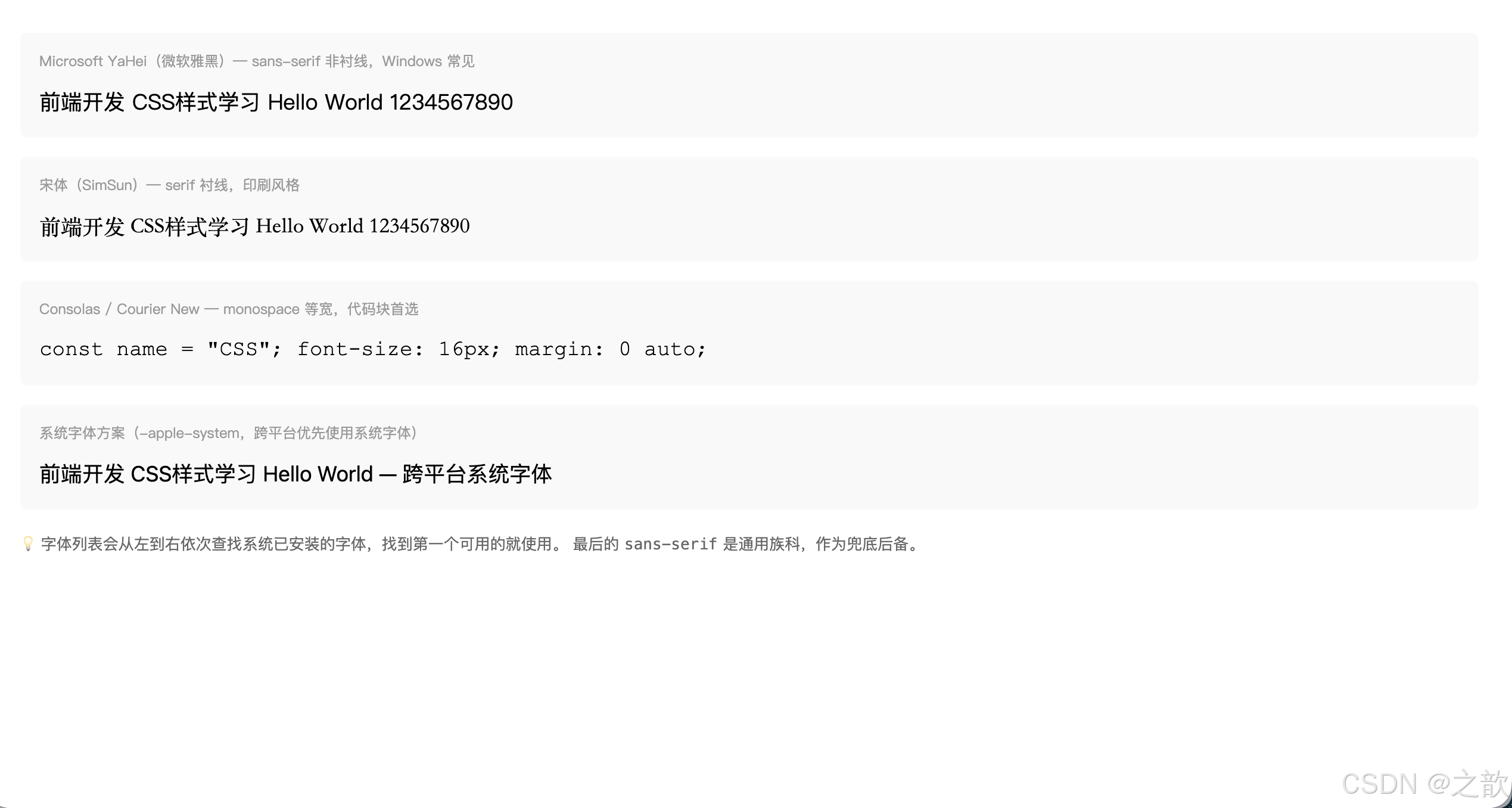
衬线 vs 非衬线:
| 类型 | 代表字体 | 特点 | 适用场景 |
|---|---|---|---|
serif(衬线) |
宋体、Times | 笔画粗细不一,有装饰 | 印刷、正式文件 |
sans-serif(非衬线) |
微软雅黑、Helvetica | 笔画一致,现代感 | 网页正文(主流) |
monospace(等宽) |
Courier、Consolas | 每个字符等宽 | 代码显示 |
⑤ 复合属性 font
名词解释:
font复合属性(Shorthand Property)CSS 复合属性允许在一条声明中同时设置多个相关属性。
font属性至少需要font-size和font-family两个值,顺序有严格要求。
font 属性语法顺序:
font: [font-style] [font-weight] font-size[/line-height] font-familyfont:
italic
bold/800
16px
/1.5
'Microsoft YaHei'
必填
可选
css
/* 最少写法:字体大小 + 字体族科(必须有这两个)*/
font: 20px 宋体;
font: 16px "Microsoft YaHei", 微软雅黑, sans-serif;

/* 加粗 */
font: bold 16px "Microsoft YaHei";
font: 700 16px "Microsoft YaHei";
font: 800 16px "Microsoft YaHei";

/* 斜体 */
font: italic 16px "Microsoft YaHei";

/* 又粗又斜:style 在 weight 前面 */
font: italic bold 16px "Microsoft YaHei";
font: italic 800 16px "Microsoft YaHei";

/* 包含行高:size/line-height */
font: 16px/1.8 "Microsoft YaHei";       /* 行高1.8倍 */
font: bold 16px/28px "Microsoft YaHei"; /* 行高28px */
font: italic 700 14px/1.6 "Microsoft YaHei", sans-serif;
⑥ 子属性和复合属性的关系
名词解释:复合属性与子属性覆盖规则
复合属性会同时设置多个子属性。即使复合属性只指定了部分值,未指定的子属性也会被重置为默认值。
规则一
复合属性写在子属性后面
前面所有子属性全部失效(被覆盖)
规则二
子属性写在复合属性后面
子属性会覆盖复合属性中对应的样式
css
/* 规则1:复合属性在后,子属性被覆盖 */
p {
    font-size: 20px;     /* 先设置 */
    font-weight: bold;   /* 先设置 */

    /* ⚠️ 复合属性在后,前面的 font-size、font-weight 全部被覆盖!*/
    /* 即使复合属性没有写 font-weight,也会用默认值(normal)覆盖 */
    font: 16px "Microsoft YaHei";  /* 最终 size=16px, weight=normal */
}

/* 规则2:子属性在后,覆盖复合属性对应值 */
p {
    font: bold 16px "Microsoft YaHei";  /* 先设置复合 */
    font-size: 20px;   /* 后设置子属性,覆盖 size 为 20px */
    /* 最终:font-size=20px, 其余保持复合属性值 */
}

/* ✅ 推荐实践:复合属性统一设置,子属性微调 */
body {
    font: 16px/1.6 "Microsoft YaHei", sans-serif; /* 全局基础 */
}
h1 {
    font-size: 32px;  /* 只微调大小,其他继承 */
    font-weight: 700;
}
6. CSS 文本样式
文本属性总览
文本样式
间距类
装饰类
对齐类
行高类
letter-spacing 字间距
word-spacing 词间距
text-decoration 修饰线
text-indent 首行缩进
text-align 水平对齐
vertical-align 垂直对齐
line-height 行高
6.1 文字与文本属性详表
| 属性名 | 作用 | 属性值 |
|---|---|---|
letter-spacing |
字符间距(每个字之间的距离) | 长度值(px/em),可为负值 |
word-spacing |
单词间距(英文空格处的距离,中文无效) | 长度值 |
text-decoration |
文本修饰线(下划线、删除线等) | none / underline / overline / line-through |
text-indent |
首行缩进 | 长度值(常用 2em 缩进两个字) |
text-align |
文本水平对齐 | left / right / center / justify |
vertical-align |
行内/行内块元素的垂直对齐 | baseline / top / middle / bottom |
line-height |
行高 | normal / 数字倍数 / px / % |
① letter-spacing 字间距
名词解释:
letter-spacing(字符间距)设置文本中每个字符之间的额外间距,正值增大间距,负值减小(但负值不建议太大,防止字符重叠)。对中文和英文都有效。
css
/* 默认值 normal,等同于0 */
letter-spacing: normal;

/* 正值:增大字间距 */
letter-spacing: 2px;
letter-spacing: 0.1em;

/* 负值:减小字间距(谨慎使用)*/
letter-spacing: -1px;

/* 实际应用 */

/* 标题增大字间距,提升视觉感 */
h1 {
    letter-spacing: 4px;
    font-weight: 300;       /* 细字+宽间距 = 设计感 */
}

/* 导航菜单间距 */
.nav-item {
    letter-spacing: 2px;
    text-transform: uppercase;  /* 大写+间距 = 时尚感 */
}

/* 验证码/密码框模拟等间距 */
.verification-code {
    letter-spacing: 20px;
    font-size: 32px;
    font-weight: bold;
}

/* 按钮文字轻微间距 */
.btn {
    letter-spacing: 1px;
}
html
<!DOCTYPE html>
<html lang="zh-CN">
<head>
  <meta charset="UTF-8">
  <title>letter-spacing 演示</title>
  <style>
    body { font-family: "Microsoft YaHei", sans-serif; padding: 20px; background: #f5f5f5; }

    /* 品牌 Logo:大字间距 */
    .brand-logo {
        font-size: 28px;
        font-weight: 300;
        letter-spacing: 12px;
        color: #1a1a1a;
        text-transform: uppercase;
        padding: 20px;
        background: white;
        display: inline-block;
        border-radius: 6px;
        margin-bottom: 12px;
    }

    /* 导航菜单字间距 */
    .nav-demo { display: flex; gap: 0; background: white; border-radius: 6px; padding: 0 10px; margin-bottom: 12px; }
    .nav-demo a {
        display: inline-block;
        padding: 14px 16px;
        color: #333;
        text-decoration: none;
        font-size: 14px;
        letter-spacing: 2px;
    }
    .nav-demo a:hover { color: #1677ff; }

    /* 对比展示 */
    .compare-row { background: white; padding: 12px 16px; border-radius: 6px; margin-bottom: 8px; }
    .compare-label { font-size: 12px; color: #999; margin-bottom: 4px; }

    /* 验证码等间距效果 */
    .captcha {
        font-size: 32px;
        font-weight: bold;
        letter-spacing: 18px;
        color: #1a1a1a;
        background: #f0f0f0;
        padding: 10px 20px;
        border-radius: 4px;
        display: inline-block;
        font-family: monospace;
    }
  </style>
</head>
<body>
  <!-- Logo 大字间距 -->
  <div class="brand-logo">FASHION</div>
  <br>

  <!-- 导航字间距 -->
  <nav class="nav-demo">
    <a href="#">首 页</a>
    <a href="#">产 品</a>
    <a href="#">关 于</a>
    <a href="#">联 系</a>
  </nav>

  <!-- 间距对比 -->
  <div class="compare-row">
    <div class="compare-label">letter-spacing: normal(默认)</div>
    <div style="letter-spacing:normal;font-size:16px">前端开发 CSS字体样式 HELLO WORLD</div>
  </div>
  <div class="compare-row">
    <div class="compare-label">letter-spacing: 3px</div>
    <div style="letter-spacing:3px;font-size:16px">前端开发 CSS字体样式 HELLO WORLD</div>
  </div>
  <div class="compare-row">
    <div class="compare-label">letter-spacing: 8px</div>
    <div style="letter-spacing:8px;font-size:16px">前端开发 CSS字体样式 HELLO WORLD</div>
  </div>

  <!-- 验证码效果 -->
  <div style="margin-top:12px">
    <div style="font-size:13px;color:#666;margin-bottom:6px">验证码等间距效果:</div>
    <div class="captcha">A3K8X</div>
  </div>
</body>
</html>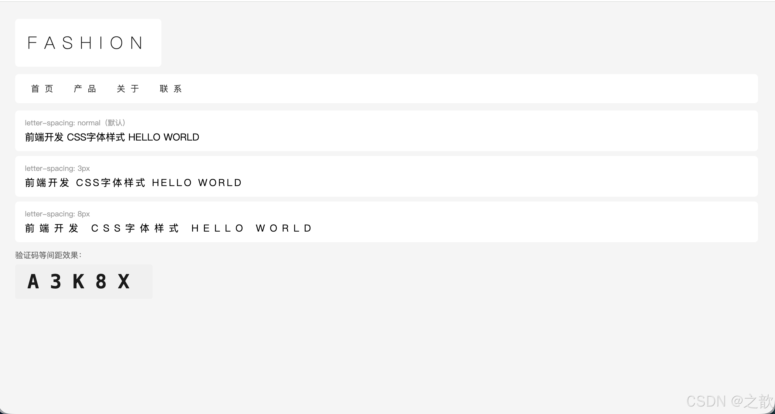
经典使用场景:
- 品牌 Logo 文字(苹果官网、奢侈品网站的 Logo 字间距很大)
- 导航栏文字(淘宝类目文字)
- 大标题增加呼吸感
② word-spacing 词间距
名词解释:
word-spacing(词间距)设置单词之间的间距(在英文中体现为空格的宽度)。对中文没有效果,因为中文没有单词间的空格。
css
word-spacing: normal;   /* 默认 */
word-spacing: 10px;     /* 英文单词间距增大 */
word-spacing: 2em;
word-spacing: -2px;     /* 减小间距 */

/* 英文段落排版 */
.article-en {
    word-spacing: 4px;
    letter-spacing: 0.5px;
    line-height: 1.8;
}

/* 标语/口号 */
.slogan {
    word-spacing: 20px;
    letter-spacing: 3px;
    font-size: 24px;
}
html
<!DOCTYPE html>
<html lang="zh-CN">
<head>
  <meta charset="UTF-8">
  <title>word-spacing 演示</title>
  <style>
    body { font-family: "Microsoft YaHei", sans-serif; padding: 20px; }
    .row { background: #f9f9f9; padding: 10px 14px; border-radius: 4px; margin-bottom: 8px; }
    .label { font-size: 12px; color: #999; margin-bottom: 4px; }
  </style>
</head>
<body>
  <p style="color:#666;font-size:13px;margin-bottom:12px">⚠️ word-spacing 对中文无效,以下用英文演示:</p>

  <div class="row">
    <div class="label">word-spacing: normal(默认)</div>
    <div style="word-spacing:normal;font-size:16px">The quick brown fox jumps over the lazy dog</div>
  </div>
  <div class="row">
    <div class="label">word-spacing: 10px</div>
    <div style="word-spacing:10px;font-size:16px">The quick brown fox jumps over the lazy dog</div>
  </div>
  <div class="row">
    <div class="label">word-spacing: 20px(明显拉开)</div>
    <div style="word-spacing:20px;font-size:16px">The quick brown fox jumps over the lazy dog</div>
  </div>
  <div class="row">
    <div class="label">word-spacing: -2px(压缩)</div>
    <div style="word-spacing:-2px;font-size:16px">The quick brown fox jumps over the lazy dog</div>
  </div>

  <!-- 广告语 / Slogan 效果 -->
  <div style="margin-top:16px;padding:20px;background:linear-gradient(135deg,#1677ff,#36cfc9);border-radius:8px;text-align:center">
    <div style="word-spacing:16px;letter-spacing:4px;font-size:22px;color:white;font-weight:300;text-transform:uppercase">
      Think Different
    </div>
  </div>
</body>
</html>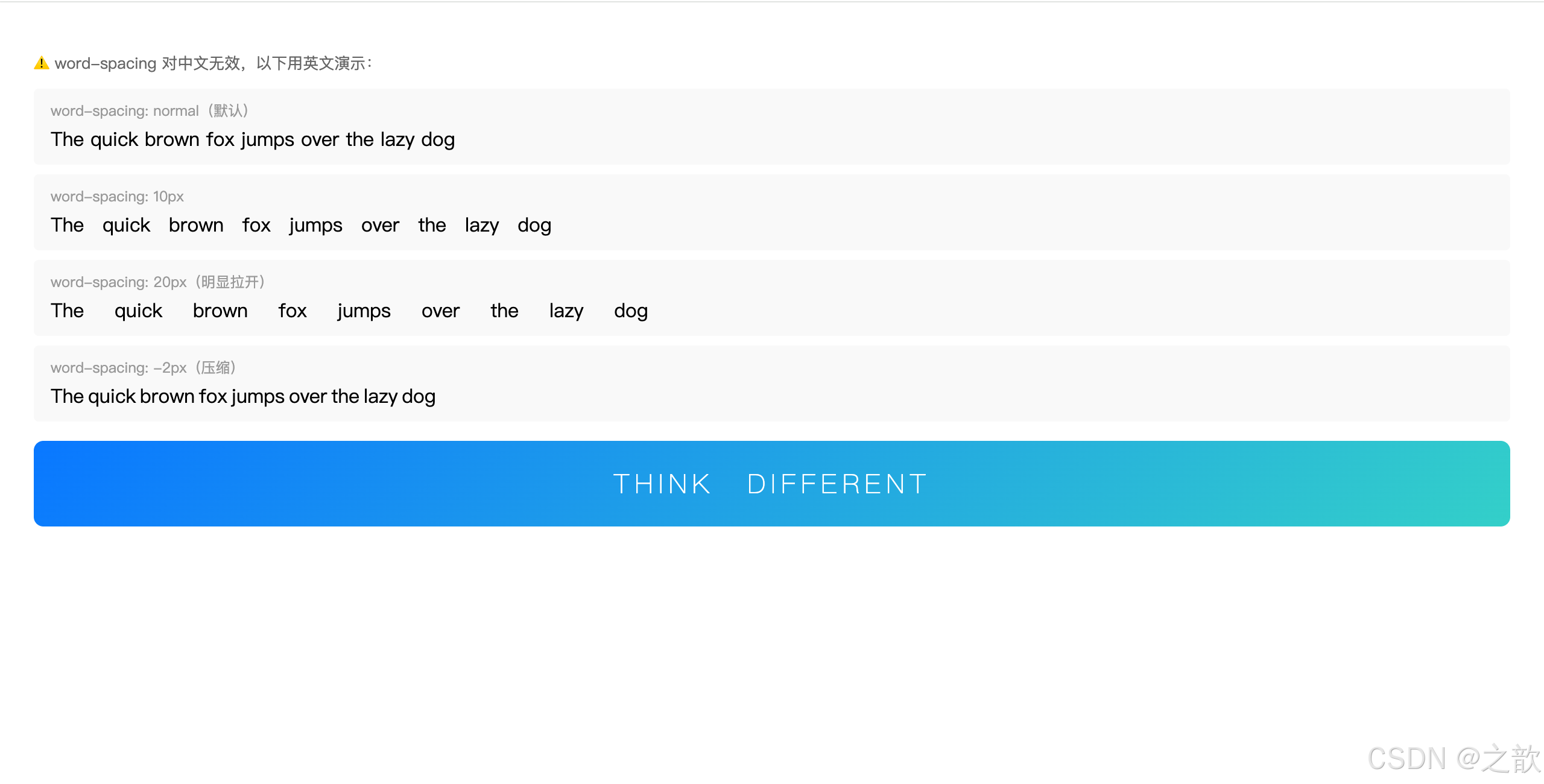
③ text-decoration 文本修饰线
名词解释:
text-decoration(文本修饰线)为文本添加修饰线:下划线、上划线、删除线等。最常用的场景是去掉超链接的默认下划线。
css
/* 四种基本值 */
text-decoration: none;          /* 无修饰线(去掉默认下划线)*/
text-decoration: underline;     /* 下划线 */
text-decoration: overline;      /* 上划线 */
text-decoration: line-through;  /* 删除线(穿过文字中间)*/

/* 实际应用 */

/* 1. 去掉 a 标签的默认下划线(几乎每个网站都有)*/
a {
    text-decoration: none;
    color: inherit;  /* 或指定颜色 */
}

/* hover 时显示下划线 */
a:hover {
    text-decoration: underline;
}

/* 2. 电商商品原价(删除线)*/
.original-price {
    text-decoration: line-through;
    color: #999;
    font-size: 14px;
}

/* 3. 下划线美化 */
.custom-underline {
    text-decoration: underline;
    text-decoration-color: #1677ff;
    text-decoration-thickness: 2px;  /* 线宽 */
    text-underline-offset: 4px;      /* 下划线距文字的距离 */
}

/* 4. 强调重点用下划线 */
.highlight {
    text-decoration: underline;
    text-decoration-style: wavy;     /* 波浪线 */
    text-decoration-color: #ff4d4f;
}
html
<!DOCTYPE html>
<html lang="zh-CN">
<head>
<meta charset="UTF-8">
<title>text-decoration 演示</title>
<style>
body { font-family: "Microsoft YaHei", sans-serif; padding: 20px; line-height: 2; }
/* 去掉 a 默认下划线 */
a { text-decoration: none; color: #1677ff; }
a:hover { text-decoration: underline; }
/* 电商价格 */
.product-card {
display: inline-block;
border: 1px solid #e8e8e8;
border-radius: 8px;
padding: 16px;
margin-top: 12px;
min-width: 200px;
}
.price-now { font-size: 22px; font-weight: bold; color: #cc0000; }
.price-old { font-size: 14px; color: #999; text-decoration: line-through; margin-left: 8px; }
.discount { background: #cc0000; color: white; font-size: 12px; padding: 1px 5px; border-radius: 2px; margin-left: 6px; }
</style>
</head>
<body>
<!-- 四种基本修饰线 -->
<p style="text-decoration:none">text-decoration: none --- 无修饰线(超链接常用)</p>
<p style="text-decoration:underline">text-decoration: underline --- 下划线</p>
<p style="text-decoration:overline">text-decoration: overline --- 上划线</p>
<p style="text-decoration:line-through">text-decoration: line-through --- 删除线</p>
<!-- 超链接去掉下划线,hover 时显示 -->
<p>
普通超链接(默认有下划线):<a href="#" style="text-decoration:underline">普通链接</a>
去掉下划线后:<a href="#">去掉下划线链接(hover 出现)</a>
</p>
<!-- 电商价格区域 -->
<div class="product-card">
<div style="font-size:14px;color:#666;margin-bottom:6px">苹果 iPhone 15</div>
<div>
<span class="price-now">¥5,999</span>
<span class="price-old">¥6,999</span>
<span class="discount">9折</span>
</div>
<div style="font-size:12px;color:#999;margin-top:4px">限时特惠 | 包邮</div>
</div>
<!-- 波浪线强调 -->
<p style="margin-top:16px">
重要内容可以用波浪下划线:
<span style="text-decoration:underline;text-decoration-style:wavy;text-decoration-color:#ff4d4f">
这段文字有红色波浪线强调
</span>
</p>
</body>
</html>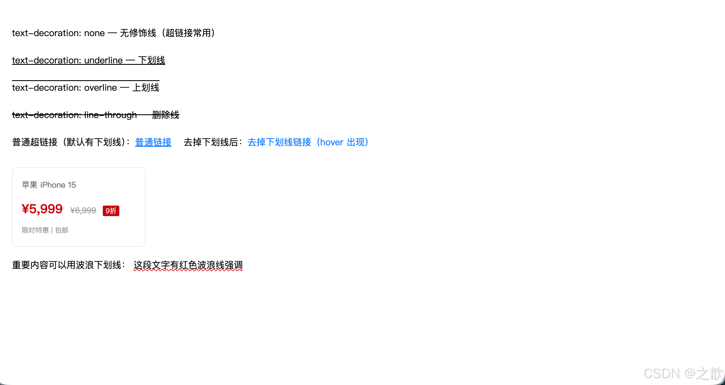
经典使用场景:
- 所有超链接去掉下划线:
a { text-decoration: none; }是最常见的 CSS Reset- 电商原价展示:
text-decoration: line-through+ 灰色文字(淘宝、京东商品价格)
④ text-indent 首行缩进
名词解释:
text-indent(首行缩进)设置文本块中第一行文字的缩进量。中文排版中常用
2em实现两个字的缩进(因为1em = 1个字宽度)。
css
/* 常用值:2em 等于缩进两个字 */
p {
    text-indent: 2em;
}

/* px 值 */
p {
    text-indent: 32px;
}

/* 负值:可实现悬挂缩进(向左突出)*/
.hanging {
    text-indent: -20px;
    padding-left: 20px;
}

/* 实际应用 */

/* 文章正文段落首行缩进(中文规范)*/
.article p {
    text-indent: 2em;
    line-height: 1.8;
    font-size: 16px;
    color: #333;
}

/* 使用负值隐藏文本(SEO 友好的隐藏图片替换文字方法)*/
.logo {
    text-indent: -9999px;  /* 将文字推到看不见的地方 */
    background: url('logo.png') no-repeat;
    width: 200px;
    height: 50px;
    display: block;
}
html
<!DOCTYPE html>
<html lang="zh-CN">
<head>
  <meta charset="UTF-8">
  <title>text-indent 演示</title>
  <style>
    body { font-family: "Microsoft YaHei", sans-serif; padding: 20px; background: #f5f5f5; }
    .article {
        max-width: 600px;
        background: white;
        padding: 24px;
        border-radius: 8px;
        box-shadow: 0 2px 8px rgba(0,0,0,0.06);
    }
    .article h2 { font-size: 20px; margin-bottom: 16px; color: #1a1a1a; }

    /* 首行缩进:中文规范 */
    .article p {
        text-indent: 2em;    /* 缩进2个字宽 */
        font-size: 15px;
        line-height: 1.9;
        color: #333;
        margin-bottom: 12px;
    }

    /* 无缩进对比 */
    .no-indent {
        text-indent: 0;
        border-left: 3px solid #1677ff;
        padding-left: 12px;
        color: #555;
    }
  </style>
</head>
<body>
  <div class="article">
    <h2>《荷塘月色》节选</h2>

    <!-- 有首行缩进(中文排版规范)-->
    <p>这几天心里颇不宁静。今晚在院子里坐着乘凉,忽然想起日日走过的荷塘,在这满月的光里,总该另有一番样子吧。</p>
    <p>沿着荷塘,是一条曲折的小煤屑路。这是一条幽僻的路;白天也少人走,夜晚更加寂寞。</p>
    <p>曲曲折折的荷塘上面,弥望的是田田的叶子。叶子出水很高,像亭亭的舞女的裙。</p>

    <!-- 引用块:不缩进 -->
    <p class="no-indent">(以上段落均有 text-indent: 2em 首行缩进,符合中文排版习惯)</p>
  </div>

  <!-- 对比:无缩进的段落 -->
  <div class="article" style="margin-top:16px">
    <h2>无首行缩进(text-indent: 0)</h2>
    <p style="text-indent:0;font-size:15px;line-height:1.9;color:#333;margin-bottom:12px">
      这几天心里颇不宁静。今晚在院子里坐着乘凉,忽然想起日日走过的荷塘,在这满月的光里,总该另有一番样子吧。
    </p>
    <p style="text-indent:0;font-size:15px;line-height:1.9;color:#333">
      沿着荷塘,是一条曲折的小煤屑路。这是一条幽僻的路;白天也少人走,夜晚更加寂寞。
    </p>
    <p style="font-size:12px;color:#999;margin-top:8px">← 没有首行缩进,视觉上段落区分不明显</p>
  </div>
</body>
</html>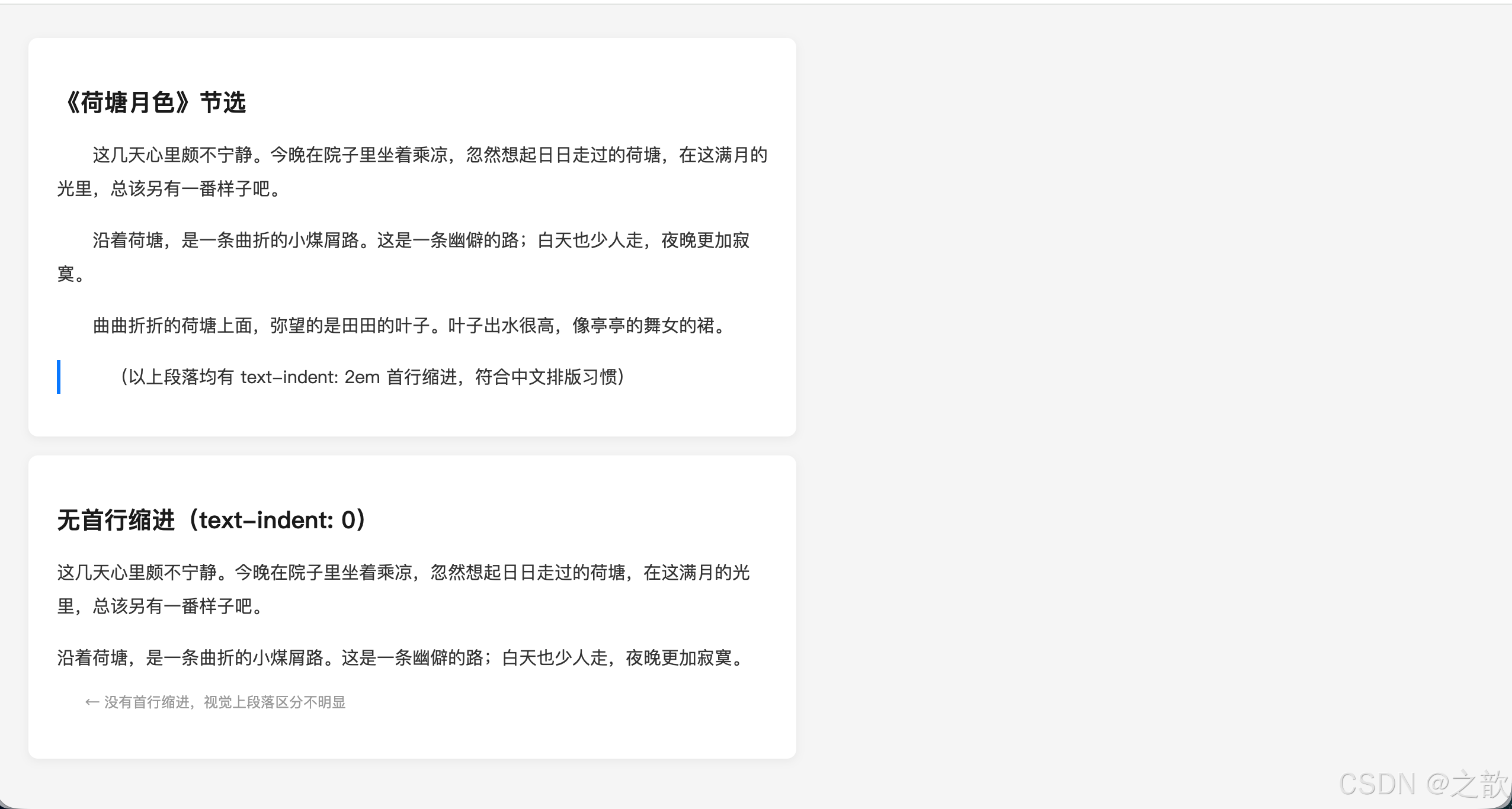
经典使用场景:
- 新闻文章、博客正文的段落首行缩进(如新浪新闻、腾讯新闻)
- Logo 文字替换(SEO 优化技巧)
⑤ text-align 文本水平对齐
名词解释:
text-align(文本水平对齐方式)设置块级元素内部 文本(包括行内元素、行内块元素)的水平对齐方式。注意:只对行内内容有效,对块级子元素无效。
css
text-align: left;     /* 左对齐(默认)*/
text-align: center;   /* 居中对齐 */
text-align: right;    /* 右对齐 */
text-align: justify;  /* 两端对齐(英文段落常用)*/

/* 实际应用 */

/* 1. 页面 Logo 或主标题居中 */
.page-title {
    text-align: center;
    font-size: 36px;
    font-weight: bold;
    padding: 40px 0;
}

/* 2. 导航栏链接居中 */
.nav-item a {
    display: block;
    text-align: center;
    height: 50px;
    line-height: 50px;
}

/* 3. 按钮文字居中 */
.btn {
    text-align: center;
    width: 120px;
    height: 40px;
    line-height: 40px;
}

/* 4. 英文长段落两端对齐 */
.article-body {
    text-align: justify;
    hyphens: auto;  /* 自动连字符 */
}

/* 5. 价格右对齐 */
.price-cell {
    text-align: right;
    font-weight: bold;
    color: #ff4400;
}

/* 6. 重要提示:text-align 也能让 img 居中 */
.image-wrapper {
    text-align: center;  /* img 是行内块,可以被 text-align 影响 */
}重要理解:text-align: center 使行内/行内块元素居中
text-align: center
对行内元素有效
对行内块元素有效
对块级子元素无效
span strong a
img input button
div p h1~h6(需用 margin: 0 auto)
html
<!DOCTYPE html>
<html lang="zh-CN">
<head>
  <meta charset="UTF-8">
  <title>text-align 演示</title>
  <style>
    * { margin: 0; padding: 0; box-sizing: border-box; }
    body { font-family: "Microsoft YaHei", sans-serif; padding: 20px; background: #f5f5f5; }

    .demo-block {
        background: white;
        border-radius: 8px;
        padding: 16px;
        margin-bottom: 12px;
    }
    .demo-label { font-size: 12px; color: #999; margin-bottom: 8px; }

    /* 左对齐(默认)*/
    .align-left  { text-align: left;    background: #fff9f0; padding: 10px; border-radius: 4px; margin-bottom: 6px; }
    /* 居中对齐 */
    .align-center{ text-align: center;  background: #f0fff4; padding: 10px; border-radius: 4px; margin-bottom: 6px; }
    /* 右对齐 */
    .align-right { text-align: right;   background: #f0f5ff; padding: 10px; border-radius: 4px; margin-bottom: 6px; }

    /* 商品卡片(居中)*/
    .goods-card {
        text-align: center;
        border: 1px solid #e8e8e8;
        border-radius: 8px;
        padding: 16px;
        width: 160px;
        display: inline-block;
        vertical-align: top;
        margin-right: 12px;
    }
    .goods-card img { width: 100px; height: 100px; border-radius: 6px; object-fit: cover; }
    .goods-card .goods-name { font-size: 13px; color: #333; margin: 8px 0 4px; }
    .goods-card .goods-price { font-size: 16px; font-weight: bold; color: #ff4400; }

    /* 价格表格(右对齐)*/
    table { width: 100%; border-collapse: collapse; }
    th, td { padding: 10px 12px; border-bottom: 1px solid #f0f0f0; font-size: 14px; }
    th { background: #fafafa; color: #666; font-weight: 500; }
    .price-col { text-align: right; font-weight: bold; color: #ff4400; }
    .name-col  { text-align: left; }
    .num-col   { text-align: center; color: #666; }
  </style>
</head>
<body>
  <!-- 四种对齐方式对比 -->
  <div class="demo-block">
    <div class="demo-label">文本对齐方式对比:</div>
    <div class="align-left">text-align: left(左对齐,默认)</div>
    <div class="align-center">text-align: center(居中对齐)</div>
    <div class="align-right">text-align: right(右对齐)</div>
  </div>

  <!-- 商品卡片居中(电商常见)-->
  <div class="demo-block">
    <div class="demo-label">商品卡片居中(text-align: center + img 行内块):</div>
    <div class="goods-card">
      <img src="https://picsum.photos/100/100?random=1" alt="商品">
      <div class="goods-name">夏季新款 T恤</div>
      <div class="goods-price">¥89</div>
    </div>
    <div class="goods-card">
      <img src="https://picsum.photos/100/100?random=2" alt="商品">
      <div class="goods-name">休闲运动裤</div>
      <div class="goods-price">¥129</div>
    </div>
    <div class="goods-card">
      <img src="https://picsum.photos/100/100?random=3" alt="商品">
      <div class="goods-name">轻便运动鞋</div>
      <div class="goods-price">¥259</div>
    </div>
  </div>

  <!-- 购物车价格右对齐(表格)-->
  <div class="demo-block">
    <div class="demo-label">购物车表格(价格右对齐):</div>
    <table>
      <tr><th class="name-col">商品名称</th><th class="num-col">数量</th><th class="price-col">价格</th></tr>
      <tr><td class="name-col">苹果 AirPods Pro</td><td class="num-col">1</td><td class="price-col">¥1,799</td></tr>
      <tr><td class="name-col">iPhone 保护壳</td><td class="num-col">2</td><td class="price-col">¥198</td></tr>
      <tr><td class="name-col">充电数据线</td><td class="num-col">3</td><td class="price-col">¥117</td></tr>
      <tr><td colspan="2" style="text-align:right;color:#999;font-size:13px">合计:</td><td class="price-col" style="font-size:18px">¥2,114</td></tr>
    </table>
  </div>
</body>
</html>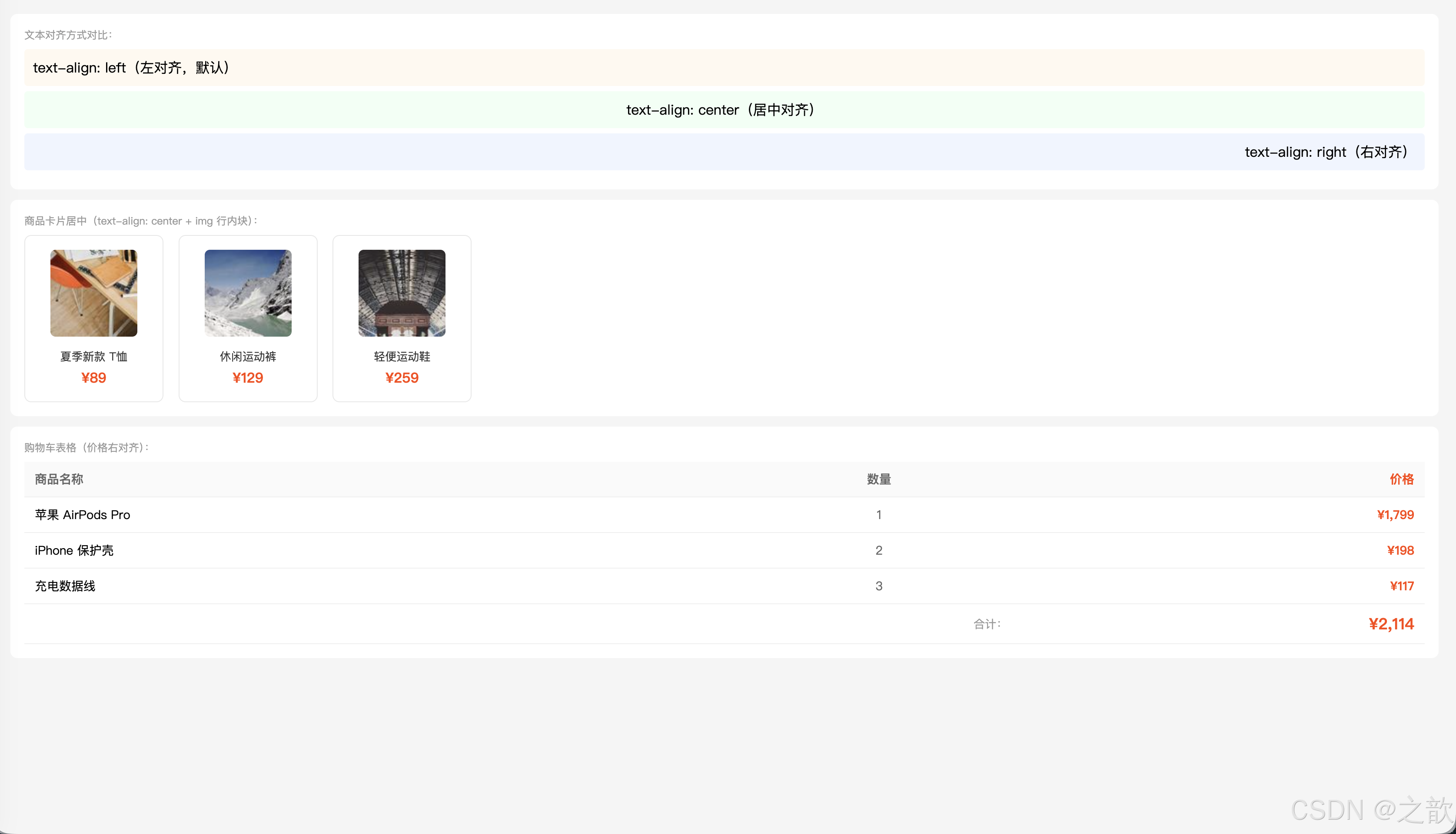
经典使用场景:
- 几乎所有网站的 Logo 居中(
text-align: center)- 表格中金额、数字的右对齐(Excel风格)
- 商品卡片中图片、标题居中(电商网站)
⑥ vertical-align 垂直对齐
名词解释:
vertical-align(垂直对齐方式)设置行内元素 或行内块元素 在其所在行中的垂直对齐方式。也可用于表格单元格(
td/th)。不能用于块级元素。
文字基线(Baseline)概念:
文本行的参考线
顶线 top - 字母最高处
中线 middle - 字母中部
基线 baseline - 字母底部对齐线
底线 bottom - 下行字母底部
css
/* 常用值 */
vertical-align: baseline;  /* 基线对齐(默认)*/
vertical-align: top;       /* 顶部对齐 */
vertical-align: middle;    /* 中线对齐 */
vertical-align: bottom;    /* 底部对齐 */
vertical-align: sub;       /* 下标(like H₂O 中的2)*/
vertical-align: super;     /* 上标(like x² 中的2)*/
vertical-align: 10px;      /* 相对基线偏移的像素值 */
三大用法:
css
/* 用法1:解决 img 底部留白问题 */
/* img 默认 baseline 对齐,底部会有空白 */
img {
    vertical-align: middle;  /* 或 bottom / top,均可消除空白 */
}

/* 用法2:文字和图标/图片垂直居中对齐 */
.icon-text {
    display: inline-block;
}
.icon-text img {
    vertical-align: middle;
    margin-right: 8px;
}
.icon-text span {
    vertical-align: middle;
}

/* 用法3:上标和下标 */
.formula {
    font-size: 16px;
}
.formula sup {
    vertical-align: super;
    font-size: 0.75em;
}
.formula sub {
    vertical-align: sub;
    font-size: 0.75em;
}

/* 用法4:表格单元格垂直对齐 */
td, th {
    vertical-align: middle;  /* 单元格内容垂直居中 */
    height: 50px;
    padding: 0 12px;
}

/* 用法5:行内块垂直居中(经典技巧)*/
.container {
    height: 200px;
    text-align: center;
}
.container::after {
    content: '';
    display: inline-block;
    height: 100%;
    vertical-align: middle;
}
.box {
    display: inline-block;
    vertical-align: middle;
}
html
<!DOCTYPE html>
<html lang="zh-CN">
<head>
<meta charset="UTF-8">
<title>vertical-align 演示</title>
<style>
* { margin: 0; padding: 0; box-sizing: border-box; }
body { font-family: "Microsoft YaHei", sans-serif; padding: 20px; line-height: 2; }
.demo-block { background: #f9f9f9; padding: 14px; border-radius: 6px; margin-bottom: 12px; }
.demo-label { font-size: 12px; color: #999; margin-bottom: 8px; }
/* 图片底部留白问题演示 */
.img-bad { background: #ffe; border: 1px solid #ddd; padding: 4px; display: inline-block; }
.img-good { background: #efe; border: 1px solid #ddd; padding: 4px; display: inline-block; }
.img-bad img { width: 60px; height: 60px; } /* ← 底部有空白 */
.img-good img { width: 60px; height: 60px; vertical-align: middle; } /* ← 底部无空白 */
/* 图标+文字垂直居中 */
.icon-text img { width: 20px; height: 20px; vertical-align: middle; margin-right: 6px; }
.icon-text span { vertical-align: middle; font-size: 14px; }
/* 表格单元格对齐 */
table { border-collapse: collapse; width: 100%; }
td, th { border: 1px solid #e8e8e8; padding: 0 12px; font-size: 14px; }
th { background: #fafafa; }
.va-top { vertical-align: top; height: 60px; }
.va-middle { vertical-align: middle; height: 60px; }
.va-bottom { vertical-align: bottom; height: 60px; }
</style>
</head>
<body>
<!-- img 底部留白问题 -->
<div class="demo-block">
<div class="demo-label">img 底部留白问题(baseline 对齐导致):</div>
<div class="img-bad">
<img src="https://picsum.photos/60?random=10" alt="">
<span style="font-size:12px;color:#999">有空白</span>
</div>
<div class="img-good">
<img src="https://picsum.photos/60?random=10" alt="">
<span style="font-size:12px;color:#999">无空白</span>
</div>
<p style="font-size:12px;color:#999;margin-top:6px">左:默认 baseline;右:vertical-align: middle 解决</p>
</div>
<!-- 图标+文字对齐 -->
<div class="demo-block">
<div class="demo-label">图标 + 文字垂直居中(常见于菜单、列表):</div>
<span class="icon-text">
<img src="https://api.iconify.design/mdi:home.svg" alt="home">
<span>首页</span>
</span>
<span class="icon-text">
<img src="https://api.iconify.design/mdi:heart.svg" alt="heart">
<span>收藏</span>
</span>
<span class="icon-text">
<img src="https://api.iconify.design/mdi:account.svg" alt="account">
<span>我的</span>
</span>
</div>
<!-- 上标下标 -->
<div class="demo-block">
<div class="demo-label">上标 sup 和下标 sub:</div>
<p>化学式:H<sub>2</sub>O(水) CO<sub>2</sub>(二氧化碳) H<sub>2</sub>SO<sub>4</sub>(硫酸)</p>
<p>数学:x<sup>2</sup> + y<sup>2</sup> = r<sup>2</sup> a<sup>n</sup> + b<sup>n</sup> 面积 = 50m<sup>2</sup></p>
<p>脚注:参考文献<sup>[1]</sup>、版权说明<sup>©</sup></p>
</div>
<!-- 表格单元格对齐 -->
<div class="demo-block">
<div class="demo-label">表格单元格垂直对齐(vertical-align 在 td 上有效):</div>
<table>
<tr>
<th>top 顶部对齐</th>
<th>middle 中间对齐</th>
<th>bottom 底部对齐</th>
</tr>
<tr>
<td class="va-top">内容在顶部</td>
<td class="va-middle">内容在中间</td>
<td class="va-bottom">内容在底部</td>
</tr>
</table>
</div>
</body>
</html>
经典使用场景:
- 解决图片底部 3px 空白(几乎所有图文混排场景)
- 图标 + 文字垂直居中(微信、微博的操作栏)
- 数学公式的上标下标
⑦ line-height 行高
名词解释:
line-height(行高)行高是指文本行之间的距离(行盒的高度)。行高 = 上半行距 + 字体高度 + 下半行距。通过设置行高等于容器高度可以实现单行文字垂直居中。
行高构成原理:
行高 line-height
上行距 = 行高-字高 / 2
字体高度 font-size
下行距 = 行高-字高 / 2
单行文字垂直居中技巧
line-height = 容器height
css
/* 行高的四种写法 */

/* 1. normal:浏览器默认(约为 font-size 的 1.2 倍)*/
line-height: normal;

/* 2. 像素值 */
line-height: 28px;

/* 3. 无单位数字(推荐!)= font-size 的倍数 */
/* 推荐:继承时子元素根据自己的 font-size 计算 */
line-height: 1.5;   /* font-size 的 1.5 倍 */
line-height: 1.8;   /* 较宽松的行距,提高可读性 */

/* 4. 百分比(不推荐继承场景)*/
line-height: 150%;  /* 与数字 1.5 效果相同,但继承行为不同 */

/* ---实际应用--- */

/* 正文段落:无单位数字推荐 */
p {
    font-size: 16px;
    line-height: 1.6;   /* 行高 = 16 * 1.6 = 25.6px */
    color: #333;
}

/* 标题:行高可以小一点 */
h1 {
    font-size: 32px;
    line-height: 1.2;  /* 标题行高紧凑 */
}

/* 单行文字垂直居中(最经典的技巧!)*/
.button {
    width: 120px;
    height: 40px;
    line-height: 40px;   /* 行高=高度,实现垂直居中 */
    text-align: center;  /* 水平居中 */
    background-color: #1677ff;
    color: white;
    border-radius: 4px;
    display: inline-block;
    cursor: pointer;
}

/* 导航条高度 */
.navbar {
    height: 60px;
    line-height: 60px;  /* 文字垂直居中 */
    background-color: #fff;
    padding: 0 20px;
}

/* 无障碍标准:正文行高至少 1.5 */
body {
    line-height: 1.5;  /* W3C WCAG 2.1 推荐 */
}
无单位数字 vs 像素/百分比 的继承差异:
css
/* ⚠️ 不推荐:百分比/px 继承后不会重新计算 */
.parent-bad {
    font-size: 14px;
    line-height: 1.5em;  /* 计算值 = 21px,子元素继承 21px */
}
.child-bad {
    font-size: 32px;     /* 继承的行高 21px < 字体大小,文字重叠!*/
}

/* ✅ 推荐:无单位数字,子元素基于自身 font-size 重新计算 */
.parent-good {
    font-size: 14px;
    line-height: 1.5;    /* 子元素继承比例 1.5 */
}
.child-good {
    font-size: 32px;     /* 行高 = 32 * 1.5 = 48px,正常!*/
}
html
<!DOCTYPE html>
<html lang="zh-CN">
<head>
  <meta charset="UTF-8">
  <title>line-height 演示</title>
  <style>
    * { margin: 0; padding: 0; box-sizing: border-box; }
    body { font-family: "Microsoft YaHei", sans-serif; padding: 20px; background: #f5f5f5; }
    .demo-block { background: white; border-radius: 8px; padding: 16px; margin-bottom: 12px; }
    .demo-label { font-size: 12px; color: #999; margin-bottom: 8px; }

    /* ① 行高对比 */
    .lh-tight  { line-height: 1.2; background: #fff9f0; padding: 10px; border-radius: 4px; margin-bottom: 6px; }
    .lh-normal { line-height: 1.5; background: #f0fff4; padding: 10px; border-radius: 4px; margin-bottom: 6px; }
    .lh-loose  { line-height: 2.0; background: #f0f5ff; padding: 10px; border-radius: 4px; margin-bottom: 6px; }

    /* ② 单行文字垂直居中技巧 */
    .nav-bar {
        height: 56px;
        line-height: 56px;      /* 行高 = 高度 → 垂直居中 */
        background: #001529;
        padding: 0 24px;
        color: white;
        font-size: 15px;
        border-radius: 6px;
        margin-bottom: 8px;
    }
    .btn-demo {
        display: inline-block;
        height: 40px;
        line-height: 40px;      /* 行高 = 高度 → 垂直居中 */
        padding: 0 20px;
        background: #1677ff;
        color: white;
        border-radius: 4px;
        font-size: 14px;
        margin-right: 8px;
        text-decoration: none;
    }

    /* ③ 继承问题对比 */
    .parent-bad  { font-size: 14px; line-height: 1.2em; background: #fff3f3; padding: 10px; border-radius: 4px; margin-bottom: 6px; }
    .parent-good { font-size: 14px; line-height: 1.5;   background: #f3fff3; padding: 10px; border-radius: 4px; }
    .child-big   { font-size: 28px; }
  </style>
</head>
<body>
  <!-- ① 行高对可读性的影响 -->
  <div class="demo-block">
    <div class="demo-label">行高对可读性的影响(同样的文字,不同行高):</div>
    <div class="lh-tight">
      <b>line-height: 1.2(紧凑)</b><br>
      前端开发是构建网页界面的核心技术,包括HTML结构、CSS样式和JavaScript交互。掌握这三者是成为前端工程师的必备基础。
    </div>
    <div class="lh-normal">
      <b>line-height: 1.5(正常)</b><br>
      前端开发是构建网页界面的核心技术,包括HTML结构、CSS样式和JavaScript交互。掌握这三者是成为前端工程师的必备基础。
    </div>
    <div class="lh-loose">
      <b>line-height: 2.0(宽松,阅读体验最佳)</b><br>
      前端开发是构建网页界面的核心技术,包括HTML结构、CSS样式和JavaScript交互。掌握这三者是成为前端工程师的必备基础。
    </div>
  </div>

  <!-- ② 单行文字垂直居中 -->
  <div class="demo-block">
    <div class="demo-label">单行文字垂直居中(line-height = height):</div>
    <div class="nav-bar">导航栏文字自动垂直居中(height: 56px; line-height: 56px)</div>
    <a class="btn-demo" href="#">确认提交</a>
    <a class="btn-demo" style="background:#52c41a" href="#">保存草稿</a>
    <a class="btn-demo" style="background:#ff4d4f" href="#">删除</a>
  </div>

  <!-- ③ 继承问题:em vs 无单位 -->
  <div class="demo-block">
    <div class="demo-label">继承差异:em 单位 vs 无单位数字(推荐无单位):</div>
    <div class="parent-bad">
      父元素 font-size:14px,line-height:1.2em(计算值=16.8px 被继承下去)
      <div class="child-big">子元素 font-size:28px,继承了父元素计算后的 16.8px → 文字重叠!</div>
    </div>
    <div class="parent-good">
      父元素 font-size:14px,line-height:1.5(倍数被继承)
      <div class="child-big">子元素 font-size:28px,line-height=28×1.5=42px → 正常!</div>
    </div>
  </div>
</body>
</html>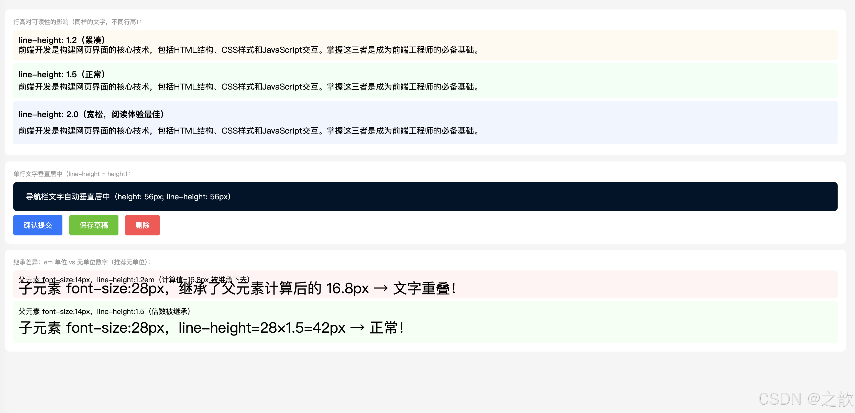
经典使用场景:
- 按钮/导航项的单行文字垂直居中:
height = line-height(无数网站使用此方案)- 正文排版行高设为
1.5~1.8(提升可读性,知乎、简书、掘金等博客网站)
7. 经典网页中的综合应用
7.1 电商网站导航栏
html
<!DOCTYPE html>
<html lang="zh-CN">
<head>
  <meta charset="UTF-8">
  <title>仿淘宝导航栏</title>
  <style>
/* 仿淘宝顶部导航栏 */
.nav-bar {
    background-color: #fff;
    border-bottom: 1px solid #e8e8e8;
    height: 50px;
    line-height: 50px;       /* 单行文字垂直居中 */
}

.nav-bar .logo {
    display: inline-block;
    width: 130px;
    height: 50px;
    vertical-align: middle;
}

.nav-bar ul {
    list-style: none;
    margin: 0;
    padding: 0;
    display: inline-block;
    vertical-align: middle;
}

.nav-bar ul li {
    display: inline-block;
    margin: 0 15px;
}

.nav-bar ul li a {
    text-decoration: none;   /* 去掉下划线 */
    color: #333;
    font-size: 14px;
    letter-spacing: 1px;
}

.nav-bar ul li a:hover {
    color: #ff4400;
}
  </style>
</head>
<body>
  <div class="nav-bar">
    <a href="#" class="logo">
      <img src="https://img.alicdn.com/imgextra/i3/O1CN01mDH1jH1dMNuJkC2UH_!!6000000003722-2-tps-220-60.png"
           alt="淘宝" style="height:36px;vertical-align:middle" onerror="this.style.display='none';this.nextSibling.style.display='inline'">
      <span style="display:none;font-size:20px;font-weight:bold;color:#ff4400">淘宝网</span>
    </a>
    <ul>
      <li><a href="#">首页</a></li>
      <li><a href="#">天猫</a></li>
      <li><a href="#">聚划算</a></li>
      <li><a href="#">天猫国际</a></li>
      <li><a href="#">淘宝心选</a></li>
    </ul>
  </div>
</body>
</html>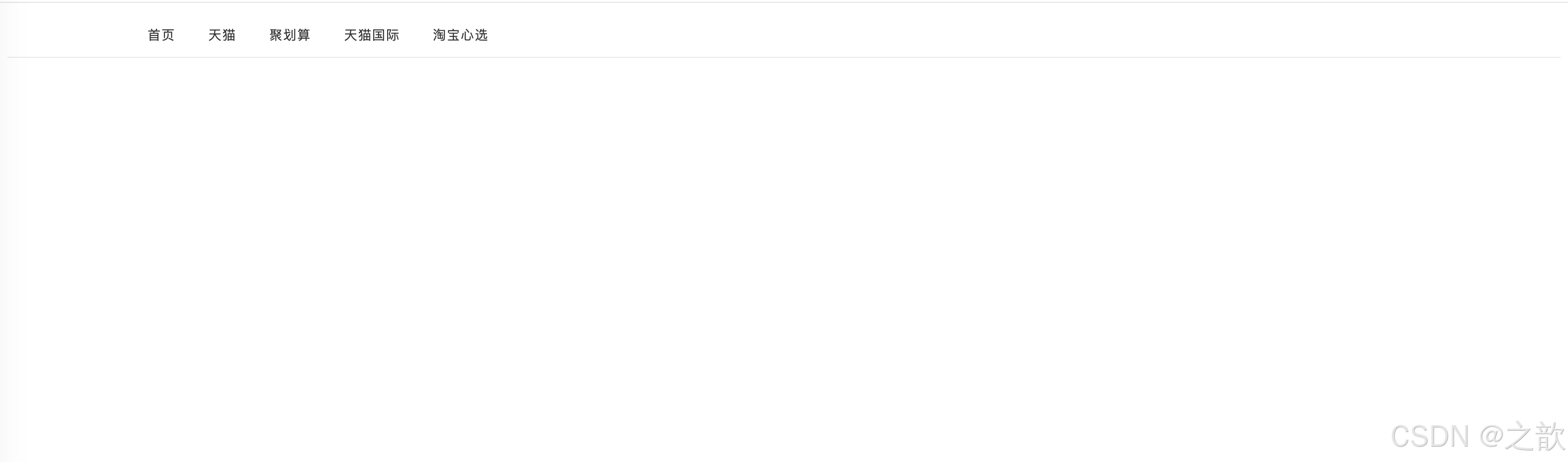
7.2 商品价格展示
html
<!DOCTYPE html>
<html lang="zh-CN">
<head>
  <meta charset="UTF-8">
  <title>仿京东商品价格展示</title>
  <style>
    * { margin: 0; padding: 0; box-sizing: border-box; }
    body { font-family: "Microsoft YaHei", sans-serif; padding: 20px; background: #f5f5f5; }

    .product-card {
        background: #fff;
        border-radius: 8px;
        padding: 16px;
        max-width: 360px;
        box-shadow: 0 2px 8px rgba(0,0,0,0.06);
    }
    .product-img {
        width: 100%;
        height: 200px;
        object-fit: cover;
        border-radius: 6px;
        display: block;
    }
    .product-name {
        font-size: 15px;
        color: #333;
        line-height: 1.5;
        margin: 12px 0 8px;
    }
    /* 价格区域 */
    .product-price { margin: 8px 0; }
    .price-current {
        font-size: 24px;
        font-weight: bold;
        color: #cc0000;
    }
    .price-original {
        font-size: 14px;
        color: #999;
        text-decoration: line-through; /* 原价删除线 */
        margin-left: 8px;
    }
    .price-discount {
        display: inline-block;
        background-color: #cc0000;
        color: white;
        font-size: 11px;
        padding: 1px 5px;
        border-radius: 2px;
        margin-left: 6px;
        vertical-align: middle;
        font-weight: bold;
    }
    /* 标签行 */
    .tag-row { margin-top: 8px; }
    .tag {
        display: inline-block;
        border: 1px solid #cc0000;
        color: #cc0000;
        font-size: 11px;
        padding: 1px 5px;
        border-radius: 2px;
        margin-right: 4px;
    }
    /* 购买按钮 */
    .btn-buy {
        display: block;
        width: 100%;
        height: 40px;
        line-height: 40px;
        text-align: center;
        background: #cc0000;
        color: white;
        border: none;
        border-radius: 4px;
        font-size: 15px;
        font-weight: 500;
        letter-spacing: 2px;
        cursor: pointer;
        margin-top: 14px;
        text-decoration: none;
    }
  </style>
</head>
<body>
  <div class="product-card">
    <img class="product-img"
         src="https://picsum.photos/360/200?random=20" alt="商品图片">

    <p class="product-name">
      【官方旗舰】Apple iPhone 15 Pro 256G 黑色钛金属
      全网通 5G 智能手机
    </p>

    <div class="product-price">
      <span class="price-current">¥7,999</span>
      <span class="price-original">¥8,999</span>
      <span class="price-discount">9折</span>
    </div>

    <div class="tag-row">
      <span class="tag">京东自营</span>
      <span class="tag">免费上门换新</span>
      <span class="tag">24期免息</span>
    </div>

    <a href="#" class="btn-buy">立即购买</a>
  </div>
</body>
</html>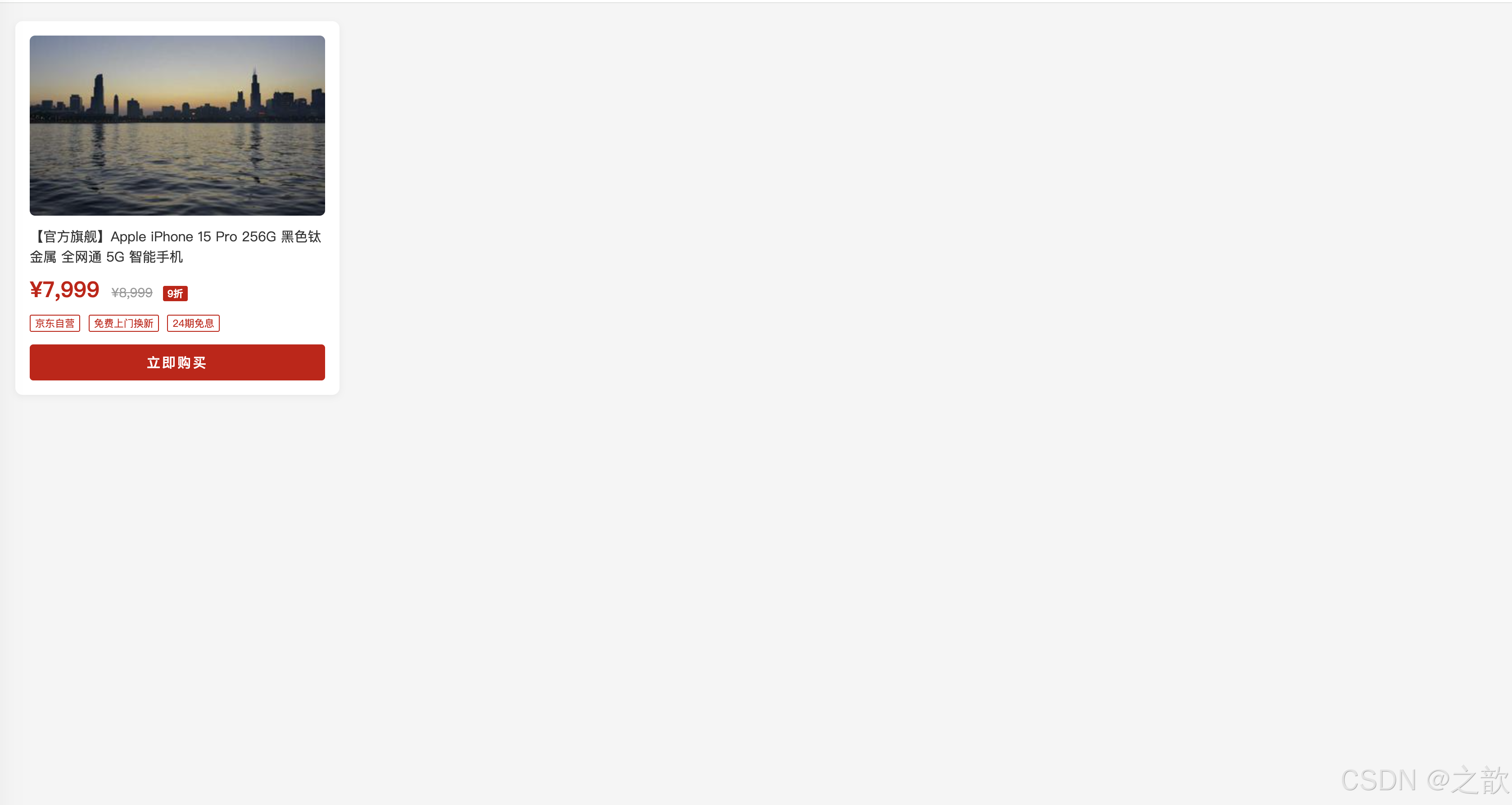
7.3 文章博客正文
html
<!DOCTYPE html>
<html lang="zh-CN">
<head>
  <meta charset="UTF-8">
  <title>仿知乎/掘金文章排版</title>
  <style>
    * { margin: 0; padding: 0; box-sizing: border-box; }
    body { background: #f4f5f7; padding: 30px 16px; }

    .article-wrap {
        max-width: 740px;
        margin: 0 auto;
        background: #fff;
        border-radius: 8px;
        padding: 40px 48px;
        box-shadow: 0 2px 8px rgba(0,0,0,0.06);
    }

    /* 文章标题 */
    .article-wrap h1 {
        font-size: 28px;
        font-weight: 700;
        color: #1a1a1a;
        line-height: 1.4;
        letter-spacing: 1px;
        margin-bottom: 12px;
    }

    /* 作者信息行 */
    .article-meta {
        display: flex;
        align-items: center;
        gap: 10px;
        font-size: 13px;
        color: #8590a6;
        padding-bottom: 20px;
        border-bottom: 1px solid #f0f0f0;
        margin-bottom: 28px;
    }
    .article-meta img {
        width: 32px; height: 32px;
        border-radius: 50%;
        vertical-align: middle;
    }

    /* 正文区域 */
    .article-body {
        font-family: -apple-system, "PingFang SC", "Microsoft YaHei", sans-serif;
        font-size: 16px;
        line-height: 1.9;       /* 宽松行高 */
        color: #1a1a1a;
    }
    .article-body p {
        text-indent: 2em;       /* 首行缩进两字 */
        margin-bottom: 18px;
    }
    .article-body h2 {
        font-size: 22px;
        font-weight: 700;
        line-height: 1.4;
        letter-spacing: 2px;
        margin-top: 36px;
        margin-bottom: 14px;
        color: #1a1a1a;
        border-left: 4px solid #1677ff;
        padding-left: 12px;
    }
    .article-body h3 {
        font-size: 18px;
        font-weight: 600;
        margin-top: 24px;
        margin-bottom: 10px;
        letter-spacing: 1px;
    }
    .article-body a {
        color: #1677ff;
        text-decoration: none;
    }
    .article-body a:hover {
        text-decoration: underline;
    }
    .article-body blockquote {
        font-style: italic;
        border-left: 4px solid #ddd;
        padding: 12px 20px;
        color: #666;
        margin: 20px 0;
        background: #f9f9f9;
        border-radius: 0 4px 4px 0;
    }
    .article-body code {
        background: #f2f3f5;
        color: #e6234e;
        font-family: Consolas, monospace;
        font-size: 14px;
        padding: 2px 6px;
        border-radius: 3px;
    }
  </style>
</head>
<body>
  <div class="article-wrap">
    <h1>CSS 是如何工作的?浏览器渲染原理浅析</h1>

    <div class="article-meta">
      <img src="https://api.dicebear.com/7.x/avataaars/svg?seed=css" alt="作者头像">
      <span>前端小明</span>
      <span>·</span>
      <span>2024-05-01</span>
      <span>·</span>
      <span>阅读 12,834</span>
    </div>

    <div class="article-body">
      <h2>一、什么是 CSS?</h2>
      <p>
        CSS(Cascading Style Sheets,层叠样式表)是用于描述 HTML 文档外观和格式的语言。
        它与 HTML、JavaScript 并称为前端三剑客,负责控制网页的颜色、布局、字体、间距等视觉呈现。
      </p>
      <p>
        一个没有 CSS 的网页,就像一篇没有排版的文章------内容在,但读起来费劲。
        CSS 的存在,让网页从"能看"变成了"好看"。
      </p>

      <h2>二、CSS 的工作原理</h2>
      <h3>2.1 解析阶段</h3>
      <p>
        浏览器在加载 HTML 文档时,会同时解析关联的 CSS 文件,
        构建 CSSOM(CSS Object Model,CSS 对象模型),
        与 DOM 树合并为渲染树(Render Tree)。
      </p>

      <blockquote>
        "样式越复杂,浏览器渲染耗时越长。合理使用选择器,避免深层嵌套,是前端性能优化的基础之一。"
      </blockquote>

      <h3>2.2 层叠与继承</h3>
      <p>
        CSS 之所以叫"层叠"样式表,是因为当多条规则同时作用于同一元素时,
        浏览器会按照<a href="#">优先级(Specificity)</a>决定最终使用哪条规则。
        <code>!important</code> 优先级最高,但应尽量避免滥用。
      </p>
    </div>
  </div>
</body>
</html>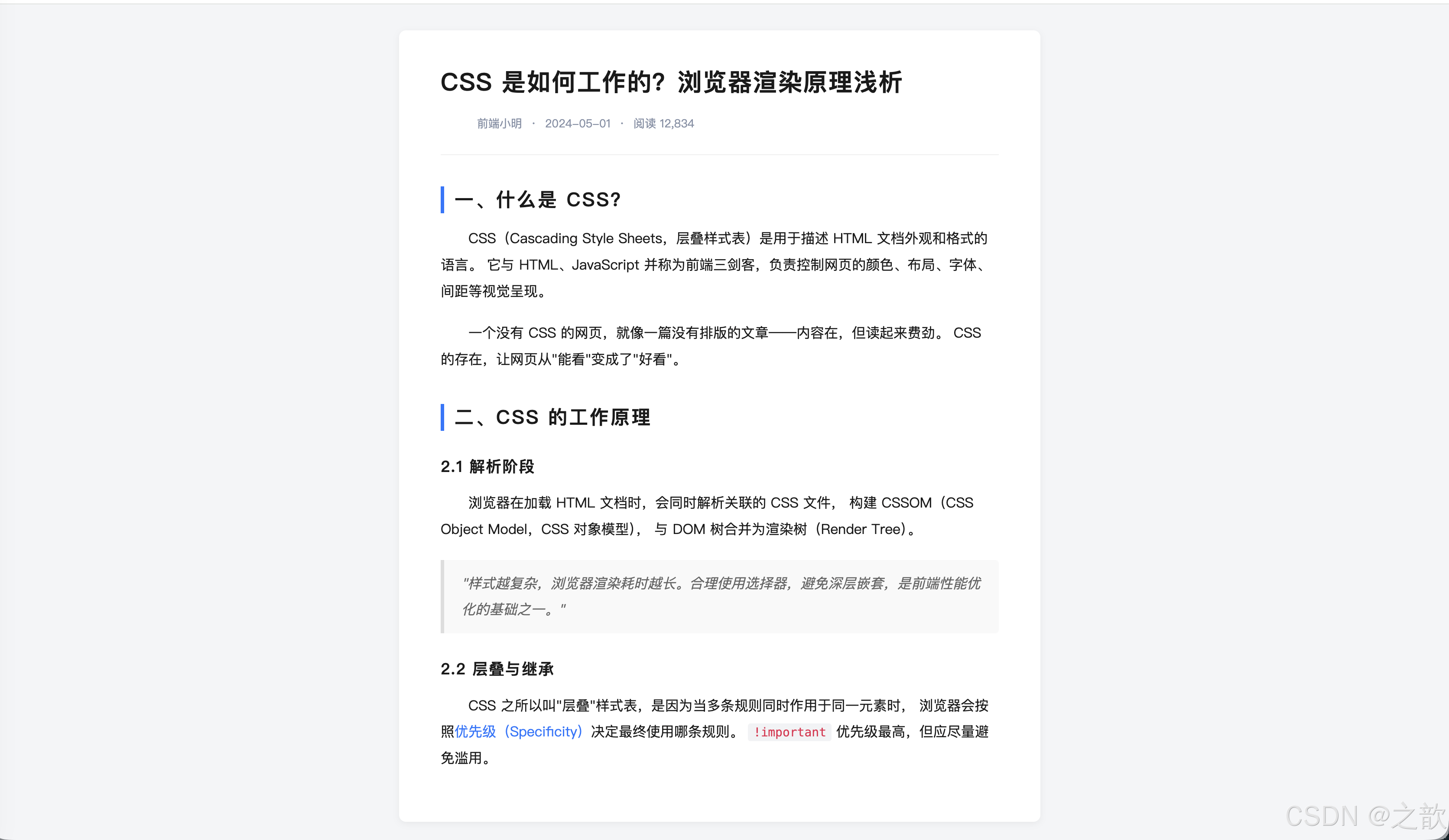
7.4 表单登录页
html
<!DOCTYPE html>
<html lang="zh-CN">
<head>
<meta charset="UTF-8">
<title>仿微信登录页</title>
<style>
* { margin: 0; padding: 0; box-sizing: border-box; }
body {
font-family: -apple-system, "PingFang SC", "Microsoft YaHei", sans-serif;
background: #f0f2f5;
min-height: 100vh;
display: flex;
align-items: center;
justify-content: center;
}
.login-form {
width: 380px;
padding: 44px 40px 36px;
background-color: #fff;
border-radius: 12px;
box-shadow: 0 6px 24px rgba(0, 0, 0, 0.08);
text-align: center;
}
/* Logo 区域 */
.login-logo {
width: 64px;
height: 64px;
border-radius: 16px;
margin: 0 auto 16px;
display: block;
}
/* 标题:letter-spacing 增大字间距 */
.login-title {
font-size: 22px;
font-weight: 600;
color: #1a1a1a;
letter-spacing: 4px; /* 字间距撑开标题 */
margin-bottom: 8px;
}
.login-subtitle {
font-size: 13px;
color: #999;
margin-bottom: 32px;
letter-spacing: 1px;
}
/* 输入框:display:block 占满行宽 */
.login-input {
display: block; /* 块级,独占整行 */
width: 100%;
height: 46px;
font-size: 15px;
padding: 0 16px;
border: 1px solid #e0e0e0;
border-radius: 8px;
margin-bottom: 14px;
color: #333;
outline: none;
transition: border-color 0.2s;
font-family: inherit;
}
.login-input:focus { border-color: #07c160; }
.login-input::placeholder { color: #bbb; }
/* 登录按钮:line-height 实现垂直居中 */
.login-btn {
display: block; /* 块级,独占整行 */
width: 100%;
height: 46px;
line-height: 46px; /* 文字垂直居中 */
text-align: center; /* 文字水平居中 */
font-size: 16px;
font-weight: 500;
letter-spacing: 6px; /* 登录两字加大间距 */
color: white;
background-color: #07c160; /* 微信绿 */
border: none;
border-radius: 8px;
cursor: pointer;
margin-top: 6px;
text-decoration: none;
transition: background 0.2s;
}
.login-btn:hover { background-color: #06ae56; }
/* 分割线 */
.divider {
display: flex;
align-items: center;
color: #ddd;
font-size: 12px;
margin: 20px 0;
gap: 10px;
}
.divider::before,
.divider::after {
content: '';
flex: 1;
height: 1px;
background: #eee;
}
/* 第三方登录 */
.oauth-row { display: flex; justify-content: center; gap: 20px; margin-bottom: 20px; }
.oauth-btn {
width: 44px; height: 44px;
border-radius: 50%;
border: 1px solid #eee;
display: flex; align-items: center; justify-content: center;
font-size: 20px;
cursor: pointer;
text-decoration: none;
background: #fff;
transition: box-shadow 0.2s;
}
.oauth-btn:hover { box-shadow: 0 2px 8px rgba(0,0,0,0.12); }
/* 底部链接:text-decoration 控制下划线 */
.login-footer { font-size: 13px; color: #999; }
.login-link {
color: #07c160;
text-decoration: none; /* 去掉默认下划线 */
}
.login-link:hover { text-decoration: underline; }
</style>
</head>
<body>
<div class="login-form">
<!-- Logo -->
<img class="login-logo"
src="https://res.wx.qq.com/a/wx_fed/assets/res/OTE0YTAw.png"
alt="微信"
onerror="this.style.background='#07c160';this.removeAttribute('src')">
<div class="login-title">微信登录</div>
<div class="login-subtitle">使用微信账号登录</div>
<!-- 输入框:display:block 让每个 input 独占一行 -->
<input class="login-input" type="text" placeholder="请输入微信号 / 手机号 / 邮箱">
<input class="login-input" type="password" placeholder="请输入密码">
<!-- 登录按钮:line-height = height,文字垂直居中 -->
<button class="login-btn">登 录</button>
<div class="divider">其他登录方式</div>
<div class="oauth-row">
<a href="#" class="oauth-btn" title="QQ登录">Q</a>
<a href="#" class="oauth-btn" title="微博登录">微</a>
<a href="#" class="oauth-btn" title="GitHub登录">G</a>
</div>
<div class="login-footer">
还没有账号?
<a href="#" class="login-link">立即注册</a>
·
<a href="#" class="login-link">忘记密码?</a>
</div>
</div>
</body>
</html>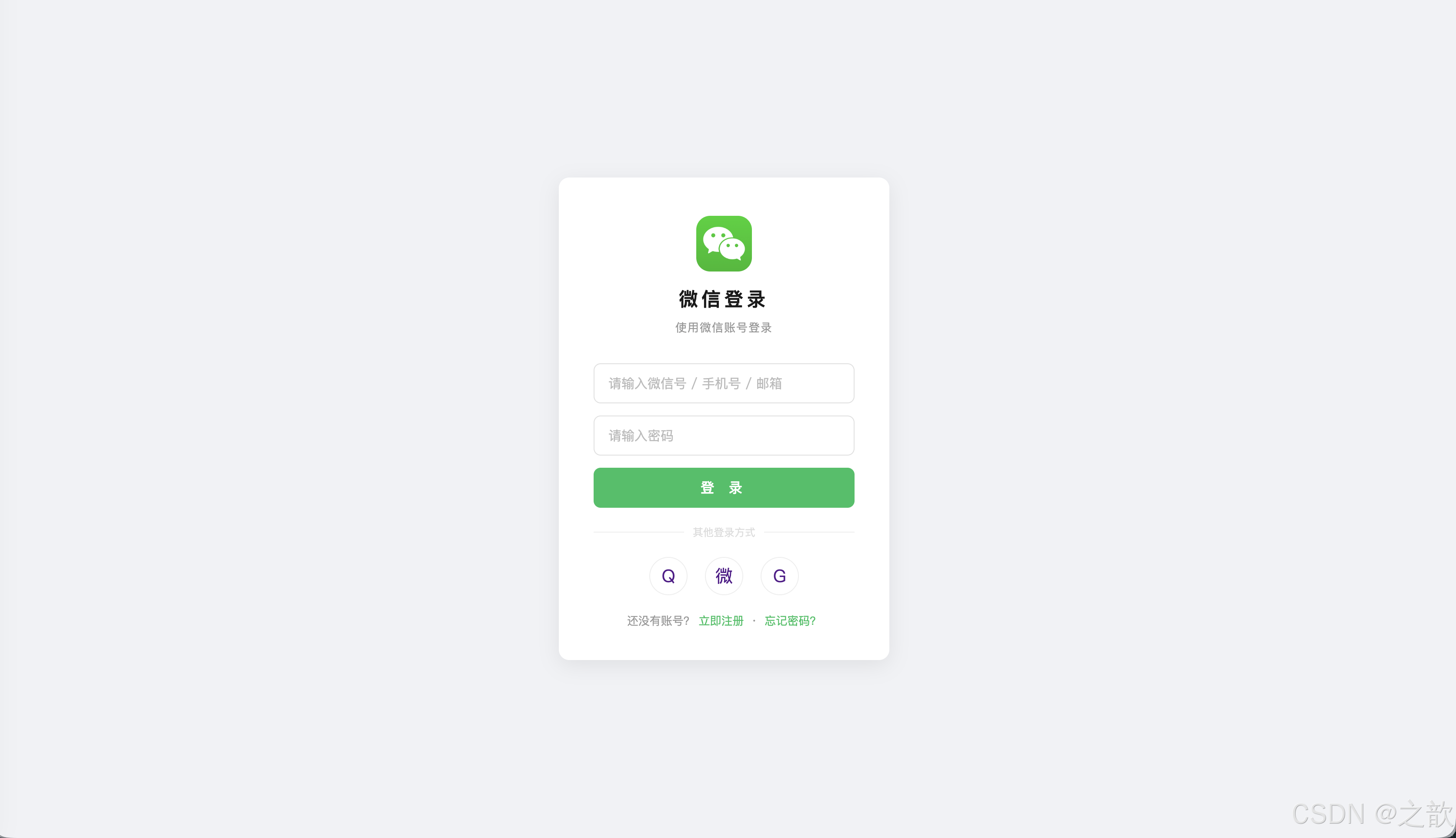
8. 知识点总结与速查
CSS 属性完整速查表
Day05 CSS知识点
颜色与单位
选择器
显示模式
字体
文本
px em %
颜色名 rgb hex rgba
标签名 .类名 #ID *通配
权重: ID>Class>Tag>*
block inline inline-block
display属性
font-size weight style family
font复合属性
letter-spacing word-spacing
text-decoration indent align
vertical-align line-height
权重优先级对照表
| 选择器类型 | 权重值 | 示例 |
|---|---|---|
行内式 style="" |
1000 | <p style="color:red"> |
| ID 选择器 | 100 | #main {} |
| 类选择器 | 10 | .active {} |
| 标签名选择器 | 1 | p {} |
| 通配选择器 | 0 | * {} |
显示模式对照表
| 特性 | block | inline | inline-block |
|---|---|---|---|
| 是否独占一行 | ✅ 是 | ❌ 否 | ❌ 否 |
| 可否设置宽高 | ✅ 是 | ❌ 否 | ✅ 是 |
| 上下 margin 有效 | ✅ 是 | ❌ 否 | ✅ 是 |
| 典型元素 | div p h1 | span a | img input |
line-height 常用值建议
| 场景 | 推荐值 | 说明 |
|---|---|---|
| 正文段落 | 1.5~1.8 |
宽松,提升阅读体验 |
| 大标题 | 1.1~1.3 |
紧凑,视觉冲击强 |
| 按钮/导航 | 等于 height |
实现单行垂直居中 |
| 最小推荐值 | 1.5(WCAG标准) |
无障碍要求 |
9. 作业
1. 完成课堂案例(01-长度和颜色 / 02-选择器 / 03-盒子模型 / 04-字体样式 / 05-文本样式)
2. Google 字体设置实践(使用 Google Fonts 引入网络字体)
Google Fonts 使用方法:
html
<!-- 在 HTML head 中引入 -->
<link rel="preconnect" href="https://fonts.googleapis.com">
<link href="https://fonts.googleapis.com/css2?family=Noto+Sans+SC:wght@300;400;500;700&display=swap" rel="stylesheet">
css
/* 在 CSS 中使用 */
body {
    font-family: "Noto Sans SC", "Microsoft YaHei", sans-serif;
}
参考资料: