CalculatorApp - 计算器应用教程
项目介绍
项目背景
计算器是每个开发者入门时最经典的项目之一。它虽然看起来简单,但涵盖了编程中的许多核心概念:数据存储、用户交互、条件判断、数学运算等。通过构建一个功能完整的计算器应用,你将深入理解 HarmonyOS NEXT 的开发模式和 ArkUI 框架的核心概念。
应用场景
计算器应用在日常生活中有着广泛的应用场景:
- 基本计算:日常生活中的加减乘除运算
- 百分比计算:购物打折、税率计算等
- 科学计算:工程计算、数学学习等
- 财务计算:贷款计算、投资回报等
功能特性
本计算器应用实现了以下功能:
- 基本四则运算:支持加(+)、减(-)、乘(×)、除(÷)运算
- 百分比计算:将当前数字转换为百分比
- 正负号切换:将正数转换为负数,负数转换为正数
- 小数点输入:支持小数运算
- 清除功能:清除所有输入,重新开始计算
- 连续运算:支持连续输入多个运算符
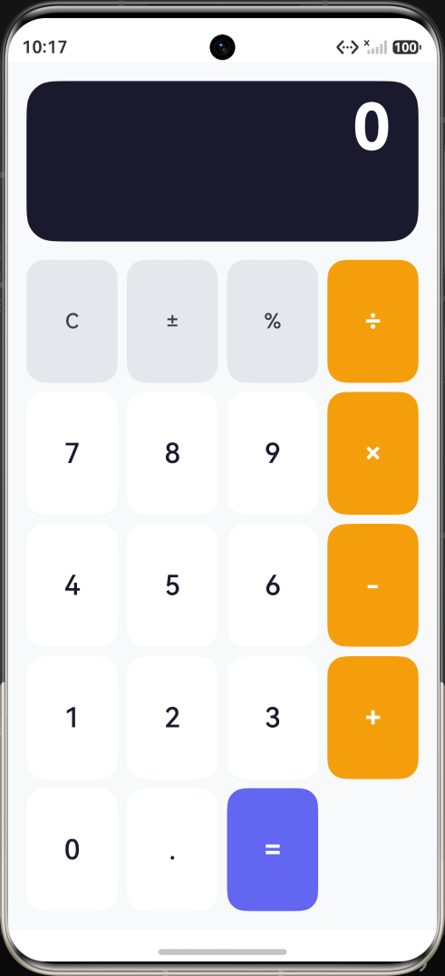
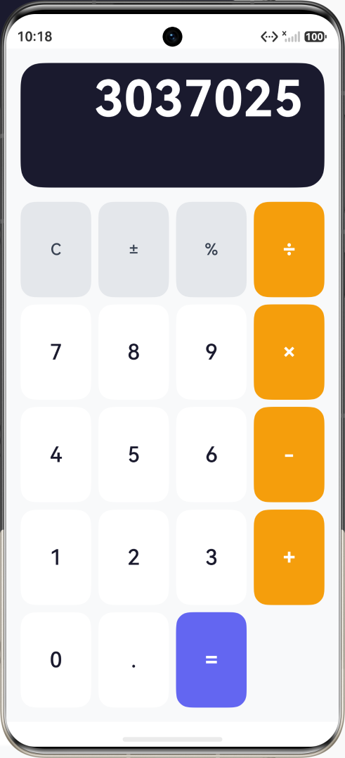
最终效果
用户界面分为两个主要区域:
- 显示区域:位于顶部,显示当前输入的数字和运算结果,采用深色背景设计
- 按钮区域:位于底部,采用网格布局,包含数字按钮、运算符按钮和功能按钮
技术栈
- 开发框架:HarmonyOS NEXT API 23
- 编程语言:ArkTS
- UI 框架:ArkUI 声明式 UI
- 布局方式:Column + Grid
开发环境准备
1. 创建项目
首先,我们需要创建一个新的 HarmonyOS NEXT 项目。可以通过以下两种方式:
方式一:使用 DevEco Studio 创建
- 打开 DevEco Studio
- 选择 "Create HarmonyOS Project"
- 选择 "Empty Ability" 模板
- 设置项目名称为 "CalculatorApp"
- 选择 API 版本为 23
方式二:复制模板项目
- 复制
project-template目录 - 重命名为 "CalculatorApp"
- 修改
AppScope/app.json5中的bundleName
2. 项目结构
创建完成后,项目结构如下:
CalculatorApp/
├── AppScope/                    # 应用全局配置
│   ├── app.json5               # 应用级配置
│   └── resources/              # 应用级资源
├── entry/                       # 主模块
│   └── src/main/
│       ├── ets/                # ArkTS 源代码
│       │   ├── entryability/   # UIAbility 入口
│       │   └── pages/          # 页面组件
│       └── resources/          # 资源文件
├── build-profile.json5         # 构建配置
└── oh-package.json5            # 依赖配置
知识点讲解
1. @Entry 装饰器 - 页面入口详解
@Entry 装饰器是 ArkUI 框架中最重要的装饰器之一,它标记当前组件为页面的入口组件。
核心概念:
- 每个页面只能有一个
@Entry修饰的组件 @Entry组件是页面的根组件- 页面的生命周期事件由
@Entry组件处理
语法示例:
typescript
@Entry  // 标记为页面入口组件
@Component
struct Index {
  // 页面状态变量
  @State message: string = 'Hello World';

  // 页面生命周期
  onPageShow(): void {
    console.info('页面显示');
  }

  onPageHide(): void {
    console.info('页面隐藏');
  }

  // UI 构建方法
  build() {
    Column() {
      Text(this.message)
    }
  }
}
生命周期说明:
onPageShow():页面显示时触发onPageHide():页面隐藏时触发onBackPress():用户点击返回按钮时触发
2. @Component 装饰器 - 自定义组件详解
@Component 装饰器用于定义自定义组件,它是 ArkUI 组件化开发的基础。
核心概念:
- 使用
struct关键字定义组件 - 必须实现
build()方法 - 可以包含状态变量和普通变量
- 支持组件复用
语法示例:
typescript
@Component
struct MyComponent {
  // 普通变量(不参与UI更新)
  private count: number = 0;

  // 状态变量(参与UI更新)
  @State message: string = 'Hello';

  build() {
    Column() {
      Text(this.message)
      Button('点击')
        .onClick(() => {
          this.count++;
          this.message = `点击了 ${this.count} 次`;
        })
    }
  }
}
组件复用:
typescript
// 在其他组件中使用
@Entry
@Component
struct ParentPage {
  build() {
    Column() {
      MyComponent()  // 使用自定义组件
      MyComponent()  // 复用组件
    }
  }
}
3. @State 装饰器 - 状态管理详解
@State 装饰器是 ArkUI 状态管理的核心,它定义组件的内部状态。
核心概念:
- 状态变量的值改变时,UI 会自动更新
- 只能在
@Component或@Entry组件中使用 - 支持基本数据类型和对象类型
数据类型支持:
typescript
// 基本类型
@State count: number = 0;
@State message: string = '';
@State isVisible: boolean = true;

// 数组类型
@State items: string[] = [];
@State numbers: number[] = [1, 2, 3];

// 对象类型
@State user: { name: string, age: number } = { name: '张三', age: 25 };
状态更新示例:
typescript
@Component
struct Counter {
  @State count: number = 0;

  build() {
    Column() {
      Text(`计数: ${this.count}`)
        .fontSize(24)

      Row() {
        Button('-')
          .onClick(() => {
            this.count--;  // 状态改变,UI自动更新
          })

        Button('+')
          .onClick(() => {
            this.count++;  // 状态改变,UI自动更新
          })
      }
    }
  }
}
4. Column 组件 - 线性布局(纵向)详解
Column 组件是 ArkUI 中最常用的布局组件之一,它将子组件垂直排列。
核心属性:
typescript
Column() {
  // 子组件
}
.width('100%')           // 宽度
.height('100%')          // 高度
.padding(16)             // 内边距
.margin(10)              // 外边距
.backgroundColor('#F8F9FA')  // 背景颜色
.borderRadius(12)        // 圆角
.justifyContent(FlexAlign.Center)  // 主轴对齐
.alignItems(HorizontalAlign.Center)  // 交叉轴对齐
对齐方式详解:
typescript
// 主轴对齐(垂直方向)
Column() { ... }
  .justifyContent(FlexAlign.Start)      // 顶部对齐
  .justifyContent(FlexAlign.Center)     // 居中对齐
  .justifyContent(FlexAlign.End)        // 底部对齐
  .justifyContent(FlexAlign.SpaceBetween)  // 两端对齐
  .justifyContent(FlexAlign.SpaceAround)   // 均匀分布
  .justifyContent(FlexAlign.SpaceEvenly)   // 完全均匀

// 交叉轴对齐(水平方向)
Column() { ... }
  .alignItems(HorizontalAlign.Start)    // 左对齐
  .alignItems(HorizontalAlign.Center)   // 居中对齐
  .alignItems(HorizontalAlign.End)      // 右对齐
内边距和外边距:
typescript
// 统一设置
.padding(16)  // 四个方向都是16
.margin(10)   // 四个方向都是10

// 分别设置
.padding({ left: 16, right: 16, top: 8, bottom: 8 })
.margin({ left: 10, right: 10, top: 5, bottom: 5 })

// 水平和垂直设置
.padding({ horizontal: 16, vertical: 8 })
.margin({ horizontal: 10, vertical: 5 })
5. Text 组件 - 文本显示详解
Text 组件用于显示文本内容,支持丰富的样式设置。
基本用法:
typescript
Text('Hello World')
  .fontSize(24)              // 字体大小
  .fontWeight(FontWeight.Bold)  // 字体粗细
  .fontColor('#333333')      // 字体颜色
  .textAlign(TextAlign.Center)  // 文本对齐
字体粗细选项:
typescript
.fontWeight(FontWeight.Lighter)  // 更细 (100-300)
.fontWeight(FontWeight.Normal)   // 正常 (400)
.fontWeight(FontWeight.Medium)   // 中等 (500)
.fontWeight(FontWeight.Bold)     // 粗体 (700)
.fontWeight(FontWeight.Bolder)   // 更粗 (900)
文本对齐方式:
typescript
.textAlign(TextAlign.Start)    // 左对齐
.textAlign(TextAlign.Center)   // 居中对齐
.textAlign(TextAlign.End)      // 右对齐
文本溢出处理:
typescript
Text('这是一段很长的文本内容,可能会超出显示区域')
  .maxLines(1)  // 最大行数
  .textOverflow({ overflow: TextOverflow.Ellipsis })  // 超出部分显示省略号
  .textOverflow({ overflow: TextOverflow.Clip })      // 超出部分裁剪
  .textOverflow({ overflow: TextOverflow.None })      // 不处理
行高设置:
typescript
Text('多行文本\n第二行')
  .lineHeight(24)  // 行高
6. Button 组件 - 按钮详解
Button 组件用于创建可点击的按钮,支持文本和点击事件。
基本用法:
typescript
Button('点击我')
  .width(120)
  .height(48)
  .fontSize(16)
  .fontWeight(FontWeight.Medium)
  .backgroundColor('#6366F1')
  .fontColor('#FFFFFF')
  .borderRadius(12)
  .onClick(() => {
    console.info('按钮被点击');
  })
按钮类型:
typescript
// 默认按钮
Button('默认按钮')

// 胶囊按钮
Button('胶囊按钮')
  .type(ButtonType.Capsule)

// 圆形按钮
Button('圆')
  .type(ButtonType.Circle)
  .width(60)
  .height(60)
按钮状态样式:
typescript
Button('按钮')
  .stateStyles({
    pressed: {
      .backgroundColor('#4F46E5')  // 按下状态
      .scale({ x: 0.95, y: 0.95 })
    },
    normal: {
      .backgroundColor('#6366F1')  // 正常状态
      .scale({ x: 1, y: 1 })
    },
    disabled: {
      .backgroundColor('#D1D5DB')  // 禁用状态
    }
  })
禁用按钮:
typescript
Button('禁用按钮')
  .enabled(false)  // 设置为禁用状态
  .opacity(0.5)    // 降低透明度
7. Grid 组件 - 网格布局详解
Grid 组件用于创建网格布局,适合展示计算器的按钮排列。
核心概念:
columnsTemplate:定义列模板rowsTemplate:定义行模板columnsGap:列间距rowsGap:行间距
列模板语法:
typescript
// 4列等宽
.columnsTemplate('1fr 1fr 1fr 1fr')

// 不等宽列
.columnsTemplate('1fr 2fr 1fr')  // 中间列是其他列的2倍

// 固定宽度和弹性宽度混合
.columnsTemplate('100px 1fr 1fr')
行模板语法:
typescript
// 5行等高
.rowsTemplate('1fr 1fr 1fr 1fr 1fr')

// 不等高行
.rowsTemplate('1fr 2fr 1fr')
完整示例:
typescript
Grid() {
  GridItem() { Text('1') }
  GridItem() { Text('2') }
  GridItem() { Text('3') }
  GridItem() { Text('+') }

  GridItem() { Text('4') }
  GridItem() { Text('5') }
  GridItem() { Text('6') }
  GridItem() { Text('-') }

  GridItem() { Text('7') }
  GridItem() { Text('8') }
  GridItem() { Text('9') }
  GridItem() { Text('×') }

  GridItem() { Text('0') }
  GridItem() { Text('.') }
  GridItem() { Text('=') }
  GridItem() { Text('÷') }
}
.columnsTemplate('1fr 1fr 1fr 1fr')
.rowsTemplate('1fr 1fr 1fr 1fr')
.columnsGap(8)
.rowsGap(8)
.width('100%')
.height(300)
8. GridItem 组件 - 网格项详解
GridItem 是 Grid 的子组件,每个 GridItem 占据一个网格单元。
基本用法:
typescript
GridItem() {
  // 子组件内容
  Button('7')
    .width('100%')
    .height('100%')
}
跨行跨列:
typescript
// 跨2列
GridItem() {
  Text('跨2列')
}
.columnStart(1)
.columnEnd(2)

// 跨2行
GridItem() {
  Text('跨2行')
}
.rowStart(1)
.rowEnd(2)
9. Row 组件 - 线性布局(横向)详解
Row 组件将子组件水平排列。
基本用法:
typescript
Row() {
  Text('左侧')
  Blank()  // 填充中间空间
  Text('右侧')
}
.width('100%')
.padding(16)
对齐方式:
typescript
// 主轴对齐(水平方向)
Row() { ... }
  .justifyContent(FlexAlign.Start)      // 左对齐
  .justifyContent(FlexAlign.Center)     // 居中对齐
  .justifyContent(FlexAlign.End)        // 右对齐
  .justifyContent(FlexAlign.SpaceBetween)  // 两端对齐

// 交叉轴对齐(垂直方向)
Row() { ... }
  .alignItems(VerticalAlign.Top)        // 顶部对齐
  .alignItems(VerticalAlign.Center)     // 居中对齐
  .alignItems(VerticalAlign.Bottom)     // 底部对齐
10. Blank 组件 - 空白填充详解
Blank 组件用于在 Row 或 Column 中填充剩余空间。
使用场景:
typescript
// 场景1:左右布局
Row() {
  Text('标题')
  Blank()
  Button('操作')
}
.width('100%')

// 场景2:中间内容居中
Row() {
  Blank()
  Text('居中内容')
  Blank()
}
.width('100%')

// 场景3:多元素分布
Row() {
  Text('左')
  Blank()
  Text('中')
  Blank()
  Text('右')
}
.width('100%')
完整代码解析
页面结构设计
我们的计算器页面采用垂直布局,分为两个主要区域:
typescript
@Entry
@Component
struct Index {
  // 状态变量定义
  @State display: string = '0';           // 显示的数字
  @State firstOperand: number = 0;        // 第一个操作数
  @State operator: string = '';           // 当前运算符
  @State waitingForSecond: boolean = false; // 是否等待第二个操作数

  build() {
    Column() {
      // 1. 显示区域(深色背景)
      Column() {
        // 运算符和第一个操作数显示
        Text(this.operator ? `${this.firstOperand} ${this.operator}` : '')
          .fontSize(14)
          .fontColor('#999999')
          .width('100%')
          .textAlign(TextAlign.End)
          .padding({ right: 24, top: 8 })

        // 当前数字显示
        Text(this.display)
          .fontSize(56)
          .fontWeight(FontWeight.Bold)
          .fontColor('#FFFFFF')
          .textAlign(TextAlign.End)
          .width('100%')
          .padding({ right: 24, bottom: 24 })
          .maxLines(1)
          .textOverflow({ overflow: TextOverflow.Ellipsis })
      }
      .width('100%')
      .height(140)
      .backgroundColor('#1A1A2E')
      .borderRadius(24)
      .margin({ bottom: 16 })

      // 2. 按钮网格区域
      Grid() {
        // 按钮内容
      }
      .columnsTemplate('1fr 1fr 1fr 1fr')
      .rowsTemplate('1fr 1fr 1fr 1fr 1fr')
      .columnsGap(8)
      .rowsGap(8)
      .width('100%')
      .layoutWeight(1)
    }
    .padding(16)
    .width('100%')
    .height('100%')
    .backgroundColor('#F8F9FA')
  }
}
显示区域详解
显示区域采用深色背景设计,分为两行:
- 第一行:显示运算符和第一个操作数(较小字体,灰色)
- 第二行:显示当前输入的数字(大字体,白色)
typescript
// 显示区域
Column() {
  // 第一行:运算符和第一个操作数
  Text(this.operator ? `${this.firstOperand} ${this.operator}` : '')
    .fontSize(14)
    .fontColor('#999999')
    .width('100%')
    .textAlign(TextAlign.End)
    .padding({ right: 24, top: 8 })

  // 第二行:当前数字
  Text(this.display)
    .fontSize(56)
    .fontWeight(FontWeight.Bold)
    .fontColor('#FFFFFF')
    .textAlign(TextAlign.End)
    .width('100%')
    .padding({ right: 24, bottom: 24 })
    .maxLines(1)
    .textOverflow({ overflow: TextOverflow.Ellipsis })
}
.width('100%')
.height(140)  // 固定高度
.backgroundColor('#1A1A2E')  // 深色背景
.borderRadius(24)  // 圆角
.margin({ bottom: 16 })
按钮网格详解
按钮网格采用 4列5行 的布局,包含:
- 第一行:功能按钮(C、±、%)和除号
- 第2-4行:数字按钮和运算符
- 第5行:0、小数点和等号
typescript
Grid() {
  // 第一行:功能按钮
  GridItem() { this.FunctionButton('C') }
  GridItem() { this.FunctionButton('±') }
  GridItem() { this.FunctionButton('%') }
  GridItem() { this.OperatorButton('÷') }

  // 第二行:7、8、9 和乘号
  GridItem() { this.NumberButton('7') }
  GridItem() { this.NumberButton('8') }
  GridItem() { this.NumberButton('9') }
  GridItem() { this.OperatorButton('×') }

  // 第三行:4、5、6 和减号
  GridItem() { this.NumberButton('4') }
  GridItem() { this.NumberButton('5') }
  GridItem() { this.NumberButton('6') }
  GridItem() { this.OperatorButton('-') }

  // 第四行:1、2、3 和加号
  GridItem() { this.NumberButton('1') }
  GridItem() { this.NumberButton('2') }
  GridItem() { this.NumberButton('3') }
  GridItem() { this.OperatorButton('+') }

  // 第五行:0、小数点和等号
  GridItem() { this.NumberButton('0') }
  GridItem() { this.NumberButton('.') }
  GridItem() { this.EqualsButton() }
}
.columnsTemplate('1fr 1fr 1fr 1fr')  // 4列等宽
.rowsTemplate('1fr 1fr 1fr 1fr 1fr') // 5行等高
.columnsGap(8)  // 列间距
.rowsGap(8)     // 行间距
.width('100%')
.layoutWeight(1)  // 占据剩余空间
事件处理逻辑
事件处理是计算器的核心逻辑,需要处理多种情况:
typescript
handleButtonPress(text: string): void {
  // 1. 处理数字输入
  if (text >= '0' && text <= '9') {
    if (this.waitingForSecond) {
      // 如果正在等待第二个操作数,直接替换显示
      this.display = text;
      this.waitingForSecond = false;
    } else {
      // 否则追加到当前数字
      this.display = this.display === '0' ? text : this.display + text;
    }
  }
  // 2. 处理小数点
  else if (text === '.') {
    // 确保只有一个小数点
    if (!this.display.includes('.')) {
      this.display += '.';
    }
  }
  // 3. 处理清除
  else if (text === 'C') {
    this.display = '0';
    this.firstOperand = 0;
    this.operator = '';
    this.waitingForSecond = false;
  }
  // 4. 处理正负号切换
  else if (text === '±') {
    this.display = String(-parseFloat(this.display));
  }
  // 5. 处理百分比
  else if (text === '%') {
    this.display = String(parseFloat(this.display) / 100);
  }
  // 6. 处理运算符
  else if (text === '+' || text === '-' || text === '×' || text === '÷') {
    this.firstOperand = parseFloat(this.display);
    this.operator = text;
    this.waitingForSecond = true;
  }
  // 7. 处理等号
  else if (text === '=') {
    if (this.operator) {
      const secondOperand = parseFloat(this.display);
      let result = 0;

      // 根据运算符计算结果
      switch (this.operator) {
        case '+':
          result = this.firstOperand + secondOperand;
          break;
        case '-':
          result = this.firstOperand - secondOperand;
          break;
        case '×':
          result = this.firstOperand * secondOperand;
          break;
        case '÷':
          // 除法需要检查除数是否为0
          result = secondOperand !== 0 ? this.firstOperand / secondOperand : 0;
          break;
      }

      this.display = String(result);
      this.operator = '';
      this.waitingForSecond = false;
    }
  }
}
常见问题与解决方案
问题1:数字显示过长
问题描述:当输入的数字过长时,可能会超出显示区域。
解决方案:
typescript
Text(this.display)
  .maxLines(1)  // 限制为单行
  .textOverflow({ overflow: TextOverflow.Ellipsis })  // 超出显示省略号
  .fontSize(56)  // 根据显示区域调整字体大小
问题2:除以零的处理
问题描述:除以零会导致错误。
解决方案:
typescript
case '÷':
  result = secondOperand !== 0 ? this.firstOperand / secondOperand : 0;
  break;
问题3:多次输入小数点
问题描述:用户可能多次输入小数点。
解决方案:
typescript
if (text === '.') {
  if (!this.display.includes('.')) {
    this.display += '.';
  }
}
扩展学习
1. 添加更多功能
可以扩展计算器的功能:
- 科学计算(sin、cos、tan 等)
- 历史记录
- 内存功能(M+、M-、MR、MC)
2. 优化用户体验
- 添加按键音效
- 添加按键震动反馈
- 支持手势操作
3. 适配不同设备
- 平板适配
- 折叠屏适配
- 横屏模式
总结
通过本教程,你学习了:
- @Entry 装饰器:页面入口组件的定义和生命周期
- @Component 装饰器:自定义组件的定义和复用
- @State 装饰器:状态管理和 UI 自动更新
- Column 组件:垂直线性布局的使用
- Text 组件:文本显示和样式设置
- Button 组件:按钮的创建和事件处理
- Grid 组件:网格布局的使用
- GridItem 组件:网格项的定义
- Row 组件:水平线性布局的使用
- Blank 组件:空白填充的使用
这些知识点构成了 HarmonyOS NEXT 开发的基础,掌握它们后,你将能够构建更复杂的应用。