一、核心架构
1.1 四大核心组件
- Figure(画布):整个图形窗口,可以包含一个或多个Axes。
- Axes(坐标系/子图) :实际绘图的区域,包含数据空间、坐标轴、图例等。(最核心的操作对象)
- Axis(坐标轴):控制数据限制、刻度(Ticks)和刻度标签。
- Artist(艺术家):图表中所有可见元素的基类(如Line2D、Text、Rectangle)。
1.2 状态机 API vs 面向对象 API
python
import matplotlib.pyplot as plt
import numpy as np

x = np.linspace(0, 10, 100)
y = np.sin(x)

# 状态机 API (不推荐用于复杂项目)
plt.figure()
plt.plot(x, y)
plt.title("Sine Wave")
plt.show()

# 面向对象 API (强烈推荐,逻辑清晰,易于控制)
fig, ax = plt.subplots(figsize=(8, 5))  # 创建画布和坐标系
ax.plot(x, y, label="Sine")             # 在指定的ax上绘图
ax.set_title("Sine Wave")               # 设置属性
ax.legend()
plt.show()
二、全局配置
在开始绘图前,配置好全局参数可以节省大量重复代码,尤其是中文显示 和统一风格。
python
import matplotlib.pyplot as plt
import matplotlib as mpl
import numpy as np
import pandas as pd

# ==========================================
# 全局参数设置 (rcParams)
# ==========================================
# 1. 解决中文显示问题 (Windows/Mac通用方案)
plt.rcParams['font.sans-serif'] = ['SimHei', 'Arial Unicode MS', 'Microsoft YaHei'] # 支持黑体/苹方/微软雅黑
plt.rcParams['axes.unicode_minus'] = False  # 正常显示负号

# 2. 提升图表默认颜值
plt.rcParams['figure.dpi'] = 120            # 提高默认分辨率
plt.rcParams['axes.spines.top'] = False     # 隐藏顶部边框
plt.rcParams['axes.spines.right'] = False   # 隐藏右侧边框
plt.rcParams['axes.grid'] = True            # 默认开启网格
plt.rcParams['grid.alpha'] = 0.3            # 网格线透明度
plt.rcParams['grid.linestyle'] = '--'       # 网格线型

# 3. 使用内置高级样式 (可选)
# plt.style.use('seaborn-v0_8-whitegrid') # 类似Seaborn的清爽风格
# plt.style.use('ggplot')                 # R语言ggplot2风格
三、六大图表汇总
3.1 折线图 (Line Plot) - 趋势分析
场景:时间序列数据、指标走势。
python
fig, ax = plt.subplots(figsize=(10, 6))

months = np.arange(1, 13)
sales_A = np.random.randint(100, 300, 12)
sales_B = np.random.randint(150, 350, 12)

# 绘制折线,控制颜色、线型、标记
ax.plot(months, sales_A, color='#1f77b4', marker='o', linewidth=2, markersize=6, label='产品A')
ax.plot(months, sales_B, color='#ff7f0e', marker='s', linewidth=2, markersize=6, linestyle='--', label='产品B')

# 填充两条线之间的区域 (突出差异)
ax.fill_between(months, sales_A, sales_B, where=(sales_A > sales_B), color='blue', alpha=0.1, interpolate=True)

ax.set_xticks(months)
ax.set_xticklabels([f"{m}月" for m in months])
ax.set_ylabel("销售额 (万元)")
ax.set_title("2025年各产品线月度销售趋势", fontsize=16, fontweight='bold', pad=15)
ax.legend(loc='upper left', frameon=False) # 去除图例边框

plt.tight_layout()
plt.show()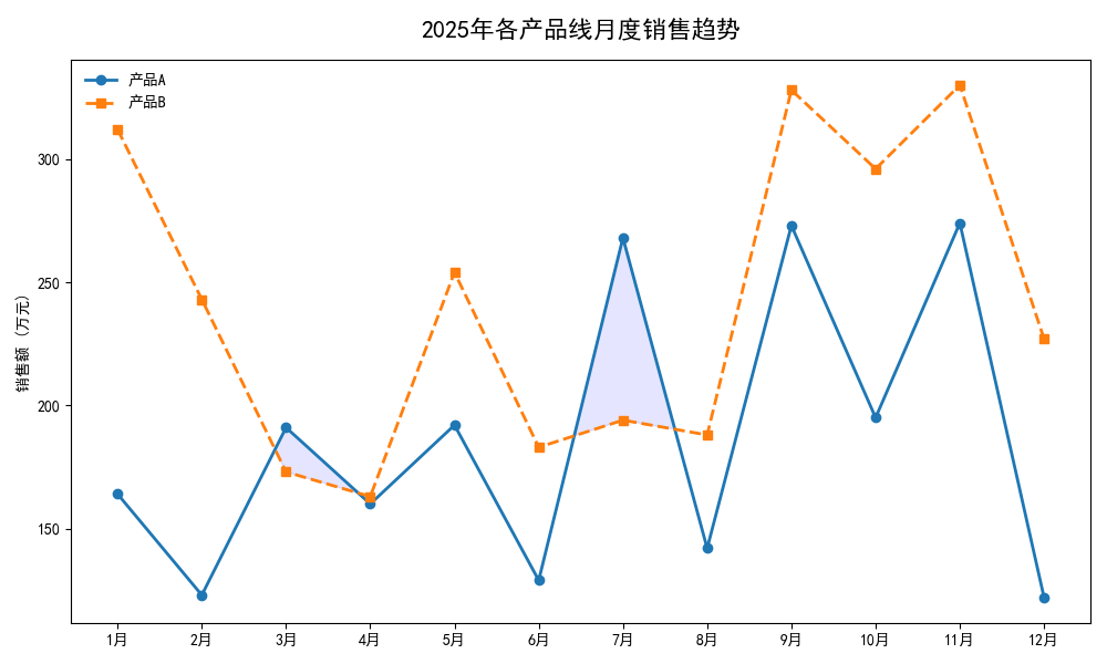
3.2 散点图 (Scatter Plot) - 相关性与聚类分析
场景:探究两个连续变量的关系,结合颜色和大小引入第三、第四维度。
python
fig, ax = plt.subplots(figsize=(9, 7))

np.random.seed(42)
x = np.random.randn(200)
y = 2.5 * x + np.random.randn(200) * 1.5
colors = np.random.rand(200)  # 颜色映射
sizes = np.random.rand(200) * 500  # 气泡大小

# 使用 cmap 映射颜色,alpha 控制透明度
scatter = ax.scatter(x, y, c=colors, s=sizes, alpha=0.6, cmap='viridis', edgecolors='w', linewidth=0.5)

# 添加颜色条 (Colorbar)
cbar = fig.colorbar(scatter, ax=ax)
cbar.set_label("用户活跃度指数", rotation=270, labelpad=15)

ax.set_xlabel("广告投入 (万元)")
ax.set_ylabel("转化率 (%)")
ax.set_title("广告投入与转化率关系分析 (气泡大小代表客单价)")
plt.show()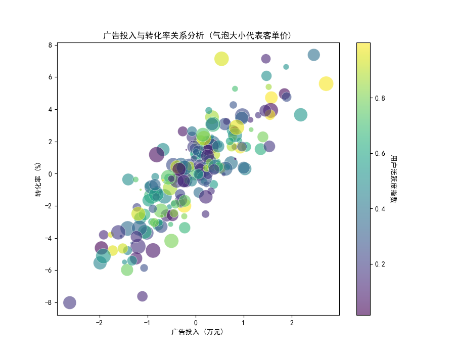
3.3 柱状图 (Bar Chart) - 分类对比
场景:离散类别的数值对比(注意:时间序列不要用柱状图,用折线图)。
python
fig, ax = plt.subplots(figsize=(10, 6))

categories = ['华北', '华东', '华南', '西南', '西北']
q1_sales = [120, 150, 130, 90, 70]
q2_sales = [135, 160, 145, 100, 85]

x = np.arange(len(categories))
width = 0.35

bars1 = ax.bar(x - width/2, q1_sales, width, label='Q1季度', color='#4C72B0', edgecolor='white')
bars2 = ax.bar(x + width/2, q2_sales, width, label='Q2季度', color='#DD8452', edgecolor='white')

# 数据标签自动化 (分析师必备技巧)
def add_labels(bars):
    for bar in bars:
        height = bar.get_height()
        ax.annotate(f'{height}',
                    xy=(bar.get_x() + bar.get_width() / 2, height),
                    xytext=(0, 3),  # 3 points vertical offset
                    textcoords="offset points",
                    ha='center', va='bottom', fontsize=10)

add_labels(bars1)
add_labels(bars2)

ax.set_xticks(x)
ax.set_xticklabels(categories)
ax.set_ylabel("营收 (百万)")
ax.set_title("各大区Q1与Q2营收对比")
ax.legend()
plt.show()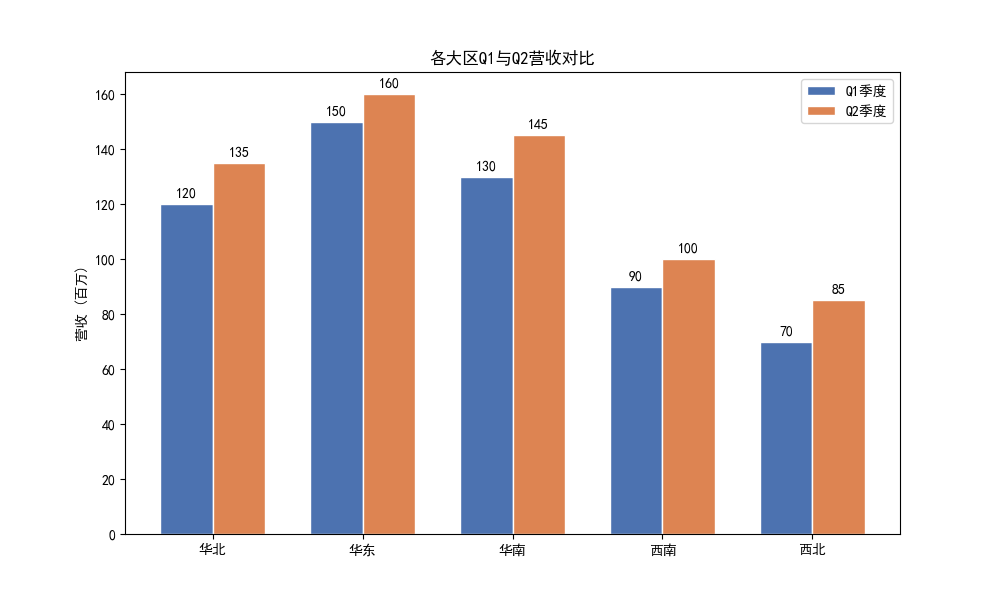
3.4 直方图与密度图 (Histogram & KDE) - 数据分布
场景:连续变量的分布形态、偏态、峰度分析。
python
fig, ax = plt.subplots(figsize=(10, 6))

# 生成偏态分布数据
data = np.random.lognormal(mean=2.0, sigma=0.8, size=1000)

# 绘制直方图 (density=True 使其与密度曲线y轴对齐)
ax.hist(data, bins=50, density=True, alpha=0.6, color='skyblue', edgecolor='black', label='频数分布')

# 叠加核密度估计曲线 (KDE) - 需借助scipy
from scipy.stats import gaussian_kde
density = gaussian_kde(data)
x_vals = np.linspace(0, np.max(data), 200)
ax.plot(x_vals, density(x_vals), color='red', linewidth=2, label='KDE密度曲线')

# 添加均值和中位数辅助线
mean_val, median_val = np.mean(data), np.median(data)
ax.axvline(mean_val, color='green', linestyle='--', label=f'均值: {mean_val:.2f}')
ax.axvline(median_val, color='purple', linestyle='-.', label=f'中位数: {median_val:.2f}')

ax.set_xlabel("用户停留时长 (秒)")
ax.set_ylabel("概率密度")
ax.set_title("用户APP停留时长分布 (右偏分布)")
ax.legend()
plt.show()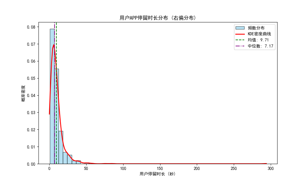
3.5 箱线图 (Boxplot) - 异常值检测与多组分布对比
场景:快速查看数据的四分位数、IQR及离群点。
python
fig, ax = plt.subplots(figsize=(10, 6))

# 模拟不同部门的薪资数据 (包含异常值)
data = [
    np.random.normal(15000, 3000, 100).tolist() + [35000, 40000], # 研发部
    np.random.normal(10000, 2000, 100).tolist() + [25000],        # 市场部
    np.random.normal(8000, 1500, 100).tolist() + [5000, 18000]    # 运营部
]

bp = ax.boxplot(data, patch_artist=True, labels=['研发部', '市场部', '运营部'],
                showmeans=True, # 显示均值点
                meanprops={"marker":"D", "markerfacecolor":"red", "markersize":8}) # 均值样式

# 自定义箱体颜色
colors = ['#8DD3C7', '#FFFFB3', '#BEBADA']
for patch, color in zip(bp['boxes'], colors):
    patch.set_facecolor(color)

ax.set_ylabel("月薪 (元)")
ax.set_title("各部门薪资分布与异常值检测")
plt.show()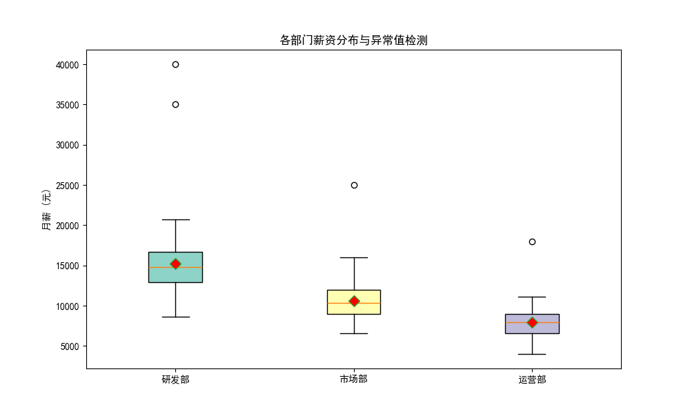
四、图表细节打磨
优秀的图表应该做到"Data-Ink Ratio(数据墨水比)"最大化,去除冗余元素,突出重点。
4.1 高亮特定数据点与注释
python
fig, ax = plt.subplots(figsize=(10, 6))
x = np.arange(2015, 2025)
y = [12, 15, 13, 18, 22, 19, 25, 30, 28, 45] # 2024年有突破

# 默认灰色线条
ax.plot(x, y, color='lightgray', marker='o', linewidth=2, markersize=8, zorder=2)

# 高亮最大值
max_idx = np.argmax(y)
ax.plot(x[max_idx], y[max_idx], color='red', marker='o', markersize=12, zorder=3)

# 添加带箭头的注释
ax.annotate(f'历史峰值: {y[max_idx]}M',
            xy=(x[max_idx], y[max_idx]),
            xytext=(x[max_idx]-2, y[max_idx]+5),
            arrowprops=dict(facecolor='black', arrowstyle='->', lw=1.5),
            fontsize=12, fontweight='bold', color='red')

# 添加背景水印或数据来源说明
ax.text(0.98, 0.02, '数据来源: 内部BI系统', transform=ax.transAxes,
        fontsize=9, color='gray', ha='right', va='bottom', alpha=0.7)

ax.set_title("公司年度营收增长趋势 (2015-2024)")
plt.show()
4.2 自定义坐标轴刻度与格式化
在金融或商业数据中,经常需要格式化Y轴(如加单位、百分比、千分位)。
python
from matplotlib.ticker import FuncFormatter, MultipleLocator

fig, ax = plt.subplots(figsize=(10, 6))
x = np.arange(10)
y = [1250000, 1450000, 1300000, 1800000, 2200000, 1950000, 2500000, 3000000, 2800000, 4500000]

ax.bar(x, y, color='steelblue')

# 自定义Y轴格式化函数 (转为"万"单位)
def format_y(value, tick_number):
    return f'{value / 10000:.0f}万'

ax.yaxis.set_major_formatter(FuncFormatter(format_y))
# 设置Y轴刻度间隔
ax.yaxis.set_major_locator(MultipleLocator(1000000))

ax.set_xticks(x)
ax.set_title("Y轴自定义格式化示例")
plt.show()
五、多子图与复杂仪表盘
5.1 规则多子图 (plt.subplots)
python
# 创建 2x2 的网格,共享X轴或Y轴
fig, axes = plt.subplots(2, 2, figsize=(12, 10), sharex=True, sharey=True)

# 扁平化axes数组以便循环
for i, ax in enumerate(axes.flatten()):
    x = np.random.randn(100)
    y = np.random.randn(100)
    ax.scatter(x, y, alpha=0.6)
    ax.set_title(f'子图 {i+1}')

fig.suptitle("多子图共享坐标轴示例", fontsize=16, y=1.02)
plt.tight_layout()
plt.show()
5.2 复杂不规则布局 (GridSpec)
场景:制作Dashboard仪表盘,例如左侧一个大图,右侧上下两个小图。
python
import matplotlib.gridspec as gridspec

fig = plt.figure(figsize=(14, 8))
# 定义 3行3列 的网格
gs = gridspec.GridSpec(3, 3, figure=fig, hspace=0.3, wspace=0.3)

# 左侧大图占据 3行2列
ax_main = fig.add_subplot(gs[:, :2])
# 右上小图
ax_top_right = fig.add_subplot(gs[0, 2])
# 右中
ax_mid_right = fig.add_subplot(gs[1, 2])
# 右下
ax_bot_right = fig.add_subplot(gs[2, 2])

# 绘制数据
x = np.linspace(0, 10, 100)
ax_main.plot(x, np.sin(x), 'b-', linewidth=2)
ax_main.set_title("主视图:正弦波")

ax_top_right.bar(['A','B','C'], [10, 20, 15], color='coral')
ax_top_right.set_title("分类统计")

ax_mid_right.hist(np.random.randn(200), bins=20, color='lightgreen', edgecolor='black')
ax_mid_right.set_title("分布直方图")

ax_bot_right.pie([30, 40, 30], labels=['X','Y','Z'], autopct='%1.1f%%', colors=['#ff9999','#66b3ff','#99ff99'])
ax_bot_right.set_title("占比分析")

plt.show()
六、双Y轴、3D图与交互
6.1 双Y轴图表 (Twinx)
场景:两个量纲不同但具有相关性的指标(如:温度与冰淇淋销量,价格与销量)。
python
fig, ax1 = plt.subplots(figsize=(10, 6))

months = np.arange(1, 13)
temperature = [5, 8, 12, 18, 24, 28, 32, 31, 26, 19, 12, 6]
ice_cream_sales = [10, 15, 25, 45, 80, 120, 150, 145, 90, 50, 20, 12]

# 左Y轴 (温度)
color1 = 'tab:red'
ax1.set_xlabel('月份')
ax1.set_ylabel('平均气温 (°C)', color=color1)
ax1.plot(months, temperature, color=color1, marker='o', label='气温')
ax1.tick_params(axis='y', labelcolor=color1)

# 实例化第二个Y轴
ax2 = ax1.twinx()
color2 = 'tab:blue'
ax2.set_ylabel('冰淇淋销量 (箱)', color=color2)
ax2.bar(months, ice_cream_sales, color=color2, alpha=0.4, label='销量')
ax2.tick_params(axis='y', labelcolor=color2)

# 合并图例 (重要技巧)
lines_1, labels_1 = ax1.get_legend_handles_labels()
lines_2, labels_2 = ax2.get_legend_handles_labels()
ax1.legend(lines_1 + lines_2, labels_1 + labels_2, loc='upper left')

plt.title("气温与冰淇淋销量相关性分析 (双Y轴)")
fig.tight_layout()
plt.show()
6.2 3D曲面图
场景:数学建模、损失函数可视化、三维地形。
python
from mpl_toolkits.mplot3d import Axes3D # 导入3D工具包

fig = plt.figure(figsize=(10, 8))
ax = fig.add_subplot(111, projection='3d')

x = np.linspace(-5, 5, 100)
y = np.linspace(-5, 5, 100)
X, Y = np.meshgrid(x, y)
# 定义一个复杂的3D函数 (如Sinc函数变形)
R = np.sqrt(X**2 + Y**2)
Z = np.sin(R) / (R + 0.1)

# 绘制3D曲面
surf = ax.plot_surface(X, Y, Z, cmap='coolwarm', edgecolor='none', alpha=0.9)

# 添加颜色条
fig.colorbar(surf, ax=ax, shrink=0.5, aspect=10, label='Z Value')

ax.set_zlabel('Z Axis')
ax.set_title("3D Surface Plot")
plt.show()
七、我的建议
7.1 图表保存规范
在撰写报告或发表论文时,图片的格式和分辨率至关重要。
python
# 保存为矢量图 (PDF/SVG) - 论文、PPT首选,无限放大不失真
fig.savefig('report_chart.pdf', format='pdf', bbox_inches='tight')

# 保存为高分辨率位图 (PNG) - 网页、公众号文章首选
fig.savefig('web_chart.png', format='png', dpi=300, bbox_inches='tight', facecolor='white')注:bbox_inches='tight' 可自动裁剪多余的白边,防止标签被截断。
7.2 与 Pandas / Seaborn 的无缝协作
作为分析师,不要从头手写所有基础统计图。Pandas负责快速探索,Seaborn负责统计美学,Matplotlib负责最终微调。
python
import seaborn as sns

# 使用Seaborn绘制复杂的统计图
fig, ax = plt.subplots(figsize=(10, 6))
tips = sns.load_dataset("tips")

# Seaborn绑定到Matplotlib的ax上
sns.violinplot(x="day", y="total_bill", hue="smoker", data=tips, split=True, ax=ax, palette="Set2")

# 使用Matplotlib的API进行细节微调
ax.set_title("Seaborn与Matplotlib结合使用", fontsize=14)
ax.set_xlabel("星期")
ax.set_ylabel("账单总额")
sns.despine(ax=ax) # 移除上右边框

plt.show()
7.3 避坑指南 (Troubleshooting)
- 中文乱码变方块 :99%是因为系统缺少字体或缓存未更新。
- 解决 :删除
~/.matplotlib/fontlist-*.json缓存文件,重启Jupyter/IDE。
- 解决 :删除
- 图表元素被遮挡 :
- 解决 :利用
zorder参数控制图层顺序(数值越大越靠上层)。
- 解决 :利用
- Jupyter Notebook中不显示 :
- 解决 :确保在文件开头添加了
%matplotlib inline或%matplotlib widget(支持交互式缩放)。
- 解决 :确保在文件开头添加了
- 饼图的误导性 :
- 建议 :人眼对面积和角度的敏感度远低于长度。超过5个分类时,坚决用条形图替代饼图。