HarmonyOS NEXT 实战:从零开发一款密码生成器应用
包名:
com.example.myapplication开发工具:DevEco Studio
一、前言:为什么开发密码生成器?
在数字化时代,密码安全已成为每个人必须面对的问题。弱密码、重复使用密码是导致账户被盗的主要原因之一。作为一名鸿蒙开发者,我决定利用 HarmonyOS NEXT 的 ArkTS 声明式UI框架,开发一款简洁实用的密码生成器应用。
这个项目虽然功能相对简单,但涵盖了鸿蒙开发的多个核心知识点:
- 状态管理 :
@State装饰器的使用 - 用户交互:Toggle开关、Button按钮事件处理
- 业务逻辑:随机算法、密码强度计算
- UI布局:Column/Row布局、样式美化
本文将详细记录从项目创建到功能实现的完整过程,希望对正在学习鸿蒙开发的同学有所帮助。
二、项目初始化
2.1 创建项目
打开 DevEco Studio,选择 File → New → Create Project ,选择 Empty Ability 模板:
- 项目名称:MyApplication
- Bundle Name:com.example.myapplication
- Compile SDK:API 12(HarmonyOS NEXT)
- Model:Stage 模型(推荐)
点击 Finish 完成创建,DevEco Studio 会自动生成项目骨架。
2.2 项目结构解析
创建完成后的项目结构如下:
MyApplication/
├── AppScope/                    # 应用全局配置
│   ├── app.json5               # 应用配置(bundleName、版本等)
│   └── resources/              # 全局资源
├── entry/                       # 主模块
│   ├── src/main/
│   │   ├── ets/
│   │   │   ├── entryability/   # 应用入口能力
│   │   │   │   └── EntryAbility.ets
│   │   │   └── pages/          # 页面目录
│   │   │       └── Index.ets   # 主页面
│   │   ├── resources/          # 资源文件
│   │   │   ├── base/element/   # 字符串、颜色等
│   │   │   └── base/media/     # 图片资源
│   │   └── module.json5        # 模块配置
│   └── build-profile.json5     # 构建配置
└── build-profile.json5 # 项目构建配置关键文件说明:
| 文件 | 作用 |
|---|---|
app.json5 |
应用全局配置,包括包名、版本号、图标等 |
module.json5 |
模块配置,定义Ability、页面路由等 |
EntryAbility.ets |
应用入口,类似Android的Application |
Index.ets |
主页面UI代码 |
三、功能设计
3.1 功能需求
本应用需要实现以下功能:
- 密码生成:根据用户选择的字符类型随机生成密码
- 长度调节:支持4-24位密码长度调节
- 字符类型选择:支持大写字母、小写字母、数字、特殊符号四种类型
- 密码强度检测:实时显示密码强度(弱/中/强)
- 一键复制:生成后可复制到剪贴板
3.2 UI设计
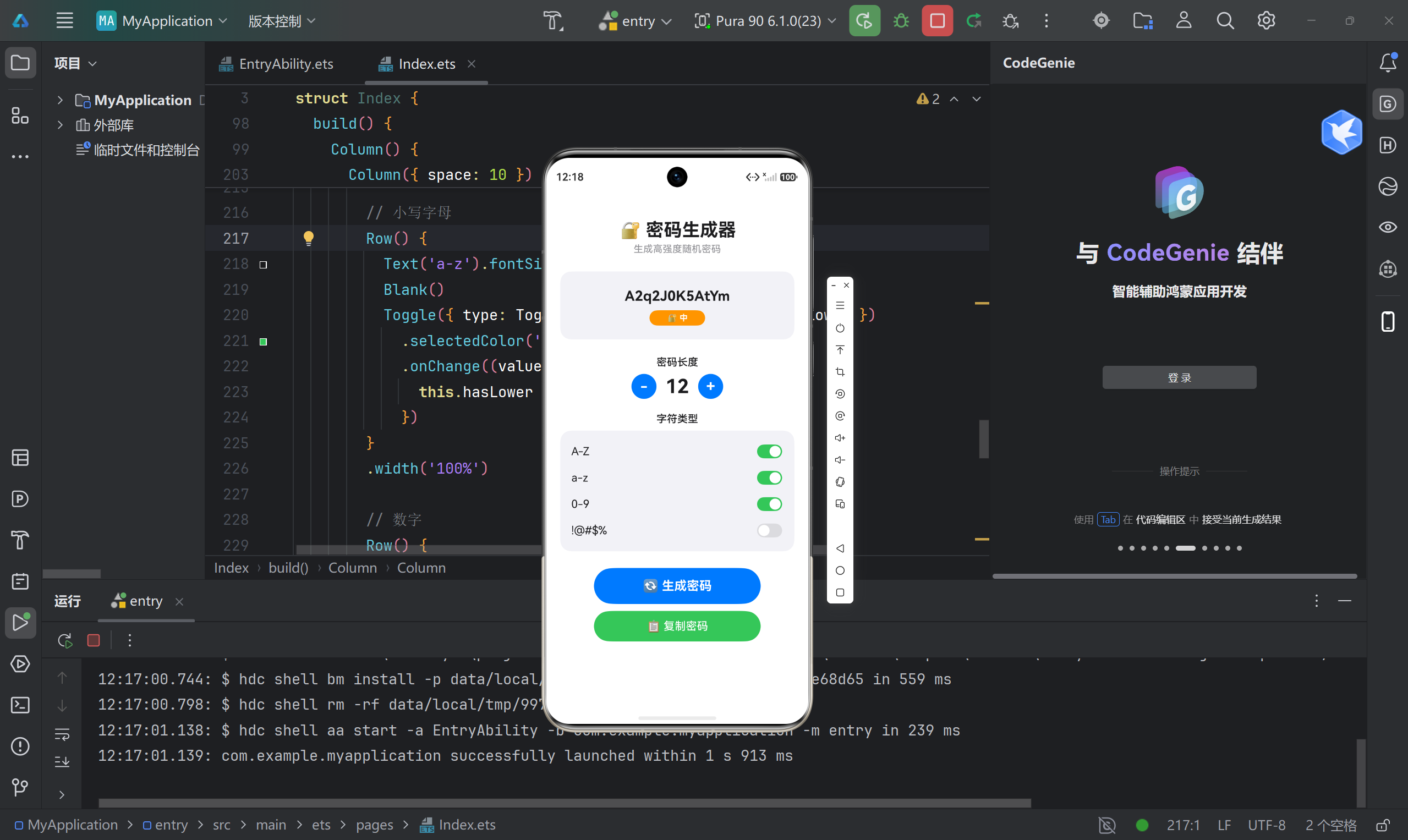
采用卡片式布局,整体风格简洁现代:
┌─────────────────────────────┐
│      🔐 密码生成器          │  ← 标题区
│    生成高强度随机密码        │
├─────────────────────────────┤
│                             │
│     [生成的密码显示区]       │  ← 结果展示
│      [强度指示条]           │
│                             │
├─────────────────────────────┤
│       密码长度              │
│    [ - ]  12  [ + ]        │  ← 长度调节
├─────────────────────────────┤
│       字符类型              │
│   A-Z        [开关]        │
│   a-z        [开关]        │  ← 类型选择
│   0-9        [开关]        │
│   !@#$%      [开关]        │
├─────────────────────────────┤
│    [ 🔄 生成密码 ]          │  ← 操作按钮
│    [ 📋 复制密码 ]          │
└─────────────────────────────┘
四、核心代码实现
4.1 状态变量定义
使用 @State 装饰器定义响应式状态变量:
typescript
@Entry
@Component
struct Index {
  // 密码结果
  @State password: string = '点击生成';

  // 密码长度
  @State passwordLength: number = 12;

  // 字符类型开关
  @State hasUpper: boolean = true;   // 大写字母
  @State hasLower: boolean = true;   // 小写字母
  @State hasNumber: boolean = true;  // 数字
  @State hasSymbol: boolean = false; // 特殊符号

  // 复制提示
  @State showCopyTip: boolean = false;

  // 字符集常量
  readonly upperChars: string = 'ABCDEFGHIJKLMNOPQRSTUVWXYZ';
  readonly lowerChars: string = 'abcdefghijklmnopqrstuvwxyz';
  readonly numberChars: string = '0123456789';
  readonly symbolChars: string = '!@#$%^&*()_+-=[]{}|;:,.<>?';
}知识点:
@State装饰的变量变化时,UI会自动刷新readonly用于定义不可变常量- 命名规范:布尔类型变量用
has/is前缀
4.2 密码生成算法
typescript
generatePassword(): void {
  // 1. 根据选择组装字符池
  let chars: string = '';
  if (this.hasUpper) chars += this.upperChars;
  if (this.hasLower) chars += this.lowerChars;
  if (this.hasNumber) chars += this.numberChars;
  if (this.hasSymbol) chars += this.symbolChars;

  // 2. 校验:至少选择一种类型
  if (chars.length === 0) {
    this.password = '⚠️ 请选择至少一种字符类型';
    return;
  }

  // 3. 随机生成
  let result: string = '';
  for (let i: number = 0; i < this.passwordLength; i++) {
    const randomIndex: number = Math.floor(Math.random() * chars.length);
    result += chars[randomIndex];
  }

  this.password = result;
  this.showCopyTip = false; // 重置复制提示
}算法解析:
- 先根据用户选择的类型拼接可用字符集
- 如果没有选择任何类型,给出提示
- 使用
Math.random()生成随机索引,循环拼接字符
4.3 密码强度检测
typescript
getStrengthLevel(): string {
  // 统计启用的字符类型数量
  let types: number = 0;
  if (this.hasUpper) types++;
  if (this.hasLower) types++;
  if (this.hasNumber) types++;
  if (this.hasSymbol) types++;

  // 强度判断逻辑
  if (this.passwordLength >= 16 && types >= 3) {
    return 'strong';  // 长度≥16且包含3种以上类型
  } else if (this.passwordLength >= 10 && types >= 2) {
    return 'medium';  // 长度≥10且包含2种以上类型
  }
  return 'weak';      // 其他情况
}

getStrengthText(): string {
  const level = this.getStrengthLevel();
  if (level === 'strong') return '🔒 强';
  if (level === 'medium') return '🔐 中';
  return '🔓 弱';
}

getStrengthColor(): string {
  const level = this.getStrengthLevel();
  if (level === 'strong') return '#34C759';  // 绿色
  if (level === 'medium') return '#FF9500';  // 橙色
  return '#FF3B30';                           // 红色
}

getStrengthWidth(): number {
  const level = this.getStrengthLevel();
  if (level === 'strong') return 100;
  if (level === 'medium') return 60;
  return 30;
}强度判断规则:
| 强度 | 条件 | 颜色 |
|---|---|---|
| 强 | 长度≥16 且 包含≥3种字符类型 | 🟢 绿色 |
| 中 | 长度≥10 且 包含≥2种字符类型 | 🟠 橙色 |
| 弱 | 其他情况 | 🔴 红色 |
4.4 长度调节功能
typescript
increaseLength(): void {
  if (this.passwordLength < 24) {
    this.passwordLength++;
  }
}

decreaseLength(): void {
  if (this.passwordLength > 4) {
    this.passwordLength--;
  }
}
UI部分使用圆形按钮配合加减号:
typescript
Row() {
  Button('-')
    .type(ButtonType.Circle)
    .width(36)
    .height(36)
    .backgroundColor('#007AFF')
    .onClick(() => {
      this.decreaseLength();
    })

  Text(`${this.passwordLength}`)
    .fontSize(28)
    .fontWeight(FontWeight.Bold)
    .width(60)

  Button('+')
    .type(ButtonType.Circle)
    .width(36)
    .height(36)
    .backgroundColor('#007AFF')
    .onClick(() => {
      this.increaseLength();
    })
}
.justifyContent(FlexAlign.Center)
4.5 字符类型选择
使用 Toggle 组件实现开关切换:
typescript
Column({ space: 10 }) {
  // 大写字母
  Row() {
    Text('A-Z').fontSize(16).fontColor('#1C1C1E')
    Blank()
    Toggle({ type: ToggleType.Switch, isOn: this.hasUpper })
      .selectedColor('#34C759')
      .onChange((value: boolean) => {
        this.hasUpper = value;
      })
  }
  .width('100%')

  // 小写字母
  Row() {
    Text('a-z').fontSize(16).fontColor('#1C1C1E')
    Blank()
    Toggle({ type: ToggleType.Switch, isOn: this.hasLower })
      .selectedColor('#34C759')
      .onChange((value: boolean) => {
        this.hasLower = value;
      })
  }
  .width('100%')

  // 数字
  Row() {
    Text('0-9').fontSize(16).fontColor('#1C1C1E')
    Blank()
    Toggle({ type: ToggleType.Switch, isOn: this.hasNumber })
      .selectedColor('#34C759')
      .onChange((value: boolean) => {
        this.hasNumber = value;
      })
  }
  .width('100%')

  // 特殊符号
  Row() {
    Text('!@#$%').fontSize(16).fontColor('#1C1C1E')
    Blank()
    Toggle({ type: ToggleType.Switch, isOn: this.hasSymbol })
      .selectedColor('#34C759')
      .onChange((value: boolean) => {
        this.hasSymbol = value;
      })
  }
  .width('100%')
}
.padding(16)
.backgroundColor('#F2F2F7')
.borderRadius(16)Toggle组件属性:
type: ToggleType.Switch:开关样式isOn:绑定布尔状态selectedColor:选中时的颜色onChange:状态变化回调
4.6 复制功能实现
typescript
copyPassword(): void {
  // 校验:空值或提示文字不可复制
  if (this.password === '' ||
      this.password === '点击生成' ||
      this.password.startsWith('⚠️')) {
    return;
  }

  this.showCopyTip = true;

  // 2秒后隐藏提示
  const timer = setTimeout(() => {
    this.showCopyTip = false;
    clearTimeout(timer);
  }, 2000);
}
注意 :HarmonyOS 的剪贴板API需要在真机上测试,模拟器可能不完全支持。本示例仅展示提示效果,实际项目中可使用
@ohos.pasteboard模块实现真正的复制功能。
五、完整UI布局
5.1 密码显示区域
typescript
Column() {
  Text(this.password)
    .fontSize(20)
    .fontWeight(FontWeight.Bold)
    .fontColor('#1C1C1E')
    .textAlign(TextAlign.Center)
    .lineHeight(28)
    .width('100%')

  // 强度指示条
  if (this.password !== '点击生成' && !this.password.startsWith('⚠️')) {
    Row() {
      Row() {
        Text(this.getStrengthText())
          .fontSize(12)
          .fontColor('#FFFFFF')
          .fontWeight(FontWeight.Bold)
      }
      .width(this.getStrengthWidth() + 20)
      .height(22)
      .backgroundColor(this.getStrengthColor())
      .borderRadius(11)
      .justifyContent(FlexAlign.Center)
      .margin({ top: 8 })
    }
    .width('100%')
    .justifyContent(FlexAlign.Center)
  }

  // 复制提示
  if (this.showCopyTip) {
    Text('✓ 已复制到剪贴板')
      .fontSize(12)
      .fontColor('#34C759')
      .margin({ top: 4 })
  }
}
.width('100%')
.padding(20)
.backgroundColor('#F2F2F7')
.borderRadius(16)
.margin({ bottom: 24 })
5.2 操作按钮
typescript
// 生成按钮
Button('🔄 生成密码')
  .type(ButtonType.Capsule)
  .width(240)
  .height(52)
  .backgroundColor('#007AFF')
  .fontSize(18)
  .fontWeight(FontWeight.Bold)
  .onClick(() => {
    this.generatePassword();
  })

// 复制按钮
Button('📋 复制密码')
  .type(ButtonType.Capsule)
  .width(240)
  .height(44)
  .backgroundColor('#34C759')
  .fontSize(16)
  .fontWeight(FontWeight.Medium)
  .margin({ top: 10 })
  .onClick(() => {
    this.copyPassword();
  })
5.3 整体布局结构
typescript
build() {
  Column() {
    // 1. 标题区
    Text('🔐 密码生成器')
      .fontSize(26)
      .fontWeight(FontWeight.Bold)
      .fontColor('#1C1C1E')
      .margin({ top: 30, bottom: 4 })
    Text('生成高强度随机密码')
      .fontSize(14)
      .fontColor('#8E8E93')
      .margin({ bottom: 24 })

    // 2. 密码显示区
    // ...(见5.1)

    // 3. 密码长度调节
    // ...(见4.4)

    // 4. 字符类型选择
    // ...(见4.5)

    // 5. 操作按钮
    // ...(见5.2)
  }
  .width('100%')
  .height('100%')
  .backgroundColor('#FFFFFF')
  .padding(20)
  .alignItems(HorizontalAlign.Center)
}
六、配置文件修改
6.1 字符串资源
修改 entry/src/main/resources/base/element/string.json:
json
{
  "string": [
    {
      "name": "module_desc",
      "value": "密码生成器"
    },
    {
      "name": "EntryAbility_desc",
      "value": "生成高强度随机密码"
    },
    {
      "name": "EntryAbility_label",
      "value": "密码生成器"
    }
  ]
}
6.2 颜色资源
修改 entry/src/main/resources/base/element/color.json:
json
{
  "color": [
    {
      "name": "start_window_background",
      "value": "#FFFFFF"
    }
  ]
}
6.3 模块配置
module.json5 已由DevEco Studio自动生成,关键配置:
json5
{
  "module": {
    "name": "entry",
    "type": "entry",
    "deviceTypes": ["phone"],
    "pages": "$profile:main_pages",
    "abilities": [
      {
        "name": "EntryAbility",
        "srcEntry": "./ets/entryability/EntryAbility.ets",
        "label": "$string:EntryAbility_label",
        "startWindowIcon": "$media:startIcon",
        "startWindowBackground": "$color:start_window_background",
        "exported": true,
        "skills": [
          {
            "entities": ["entity.system.home"],
            "actions": ["ohos.want.action.home"]
          }
        ]
      }
    ]
  }
}
七、运行效果
八、踩坑记录
8.1 踩坑一:Toggle组件状态不同步
问题 :Toggle的 isOn 属性绑定状态变量后,有时UI显示与实际值不一致。
解决 :确保 onChange 回调中正确更新状态,并使用箭头函数保持 this 指向:
typescript
Toggle({ type: ToggleType.Switch, isOn: this.hasUpper })
  .onChange((value: boolean) => {
    this.hasUpper = value;  // 正确更新
  })
8.2 踩坑二:密码强度不更新
问题:修改字符类型后,强度指示条没有实时更新。
解决 :密码强度的计算依赖于多个状态变量,ArkTS会自动追踪依赖关系。确保 getStrengthLevel() 方法中正确读取所有相关状态即可。
8.3 踩坑三:Button样式继承问题
问题:两个按钮样式不一致,一个圆角一个方形。
解决 :显式指定 type 属性:
typescript
Button('生成密码')
  .type(ButtonType.Capsule)  // 胶囊形状
8.4 踩坑四:条件渲染失效
问题:强度指示条有时不显示。
解决:条件判断要完整,避免空值或特殊字符:
typescript
if (this.password !== '点击生成' && !this.password.startsWith('⚠️')) {
  // 渲染强度指示条
}
九、优化建议
9.1 功能扩展
- 密码历史记录 :使用
@ohos.data.preferences持久化存储历史密码 - 自定义字符集:允许用户自定义特殊符号集
- 密码规则预设:提供"银行级"、"网站级"等预设配置
- 批量生成:一次生成多个密码供选择
9.2 UI优化
- 暗黑模式支持:通过系统配置自动切换深色主题
- 动画效果:生成密码时添加动画,提升用户体验
- 触觉反馈:生成密码时震动提示
9.3 安全增强
- 真随机数 :使用
@ohos.crypto模块生成加密级随机数 - 剪贴板清理:复制后定时清除剪贴板内容
十、总结
通过这个密码生成器项目,我深入实践了 HarmonyOS NEXT 的 ArkTS 声明式UI开发,掌握了以下核心技能:
| 知识点 | 应用场景 |
|---|---|
@State 状态管理 |
密码、长度、开关等响应式数据 |
| Column/Row布局 | 整体页面结构搭建 |
| Toggle组件 | 字符类型开关选择 |
| Button组件 | 生成、复制等操作按钮 |
| 条件渲染 | 强度指示条、复制提示 |
| 样式美化 | 圆角、颜色、间距等 |
项目亮点:
- ✅ 代码简洁,单文件实现全部功能(约200行)
- ✅ UI美观,采用现代卡片式设计
- ✅ 交互友好,实时反馈密码强度
- ✅ 可扩展性强,易于添加新功能
HarmonyOS NEXT 的 ArkTS 语法与 TypeScript 高度一致,学习成本低,开发效率高。声明式UI让界面与数据自动同步,大大减少了手动更新的代码量。如果你也在学习鸿蒙开发,建议从这类小项目入手,逐步积累经验。