完整源码 :ImageEditor
在分享如何实现添加文字编辑、排版等功能之前。我觉得有必要分享下在图片编辑器的文字功能中,面临两个典型的UI问题:键盘弹起时底部工具条被遮挡 ,以及全屏模式下状态栏和导航栏的适配。本文详细讲解如何通过监听键盘高度、动态调整布局,以及获取系统安全区域来实现优雅的适配效果。
一、效果演示
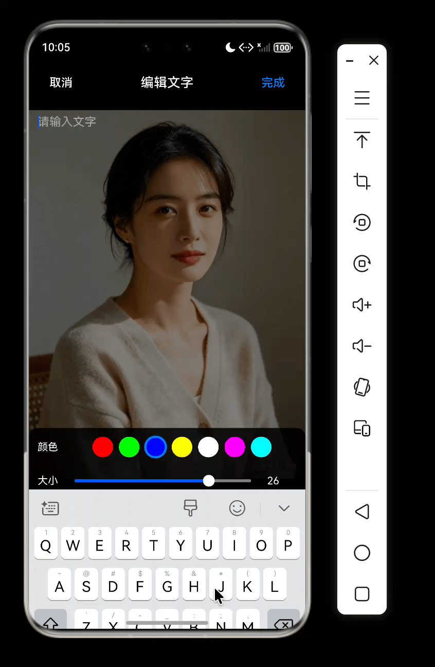
- 点击
T弹出编辑层-> 键盘平滑弹起 → 底部颜色/大小工具条自动上移,紧贴键盘顶部 - 键盘收起 → 工具条平滑回落到底部安全区域上方
- 全屏模式下,状态栏文字白色透明背景,顶部内容不被遮挡
- 底部导航栏区域自动预留空白,操作栏始终可见
二、需求分析
2.1 问题场景
在文字编辑弹窗 TextEditorDialog 中,用户需要输入文字、调整颜色和大小。底部工具条 ColorSizeToolbar 固定在弹窗底部。当键盘弹起时,如果工具条不跟随上移,就会被键盘完全遮挡,导致无法操作。
另外,应用设置为全屏后,原本隐藏在状态栏下方的顶部内容会露出来,可能被状态栏文字覆盖;底部虚拟导航栏区域也可能遮挡工具条。
2.2 解决方案概览
| 问题 | 技术方案 |
|---|---|
| 键盘遮挡工具条 | 监听 window.on('keyboardHeightChange'),动态设置工具条的 margin.bottom |
| 状态栏适配 | 在 EntryAbility 中获取状态栏高度,通过 AppStorage 共享,页面中增加顶部内边距 |
| 导航栏适配 | 同样获取导航栏高度,作为底部内边距的附加值 |
三、核心实现
3.1 全屏与安全区域获取(EntryAbility)
在应用启动时,我们需要获取状态栏和导航栏的高度(物理像素),并存入全局存储。
javascript
// EntryAbility.ets
onWindowStageCreate(windowStage: window.WindowStage): void {
  const mainWindow = windowStage.getMainWindowSync();
  // 设置全屏布局(内容延伸到状态栏和导航栏区域)
  mainWindow.setWindowLayoutFullScreen(true);
  // 设置状态栏样式:透明背景,白色文字
  mainWindow.setWindowSystemBarProperties({
    statusBarColor: '#00000000',
    statusBarContentColor: '#FFFFFF'
  });

  // 获取系统安全区域(包括状态栏和导航栏)
  const avoidArea = mainWindow.getWindowAvoidArea(window.AvoidAreaType.TYPE_SYSTEM);
  const statusBarHeightPx = avoidArea.topRect.height;
  const navigationBarHeightPx = avoidArea.bottomRect.height;

  // 存储到 AppStorage,供所有页面使用
  AppStorage.setOrCreate('statusBarHeightPx', statusBarHeightPx);
  AppStorage.setOrCreate('navigationBarHeightPx', navigationBarHeightPx);

}关键点:
- 必须先设置全屏,再获取安全区域,否则高度可能为0。
- 存储的是物理像素(px),在各组件中需要通过
px2vp转换为逻辑像素(vp)。
3.2 页面中使用安全区域高度(Index.ets)
在主页 Index.ets 中,我们通过 @StorageProp 读取存储的高度,转换为 vp 后应用到顶部工具栏和底部区域的偏移。
javascript
@StorageProp('statusBarHeightPx') statusBarHeightPx: number = 0;
@StorageProp('navigationBarHeightPx') navigationBarHeightPx: number = 0;
@State statusBarHeightVp: number = 0;
@State navigationBarHeightVp: number = 0;

aboutToAppear() {
  this.statusBarHeightVp = this.getUIContext().px2vp(this.statusBarHeightPx);
  this.navigationBarHeightVp = this.getUIContext().px2vp(this.navigationBarHeightPx);
}

build() {
  Column() {
    TopToolBar()
      .margin({ top: this.statusBarHeightVp })   // 避开状态栏
    Canvas(this.ctx).layoutWeight(1)
    Column() {
      // 工具条 + DrawToolBar
    }
    .padding({ top: 12, bottom: this.navigationBarHeightVp + 12 }) // 12 是底部工具栏 内边距 navigationBarHeightVp是安全边距
  }
}
3.3 文字编辑弹窗的键盘避让(TextEditorDialog)
弹窗中的底部工具条需要跟随键盘高度动态上移。我们监听 keyboardHeightChange 事件,将键盘高度转换为 vp 后赋给工具条的 margin.bottom。
键盘的高度是包含了底部导航栏高度的,如果不设置全屏模式跟随键盘弹起,当ColorSizeToolbar弹起时距离键盘高出navigationBarHeightVp高度。
javascript
// TextEditorDialog.ets
@Component
export struct TextEditorDialog {
  @State private keyboardHeight: number = 0;
  private currentWindow: window.Window | null = null;

  aboutToAppear() {
    window.getLastWindow(this.getUIContext().getHostContext())
      .then((win) => {
        this.currentWindow = win;
        win.on('keyboardHeightChange', (height) => {
          this.keyboardHeight = this.getUIContext().px2vp(height);
          // 键盘收起时可兼做清理动作
          if (height <= 0) {
            this.text = '';
            this.onCancel?.();
          }
        });
      });
  }

  aboutToDisappear() {
    this.currentWindow?.off('keyboardHeightChange');
  }

  build() {
    Column() {
      // 顶部栏、TextArea(占据剩余空间)
      TextArea({ text: this.text })
        .layoutWeight(1)

      // 底部工具条,动态下边距实现上移
      ColorSizeToolbar({ config: this.config })
        .margin({ bottom: this.keyboardHeight })
        .animation({ duration: 250, curve: Curve.EaseOut })
    }
    .backgroundColor('rgba(0,0,0,0.5)')
  }
}要点:
- 键盘高度为物理像素,必须转换为 vp(组件的 margin 使用 vp 单位)。
- 添加
.animation()让工具条移动平滑,提升体验。 - 在
aboutToDisappear中记得移除监听,避免内存泄漏。
3.4 工具条组件(ColorSizeToolbar)的设计
ColorSizeToolbar整体分三部分顶层(取消、标题、完成)、中间(编辑区域)、底部(颜色、字体)工具栏。工具栏跟随键盘一起弹起弹起回落。
ColorSizeToolbar 接收 config 对象(包含颜色、大小、范围等)和两个回调,负责颜色选择器和大小滑块的渲染。它不关心键盘高度,只负责展示和交互。
javascript
import { ToolbarConfig } from '../model/ToolbarConfig';

@Component
export struct ColorSizeToolbar {
  @Prop config: ToolbarConfig;
  onColorChangeCallback?: (color: string) => void;
  onSizeChangeCallback?: (size: number) => void;

  build() {
    Column() {
      // 颜色选择栏
      if (this.config.showColor !== false) {
        Row({ space: 12 }) {
          Text('颜色')
            .fontColor('#fff')
            .fontSize(14)

          Scroll() {
            Row({ space: 8 }) {
              ForEach(['#ff0000', '#00ff00', '#0000ff', '#ffff00', '#ffffff', '#ff00ff', '#00ffff'], (c: string) => {
                Circle()
                  .width(28)
                  .height(28)
                  .fill(c)
                  .stroke(this.config.color === c ? '#007aff' : 'transparent')
                  .strokeWidth(3)
                  .onClick(() => {
                    if (this.onColorChangeCallback) {
                      this.onColorChangeCallback(c);
                    }
                  })
              })
            }
            .padding(4)
          }
          .scrollable(ScrollDirection.Horizontal)
          .scrollBar(BarState.Off)
          .layoutWeight(1)
        }
        .width('100%')
        .padding({ top: 8, bottom: 8, left: 12, right: 12 })
      }

      // 大小调节栏
      if (this.config.showSize !== false) {
        Row({ space: 12 }) {
          Text('大小')
            .fontColor('#fff')
            .fontSize(14)

          Slider({
            value: this.config.sizeValue ?? 40,
            min: this.config.sizeMin ?? 20,
            max: this.config.sizeMax ?? 80,
            step: 1
          })
            .layoutWeight(1)
            .trackColor(Color.Gray)
            .onChange((v: number) => {
              if (this.onSizeChangeCallback) {
                this.onSizeChangeCallback(v);
              }
            })

          Text(`${Math.round(this.config.sizeValue ?? 40)}`)
            .fontColor('#fff')
            .fontSize(14)
            .width(40)
        }
        .width('100%')
        .padding({ left: 12, right: 12, bottom: 12 })
      }
    }
    .backgroundColor('rgba(0,0,0,0.85)')
    .borderRadius({ topLeft: 12, topRight: 12 })
    .width('100%')
  }
}
四、完整调用示例
在 Index.ets 中,点击"文字"按钮后弹出 TextEditorDialog,并绑定 textConfig 实现双向样式同步:
javascript
if (this.showTextEditor) {
  TextEditorDialog({
    show: this.showTextEditor,
    initText: this.selectedTextInfo?.text,
    config: $textConfig,
    onConfirm: (text) => { this.onTextConfirm(text); },
    onCancel: () => { this.onTextCancel(); }
  })
}
弹窗内部修改颜色或大小时,会通过 @Link config 直接更新外部的 textConfig,同时触发 onColorChangeCallback 和 onSizeChangeCallback,进而更新选中文字的样式(已在父组件中实现)。关于添加文字、编辑、排版、选中 删除 撤回等完整功能我们单独开启一篇帖子分享。
五、踩坑与注意事项
| 问题 | 原因 | 解决方案 |
|---|---|---|
| 键盘高度监听不触发 | 未获取当前窗口实例 | 使用 window.getLastWindow(this.getUIContext().getHostContext()) |
| 工具条移动很生硬 | 缺少动画过渡 | 添加 .animation({ duration: 250, curve: Curve.EaseOut }) |
| 工具栏弹起后高出键盘 | 未设置全屏模式多出底部导航栏高度 | 调用 setWindowLayoutFullScreen(true),让工具栏占据底部导航 |
| 高度单位不一致 | 键盘事件返回px,组件margin需要vp | 使用 px2vp 转换 |
六、总结
本文分享了鸿蒙图片编辑器中文字模块的UI适配与键盘避让:
- 全屏安全区域适配 :在
EntryAbility中获取状态栏和导航栏高度,通过AppStorage全局共享,页面中转换为 vp 并应用到合适的 padding/margin。 - 键盘避让 :在
TextEditorDialog中监听keyboardHeightChange,动态调整底部工具条的margin.bottom,并辅以平滑动画。
这些技巧不仅适用于文字编辑弹窗,也适用于任何需要全屏输入界面的场景。合理运用,可大幅提升用户体验。如果觉得本文对你有帮助,请点赞、收藏、转发支持!