第一印象很重要------首页是用户对游戏的第一眼
首页截图:
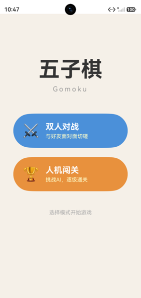
Index页面结构
typescript
@Entry
@Component
struct Index {
  build() {
    Column() {
      // 顶部标题区域 (35%高度)
      Column() {
        Text('五子棋').fontSize(56).fontWeight(FontWeight.Bold)
        Text('Gomoku').fontSize(18).fontColor('#999999')
      }
      .height('35%')

      // 模式选择按钮 (居中)
      Column({ space: 24 }) {
        // 双人对战按钮
        Button() { ... }
          .backgroundColor('#4A90D9')
          .onClick(() => {
            router.pushUrl({ url: 'pages/TwoPlayerPage' });
          })

        // 人机闯关按钮
        Button() { ... }
          .backgroundColor('#E8913C')
          .onClick(() => {
            router.pushUrl({ url: 'pages/AIBattlePage' });
          })
      }

      // 底部信息 (15%高度)
      Column() {
        Text('选择模式开始游戏')
      }
      .height('15%')
    }
    .backgroundColor('#F5F0E8')
  }
}
布局分析
┌─────────────────────────┐
│                         │  ← 35% 标题区
│       五子棋             │
│      Gomoku             │
│                         │
├─────────────────────────┤
│                         │
│  ┌───────────────────┐  │  ← 按钮区
│  │ ⚔  双人对战        │  │
│  └───────────────────┘  │
│  ┌───────────────────┐  │
│  │ 🏆  人机闯关       │  │
│  └───────────────────┘  │
│                         │
├─────────────────────────┤
│     选择模式开始游戏      │  ← 15% 底部信息
└─────────────────────────┘
百分比高度布局
typescript
Column() {
  Column() { /* 标题 */ }.height('35%')
  Column() { /* 按钮 */ }  // 自适应高度
  Column() { /* 底部 */ }.height('15%')
}
.height('100%')
标题占35%、底部占15%,按钮区域自动占据剩余50%。这种百分比布局在不同屏幕尺寸下都能保持比例。
按钮设计
typescript
Button() {
  Row({ space: 16 }) {
    Text('⚔').fontSize(36)
    Column() {
      Text('双人对战')
        .fontSize(22)
        .fontWeight(FontWeight.Bold)
        .fontColor('#FFFFFF')
      Text('与好友面对面切磋')
        .fontSize(14)
        .fontColor('#FFFFFFCC')  // 80%不透明度
        .margin({ top: 4 })
    }
    .alignItems(HorizontalAlign.Start)
  }
  .width('100%')
  .padding({ left: 24, right: 24, top: 20, bottom: 20 })
}
.type(ButtonType.Capsule)
.width('80%')
.height(90)
.backgroundColor('#4A90D9')设计要点:
- 图标+文字:Row布局,emoji图标在左,文字在右
- 主副标题:Column布局,大标题+小描述
- 胶囊形状 :
ButtonType.Capsule圆角按钮 - 80%宽度:两侧留出边距
- 固定高度90vp:按钮大小一致
颜色语义
typescript
// 双人对战:蓝色(社交、友好)
.backgroundColor('#4A90D9')

// 人机闯关:橙色(挑战、竞技)
.backgroundColor('#E8913C')
不同颜色帮助用户快速区分模式。
文字层级
五子棋      → fontSize(56), Bold     ← 主标题
Gomoku     → fontSize(18), #999999  ← 副标题
双人对战    → fontSize(22), Bold     ← 按钮标题
与好友切磋  → fontSize(14), #FFFFFFCC ← 按钮描述
选择模式 → fontSize(14), #AAAAAA ← 底部提示字号层级:56 > 22 > 18 > 14,形成清晰的视觉层次。
justifyContent居中
typescript
Column() { /* 标题 */ }
  .justifyContent(FlexAlign.Center)  // 垂直居中

Column({ space: 24 }) { /* 按钮 */ }
.justifyContent(FlexAlign.Center) // 垂直居中justifyContent(FlexAlign.Center)让子元素在主轴(垂直方向)上居中。
总结
Index首页的设计要点:
- 百分比布局:35%/50%/15%三段式
- 按钮设计:图标+主副标题,胶囊形状
- 颜色语义:蓝色社交、橙色挑战
- 文字层级:56/22/18/14四级字号
- 居中布局:justifyContent实现垂直居中
首页虽然简单,但布局、配色、字号层级都经过精心设计,给用户良好的第一印象。