HarmonyOS ArkUI 自定义键盘完全指南:customKeyboard 从入门到进阶实践
适用版本 :HarmonyOS NEXT(API 23+)、DevEco Studio 6.1+
关键词:ArkUI、自定义键盘、customKeyboard、TextInput、TextInputController、HarmonyOS NEXT
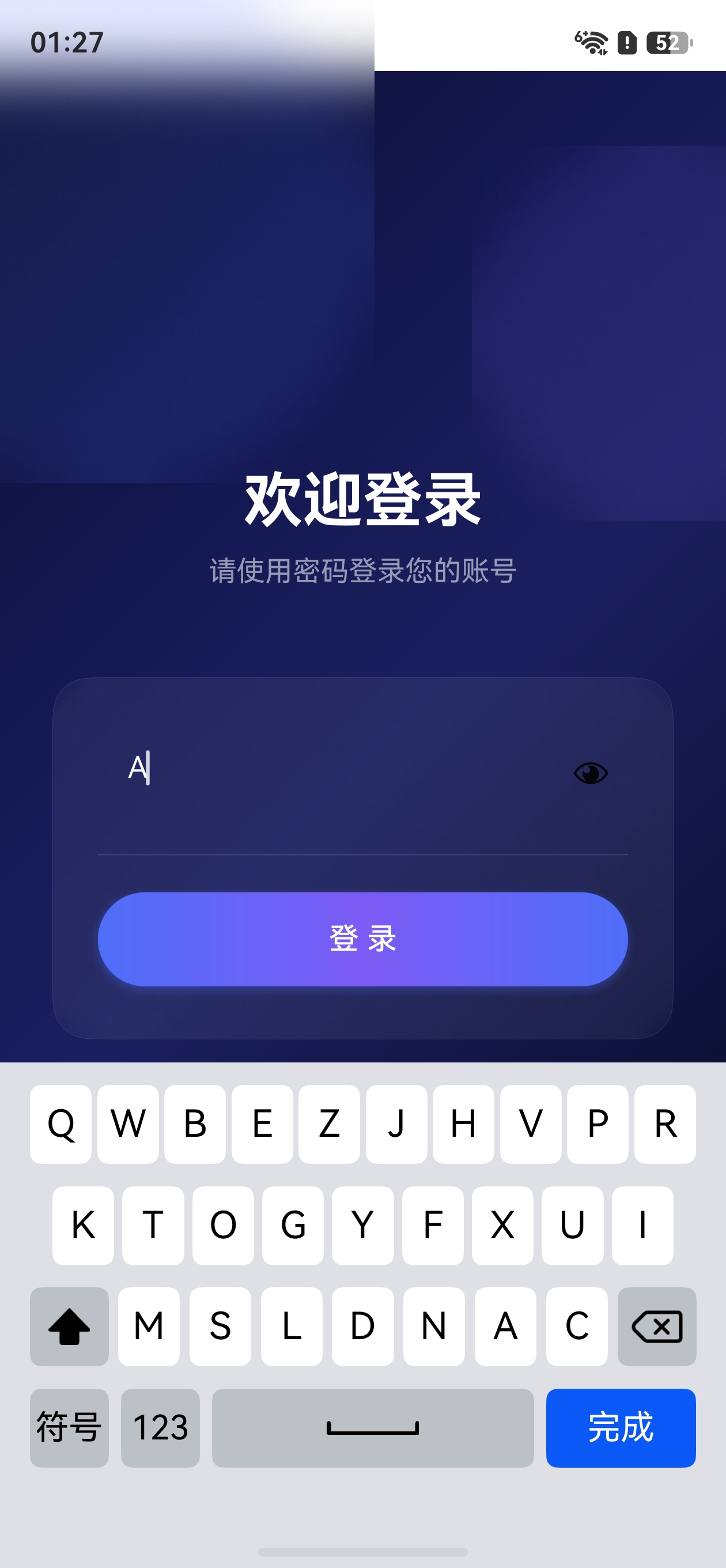
效果
一、前言
系统默认键盘虽然功能完善,但在以下场景中往往无法满足需求:
- 安全输入:金融、支付类App需要乱序键盘防止按键位置被记录
- 特殊输入:自定义符号面板、表情键盘、公式输入等
- 品牌一致性:希望键盘UI与应用整体风格统一
- 输入限制:特定格式的输入(如车牌号、身份证等)
HarmonyOS NEXT 的 TextInput 组件提供了 customKeyboard 方法,允许开发者完全替换系统键盘,自定义输入面板的外观和行为。
二、核心 API 详解
2.1 customKeyboard 方法签名
typescript
TextInput.customKeyboard(builder: () => void, options?: CustomKeyboardOptions)| 参数 | 类型 | 说明 |
|---|---|---|
builder |
() => void |
@Builder 函数,返回自定义键盘的UI组件树 |
options |
CustomKeyboardOptions |
可选配置项 |
CustomKeyboardOptions:
| 属性 | 类型 | 默认值 | 说明 |
|---|---|---|---|
supportAvoidance |
boolean |
false |
键盘弹出时,输入框是否自动避让(向上移动避免遮挡) |
2.2 TextInputController 控制器
TextInputController 是管理 TextInput 行为的核心类,主要用于:
typescript
let controller: TextInputController = new TextInputController();

// 关键方法
controller.caretPosition(index: number);    // 设置光标位置
controller.stopEditing();                    // 关闭键盘
controller.startEditing();                   // 打开键盘(聚焦)
2.3 TextInput 关键事件
| 事件 | 参数 | 用途 |
|---|---|---|
onChange |
(value: string) => void |
输入内容变化时触发 |
onTextSelectionChange |
(start: number, end: number) => void |
光标/选区变化时触发 |
onCut |
() => void |
剪切操作时触发 |
onPaste |
(value: string) => void |
粘贴操作时触发 |
onFocus |
() => void |
输入框获得焦点 |
onBlur |
() => void |
输入框失去焦点 |
三、基本使用步骤
第一步:创建自定义键盘组件
定义一个 @Component,包含键盘的 UI 布局:
typescript
@Component
struct MyKeyboard {
  build() {
    Column() {
      // 键盘布局内容
      Text('自定义键盘')
        .fontSize(14)
        .fontColor('#999999')
        .margin({ bottom: 8 })
      // 按键区域...
    }
    .width('100%')
    .height(240)
    .backgroundColor('#E0E0E0')
  }
}
第二步:在 TextInput 上绑定自定义键盘
使用 @Builder 函数将键盘组件传入 customKeyboard:
typescript
@Entry
@Component
struct InputPage {
  @State inputText: string = '';
  textController: TextInputController = new TextInputController();

  build() {
    Column() {
      TextInput({ placeholder: '点击输入', text: this.inputText })
        .controller(this.textController)
        .customKeyboard(this.myKeyboardBuilder(), { supportAvoidance: true })
        .width('90%')
        .margin({ top: 40 })
    }
    .width('100%')
    .height('100%')
  }

  @Builder
  myKeyboardBuilder() {
    MyKeyboard()
  }
}
⚠️ 注意 :
@Builder函数必须通过this.builderName()的方式调用,不能直接传入函数引用。
第三步:处理按键输入
通过 TextInputController 操作输入内容:
typescript
// 在键盘组件中,点击按键时更新输入
onKeyClick(key: string) {
  this.inputText += key;
  this.textController.caretPosition(this.inputText.length);
}

// 关闭键盘
onFinish() {
  this.textController.stopEditing();
}
四、完整示例:自定义数字键盘
以下实现一个带删除和完成功能的自定义数字键盘:
typescript
import { hilog } from '@kit.PerformanceAnalysisKit';

@Entry
@Component
struct CustomNumKeyboardDemo {
  @State inputText: string = '';
  textController: TextInputController = new TextInputController();
  private maxLength: number = 11;

  build() {
    Column() {
      Text('自定义数字键盘示例')
        .fontSize(20)
        .fontWeight(FontWeight.Bold)
        .margin({ top: 40, bottom: 20 })

      TextInput({ placeholder: '请输入手机号', text: this.inputText })
        .controller(this.textController)
        .type(InputType.Number)
        .customKeyboard(this.keyboardBuilder(), { supportAvoidance: true })
        .onChange((value: string) => {
          this.inputText = value;
        })
        .onTextSelectionChange((start: number, end: number) => {
          // 同步光标位置
        })
        .maxLength(this.maxLength)
        .width('90%')
        .height(48)
        .borderRadius(8)
        .backgroundColor('#F5F5F5')
    }
    .width('100%')
    .height('100%')
    .backgroundColor('#FFFFFF')
  }

  @Builder
  keyboardBuilder() {
    Column() {
      // 第一排:1 2 3
      Row({ space: 12 }) {
        ForEach(['1', '2', '3'], (item: string) => {
          this.KeyButton(item)
        })
      }.margin({ bottom: 8 })

      // 第二排:4 5 6
      Row({ space: 12 }) {
        ForEach(['4', '5', '6'], (item: string) => {
          this.KeyButton(item)
        })
      }.margin({ bottom: 8 })

      // 第三排:7 8 9
      Row({ space: 12 }) {
        ForEach(['7', '8', '9'], (item: string) => {
          this.KeyButton(item)
        })
      }.margin({ bottom: 8 })

      // 第四排:删除 0 完成
      Row({ space: 12 }) {
        Button('删除')
          .width(100)
          .height(48)
          .borderRadius(8)
          .backgroundColor('#D0D0D0')
          .onClick(() => {
            if (this.inputText.length > 0) {
              this.inputText = this.inputText.slice(0, -1);
              this.textController.caretPosition(this.inputText.length);
            }
          })

        this.KeyButton('0')

        Button('完成')
          .width(100)
          .height(48)
          .borderRadius(8)
          .backgroundColor('#4A90D9')
          .fontColor('#FFFFFF')
          .onClick(() => {
            this.textController.stopEditing();
          })
      }
    }
    .width('100%')
    .height(260)
    .padding(12)
    .backgroundColor('#E8E8E8')
    .justifyContent(FlexAlign.Center)
  }

  @Builder
  KeyButton(label: string) {
    Button(label)
      .width(100)
      .height(48)
      .borderRadius(8)
      .fontSize(20)
      .backgroundColor('#FFFFFF')
      .onClick(() => {
        if (this.inputText.length < this.maxLength) {
          this.inputText += label;
          this.textController.caretPosition(this.inputText.length);
        }
      })
  }
}
五、进阶技巧
5.1 光标位置精确管理
在实际项目中,用户可能在文本中间插入字符,需要精确管理光标位置:
typescript
@Component
struct CursorAwareKeyboard {
  @State inputText: string = '';
  @State cursorStart: number = 0;
  @State cursorEnd: number = 0;
  textController: TextInputController = new TextInputController();

  onInsert(text: string): void {
    // 在光标位置插入文本
    let before = this.inputText.substring(0, this.cursorStart);
    let after = this.inputText.substring(this.cursorEnd);
    this.inputText = before + text + after;
    this.cursorStart += text.length;
    this.cursorEnd = this.cursorStart;
    this.textController.caretPosition(this.cursorStart);
  }

  onDelete(): void {
    if (this.cursorStart === this.cursorEnd && this.cursorStart > 0) {
      // 光标未选中时,删除光标前一个字符
      this.cursorStart--;
    }
    let before = this.inputText.substring(0, this.cursorStart);
    let after = this.inputText.substring(this.cursorEnd);
    this.inputText = before + after;
    this.cursorEnd = this.cursorStart;
    this.textController.caretPosition(this.cursorStart);
  }

  build() {
    Column() {
      TextInput({ text: this.inputText })
        .controller(this.textController)
        .customKeyboard(this.kbBuilder(), { supportAvoidance: true })
        .onTextSelectionChange((start: number, end: number) => {
          this.cursorStart = start;
          this.cursorEnd = end;
        })
    }
  }

  @Builder
  kbBuilder() {
    // 键盘布局...
    Column()
  }
}
5.2 键盘类型切换(ABC / 数字 / 符号)
通过状态变量在多个键盘组件之间切换:
typescript
enum KeyboardType {
  ABC,
  NUMBER,
  SYMBOL
}

@Component
struct MultiKeyboard {
  @State currentType: KeyboardType = KeyboardType.NUMBER;

  build() {
    Column() {
      if (this.currentType === KeyboardType.ABC) {
        AbcKeyboardView()
      } else if (this.currentType === KeyboardType.NUMBER) {
        NumKeyboardView()
      } else {
        SymbolKeyboardView()
      }
    }
  }

  switchTo(type: KeyboardType): void {
    this.currentType = type;
  }
}
5.3 长按连续删除
使用 LongPressGesture 实现长按删除键时连续触发删除:
typescript
Button('⌫')
  .onClick(() => {
    this.onDelete(); // 单次删除
  })
  .gesture(
    LongPressGesture({ repeat: true, duration: 50 })
      .onAction((event: GestureEvent) => {
        if (event && event.repeat) {
          this.onDelete(); // 长按期间重复删除
        }
      })
      .onActionEnd(() => {
        this.onDelete(); // 松手时最后删除一次
      })
)参数说明:
repeat: true:允许手势在长按期间重复触发duration: 50:每次重复的间隔为 50ms(约每秒20次)
5.4 剪切和粘贴处理
typescript
TextInput({ text: this.inputText })
  .controller(this.textController)
  .customKeyboard(this.kbBuilder(), { supportAvoidance: true })
  .onCut(() => {
    // 剪切时清空选区
    let before = this.inputText.substring(0, this.cursorStart);
    let after = this.inputText.substring(this.cursorEnd);
    this.inputText = before + after;
    this.cursorEnd = this.cursorStart;
  })
  .onPaste((value: string) => {
    // 粘贴时在光标位置插入
    let before = this.inputText.substring(0, this.cursorStart);
    let after = this.inputText.substring(this.cursorEnd);
    let maxInsert = this.maxLength - this.inputText.length;
    let pasteText = value.substring(0, maxInsert);
    this.inputText = before + pasteText + after;
    this.cursorStart += pasteText.length;
    this.cursorEnd = this.cursorStart;
    this.textController.caretPosition(this.cursorStart);
  })
5.5 键盘高度与避让适配
supportAvoidance: true 使输入框在键盘弹出时自动上移,避免被遮挡:
typescript
TextInput({ placeholder: '输入内容' })
  .customKeyboard(this.kbBuilder(), {
    supportAvoidance: true // 自动避让
  })
键盘容器的高度建议通过资源文件统一管理,确保一致性:
json
// float.json
{
  "float": [
    { "name": "keyboard_height", "value": "260vp" }
  ]
}
六、注意事项
6.1 Builder 函数传参
customKeyboard 的第一个参数必须是 @Builder 函数调用,而非组件直接引用:
typescript
// ✅ 正确
.customKeyboard(this.myKeyboardBuilder(), { supportAvoidance: true })

@Builder
myKeyboardBuilder() {
  MyKeyboard()
}

// ❌ 错误:不能直接传入组件
.customKeyboard(MyKeyboard(), { supportAvoidance: true })
6.2 与 InputType 的关系
TextInput.type 属性决定系统键盘类型。使用自定义键盘时,type 仍会影响输入框的行为(如密码遮挡),但不会弹出系统键盘:
typescript
TextInput()
  .type(InputType.Password) // 密码遮挡生效
  .customKeyboard(this.kbBuilder()) // 系统键盘被替换
6.3 焦点与键盘显示
- 用户点击
TextInput时,自动显示自定义键盘 - 调用
textController.stopEditing()关闭键盘 - 调用
textController.startEditing()重新打开键盘
6.4 性能优化
| 建议 | 说明 |
|---|---|
| 键盘组件轻量化 | 避免在键盘组件中加载大图或复杂动画 |
| 使用 ForEach | 按键列表使用 ForEach 渲染,配合 keyGenerator |
| 避免频繁重建 | 键盘切换时尽量复用组件状态 |
| 懒加载 | 多类型键盘可用 if/else 按需渲染 |
七、总结
customKeyboard 是 HarmonyOS ArkUI 中实现自定义输入面板的核心 API,其使用流程如下:
1. 创建 @Builder 函数 → 返回自定义键盘组件
2. 调用 TextInput.customKeyboard(builder, options) → 绑定键盘
3. 使用 TextInputController → 管理光标、关闭键盘
4. 监听 onTextSelectionChange / onChange → 同步输入状态
5. 处理 onCut / onPaste → 完善剪切粘贴逻辑核心要点回顾:
@Builder函数必须通过this.builderName()调用传入supportAvoidance: true让输入框自动避让键盘遮挡TextInputController.caretPosition()精确控制光标LongPressGesture可实现长按连续删除- 键盘切换通过状态变量 +
if/else条件渲染
八、状态管理 V2 与自定义键盘
本指南中的示例使用 V1 状态管理(@Component + @State + @Prop)。在实际项目中,推荐使用 V2 状态管理(API 12+)以获得更精准的响应式更新和更清晰的数据流。
8.1 V2 版本的键盘组件结构
typescript
// 数据模型(@ObservedV2 + @Trace)
@ObservedV2
export class KeyboardController {
  @Trace keyboardType: KeyboardType = KeyboardType.ABC;
  @Trace text: string = '';
  @Trace isUpperCase: boolean = false;
}

// 父组件通过 @Provider() 提供状态
@ComponentV2
struct LoginPage {
  @Provider() keyboardController: KeyboardController = new KeyboardController();
  @Provider() inputText: string = '';
  // ...
}

// 键盘子组件通过 @Consumer() 消费状态
@ComponentV2
struct OutOrderKeyboard {
  @Consumer() keyboardController: KeyboardController = new KeyboardController();
  // ...
}
8.2 V2 装饰器语法要点
| 装饰器 | 语法 | 说明 |
|---|---|---|
@Provider() |
必须加括号 | 替代 V1 的 @Provide |
@Consumer() |
必须加括号 | 替代 V1 的 @Consume |
@Param |
不加括号 | 替代 V1 的 @Prop(单向同步) |
@Local |
不加括号 | 替代 V1 的 @State |
@Monitor |
方法装饰器 | 替代 V1 的 @Watch,装饰方法而非属性 |