第10篇:半模态与弹窗交互
在 HarmonyOS 应用开发中,半模态(Half Modal)和自定义弹窗是两种常见的高频交互形态。半模态从页面底部滑出,不会完全遮挡底层内容,适合表单填写、筛选等场景;自定义弹窗则用于确认、提醒等强反馈交互。本文结合"柚兔学伴"项目中 TodoView.ets 的真实代码,详解这两种交互的实现方式。
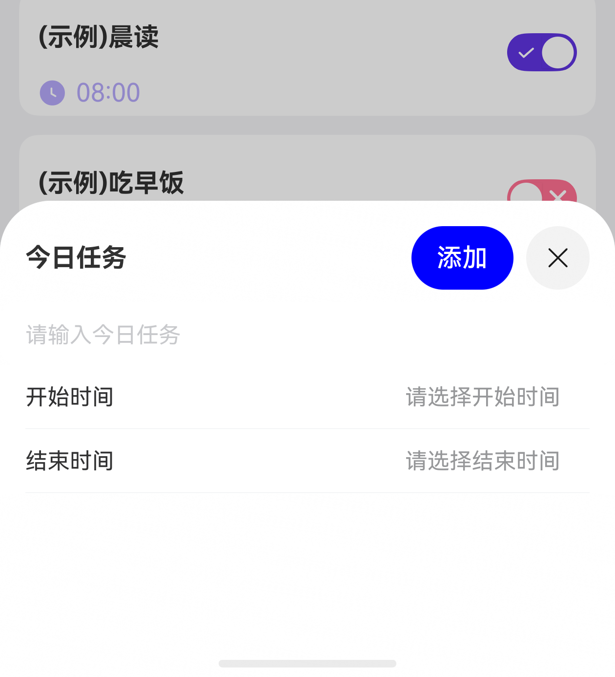
一、bindSheet 半模态绑定
HarmonyOS 提供了 bindSheet 修饰符,可以将任意自定义 Builder 以半模态面板的形式绑定到组件上。当绑定的状态变量为 true 时,面板从底部弹出;为 false 时自动收起。
1.1 基本用法
在项目中,TodoView 通过 isShowTask 状态变量控制任务添加面板的显示与隐藏:
typescript
@State isShowTask: boolean = false
@State sheetHeight: number = 300;
点击添加按钮时,将 isShowTask 置为 true:
typescript
Image($r('app.media.ic_add')).width(20)
  .onClick(() => {
    this.isShowTask = true
  })
然后在 Scroll 组件上绑定半模态:
typescript
Scroll(this.scroller) {
  // ...页面内容
}
.bindSheet($$this.isShowTask, this.todoAddBuilder(), {
  blurStyle: BlurStyle.Thick,
  dragBar: true,
  title: this.DialogTitle('今日任务', '添加', async () => {
    // 添加逻辑
  }),
  height: this.sheetHeight,
  keyboardAvoidMode: SheetKeyboardAvoidMode.TRANSLATE_AND_RESIZE
})
1.2 关键参数解析
| 参数 | 说明 |
|---|---|
$$this.isShowTask |
双向绑定状态变量,$$ 语法确保半模态内部(如拖拽关闭)也能同步修改状态 |
this.todoAddBuilder() |
自定义 Builder,作为半模态的内容区 |
blurStyle |
底层页面的模糊样式,BlurStyle.Thick 表示深度模糊 |
dragBar |
是否显示顶部拖拽条,方便用户下拉关闭 |
title |
半模态标题栏,支持自定义 Builder |
height |
半模态高度,可动态设置 |
keyboardAvoidMode |
键盘避让模式 |
其中 keyboardAvoidMode: SheetKeyboardAvoidMode.TRANSLATE_AND_RESIZE 是表单场景的关键配置------当软键盘弹出时,半模态面板会同时平移和缩放,确保输入框不被遮挡。
二、自定义 Sheet 标题栏
半模态的 title 参数不仅支持纯文本,还支持传入自定义 Builder。项目中实现了一个 DialogTitle Builder,左侧显示标题文字,右侧放置操作按钮:
typescript
@Builder
DialogTitle(title: string, btnText: string, onClick: () => void) {
  Row() {
    Text(title).fontWeight(FontWeight.Bold)
    Button(btnText)
      .backgroundColor(Color.Blue)
      .fontColor(Color.White)
      .onClick(onClick)
  }.width('100%').justifyContent(FlexAlign.SpaceBetween)
}
在 bindSheet 中使用:
typescript
title: this.DialogTitle('今日任务', '添加', async () => {
  if (StrUtil.isEmpty(this.value)) {
    ToastUtil.showToast("任务内容不能为空")
    return
  }
  if (StrUtil.isEmpty(this.startTime)) {
    ToastUtil.showToast("开始时间不能为空")
    return
  }
  if (StrUtil.isEmpty(this.stopTime)) {
    ToastUtil.showToast("结束时间不能为空")
    return
  }
  // 验证通过,添加待办事项
  const newTodo: TodoItem = {
    date: DateUtil.getTodayStr('yyyy-MM-dd'),
    dayOfWeek: '周' + DateUtil.getWeekDay(DateUtil.getTodayStr('HH-mm-ss')),
    time: `${this.startTime}-${this.stopTime}`,
    content: this.value,
    isCompleted: false
  };
  const todoId = await this.todoDb.addTodo(newTodo);
  this.arr = await this.todoDb.getAllTodos();
  this.startTime = this.stopTime = ''
  this.isShowTask = false
  this.isTodoEmpty = false
})这种设计将表单验证逻辑集中在标题栏按钮的回调中,验证通过后关闭面板(isShowTask = false),验证失败则通过 Toast 提示用户。
三、IBestField 输入组件
项目使用了 @ibestservices/ibest-ui 三方库提供的 IBestField 组件作为输入框。它内置了标签、边框、圆角等样式配置:
typescript
IBestField({
  label: '任务名称',
  value: $value,
  showLabel: false,
  placeholder: "请输入今日任务",
  hasBorder: false,
  radius: 12,
  onChange: (input) => {
    this.value = input.toString()
  }
}).width('100%')
value: $value:通过$语法进行双向绑定,输入内容自动同步到this.valueshowLabel: false:隐藏左侧标签,因为半模态空间有限hasBorder: false:去除默认边框,与面板整体风格统一onChange:内容变化时的回调
四、IBestCell + showDialogTime 时间选择
时间选择采用 IBestCell(单元格)+ showDialogTime(时间弹窗)的组合模式。IBestCell 以列表项的形式展示当前值,点击后弹出时间选择器:
typescript
IBestCell({
  title: "开始时间",
  value: this.startTime ? this.startTime : '请选择开始时间',
  isLink: true,
  onCellClick: (() => {
    showDialogTime({
      titleBarAttribute: {
        titleText: "请选择开始时间",
        backgroundColor: $r('app.color.color_card')
      },
      timeAttribute: {
        timeType: TimeDialogType.HM,
        startHours: 6,
        startMinutes: 0,
        endHours: 22,
        endMinutes: 59,
      },
      backgroundColor: $r('app.color.color_card'),
      timeConfirmClick: (date) => {
        let formatter = new Intl.DateTimeFormat('zh-CN', {
          hour: '2-digit',
          minute: '2-digit',
          hour12: false
        });
        let result: string = formatter.format(date);
        this.startTime = result
      },
      confirmClick: (value, index) => {
        console.log("===内容结果:" + value + "====" + index)
      }
    })
  })
})
4.1 TimeDialogType
@abner/dialog 库的 showDialogTime 支持 TimeDialogType 枚举:
TimeDialogType.HM:仅选择时和分(小时:分钟),适合任务时间选择TimeDialogType.HMS:选择时、分、秒,适合倒计时精确设置
4.2 Intl.DateTimeFormat 时间格式化
项目使用 JavaScript 内置的 Intl.DateTimeFormat API 进行时间格式化:
typescript
let formatter = new Intl.DateTimeFormat('zh-CN', {
  hour: '2-digit',
  minute: '2-digit',
  hour12: false
});
let result: string = formatter.format(date);
this.startTime = result'zh-CN':中文 locale,确保格式符合中国用户习惯hour12: false:强制 24 小时制,避免上下午歧义'2-digit':两位数显示,如08:00而非8:0
五、IBestDialog 自定义弹窗
IBestDialog 是 @ibestservices/ibest-ui 提供的自定义弹窗组件,支持通过 $$ 双向绑定控制可见性,并通过 defaultBuilder 自定义内容区。
5.1 倒计时结束弹窗
typescript
@State alarmVisible: boolean = false

IBestDialog({
  visible: $alarmVisible,
  defaultBuilder: (): void => this.alarmBuild(),
  onConfirm: (() => {
    this.alarmVisible = false
    this.timerController.reset()
  })
})
弹窗内容通过 alarmBuild Builder 定义,包含闹钟动画和提示文字:
typescript
@Builder
alarmBuild() {
  Column({ space: 15 }) {
    Lottie({
      controller: this.alarmController,
      animationPath: 'lottie/lottie_alarm.json',
      autoPlay: true,
      loop: true,
    })
      .width(80)
      .height(80)

    Text('时间到').fontColor($r('app.color.app_primary')).fontWeight(FontWeight.Bold)
  }.padding(15)
}
5.2 任务完成弹窗
typescript
@State finishVisible: boolean = false

IBestDialog({
  visible: $finishVisible,
  defaultBuilder: (): void => this.finishBuild(),
  onConfirm: (() => {
    this.finishVisible = false
    this.timerController.reset()
  })
})
两个弹窗的触发时机不同:
alarmVisible:倒计时归零时设为truefinishVisible:所有任务完成时设为true
typescript
// 倒计时结束
onTimerFinished = async () => {
  this.alarmVisible = true
}

// 任务切换时检查
onToggleChange: (value) => {
  item.isCompleted = value;
  this.finishVisible = this.arr.every(item => item.isCompleted === true);
}
六、表单验证模式
项目使用 @pura/harmony-utils 提供的 StrUtil.isEmpty 方法进行非空校验,形成三级验证链:
typescript
if (StrUtil.isEmpty(this.value)) {
  ToastUtil.showToast("任务内容不能为空")
  return
}
if (StrUtil.isEmpty(this.startTime)) {
  ToastUtil.showToast("开始时间不能为空")
  return
}
if (StrUtil.isEmpty(this.stopTime)) {
  ToastUtil.showToast("结束时间不能为空")
  return
}
这种逐项验证 + 提前返回的模式,确保用户能明确知道哪个字段未填写,而非一次性弹出所有错误。
七、小结
| 交互方式 | 适用场景 | 核心API |
|---|---|---|
| 半模态 bindSheet | 表单填写、筛选 | bindSheet($$state, builder, options) |
| 时间弹窗 showDialogTime | 时间选择 | TimeDialogType.HM / HMS |
| 自定义弹窗 IBestDialog | 确认、提醒、庆祝 | visible: $$state, defaultBuilder |
| 表单验证 | 数据完整性 | StrUtil.isEmpty + ToastUtil |
关键设计要点:
- **双向绑定∗∗:半模态和弹窗的'visible'都需要使用' 双向绑定**:半模态和弹窗的 `visible` 都需要使用 `双向绑定∗∗:半模态和弹窗的'visible'都需要使用'` 语法,确保组件内部的关闭操作能同步到外部状态
- 键盘避让 :半模态内包含输入框时,务必设置
keyboardAvoidMode - 验证前置:在关闭半模态之前完成验证,避免无效数据入库
- 弹窗分层:根据业务含义(闹钟提醒 vs 完成庆祝)使用不同的弹窗实例和动画内容