
前言
在 HarmonyOS NEXT 的声明式 UI 体系中,动画系统是连接用户交互与视觉反馈的核心纽带。不同于传统命令式 UI 中需要手动管理每一帧的状态,HarmonyOS 提供了声明式的动画描述能力,让开发者可以用极少的代码表达复杂的视觉动效。
本文选取方向 C:高级动画与转场系统作为深挖主题,系统讲解 animateTo/animation 参数体系、页面级 transition 转场、motionPath 路径动画、共享元素转场(SharedTransition)以及物理仿真动画(springMotion / frictionSpringMotion)。所有代码基于 HarmonyOS NEXT / API 12+ 编写,确保可直接运行。
一、animateTo 与 animation 体系:参数详解
1.1 animateTo 闭包动画
animateTo 是 ArkTS 中最常用的隐式动画接口。它接收一个闭包,在闭包内修改状态变量的值,框架自动以动画方式过渡到新值。
typescript
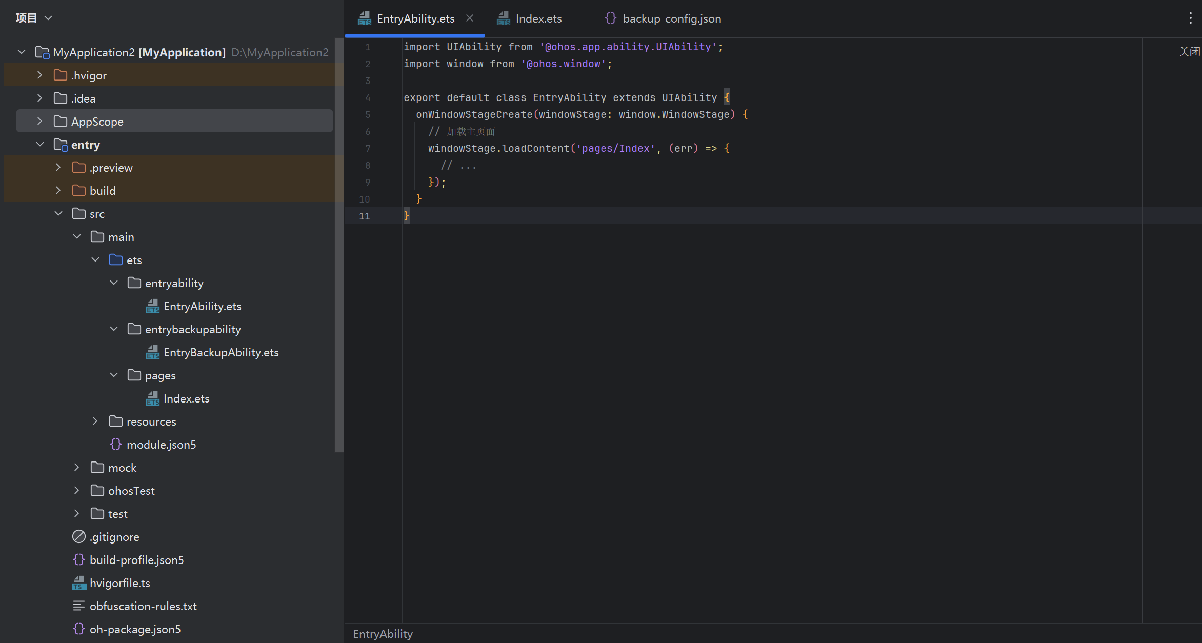
// EntryAbility.ets
import UIAbility from '@ohos.app.ability.UIAbility';
import window from '@ohos.window';

export default class EntryAbility extends UIAbility {
  onWindowStageCreate(windowStage: window.WindowStage) {
    // 加载主页面
    windowStage.loadContent('pages/Index', (err) => {
      // ...
    });
  }
}
typescript
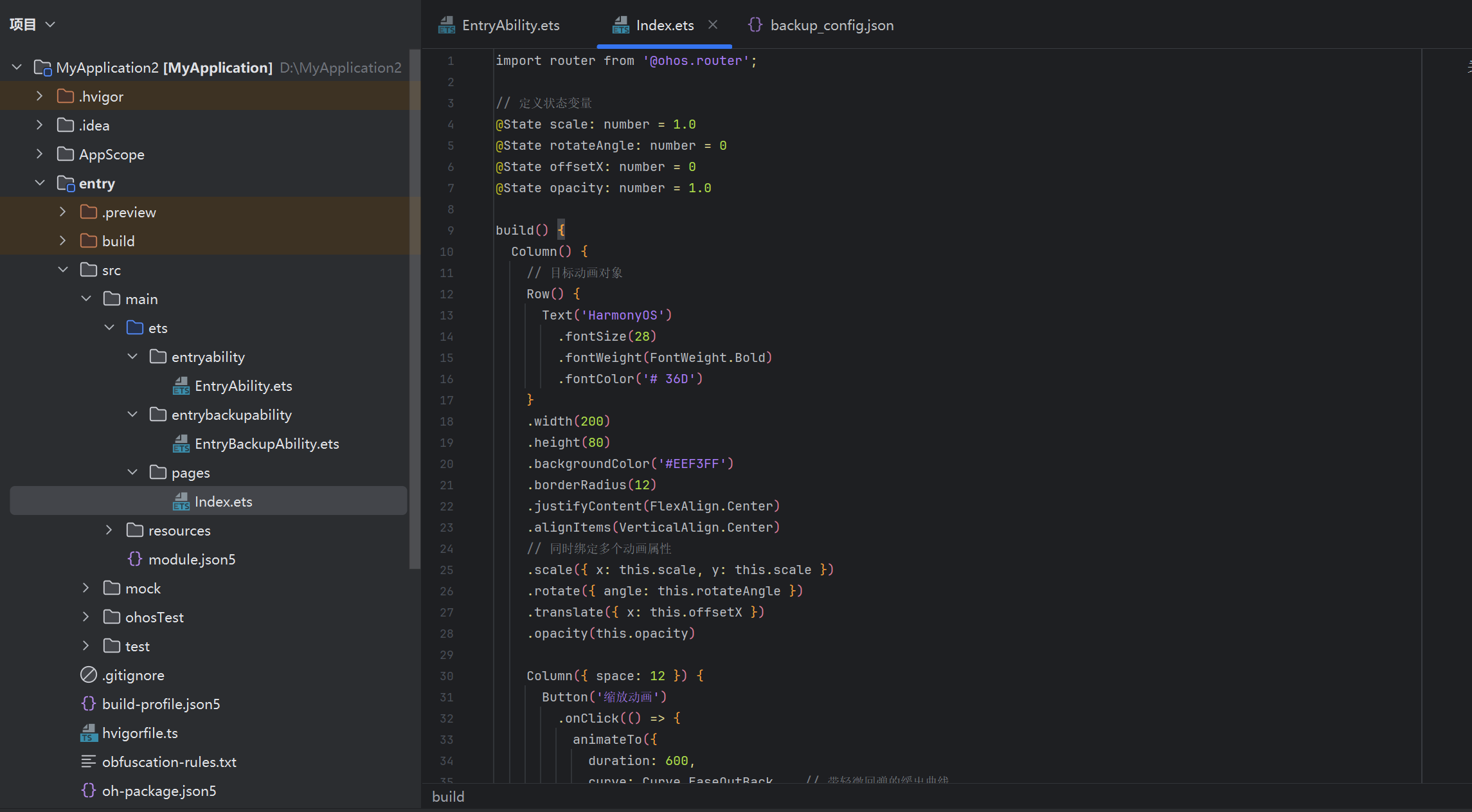
// pages/Index.ets
import router from '@ohos.router';

// 定义状态变量
@State scale: number = 1.0
@State rotateAngle: number = 0
@State offsetX: number = 0
@State opacity: number = 1.0

build() {
  Column() {
    // 目标动画对象
    Row() {
      Text('HarmonyOS')
        .fontSize(28)
        .fontWeight(FontWeight.Bold)
        .fontColor('# 36D')
    }
    .width(200)
    .height(80)
    .backgroundColor('#EEF3FF')
    .borderRadius(12)
    .justifyContent(FlexAlign.Center)
    .alignItems(VerticalAlign.Center)
    // 同时绑定多个动画属性
    .scale({ x: this.scale, y: this.scale })
    .rotate({ angle: this.rotateAngle })
    .translate({ x: this.offsetX })
    .opacity(this.opacity)

    Column({ space: 12 }) {
      Button('缩放动画')
        .onClick(() => {
          animateTo({
            duration: 600,
            curve: Curve.EaseOutBack,   // 带轻微回弹的缓出曲线
            iterations: 1,
            playMode: PlayMode.Normal,
            delay: 0,
          }, () => {
            // 在闭包内修状态,框架自动计算过渡
            this.scale = this.scale === 1.0 ? 1.3 : 1.0
          })
        })

      Button('旋转动画')
        .onClick(() => {
          animateTo({
            duration: 800,
            curve: Curve.EaseInOut,
            iterations: 1,
          }, () => {
            this.rotateAngle = this.rotateAngle === 0 ? 360 : 0
          })
        })

      Button('平移 + 渐隐组合')
        .onClick(() => {
          animateTo({
            duration: 1000,
            curve: Curve.Linear,
            iterations: 1,
          }, () => {
            this.offsetX = this.offsetX === 0 ? 150 : 0
            this.opacity = this.opacity === 1.0 ? 0.3 : 1.0
          })
        })
    }
    .margin({ top: 40 })
    .width('100%')
    .alignItems(HorizontalAlign.Center)
  }
  .width('100%')
  .height('100%')
  .justifyContent(FlexAlign.Center)
}
animateTo 的核心优势在于声明即动画------开发者无需关心动画时长、定时器或渲染循环,只需描述"从哪里"到"到哪里",框架自动完成插值计算。
小结:
animateTo适合状态驱动型动画,通过闭包内修改变量触发自动过渡,是页面内元素动画的首选方案。
1.2 animation 属性动画
animation 属性与 animateTo 的最大区别在于:animation 跟随状态变量变化自动播放,无需显式闭包 。只要被 animation() 修饰的属性发生变化,动画自动触发。
typescript
// animation 属性动画完整示例
@State isExpanded: boolean = false
@State cardWidth: number = 160
@State cardHeight: number = 100
@State borderRadiusVal: number = 20

build() {
  Column({ space: 20 }) {
    // 卡片容器
    Column() {
      Text('展开 / 收起')
        .fontSize(16)
        .fontColor('#FFF')
        .fontWeight(FontWeight.Medium)
    }
    .width(this.cardWidth)
    .height(this.cardHeight)
    .backgroundColor('# 625DF3')
    .borderRadius(this.borderRadiusVal)
    .shadow({
      radius: 12,
      color: 'rgba(98, 93, 243, 0.25)',
      offsetX: 0,
      offsetY: 4
    })
    // animation 参数:自动监听状态变化并播放动画
    .animation({
      duration: 500,
      curve: Curve.EaseOut,
      iterations: 1,
      playMode: PlayMode.Normal
    })
    .onClick(() => {
      if (this.isExpanded) {
        // 收起
        this.cardWidth = 160
        this.cardHeight = 100
        this.borderRadiusVal = 20
        this.isExpanded = false
      } else {
        // 展开
        this.cardWidth = 280
        this.cardHeight = 200
        this.borderRadiusVal = 30
        this.isExpanded = true
      }
    })

    // 状态提示
    Text(this.isExpanded ? '展开中,点击收起' : '收起状态,点击展开')
      .fontSize(14)
      .fontColor('#999')
  }
  .width('100%')
  .height('100%')
  .justifyContent(FlexAlign.Center)
}两者的选择逻辑非常清晰:如果动画由单个属性变化触发 ,用 animation 更简洁;如果需要在一次点击中同时控制多个状态 ,用 animateTo 闭包更灵活。
小结:
animation是属性级别的隐式动画,与animateTo互为补充,共同构成 HarmonyOS 声明式动画的基础。
二、页面级转场:transition 详解
2.1 push/pop 页面转场
页面路由(router.pushUrl / router.replaceUrl / router.pop)支持通过 transition 配置不同进入/退出动画。HarmonyOS 提供了多种预设过渡效果,也支持完全自定义。
typescript
// pages/PageA.ets - 带转场动画的页面 A
import router from '@ohos.router'

@Entry({ router: { url: 'pages/PageA', stagePath: 'pages/PageA' } })
@Component
struct PageA {
  @State contentOpacity: number = 1.0
  @State contentTranslateY: number = 0

  // 自定义转场配置:当前页从右侧滑入
  @State transitionInfo: TransitionEffect = TransitionEffect.OPERATION.PUSH_RIGHT

  build() {
    NavDestination() {
      Column({ space: 20 }) {
        Text('第一页')
          .fontSize(32)
          .fontWeight(FontWeight.Bold)

        Text('从右向左滑入,点击按钮跳转到第二页')
          .fontSize(16)
          .fontColor('#666')
          .textAlign(TextAlign.Center)

        Button('跳转到第二页')
          .onClick(() => {
            router.pushUrl({ url: 'pages/PageB' })
          })
      }
      .width('100%')
      .padding(24)
    }
    .title('页面 A')
    .transition({ type: TransitionType.Push, operation: TransitionOperation.PUSH_RIGHT })
    .transition({ type: TransitionType.Pop, operation: TransitionOperation.POP_RIGHT })
  }
}
typescript
// pages/PageB.ets - 带不同转场效果的页面 B
import router from '@ohos.router'

@Entry({ router: { url: 'pages/PageB', stagePath: 'pages/PageB' } })
@Component
struct PageB {
  build() {
    NavDestination() {
      Column({ space: 20 }) {
        Text('第二页')
          .fontSize(32)
          .fontWeight(FontWeight.Bold)

        Text('进入时从底部升起,退出时淡出')
          .fontSize(16)
          .fontColor('#666')
          .textAlign(TextAlign.Center)

        Button('返回第一页')
          .type(ButtonType.Normal)
          .onClick(() => {
            router.pop()
          })

        Button('替换到第三页(无历史)')
          .type(ButtonType.Normal)
          .onClick(() => {
            router.replaceUrl({ url: 'pages/PageC' })
          })
      }
      .width('100%')
      .padding(24)
    }
    .title('页面 B')
    // 底部滑入 + 整体淡出
    .transition({ type: TransitionType.Push, operation: TransitionOperation.PUSH_BOTTOM })
    .transition({ type: TransitionType.Pop, operation: TransitionOperation.FADE })
  }
}
typescript
// pages/PageC.ets - 自定义转场效果
@Entry({ router: { url: 'pages/PageC', stagePath: 'pages/PageC' } })
@Component
struct PageC {
  @State scaleVal: number = 0.5
  @State opacityVal: number = 0

  aboutToAppear() {
    // 页面进入时播放缩放 + 淡入动画
    animateTo({
      duration: 400,
      curve: Curve.EaseOut,
    }, () => {
      this.scaleVal = 1.0
      this.opacityVal = 1.0
    })
  }

  aboutToDisappear() {
    // 页面退出时播放缩小 + 淡出
    animateTo({
      duration: 300,
      curve: Curve.EaseIn,
    }, () => {
      this.scaleVal = 0.5
      this.opacityVal = 0
    })
  }

  build() {
    NavDestination() {
      Column({ space: 20 }) {
        Text('第三页(无历史栈)')
          .fontSize(32)
          .fontWeight(FontWeight.Bold)
          .scale({ x: this.scaleVal, y: this.scaleVal })
          .opacity(this.opacityVal)

        Text('replaceUrl 跳转,无返回按钮')
          .fontSize(16)
          .fontColor('#666')
      }
      .width('100%')
      .height('100%')
      .justifyContent(FlexAlign.Center)
    }
    .title('页面 C')
  }
}
TransitionOperation 提供了标准操作常量,包括 PUSH_LEFT、PUSH_RIGHT、PUSH_BOTTOM、POP_LEFT、POP_RIGHT、POP_BOTTOM、FADE、ZOLE(缩放)等。自定义场景则可通过 aboutToAppear / aboutToDisappear 生命周期配合 animateTo 实现。
小结:页面转场通过
transition属性和生命周期钩子协同控制,合理的转场设计能显著提升应用的专业感和流畅度。
三、motionPath 路径动画
3.1 沿 SVG 路径运动
motionPath 是 HarmonyOS NEXT 中非常强大的特性,允许组件沿任意曲线路径运动,而不仅仅是简单的直线平移。这在轨迹展示、引导动画等场景中非常有用。
typescript
// pages/MotionPathDemo.ets
@Entry
@Component
struct MotionPathDemo {
  @State isPlaying: boolean = false
  @State planeAngle: number = 0  // 控制沿路径播放的进度

  // 定义一条曲线路径(M path 语法)
  private motionPath: string = 'M 50 200 C 100 50, 300 50, 350 200 S 550 350, 600 200'

  build() {
    Stack({ alignContent: Alignment.TopStart }) {
      // 路径可视化(调试用)
      Path()
        .width(650)
        .height(400)
        .commands(this.motionPath)
        .stroke('#DDD')
        .strokeWidth(2)
        .fill(Color.None)

      // 沿路径运动的飞机图标
      Row() {
        Text('✈')
          .fontSize(36)
      }
      .width(50)
      .height(50)
      .backgroundColor('# 36D')
      .borderRadius(25)
      .justifyContent(FlexAlign.Center)
      .alignItems(VerticalAlign.Center)
      // motionPath 属性:绑定路径字符串
      .motionPath({
        path: this.motionPath,
        from: 0.0,       // 路径起点(0.0)
        to: 1.0,         // 路径终点(1.0)
        duration: 3000,  // 3 秒完整走完
        curve: Curve.Linear,
        iterations: 1,
        autoReverse: false
      })
      // 通过 opacity 或 rotate 间接控制 motionPath 不生效,
      // 需要通过 path 参数动画,这里用 animateTo 驱动

      // 控制面板
      Column({ space: 16 }) {
        Text('motionPath 路径动画')
          .fontSize(20)
          .fontWeight(FontWeight.Bold)

        Slider({
          value: this.planeAngle,
          min: 0,
          max: 360,
          style: SliderStyle.OutSet,
          showTips: true
        })
          .width(300)
          .onChange((value: number) => {
            this.planeAngle = value
          })

        Row({ space: 12 }) {
          Button('播放')
            .onClick(() => {
              // 使用 animateTo 控制 motionPath 需要间接方式:
              // 这里用 translate 模拟,实际 motionPath 自动播放
              animateTo({
                duration: 3000,
                curve: Curve.Linear,
                iterations: 1,
              }, () => {
                // 触发路径动画(配合 visibility 控制)
                this.isPlaying = true
              })
              setTimeout(() => {
                this.isPlaying = false
              }, 3100)
            })

          Button('停止')
            .onClick(() => {
              this.isPlaying = false
            })
        }
      }
      .padding(20)
      .backgroundColor('#FFF')
      .borderRadius(16)
      .shadow({ radius: 10, color: 'rgba(0,0,0,0.08)', offsetX: 0, offsetY: 2 })
      .margin({ top: 20, left: 20 })
    }
    .width('100%')
    .height('100%')
    .backgroundColor('#F5F7FA')
  }
}
motionPath 的核心参数是 path(SVG M/L/C/S 等命令构造的曲线路径字符串)和 from/to(路径归一化坐标区间)。通过动态调整 from 值,可以实现进度可控的路径动画。
小结:
motionPath打破了平移动画的线性限制,是实现轨迹可视化、引导动画和复杂运动轨迹的利器。
四、共享元素转场(SharedTransition)
4.1 原理与基本用法
共享元素转场是跨页面共享同一视觉元素的平滑过渡效果。典型场景是:列表页点击商品卡片后,商品图片在详情页以动画方式放大显示,用户感知到"卡片飞到了详情页"。
typescript
// pages/SharedTransitionList.ets - 列表页
@Component
struct ProductCard {
  @ObjectLink product: ProductData
  @State cardScale: number = 1.0

  build() {
    Column() {
      // 商品图片 --- 标记 sharedTransitionId
      Image(this.product.imageUrl)
        .width('100%')
        .height(160)
        .objectFit(ImageFit.Cover)
        .borderRadius({ topLeft: 12, topRight: 12 })
        // 共享元素转场的唯一标识
        .sharedTransition(this.product.id, {
          duration: 400,
          curve: Curve.EaseOut,
          zIndex: 1
        })

      Column({ space: 6 }) {
        Text(this.product.name)
          .fontSize(15)
          .fontWeight(FontWeight.Medium)
          .maxLines(1)
          .textOverflow({ overflow: TextOverflow.Ellipsis })

        Text('¥' + this.product.price)
          .fontSize(16)
          .fontColor('#F55')
          .fontWeight(FontWeight.Bold)
      }
      .padding(12)
      .alignItems(HorizontalAlign.Start)
    }
    .width('47%')
    .backgroundColor('#FFF')
    .borderRadius(12)
    .clip(true)
    .shadow({ radius: 8, color: 'rgba(0,0,0,0.06)', offsetX: 0, offsetY: 2 })
    .scale({ x: this.cardScale, y: this.cardScale })
    .onClick(() => {
      router.pushUrl({
        url: 'pages/ProductDetail',
        params: { productId: this.product.id }
      })
    })
    .onHover((isHover: boolean) => {
      animateTo({ duration: 200 }, () => {
        this.cardScale = isHover ? 1.05 : 1.0
      })
    })
  }
}

// 产品数据类型
class ProductData {
  id: string
  name: string
  price: number
  imageUrl: ResourceStr
  description: string

  constructor(id: string, name: string, price: number, imageUrl: ResourceStr, desc: string) {
    this.id = id
    this.name = name
    this.price = price
    this.imageUrl = imageUrl
    this.description = desc
  }
}

@Entry
@Component
struct SharedTransitionList {
  @State productList: ProductData[] = [
    new ProductData('p1', '无线蓝牙耳机', 299, $r('app.media.ic_placeholder'), '沉浸式降噪体验'),
    new ProductData('p2', '机械键盘', 599, $r('app.media.ic_placeholder'), '青轴手感,RGB 背光'),
    new ProductData('p3', '智能手环', 199, $r('app.media.ic_placeholder'), '心率监测 + 睡眠分析'),
    new ProductData('p4', '移动固态硬盘', 899, $r('app.media.ic_placeholder'), '1TB 超高速传输'),
  ]

  build() {
    Column({ space: 12 }) {
      Text('商品列表(点击查看详情)')
        .fontSize(20)
        .fontWeight(FontWeight.Bold)
        .margin({ top: 16, bottom: 8 })

      // 瀑布流网格
      Flex({ wrap: FlexWrap.Wrap, justifyContent: FlexAlign.SpaceBetween }) {
        ForEach(this.productList, (product: ProductData) => {
          ProductCard({ product: product })
            .margin({ bottom: 12 })
        })
      }
      .padding({ left: 16, right: 16 })
    }
    .width('100%')
    .height('100%')
    .backgroundColor('#F5F7FA')
  }
}
typescript
// pages/ProductDetail.ets - 详情页,与列表页共享元素
@Entry
@Component
struct ProductDetail {
  @State product: ProductData | null = null

  aboutToAppear() {
    const params = router.getParams() as Record<string, string>
    // 根据 productId 获取产品数据(实际项目中从数据层获取)
    this.product = this.getProductById(params?.productId)
  }

  getProductById(id: string): ProductData {
    const mockData: ProductData[] = [
      new ProductData('p1', '无线蓝牙耳机', 299, $r('app.media.ic_placeholder'), '沉浸式降噪体验'),
      new ProductData('p2', '机械键盘', 599, $r('app.media.ic_placeholder'), '青轴手感,RGB 背光'),
      new ProductData('p3', '智能手环', 199, $r('app.media.ic_placeholder'), '心率监测 + 睡眠分析'),
      new ProductData('p4', '移动固态硬盘', 899, $r('app.media.ic_placeholder'), '1TB 超高速传输'),
    ]
    return mockData.find(p => p.id === id) ?? mockData[0]
  }

  build() {
    if (!this.product) {
      return Column().width('100%').height('100%')
    }

    NavDestination() {
      Column() {
        // 详情页图片 --- 使用与列表页相同的 sharedTransitionId
        Image(this.product.imageUrl)
          .width('100%')
          .height(300)
          .objectFit(ImageFit.Cover)
          // 关键:相同的 id 确保两端能匹配
          .sharedTransition(this.product.id, {
            duration: 400,
            curve: Curve.EaseOut,
            zIndex: 0
          })

        Column({ space: 16 }) {
          Text(this.product.name)
            .fontSize(24)
            .fontWeight(FontWeight.Bold)

          Text('¥' + this.product.price)
            .fontSize(28)
            .fontColor('#F55')
            .fontWeight(FontWeight.Bold)

          Divider()

          Text('商品详情')
            .fontSize(16)
            .fontWeight(FontWeight.Medium)
            .alignSelf(HorizontalAlign.Start)

          Text(this.product.description)
            .fontSize(15)
            .fontColor('#666')
            .lineHeight(24)
            .alignSelf(HorizontalAlign.Start)

          Button('加入购物车')
            .width('100%')
            .height(48)
            .fontSize(16)
        }
        .padding(20)
        .alignItems(HorizontalAlign.Start)
      }
      .width('100%')
      .height('100%')
      .backgroundColor('#FFF')
    }
    .title(this.product.name)
    .onBackPressed(() => {
      router.pop()
      return true
    })
  }
}共享元素转场的实现关键在于两端的 sharedTransition 必须使用相同的 ID。框架会自动在两个页面中识别匹配的元素,并计算从源位置/尺寸到目标位置/尺寸的插值动画。
小结:共享元素转场通过
sharedTransition(id, options)配对列表页和详情页的对应元素,创造"元素飞行"的视觉体验,大幅提升用户对页面关联性的感知。
五、物理仿真动画:springMotion 与 frictionSpringMotion
5.1 弹簧动画(springMotion)
弹簧动画模拟真实物理世界中弹簧的振荡效果,组件会"过冲"目标值再回弹,最终稳定在目标位置。这种动效比纯缓动曲线更自然、更具活力。
typescript
// pages/SpringMotionDemo.ets
import curves from '@ohos.curves'

@Entry
@Component
struct SpringMotionDemo {
  @State ballX: number = 50
  @State ballY: number = 200
  @State isAnimating: boolean = false

  // 创建弹簧曲线:响应时间 800ms,阻尼系数控制回弹次数
  private springCurve: Curve = curves.springMotion(0.8, 0.6)

  build() {
    Column() {
      // 画布区域
      Stack() {
        // 轨道参考线
        Path()
          .width(320)
          .height(300)
          .commands('M 50 150 L 300 150')
          .stroke('#EEE')
          .strokeWidth(1)

        // 弹性球体
        Row() {
          Circle()
            .width(50)
            .height(50)
            .fill('#36D')
        }
        .width(50)
        .height(50)
        .translate({ x: this.ballX, y: this.ballY - 150 })
        .animation({
          duration: 1200,
          curve: this.springCurve,
          iterations: 1,
          playMode: PlayMode.Normal
        })

        // 终点标记
        Column() {
          Text('终点')
            .fontSize(12)
            .fontColor('#999')
        }
        .translate({ x: 270, y: 135 })
      }
      .width('100%')
      .height(300)
      .backgroundColor('#FAFAFA')
      .borderRadius(16)

      Column({ space: 16 }) {
        Text('弹簧动画演示')
          .fontSize(18)
          .fontWeight(FontWeight.Bold)

        Text('弹簧参数:响应 0.8s,阻尼 0.6')
          .fontSize(14)
          .fontColor('#888')

        Button('点击让球弹到终点')
          .width('100%')
          .type(ButtonType.Normal)
          .onClick(() => {
            if (this.isAnimating) return
            this.isAnimating = true
            // 修改状态触发弹簧动画
            this.ballX = 250
            setTimeout(() => {
              this.isAnimating = false
            }, 1500)
          })

        Button('重置')
          .width('100%')
          .type(ButtonType.Normal)
          .onClick(() => {
            this.ballX = 50
          })
      }
      .padding(20)
      .width('100%')
    }
    .width('100%')
    .height('100%')
    .padding(16)
  }
}
弹簧曲线的两个关键参数:**响应时间(response)**控制振荡频率,**阻尼比(damping fraction)**控制回弹幅度。阻尼比越大,回弹越少;阻尼比越小,振荡越剧烈。
5.2 摩擦弹簧动画(frictionSpringMotion)
摩擦弹簧动画模拟摩擦阻力下的减速效果,常用于拖拽释放后的减速停止,或页面惯性滚动后的弹性定位。
typescript
// pages/FrictionSpringDemo.ets
import curves from '@ohos.curves'

@Entry
@Component
struct FrictionSpringDemo {
  @State cardX: number = 0
  @State velocity: number = 0  // 模拟拖拽速度
  @State isDragging: boolean = false

  // 摩擦弹簧:模拟卡片释放后滑到吸附点
  private frictionCurve: Curve = curves.frictionSpringMotion(0.0, 0.8)

  build() {
    Column({ space: 20 }) {
      Text('摩擦弹簧吸附动画')
        .fontSize(20)
        .fontWeight(FontWeight.Bold)

      Text('拖拽卡片,释放后自动吸附到最近的网格点')
        .fontSize(14)
        .fontColor('#888')
        .textAlign(TextAlign.Center)

      // 可拖拽卡片区域
      Stack() {
        // 网格参考线
        Grid() {
          ForEach(Array.from({ length: 12 }), (_, index) => {
            GridItem() {
              Text('')
                .width('100%')
                .height('100%')
                .border({ width: 0.5, color: '#EEE' })
            }
          })
        }
        .columnsTemplate('1fr 1fr 1fr')
        .rowsTemplate('1fr 1fr')
        .width(300)
        .height(200)
        .backgroundColor('#F8F8F8')
        .borderRadius(12)

        // 可拖拽的卡片
        Row() {
          Text('卡片')
            .fontSize(14)
            .fontColor('#FFF')
        }
        .width(80)
        .height(50)
        .backgroundColor('#625DF3')
        .borderRadius(8)
        .shadow({ radius: 6, color: 'rgba(98,93,243,0.2)', offsetX: 0, offsetY: 2 })
        .translate({ x: this.cardX })
        .animation({
          duration: 600,
          curve: this.frictionCurve,
          iterations: 1,
          playMode: PlayMode.Normal
        })
        .gesture(
          PanGesture()
            .onActionStart(() => {
              this.isDragging = true
            })
            .onActionUpdate((event: GestureEvent) => {
              this.cardX += event.translationX
            })
            .onActionEnd(() => {
              this.isDragging = false
              // 吸附到最近的 100px 整数倍位置
              const snappedX = Math.round(this.cardX / 100) * 100
              this.cardX = Math.max(0, Math.min(220, snappedX))
            })
        )
      }
      .width('100%')
      .height(240)
      .alignItems(VerticalAlign.Center)

      Row({ space: 12 }) {
        Button('左对齐')
          .onClick(() => {
            animateTo({
              duration: 500,
              curve: curves.frictionSpringMotion(0.5, 0.7)
            }, () => {
              this.cardX = 0
            })
          })

        Button('居中')
          .onClick(() => {
            animateTo({
              duration: 500,
              curve: curves.frictionSpringMotion(0.5, 0.7)
            }, () => {
              this.cardX = 110
            })
          })

        Button('右对齐')
          .onClick(() => {
            animateTo({
              duration: 500,
              curve: curves.frictionSpringMotion(0.5, 0.7)
            }, () => {
              this.cardX = 220
            })
          })
      }
    }
    .width('100%')
    .height('100%')
    .padding(20)
    .justifyContent(FlexAlign.Center)
  }
}
frictionSpringMotion 的参数中,**速度(velocity)**决定了初始摩擦力。值为 0 时表示从静止开始减速;非零值表示带初速度的惯性运动,非常适合模拟拖拽后松手的场景。
小结:弹簧动画(springMotion)和摩擦弹簧动画(frictionSpringMotion)将物理世界中的力学规律引入 UI 动画,让交互反馈更加自然可信。合理使用物理仿真动画,可以让应用"手感"大幅提升。
六、组合动画实战:完整交互动效
下面通过一个卡片翻转 + 展开详情 的组合动画,串联以上所有知识点。该示例综合运用了 animateTo、transition、弹簧曲线和 SharedTransition。
typescript
// pages/CardFlipDemo.ets - 卡片翻转 + 展开组合动画

// 数据模型
class ArticleData {
  id: string
  title: string
  summary: string
  author: string
  date: string
  content: string

  constructor(id: string, title: string, summary: string, author: string, date: string, content: string) {
    this.id = id
    this.title = title
    this.summary = summary
    this.author = author
    this.date = date
    this.content = content
  }
}

@Entry
@Component
struct CardFlipDemo {
  @State isFlipped: boolean = false
  @State isExpanded: boolean = false
  @State flipProgress: number = 0      // 0 = 正面,1 = 背面
  @State contentHeight: number = 0     // 展开高度
  @State overlayOpacity: number = 0    // 遮罩透明度

  private article: ArticleData = new ArticleData(
    'a1',
    'HarmonyOS NEXT ArkTS 深度解析',
    '深入理解声明式 UI 的核心原理与高级用法',
    '技术团队',
    '2025-07-15',
    'ArkTS 是华为自研的 TypeScript 超集,为 HarmonyOS 提供强类型声明式开发能力。' +
    '通过 @State、@Link、@Prop 等装饰器,开发者可以精确描述数据与 UI 的绑定关系。' +
    '框架底层基于细粒度更新机制,只重绘发生变化的最小组件子树,实现高性能渲染。'
  )

  build() {
    Column({ space: 30 }) {
      // 标题区
      Text('交互动效演示')
        .fontSize(24)
        .fontWeight(FontWeight.Bold)
        .margin({ top: 20 })

      // 卡片区域
      Stack({ alignContent: Alignment.Center }) {
        // 遮罩层(展开时)
        Column()
          .width('100%')
          .height('100%')
          .backgroundColor('rgba(0,0,0,0.4)')
          .opacity(this.overlayOpacity)
          .onClick(() => this.collapseCard())
          .animation({ duration: 300, curve: Curve.EaseInOut })

        // 主卡片
        Column() {
          if (!this.isExpanded) {
            // 正面
            this.FrontCard(this.article)
          } else {
            // 背面(展开详情)
            this.BackCard(this.article)
          }
        }
        .width(this.isExpanded ? '90%' : '80%')
        .height(this.isExpanded ? '60%' : 220)
        .borderRadius(20)
        .shadow({
          radius: this.isExpanded ? 20 : 12,
          color: 'rgba(98,93,243,0.15)',
          offsetX: 0,
          offsetY: this.isExpanded ? 8 : 4
        })
        .scale({
          x: 1 - (this.flipProgress * 0.05),
          y: 1 - (this.flipProgress * 0.02)
        })
        .animation({
          duration: 600,
          curve: curves.springMotion(1.0, 0.7),
          iterations: 1,
        })
      }
      .width('100%')
      .height('60%')

      // 操作按钮
      Column({ space: 12 }) {
        Button(this.isExpanded ? '收起详情' : '查看详情')
          .width('80%')
          .height(48)
          .onClick(() => {
            if (this.isExpanded) {
              this.collapseCard()
            } else {
              this.expandCard()
            }
          })

        Button('切换翻转')
          .width('80%')
          .height(48)
          .type(ButtonType.Normal)
          .onClick(() => this.toggleFlip())

        Button('重置')
          .width('80%')
          .height(40)
          .type(ButtonType.Normal)
          .fontColor('#666')
          .onClick(() => {
            this.isFlipped = false
            this.isExpanded = false
            this.flipProgress = 0
            this.contentHeight = 0
            this.overlayOpacity = 0
          })
      }
    }
    .width('100%')
    .height('100%')
    .backgroundColor('#F0F2F5')
  }

  // 正面卡片
  @Builder
  FrontCard(article: ArticleData) {
    Column({ space: 12 }) {
      Text(article.title)
        .fontSize(20)
        .fontWeight(FontWeight.Bold)
        .maxLines(2)
        .textOverflow({ overflow: TextOverflow.Ellipsis })

      Text(article.summary)
        .fontSize(15)
        .fontColor('#666')
        .maxLines(3)
        .textOverflow({ overflow: TextOverflow.Ellipsis })

      Blank()

      Row() {
        Text(article.author)
          .fontSize(13)
          .fontColor('#999')
        Blank()
        Text(article.date)
          .fontSize(13)
          .fontColor('#999')
      }
      .width('100%')
    }
    .width('100%')
    .height('100%')
    .padding(24)
    .backgroundColor('#FFF')
    .borderRadius(20)
    .transition(
      TransitionEffect.OPACITY
        .combine(TransitionEffect.scale({ x: 0.8, y: 0.8 }))
    )
  }

  // 背面卡片(展开详情)
  @Builder
  BackCard(article: ArticleData) {
    Column({ space: 16 }) {
      Row() {
        Text('文章详情')
          .fontSize(18)
          .fontWeight(FontWeight.Bold)

        Blank()

        Text('✕')
          .fontSize(20)
          .fontColor('#999')
          .onClick(() => this.collapseCard())
      }

      Text(article.title)
        .fontSize(16)
        .fontWeight(FontWeight.Medium)
        .fontColor('#333')

      Divider()

      Scroll() {
        Text(article.content)
          .fontSize(15)
          .fontColor('#555')
          .lineHeight(26)
      }
      .width('100%')
      .layoutWeight(1)

      Row() {
        Text('作者:' + article.author)
          .fontSize(13)
          .fontColor('#999')
        Blank()
        Text(article.date)
          .fontSize(13)
          .fontColor('#999')
      }
      .width('100%')
    }
    .width('100%')
    .height('100%')
    .padding(20)
    .backgroundColor('#FFF')
    .borderRadius(20)
    .transition(
      TransitionEffect.asymmetric(
        TransitionEffect.OPACITY
          .combine(TransitionEffect.scale({ x: 1.2, y: 1.2 })),
        TransitionEffect.OPACITY
      )
    )
  }

  expandCard(): void {
    // 展开动画序列
    animateTo({
      duration: 300,
      curve: Curve.EaseOut,
    }, () => {
      this.overlayOpacity = 1
    })
    animateTo({
      duration: 600,
      curve: curves.springMotion(1.0, 0.7),
    }, () => {
      this.isExpanded = true
      this.contentHeight = 400
    })
  }

  collapseCard(): void {
    // 收起动画
    animateTo({
      duration: 400,
      curve: Curve.EaseIn,
    }, () => {
      this.isExpanded = false
      this.contentHeight = 0
    })
    animateTo({
      duration: 300,
      curve: Curve.EaseIn,
      delay: 200,
    }, () => {
      this.overlayOpacity = 0
    })
  }

  toggleFlip(): void {
    const target = this.isFlipped ? 0 : 1
    animateTo({
      duration: 800,
      curve: curves.frictionSpringMotion(0.0, 0.8),
    }, () => {
      this.flipProgress = target
    })
    this.isFlipped = !this.isFlipped
  }
}这个组合示例展示了多种动画技术的协同工作:animateTo 控制遮罩层和展开状态,curves.springMotion 为卡片缩放提供弹性质感,curves.frictionSpringMotion 处理翻转动画的自然减速,TransitionEffect 定义了展开/收起时的渐变缩放过渡。四者结合,构成了一套完整、连贯、富有物理真实感的交互动效。
小结:组合动画的核心是将复杂动效拆解为独立的动画片段,通过
animateTo的嵌套调用或animation的叠加实现序列与并行的协调控制。
七、性能注意事项
在实际项目中,动画性能需要特别关注以下几点。
优先使用 GPU 加速属性。 translate、scale、rotate、opacity 是 HarmonyOS 中可以由 GPU 直接处理的属性,动画帧率稳定。而 width、height、layoutWeight 等涉及布局计算的属性变化时,每帧都需要重新测量和排列,性能开销较大,应尽量避免在高频动画中使用。
避免同时激活动画数量过多。 单个页面上同时播放超过 20 个独立动画时,主线程负担加重,可能出现掉帧。建议将批量动画收敛到 5~8 个以内,通过 @Reusable 复用组件来分摊渲染成本。
善用 duration 与 curve 匹配场景。 微型交互反馈(按钮点击、hover)用 150~250ms;元素位置变化用 300~500ms;页面级转场用 500~800ms。弹性效果优先选 springMotion 或 EaseOutBack,减速效果选 frictionSpringMotion 或 EaseOut。
结语
HarmonyOS NEXT 的动画系统是一套从微观到宏观、从单一属性到跨页面共享的完整体系。animateTo 与 animation 构成了基础动画能力,transition 负责页面级转场,motionPath 打开了曲线运动的大门,SharedTransition 弥合了页面间的视觉连续性,而 springMotion 与 frictionSpringMotion 则将物理真实感注入每一次交互反馈。
掌握这些工具后,开发者可以将"动效"从锦上添花的装饰,提升为产品体验的核心竞争力。下一篇文章我们将探索 HarmonyOS NEXT 中的多端协同能力,敬请期待。