HarmonyOS API 24 List组件与数据渲染技术详解
引言
在鸿蒙应用开发中,列表展示是最常见的UI需求之一。List组件作为ArkUI框架提供的核心滚动容器组件,为开发者提供了高效的数据渲染能力。本文将深入探讨HarmonyOS API 24中List组件的核心技术,包括组件架构、数据绑定机制、性能优化策略以及高级特性。
第一章:List组件概述
1.1 List组件的定位与作用
List组件是HarmonyOS ArkUI框架中用于实现列表展示的核心容器组件。它提供了垂直或水平方向的滚动能力,支持大量数据的高效渲染。
主要特点:
- 支持垂直和水平滚动
- 提供高性能的虚拟滚动机制
- 支持分组、粘性标题、侧滑操作等高级特性
- 与状态管理深度集成,支持数据响应式更新
1.2 List组件的基本结构
List组件由容器和列表项组成:
- List:滚动容器,负责管理滚动状态和渲染
- ListItem:列表项容器,用于承载列表项内容
- ListItemGroup:列表项分组容器,用于对列表项进行分组
typescript
List() {
  ListItem() {
    Text('列表项1')
  }

  ListItem() {
    Text('列表项2')
  }
}
1.3 List组件在API 24中的新增特性
API 24为List组件带来了多项重要更新:
| 特性 | 说明 | API版本 |
|---|---|---|
| cachedCount | 控制列表项缓存数量 | 通用 |
| listDirection | 设置滚动方向 | 通用 |
| initialIndex | 设置初始滚动位置 | 通用 |
| edgeEffect | 设置边缘效果 | 12+ |
| chainAnimation | 设置链式动画 | 12+ |
第二章:List组件核心API详解
2.1 ListOptions构造参数
List组件的构造函数支持传入ListOptions对象:
typescript
interface ListOptions {
  space?: number        // 列表项间距,默认值0
  initialIndex?: number // 初始滚动到的列表项索引,默认值0
}
使用示例:
typescript
List({ space: 12, initialIndex: 0 }) {
  // ListItem列表
}
2.2 核心属性方法
2.2.1 listDirection属性
设置列表的滚动方向:
typescript
listDirection(value: Axis)Axis枚举值:
Axis.Vertical:垂直滚动(默认)Axis.Horizontal:水平滚动
使用示例:
typescript
List() {
  // ListItem列表
}
.listDirection(Axis.Vertical)
2.2.2 cachedCount属性
设置列表项的缓存数量:
typescript
cachedCount(value: number)使用示例:
typescript
List() {
  // ListItem列表
}
.cachedCount(3)  // 缓存3个列表项
注意事项:
- 缓存数量越多,内存占用越大,但滚动越流畅
- 根据列表项复杂度和设备性能合理设置
2.2.3 initialIndex属性
设置列表初始滚动到的位置:
typescript
initialIndex(value: number)使用示例:
typescript
List() {
  // ListItem列表
}
.initialIndex(5)  // 初始滚动到第6个列表项
2.2.4 edgeEffect属性(API 12+)
设置列表滚动到边缘时的效果:
typescript
edgeEffect(value: EdgeEffect)EdgeEffect枚举值:
EdgeEffect.None:无效果EdgeEffect.Spring:弹性效果(默认)EdgeEffect.Fade:渐变效果
使用示例:
typescript
List() {
  // ListItem列表
}
.edgeEffect(EdgeEffect.Spring)
2.2.5 chainAnimation属性(API 12+)
设置列表项的链式动画效果:
typescript
chainAnimation(value: boolean)使用示例:
typescript
List() {
  // ListItem列表
}
.chainAnimation(true)  // 启用链式动画
效果说明:
- 列表项依次进入屏幕时会有连续的动画效果
- 提升视觉体验,但可能影响性能
2.2.6 width和height属性
设置列表的宽度和高度:
typescript
width(value: Length)
height(value: Length)
使用示例:
typescript
List() {
  // ListItem列表
}
.width('100%')
.height('100%')
2.3 事件处理
2.3.1 onScroll事件
列表滚动时触发的事件:
typescript
onScroll(event: (scrollOffset: number, scrollState: ScrollState) => void)参数说明:
scrollOffset:滚动偏移量(像素)scrollState:滚动状态
ScrollState枚举值:
ScrollState.Idle:空闲状态ScrollState.Dragging:拖拽状态ScrollState.Settling:惯性滚动状态
使用示例:
typescript
List() {
  // ListItem列表
}
.onScroll((scrollOffset: number, scrollState: ScrollState) => {
  console.log(`滚动偏移量: ${scrollOffset}, 滚动状态: ${scrollState}`)
})
2.3.2 onReachStart事件
列表滚动到起始位置时触发:
typescript
onReachStart(event: () => void)使用示例:
typescript
List() {
  // ListItem列表
}
.onReachStart(() => {
  console.log('滚动到顶部')
})
2.3.3 onReachEnd事件
列表滚动到末尾时触发:
typescript
onReachEnd(event: () => void)使用示例:
typescript
List() {
  // ListItem列表
}
.onReachEnd(() => {
  console.log('滚动到底部')
  // 加载更多数据
})
2.3.4 onScrollIndex事件
列表项滚动到可视区域时触发:
typescript
onScrollIndex(event: (start: number, end: number) => void)参数说明:
start:可视区域第一个列表项的索引end:可视区域最后一个列表项的索引
使用示例:
typescript
List() {
  // ListItem列表
}
.onScrollIndex((start: number, end: number) => {
  console.log(`可视区域: ${start} - ${end}`)
})
第三章:ListItem组件详解
3.1 ListItem组件概述
ListItem是List组件的子组件,用于定义列表项的内容和样式。
3.2 核心属性方法
3.2.1 height属性
设置列表项的高度:
typescript
height(value: Length)使用示例:
typescript
ListItem() {
  Text('列表项')
}
.height(80)
3.2.2 backgroundColor属性
设置列表项的背景颜色:
typescript
backgroundColor(value: ResourceColor)使用示例:
typescript
ListItem() {
  Text('列表项')
}
.backgroundColor(Color.White)
3.2.3 borderRadius属性
设置列表项的圆角:
typescript
borderRadius(value: Length | BorderRadiuses)使用示例:
typescript
ListItem() {
  Text('列表项')
}
.borderRadius(12)
3.2.4 padding属性
设置列表项的内边距:
typescript
padding(value: Padding)使用示例:
typescript
ListItem() {
  Text('列表项')
}
.padding({ left: 16, right: 16, top: 12, bottom: 12 })
3.3 ListItemGroup组件
3.3.1 概述
ListItemGroup用于对列表项进行分组,支持分组标题和粘性标题。
3.3.2 核心属性
typescript
ListItemGroup() {
  // 分组标题
  Text('分组标题')

  // 列表项
  ListItem() {
    Text('列表项1')
  }

  ListItem() {
    Text('列表项2')
  }
}
3.3.3 粘性标题
使用sticky属性实现粘性标题效果:
typescript
ListItemGroup({ sticky: StickyStyle.Header }) {
  Text('分组标题')
    .fontSize(16)
    .fontWeight(FontWeight.Bold)
    .padding(12)

  ListItem() {
    Text('列表项')
  }
}
StickyStyle枚举值:
StickyStyle.None:无粘性效果StickyStyle.Header:标题粘性效果
第四章:数据绑定与渲染机制
4.1 ForEach数据绑定
ForEach是ArkUI框架提供的声明式数据绑定方法,用于根据数据列表生成组件。
4.1.1 基本用法
typescript
@State items: string[] = ['项1', '项2', '项3']

List() {
  ForEach(this.items, (item: string) => {
    ListItem() {
      Text(item)
    }
  })
}
4.1.2 带索引的ForEach
typescript
ForEach(this.items, (item: string, index: number) => {
  ListItem() {
    Text(`${index}: ${item}`)
  }
})
4.1.3 ForEach的性能问题
问题描述:
ForEach会一次性渲染所有列表项,当数据量较大时会导致性能问题。
解决方案:
使用LazyForEach替代ForEach,实现按需渲染。
4.2 LazyForEach数据绑定
LazyForEach是ArkUI框架提供的懒加载数据绑定方法,只渲染可视区域的列表项。
4.2.1 基本用法
typescript
class DataSource implements IDataSource {
  private data: string[] = []

  constructor(data: string[]) {
    this.data = data
  }

  totalCount(): number {
    return this.data.length
  }

  getData(index: number): string {
    return this.data[index]
  }

  registerDataChangeListener(listener: DataChangeListener): void {
    // 注册数据变化监听器
  }

  unregisterDataChangeListener(listener: DataChangeListener): void {
    // 注销数据变化监听器
  }
}

@State dataSource: DataSource = new DataSource(['项1', '项2', '项3'])

List() {
  LazyForEach(this.dataSource, (item: string) => {
    ListItem() {
      Text(item)
    }
  })
}
4.2.2 IDataSource接口详解
typescript
interface IDataSource {
  totalCount(): number                                    // 返回数据总数
  getData(index: number): any                             // 返回指定索引的数据
  registerDataChangeListener(listener: DataChangeListener): void  // 注册监听器
  unregisterDataChangeListener(listener: DataChangeListener): void // 注销监听器
}
4.2.3 DataChangeListener接口
typescript
interface DataChangeListener {
  onDataReloaded(): void                                 // 数据重新加载
  onDataAdd(index: number): void                         // 数据添加
  onDataChange(index: number): void                      // 数据变更
  onDataDelete(index: number): void                      // 数据删除
  onDataMove(from: number, to: number): void             // 数据移动
}
4.2.4 更新数据
typescript
class DataSource implements IDataSource {
  private data: string[] = []
  private listener: DataChangeListener | null = null

  constructor(data: string[]) {
    this.data = data
  }

  totalCount(): number {
    return this.data.length
  }

  getData(index: number): string {
    return this.data[index]
  }

  registerDataChangeListener(listener: DataChangeListener): void {
    this.listener = listener
  }

  unregisterDataChangeListener(listener: DataChangeListener): void {
    this.listener = null
  }

  // 添加数据
  addItem(item: string) {
    this.data.push(item)
    if (this.listener) {
      this.listener.onDataAdd(this.data.length - 1)
    }
  }

  // 更新数据
  updateItem(index: number, item: string) {
    this.data[index] = item
    if (this.listener) {
      this.listener.onDataChange(index)
    }
  }

  // 删除数据
  deleteItem(index: number) {
    this.data.splice(index, 1)
    if (this.listener) {
      this.listener.onDataDelete(index)
    }
  }
}
4.3 数据绑定的性能对比
| 特性 | ForEach | LazyForEach |
|---|---|---|
| 渲染方式 | 一次性渲染所有项 | 按需渲染可视区域项 |
| 内存占用 | 高(所有项都在内存中) | 低(仅可视区域项在内存中) |
| 首屏加载速度 | 慢(数据量大时) | 快(只渲染可视区域) |
| 滚动流畅度 | 好(所有项已渲染) | 好(虚拟滚动机制) |
| 适用场景 | 数据量小(<100项) | 数据量大(>100项) |
第五章:列表项布局设计
5.1 列表项布局原则
1. 简洁明了:
- 每个列表项只展示关键信息
- 避免信息过载
2. 层次分明:
- 使用字体大小、颜色区分信息层级
- 重要信息突出显示
3. 统一风格:
- 列表项之间保持一致的布局风格
- 间距、对齐方式统一
4. 交互友好:
- 提供清晰的点击反馈
- 支持滑动操作等交互方式
5.2 常见列表项布局模式
5.2.1 左图右文模式
typescript
ListItem() {
  Row({ space: 16 }) {
    Image($r('app.media.icon'))
      .width(48)
      .height(48)
      .borderRadius(12)

    Column({ space: 6 }) {
      Text('标题')
        .fontSize(16)
        .fontWeight(FontWeight.Medium)

      Text('副标题')
        .fontSize(12)
        .fontColor(Color.Gray)
    }
    .flexGrow(1)

    Image($r('app.media.arrow'))
      .width(20)
      .height(20)
      .opacity(0.4)
  }
  .padding({ left: 16, right: 16 })
  .height(80)
}
5.2.2 图标+文字模式
typescript
ListItem() {
  Row({ space: 12 }) {
    Text('📚')
      .fontSize(24)
      .width(40)
      .height(40)
      .backgroundColor(Color.Blue)
      .borderRadius(8)
      .textAlign(TextAlign.Center)

    Column({ space: 4 }) {
      Text('标题')
        .fontSize(16)
        .fontWeight(FontWeight.Medium)

      Text('描述信息')
        .fontSize(12)
        .fontColor(Color.Gray)
    }
    .flexGrow(1)

    Text('箭头')
      .fontSize(16)
      .fontColor(Color.Gray)
  }
  .padding({ left: 16, right: 16 })
  .height(72)
}
5.2.3 多行文本模式
typescript
ListItem() {
  Column({ space: 8 }) {
    Text('标题')
      .fontSize(16)
      .fontWeight(FontWeight.Medium)

    Text('这是一段较长的描述文本,可能会占据多行显示空间。')
      .fontSize(14)
      .fontColor(Color.Gray)
      .maxLines(2)
      .textOverflow({ overflow: TextOverflow.Ellipsis })

    Row({ space: 16 }) {
      Text('标签1')
        .fontSize(12)
        .padding({ left: 8, right: 8, top: 4, bottom: 4 })
        .backgroundColor(Color.Blue)
        .borderRadius(4)

      Text('标签2')
        .fontSize(12)
        .padding({ left: 8, right: 8, top: 4, bottom: 4 })
        .backgroundColor(Color.Green)
        .borderRadius(4)
    }
  }
  .padding({ left: 16, right: 16, top: 12, bottom: 12 })
}
5.2.4 图文混排模式
typescript
ListItem() {
  Column({ space: 8 }) {
    Row({ space: 12 }) {
      Image($r('app.media.image'))
        .width(120)
        .height(80)
        .borderRadius(8)

      Column({ space: 4 }) {
        Text('标题')
          .fontSize(16)
          .fontWeight(FontWeight.Medium)
          .maxLines(1)
          .textOverflow({ overflow: TextOverflow.Ellipsis })

        Text('描述信息')
          .fontSize(12)
          .fontColor(Color.Gray)
          .maxLines(2)
          .textOverflow({ overflow: TextOverflow.Ellipsis })

        Text('时间')
          .fontSize(10)
          .fontColor(Color.Gray)
      }
      .flexGrow(1)
    }
  }
  .padding({ left: 16, right: 16, top: 12, bottom: 12 })
}
5.3 列表项点击效果
5.3.1 使用scale属性实现缩放效果
typescript
@State clickedItemId: number = -1

ListItem() {
  Row({ space: 16 }) {
    // 列表项内容
  }
  .scale({
    x: this.clickedItemId === item.id ? 0.95 : 1,
    y: this.clickedItemId === item.id ? 0.95 : 1
  })
  .onClick(() => {
    this.onItemClick(item)
  })
}

onItemClick(item: ItemData): void {
  this.clickedItemId = item.id
  setTimeout(() => {
    this.clickedItemId = -1
  }, 150)
}
5.3.2 使用backgroundColor属性实现高亮效果
typescript
@State selectedItemId: number = -1

ListItem() {
  Row({ space: 16 }) {
    // 列表项内容
  }
  .backgroundColor(this.selectedItemId === item.id ? Color.Blue : Color.White)
  .onClick(() => {
    this.selectedItemId = item.id
  })
}
第六章:List组件性能优化
6.1 性能问题分析
List组件常见的性能问题包括:
- 首屏加载缓慢:数据量大时初始化时间长
- 滚动卡顿:滚动过程中帧率下降
- 内存占用过高:所有列表项都在内存中
6.2 性能优化策略
6.2.1 使用LazyForEach
对于数据量较大的列表,使用LazyForEach替代ForEach:
typescript
List() {
  LazyForEach(dataSource, (item: Item) => {
    ListItem() {
      Text(item.name)
    }
  })
}
优化效果:
- 只渲染可视区域的列表项
- 减少内存占用
- 提升首屏加载速度
6.2.2 设置合理的缓存数量
typescript
List() {
  // ListItem列表
}
.cachedCount(3)  // 根据列表项复杂度设置
建议值:
- 简单列表项(纯文本):3-5
- 中等列表项(包含图片):2-3
- 复杂列表项(包含视频):1-2
6.2.3 优化图片加载
1. 使用合适大小的图片:
- 根据显示区域大小选择合适分辨率的图片
- 避免加载过大的图片
2. 使用缓存机制:
typescript
Image($r('app.media.image'))
  .width(100)
  .height(100)
  .cache(true)  // 启用图片缓存
3. 懒加载图片:
typescript
@Component
struct LazyImageItem {
  @State isLoaded: boolean = false
  imageUrl: string = ''

  aboutToAppear() {
    setTimeout(() => {
      this.isLoaded = true
    }, 100)
  }

  build() {
    if (!this.isLoaded) {
      Row()
        .width(100)
        .height(100)
        .backgroundColor(Color.Gray)
    } else {
      Image(this.imageUrl)
        .width(100)
        .height(100)
    }
  }
}
6.2.4 避免复杂布局
1. 减少嵌套层级:
- 避免过多的容器组件嵌套
- 合理使用flex布局减少嵌套
2. 使用renderGroup优化渲染:
typescript
ListItem() {
  Row({ space: 16 }) {
    // 列表项内容
  }
  .renderGroup(true)  // 合并渲染批次
}
6.2.5 避免在列表项中使用过多状态变量
问题描述:
每个列表项都有自己的状态变量会导致内存占用过高。
解决方案:
- 使用@Prop传递状态,避免状态复制
- 将共享状态提升到父组件
typescript
@Component
struct ListItemComponent {
  @Prop item: ItemData

  build() {
    Text(this.item.title)
  }
}
6.2.6 分页加载数据
对于大量数据,采用分页加载策略:
typescript
@State items: ItemData[] = []
@State page: number = 1
@State isLoading: boolean = false

onReachEnd() {
  if (this.isLoading) return

  this.isLoading = true
  this.loadMoreData()
}

async loadMoreData() {
  let newItems = await fetchData(this.page)
  this.items = [...this.items, ...newItems]
  this.page++
  this.isLoading = false
}
第七章:List组件高级特性
7.1 侧滑操作
实现列表项的侧滑删除、编辑等操作:
typescript
ListItem() {
  Row({ space: 16 }) {
    Text('列表项内容')
  }

  // 右侧操作按钮
  Row() {
    Button('删除')
      .width(80)
      .height('100%')
      .backgroundColor(Color.Red)
  }
}
.swipeAction({ end: this.buildSwipeAction() })

@Builder
buildSwipeAction() {
  Row() {
    Button('编辑')
      .width(80)
      .height('100%')
      .backgroundColor(Color.Blue)

    Button('删除')
      .width(80)
      .height('100%')
      .backgroundColor(Color.Red)
  }
}
7.2 分组列表
使用ListItemGroup实现分组列表:
typescript
List() {
  ListItemGroup({ header: this.buildHeader('分组1') }) {
    ForEach(group1Items, (item: ItemData) => {
      ListItem() {
        Text(item.title)
      }
    })
  }

  ListItemGroup({ header: this.buildHeader('分组2') }) {
    ForEach(group2Items, (item: ItemData) => {
      ListItem() {
        Text(item.title)
      }
    })
  }
}

@Builder
buildHeader(title: string) {
  Text(title)
    .fontSize(16)
    .fontWeight(FontWeight.Bold)
    .padding(12)
    .backgroundColor(Color.Gray)
}
7.3 粘性标题
实现滚动时标题固定在顶部的效果:
typescript
List() {
  ListItemGroup({ sticky: StickyStyle.Header }) {
    Text('分组标题')
      .fontSize(16)
      .fontWeight(FontWeight.Bold)
      .padding(12)
      .backgroundColor(Color.White)

    ForEach(items, (item: ItemData) => {
      ListItem() {
        Text(item.title)
      }
    })
  }
}
7.4 滚动到指定位置
使用scrollToIndex方法滚动到指定位置:
typescript
private listController: ListController = new ListController()

List({ controller: this.listController }) {
  // ListItem列表
}

scrollToIndex(index: number) {
  this.listController.scrollToIndex(index)
}
7.5 下拉刷新
实现下拉刷新功能:
typescript
@State isRefreshing: boolean = false

List() {
  // ListItem列表
}
.onPullDown(() => {
  this.isRefreshing = true
  this.refreshData()
})

async refreshData() {
  this.items = await fetchData()
  this.isRefreshing = false
}
第八章:List组件实战案例
8.1 案例一:分类内容列表
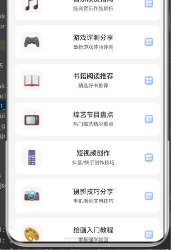
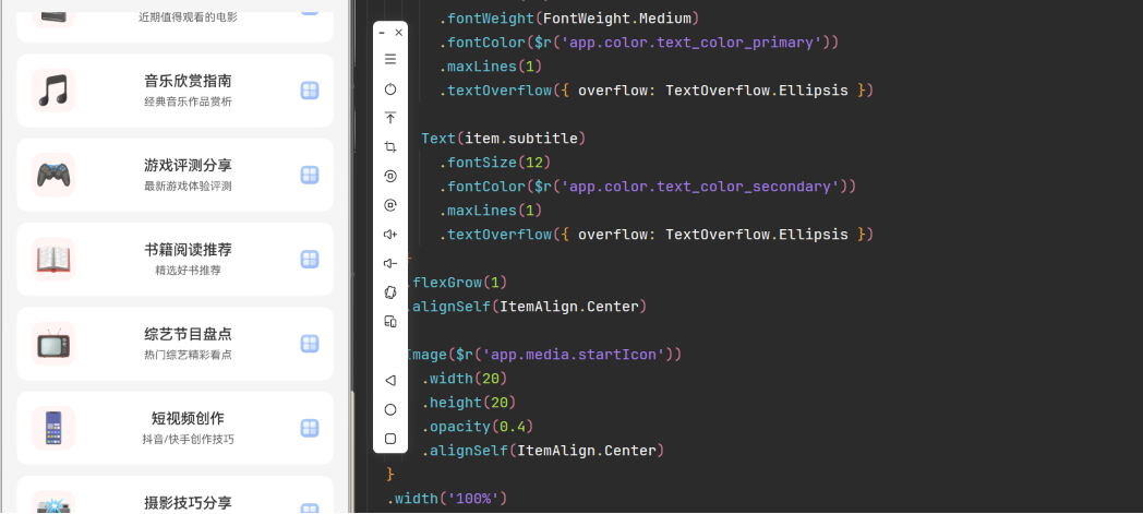
实现一个分类内容列表,包含图标、标题和副标题:
typescript
import { ItemData } from '../data/CategoryData'

@Component
struct CategoryList {
  categoryData: ItemData[] = []

  build() {
    List({ space: 12 }) {
      ForEach(this.categoryData, (item: ItemData) => {
        ListItem() {
          this.buildListItem(item)
        }
        .height(80)
        .backgroundColor(Color.White)
        .borderRadius(12)
      })
    }
    .width('100%')
    .height('100%')
    .padding({ left: 16, right: 16, top: 16 })
  }

  @Builder
  buildListItem(item: ItemData) {
    Row({ space: 16 }) {
      Text(item.icon)
        .fontSize(32)
        .width(48)
        .height(48)
        .backgroundColor(Color.Blue)
        .borderRadius(12)
        .textAlign(TextAlign.Center)
        .alignSelf(ItemAlign.Center)

      Column({ space: 6 }) {
        Text(item.title)
          .fontSize(16)
          .fontWeight(FontWeight.Medium)
          .fontColor(Color.Black)
          .maxLines(1)
          .textOverflow({ overflow: TextOverflow.Ellipsis })

        Text(item.subtitle)
          .fontSize(12)
          .fontColor(Color.Gray)
          .maxLines(1)
          .textOverflow({ overflow: TextOverflow.Ellipsis })
      }
      .flexGrow(1)
      .alignSelf(ItemAlign.Center)

      Image($r('app.media.arrow'))
        .width(20)
        .height(20)
        .opacity(0.4)
        .alignSelf(ItemAlign.Center)
    }
    .width('100%')
    .padding({ left: 16, right: 16 })
  }
}
8.2 案例二:长列表分页加载
实现一个支持分页加载的长列表:
typescript
class ListDataSource implements IDataSource {
  private data: string[] = []
  private listener: DataChangeListener | null = null

  constructor(data: string[]) {
    this.data = data
  }

  totalCount(): number {
    return this.data.length
  }

  getData(index: number): string {
    return this.data[index]
  }

  registerDataChangeListener(listener: DataChangeListener): void {
    this.listener = listener
  }

  unregisterDataChangeListener(listener: DataChangeListener): void {
    this.listener = null
  }

  addItems(items: string[]) {
    let startIndex = this.data.length
    this.data = [...this.data, ...items]
    if (this.listener) {
      this.listener.onDataAdd(startIndex)
    }
  }
}

@Entry
@Component
struct PaginationListPage {
  @State dataSource: ListDataSource = new ListDataSource([])
  @State isLoading: boolean = false
  @State page: number = 1

  build() {
    Column() {
      List() {
        LazyForEach(this.dataSource, (item: string) => {
          ListItem() {
            Text(item)
              .padding(16)
              .fontSize(16)
          }
          .height(60)
          .backgroundColor(Color.White)
          .borderRadius(8)
        })

        // 加载更多提示
        if (this.isLoading) {
          ListItem() {
            Text('加载中...')
              .padding(16)
              .fontSize(14)
              .fontColor(Color.Gray)
          }
        }
      }
      .width('100%')
      .height('100%')
      .padding({ left: 16, right: 16, top: 16 })
      .onReachEnd(() => {
        this.loadMore()
      })
    }
    .width('100%')
    .height('100%')
    .backgroundColor(Color.Gray)

    // 初始化数据
    aboutToAppear() {
      this.loadData()
    }
  }

  async loadData() {
    let data = await this.fetchData(1)
    this.dataSource = new ListDataSource(data)
  }

  async loadMore() {
    if (this.isLoading) return

    this.isLoading = true
    let data = await this.fetchData(this.page + 1)

    if (data.length > 0) {
      this.dataSource.addItems(data)
      this.page++
    }

    this.isLoading = false
  }

  async fetchData(page: number): Promise<string[]> {
    // 模拟网络请求
    await new Promise((resolve) => setTimeout(resolve, 1000))
    return Array.from({ length: 20 }, (_, i) => `第${page}页第${i + 1}项`)
  }
}
8.3 案例三:分组列表带粘性标题
实现一个分组列表,支持粘性标题:
typescript
@Entry
@Component
struct GroupedListPage {
  groups: Group[] = [
    { title: 'A', items: ['Apple', 'Banana', 'Cherry'] },
    { title: 'B', items: ['Date', 'Elderberry', 'Fig'] },
    { title: 'C', items: ['Grape', 'Honeydew', 'Kiwi'] }
  ]

  build() {
    List() {
      ForEach(this.groups, (group: Group) => {
        ListItemGroup({ sticky: StickyStyle.Header }) {
          // 分组标题
          Text(group.title)
            .fontSize(18)
            .fontWeight(FontWeight.Bold)
            .padding({ left: 16, top: 12, bottom: 8 })
            .backgroundColor(Color.White)

          // 列表项
          ForEach(group.items, (item: string) => {
            ListItem() {
              Text(item)
                .padding(16)
                .fontSize(16)
            }
            .height(50)
            .backgroundColor(Color.White)
          })
        }
      })
    }
    .width('100%')
    .height('100%')
    .backgroundColor(Color.Gray)
  }
}

interface Group {
  title: string
  items: string[]
}
第九章:常见问题与解决方案
9.1 列表滚动卡顿
问题描述:
列表滚动时帧率下降,出现卡顿。
解决方案:
- 使用LazyForEach替代ForEach
- 减少列表项复杂度
- 优化图片加载
- 设置合理的缓存数量
typescript
List() {
  LazyForEach(dataSource, (item: Item) => {
    ListItem() {
      // 简化列表项内容
    }
  })
}
.cachedCount(3)
9.2 列表项样式不生效
问题描述:
设置列表项的样式没有效果。
解决方案:
- 检查样式属性是否正确设置
- 确保样式属性应用在正确的组件上
- 检查是否有其他样式覆盖
typescript
ListItem() {
  Row() {
    Text('内容')
  }
  .width('100%')  // 正确:在Row上设置宽度
}
.height(80)  // 正确:在ListItem上设置高度
9.3 数据更新后列表不刷新
问题描述:
数据更新后列表没有重新渲染。
解决方案:
- 使用@State装饰器管理数据
- 确保数据是新的引用(不是原地修改)
- 使用LazyForEach时正确实现DataSource
typescript
@State items: string[] = []

updateItems() {
  // 正确:创建新数组
  this.items = [...this.items, '新项目']
}
9.4 列表项点击事件不触发
问题描述:
点击列表项时没有触发onClick事件。
解决方案:
- 检查是否有其他组件遮挡了点击区域
- 确保onClick事件绑定在正确的组件上
- 检查是否有触摸事件冲突
typescript
ListItem() {
  Row() {
    Text('内容')
  }
  .onClick(() => {
    // 正确:在Row上绑定点击事件
  })
}
9.5 图片加载失败
问题描述:
列表项中的图片无法显示。
解决方案:
- 检查图片路径是否正确
- 确保图片资源已添加到项目中
- 检查图片格式是否支持
typescript
Image($r('app.media.icon'))  // 正确:使用资源引用
  .width(48)
  .height(48)
第十章:API 24特性与未来展望
10.1 API 24 List组件特性总结
通过本文的深入探讨,我们掌握了List组件的核心技术:
- 组件架构:List组件由List、ListItem、ListItemGroup组成
- 数据绑定:支持ForEach和LazyForEach两种数据绑定方式
- 性能优化:包括懒加载、缓存机制、图片优化等
- 高级特性:侧滑操作、分组列表、粘性标题等
- 事件处理:滚动事件、点击事件等
10.2 最佳实践建议
1. 选择合适的数据绑定方式:
- 数据量小(<100项):使用ForEach
- 数据量大(>100项):使用LazyForEach
2. 优化列表项布局:
- 减少嵌套层级
- 合理使用flex布局
- 避免复杂的动画效果
3. 合理设置缓存数量:
- 根据列表项复杂度设置
- 平衡内存占用和滚动流畅度
4. 实现分页加载:
- 对于大量数据采用分页加载
- 提供加载状态提示
5. 提供良好的交互反馈:
- 点击效果
- 加载状态
- 错误提示
10.3 未来发展方向
随着HarmonyOS的不断发展,List组件将继续演进:
- 更智能的缓存策略:根据设备性能自动调整缓存
- 增强的虚拟滚动:支持更复杂的布局
- 更多交互方式:手势操作、3D效果等
- 更好的无障碍支持:屏幕阅读器、语音控制等
结语
List组件是HarmonyOS应用开发中最常用的组件之一。通过深入理解其API和机制,我们可以构建出高效、流畅的列表展示体验。希望本文能够帮助开发者更好地掌握List组件的使用技巧,为用户提供优质的应用体验。
在实际开发中,建议结合具体场景灵活运用List组件的各项特性,不断优化性能和用户体验。同时,关注HarmonyOS官方文档的更新,及时了解API的新特性和最佳实践。