项目演示
一、引言
在鸿蒙(HarmonyOS)原生应用开发中,用户输入体验是衡量应用质量的重要指标。输入框(TextInput)作为最基础的交互组件,其设计和交互方式直接影响用户的使用感受。为了提升输入体验,开发者常常需要为输入框添加智能提示、快捷选择等功能。
HarmonyOS NEXT(API 24)为 ArkTS 开发者提供了强大的 bindPopup 属性方法,配合 @Builder 装饰器,可以优雅地实现输入框附带弹出提示的布局方式。这种布局方式在以下场景中尤为常见:
- 搜索框智能提示:用户输入时实时显示搜索建议
- 快捷标签选择:提供预设的标签供用户快速选择
- 输入规则说明:在用户输入时展示格式要求和规则
- 历史记录展示:显示用户之前的输入历史
本文将从核心概念、API 详解、实战示例、进阶技巧、性能优化等多个维度,全面深入地探讨 Popup+TextInput 提示输入布局的实现方式和最佳实践。
二、核心概念速览
2.1 什么是 Popup?
Popup(气泡弹窗)是 ArkUI 框架提供的一种轻量级浮层组件,用于在目标组件附近显示辅助信息。与传统的 Dialog 不同,Popup 具有以下特点:
- 定位精准:Popup 会自动定位到目标组件的指定位置(上、下、左、右)
- 轻量高效:Popup 的创建和销毁开销远小于 Dialog
- 交互灵活:Popup 可以包含复杂的交互组件,支持点击、滑动等操作
- 上下文感知:Popup 与绑定的组件紧密关联,适合展示与该组件相关的辅助信息
2.2 什么是 bindPopup?
bindPopup 是 ArkUI 框架提供的一个通用属性方法,它允许开发者将一个 Popup 气泡绑定到任何组件上。其核心作用是:
- 将一段通过
@Builder声明的 UI 内容以气泡浮层的形式绑定到目标组件 - 通过一个
boolean状态变量控制 Popup 的显示与隐藏 - 提供丰富的配置选项,如弹出位置、箭头显示、背景样式等
2.3 什么是 @Builder?
@Builder 是 ArkTS 中用于声明式构建 UI 片段的装饰器。它允许开发者将一段 UI 逻辑封装成可复用的函数,在需要的地方直接调用。
@Builder 有两种定义形式:
| 形式 | 定义位置 | 调用方式 | 特点 |
|---|---|---|---|
| 全局 @Builder | 文件顶层(struct 外) | BuilderName() |
可被多个组件复用,无法访问组件内部状态 |
| 内部 @Builder | struct 内部 | this.BuilderName() |
可以访问组件的 @State、@Prop 等状态变量 |
2.4 TextInput 组件简介
TextInput 是 ArkUI 框架提供的文本输入组件,用于获取用户输入的文本信息。它支持以下核心功能:
- 文本输入与编辑
- 占位符提示
- 输入类型限制(如数字、密码等)
- 焦点管理 (
onFocus、onBlur事件) - 输入内容监听 (
onChange事件)
三、bindPopup API 详解(API 24)
3.1 API 签名
在 HarmonyOS NEXT(API 24)中,bindPopup 的标准签名如下:
typescript
bindPopup(show: boolean, popup: PopupOptions | CustomPopupOptions): T参数说明:
| 参数名 | 类型 | 必填 | 说明 |
|---|---|---|---|
| show | boolean | 是 | Popup 的显示状态。true 时显示,false 时隐藏。注意:Popup 必须等待页面全部构建完成才能展示,因此不能在页面构建过程中将 show 设置为 true |
| popup | PopupOptions | CustomPopupOptions | 是 | Popup 的配置选项,分为简单文本配置和自定义内容配置 |
3.2 PopupOptions 类型(简单文本弹窗)
当只需要显示简单文本时,可以使用 PopupOptions:
typescript
interface PopupOptions {
  message: string;                          // 必填,弹窗信息内容
  placementOnTop?: boolean;                 // 已废弃,使用 placement 替代
  primaryButton?: {                         // 主按钮配置
    value: string;
    action: () => void;
  };
  secondaryButton?: {                       // 辅助按钮配置
    value: string;
    action: () => void;
  };
  onStateChange?: (event: { isVisible: boolean }) => void;  // 状态变化回调
  arrowOffset?: Length;                     // 箭头偏移量
  showInSubWindow?: boolean;                // 是否在子窗口显示
  mask?: boolean | { color: ResourceColor }; // 遮罩层配置
  messageOptions?: PopupMessageOptions;     // 文本样式配置
  targetSpace?: Length;                     // 与目标组件的间距
  placement?: Placement;                    // 弹出位置
}
3.3 CustomPopupOptions 类型(自定义内容弹窗)
当需要自定义 Popup 内容时,使用 CustomPopupOptions:
typescript
interface CustomPopupOptions {
  builder: CustomBuilder;                   // 必填,自定义内容的 @Builder 方法引用
  placement?: Placement;                    // 弹出位置,默认 Placement.Bottom
  popupColor?: ResourceColor;               // 弹窗背景色
  enableArrow?: boolean;                    // 是否显示箭头,默认 true
  arrowOffset?: Length;                     // 箭头偏移量
  showInSubWindow?: boolean;                // 是否在子窗口显示
  mask?: boolean | { color: ResourceColor }; // 遮罩层配置
  targetSpace?: Length;                     // 与目标组件的间距
  onStateChange?: (event: { isVisible: boolean }) => void;  // 状态变化回调
  autoCancel?: boolean;                     // 点击外部是否自动关闭,默认 true
  backgroundBlurStyle?: BlurStyle;          // 背景模糊样式
}
3.4 Placement 枚举值
placement 属性用于指定 Popup 相对于目标组件的显示位置:
| 枚举值 | 说明 |
|---|---|
| Placement.Top | 在目标组件上方显示 |
| Placement.Bottom | 在目标组件下方显示(默认) |
| Placement.Left | 在目标组件左侧显示 |
| Placement.Right | 在目标组件右侧显示 |
| Placement.TopStart | 在目标组件上方起始位置显示 |
| Placement.TopEnd | 在目标组件上方结束位置显示 |
| Placement.BottomStart | 在目标组件下方起始位置显示 |
| Placement.BottomEnd | 在目标组件下方结束位置显示 |
| Placement.LeftStart | 在目标组件左侧起始位置显示 |
| Placement.LeftEnd | 在目标组件左侧结束位置显示 |
| Placement.RightStart | 在目标组件右侧起始位置显示 |
| Placement.RightEnd | 在目标组件右侧结束位置显示 |
四、完整实战示例
4.1 场景描述
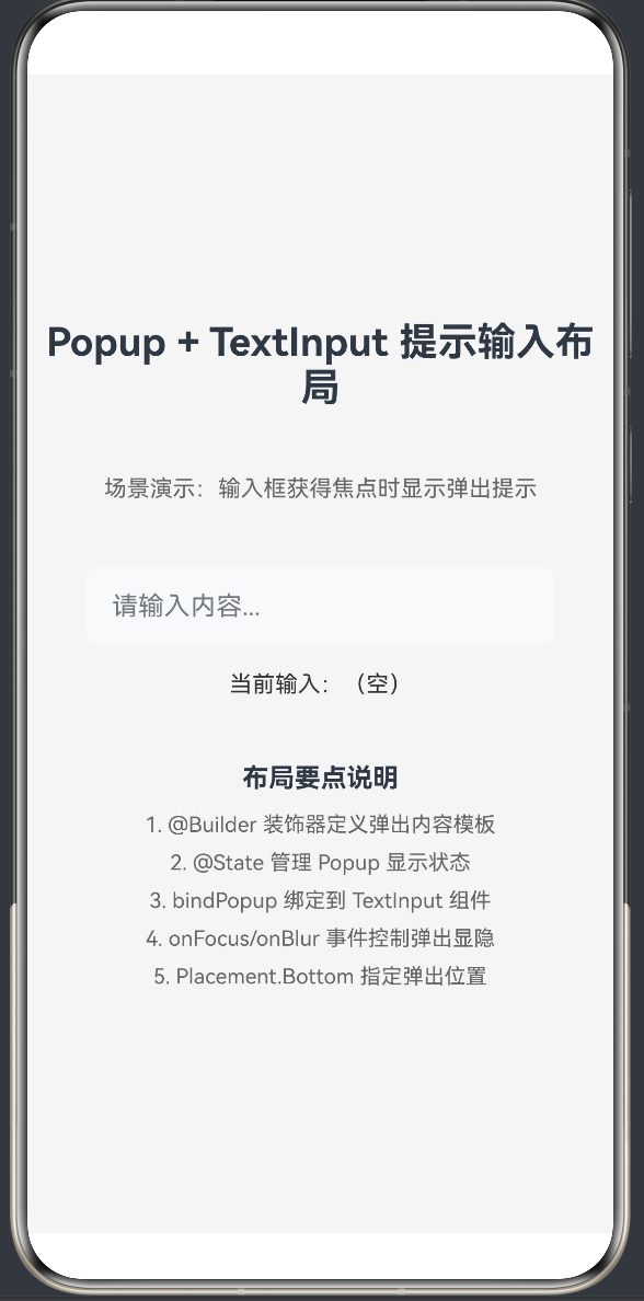
本示例实现一个带有智能提示的搜索输入框,功能包括:
- 输入框获得焦点时显示弹出提示面板
- 弹出面板包含快捷输入标签(华为、鸿蒙、ArkTS、HarmonyOS)
- 点击快捷标签自动填充到输入框
- 显示输入规则说明
- 实时显示当前输入内容
- 输入框失去焦点时自动隐藏弹出面板
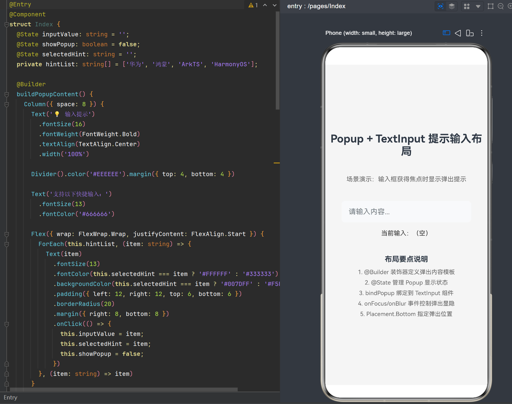
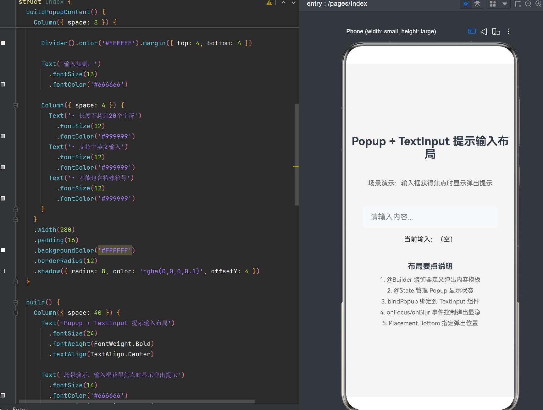
4.2 完整代码实现
typescript
@Entry
@Component
struct PopupTextInputDemo {
  @State inputValue: string = '';
  @State showPopup: boolean = false;
  @State selectedHint: string = '';
  private hintList: string[] = ['华为', '鸿蒙', 'ArkTS', 'HarmonyOS'];

  @Builder
  buildPopupContent() {
    Column({ space: 8 }) {
      Text('💡 输入提示')
        .fontSize(16)
        .fontWeight(FontWeight.Bold)
        .textAlign(TextAlign.Center)
        .width('100%')

      Divider().color('#EEEEEE').margin({ top: 4, bottom: 4 })

      Text('支持以下快捷输入:')
        .fontSize(13)
        .fontColor('#666666')

      Flex({ wrap: FlexWrap.Wrap, justifyContent: FlexAlign.Start }) {
        ForEach(this.hintList, (item: string) => {
          Text(item)
            .fontSize(13)
            .fontColor(this.selectedHint === item ? '#FFFFFF' : '#333333')
            .backgroundColor(this.selectedHint === item ? '#007DFF' : '#F5F5F5')
            .padding({ left: 12, right: 12, top: 6, bottom: 6 })
            .borderRadius(20)
            .margin({ right: 8, bottom: 8 })
            .onClick(() => {
              this.inputValue = item;
              this.selectedHint = item;
              this.showPopup = false;
            })
        }, (item: string) => item)
      }

      Divider().color('#EEEEEE').margin({ top: 4, bottom: 4 })

      Text('输入规则:')
        .fontSize(13)
        .fontColor('#666666')

      Column({ space: 4 }) {
        Text('• 长度不超过20个字符')
          .fontSize(12)
          .fontColor('#999999')
        Text('• 支持中英文输入')
          .fontSize(12)
          .fontColor('#999999')
        Text('• 不能包含特殊符号')
          .fontSize(12)
          .fontColor('#999999')
      }
    }
    .width(280)
    .padding(16)
    .backgroundColor('#FFFFFF')
    .borderRadius(12)
    .shadow({ radius: 8, color: 'rgba(0,0,0,0.1)', offsetY: 4 })
  }

  build() {
    Column({ space: 40 }) {
      Text('Popup + TextInput 提示输入布局')
        .fontSize(24)
        .fontWeight(FontWeight.Bold)
        .textAlign(TextAlign.Center)

      Text('场景演示:输入框获得焦点时显示弹出提示')
        .fontSize(14)
        .fontColor('#666666')
        .textAlign(TextAlign.Center)

      Column({ space: 16 }) {
        TextInput({ placeholder: '请输入内容...', text: this.inputValue })
          .width('80%')
          .height(48)
          .backgroundColor('#F8F9FA')
          .borderRadius(8)
          .padding({ left: 16, right: 16 })
          .fontSize(16)
          .onChange((value: string) => {
            this.inputValue = value;
          })
          .onFocus(() => {
            this.showPopup = true;
          })
          .onBlur(() => {
            setTimeout(() => {
              this.showPopup = false;
            }, 200);
          })
          .bindPopup(this.showPopup, {
            builder: this.buildPopupContent,
            placement: Placement.Bottom,
            onStateChange: (e) => {
              this.showPopup = e.isVisible;
            }
          })

        Text(`当前输入:${this.inputValue || '(空)'}`)
          .fontSize(14)
          .fontColor('#333333')
          .textAlign(TextAlign.Center)
      }
    }
    .width('100%')
    .height('100%')
    .justifyContent(FlexAlign.Center)
    .backgroundColor('#F5F5F5')
  }
}
4.3 代码解析
4.3.1 状态管理
typescript
@State inputValue: string = '';
@State showPopup: boolean = false;
@State selectedHint: string = '';
private hintList: string[] = ['华为', '鸿蒙', 'ArkTS', 'HarmonyOS'];inputValue:存储输入框的当前值,使用@State修饰实现响应式更新showPopup:控制 Popup 的显示状态,@State修饰确保状态变化时 UI 自动刷新selectedHint:记录用户选中的快捷标签,用于高亮显示hintList:快捷输入标签列表,使用private修饰表示私有属性
4.3.2 @Builder 定义弹出内容
typescript
@Builder
buildPopupContent() {
  Column({ space: 8 }) {
    // ... 弹出内容
  }
  .width(280)
  .padding(16)
  .backgroundColor('#FFFFFF')
  .borderRadius(12)
  .shadow({ radius: 8, color: 'rgba(0,0,0,0.1)', offsetY: 4 })
}
使用内部 @Builder 方法定义弹出内容的原因:
- 访问组件状态 :内部
@Builder可以访问this.inputValue、this.showPopup等状态变量 - 响应式更新:当状态变化时,Builder 内容会自动更新
- 封装性:将弹出内容逻辑封装在组件内部,保持代码整洁
4.3.3 ForEach 循环渲染快捷标签
typescript
Flex({ wrap: FlexWrap.Wrap, justifyContent: FlexAlign.Start }) {
  ForEach(this.hintList, (item: string) => {
    Text(item)
      .fontSize(13)
      .fontColor(this.selectedHint === item ? '#FFFFFF' : '#333333')
      .backgroundColor(this.selectedHint === item ? '#007DFF' : '#F5F5F5')
      .padding({ left: 12, right: 12, top: 6, bottom: 6 })
      .borderRadius(20)
      .margin({ right: 8, bottom: 8 })
      .onClick(() => {
        this.inputValue = item;
        this.selectedHint = item;
        this.showPopup = false;
      })
  }, (item: string) => item)
}
关键要点:
- 使用
Flex容器配合FlexWrap.Wrap实现标签自动换行 ForEach的第三个参数(item: string) => item是键值生成函数,确保每个标签有唯一标识- 点击标签时更新
inputValue并关闭 Popup
4.3.4 bindPopup 绑定到 TextInput
typescript
.bindPopup(this.showPopup, {
  builder: this.buildPopupContent,
  placement: Placement.Bottom,
  onStateChange: (e) => {
    this.showPopup = e.isVisible;
  }
})
绑定配置说明:
builder:指定弹出内容的@Builder方法引用placement:设置在输入框下方弹出onStateChange:监听 Popup 状态变化,同步更新showPopup状态
4.3.5 焦点事件控制显隐
typescript
.onFocus(() => {
  this.showPopup = true;
})
.onBlur(() => {
  setTimeout(() => {
    this.showPopup = false;
  }, 200);
})
设计要点:
onFocus:输入框获得焦点时显示 PopuponBlur:输入框失去焦点时延迟 200ms 关闭 Popup,避免用户点击 Popup 内的标签时误关闭
五、进阶应用场景
5.1 场景一:实时搜索建议
实现一个搜索框,用户输入时实时显示搜索建议:
typescript
@Entry
@Component
struct SearchSuggestionDemo {
  @State searchText: string = '';
  @State showPopup: boolean = false;
  @State suggestions: string[] = [];

  private mockSearchData: string[] = [
    '鸿蒙开发入门',
    'ArkTS语法教程',
    'HarmonyOS NEXT新特性',
    '华为开发者联盟',
    '鸿蒙应用市场',
    'ArkUI组件详解',
    'Stage模型实战',
    '分布式能力开发'
  ];

  filterSuggestions(input: string): string[] {
    if (!input) return [];
    return this.mockSearchData.filter(item =>
      item.includes(input)
    ).slice(0, 5);
  }

  @Builder
  buildSearchSuggestions() {
    Column({ space: 4 }) {
      ForEach(this.suggestions, (item: string) => {
        Row() {
          Image($r('app.media.search_icon'))
            .width(20)
            .height(20)
            .margin({ right: 12 })
          Text(item)
            .fontSize(14)
            .fontColor('#333333')
        }
        .width('100%')
        .padding({ left: 16, right: 16, top: 12, bottom: 12 })
        .backgroundColor('#FFFFFF')
        .onClick(() => {
          this.searchText = item;
          this.showPopup = false;
        })
      }, (item: string) => item)
    }
    .width(320)
    .backgroundColor('#FFFFFF')
    .borderRadius(12)
    .shadow({ radius: 8, color: 'rgba(0,0,0,0.1)' })
  }

  build() {
    Column({ space: 20 }) {
      TextInput({ placeholder: '搜索...', text: this.searchText })
        .width('90%')
        .height(48)
        .backgroundColor('#FFFFFF')
        .borderRadius(24)
        .padding({ left: 20, right: 20 })
        .fontSize(16)
        .onChange((value: string) => {
          this.searchText = value;
          this.suggestions = this.filterSuggestions(value);
          if (this.suggestions.length > 0) {
            this.showPopup = true;
          }
        })
        .onFocus(() => {
          this.suggestions = this.filterSuggestions(this.searchText);
          if (this.suggestions.length > 0) {
            this.showPopup = true;
          }
        })
        .onBlur(() => {
          setTimeout(() => {
            this.showPopup = false;
          }, 200);
        })
        .bindPopup(this.showPopup, {
          builder: this.buildSearchSuggestions,
          placement: Placement.Bottom,
          enableArrow: false,
          onStateChange: (e) => {
            this.showPopup = e.isVisible;
          }
        })
    }
    .width('100%')
    .height('100%')
    .justifyContent(FlexAlign.Start)
    .padding({ top: 60 })
    .backgroundColor('#F5F5F5')
  }
}
核心改进:
- 实时过滤:根据用户输入实时过滤搜索建议
- 动态显示:只有当有搜索建议时才显示 Popup
- 图标配合:搜索建议前添加搜索图标,提升视觉效果
- 无边距设计:去掉 Popup 内边距,使建议列表更紧凑
5.2 场景二:输入验证与错误提示
实现一个表单输入框,实时验证输入并显示错误提示:
typescript
@Entry
@Component
struct InputValidationDemo {
  @State phoneNumber: string = '';
  @State showPopup: boolean = false;
  @State validationError: string = '';

  validatePhone(input: string): string {
    if (!input) return '';
    if (input.length < 11) return '手机号必须为11位';
    if (!/^1[3-9]\d{9}$/.test(input)) return '请输入有效的手机号';
    return '';
  }

  @Builder
  buildValidationPopup() {
    Column({ space: 8 }) {
      if (this.validationError) {
        Row() {
          Image($r('app.media.error_icon'))
            .width(20)
            .height(20)
            .margin({ right: 8 })
          Text(this.validationError)
            .fontSize(14)
            .fontColor('#FF4D4F')
        }
      } else {
        Row() {
          Image($r('app.media.success_icon'))
            .width(20)
            .height(20)
            .margin({ right: 8 })
          Text('✓ 输入格式正确')
            .fontSize(14)
            .fontColor('#52C41A')
        }
      }

      Divider().color('#EEEEEE').margin({ top: 8, bottom: 8 })

      Column({ space: 4 }) {
        Text('输入提示:')
          .fontSize(13)
          .fontWeight(FontWeight.Bold)
          .fontColor('#666666')
        Text('• 请输入11位手机号码')
          .fontSize(12)
          .fontColor('#999999')
        Text('• 以1开头,第二位为3-9')
          .fontSize(12)
          .fontColor('#999999')
      }
    }
    .width(280)
    .padding(16)
    .backgroundColor('#FFFFFF')
    .borderRadius(12)
    .shadow({ radius: 8, color: 'rgba(0,0,0,0.1)' })
  }

  build() {
    Column({ space: 20 }) {
      Text('手机号验证')
        .fontSize(20)
        .fontWeight(FontWeight.Bold)

      TextInput({ placeholder: '请输入手机号', text: this.phoneNumber })
        .width('80%')
        .height(48)
        .backgroundColor('#FFFFFF')
        .borderRadius(8)
        .padding({ left: 16, right: 16 })
        .fontSize(16)
        .type(InputType.PhoneNumber)
        .onChange((value: string) => {
          this.phoneNumber = value;
          this.validationError = this.validatePhone(value);
        })
        .onFocus(() => {
          this.showPopup = true;
        })
        .onBlur(() => {
          setTimeout(() => {
            this.showPopup = false;
          }, 200);
        })
        .bindPopup(this.showPopup, {
          builder: this.buildValidationPopup,
          placement: Placement.Bottom,
          onStateChange: (e) => {
            this.showPopup = e.isVisible;
          }
        })

      Button('提交')
        .width('80%')
        .height(48)
        .backgroundColor(this.validationError ? '#CCCCCC' : '#007DFF')
        .fontColor('#FFFFFF')
        .fontSize(16)
        .borderRadius(8)
        .enabled(!this.validationError && this.phoneNumber.length === 11)
        .onClick(() => {
          // 提交逻辑
        })
    }
    .width('100%')
    .height('100%')
    .justifyContent(FlexAlign.Center)
    .backgroundColor('#F5F5F5')
  }
}
核心改进:
- 实时验证:每次输入变化时进行格式验证
- 错误状态:根据验证结果显示不同的提示样式
- 按钮联动:根据验证结果控制提交按钮的可用性
- 输入类型 :使用
InputType.PhoneNumber限制输入类型
5.3 场景三:历史记录选择
实现一个输入框,显示用户之前的输入历史:
typescript
@Entry
@Component
struct HistoryInputDemo {
  @State inputText: string = '';
  @State showPopup: boolean = false;
  @State historyList: string[] = [];

  aboutToAppear() {
    this.loadHistory();
  }

  loadHistory() {
    this.historyList = ['华为', '鸿蒙', 'ArkTS', 'HarmonyOS NEXT'];
  }

  saveToHistory(text: string) {
    if (!text) return;
    const index = this.historyList.indexOf(text);
    if (index > -1) {
      this.historyList.splice(index, 1);
    }
    this.historyList.unshift(text);
    if (this.historyList.length > 10) {
      this.historyList.pop();
    }
  }

  @Builder
  buildHistoryPopup() {
    Column({ space: 0 }) {
      Row() {
        Text('搜索历史')
          .fontSize(14)
          .fontWeight(FontWeight.Bold)
          .fontColor('#333333')
        Text('清空')
          .fontSize(13)
          .fontColor('#007DFF')
          .margin({ left: 12 })
          .onClick(() => {
            this.historyList = [];
            this.showPopup = false;
          })
      }
      .width('100%')
      .padding({ left: 16, right: 16, top: 16, bottom: 12 })

      Divider().color('#EEEEEE')

      Column({ space: 0 }) {
        ForEach(this.historyList, (item: string) => {
          Row() {
            Image($r('app.media.history_icon'))
              .width(18)
              .height(18)
              .margin({ right: 12 })
            Text(item)
              .fontSize(14)
              .fontColor('#666666')
          }
          .width('100%')
          .padding({ left: 16, right: 16, top: 12, bottom: 12 })
          .onClick(() => {
            this.inputText = item;
            this.showPopup = false;
          })
        }, (item: string) => item)
      }
    }
    .width(320)
    .backgroundColor('#FFFFFF')
    .borderRadius(12)
    .shadow({ radius: 8, color: 'rgba(0,0,0,0.1)' })
  }

  build() {
    Column({ space: 20 }) {
      TextInput({ placeholder: '搜索历史', text: this.inputText })
        .width('90%')
        .height(48)
        .backgroundColor('#FFFFFF')
        .borderRadius(8)
        .padding({ left: 16, right: 16 })
        .fontSize(16)
        .onChange((value: string) => {
          this.inputText = value;
        })
        .onFocus(() => {
          if (this.historyList.length > 0) {
            this.showPopup = true;
          }
        })
        .onBlur(() => {
          setTimeout(() => {
            this.showPopup = false;
            this.saveToHistory(this.inputText);
          }, 200);
        })
        .bindPopup(this.showPopup, {
          builder: this.buildHistoryPopup,
          placement: Placement.Bottom,
          enableArrow: false,
          onStateChange: (e) => {
            this.showPopup = e.isVisible;
          }
        })
    }
    .width('100%')
    .height('100%')
    .justifyContent(FlexAlign.Start)
    .padding({ top: 60 })
    .backgroundColor('#F5F5F5')
  }
}
核心改进:
- 历史加载 :在
aboutToAppear生命周期中加载历史记录 - 历史保存:失去焦点时自动保存当前输入到历史
- 历史管理:支持清空历史,限制历史记录数量
- 置顶显示:新输入的内容自动置顶
六、样式定制与视觉优化
6.1 Popup 样式配置
6.1.1 背景色与圆角
typescript
.bindPopup(this.showPopup, {
  builder: this.buildPopupContent,
  popupColor: '#FFFFFF',
  // 注意:popupColor 需要配合 backgroundBlurStyle 使用才能生效
})
正确的背景色设置方式:
typescript
@Builder
buildPopupContent() {
  Column() {
    // 内容
  }
  .backgroundColor('#FFFFFF')
  .borderRadius(12)
}
推荐做法 :直接在 @Builder 内部的根容器上设置背景色和圆角,比通过 popupColor 属性更可靠。
6.1.2 阴影效果
typescript
@Builder
buildPopupContent() {
  Column() {
    // 内容
  }
  .shadow({
    radius: 8,
    color: 'rgba(0, 0, 0, 0.1)',
    offsetX: 0,
    offsetY: 4
  })
}
阴影参数说明:
| 参数 | 说明 |
|---|---|
| radius | 阴影模糊半径,值越大阴影越模糊 |
| color | 阴影颜色,支持 RGBA 格式 |
| offsetX | 阴影水平偏移量 |
| offsetY | 阴影垂直偏移量 |
6.1.3 箭头控制
typescript
.bindPopup(this.showPopup, {
  builder: this.buildPopupContent,
  enableArrow: true,           // 是否显示箭头
  arrowOffset: 20,             // 箭头偏移量
  placement: Placement.Bottom  // 箭头指向下方
})
箭头显示规则:
- 当
enableArrow为true时,Popup 会自动显示一个指向目标组件的箭头 - 箭头位置会根据
placement属性自动调整 arrowOffset控制箭头在 Popup 边缘的位置
6.1.4 遮罩层
typescript
.bindPopup(this.showPopup, {
  builder: this.buildPopupContent,
  mask: { color: 'rgba(0, 0, 0, 0.3)' }  // 半透明遮罩
})
遮罩层配置:
| 值 | 说明 |
|---|---|
| false | 不显示遮罩层 |
| true | 显示透明遮罩层 |
| { color: '#33000000' } | 显示指定颜色的遮罩层 |
6.2 TextInput 样式优化
6.2.1 输入框样式
typescript
TextInput({ placeholder: '请输入内容...', text: this.inputValue })
  .width('80%')
  .height(48)
  .backgroundColor('#F8F9FA')
  .borderRadius(8)
  .padding({ left: 16, right: 16 })
  .fontSize(16)
推荐尺寸规范:
- 输入框高度:44-52px(符合移动端设计规范)
- 内边距:左右各 16px,保证文字与边框的距离
- 圆角:8-16px,根据设计风格调整
6.2.2 焦点状态样式
typescript
TextInput({ placeholder: '请输入内容...', text: this.inputValue })
  .width('80%')
  .height(48)
  .backgroundColor(this.isFocused ? '#FFFFFF' : '#F8F9FA')
  .border({
    width: this.isFocused ? 2 : 0,
    color: this.isFocused ? '#007DFF' : 'transparent',
    radius: 8
  })
  .onFocus(() => {
    this.isFocused = true;
    this.showPopup = true;
  })
  .onBlur(() => {
    this.isFocused = false;
    setTimeout(() => {
      this.showPopup = false;
    }, 200);
  })
焦点状态优化:
- 获得焦点时背景色变为白色
- 获得焦点时显示蓝色边框
- 通过
@State isFocused变量管理焦点状态
七、状态管理与交互设计
7.1 状态管理最佳实践
7.1.1 使用 @State 管理本地状态
typescript
@State inputValue: string = '';
@State showPopup: boolean = false;
@State selectedHint: string = '';
@State 特点:
- 用于管理组件内部的可变状态
- 状态变化时自动触发组件重新渲染
- 只能在组件内部访问和修改
7.1.2 使用 @Link 实现父子组件状态同步
当 Popup 内容复杂时,可以将其抽离为独立组件:
typescript
@Component
struct PopupContent {
  @Link inputValue: string;
  @Link showPopup: boolean;
  @Link selectedHint: string;
  private hintList: string[];

  build() {
    Column({ space: 8 }) {
      ForEach(this.hintList, (item: string) => {
        Text(item)
          .onClick(() => {
            this.inputValue = item;
            this.selectedHint = item;
            this.showPopup = false;
          })
      }, (item: string) => item)
    }
  }
}

@Entry
@Component
struct MainPage {
  @State inputValue: string = '';
  @State showPopup: boolean = false;
  @State selectedHint: string = '';
  private hintList: string[] = ['华为', '鸿蒙', 'ArkTS'];

  @Builder
  buildPopup() {
    PopupContent({
      inputValue: $inputValue,
      showPopup: $showPopup,
      selectedHint: $selectedHint,
      hintList: this.hintList
    })
  }

  build() {
    Column() {
      TextInput({ text: this.inputValue })
        .bindPopup(this.showPopup, {
          builder: this.buildPopup,
          placement: Placement.Bottom
        })
    }
  }
}
@Link 特点:
- 用于父子组件间的双向状态同步
- 子组件可以修改父组件传递的状态
- 使用
$语法传递状态引用
7.2 交互设计模式
7.2.1 焦点驱动显示
typescript
.onFocus(() => {
  this.showPopup = true;
})
.onBlur(() => {
  setTimeout(() => {
    this.showPopup = false;
  }, 200);
})
设计原理:
- 用户点击输入框获得焦点时,自动显示提示 Popup
- 用户点击其他区域失去焦点时,延迟关闭 Popup
- 200ms 延迟是为了让用户能够点击 Popup 内的交互元素
7.2.2 输入内容驱动显示
typescript
.onChange((value: string) => {
  this.inputValue = value;
  this.suggestions = this.filterSuggestions(value);
  this.showPopup = this.suggestions.length > 0;
})
设计原理:
- 根据用户输入内容动态显示或隐藏 Popup
- 只有当有匹配的建议时才显示 Popup
- 输入为空时自动隐藏 Popup
7.2.3 点击外部自动关闭
typescript
.bindPopup(this.showPopup, {
  builder: this.buildPopupContent,
  autoCancel: true,
  onStateChange: (e) => {
    this.showPopup = e.isVisible;
  }
})
设计原理:
autoCancel: true允许点击 Popup 外部区域自动关闭onStateChange回调确保状态变量与实际显示状态同步
八、性能优化策略
8.1 避免不必要的重新渲染
8.1.1 使用 @Builder 缓存内容
typescript
@Builder
buildPopupContent() {
  // Popup 内容只在状态变化时重新构建
}
优化原理:
@Builder方法只会在依赖的状态变化时重新执行- 避免在
build()方法中直接定义复杂的 UI 结构
8.1.2 合理使用 ForEach 键值生成函数
typescript
ForEach(this.hintList, (item: string) => {
  Text(item)
}, (item: string) => item)  // 使用 item 作为唯一键值
优化原理:
- 键值生成函数用于标识每个列表项的唯一性
- 当列表数据变化时,框架根据键值判断是否需要重新创建组件
- 使用稳定的唯一标识(如 item 本身)比使用索引更高效
8.2 控制 Popup 显示时机
8.2.1 延迟显示
typescript
.onFocus(() => {
  setTimeout(() => {
    this.showPopup = true;
  }, 100);
})
优化原理:
- 延迟 100ms 显示 Popup,避免快速点击时的闪烁
- 给用户一个短暂的反应时间
8.2.2 条件显示
typescript
.onChange((value: string) => {
  this.inputValue = value;
  if (value.length >= 2) {
    this.showPopup = true;
  } else {
    this.showPopup = false;
  }
})
优化原理:
- 只有当输入内容达到一定长度时才显示建议
- 减少不必要的 Popup 显示和隐藏操作
8.3 内存管理
8.3.1 及时清理状态
typescript
aboutToDisappear() {
  this.showPopup = false;
}
优化原理:
- 在组件销毁前确保 Popup 已关闭
- 避免内存泄漏和状态残留
8.3.2 避免过多状态变量
typescript
// 不推荐:使用多个独立状态变量
@State showPopup1: boolean = false;
@State showPopup2: boolean = false;
@State showPopup3: boolean = false;

// 推荐:使用对象或枚举管理状态
@State popupState: PopupState = PopupState.None;

enum PopupState {
  None,
  Suggestions,
  History,
  Validation
}
优化原理:
- 使用枚举或对象管理相关状态,减少状态变量数量
- 提高代码可读性和维护性
九、常见问题与解决方案
9.1 问题一:Popup 显示位置不正确
现象: Popup 显示在错误的位置,或者显示不完整
原因分析:
- Popup 在页面构建过程中就被设置为显示
- 目标组件的布局还未确定
- 屏幕边缘导致 Popup 被裁剪
解决方案:
typescript
// 避免在 aboutToAppear 中直接显示 Popup
aboutToAppear() {
  // 错误做法
  // this.showPopup = true;

  // 正确做法:延迟显示或等待用户交互
}

// 使用 onStateChange 同步状态
.onFocus(() => {
  this.showPopup = true;
})
.bindPopup(this.showPopup, {
  builder: this.buildPopupContent,
  onStateChange: (e) => {
    this.showPopup = e.isVisible;
  }
})
9.2 问题二:点击 Popup 内部元素时 Popup 关闭
现象: 用户点击 Popup 内的按钮或标签时,Popup 立即关闭
原因分析:
onBlur事件在点击 Popup 时触发onBlur中直接设置showPopup = false,没有延迟
解决方案:
typescript
.onBlur(() => {
  // 添加延迟,让用户有时间点击 Popup 内的元素
  setTimeout(() => {
    this.showPopup = false;
  }, 200);
})
9.3 问题三:Popup 内容不更新
现象: 状态变化后,Popup 内容没有更新
原因分析:
- 使用了全局
@Builder,无法访问组件内部状态 @Builder方法中没有正确引用状态变量
解决方案:
typescript
// 使用内部 @Builder 方法
@Builder
buildPopupContent() {
  Column() {
    Text(this.inputValue)  // 直接引用组件状态
  }
}
9.4 问题四:TextInput 输入时键盘遮挡 Popup
现象: 软键盘弹出后,Popup 被键盘遮挡
原因分析:
- Popup 位置是基于输入框计算的
- 键盘弹出后页面布局发生变化
- Popup 没有自动调整位置
解决方案:
typescript
.bindPopup(this.showPopup, {
  builder: this.buildPopupContent,
  placement: Placement.Top,  // 改为上方弹出
  showInSubWindow: true      // 在子窗口显示,避免被遮挡
})
9.5 问题五:ArkTS 编译器报错
现象: 编译时出现 Property 'bindPopover' does not exist 错误
原因分析:
- 使用了错误的 API 名称(
bindPopover) - 正确的 API 名称是
bindPopup
解决方案:
typescript
// 错误写法
.bindPopover(this.showPopup, { ... })

// 正确写法
.bindPopup(this.showPopup, { ... })
9.6 问题六:ForEach 语法错误
现象: 编译时出现 does not meet UI component syntax 错误
原因分析:
- 在 UI 组件中使用了 JavaScript 的
forEach方法 - ArkTS 需要使用
ForEach组件进行循环渲染
解决方案:
typescript
// 错误写法
['华为', '鸿蒙'].forEach((item) => {
  Text(item)
})

// 正确写法
ForEach(['华为', '鸿蒙'], (item: string) => {
  Text(item)
}, (item: string) => item)
9.7 问题七:对象字面量类型声明错误
现象: 编译时出现 Object literals cannot be used as type declarations 错误
原因分析:
- 在回调函数参数中使用了对象字面量类型注解
- ArkTS 不允许使用
(e: { isVisible: boolean })这种语法
解决方案:
typescript
// 错误写法
onStateChange: (e: { isVisible: boolean }) => {
  this.showPopup = e.isVisible;
}

// 正确写法:移除类型注解,让编译器自动推断
onStateChange: (e) => {
  this.showPopup = e.isVisible;
}
十、总结与最佳实践
10.1 核心要点回顾
- API 名称 :使用
bindPopup,而非bindPopover - 状态管理 :使用
@State管理 Popup 显示状态 - 内容定义 :使用
@Builder装饰器定义 Popup 内容 - 循环渲染 :使用
ForEach组件进行列表渲染 - 类型注解:避免使用对象字面量作为类型声明
10.2 最佳实践清单
| 实践项 | 推荐做法 | 不推荐做法 |
|---|---|---|
| API 调用 | .bindPopup(show, { builder, placement }) |
.bindPopover(...) |
| 状态控制 | 使用 @State showPopup: boolean |
直接操作 DOM |
| 内容定义 | 内部 @Builder 方法 |
全局 @Builder(无法访问状态) |
| 列表渲染 | ForEach(arr, callback, keyGenerator) |
JavaScript forEach |
| 焦点处理 | onFocus 显示 + onBlur 延迟隐藏 |
直接在构建时显示 |
| 状态同步 | onStateChange 回调同步状态 |
忽略状态变化 |
| 箭头控制 | 根据场景决定是否显示 | 始终显示或始终隐藏 |
| 性能优化 | 条件显示 + 延迟显示 | 无条件实时显示 |
10.3 适用场景推荐
| 场景 | 推荐方案 |
|---|---|
| 搜索建议 | Popup + 实时过滤 |
| 快捷选择 | Popup + 标签列表 |
| 输入验证 | Popup + 动态提示 |
| 历史记录 | Popup + 本地存储 |
| 功能引导 | Popup + 步骤说明 |
10.4 未来展望
随着 HarmonyOS NEXT 的不断发展,Popup 组件将会支持更多高级功能:
- 动画效果:弹出和收起时的过渡动画
- 手势支持:滑动关闭、拖拽定位
- 响应式布局:根据屏幕尺寸自动调整大小和位置
- 模板化:提供更多预设的 Popup 模板
附录:完整代码示例
以下是本文中使用的完整代码示例:
A.1 基础示例代码
typescript
@Entry
@Component
struct PopupTextInputDemo {
  @State inputValue: string = '';
  @State showPopup: boolean = false;
  @State selectedHint: string = '';
  private hintList: string[] = ['华为', '鸿蒙', 'ArkTS', 'HarmonyOS'];

  @Builder
  buildPopupContent() {
    Column({ space: 8 }) {
      Text('💡 输入提示')
        .fontSize(16)
        .fontWeight(FontWeight.Bold)
        .textAlign(TextAlign.Center)
        .width('100%')

      Divider().color('#EEEEEE').margin({ top: 4, bottom: 4 })

      Text('支持以下快捷输入:')
        .fontSize(13)
        .fontColor('#666666')

      Flex({ wrap: FlexWrap.Wrap, justifyContent: FlexAlign.Start }) {
        ForEach(this.hintList, (item: string) => {
          Text(item)
            .fontSize(13)
            .fontColor(this.selectedHint === item ? '#FFFFFF' : '#333333')
            .backgroundColor(this.selectedHint === item ? '#007DFF' : '#F5F5F5')
            .padding({ left: 12, right: 12, top: 6, bottom: 6 })
            .borderRadius(20)
            .margin({ right: 8, bottom: 8 })
            .onClick(() => {
              this.inputValue = item;
              this.selectedHint = item;
              this.showPopup = false;
            })
        }, (item: string) => item)
      }

      Divider().color('#EEEEEE').margin({ top: 4, bottom: 4 })

      Text('输入规则:')
        .fontSize(13)
        .fontColor('#666666')

      Column({ space: 4 }) {
        Text('• 长度不超过20个字符')
          .fontSize(12)
          .fontColor('#999999')
        Text('• 支持中英文输入')
          .fontSize(12)
          .fontColor('#999999')
        Text('• 不能包含特殊符号')
          .fontSize(12)
          .fontColor('#999999')
      }
    }
    .width(280)
    .padding(16)
    .backgroundColor('#FFFFFF')
    .borderRadius(12)
    .shadow({ radius: 8, color: 'rgba(0,0,0,0.1)', offsetY: 4 })
  }

  build() {
    Column({ space: 40 }) {
      Text('Popup + TextInput 提示输入布局')
        .fontSize(24)
        .fontWeight(FontWeight.Bold)
        .textAlign(TextAlign.Center)

      Text('场景演示:输入框获得焦点时显示弹出提示')
        .fontSize(14)
        .fontColor('#666666')
        .textAlign(TextAlign.Center)

      Column({ space: 16 }) {
        TextInput({ placeholder: '请输入内容...', text: this.inputValue })
          .width('80%')
          .height(48)
          .backgroundColor('#F8F9FA')
          .borderRadius(8)
          .padding({ left: 16, right: 16 })
          .fontSize(16)
          .onChange((value: string) => {
            this.inputValue = value;
          })
          .onFocus(() => {
            this.showPopup = true;
          })
          .onBlur(() => {
            setTimeout(() => {
              this.showPopup = false;
            }, 200);
          })
          .bindPopup(this.showPopup, {
            builder: this.buildPopupContent,
            placement: Placement.Bottom,
            onStateChange: (e) => {
              this.showPopup = e.isVisible;
            }
          })

        Text(`当前输入:${this.inputValue || '(空)'}`)
          .fontSize(14)
          .fontColor('#333333')
          .textAlign(TextAlign.Center)
      }
    }
    .width('100%')
    .height('100%')
    .justifyContent(FlexAlign.Center)
    .backgroundColor('#F5F5F5')
  }
}
A.2 关键 API 参考
| API | 说明 |
|---|---|
bindPopup(show, options) |
绑定 Popup 气泡到组件 |
@Builder |
声明式构建 UI 片段 |
ForEach(arr, callback, keyGenerator) |
循环渲染组件列表 |
@State |
管理组件内部状态 |
@Link |
父子组件状态双向同步 |
TextInput |
文本输入组件 |
Placement |
Popup 弹出位置枚举 |