文章目录
-
- 前言
- 一、六个参数可以沿着两条线理解
- 二、用同一张卡片完成整轮参数实验
-
- 先确认应用级状态
- 一张状态对象负责替换材质
- 第一步先看基础材质
- [第二步打开 materialColor](#第二步打开 materialColor)
- [第三步检查 colorInvert](#第三步检查 colorInvert)
- [第四步切换 applyShadow](#第四步切换 applyShadow)
- [第五步单独打开 interactive](#第五步单独打开 interactive)
- [第六步加入 lightEffect](#第六步加入 lightEffect)
- 三、把参数组合带回现有项目
- 总结
- 完整代码
前言
沉浸材质真正开始难调,通常出现在参数从一个变成一组之后。
一张卡片可以同时设置材质样式、材质赋色、自动反色、系统阴影、按压形变和触点光感。所有参数一起打开,页面看起来会更丰富,可一旦某个效果没有达到预期,大家很难马上判断问题出在颜色、阴影还是交互反馈上。
我第一次集中测试这些参数时,也经历过这种混乱。卡片颜色变了,文字对比度也跟着变化;按下卡片以后,形变和光感又同时出现。页面能够运行,却很难说清每个参数究竟做了什么。
后来我把它改成了一张可以反复操作的实验页面。卡片的位置、尺寸、圆角和背景始终不变,页面只通过开关替换材质参数。先看颜色、文字和阴影,再按住卡片观察形变,最后移动触点检查光感。每次只增加一个变量,页面上的变化也更容易解释。
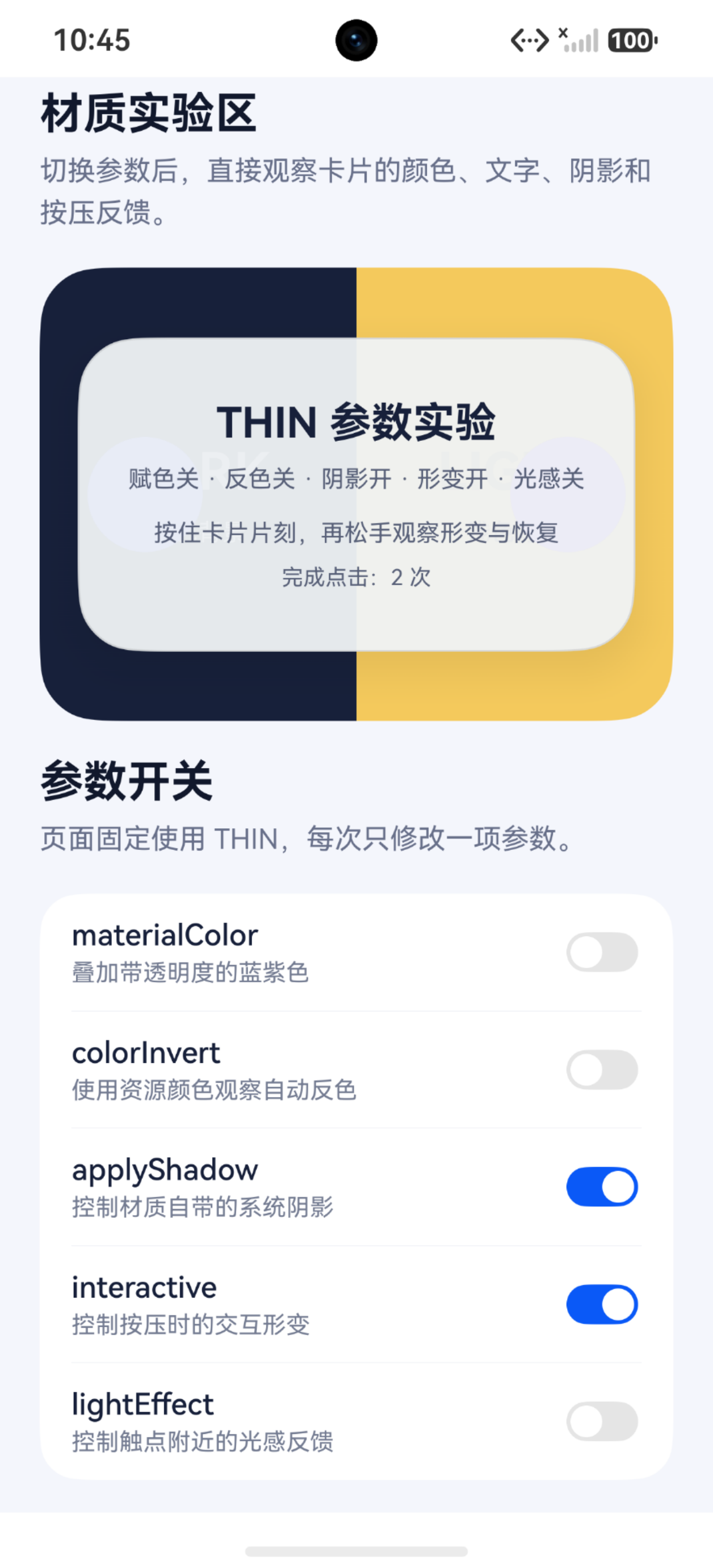
当前实验固定使用 THIN 材质,并让卡片同时覆盖深色与浅色背景。卡片内部会显示当前参数状态,下方则提供五个开关和两个光感颜色选项。大家可以直接在页面中完成整轮实验,无需准备多组 Demo。
目前我的测试设备还没有 HarmonyOS 7 实机测试权限,因此当前页面先在模拟器中运行。模拟器适合核对接口、开关和基础显示;按压形变、触点光感及其响应节奏仍需要在具备权限的真机上复核。
一、六个参数可以沿着两条线理解
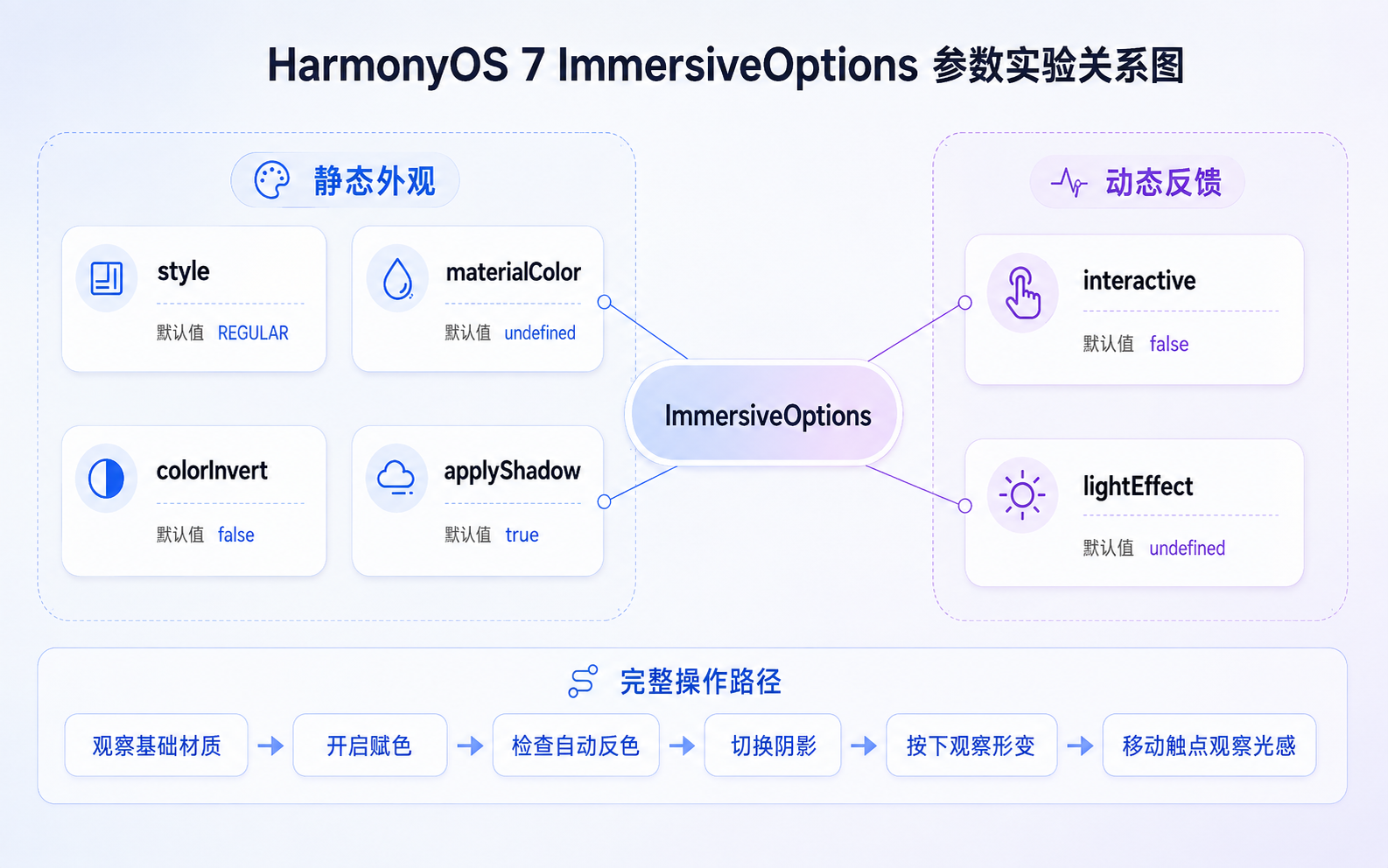
ImmersiveMaterial 的构造函数接收 ImmersiveOptions。当前可以配置 style、materialColor、colorInvert、applyShadow、interactive 和 lightEffect。
没有传入参数时,系统会使用下面这组默认值:
ts
{
  style: uiMaterial.ImmersiveStyle.REGULAR,
  materialColor: undefined,
  colorInvert: false,
  applyShadow: true,
  interactive: false,
  lightEffect: undefined
}
因此,一个没有额外配置的 ImmersiveMaterial 会使用 REGULAR 样式和系统材质阴影,赋色、自动反色、按压形变与触点光感则保持关闭。
六个参数放在一起时容易显得杂乱。按照它们在页面中的作用,可以先分成静态外观和动态反馈两组。
| 参数 | 默认值 | 页面中的作用 | 实验时怎样观察 |
|---|---|---|---|
style |
REGULAR |
决定材质的整体样式 | 保持背景不变,切换样式 |
materialColor |
undefined |
改变材质整体色调 | 来回切换赋色开关 |
colorInvert |
false |
调整子树中的文字和图标颜色 | 让卡片横跨深浅背景 |
applyShadow |
true |
影响卡片与背景之间的层级 | 观察圆角四周和下方 |
interactive |
false |
提供按压时的交互形变 | 按下、保持,然后松开 |
lightEffect |
undefined |
提供触点附近的光感反馈 | 按住卡片并缓慢移动触点 |
前四项主要改变组件停留在页面上的状态,后两项发生在操作过程中。实验顺序也可以顺着这两条线展开:先把颜色、文字和阴影看清楚,再加入按压形变与触点光感。
当前页面统一使用 THIN,主要是为了满足自动反色的条件。colorInvert 需要使用 THIN 或 ULTRA_THIN,文字和图标还要通过 $r() 等资源接口设置颜色。直接写入 Color.White 或十六进制颜色时,自动反色不会按照资源颜色的路径生效。
把这些前提固定以后,页面中的主要变量就只剩五个开关和一个光感颜色。大家可以沿着同一套背景逐项操作,参数之间也不会互相遮挡。
二、用同一张卡片完成整轮参数实验
参数分组以后,页面结构还要尽量稳定。
每项参数使用一张独立卡片时,组件的位置、背景和尺寸也会随之变化。最后看到的差异可能同时来自材质参数和页面布局,很难继续判断。
当前页面只保留一张材质卡片。它横跨深蓝色和浅黄色两块背景,位置、尺寸和圆角始终不变。所有开关只负责重新创建卡片使用的 ImmersiveMaterial。
先确认应用级状态
页面启动后先调用 getMaterialInfo(),读取当前应用的材质状态:
ts
private loadMaterialState(): void {
  const info: uiMaterial.MaterialInfo =
    uiMaterial.getMaterialInfo();

  this.materialStateText =
    this.getMaterialStateName(info.state);

  this.stateColor =
    this.getMaterialStateColor(info.state);
}
页面读取到 DISABLE 时,应用中的沉浸式系统材质会被关闭。此时继续切换其他参数,也不会显示对应材质效果。DEFAULT 和 ENABLE 都允许普通组件主动设置材质。
所以,开始实验前可以先看页面顶部的 MaterialState。这个步骤很简单,却能避免把应用级配置问题误判成参数问题。
一张状态对象负责替换材质
页面通过 @State 保存当前材质:
ts
@State private currentMaterial: uiMaterial.Material =
  new uiMaterial.ImmersiveMaterial({
    style: uiMaterial.ImmersiveStyle.THIN
});任意开关发生变化后,refreshMaterial() 都会按照当前参数重新创建一个 ImmersiveMaterial。
关闭 materialColor 时,代码直接省略这个字段,让它保持 undefined。关闭 lightEffect 时,也会省略整个光感配置。这样可以保留接口的默认状态,无需使用临时颜色或空对象模拟关闭。
ts
private refreshMaterial(): void {
  if (this.tintEnabled) {
    this.currentMaterial =
      new uiMaterial.ImmersiveMaterial({
        style: uiMaterial.ImmersiveStyle.THIN,
        materialColor: '#665B7CFF',
        colorInvert: this.colorInvertEnabled,
        applyShadow: this.applyShadowEnabled,
        interactive: this.interactiveEnabled
      });
    return;
  }

  this.currentMaterial =
    new uiMaterial.ImmersiveMaterial({
      style: uiMaterial.ImmersiveStyle.THIN,
      colorInvert: this.colorInvertEnabled,
      applyShadow: this.applyShadowEnabled,
      interactive: this.interactiveEnabled
    });
}
第一步先看基础材质
实验开始时,页面保持下面这组状态:
text
style = THIN
materialColor = undefined
colorInvert = false
applyShadow = true
interactive = false
lightEffect = undefined
这组配置相当于整轮实验的基准。大家可以先观察深浅背景透过卡片后的表现,再看圆角四周和卡片下方有没有系统阴影。
基础状态确认后,后面的每一步都只改变一个参数。
第二步打开 materialColor
materialColor 会在材质滤镜上继续混合一层颜色。它可以给搜索框、工具栏或操作卡片加入轻量的品牌色。
颜色需要保留透明度。完全不透明的颜色会遮住材质滤镜,组件容易变成一块普通色板。官方常见问题建议为 materialColor 传入带透明度的颜色。
当前实验使用下面的蓝紫色:
ts
new uiMaterial.ImmersiveMaterial({
  style: uiMaterial.ImmersiveStyle.THIN,
  materialColor: '#665B7CFF'
});
打开开关以后,可以观察卡片整体色调有没有变化,同时看左右两侧的背景还能保留多少信息。
背景仍然能够透出,说明材质还保留着原来的空间关系。颜色明显盖住背景文字和分区以后,可以在实际项目中继续降低 alpha。
赋色观察完成后,再关闭 materialColor。深浅背景恢复清楚,下一步查看文字变化会更容易。
第三步检查 colorInvert
colorInvert 用于让材质节点子树中的文字和图标根据背景调整颜色。搜索框、悬浮工具栏和跨越图片内容的浮动操作区,都可能用到这项能力。
自动反色需要同时满足几个条件:
- 材质使用
THIN或ULTRA_THIN。 - 文字与图标颜色通过资源接口设置。
- 卡片下方存在明显的明暗变化。
- 系统沉浸光感强度会影响反色触发阈值。
REGULAR、THICK 和 ULTRA_THICK 不会进入相同的自动反色路径,硬编码颜色也不会触发相同的适配逻辑。
页面中的文字使用资源颜色:
ts
Text('THIN 参数实验')
  .fontColor($r('app.color.material_demo_text'))
材质对象再打开自动反色:
ts
new uiMaterial.ImmersiveMaterial({
  style: uiMaterial.ImmersiveStyle.THIN,
  colorInvert: true
});
切换开关以后,可以直接观察标题和参数摘要在深色、浅色两侧的表现。
当前模拟器中没有出现明显变化时,大家可以依次检查材质样式、资源颜色和系统沉浸光感强度。上述条件都满足以后,仍然可以在具备权限的真机上继续复核。
第四步切换 applyShadow
applyShadow 默认开启,系统会为沉浸材质提供阴影。
组件已经设置 .shadow() 时,两套阴影可能叠加,卡片边缘容易显得偏重。项目已有统一阴影体系时,可以关闭系统材质阴影,继续使用原来的组件阴影。
ts
new uiMaterial.ImmersiveMaterial({
  style: uiMaterial.ImmersiveStyle.THIN,
  applyShadow: false
});
当前实验没有增加自定义阴影。切换 applyShadow 时,只需要观察卡片下方、左右边缘和圆角区域。
阴影关闭以后,卡片与背景之间的距离感可能减弱。模拟器中的差异较小时,也可以直接回到基础状态来回切换,两种状态之间会更容易比较。
第五步单独打开 interactive
静态外观确认以后,可以保持 lightEffect 关闭,只打开 interactive。
interactive 用于启用系统提供的交互形变。按下组件、保持片刻再松开,可以观察卡片在操作过程中的变化。
ts
new uiMaterial.ImmersiveMaterial({
  style: uiMaterial.ImmersiveStyle.THIN,
  interactive: true
});
操作顺序可以保持简单:
text
按下卡片
↓
保持片刻
↓
松开
页面中的点击次数只能确认组件已经接收到操作。形变的幅度和恢复过程仍然要直接观察材质卡片。
第六步加入 lightEffect
lightEffect 用于配置触点附近的光感反馈。设置 lightEffect 后,color 可以指定光感颜色;color 未填写时,系统使用默认白色。
使用白色光感:
ts
new uiMaterial.ImmersiveMaterial({
  style: uiMaterial.ImmersiveStyle.THIN,
  interactive: true,
  lightEffect: {
    color: Color.White
  }
});
切换为蓝紫色:
ts
new uiMaterial.ImmersiveMaterial({
  style: uiMaterial.ImmersiveStyle.THIN,
  interactive: true,
  lightEffect: {
    color: '#FF77A0FF'
  }
});
打开光感以后,可以按住卡片并缓慢移动触点,然后再松开:
text
按下卡片
↓
缓慢移动触点
↓
观察光感位置和颜色
↓
松开并查看恢复
我更习惯先使用白色,确认触点附近有没有光感;随后切换蓝紫色,在相同位置重复操作。背景和操作方式保持一致以后,颜色配置是否生效会更容易辨认。
实验页面会在打开 lightEffect 时同步打开 interactive,关闭 interactive 时同步关闭光感。这个处理只用于减少无效的开关组合,两个参数在接口层面仍然保持独立。
三、把参数组合带回现有项目
实验页面解决了每个参数的作用,真正放进项目时,还需要结合组件的位置、内容和交互频率做取舍。
我更倾向于从一组简单配置开始。页面先稳定运行,再根据实际问题逐项增加参数。这样做虽然慢一点,却能避免颜色、阴影和交互同时变化后再回头排查。
轻量工具栏先处理文字适配
跨越复杂背景的顶部或底部工具栏,可以先使用:
ts
new uiMaterial.ImmersiveMaterial({
  style: uiMaterial.ImmersiveStyle.THIN,
  colorInvert: true,
  applyShadow: true
});
文字和图标需要通过资源接口设置颜色。静态效果稳定以后,再决定是否加入 interactive。
工具栏操作较少时,按压反馈可以保持克制。工具栏中包含多个高频按钮时,再逐个判断哪些区域需要形变反馈。
带品牌色的操作卡片先控制透明度
材质需要带有轻量品牌色时,可以加入透明赋色:
ts
new uiMaterial.ImmersiveMaterial({
  style: uiMaterial.ImmersiveStyle.THIN,
  materialColor: '#665B7CFF',
  applyShadow: true,
  interactive: true
});
这类组件需要同时检查浅色模式、深色模式和图片背景。品牌色在纯色页面上看起来合适,换到复杂图片后可能显得偏重。
我通常会优先调整透明度,等颜色与背景达到平衡,再考虑增加光感。这样能够避免品牌色和触点光晕同时抢占注意力。
高频操作组件再加入光感
操作区域较大、交互频率较高时,可以同时加入形变和光感:
ts
new uiMaterial.ImmersiveMaterial({
  style: uiMaterial.ImmersiveStyle.THIN,
  interactive: true,
  lightEffect: {
    color: Color.White
  }
});
页面中已经存在较多动画时,光感颜色和使用范围可以适当收敛。多个高强度反馈集中出现,组件之间容易互相争夺注意力。
项目已有阴影时先明确归属
项目已经有自己的阴影规范时,可以关闭材质阴影:
ts
new uiMaterial.ImmersiveMaterial({
  style: uiMaterial.ImmersiveStyle.THIN,
  applyShadow: false
});
随后继续使用原来的 .shadow()。
阴影由系统材质负责,或者由组件样式负责,需要在接入时确定下来。同一个组件保留两套未经比较的阴影,页面层级很难保持统一。
整个调整过程可以沿着下面的路径推进:
text
确定 style
↓
决定是否加入 materialColor
↓
检查资源颜色与 colorInvert
↓
明确阴影来源
↓
最后加入 interactive 与 lightEffect
每一步只增加一个变量。页面出现问题时,也可以直接回到最近一次修改,不需要从整组参数中重新排查。
总结
把六个参数放进同一张实验页面以后,原本容易混在一起的变化会清楚很多。
materialColor 改变材质整体色调,透明度决定了颜色和背景之间的平衡。colorInvert 需要薄材质、资源颜色和明显的明暗背景。applyShadow 则要和项目原有的阴影体系明确分工。
按下卡片以后,interactive 负责交互形变,lightEffect 负责触点附近的光感。先观察纯形变,再加入光感和颜色,整个过程更容易理解。
我更推荐先把静态外观调稳定,再增加动态反馈。颜色、文字和阴影确认以后,按压形变与光感才有清楚的观察基础。
目前我的测试设备还没有 HarmonyOS 7 实机测试权限,因此当前页面先在模拟器中运行,可以确认接口调用、参数切换和基础表现。正式接入项目前,大家仍应优先在具备权限的真机上复核自动反色、按压形变、触点光感和性能表现。
完整代码
resources/base/element/color.json
json
{
  "color": [
    {
      "name": "material_demo_text",
      "value": "#FF17203A"
    },
    {
      "name": "material_demo_subtext",
      "value": "#FF596179"
    }
  ]
}
Main.ets
ts
/**
 * HarmonyOS 7 沉浸光感深度实战 04
 *
 * 验证环境:
 * HarmonyOS SDK API 26
 * HarmonyOS 7 模拟器
 */

import { uiMaterial } from '@kit.ArkUI';

@Entry
@Component
struct Main {
  @State private materialStateText: string =
    '当前应用尚未读取状态';

  @State private stateColor: ResourceColor =
    '#68708A';

  @State private tintEnabled: boolean = false;

  @State private colorInvertEnabled: boolean = false;

  @State private applyShadowEnabled: boolean = true;

  @State private interactiveEnabled: boolean = false;

  @State private lightEffectEnabled: boolean = false;

  /**
   * 0 表示白色光感。
   * 1 表示蓝紫色光感。
   */
  @State private lightColorMode: number = 0;

  @State private pressCount: number = 0;

  /**
   * 页面始终使用 THIN。
   * 参数变化后,refreshMaterial 会替换当前材质。
   */
  @State private currentMaterial: uiMaterial.Material =
    new uiMaterial.ImmersiveMaterial({
      style: uiMaterial.ImmersiveStyle.THIN
    });

  aboutToAppear(): void {
    this.loadMaterialState();
    this.refreshMaterial();
  }

  /**
   * 读取应用当前采用的材质状态。
   */
  private loadMaterialState(): void {
    const info: uiMaterial.MaterialInfo =
      uiMaterial.getMaterialInfo();

    this.materialStateText =
      this.getMaterialStateName(info.state);

    this.stateColor =
      this.getMaterialStateColor(info.state);
  }

  private getMaterialStateName(
    state: uiMaterial.MaterialState
  ): string {
    switch (state) {
      case uiMaterial.MaterialState.DEFAULT:
        return 'DEFAULT';

      case uiMaterial.MaterialState.ENABLE:
        return 'ENABLE';

      case uiMaterial.MaterialState.DISABLE:
        return 'DISABLE';

      default:
        return `未知状态 ${state}`;
    }
  }

  private getMaterialStateColor(
    state: uiMaterial.MaterialState
  ): ResourceColor {
    switch (state) {
      case uiMaterial.MaterialState.DEFAULT:
        return '#5065E8';

      case uiMaterial.MaterialState.ENABLE:
        return '#1A8F5D';

      case uiMaterial.MaterialState.DISABLE:
        return '#C85A3A';

      default:
        return '#68708A';
    }
  }

  /**
   * 按照当前开关状态重新创建材质对象。
   *
   * materialColor 和 lightEffect 关闭时直接省略字段,
   * 保持接口默认的 undefined 状态。
   */
  private refreshMaterial(): void {
    const lightColor: ResourceColor =
      this.lightColorMode === 0
        ? Color.White
        : '#FF77A0FF';

    if (this.tintEnabled) {
      if (this.lightEffectEnabled) {
        this.currentMaterial =
          new uiMaterial.ImmersiveMaterial({
            style: uiMaterial.ImmersiveStyle.THIN,
            materialColor: '#665B7CFF',
            colorInvert: this.colorInvertEnabled,
            applyShadow: this.applyShadowEnabled,
            interactive: this.interactiveEnabled,
            lightEffect: {
              color: lightColor
            }
          });
      } else {
        this.currentMaterial =
          new uiMaterial.ImmersiveMaterial({
            style: uiMaterial.ImmersiveStyle.THIN,
            materialColor: '#665B7CFF',
            colorInvert: this.colorInvertEnabled,
            applyShadow: this.applyShadowEnabled,
            interactive: this.interactiveEnabled
          });
      }

      return;
    }

    if (this.lightEffectEnabled) {
      this.currentMaterial =
        new uiMaterial.ImmersiveMaterial({
          style: uiMaterial.ImmersiveStyle.THIN,
          colorInvert: this.colorInvertEnabled,
          applyShadow: this.applyShadowEnabled,
          interactive: this.interactiveEnabled,
          lightEffect: {
            color: lightColor
          }
        });
    } else {
      this.currentMaterial =
        new uiMaterial.ImmersiveMaterial({
          style: uiMaterial.ImmersiveStyle.THIN,
          colorInvert: this.colorInvertEnabled,
          applyShadow: this.applyShadowEnabled,
          interactive: this.interactiveEnabled
        });
    }
  }

  /**
   * 将页面恢复到基础实验状态。
   */
  private resetExperiment(): void {
    this.tintEnabled = false;
    this.colorInvertEnabled = false;
    this.applyShadowEnabled = true;
    this.interactiveEnabled = false;
    this.lightEffectEnabled = false;
    this.lightColorMode = 0;
    this.pressCount = 0;
    this.refreshMaterial();
  }

  private getCurrentConfigText(): string {
    const tintText: string =
      this.tintEnabled ? '赋色开' : '赋色关';

    const invertText: string =
      this.colorInvertEnabled ? '反色开' : '反色关';

    const shadowText: string =
      this.applyShadowEnabled ? '阴影开' : '阴影关';

    const interactiveText: string =
      this.interactiveEnabled ? '形变开' : '形变关';

    const lightText: string =
      this.lightEffectEnabled ? '光感开' : '光感关';

    return `${tintText} · ${invertText} · ${shadowText} · `
      + `${interactiveText} · ${lightText}`;
  }

  private getOperationHint(): string {
    if (this.lightEffectEnabled) {
      return '按住卡片并缓慢移动触点,再松手观察恢复';
    }

    if (this.interactiveEnabled) {
      return '按住卡片片刻,再松手观察形变与恢复';
    }

    return '切换参数,观察颜色、文字和阴影变化';
  }

  @Builder
  private sectionTitle(
    title: string,
    description: string
  ) {
    Column({ space: 4 }) {
      Text(title)
        .fontSize(22)
        .fontWeight(FontWeight.Bold)
        .fontColor('#11182C')
        .width('100%')

      Text(description)
        .fontSize(14)
        .fontColor('#68708A')
        .lineHeight(21)
        .width('100%')
    }
    .alignItems(HorizontalAlign.Start)
    .width('100%')
  }

  /**
   * 深浅分区背景用于观察赋色和自动反色。
   */
  @Builder
  private comparisonBackground() {
    Stack() {
      Row() {
        Column({ space: 8 }) {
          Text('DARK')
            .fontSize(26)
            .fontWeight(FontWeight.Bold)
            .fontColor('#99FFFFFF')

          Text('深色背景')
            .fontSize(12)
            .fontColor('#BFFFFFFF')
        }
        .width('50%')
        .height('100%')
        .justifyContent(FlexAlign.Center)
        .alignItems(HorizontalAlign.Center)
        .backgroundColor('#17203A')

        Column({ space: 8 }) {
          Text('LIGHT')
            .fontSize(26)
            .fontWeight(FontWeight.Bold)
            .fontColor('#6617203A')

          Text('浅色背景')
            .fontSize(12)
            .fontColor('#9917203A')
        }
        .layoutWeight(1)
        .height('100%')
        .justifyContent(FlexAlign.Center)
        .alignItems(HorizontalAlign.Center)
        .backgroundColor('#F4C95D')
      }
      .width('100%')
      .height('100%')

      Row() {
        Circle()
          .width(58)
          .height(58)
          .fill('#4B62FF')

        Blank()

        Circle()
          .width(58)
          .height(58)
          .fill('#A266FF')
      }
      .width('100%')
      .padding({
        left: 24,
        right: 24
      })
    }
    .width('100%')
    .height('100%')
  }

  /**
   * 同一张卡片承载全部参数实验。
   *
   * 文字使用资源颜色,为 colorInvert 提供观察条件。
   */
  @Builder
  private materialPreview() {
    Stack() {
      this.comparisonBackground()

      Column({ space: 9 }) {
        Text('THIN 参数实验')
          .fontSize(21)
          .fontWeight(FontWeight.Bold)
          .fontColor(
            $r('app.color.material_demo_text')
          )
          .textAlign(TextAlign.Center)
          .width('100%')

        Text(this.getCurrentConfigText())
          .fontSize(12)
          .fontColor(
            $r('app.color.material_demo_subtext')
          )
          .textAlign(TextAlign.Center)
          .maxLines(2)
          .width('100%')

        Text(this.getOperationHint())
          .fontSize(12)
          .fontColor(
            $r('app.color.material_demo_subtext')
          )
          .textAlign(TextAlign.Center)
          .maxLines(2)
          .width('100%')
          .margin({ top: 4 })

        Text(`完成点击:${this.pressCount} 次`)
          .fontSize(11)
          .fontColor(
            $r('app.color.material_demo_subtext')
          )
      }
      .width('88%')
      .height(158)
      .padding({
        left: 12,
        right: 12
      })
      .backgroundColor(Color.Transparent)
      .borderRadius(30)
      .justifyContent(FlexAlign.Center)
      .alignItems(HorizontalAlign.Center)
      .onClick(() => {
        this.pressCount += 1;
      })
      .systemMaterial(this.currentMaterial)
    }
    .width('100%')
    .height(228)
    .borderRadius(30)
    .clip(true)
  }

  @Builder
  private materialStateCard() {
    Row({ space: 12 }) {
      Text('MaterialState')
        .width('42%')
        .fontSize(14)
        .fontColor('#68708A')

      Text(this.materialStateText)
        .layoutWeight(1)
        .fontSize(14)
        .fontWeight(FontWeight.Medium)
        .fontColor(this.stateColor)
        .textAlign(TextAlign.End)
    }
    .width('100%')
    .padding(16)
    .backgroundColor(Color.White)
    .borderRadius(20)
  }

  @Builder
  private parameterPanel() {
    Column() {
      Row({ space: 12 }) {
        Column({ space: 3 }) {
          Text('materialColor')
            .fontSize(15)
            .fontWeight(FontWeight.Medium)
            .fontColor('#17203A')

          Text('叠加带透明度的蓝紫色')
            .fontSize(12)
            .fontColor('#747C92')
        }
        .layoutWeight(1)
        .alignItems(HorizontalAlign.Start)

        Toggle({
          type: ToggleType.Switch,
          isOn: this.tintEnabled
        })
          .onChange((isOn: boolean) => {
            this.tintEnabled = isOn;
            this.refreshMaterial();
          })
      }
      .width('100%')
      .padding({ top: 12, bottom: 12 })
      .alignItems(VerticalAlign.Center)

      Divider()
        .color('#E8EBF2')

      Row({ space: 12 }) {
        Column({ space: 3 }) {
          Text('colorInvert')
            .fontSize(15)
            .fontWeight(FontWeight.Medium)
            .fontColor('#17203A')

          Text('使用资源颜色观察自动反色')
            .fontSize(12)
            .fontColor('#747C92')
        }
        .layoutWeight(1)
        .alignItems(HorizontalAlign.Start)

        Toggle({
          type: ToggleType.Switch,
          isOn: this.colorInvertEnabled
        })
          .onChange((isOn: boolean) => {
            this.colorInvertEnabled = isOn;
            this.refreshMaterial();
          })
      }
      .width('100%')
      .padding({ top: 12, bottom: 12 })
      .alignItems(VerticalAlign.Center)

      Divider()
        .color('#E8EBF2')

      Row({ space: 12 }) {
        Column({ space: 3 }) {
          Text('applyShadow')
            .fontSize(15)
            .fontWeight(FontWeight.Medium)
            .fontColor('#17203A')

          Text('控制材质自带的系统阴影')
            .fontSize(12)
            .fontColor('#747C92')
        }
        .layoutWeight(1)
        .alignItems(HorizontalAlign.Start)

        Toggle({
          type: ToggleType.Switch,
          isOn: this.applyShadowEnabled
        })
          .onChange((isOn: boolean) => {
            this.applyShadowEnabled = isOn;
            this.refreshMaterial();
          })
      }
      .width('100%')
      .padding({ top: 12, bottom: 12 })
      .alignItems(VerticalAlign.Center)

      Divider()
        .color('#E8EBF2')

      Row({ space: 12 }) {
        Column({ space: 3 }) {
          Text('interactive')
            .fontSize(15)
            .fontWeight(FontWeight.Medium)
            .fontColor('#17203A')

          Text('控制按压时的交互形变')
            .fontSize(12)
            .fontColor('#747C92')
        }
        .layoutWeight(1)
        .alignItems(HorizontalAlign.Start)

        Toggle({
          type: ToggleType.Switch,
          isOn: this.interactiveEnabled
        })
          .onChange((isOn: boolean) => {
            this.interactiveEnabled = isOn;

            if (!isOn) {
              this.lightEffectEnabled = false;
            }

            this.refreshMaterial();
          })
      }
      .width('100%')
      .padding({ top: 12, bottom: 12 })
      .alignItems(VerticalAlign.Center)

      Divider()
        .color('#E8EBF2')

      Row({ space: 12 }) {
        Column({ space: 3 }) {
          Text('lightEffect')
            .fontSize(15)
            .fontWeight(FontWeight.Medium)
            .fontColor('#17203A')

          Text('控制触点附近的光感反馈')
            .fontSize(12)
            .fontColor('#747C92')
        }
        .layoutWeight(1)
        .alignItems(HorizontalAlign.Start)

        Toggle({
          type: ToggleType.Switch,
          isOn: this.lightEffectEnabled
        })
          .onChange((isOn: boolean) => {
            this.lightEffectEnabled = isOn;

            if (isOn) {
              this.interactiveEnabled = true;
            }

            this.refreshMaterial();
          })
      }
      .width('100%')
      .padding({ top: 12, bottom: 12 })
      .alignItems(VerticalAlign.Center)
    }
    .width('100%')
    .padding({
      left: 16,
      right: 16
    })
    .backgroundColor(Color.White)
    .borderRadius(20)
  }

  @Builder
  private lightColorPanel() {
    Column({ space: 10 }) {
      Text('光感颜色')
        .fontSize(15)
        .fontWeight(FontWeight.Medium)
        .fontColor('#17203A')
        .width('100%')

      Row({ space: 12 }) {
        Button('白色')
          .layoutWeight(1)
          .height(40)
          .fontSize(13)
          .fontColor(
            this.lightColorMode === 0
              ? Color.White
              : '#5065E8'
          )
          .backgroundColor(
            this.lightColorMode === 0
              ? '#5065E8'
              : '#EEF1FF'
          )
          .onClick(() => {
            this.lightColorMode = 0;
            this.refreshMaterial();
          })

        Button('蓝紫色')
          .layoutWeight(1)
          .height(40)
          .fontSize(13)
          .fontColor(
            this.lightColorMode === 1
              ? Color.White
              : '#5065E8'
          )
          .backgroundColor(
            this.lightColorMode === 1
              ? '#5065E8'
              : '#EEF1FF'
          )
          .onClick(() => {
            this.lightColorMode = 1;
            this.refreshMaterial();
          })
      }
      .width('100%')

      Text(
        '光感关闭时,颜色选择会保留,页面不会显示触点光感。'
      )
        .fontSize(12)
        .fontColor('#747C92')
        .lineHeight(19)
        .width('100%')

      Button('恢复默认参数')
        .width('100%')
        .height(42)
        .fontSize(14)
        .fontColor('#5065E8')
        .backgroundColor('#EEF1FF')
        .margin({ top: 4 })
        .onClick(() => {
          this.resetExperiment();
        })
    }
    .width('100%')
    .padding(16)
    .backgroundColor(Color.White)
    .borderRadius(20)
  }

  build() {
    Scroll() {
      Column({ space: 18 }) {
        Column({ space: 6 }) {
          Text('HarmonyOS 7 沉浸光感')
            .fontSize(28)
            .fontWeight(FontWeight.Bold)
            .fontColor('#11182C')
            .width('100%')

          Text('ImmersiveOptions 参数实验')
            .fontSize(16)
            .fontColor('#68708A')
            .width('100%')
        }
        .alignItems(HorizontalAlign.Start)
        .width('100%')

        this.sectionTitle(
          '当前应用状态',
          'DISABLE 状态会关闭页面中的沉浸式系统材质。'
        )

        this.materialStateCard()

        this.sectionTitle(
          '材质实验区',
          '切换参数后,直接观察卡片的颜色、文字、阴影和按压反馈。'
        )

        this.materialPreview()

        this.sectionTitle(
          '参数开关',
          '页面固定使用 THIN,每次只修改一项参数。'
        )

        this.parameterPanel()

        this.lightColorPanel()

        Text(
          '模拟器用于核对接口和基础表现,动态反馈仍需在真机上复核。'
        )
          .fontSize(13)
          .fontColor('#747C92')
          .lineHeight(20)
          .padding({
            top: 4,
            bottom: 24
          })
          .width('100%')
      }
      .width('100%')
      .padding({
        left: 20,
        right: 20,
        top: 24,
        bottom: 24
      })
    }
    .width('100%')
    .height('100%')
    .backgroundColor('#F4F6FB')
  }
}