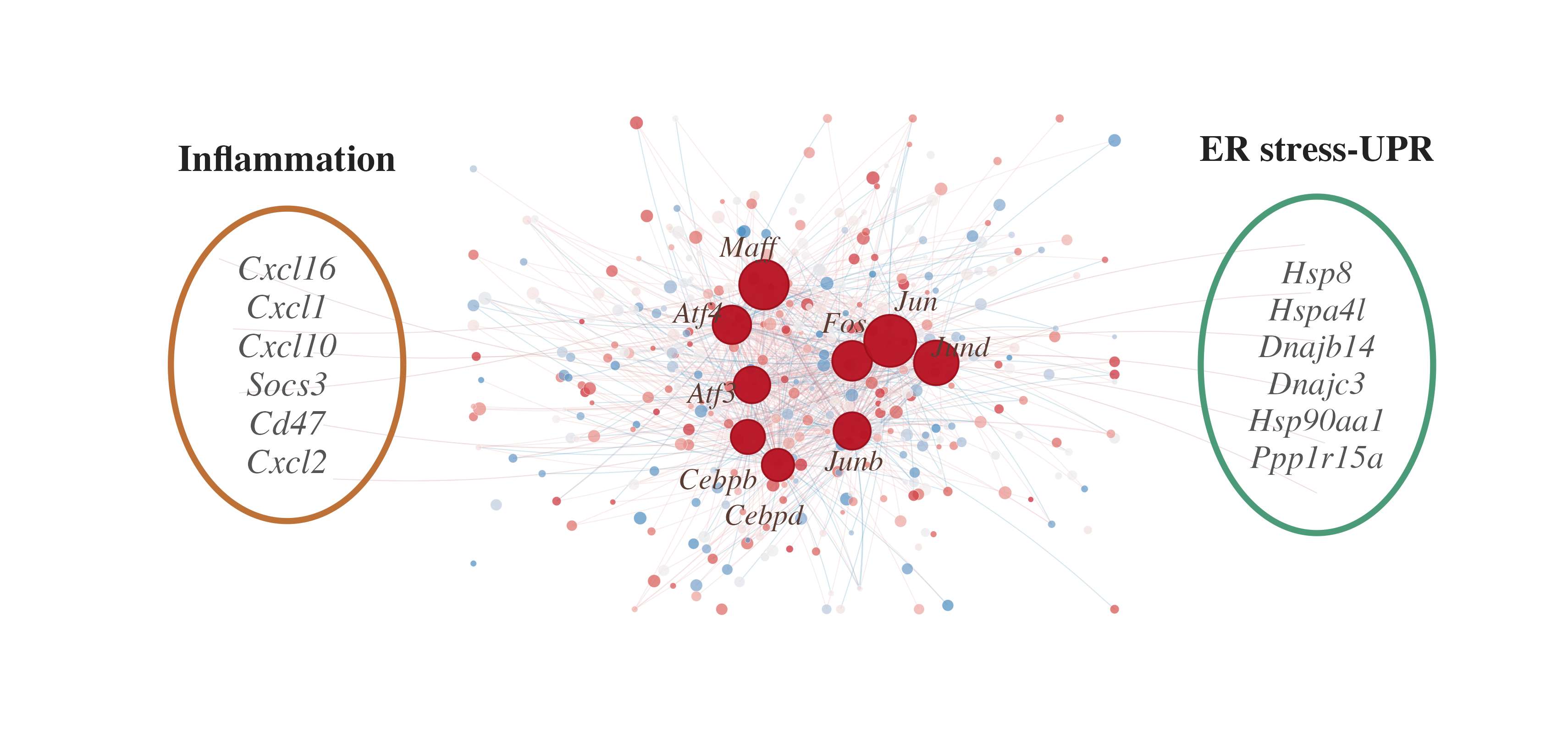
这张图有一个很适合复用的表达方式:中间展示转录因子调控网络,两侧单独圈出重点通路基因。它不是常规的富集气泡图,而是把"谁调控谁"和"这些基因属于什么功能模块"放在同一张 panel 里。
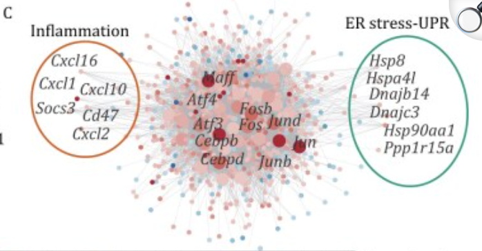
图片来源
| 项目 | 内容 |
|---|---|
| 文章 | A single-cell transcriptomic landscape characterizes the endocrine system aging in the mouse |
| 期刊/年份 | Protein & Cell, 2026 |
| 图号 | Fig. 3C |
| DOI/链接 | https://doi.org/10.1093/procel/pwaf074 |
原文利用小鼠内分泌系统单细胞图谱分析衰老相关通路,并在 Fig. 3C 中展示 thyroid follicular cells 中衰老相关 DEGs 的转录因子调控网络。图中重点突出两类通路:Inflammation 和 ER stress-UPR。
图片解读
这张图可以分成三层:
- 中间是基因调控网络,节点代表基因或转录因子,连线代表调控关系。
- 中心较大的红色节点是关键转录因子,例如
Maff、Atf4、Atf3、Fos、Jun、Jund等。 - 左右两侧用椭圆框单独标注重点功能模块:左侧是 Inflammation,右侧是 ER stress-UPR。
复现时真正决定效果的是 网络布局、节点层级、标签位置和两侧功能模块框。如果只画普通网络图,重点基因会被大量背景节点淹没;所以这里要把背景节点弱化,把 hub gene 和模块基因突出出来。
输入数据
建议准备三个输入表。
节点表 input_network_nodes.csv:
| 列名 | 含义 |
|---|---|
gene |
基因名 |
group |
节点类型,例如 hub、up、down、neutral |
x |
节点横坐标 |
y |
节点纵坐标 |
label |
是否显示标签;不显示可留空 |
size |
节点大小 |
score |
节点颜色映射值,例如 logFC 或调控强度 |
边表 input_network_edges.csv:
| 列名 | 含义 |
|---|---|
from |
起始基因 |
to |
目标基因 |
edge_group |
连线类型,例如 activation、repression、hub、module |
模块基因表 input_module_genes.csv:
| 列名 | 含义 |
|---|---|
module |
功能模块名称 |
gene |
模块内基因名 |
r
library(dplyr)
library(readr)
library(ggplot2)
library(scales)

nodes <- read_csv("input_network_nodes.csv", show_col_types = FALSE)
edges <- read_csv("input_network_edges.csv", show_col_types = FALSE)
module_genes <- read_csv("input_module_genes.csv", show_col_types = FALSE)
需要示例数据的后台 添加小编 领取,调整好数据结构,以下代码可以直接复制粘贴运行。
第一步:把边表连接到节点坐标
网络图的核心是边表。from 和 to 只是基因名,真正画线时还需要把它们转换成起点和终点坐标。
r
edge_dat <- edges |>
  left_join(nodes |> select(from = gene, x, y), by = "from") |>
  left_join(nodes |> select(to = gene, xend = x, yend = y), by = "to") |>
  mutate(edge_col = case_when(
    edge_group == "repression" ~ "#4e97b7",
    edge_group == "hub" ~ "#ce6d72",
    edge_group == "module" ~ "#b77a78",
    TRUE ~ "#e7b1b2"
  ))
第二步:准备两侧椭圆模块框
两侧功能模块不是图例,而是正文的一部分。这里用一组椭圆坐标来画边框。
r
ellipse_df <- function(cx, cy, rx, ry, n = 240) {
  theta <- seq(0, 2 * pi, length.out = n)
  tibble(x = cx + rx * cos(theta), y = cy + ry * sin(theta))
}

left_ellipse <- ellipse_df(-2.48, 0.02, 0.58, 0.78)
right_ellipse <- ellipse_df(2.66, 0.02, 0.58, 0.84)
第三步:手动微调 hub gene 标签
网络中心的基因名很容易重叠,所以这里不建议完全依赖自动避让。对少量核心基因,手动给标签坐标反而更稳定。
r
label_pos <- nodes |>
  filter(!is.na(label), group == "hub") |>
  mutate(
    label_x = case_when(
      gene == "Maff" ~ -0.18,
      gene == "Atf4" ~ -0.43,
      gene == "Atf3" ~ -0.36,
      gene == "Cebpb" ~ -0.33,
      gene == "Cebpd" ~ -0.10,
      gene == "Fos" ~ 0.30,
      gene == "Jun" ~ 0.66,
      gene == "Jund" ~ 0.88,
      gene == "Junb" ~ 0.35,
      TRUE ~ x
    ),
    label_y = case_when(
      gene == "Maff" ~ 0.61,
      gene == "Atf4" ~ 0.28,
      gene == "Atf3" ~ -0.12,
      gene == "Cebpb" ~ -0.55,
      gene == "Cebpd" ~ -0.73,
      gene == "Fos" ~ 0.23,
      gene == "Jun" ~ 0.34,
      gene == "Jund" ~ 0.11,
      gene == "Junb" ~ -0.46,
      TRUE ~ y
    )
  )
第四步:叠加网络、节点、标签和模块框
背景边和普通节点要轻,hub gene 要重,两侧模块框则用不同颜色区分。
r
p <- ggplot() +
  geom_curve(
    data = edge_dat,
    aes(x = x, y = y, xend = xend, yend = yend, color = edge_col),
    curvature = 0.08,
    linewidth = 0.16,
    alpha = 0.24
  ) +
  scale_color_identity() +
  geom_point(
    data = nodes |> filter(group %in% c("up", "down", "neutral")),
    aes(x, y, fill = score, size = size),
    shape = 21,
    color = "white",
    stroke = 0.10,
    alpha = 0.72
  ) +
  geom_point(
    data = nodes |> filter(group == "hub"),
    aes(x, y, size = size),
    shape = 21,
    fill = "#b81423",
    color = "#9b101b",
    stroke = 0.45,
    alpha = 0.96
  ) +
  geom_path(
    data = left_ellipse,
    aes(x, y),
    color = "#bd7136",
    linewidth = 1.0
  ) +
  geom_path(
    data = right_ellipse,
    aes(x, y),
    color = "#4b9a78",
    linewidth = 1.0
  ) +
  annotate(
    "text",
    x = -2.48,
    y = 1.05,
    label = "Inflammation",
    family = "serif",
    fontface = "bold",
    size = 4.6,
    color = "#222222"
  ) +
  annotate(
    "text",
    x = 2.66,
    y = 1.10,
    label = "ER stress-UPR",
    family = "serif",
    fontface = "bold",
    size = 4.5,
    color = "#222222"
  ) +
  annotate(
    "text",
    x = -2.48,
    y = 0.02,
    label = paste(
      module_genes |> filter(module == "Inflammation") |> pull(gene),
      collapse = "\n"
    ),
    family = "serif",
    fontface = "italic",
    size = 4.3,
    lineheight = 0.92,
    color = "#555555"
  ) +
  annotate(
    "text",
    x = 2.66,
    y = 0.02,
    label = paste(
      module_genes |> filter(module == "ER stress-UPR") |> pull(gene),
      collapse = "\n"
    ),
    family = "serif",
    fontface = "italic",
    size = 4.1,
    lineheight = 0.92,
    color = "#555555"
  ) +
  geom_text(
    data = label_pos,
    aes(label_x, label_y, label = label),
    family = "serif",
    fontface = "italic",
    size = 3.7,
    color = "#5a3c32"
  ) +
  scale_fill_gradient2(
    low = "#2b83ba",
    mid = "#f2eeee",
    high = "#c82333",
    midpoint = 0,
    guide = "none"
  ) +
  scale_size_identity() +
  coord_fixed(
    xlim = c(-3.35, 3.35),
    ylim = c(-1.45, 1.45),
    clip = "off"
  ) +
  theme_void(base_family = "serif") +
  theme(plot.margin = margin(12, 16, 10, 16))
第五步:导出结果
这种横向网络图建议宽一点,避免两侧模块和中心网络挤在一起。
r
ggsave(
  "gene_network_module.png",
  p,
  width = 7.6,
  height = 3.55,
  dpi = 450,
  bg = "white"
)

ggsave(
  "gene_network_module.pdf",
  p,
  width = 7.6,
  height = 3.55,
  bg = "white"
)
完整代码
r
library(dplyr)
library(readr)
library(ggplot2)
library(scales)

nodes <- read_csv("input_network_nodes.csv", show_col_types = FALSE)
edges <- read_csv("input_network_edges.csv", show_col_types = FALSE)
module_genes <- read_csv("input_module_genes.csv", show_col_types = FALSE)

edge_dat <- edges |>
  left_join(nodes |> select(from = gene, x, y), by = "from") |>
  left_join(nodes |> select(to = gene, xend = x, yend = y), by = "to") |>
  mutate(edge_col = case_when(
    edge_group == "repression" ~ "#4e97b7",
    edge_group == "hub" ~ "#ce6d72",
    edge_group == "module" ~ "#b77a78",
    TRUE ~ "#e7b1b2"
  ))

ellipse_df <- function(cx, cy, rx, ry, n = 240) {
  theta <- seq(0, 2 * pi, length.out = n)
  tibble(x = cx + rx * cos(theta), y = cy + ry * sin(theta))
}

left_ellipse <- ellipse_df(-2.48, 0.02, 0.58, 0.78)
right_ellipse <- ellipse_df(2.66, 0.02, 0.58, 0.84)

label_pos <- nodes |>
  filter(!is.na(label), group == "hub") |>
  mutate(
    label_x = case_when(
      gene == "Maff" ~ -0.18,
      gene == "Atf4" ~ -0.43,
      gene == "Atf3" ~ -0.36,
      gene == "Cebpb" ~ -0.33,
      gene == "Cebpd" ~ -0.10,
      gene == "Fos" ~ 0.30,
      gene == "Jun" ~ 0.66,
      gene == "Jund" ~ 0.88,
      gene == "Junb" ~ 0.35,
      TRUE ~ x
    ),
    label_y = case_when(
      gene == "Maff" ~ 0.61,
      gene == "Atf4" ~ 0.28,
      gene == "Atf3" ~ -0.12,
      gene == "Cebpb" ~ -0.55,
      gene == "Cebpd" ~ -0.73,
      gene == "Fos" ~ 0.23,
      gene == "Jun" ~ 0.34,
      gene == "Jund" ~ 0.11,
      gene == "Junb" ~ -0.46,
      TRUE ~ y
    )
  )

p <- ggplot() +
  geom_curve(
    data = edge_dat,
    aes(x = x, y = y, xend = xend, yend = yend, color = edge_col),
    curvature = 0.08,
    linewidth = 0.16,
    alpha = 0.24
  ) +
  scale_color_identity() +
  geom_point(
    data = nodes |> filter(group %in% c("up", "down", "neutral")),
    aes(x, y, fill = score, size = size),
    shape = 21,
    color = "white",
    stroke = 0.10,
    alpha = 0.72
  ) +
  geom_point(
    data = nodes |> filter(group == "hub"),
    aes(x, y, size = size),
    shape = 21,
    fill = "#b81423",
    color = "#9b101b",
    stroke = 0.45,
    alpha = 0.96
  ) +
  geom_path(
    data = left_ellipse,
    aes(x, y),
    color = "#bd7136",
    linewidth = 1.0
  ) +
  geom_path(
    data = right_ellipse,
    aes(x, y),
    color = "#4b9a78",
    linewidth = 1.0
  ) +
  annotate(
    "text",
    x = -2.48,
    y = 1.05,
    label = "Inflammation",
    family = "serif",
    fontface = "bold",
    size = 4.6,
    color = "#222222"
  ) +
  annotate(
    "text",
    x = 2.66,
    y = 1.10,
    label = "ER stress-UPR",
    family = "serif",
    fontface = "bold",
    size = 4.5,
    color = "#222222"
  ) +
  annotate(
    "text",
    x = -2.48,
    y = 0.02,
    label = paste(
      module_genes |> filter(module == "Inflammation") |> pull(gene),
      collapse = "\n"
    ),
    family = "serif",
    fontface = "italic",
    size = 4.3,
    lineheight = 0.92,
    color = "#555555"
  ) +
  annotate(
    "text",
    x = 2.66,
    y = 0.02,
    label = paste(
      module_genes |> filter(module == "ER stress-UPR") |> pull(gene),
      collapse = "\n"
    ),
    family = "serif",
    fontface = "italic",
    size = 4.1,
    lineheight = 0.92,
    color = "#555555"
  ) +
  geom_text(
    data = label_pos,
    aes(label_x, label_y, label = label),
    family = "serif",
    fontface = "italic",
    size = 3.7,
    color = "#5a3c32"
  ) +
  scale_fill_gradient2(
    low = "#2b83ba",
    mid = "#f2eeee",
    high = "#c82333",
    midpoint = 0,
    guide = "none"
  ) +
  scale_size_identity() +
  coord_fixed(
    xlim = c(-3.35, 3.35),
    ylim = c(-1.45, 1.45),
    clip = "off"
  ) +
  theme_void(base_family = "serif") +
  theme(plot.margin = margin(12, 16, 10, 16))

ggsave(
  "gene_network_module.png",
  p,
  width = 7.6,
  height = 3.55,
  dpi = 450,
  bg = "white"
)

ggsave(
  "gene_network_module.pdf",
  p,
  width = 7.6,
  height = 3.55,
  bg = "white"
)
复现结果