文章目录
- 一、XGBoost算法
- 二、Python代码和Sentosa_DSML社区版算法实现对比
-
- [(一) 数据读入和统计分析](#(一) 数据读入和统计分析)
- (二)数据预处理
- (三)模型训练与评估
- (四)模型可视化
- 三、总结
一、XGBoost算法
关于集成学习中的XGBoost算法原理,已经进行了介绍与总结,相关内容可参考【机器学习(一)】分类和回归任务-XGBoost算法-Sentosa_DSML社区版一文。本文将利用糖尿病数据集,通过Python代码和Sentosa_DSML社区版分别实现构建XGBoost分类预测模型。随后对模型进行评估,包括评估指标的选择与分析。最后得出实验结果结论,展示模型在糖尿病分类预测中的有效性和准确性,为糖尿病的早期诊断和干预提供了技术手段和决策支持。
二、Python代码和Sentosa_DSML社区版算法实现对比
(一) 数据读入和统计分析
1、python代码实现
python
import os
import pandas as pd
import numpy as np
import seaborn as sns
import matplotlib.pyplot as plt
import xgboost as xgb
from sklearn.model_selection import train_test_split
from sklearn.metrics import accuracy_score, precision_score, recall_score, f1_score, confusion_matrix, roc_curve, auc
from matplotlib import rcParams
from datetime import datetime
from sklearn.preprocessing import LabelEncoder

file_path = r'.\xgboost分类案例-糖尿病结果预测.csv'
output_dir = r'.\xgb分类'

if not os.path.exists(file_path):
    raise FileNotFoundError(f"文件未找到: {file_path}")

if not os.path.exists(output_dir):
    os.makedirs(output_dir)

df = pd.read_csv(file_path)

print("缺失值统计:")
print(df.isnull().sum())

print("原始数据前5行:")
print(df.head())
读入完成后对数据信息进行统计
python
rcParams['font.family'] = 'sans-serif'
rcParams['font.sans-serif'] = ['SimHei']
stats_df = pd.DataFrame(columns=[
    '列名', '数据类型', '最大值', '最小值', '平均值', '非空值数量', '空值数量',
    '众数', 'True数量', 'False数量', '标准差', '方差', '中位数', '峰度', '偏度',
    '极值数量', '异常值数量'
])

def detect_extremes_and_outliers(column, extreme_factor=3, outlier_factor=6):
    if not np.issubdtype(column.dtype, np.number):
        return None, None
    q1 = column.quantile(0.25)
    q3 = column.quantile(0.75)
    iqr = q3 - q1
    lower_extreme = q1 - extreme_factor * iqr
    upper_extreme = q3 + extreme_factor * iqr
    lower_outlier = q1 - outlier_factor * iqr
    upper_outlier = q3 + outlier_factor * iqr
    extremes = column[(column < lower_extreme) | (column > upper_extreme)]
    outliers = column[(column < lower_outlier) | (column > upper_outlier)]
    return len(extremes), len(outliers)

for col in df.columns:
    col_data = df[col]
    dtype = col_data.dtype
    if np.issubdtype(dtype, np.number):
        max_value = col_data.max()
        min_value = col_data.min()
        mean_value = col_data.mean()
        std_value = col_data.std()
        var_value = col_data.var()
        median_value = col_data.median()
        kurtosis_value = col_data.kurt()
        skew_value = col_data.skew()
        extreme_count, outlier_count = detect_extremes_and_outliers(col_data)
    else:
        max_value = min_value = mean_value = std_value = var_value = median_value = kurtosis_value = skew_value = None
        extreme_count = outlier_count = None

    non_null_count = col_data.count()
    null_count = col_data.isna().sum()
    mode_value = col_data.mode().iloc[0] if not col_data.mode().empty else None
    true_count = col_data[col_data == True].count() if dtype == 'bool' else None
    false_count = col_data[col_data == False].count() if dtype == 'bool' else None

    new_row = pd.DataFrame({
        '列名': [col],
        '数据类型': [dtype],
        '最大值': [max_value],
        '最小值': [min_value],
        '平均值': [mean_value],
        '非空值数量': [non_null_count],
        '空值数量': [null_count],
        '众数': [mode_value],
        'True数量': [true_count],
        'False数量': [false_count],
        '标准差': [std_value],
        '方差': [var_value],
        '中位数': [median_value],
        '峰度': [kurtosis_value],
        '偏度': [skew_value],
        '极值数量': [extreme_count],
        '异常值数量': [outlier_count]
    })

    stats_df = pd.concat([stats_df, new_row], ignore_index=True)

print(stats_df)
>> 列名     数据类型     最大值    最小值  ...         峰度        偏度  极值数量 异常值数量
0               gender   object     NaN    NaN  ...        NaN       NaN  None  None
1                  age  float64   80.00   0.08  ...  -1.003835 -0.051979     0     0
2         hypertension    int64    1.00   0.00  ...   8.441441  3.231296  7485  7485
3        heart_disease    int64    1.00   0.00  ...  20.409952  4.733872  3942  3942
4      smoking_history   object     NaN    NaN  ...        NaN       NaN  None  None
5                  bmi  float64   95.69  10.01  ...   3.520772  1.043836  1258    46
6          HbA1c_level  float64    9.00   3.50  ...   0.215392 -0.066854     0     0
7  blood_glucose_level    int64  300.00  80.00  ...   1.737624  0.821655     0     0
8             diabetes    int64    1.00   0.00  ...   6.858005  2.976217  8500  8500

for col in df.columns:
    plt.figure(figsize=(10, 6))
    df[col].dropna().hist(bins=30)
    plt.title(f"{col} - 数据分布图")
    plt.ylabel("频率")
    timestamp = datetime.now().strftime('%Y%m%d_%H%M%S')
    file_name = f"{col}_数据分布图_{timestamp}.png"
    file_path = os.path.join(output_dir, file_name)
    plt.savefig(file_path)
    plt.close()

grouped_data = df.groupby('smoking_history')['diabetes'].count()
plt.figure(figsize=(8, 8))
plt.pie(grouped_data, labels=grouped_data.index, autopct='%1.1f%%', startangle=90, colors=plt.cm.Paired.colors)
plt.title("饼状图\n维饼状图", fontsize=16)
plt.axis('equal')
timestamp = datetime.now().strftime('%Y%m%d_%H%M%S')
file_name = f"smoking_history_diabetes_distribution_{timestamp}.png"
file_path = os.path.join(output_dir, file_name)
plt.savefig(file_path)
plt.close() 

2、Sentosa_DSML社区版实现
首先,进行数据读入,利用文本算子直接对数据进行读取,选择数据所在路径,

接着,利用描述算子即可对数据进行统计分析,得到每一列数据的数据分布图、极值、异常值等结果。连接描述算子,右侧设置极值倍数为3,异常值倍数为6。

点击执行后即可得到数据统计分析的结果。

也可以连接图表算子,如饼状图,对不同吸烟历史(smoking_history)与糖尿病(diabetes)之间的关系进行统计,

得到结果如下所示:
(二)数据预处理
1、python代码实现
python
df_filtered = df[df['gender'] != 'Other']
if df_filtered.empty:
    raise ValueError(" `gender`='Other'")
else:
    print(df_filtered.head())

if 'Partition_Column' in df.columns:
    df['Partition_Column'] = df['Partition_Column'].astype('category')

df = pd.get_dummies(df, columns=['gender', 'smoking_history'], drop_first=True)

X = df.drop(columns=['diabetes'])
y = df['diabetes']

X_train, X_test, y_train, y_test = train_test_split(X, y, test_size=0.1, random_state=42)
2、Sentosa_DSML社区版实现
在文本算子后连接过滤算子,过滤条件为gender='Other',不保留过滤项,即在'gender'列中过滤掉值为 'Other' 的数据。

连接样本分区算子,划分训练集和测试集比例,

然后,连接类型算子,展示数据的存储类型,测量类型和模型类型,将diabetes列的模型类型设置为Label。

(三)模型训练与评估
1、python代码实现
python
dtrain = xgb.DMatrix(X_train, label=y_train, enable_categorical=True)

params = {
    'n_estimators': 300,
    'learning_rate': 0.3,
    'min_split_loss': 0,
    'max_depth': 30,
    'min_child_weight': 1,
    'subsample': 1,
    'colsample_bytree': 0.8,
    'lambda': 1,
    'alpha': 0,
    'objective': 'binary:logistic',
    'eval_metric': 'logloss',
    'missing': np.nan
}

xgb_model = xgb.XGBClassifier(**params, use_label_encoder=False)
xgb_model.fit(X_train, y_train, eval_set=[(X_test, y_test)], verbose=True)

y_train_pred = xgb_model.predict(X_train)
y_test_pred = xgb_model.predict(X_test)

def evaluate_model(y_true, y_pred, dataset_name=''):
    accuracy = accuracy_score(y_true, y_pred)
    weighted_precision = precision_score(y_true, y_pred, average='weighted')
    weighted_recall = recall_score(y_true, y_pred, average='weighted')
    weighted_f1 = f1_score(y_true, y_pred, average='weighted')

    print(f"评估结果 - {dataset_name}")
    print(f"准确率 (Accuracy): {accuracy:.4f}")
    print(f"加权精确率 (Weighted Precision): {weighted_precision:.4f}")
    print(f"加权召回率 (Weighted Recall): {weighted_recall:.4f}")
    print(f"加权 F1 分数 (Weighted F1 Score): {weighted_f1:.4f}\n")

    return {
        'accuracy': accuracy,
        'weighted_precision': weighted_precision,
        'weighted_recall': weighted_recall,
        'weighted_f1': weighted_f1
    }

train_eval_results = evaluate_model(y_train, y_train_pred, dataset_name='训练集 (Training Set)')
>评估结果 - 训练集 (Training Set)
准确率 (Accuracy): 0.9991
加权精确率 (Weighted Precision): 0.9991
加权召回率 (Weighted Recall): 0.9991
加权 F1 分数 (Weighted F1 Score): 0.9991

test_eval_results = evaluate_model(y_test, y_test_pred, dataset_name='测试集 (Test Set)')

>评估结果 - 测试集 (Test Set)
准确率 (Accuracy): 0.9657
加权精确率 (Weighted Precision): 0.9641
加权召回率 (Weighted Recall): 0.9657
加权 F1 分数 (Weighted F1 Score): 0.9643
通过绘制 ROC曲线来评估分类模型在测试集的性能。
python
def save_plot(filename):
    timestamp = datetime.now().strftime('%Y%m%d_%H%M%S')
    file_path = os.path.join(output_dir, f"{filename}_{timestamp}.png")
    plt.savefig(file_path)
    plt.close()

def plot_roc_curve(model, X_test, y_test):
    """绘制ROC曲线"""
    y_probs = model.predict_proba(X_test)[:, 1]
    fpr, tpr, thresholds = roc_curve(y_test, y_probs)
    roc_auc = auc(fpr, tpr)

    plt.figure(figsize=(10, 6))
    plt.plot(fpr, tpr, color='blue', label='ROC 曲线 (area = {:.2f})'.format(roc_auc))
    plt.plot([0, 1], [0, 1], color='red', linestyle='--')
    plt.xlabel('假阳性率 (FPR)')
    plt.ylabel('真正率 (TPR)')
    plt.title('Receiver Operating Characteristic (ROC) 曲线')
    plt.legend(loc='lower right')
    save_plot("ROC曲线")

plot_roc_curve(xgb_model, X_test, y_test)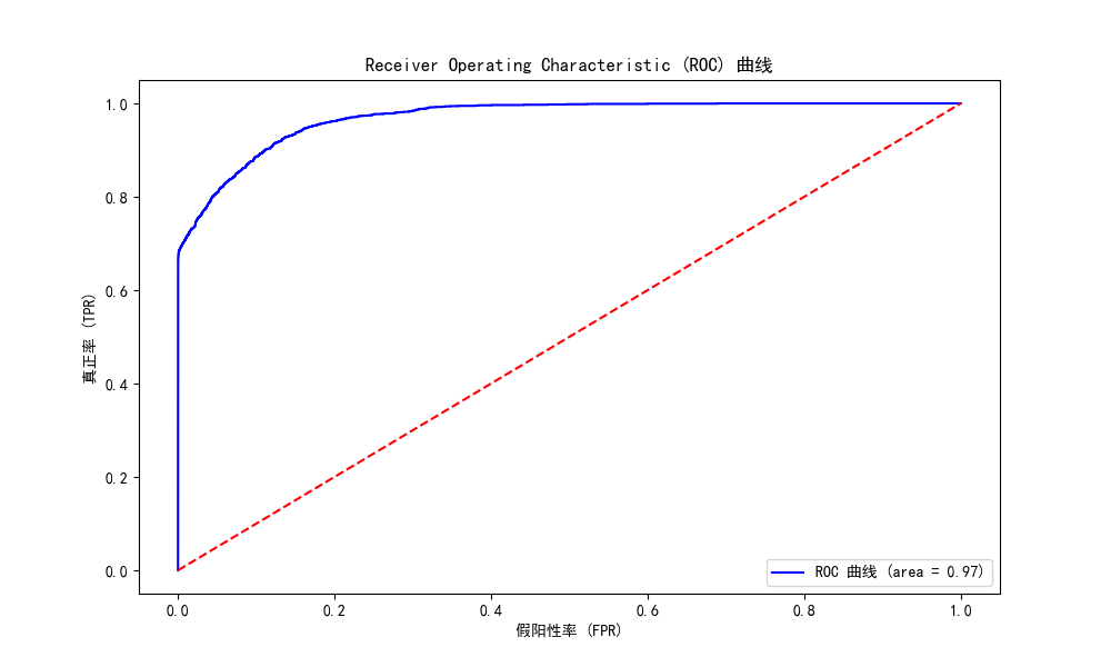
2、Sentosa_DSML社区版实现
预处理完成后,连接XGBoost分类算子,可再右侧配置算子属性,算子属性中,评估指标即算法的损失函数,有对数损失和分类错误率两种;学习率,树的最大深度,最小叶子节点样本权重和,子采样率,最小分裂损失,每棵树随机采样的列数占比,L1正则化项和L2正则化项都用来防止算法过拟合。子当子节点样本权重和不大于所设的最小叶子节点样本权重和时不对该节点进行进一步划分。最小分裂损失指定了节点分裂所需的最小损失函数下降值。当树构造方法是为hist的时候,需要配置节点方式、最大箱数、是否单精度三个属性。
在本案例中,分类模型中的属性配置为,迭代次数:300,学习率:0.3,最小分裂损失:0,数的最大深度:30,最小叶子节点样本权重和:1、子采样率:1,树构造算法:auto,每棵树随机采样的列数占比:0.8,L2正则化项:1,L1正则化项:0,评估指标为对数损失,初始预测分数为0.5,并计算特征重要性和训练数据的混淆矩阵。

右击执行即可得到XGBoost分类模型。

在分类模型后连接评估算子和ROC---AUC评估算子,可以对模型训练集和测试集的预测结果进行评估。


评估模型在训练集和测试集上的性能,主要使用准确率、加权精确率、加权召回率和加权 F1 分数。结果如下所示:


ROC-AUC算子用于评估当前数据训练出来的分类模型的正确性,显示分类结果的ROC曲线和AUC值,对模型的分类效果进行评估。执行结果如下所示:


还可以利用图表分析中的表格算子对模型数据以表格形式输出。

表格算子执行结果如下所示:

(四)模型可视化
1、python代码实现
python
def save_plot(filename):
    timestamp = datetime.now().strftime('%Y%m%d_%H%M%S')
    file_path = os.path.join(output_dir, f"{filename}_{timestamp}.png")
    plt.savefig(file_path)
    plt.close()

def plot_confusion_matrix(y_true, y_pred):
    confusion = confusion_matrix(y_true, y_pred)
    plt.figure(figsize=(8, 6))
    sns.heatmap(confusion, annot=True, fmt='d', cmap='Blues')
    plt.title("混淆矩阵")
    plt.xlabel("预测标签")
    plt.ylabel("真实标签")
    save_plot("混淆矩阵")

def print_model_params(model):
    params = model.get_params()
    print("模型参数:")
    for key, value in params.items():
        print(f"{key}: {value}")

def plot_feature_importance(model):
    plt.figure(figsize=(12, 8))
    xgb.plot_importance(model, importance_type='weight', max_num_features=10)
    plt.title('特征重要性图')
    plt.xlabel('特征重要性 (Weight)')
    plt.ylabel('特征')
    save_plot("特征重要性图")

print_model_params(xgb_model)
plot_feature_importance(xgb_model)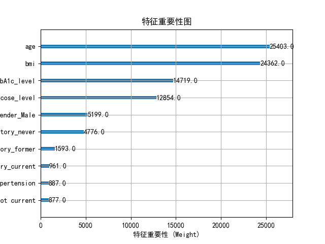
2、Sentosa_DSML社区版实现
右击查看模型信息,即可展示特征重要性图,混淆矩阵,决策树等模型结果。

模型信息如下所示:


经过连接算子和配置参数,完成了基于XGBoost算法的糖尿病分类预测全过程,从数据导入、预处理、模型训练到预测及性能评估。通过模型评估算子,可以详细了解模型的精确度、召回率、F1分数等关键评估指标,从而判断模型在糖尿病分类任务中的表现。
三、总结
相比传统代码方式,利用Sentosa_DSML社区版完成机器学习算法的流程更加高效和自动化,传统方式需要手动编写大量代码来处理数据清洗、特征工程、模型训练与评估,而在Sentosa_DSML社区版中,这些步骤可以通过可视化界面、预构建模块和自动化流程来简化,有效的降低了技术门槛,非专业开发者也能通过拖拽和配置的方式开发应用,减少了对专业开发人员的依赖。
Sentosa_DSML社区版提供了易于配置的算子流,减少了编写和调试代码的时间,并提升了模型开发和部署的效率,由于应用的结构更清晰,维护和更新变得更加容易,且平台通常会提供版本控制和更新功能,使得应用的持续改进更为便捷。
为了非商业用途的科研学者、研究人员及开发者提供学习、交流及实践机器学习技术,推出了一款轻量化且完全免费的Sentosa_DSML社区版。以轻量化一键安装、平台免费使用、视频教学和社区论坛服务为主要特点,能够与其他数据科学家和机器学习爱好者交流心得,分享经验和解决问题。文章最后附上官网链接,感兴趣工具的可以直接下载使用
