知识点讲解:
scale
是 CSS 的 transform 属性的一部分,用于对元素进行比例缩放。
css
transform: scale(sx);
transform: scale(sx, sy);
/*
sx:表示元素在 水平轴(X轴)的缩放比例。
sy(可选):表示元素在 垂直轴(Y轴)的缩放比例。
如果 sy 省略,则默认等于 sx(即均匀缩放)
应用:
*/

/* 水平和垂直均匀缩放至 150% */
transform: scale(1.5);

/* 仅水平缩放至 200%,垂直缩放至 50% */
transform: scale(2, 0.5);
transform-origin
用于transform 设置缩放的基准点(即元素的"中心点")
css
transform-origin: x y;
/*
x:水平位置,可使用 px、百分比(%)、或关键词(left, center, right)。
y:垂直位置,可使用 px、百分比(%)、或关键词(top, center, bottom)。
默认值:
 */
transform-origin: 50% 50%; /* 元素中心点 */
/*应用:*/
/* 基于左上角进行缩放 */
transform-origin: 0 0;

/* 基于右下角进行缩放 */
transform-origin: 100% 100%;

/* 基于坐标点 (50px, 50px) 缩放 */
transform-origin: 50px 50px;
组合使用
transform 结合旋转(rotate)、位移(translate)、倾斜(skew)。
css
/* 缩放 1.5 倍,并旋转 45 度 */
transform: scale(1.5) rotate(45deg);
/* 缩放后向右移动 100px */
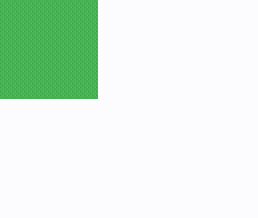
transform: scale(0.8) translate(100px, 0);动画效果
通过 transition 属性,给 scale 增加平滑过渡效果。
效果:
javascript
<template>
  <div class="box"></div>
</template>

<script setup>

</script>

<style scoped>
.box {
  width: 100px;
  height: 100px;
  background-color: #4caf50;
  transition: transform 0.3s ease;
}

.box:hover {
  transform: scale(1.5);
}
</style>
实践案例1-基于左右上角缩放:
效果:
javascript
<template>
<div class="container">
<!-- 红色圆点标识在画布的左上角 -->
<div class="dot fixed-left-top"></div>
<!-- 左上角盒子 -->
<div class="box-wrapper">
<div class="box" :class="{ 'scale-left-top': isLeftScaled }">
缩放到左上角
</div>
<button @click="toggleLeftScale">
左上缩放
</button>
</div>
<!-- 红色圆点标识在画布的右上角 -->
<div class="dot fixed-right-top"></div>
<!-- 右上角盒子 -->
<div class="box-wrapper">
<div class="box" :class="{ 'scale-right-top': isRightScaled }">
缩放到右上角
</div>
<button @click="toggleRightScale">
右上缩放
</button>
</div>
</div>
</template>
<script setup>
import { ref } from 'vue';
// 左上角缩放状态
const isLeftScaled = ref(false);
// 右上角缩放状态
const isRightScaled = ref(false);
// 切换左上角盒子的缩放状态
const toggleLeftScale = () => {
isLeftScaled.value = !isLeftScaled.value;
};
// 切换右上角盒子的缩放状态
const toggleRightScale = () => {
isRightScaled.value = !isRightScaled.value;
};
</script>
<style scoped>
.container {
display: flex;
justify-content: space-between;
align-items: flex-start;
height: 100vh;
padding: 20px;
background-color: #f5f5f5;
position: relative;
/* 为固定红点提供定位上下文 */
}
.box-wrapper {
display: flex;
flex-direction: column;
align-items: center;
gap: 10px;
}
.box {
width: 200px;
height: 200px;
background-color: #4caf50;
color: white;
font-size: 18px;
font-weight: bold;
display: flex;
justify-content: center;
align-items: center;
border: 2px solid #333;
transition: transform 0.3s ease, transform-origin 0.3s ease;
}
/* 固定红色圆点标识 */
.dot {
width: 10px;
height: 10px;
background-color: red;
border-radius: 50%;
position: absolute;
z-index: 1;
}
/* 左上角红点固定在画布左上角 */
.fixed-left-top {
top: 20px;
left: 20px;
}
/* 右上角红点固定在画布右上角 */
.fixed-right-top {
top: 20px;
right: 20px;
}
/*
左上角:transform-origin: 0 0;
左下角:transform-origin: 0 100%;
右上角:transform-origin: 100% 0;
右下角:transform-origin: 100% 100%;
*/
/* 左上角缩放 */
.scale-left-top {
transform-origin: 0 0;
transform: scale(0.7);
}
/* 右上角缩放 */
.scale-right-top {
transform-origin: 100% 0;
transform: scale(0.7);
}
button {
padding: 10px 15px;
font-size: 16px;
cursor: pointer;
background-color: #007bff;
color: white;
border: none;
border-radius: 5px;
transition: background-color 0.3s;
}
button:hover {
background-color: #0056b3;
}
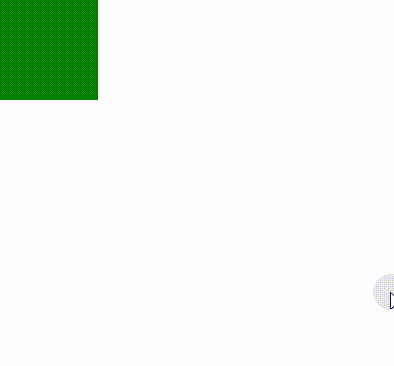
</style>实践案例2-悬浮动态缩放:
javascript
<template>
  <div class="box"></div>
</template>

<script setup>

</script>

<style scoped>
.box {
  width: 100px;
  height: 100px;
  background-color: green;
  transition: transform 0.3s ease;
}

.box:hover {
  transform: scale(1.2);
  /* 悬浮时缩放 1.2 倍 */
}
</style>
实践案例3-非均匀缩放:

javascript
<template>
  <div class="box"></div>
</template>

<script setup>

</script>

<style scoped>
.box {
  width: 100px;
  height: 100px;
  background-color: orange;
  transform: scale(2, 0.5);
  /* 水平方向 2 倍,垂直方向 0.5 倍 */
}
</style>