wpf 布局控件有很多,常用的有:Grid, UniformGrid, Border, StackPanel, WrapPanel, DockPanel。
1. Grid
Grid 经常作为控件的 Content 使用,常作为 Windows, UserControl 等 UI 元素的根节点。它用来展示一个 n 行 n 列的排版。
因此就有下面几个常用且重要的属性:
RowDefinitions和ColumnDefinitions:行定义、列定义Grid.Row和Grid.Column:子元素位于 Grid 第几行、第几列
1.1 RowDefinitions 和 ColumnDefinitions
RowDefinitions :有个重要属性 Height,它有 3 种值:
- 常规数值,如100,200,单位是像素,表示该行的实际像素高度。
*值, 如1*,2*,1.5*,表示占比,比如 2 * 就是 1* 的两倍高。- "
Auto", 表示高度自动伸缩。
ColumnDefinitions :也有个重要属性 Width,也有类似 3 种值:
- 常规数值,如100,200,单位是像素,表示该列的实际像素宽度。
*值, 如1*,2*,1.5*,表示占比,比如 2 * 就是 1* 的两倍宽。- "
Auto", 表示宽度自动伸缩。
1.2 Grid.Row 和 Grid.Column
这两个属性,实际上是 Row 和 Column 属性,为什么要加上 Grid. ,原因是它们是定义在 Grid 类里的 附加属性。
它俩是用来标识当前控件位于 Grid 哪行哪列,即:
Grid.Row 设置值: 表示该控件处于父类 Grid 的第几行。
Grid.Column 设置值: 表示该控件处于父类 Grid 的第几列。
例子,
xml
 <!-- 创建一个 3 行 3 列 的布局 -->
<Grid>
    <Grid.RowDefinitions>
        <RowDefinition Height="Auto" />
        <RowDefinition Height="*" />
        <RowDefinition Height="1.5*" />
    </Grid.RowDefinitions>

    <Grid.ColumnDefinitions>
        <ColumnDefinition Width="*" />
        <ColumnDefinition Width="2*" />
        <ColumnDefinition Width="Auto" />
    </Grid.ColumnDefinitions>

    <Grid Grid.Row="0" Grid.Column="0" Background="Red" />
    <Grid Grid.Row="0" Grid.Column="1" Background="IndianRed" />
    <Grid Grid.Row="0" Grid.Column="2" Background="OrangeRed" />

    <Grid Grid.Row="1" Grid.Column="0" Background="Green" />
    <Grid Grid.Row="1" Grid.Column="1" Background="GreenYellow" />
    <Grid Grid.Row="1" Grid.Column="2" Background="DarkSlateGray" />

    <Grid Grid.Row="2" Grid.Column="0" Background="Blue" />
    <Grid Grid.Row="2" Grid.Column="1" Background="DodgerBlue" />
    <Grid Grid.Row="2" Grid.Column="2" Background="PowderBlue" />
</Grid>
结果:

为什么只剩 2 行 2 列了?第 1 行和第 3 列哪去了?
因为:第 1 行高度和第 3 列宽度都被设置为了 Auto, Auto 会根据相邻或子元素自动排版,没有子元素时,实际宽高就为0。
给第 1 行任意一列填充实际子元素,第 3 列任意一行填充实际子元素,
xml
<Grid Grid.Row="0" Grid.Column="0" Background="Red">
    <TextBlock Height="80" Text="第 1 行,第 1 列" />
</Grid>
<Grid Grid.Row="0" Grid.Column="1" Background="IndianRed" />
<Grid Grid.Row="0" Grid.Column="2" Background="OrangeRed" />

<Grid Grid.Row="1" Grid.Column="0" Background="Green" />
<Grid Grid.Row="1" Grid.Column="1" Background="GreenYellow" />
<Grid Grid.Row="1" Grid.Column="2" Background="DarkSlateGray" />

<Grid Grid.Row="2" Grid.Column="0" Background="Blue" />
<Grid Grid.Row="2" Grid.Column="1" Background="DodgerBlue" />
<Grid Grid.Row="2" Grid.Column="2" Background="PowderBlue">
    <TextBlock Height="80" Text="第 3 行,第 3 列" />
</Grid>
所有行列就都显示了:

2. UniformGrid
一般称作网格布局,因为它以均匀的网格方式排列容器中的子元素,不用再像 Grid 那样手动指定每个元素的行和列,会自动按顺序(从左到右、从上到下)展示。每个子元素占用相同大小的空间。
xml
<UniformGrid Columns="2" Rows="2">
    <Grid Background="Red">
        <TextBlock Text="1" FontSize="20" Foreground="White" HorizontalAlignment="Center" VerticalAlignment="Center" />
    </Grid>
    <Grid Background="Brown">
        <TextBlock Text="2" FontSize="20" Foreground="White" HorizontalAlignment="Center" VerticalAlignment="Center" />
    </Grid>
    <Grid Background="DarkGoldenrod">
        <TextBlock Text="3" FontSize="20" Foreground="White" HorizontalAlignment="Center" VerticalAlignment="Center" />
    </Grid>
    <Grid Width="100" Height="100" Background="Green">
        <TextBlock Text="4" FontSize="20" Foreground="White" HorizontalAlignment="Center" VerticalAlignment="Center" />
    </Grid>
</UniformGrid>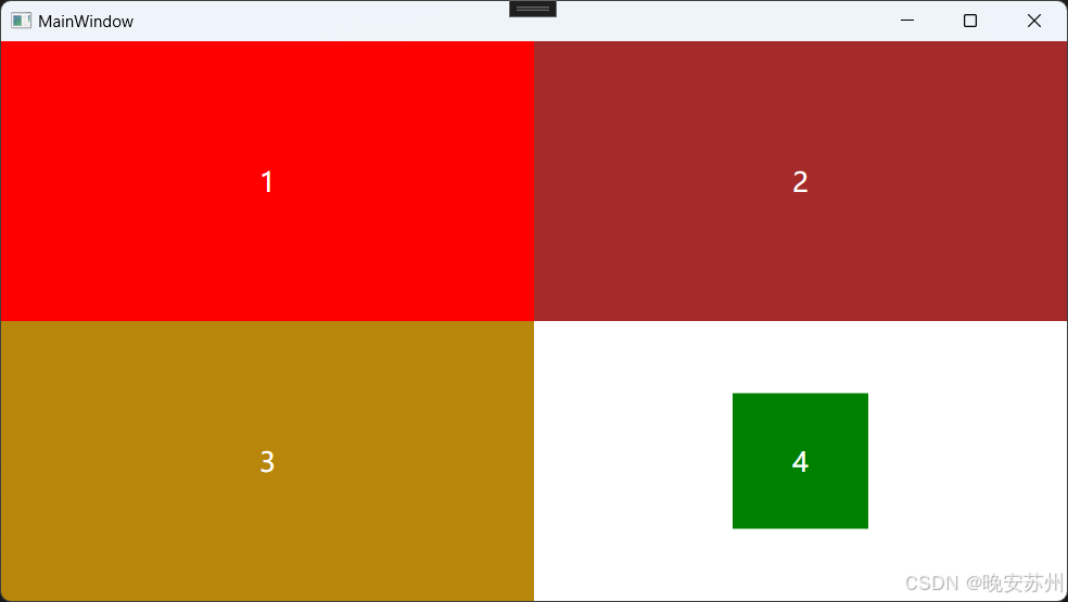
3. Border
Border 就是带有边框的区域布局,既然是边框就有边框颜色和边框厚度。
BorderBrush: 边框颜色
BorderThickness: 边框厚度(从左右到依次:左、上、 右、 下 厚度)
xml
<Grid>
    <Grid.ColumnDefinitions>
        <ColumnDefinition />
        <ColumnDefinition />
    </Grid.ColumnDefinitions>

    <!-- 不带边框 -->
    <Border
        Width="100"
        Height="100"
        Background="DeepPink" />

    <!-- 带边框 -->
    <Border Grid.Column="1"
            Width="100"
        Height="100"
        Background="DeepPink"
        BorderBrush="Black"
        BorderThickness="4" />
</Grid>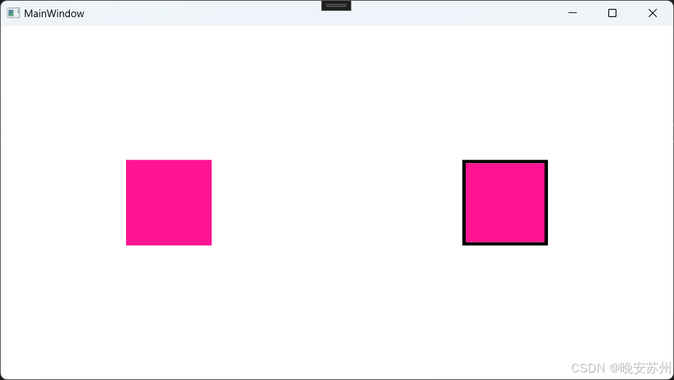
4. StackPanel 和 WrapPanel
从名字可以看出,StackPanel 即按照栈的方式排版子元素,WrapPanel 在按照栈方式排版基础上,超出显示范围时可以自动换行或换列。
4.1 StackPanel
StackPanel 演示
横向排列:
xml
<StackPanel Orientation="Horizontal">
    <Grid Width="100" Height="40" Background="DeepPink"></Grid>
    <Grid Width="100" Height="40" Background="DarkOrchid"></Grid>
    <Grid Width="100" Height="40" Background="DarkGreen"></Grid>
</StackPanel>
竖向排列:
xml
<StackPanel Orientation="Vertical">
    <Grid Width="100" Height="40" Background="DeepPink" />
    <Grid Width="100" Height="40" Background="DarkOrchid" />
    <Grid Width="100" Height="40" Background="DarkGreen" />
</StackPanel>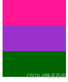
4.2 WrapPanel
WrapPanel 演示
横向排列:
xml
<WrapPanel Orientation="Horizontal">
    <Grid Width="100" Height="40" Background="DeepPink" />
    <Grid Width="100" Height="40" Background="DarkOrchid"/>
    <Grid Width="100" Height="40" Background="DarkGreen"/>
</WrapPanel>
当宽度显示不下时自动换行:

竖向排列:
xml
<WrapPanel Orientation="Vertical">
    <Grid Width="100" Height="40" Background="DeepPink"/>
    <Grid Width="100" Height="40" Background="DarkOrchid"/>
    <Grid Width="100" Height="40" Background="DarkGreen"/>
</WrapPanel>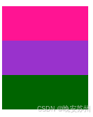
当高度显示不下时,自动换列

5. DockPanel
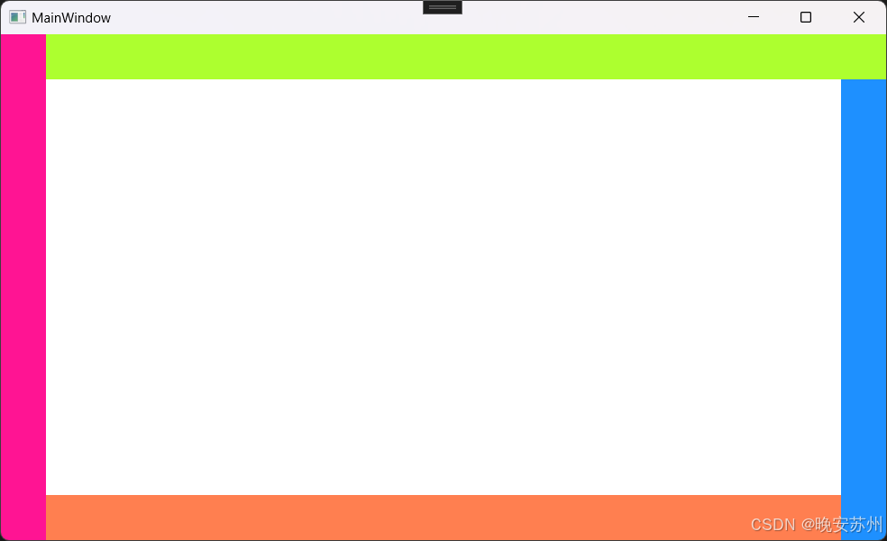
使用锚点停靠方式在 DockPanel 区域中进行排版。
例如,
xml
<DockPanel>
    <Grid DockPanel.Dock="Left" Width="40" Background="DeepPink" />
    <Grid DockPanel.Dock="Top" Height="40" Background="GreenYellow" />
    <Grid DockPanel.Dock="Right" Width="40" Background="DodgerBlue" />
    <Grid DockPanel.Dock="Bottom" Height="40" Background="Coral" />
</DockPanel>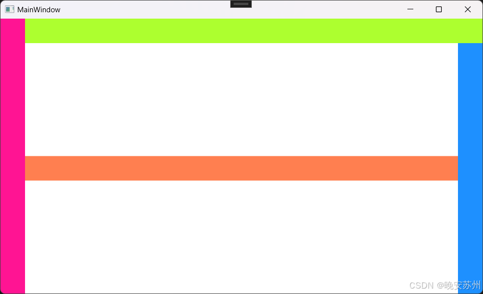
为什么底部 Grid 元素不是在最下面,跑中间去了?
默认情况下,后添加的元素只能使用剩余空间,无论对 DockPanel 的最后一个子元素设置任何停靠值,该子元素都将始终填满剩余的空间。如果不希望最后一个元素填充剩余区域,可以将 DockPanel 属性
LastChildFill设置为 false,还必须为最后一个子元素显式指定停靠方向。
我们可以做个实验,把底部 Grid 高度设置去掉,
xml
<Grid DockPanel.Dock="Bottom" Background="Coral" />就变成了,

最后我们实验一下 LastChildFill 设置
xml
<DockPanel LastChildFill="False">
    <Grid DockPanel.Dock="Left" Width="40" Background="DeepPink" />
    <Grid DockPanel.Dock="Top" Height="40" Background="GreenYellow" />
    <Grid DockPanel.Dock="Right" Width="40" Background="DodgerBlue" />
    <Grid DockPanel.Dock="Bottom" Height="40" Background="Coral" />
</DockPanel>