Swiper组件提供滑动轮播显示的能力。Swiper本身是一个容器组件,当设置了多个子组件后,可以对这些子组件进行轮播显示。
一般情况下,在一些应用首页显示推荐的内容时,需要用到轮播显示的能力。
针对复杂页面场景,可以使用Swiper组件的预加载机制,利用主线程的空闲时间来提前构建和布局绘制组件,优化滑动体验。
布局与约束
Swiper作为一个容器组件,如果设置了自身尺寸属性,则在轮播显示过程中均以该尺寸生效。
如果Swiper自身尺寸属性未被设置,则分两种情况:如果设置了prevMargin或者nextMargin属性,则Swiper自身尺寸会跟随其父组件;如果未设置prevMargin或者nextMargin属性,则会自动根据子组件的大小设置自身的尺寸。
循环播放
通过loop属性控制是否循环播放,该属性默认值为true。
当loop为true时,在显示第一页或最后一页时,可以继续往前切换到前一页或者往后切换到后一页。如果loop为false,则在第一页或最后一页时,无法继续向前或者向后切换页面。
- loop为true
TypeScript
@Entry
@Component
struct SwiperSample {
  build() {
    Row() {
      // 轮播组件
      Swiper() {
        // 子组件
        Text('0')
          .width('90%').height('100%').backgroundColor(Color.Gray)
          .textAlign(TextAlign.Center).fontSize(30)
        Text('1')
          .width('90%').height('100%').backgroundColor(Color.Green)
          .textAlign(TextAlign.Center).fontSize(30)
        Text('2')
          .width('90%').height('100%').backgroundColor(Color.Pink)
          .textAlign(TextAlign.Center).fontSize(30)
      }
      // 设置子组件循环播放
      .loop(true)
    }.height(200).width('100%')
    .justifyContent(FlexAlign.Center)
  }
}
显示效果如下图所示:
- loop为false
TypeScript
@Entry
@Component
struct SwiperSample {
  build() {
    Row() {
      // 轮播组件
      Swiper() {
        // 子组件
        Text('0')
          .width('90%').height('100%').backgroundColor(Color.Gray)
          .textAlign(TextAlign.Center).fontSize(30)
        Text('1')
          .width('90%').height('100%').backgroundColor(Color.Green)
          .textAlign(TextAlign.Center).fontSize(30)
        Text('2')
          .width('90%').height('100%').backgroundColor(Color.Pink)
          .textAlign(TextAlign.Center).fontSize(30)
      }
      // 设置禁止子组件循环播放
      .loop(false)
    }.height(200).width('100%').border({ width: 2 })
    .justifyContent(FlexAlign.Center)
  }
}
显示效果如下图所示,当向右滑动到最后一个子组件的时候无法继续滑动。
同时从第一个子组件向左也无法滑动,如下图所示:
自动轮播
Swiper通过设置autoPlay属性,控制是否自动轮播子组件。该属性默认值为false。
autoPlay为true时,会自动切换播放子组件,子组件与子组件之间的播放间隔通过interval属性设置。interval属性默认值为3000,单位毫秒。
TypeScript
@Entry
@Component
struct SwiperSample {
  build() {
    Row() {
      // 轮播组件
      Swiper() {
        // 子组件
        Text('0')
          .width('90%').height('100%').backgroundColor(Color.Gray)
          .textAlign(TextAlign.Center).fontSize(30)
        Text('1')
          .width('90%').height('100%').backgroundColor(Color.Green)
          .textAlign(TextAlign.Center).fontSize(30)
        Text('2')
          .width('90%').height('100%').backgroundColor(Color.Pink)
          .textAlign(TextAlign.Center).fontSize(30)
      }
      // 设置循环播放子组件,设置自动播放,设置自动播放的时间间隔为1000毫秒
      .loop(true).autoPlay(true).interval(3000)
    }.height(200).width('100%').border({ width: 2 })
    .justifyContent(FlexAlign.Center)
  }
}
导航点样式
Swiper提供了默认的导航点样式和导航点箭头样式,导航点默认显示在Swiper下方居中位置,开发者也可以通过indicator属性自定义导航点的位置和样式,导航点箭头默认不显示。
通过indicator属性,开发者可以设置导航点相对于Swiper组件上下左右四个方位的位置,同时也可以设置每个导航点的尺寸、颜色、蒙层和被选中导航点的颜色。
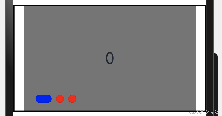
- 导航点使用默认样式
TypeScript
@Entry
@Component
struct SwiperSample {
  build() {
    Row() {
      // 轮播组件,导航点使用默认样式
      Swiper() {
        // 子组件
        Text('0')
          .width('90%').height('100%').backgroundColor(Color.Gray)
          .textAlign(TextAlign.Center).fontSize(30)
        Text('1')
          .width('90%').height('100%').backgroundColor(Color.Green)
          .textAlign(TextAlign.Center).fontSize(30)
        Text('2')
          .width('90%').height('100%').backgroundColor(Color.Pink)
          .textAlign(TextAlign.Center).fontSize(30)
      }
    }.height(200).width('100%').border({ width: 2 })
    .justifyContent(FlexAlign.Center)
  }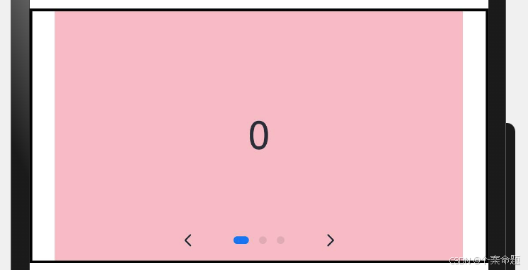
}- 自定义导航点样式
导航点直径设为30vp,左边距为0,导航点颜色设为红色。
TypeScript
@Entry
@Component
struct SwiperSample {
  build() {
    Row() {
      // 轮播组件,导航点使用自定义样式
      Swiper() {
        // 子组件
        Text('0')
          .width('90%').height('100%').backgroundColor(Color.Gray)
          .textAlign(TextAlign.Center).fontSize(30)
        Text('1')
          .width('90%').height('100%').backgroundColor(Color.Green)
          .textAlign(TextAlign.Center).fontSize(30)
        Text('2')
          .width('90%').height('100%').backgroundColor(Color.Pink)
          .textAlign(TextAlign.Center).fontSize(30)
      }
      .indicator(
        // 设置点式导航点
        Indicator.dot()
          // 设置导航点左边距为0
        .left(0)
          // 设置导航点的宽度为15vp
        .itemWidth(15)
          // 设置导航点的高度为15vp
        .itemHeight(15)
          // 设置选中的导航点宽度为30vp
        .selectedItemWidth(30)
          // 设置选中的导航点高度为15vp
        .selectedItemHeight(15)
          // 设置未选中的导航点的颜色
        .color(Color.Red)
          // 设置选中的导航点的颜色
        .selectedColor(Color.Blue)
      )
    }.height(200).width('100%').border({ width: 2 })
    .justifyContent(FlexAlign.Center)
  }
}
显示效果如下图所示:
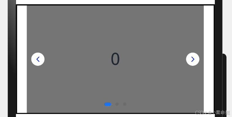
Swiper通过设置displayArrow属性,可以控制导航点箭头的大小、位置、颜色、底板的大小、颜色,以及鼠标悬停时是否显示箭头。
- 箭头使用默认样式
TypeScript
@Entry
@Component
struct SwiperSample {
  build() {
    Row() {
      // 轮播组件
      Swiper() {
        // 子组件
        Text('0')
          .width('90%').height('100%').backgroundColor(Color.Gray)
          .textAlign(TextAlign.Center).fontSize(30)
        Text('1')
          .width('90%').height('100%').backgroundColor(Color.Green)
          .textAlign(TextAlign.Center).fontSize(30)
        Text('2')
          .width('90%').height('100%').backgroundColor(Color.Pink)
          .textAlign(TextAlign.Center).fontSize(30)
      }
      // 第一个参数true表示显示导航箭头
      // 第二个参数表示是否在鼠标悬浮上方的时候显示导航箭头
      // 此处设置为false,表示无需鼠标悬浮即显示导航箭头
      .displayArrow(true, false)
    }.height(200).width('100%').border({ width: 2 })
    .justifyContent(FlexAlign.Center)
  }
}
初始的显示效果如下图所示:
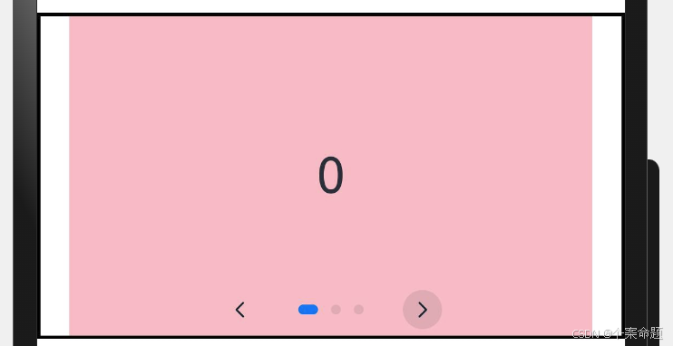
同时导航箭头可以点击进行导航,动效如下图所示,当释放鼠标按键的时候执行子组件切换:
- 自定义箭头样式
箭头显示在组件两侧,大小为18vp,导航点箭头颜色设为蓝色。
TypeScript
@Entry
@Component
struct SwiperSample {
  build() {
    Row() {
      // 轮播组件
      Swiper() {
        // 子组件
        Text('0')
          .width('90%').height('100%').backgroundColor(Color.Gray)
          .textAlign(TextAlign.Center).fontSize(30)
        Text('1')
          .width('90%').height('100%').backgroundColor(Color.Green)
          .textAlign(TextAlign.Center).fontSize(30)
        Text('2')
          .width('90%').height('100%').backgroundColor(Color.Pink)
          .textAlign(TextAlign.Center).fontSize(30)
      }
      .displayArrow({
        // 设置显示导航箭头的背景
        showBackground: true,
        // 设置导航边栏垂直居中
        isSidebarMiddle: true,
        // 设置背景的大小为24vp
        backgroundSize: 24,
        // 设置背景的颜色为白色
        backgroundColor: Color.White,
        // 设置箭头的大小为18vp
        arrowSize: 18,
        // 设置箭头的颜色为蓝色
        arrowColor: Color.Blue
      }, false) // 此处的false指的是无需鼠标悬浮即可显示导航箭头
    }.height(200).width('100%').border({ width: 2 })
    .justifyContent(FlexAlign.Center)
  }
}
显示的效果如下图所示:
页面切换方式
Swiper支持手指滑动、点击导航点和通过控制器三种方式切换页面,以下示例展示通过控制器切换页面的方法。
TypeScript
@Entry
@Component
struct SwiperSample {
// 轮播控制器
private swiperController: SwiperController = new SwiperController();
build() {
Column({ space: 5 }) {
Swiper(this.swiperController) {
Text('0').width(250).height(250).backgroundColor(Color.Gray)
.textAlign(TextAlign.Center).fontSize(30)
Text('1').width(250).height(250).backgroundColor(Color.Green)
.textAlign(TextAlign.Center).fontSize(30)
Text('2').width(250).height(250).backgroundColor(Color.Pink)
.textAlign(TextAlign.Center).fontSize(30)
}.indicator(true)
Row({ space: 12 }) {
Button('showNext')
.onClick(() => {
// 通过controller切换到后一页
this.swiperController.showNext();
})
Button('showPrevious')
.onClick(() => {
// 通过controller切换到前一页
this.swiperController.showPrevious();
})
}.margin(5)
}.width('100%')
.margin({ top: 5 })
}
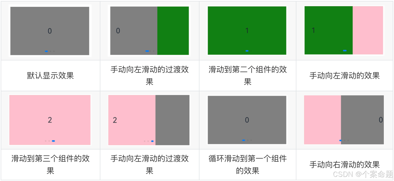
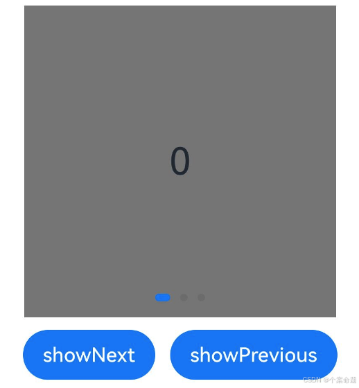
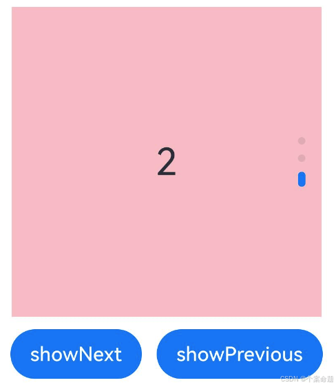
}初始显示效果如下:
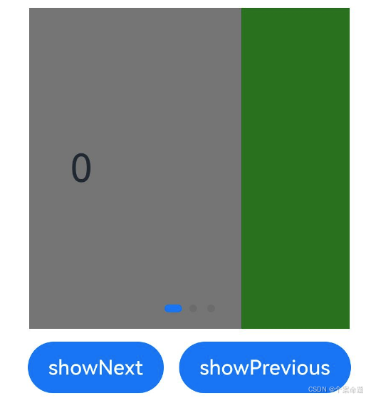
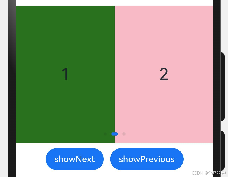
当点击showNext按钮的时候的切换动效,如下图所示:
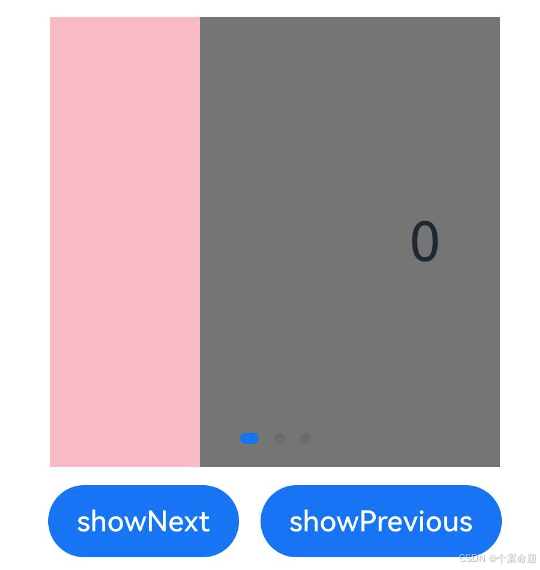
当点击showPrevious按钮的时候的切换动效,如下图所示:
轮播方向
Swiper支持水平和垂直方向上进行轮播,主要通过vertical属性控制。
当vertical为true时,表示在垂直方向上进行轮播;为false时,表示在水平方向上进行轮播。vertical默认值为false。
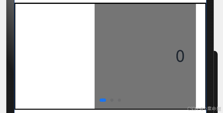
- 设置水平方向上轮播。
TypeScript
@Entry
@Component
struct SwiperSample {
  // 轮播控制器
  private swiperController: SwiperController = new SwiperController();
  build() {
    Column({ space: 5 }) {
      Swiper(this.swiperController) {
        Text('0').width(250).height(250).backgroundColor(Color.Gray)
          .textAlign(TextAlign.Center).fontSize(30)
        Text('1').width(250).height(250).backgroundColor(Color.Green)
          .textAlign(TextAlign.Center).fontSize(30)
        Text('2').width(250).height(250).backgroundColor(Color.Pink)
          .textAlign(TextAlign.Center).fontSize(30)
      }
      // 设置显示导航点
      .indicator(true)
      // 设置false表示在水平方向轮播
      .vertical(false)
      Row({ space: 12 }) {
        Button('showNext')
          .onClick(() => {
            // 通过controller切换到后一页
            this.swiperController.showNext();
          })
        Button('showPrevious')
          .onClick(() => {
            // 通过controller切换到前一页
            this.swiperController.showPrevious();
          })
      }.margin(5)
    }.width('100%')
    .margin({ top: 5 })
  }
}
显示效果如下图所示:
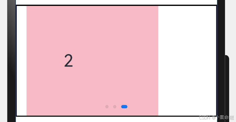
- 设置垂直方向轮播。
TypeScript
@Entry
@Component
struct SwiperSample {
  // 轮播控制器
  private swiperController: SwiperController = new SwiperController();
  build() {
    Column({ space: 5 }) {
      Swiper(this.swiperController) {
        Text('0').width(250).height(250).backgroundColor(Color.Gray)
          .textAlign(TextAlign.Center).fontSize(30)
        Text('1').width(250).height(250).backgroundColor(Color.Green)
          .textAlign(TextAlign.Center).fontSize(30)
        Text('2').width(250).height(250).backgroundColor(Color.Pink)
          .textAlign(TextAlign.Center).fontSize(30)
      }
      // 设置显示导航点
      .indicator(true)
      // 设置true表示在垂直方向轮播
      .vertical(true)
      Row({ space: 12 }) {
        Button('showNext')
          .onClick(() => {
            // 通过controller切换到后一页
            this.swiperController.showNext();
          })
        Button('showPrevious')
          .onClick(() => {
            // 通过controller切换到前一页
            this.swiperController.showPrevious();
          })
      }.margin(5)
    }.width('100%')
    .margin({ top: 5 })
  }
}
显示效果如下图所示:
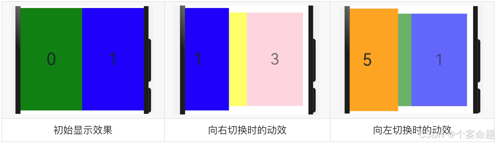
每页显示多个子页面
Swiper通过设置displayCount属性值,支持在一个页面内同时显示多个子组件。
TypeScript
@Entry
@Component
struct SwiperSample {
  // 轮播控制器
  private swiperController: SwiperController = new SwiperController();
  build() {
    Column({ space: 5 }) {
      Swiper(this.swiperController) {
        Text('0').width(250).height(250).backgroundColor(Color.Gray)
          .textAlign(TextAlign.Center).fontSize(30)
        Text('1').width(250).height(250).backgroundColor(Color.Green)
          .textAlign(TextAlign.Center).fontSize(30)
        Text('2').width(250).height(250).backgroundColor(Color.Pink)
          .textAlign(TextAlign.Center).fontSize(30)
      }
      // 设置显示导航点
      .indicator(true)
      // 设置一次显示2个子组件内容
      .displayCount(2)
      Row({ space: 12 }) {
        Button('showNext')
          .onClick(() => {
            // 通过controller切换到后一页
            this.swiperController.showNext();
          })
        Button('showPrevious')
          .onClick(() => {
            // 通过controller切换到前一页
            this.swiperController.showPrevious();
          })
      }.margin(5)
    }.width('100%')
    .margin({ top: 5 })
  }
}
显示效果如下图所示:
自定义切换动画
Swiper支持通过customContentTransition设置自定义切换动画,可以在回调中对视窗内所有页面逐帧设置透明度、缩放比例、位移、渲染层级等属性实现自定义切换动画。
TypeScript
@Entry
@Component
struct SwiperCustomAnimation {
  private DISPLAY_COUNT: number = 2
  private MIN_SCALE: number = 0.75
  @State backgroundColors: Color[] = [
    Color.Green, Color.Blue, Color.Yellow,
    Color.Pink, Color.Gray, Color.Orange
  ]
  @State opacityList: number[] = []
  @State scaleList: number[] = []
  @State translateList: number[] = []
  @State zIndexList: number[] = []

  aboutToAppear(): void {
    for (let i = 0; i < this.backgroundColors.length; i++) {
      this.opacityList.push(1.0)
      this.scaleList.push(1.0)
      this.translateList.push(0.0)
      this.zIndexList.push(0)
    }
  }

  build() {
    Column() {
      Swiper() {
        ForEach(this.backgroundColors, (backgroundColor: Color, index: number) => {
          Text(index.toString()).width('100%').height('100%').fontSize(50)
            .textAlign(TextAlign.Center).backgroundColor(backgroundColor)
            // 透明度使用状态变量控制
            .opacity(this.opacityList[index])
            // 缩放使用状态变量控制
            .scale({ x: this.scaleList[index], y: this.scaleList[index] })
            // 切换使用状态变量控制
            .translate({ x: this.translateList[index] })
            // zIndex使用状态变量控制
            .zIndex(this.zIndexList[index])
        })
      }.height(300).indicator(false).displayCount(this.DISPLAY_COUNT, true)
      .customContentTransition({
        // 切换动效持续时长为1000毫秒
        timeout: 1000,
        transition: (proxy: SwiperContentTransitionProxy) => {
          // 当发生切换的时候,执行下列操作
          // 1. 同组页面完全滑出视窗外时,重置属性值
          if (proxy.position <= proxy.index % this.DISPLAY_COUNT ||
            proxy.position >= this.DISPLAY_COUNT + proxy.index % this.DISPLAY_COUNT) {
            this.opacityList[proxy.index] = 1.0
            this.scaleList[proxy.index] = 1.0
            this.translateList[proxy.index] = 0.0
            this.zIndexList[proxy.index] = 0
          } else {
            // 2. 同组页面未滑出视窗外时,对同组中左右两个页面,逐帧根据position修改属性值
            if (proxy.index % this.DISPLAY_COUNT === 0) {
              this.opacityList[proxy.index] = 1 - proxy.position / this.DISPLAY_COUNT
              this.scaleList[proxy.index] =
                this.MIN_SCALE + (1 - this.MIN_SCALE) * (1 - proxy.position / this.DISPLAY_COUNT)
              this.translateList[proxy.index] =
                -proxy.position * proxy.mainAxisLength + (1 - this.scaleList[proxy.index]) * proxy.mainAxisLength / 2.0
            } else {
              this.opacityList[proxy.index] = 1 - (proxy.position - 1) / this.DISPLAY_COUNT
              this.scaleList[proxy.index] =
                this.MIN_SCALE + (1 - this.MIN_SCALE) * (1 - (proxy.position - 1) / this.DISPLAY_COUNT)
              this.translateList[proxy.index] = -(proxy.position - 1) * proxy.mainAxisLength -
                (1 - this.scaleList[proxy.index]) * proxy.mainAxisLength / 2.0
            }
            this.zIndexList[proxy.index] = -1
          }
        }
      })
    }.width('100%')
  }
}
显示效果如下图所示: