Wpf美化按钮,输入框,下拉框,dataGrid
引用代码后
引用资源
<ControlTemplate x:Key="CustomProgressBarTemplate" TargetType="ProgressBar">
    <Grid>
        <Border x:Name="PART_Track" CornerRadius="2" BorderBrush="#AAAAAA" BorderThickness="1">
            <Border.Background>
                <LinearGradientBrush StartPoint="0,0" EndPoint="1,1">
                    <GradientStop Color="#EEEEEE" Offset="0"/>
                    <GradientStop Color="#CCCCCC" Offset="1"/>
                </LinearGradientBrush>
            </Border.Background>
            <Rectangle x:Name="PART_Indicator" HorizontalAlignment="Left" Fill="#248735"/>
        </Border>
    </Grid>
    <ControlTemplate.Triggers>
        <Trigger Property="IsIndeterminate" Value="True">
            <!-- 处理不确定模式的逻辑 -->
        </Trigger>
    </ControlTemplate.Triggers>
</ControlTemplate>

<Style x:Key="ToggleButtonStyle" TargetType="{x:Type ToggleButton}">
    <Setter Property="Width" Value="50"></Setter>
    <Setter Property="Height" Value="20"></Setter>
    <Setter Property="Template">
        <Setter.Value>
            <ControlTemplate TargetType="ToggleButton">
                <!--定义视觉树-->
                <Border x:Name="border" BorderThickness="1.5" CornerRadius="9" BorderBrush="#aaa" Background="#2790ff">
                    <Grid x:Name="togglebutton" HorizontalAlignment="Right">
                        <Border Width="17" Height="17" CornerRadius="9" Background="White"/>
                    </Grid>
                    <!--阴影设置-->
                    <Border.Effect>
                        <DropShadowEffect Color="Gray" BlurRadius="5" ShadowDepth="0" Opacity="0.5" />
                    </Border.Effect>
                </Border>
                <!--定义触发器-->
                <ControlTemplate.Triggers>
                    <Trigger Property="IsChecked" Value="false">
                        <Setter TargetName="border" Property="Background" Value="#ccc"/>
                        <Setter TargetName="togglebutton" Property="HorizontalAlignment" Value="Left"/>
                    </Trigger>
                </ControlTemplate.Triggers>
            </ControlTemplate>
        </Setter.Value>
    </Setter>
</Style>
<!--<c:CheckConverter x:Key="CheckConverter"/>-->
<Style x:Key="pro1" TargetType="{x:Type ProgressBar}">
    <Setter Property="Height" Value="15"/>
    <Setter Property="Background" Value="#F9F9F9"/>
    <Setter Property="Padding" Value="5,2"/>
    <Setter Property="Template">
        <Setter.Value>
            <ControlTemplate TargetType="{x:Type ProgressBar}">
                <Border Padding="0" CornerRadius="10" Background="{TemplateBinding Background}">
                    <Grid Height="{TemplateBinding Height}">
                        <Border x:Name="PART_Track"/>
                        <Grid  x:Name="PART_Indicator" Background="Transparent"
                                   HorizontalAlignment="Left" >
                            <Border Background="Green" CornerRadius="10">
                                <Viewbox HorizontalAlignment="Right"
                                             Margin="{TemplateBinding Padding}"
                                             SnapsToDevicePixels="True">
                                    <TextBlock Foreground="White"
                                                HorizontalAlignment="Right"
                                                Text="{Binding RelativeSource={RelativeSource TemplatedParent},Path=Value,StringFormat={}{0}%}"/>
                                </Viewbox>
                            </Border>
                        </Grid>
                    </Grid>
                </Border>
                <ControlTemplate.Triggers>
                    <Trigger Property="IsEnabled" Value="False">
                        <Setter Property="Background" Value="gray"/>
                    </Trigger>
                </ControlTemplate.Triggers>
            </ControlTemplate>
        </Setter.Value>
    </Setter>
</Style>
<Style x:Key="TextBoxStyle" TargetType="TextBox">
    <Setter Property="Foreground" Value="Black"/>
    <Setter Property="BorderBrush" Value="#FF3C3C3C"/>
    <Setter Property="BorderThickness" Value="1"/>
    <Setter Property="Padding" Value="5"/>
    <Setter Property="Template">
        <Setter.Value>
            <ControlTemplate TargetType="TextBox">
                <Border Background="{TemplateBinding Background}"
                        BorderBrush="{TemplateBinding BorderBrush}"
                        BorderThickness="{TemplateBinding BorderThickness}"
                        CornerRadius="5">
                    <ScrollViewer x:Name="PART_ContentHost"/>
                </Border>
            </ControlTemplate>
        </Setter.Value>
    </Setter>
    <!-- 当 IsReadOnly 为 true 时,改变背景色 -->
    <Style.Triggers>
        <Trigger Property="IsEnabled" Value="False">
            <Setter Property="Background" Value="LightGray"/>
            <Setter Property="Foreground" Value="DarkGray"/>
            <Setter Property="BorderBrush" Value="Gray"/>
        </Trigger>
    </Style.Triggers>
</Style>

<Style x:Key="ButtonStyle" TargetType="Button">
    <Setter Property="FontSize" Value="16"/>
    <Setter Property="BorderBrush" Value="Transparent"/>
    <Setter Property="Margin" Value="10"/>
    <Setter Property="Foreground" Value="White"/>
    <Setter Property="Background" Value="Green"/>
    <Setter Property="Padding" Value="10,5"/>
    <Setter Property="FontWeight" Value="Bold"/>
    <Setter Property="FocusVisualStyle" Value="{x:Null}"/>
    <Setter Property="Template">
        <Setter.Value>
            <ControlTemplate TargetType="Button">
                <Border Background="{TemplateBinding Background}" BorderBrush="{TemplateBinding BorderBrush}" BorderThickness="1" CornerRadius="10">
                    <ContentPresenter HorizontalAlignment="Center" VerticalAlignment="Center" />
                </Border>
            </ControlTemplate>
        </Setter.Value>
    </Setter>
    <Style.Triggers>
        <Trigger Property="IsEnabled" Value="False">
            <Setter Property="Background" Value="LightGray"/>
            <Setter Property="Foreground" Value="DarkGray"/>
            <Setter Property="BorderBrush" Value="Gray"/>
        </Trigger>
    </Style.Triggers>
</Style>

<!-- 定义 ComboBox 的样式 -->
<Style x:Key="ComboBoxStyle" TargetType="ComboBox">
    <!-- 默认样式 -->
    <Setter Property="Background" Value="White"/>
    <Setter Property="Foreground" Value="#FF1E1E1E"/>
    <Setter Property="BorderBrush" Value="#FF3C3C3C"/>
    <Setter Property="BorderThickness" Value="1"/>
    <Setter Property="Padding" Value="5"/>
    <Setter Property="Template">
        <Setter.Value>
            <ControlTemplate TargetType="ComboBox">
                <Grid>
                    <Border x:Name="Border" Background="{TemplateBinding Background}"
                                BorderBrush="{TemplateBinding BorderBrush}"
                                BorderThickness="{TemplateBinding BorderThickness}"
                                CornerRadius="5"/>
                    <ToggleButton x:Name="ToggleButton"
                                      Grid.Column="1"
                                      Focusable="False"
                                      IsChecked="{Binding Path=IsDropDownOpen, Mode=TwoWay, RelativeSource={RelativeSource TemplatedParent}}"
                                      ClickMode="Press">
                        <ToggleButton.Template>
                            <ControlTemplate TargetType="ToggleButton">
                                <Border Background="Transparent">
                                    <Path x:Name="Arrow"
                                              Fill="Green"
                                              HorizontalAlignment="Right"
                                              VerticalAlignment="Center"
                                              Data="M 0 0 L 4 4 L 8 0 Z"/>
                                </Border>
                            </ControlTemplate>
                        </ToggleButton.Template>
                    </ToggleButton>
                    <ContentPresenter x:Name="ContentSite"
                                          IsHitTestVisible="False"
                                          Content="{TemplateBinding SelectionBoxItem}"
                                          ContentTemplate="{TemplateBinding SelectionBoxItemTemplate}"
                                          ContentTemplateSelector="{TemplateBinding ItemTemplateSelector}"
                                          Margin="5,0,0,0"
                                          VerticalAlignment="Center"
                                          HorizontalAlignment="Left"/>
                    <TextBox x:Name="PART_EditableTextBox"
                                 Style="{x:Null}"
                                 HorizontalAlignment="Left"
                                 VerticalAlignment="Center"
                                 Margin="5,0,0,0"
                                 Focusable="True"
                                 Background="Transparent"
                                 Foreground="{TemplateBinding Foreground}"
                                 Visibility="Hidden"
                                 IsReadOnly="{TemplateBinding IsReadOnly}"/>
                    <Popup x:Name="Popup"
                               Placement="Bottom"
                               IsOpen="{TemplateBinding IsDropDownOpen}"
                               AllowsTransparency="True"
                               Focusable="False"
                               PopupAnimation="Slide">
                        <Grid x:Name="DropDown"
                                  SnapsToDevicePixels="True"
                                  MinWidth="{TemplateBinding ActualWidth}"
                                  MaxHeight="{TemplateBinding MaxDropDownHeight}">
                            <Border x:Name="DropDownBorder"
                                        Background="{TemplateBinding Background}"
                                        BorderBrush="{TemplateBinding BorderBrush}"
                                        BorderThickness="1"
                                        CornerRadius="5"/>
                            <ScrollViewer Margin="4,6,4,6" SnapsToDevicePixels="True">
                                <StackPanel IsItemsHost="True" KeyboardNavigation.DirectionalNavigation="Contained"/>
                            </ScrollViewer>
                        </Grid>
                    </Popup>
                </Grid>
            </ControlTemplate>
        </Setter.Value>
    </Setter>

    <!-- 当 IsEnabled 为 false 时,改变背景色 -->
    <Style.Triggers>
        <Trigger Property="IsEnabled" Value="False">
            <Setter Property="Background" Value="LightGray"/>
            <Setter Property="Foreground" Value="DarkGray"/>
            <Setter Property="BorderBrush" Value="Gray"/>
        </Trigger>
    </Style.Triggers>
</Style>

<Style x:Key="DataGridStyles" TargetType="DataGrid">
    <!--<Setter Property="ColumnHeaderStyle" Value="{DynamicResource ColumnHeaderStyle}"></Setter>
    <Setter Property="CellStyle" Value="{DynamicResource CellStyle}"></Setter>
    <Setter Property="RowStyle" Value="{DynamicResource RowStyle}"></Setter>-->
    <!-- <Setter Property="EnableRowVirtualization" Value="True"></Setter> -->
    <!-- <Setter Property="GridLinesVisibility" Value="None"></Setter> -->
    <!-- <Setter Property="CanUserAddRows" Value="False"></Setter> -->
    <!-- <Setter Property="AutoGenerateColumns" Value="False"></Setter> -->
    <Setter Property="IsEnabled" Value="True"></Setter>
    <Setter Property="HeadersVisibility" Value="Column"></Setter>
    <!--网格线颜色-->
    <Setter Property="Background" Value="White" />
</Style>
<Style x:Key="ColumnHeaderStyles" TargetType="DataGridColumnHeader">
    <Setter Property="Height" Value="35"></Setter>
    <Setter Property="FontSize" Value="13"></Setter>
    <Setter Property="Background" Value="#F2F2F2"></Setter>
    <Setter Property="BorderThickness" Value="0,0,1,1"></Setter>
    <Setter Property="BorderBrush" Value="Black"></Setter>
    <Setter Property="VerticalContentAlignment" Value="Center"></Setter>
    <Setter Property="HorizontalContentAlignment" Value="Center"></Setter>
</Style>
<Style x:Key="RowStyles" TargetType="DataGridRow">
    <Setter Property="Cursor" Value="Hand"></Setter>
    <Setter Property="BorderBrush" Value="Black"/>
    <Setter Property="BorderThickness" Value="0,0,0,1"/>
    <Style.Triggers>
        <Trigger Property="IsMouseOver" Value="true">
            <Setter Property="Background" Value="#F2F2F2"/>
        </Trigger>
        <Trigger Property="IsSelected" Value="True">
            <Setter Property="Background"  Value="Blue" />
        </Trigger>
    </Style.Triggers>
</Style>
<Style x:Key="CellStyles" TargetType="DataGridCell">
    <Setter Property="Height" Value="35"></Setter>
    <Setter Property="FontSize" Value="15"></Setter>
    <Setter Property="Template">
        <Setter.Value>
            <ControlTemplate TargetType="DataGridCell">
                <Border x:Name="Bg" Background="Transparent" BorderThickness="0" UseLayoutRounding="True" BorderBrush="#FFCBCBCB">
                    <ContentPresenter HorizontalAlignment="Center"  VerticalAlignment="Center" />
                </Border>
            </ControlTemplate>
        </Setter.Value>
    </Setter>
</Style>
<!-- 定义数据表格的基础风格 -->
    <Style x:Key="styleDataGridView" TargetType="DataGrid">
        <Setter Property="Background" Value="#F0F0F0"/>
        <Setter Property="BorderBrush" Value="#D7D7D7"/>
        <Setter Property="BorderThickness" Value="1"/>
        <Setter Property="RowHeaderWidth" Value="25"/>
        <Setter Property="AutoGenerateColumns" Value="False"/>
        <Setter Property="CanUserAddRows" Value="False"/>
        <!-- <Setter Property="AlternatingRowBackground" Value="#EDEDED"/> -->
        <!-- 隔行变色效果 -->
        <Setter Property="CellStyle">
            <Setter.Value>
                <Style TargetType="DataGridCell">
                    <Setter Property="Padding" Value="8,4"/>
                    <Setter Property="Foreground" Value="Black"/>
                    <Setter Property="FontSize" Value="14"/>
                    <Setter Property="FontFamily" Value="Arial"/>
                    <Setter Property="HorizontalContentAlignment" Value="Center"/>
                    <Setter Property="VerticalContentAlignment" Value="Center"/>
                </Style>
            </Setter.Value>
        </Setter>
    </Style>

     <Style x:Key="DataGridStyles" TargetType="DataGrid">
        <Setter Property="ColumnHeaderStyle" Value="{DynamicResource ColumnHeaderStyle}"></Setter>
        <Setter Property="CellStyle" Value="{DynamicResource CellStyle}"></Setter>
        <Setter Property="RowStyle" Value="{DynamicResource RowStyle}"></Setter>
        <!-- <Setter Property="EnableRowVirtualization" Value="True"></Setter> -->
        <!-- <Setter Property="GridLinesVisibility" Value="None"></Setter> -->
        <!-- <Setter Property="CanUserAddRows" Value="False"></Setter> -->
        <!-- <Setter Property="AutoGenerateColumns" Value="False"></Setter> -->
        <Setter Property="IsEnabled" Value="True"></Setter>
        <Setter Property="HeadersVisibility" Value="Column"></Setter>
         <!--网格线颜色-->
         <Setter Property="Background" Value="White" />
    </Style>
    <Style x:Key="ColumnHeaderStyles" TargetType="DataGridColumnHeader">
        <Setter Property="Height" Value="35"></Setter>
        <Setter Property="FontSize" Value="15"></Setter>
        <Setter Property="FontWeight" Value="Bold"></Setter>
        <Setter Property="Background" Value="#F2F2F2"></Setter>
        <Setter Property="BorderThickness" Value="0,0,1,1"></Setter>
        <Setter Property="BorderBrush" Value="Black"></Setter>
        <Setter Property="VerticalContentAlignment" Value="Center"></Setter>
        <Setter Property="HorizontalContentAlignment" Value="Center"></Setter>
    </Style>
    <Style x:Key="RowStyles" TargetType="DataGridRow">
        <Setter Property="Cursor" Value="Hand"></Setter>
        <Setter Property="BorderBrush" Value="Black"/>
        <Setter Property="BorderThickness" Value="0,0,0,1"/>
        <Style.Triggers>
            <Trigger Property="IsMouseOver" Value="true">
                <Setter Property="Background" Value="#F2F2F2"/>
            </Trigger>
            <Trigger Property="IsSelected" Value="True">
                <Setter Property="Background"  Value="Blue" />
            </Trigger>
        </Style.Triggers>
    </Style>
    <Style x:Key="CellStyles" TargetType="DataGridCell">
        <Setter Property="Height" Value="35"></Setter>
        <Setter Property="FontSize" Value="15"></Setter>
        <Setter Property="Template">
            <Setter.Value>
                <ControlTemplate TargetType="DataGridCell">
                    <Border x:Name="Bg" Background="Transparent" BorderThickness="0" UseLayoutRounding="True" BorderBrush="#FFCBCBCB">
                        <ContentPresenter HorizontalAlignment="Center"  VerticalAlignment="Center" />
                    </Border>
                </ControlTemplate>
            </Setter.Value>
        </Setter>
   </Style>
项目主要代码
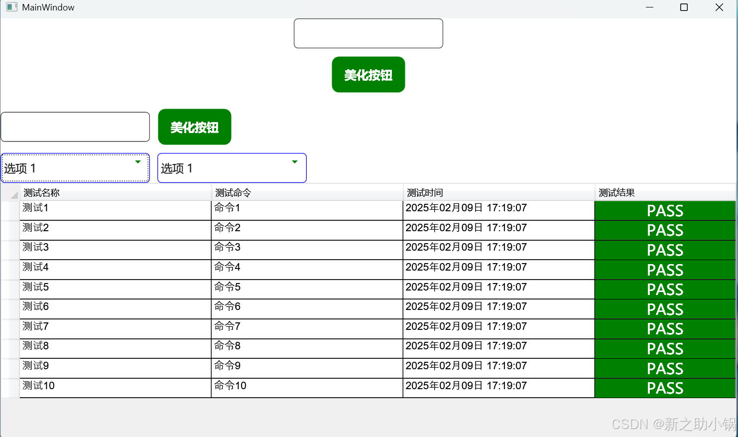
MainWindow.xaml
<Window x:Class="TestWpfUI.MainWindow"
        xmlns="http://schemas.microsoft.com/winfx/2006/xaml/presentation"
        xmlns:x="http://schemas.microsoft.com/winfx/2006/xaml"
        xmlns:d="http://schemas.microsoft.com/expression/blend/2008"
        xmlns:mc="http://schemas.openxmlformats.org/markup-compatibility/2006"
        mc:Ignorable="d"
        Title="MainWindow" Height="600" Width="1000"
        WindowStartupLocation="CenterScreen">
    <Grid>
        <Grid.RowDefinitions>
            <RowDefinition Height="Auto"/>
            <RowDefinition Height="Auto"/>
            <RowDefinition Height="Auto"/>
            <RowDefinition Height="Auto"/>
            <RowDefinition/>
        </Grid.RowDefinitions>
        <TextBox Grid.Row="0"
            Style="{StaticResource TextBoxStyle}"
            Width="200" Height="40"
            x:Name="textBox1"
            FontSize="20"></TextBox>
        <Button Grid.Row="1"
                Style="{StaticResource ButtonStyle}"
                Width="100" Height="50" Content="美化按钮"
                Click="Button1_OnClick"/>
        <StackPanel Grid.Row="2" Orientation="Horizontal">
            <TextBox
                     Style="{StaticResource TextBoxStyle}"
                     Width="200" Height="40"
                     x:Name="textBox2"
                     IsReadOnly="True"
                     FontSize="20"></TextBox>
            <Button Style="{StaticResource ButtonStyle}"
                    Width="100" Height="50" Content="美化按钮"
                    IsEnabled="False"
                    Click="Button2_OnClick"

                    x:Name="Button2"/>
        </StackPanel>

        <StackPanel Grid.Row="3" Orientation="Horizontal"  VerticalAlignment="Center">
            <!-- 普通 ComboBox -->
            <ComboBox x:Name="ComboBox1" FontSize="15" Style="{StaticResource ComboBoxStyle}" Width="200" Height="40" SelectedIndex="0">
                <ComboBoxItem Content="选项 1"/>
                <ComboBoxItem Content="选项 2"/>
                <ComboBoxItem Content="选项 3"/>
            </ComboBox>

            <!-- 不可用 ComboBox -->
            <ComboBox x:Name="ComboBox2" FontSize="15" Style="{StaticResource ComboBoxStyle}" Width="200" Height="40"
                      Margin="10,0,0,0" SelectedIndex="0" IsEnabled="False">
                <ComboBoxItem Content="选项 1"/>
                <ComboBoxItem Content="选项 2"/>
                <ComboBoxItem Content="选项 3"/>
            </ComboBox>
        </StackPanel>
        <Grid Grid.Row="4">
            <DataGrid x:Name="DataGrids" Style="{StaticResource styleDataGridView}">
                <DataGrid.Columns>
                    <DataGridTextColumn Header="测试名称" Binding="{Binding Path=TestName ,Mode=TwoWay,UpdateSourceTrigger=PropertyChanged}" Width="0.15*" />
                    <DataGridTextColumn Header="测试命令" Binding="{Binding Path=Command,Mode=TwoWay,UpdateSourceTrigger=PropertyChanged}" Width="0.15*" />
                    <DataGridTextColumn Header="测试时间" Binding="{Binding Path=TestDate,Mode=TwoWay,UpdateSourceTrigger=PropertyChanged}" Width="0.15*" />

                    <DataGridTextColumn Header="测试结果" Binding="{Binding Path=TestValue,Mode=TwoWay,UpdateSourceTrigger=PropertyChanged}" Width="0.11*">
                        <DataGridTextColumn.CellStyle >

                            <Style TargetType="DataGridCell">
                                 <Setter Property="FontSize" Value="20"></Setter>

                                 <Style.Triggers>
                                    <DataTrigger Binding="{Binding TestValue}" Value="PASS">
                                        <Setter Property="Template">
                                            <Setter.Value>
                                                <ControlTemplate TargetType="DataGridCell">
                                                    <Border Background="Green">
                                                        <ContentPresenter HorizontalAlignment="Center"  VerticalAlignment="Center" />
                                                    </Border>
                                                </ControlTemplate>
                                            </Setter.Value>
                                        </Setter>
                                        <Setter Property="Foreground" Value="White"></Setter>
                                    </DataTrigger>
                                    <DataTrigger Binding="{Binding TestValue}" Value="FAIL">
                                        <Setter Property="Template">
                                            <Setter.Value>
                                                <ControlTemplate TargetType="DataGridCell">
                                                    <Border Background="Red" >
                                                        <ContentPresenter HorizontalAlignment="Center"  VerticalAlignment="Center" />
                                                    </Border>
                                                </ControlTemplate>
                                            </Setter.Value>
                                        </Setter>
                                        <Setter Property="Foreground" Value="White"></Setter>

                                    </DataTrigger>
                                </Style.Triggers>
                            </Style>

                        </DataGridTextColumn.CellStyle>
                    </DataGridTextColumn>
                </DataGrid.Columns>
            </DataGrid>
        </Grid>
    </Grid>
</Window>
MainWindow.cs
using System.Collections.ObjectModel;
using System.Windows;
using TestWpfUI.Common.Models;

namespace TestWpfUI;

/// <summary>
/// Interaction logic for MainWindow.xaml
/// </summary>
public partial class MainWindow
{
    public MainWindow()
    {
        InitializeComponent();
        var testDatas = new ObservableCollection<TestData>();

        for (int i = 1; i <= 10; i++)
        {
            testDatas.Add(new TestData() { TestName = "测试"+i, Command = "命令"+i,
                TestDate = DateTime.Now.ToString("yyyy年MM月dd日 HH:mm:ss"),TestValue = "PASS"});
        }

        DataGrids.ItemsSource = testDatas;
    }

    private void Button1_OnClick(object sender, RoutedEventArgs e)
    {
        MessageBox.Show(textBox1.Text);
        if (textBox2.IsReadOnly)
        {
            textBox2.IsReadOnly = false;
        }

        if (Button2.IsEnabled == false)
        {
            Button2.IsEnabled = true;
        }
    }

    private void Button2_OnClick(object sender, RoutedEventArgs e)
    {
        MessageBox.Show(textBox2.Text);
        if (ComboBox2.IsEnabled == false)
        {
            ComboBox2.IsEnabled = true;
        }
    }
}