前言
本专栏是关于iced库的部件的介绍,iced库是基于rust的GUI库,可以创建基于rust的窗口程序。
关于iced
iced是跨平台的GUI框架,基于rust语言,它的架构受到Elm的启发。
发文平台
稀土掘金
概述
本文是专栏的第一篇,介绍iced中的按钮部件,button。
1、button构建
rust
pub struct Button<'a, Message, Theme = crate::Theme, Renderer = crate::Renderer>
where
    Renderer: crate::core::Renderer,
    Theme: Catalog,
{
    content: Element<'a, Message, Theme, Renderer>,
    on_press: Option<OnPress<'a, Message>>,
    width: Length,
    height: Length,
    padding: Padding,
    clip: bool,
    class: Theme::Class<'a>,
}实例创建使用Button::new(content),
rust
pub fn button<'a, Message, Theme, Renderer>(
    content: impl Into<Element<'a, Message, Theme, Renderer>>,
) -> Button<'a, Message, Theme, Renderer>
where
    Theme: button::Catalog + 'a,
    Renderer: core::Renderer,
{
    Button::new(content)
}
此处content的类型,是iced中的Element,即任何部件。通常按钮的content添加的是文本内容,用于设置按钮名称,可使用text部件,当然,也可以使用image部件,为按钮添加图片。
2、实际应用
我们需要先导入button:
rust
use iced::widget::{button,column,text,image};我们可以这样添加一个按钮:
rust
button(text("增加").size(20)).width(100).height(40).on_press(Message::Increment)如上,on_press是button的触发函数,当点击按钮时,on_press触发消息,此处,消息为Message类型。所以我们需要创建一个Message枚举:
rust
#[derive(Debug, Clone)]
enum Message {
    Increment,
    Decrement,
}
比如,我们要实现一个计数器功能,那么要添加两个按钮,一个是增加计数,一个是减少计数。那么按钮的触发消息就是Inc和Dec。并且需要分别绑定到按钮的on_press上。
那么消息的触发,在哪里处理呢? iced中有一个update函数,此中处理所有的消息逻辑:
rust
fn update(&mut self,message:Message){
        match message {
            Message::Increment =>{
                self.count += 1;
            }
            Message::Decrement =>{
                self.count -= 1;
            }
        }
}比如此例中,两个按钮消息的处理逻辑就是对计数器变量count进行增、减计算。
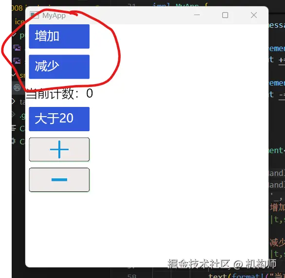
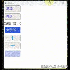
看一下实际演示:
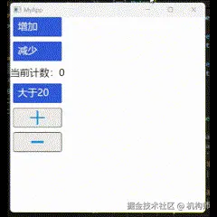
对于button,除了on_press之外,还有on_press_with与on_press_maybe两种用法,下面简单说一下这两种用法。 相比于on_press是直接产生消息Message,on_press_with则稍有不同,可以使用闭包函数来产生消息。我们举例来说明:
rust
 button(text("大于20").size(20)).width(100).height(40).on_press_with(||{
                if self.count > 20 {
                    Message::Increment
                } else if self.count < 20 {
                    Message::Decrement
                } else {
                    Message::Null
                }
            }),
如上,按钮点击时,产生的消息,将根据count的值的不同而变化,如果count大于20,那么点击时就是增加,如果小于20,那么点击时就是减少。 所以,on_press_with事实上是增强了button,可以让button根据条件来产生消息,便于实现复杂的功能。
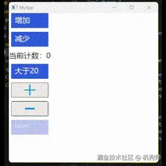
再来看on_press_maybe,这个的用法是,消息参数并不直接为Message而是Option(Message),这个Option的结果如果是Some,那么就接收Message,如果是None,那么button将被禁用。我们将其参数使用一个变量来表示,根据count的值来返回不同的结果。
rust
struct MyApp {
    count: i32,
    someornone:Option<Message>,
}
rust
 Message::Increment =>{
                self.count += 1;
                if self.count > 20 {
                    self.someornone = Some(Message::Null);
                }
            }
            Message::Decrement =>{
                self.count -= 1;
                if self.count < 20 {
                    self.someornone = None;
                }
            }
rust
button("none").width(100).height(40).on_press_maybe(self.someornone.clone()),我们可以来看一下实际演示:
3、button自定义样式
我们上文创建的button,并未设置样式,所以运行后显示的是默认样式。但是iced提供了style函数来设置自定义样式。 我们先看下iced中style的定义:
rust
 /// Sets the style of the [`Button`].
    #[must_use]
    pub fn style(mut self, style: impl Fn(&Theme, Status) -> Style + 'a) -> Self
    where
        Theme::Class<'a>: From<StyleFn<'a, Theme>>,
    {
        self.class = (Box::new(style) as StyleFn<'a, Theme>).into();
        self
    }
可以看到,style的参数是闭包函数,返回的是Style,此处的Style是button的Style:
rust
/// The style of a button.
#[derive(Debug, Clone, Copy, PartialEq)]
pub struct Style {
    /// The [`Background`] of the button.
    pub background: Option<Background>,
    /// The text [`Color`] of the button.
    pub text_color: Color,
    /// The [`Border`] of the buton.
    pub border: Border,
    /// The [`Shadow`] of the butoon.
    pub shadow: Shadow,
}
其中参数主要是4个:background、text_color、border、shadow。 也就是背景色、文本色、边框以及阴影。 我们可以这样来构建自定义样式,创建一个函数,返回Style:
rust
fn mybuttonstyle(t:&iced::Theme,s:iced::widget::button::Status) -> iced::widget::button::Style{

    match s {
        iced::widget::button::Status::Active =>{
            iced::widget::button::Style {
                background:Some(iced::Background::Color(color!(0xEEE9E9))),//#EEE9E9FF
                text_color:color!(0x2A13F1),//#2A13F1FF
                border:iced::Border{
                    color:iced::Color::from_rgb(0.0, 0.0, 0.0),
                    width:1.0,
                    radius:{1.0;4}.into(),
                },
                shadow:iced::Shadow {
                    color:color!(0x92EF9D), //#92EF9DFF
                    offset:iced::Vector {x:1.0,y:1.0},
                    blur_radius:1.0,
                },
            }
        }
        iced::widget::button::Status::Hovered =>{
            iced::widget::button::Style {
                background:Some(iced::Background::Color(color!(0x49BBF0))),//#49BBF0FF
                text_color:color!(0x2A13F1),//#2A13F1FF
                border:iced::Border{
                    color:iced::Color::from_rgb(0.0, 0.0, 0.0),
                    width:1.0,
                    radius:{1.0;4}.into(),
                },
                shadow:iced::Shadow {
                    color:color!(0x92EF9D), //#92EF9DFF
                    offset:iced::Vector {x:1.0,y:1.0},
                    blur_radius:1.0,
                },
            }
        }
        iced::widget::button::Status::Pressed =>{
            iced::widget::button::Style {
                background:Some(iced::Background::Color(color!(0xEEE9E9))),//#EEE9E9FF
                text_color:color!(0x2A13F1),//#2A13F1FF
                border:iced::Border{
                    color:iced::Color::from_rgb(0.0, 0.0, 0.0),
                    width:1.0,
                    radius:{1.0;4}.into(),
                },
                shadow:iced::Shadow {
                    color:color!(0x92EF9D), //#92EF9DFF
                    offset:iced::Vector {x:1.0,y:1.0},
                    blur_radius:1.0,
                },
            }
        }
        iced::widget::button::Status::Disabled =>{
            iced::widget::button::Style {
                background:Some(iced::Background::Color(color!(0xEEE9E9))),//#EEE9E9FF
                text_color:color!(0x2A13F1),//#2A13F1FF
                border:iced::Border{
                    color:iced::Color::from_rgb(0.0, 0.0, 0.0),
                    width:1.0,
                    radius:{1.0;4}.into(),
                },
                shadow:iced::Shadow {
                    color:color!(0x92EF9D), //#92EF9DFF
                    offset:iced::Vector {x:1.0,y:1.0},
                    blur_radius:1.0,
                },
            }
        }
    }

}
可以看到,我们设置了button在不同的Status下的样式(active、pressed、hovered、disabled)。
然后,我们在创建按钮时,直接设置button的style即可:
rust
 button(text("增加").size(20)).width(100).height(40).on_press(Message::Increment)
                .style(|t,s|{mybuttonstyle(t, s)})
                ,
            button(text("减少").size(20)).width(100).height(40).on_press(Message::Decrement)
                .style(|t,s|{mybuttonstyle(t, s)})
看下效果:
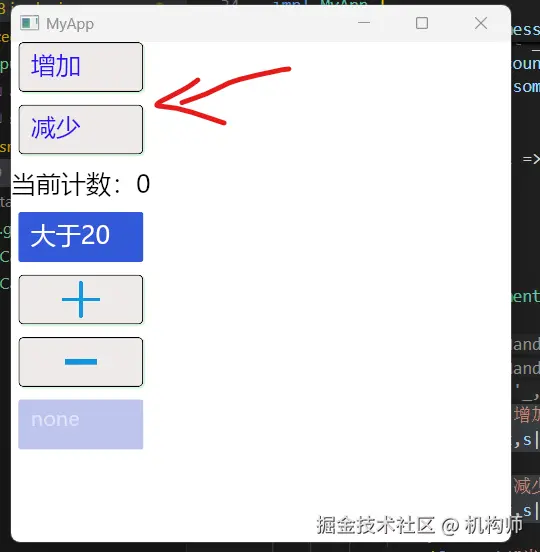
上图可以看到效果,同时还可以看到下面的两个按钮,有加减符号的图片,此处,我们简单说说button添加图片的用法,实际上也很简单,就是button的content元素使用图片:
rust
button(image(&handle_add).width(80).height(20).content_fit(iced::ContentFit::Contain))
                .width(100).height(40).on_press(Message::Increment)
                .style(|t,s|{mybuttonstyle(t, s)}),
            button(image(handle_sub).width(80).height(20).content_fit(iced::ContentFit::Contain))
                .width(100).height(40).on_press(Message::Decrement)
                .style(|t,s|{mybuttonstyle(t, s)}),
image也是iced中的部件,我们会在后面的博文中细说。此处我们为按钮添加了image元素,显示效果如下:
综上,我们大致了解了iced中button的简单使用。