Android总体有五大布局:
线性布局(LiearLayout): 屏幕垂直或水平方向布局。
帧布局(FrameLayout):控件从屏幕左上角开始布局。
相对布局(RelativeLayout): 以其他控件为参照布局。
绝对布局(AbsoluteLayout):以屏幕坐标布局。
表格布局(TableLayout):按照行列方式布局
1. RelativeLayout(相对布局)
-
特点:通过相对位置来排列子视图,子视图的位置可以相对于父布局或其他子视图进行定位。
-
重要属性:
-
相对于父布局的定位属性:
- android:layout_alignParentTop:将视图与父布局顶部对齐。
- android:layout_alignParentBottom:与父布局底部对齐。
- android:layout_alignParentLeft:与父布局左侧对齐。
- android:layout_alignParentRight:与父布局右侧对齐。
- android:layout_centerInParent:将视图在父布局中居中显示。
-
相对于其他子视图的定位属性:
- android:layout_below :将视图置于指定视图下方,如
android:layout_below="@id/view1"。 - android:layout_above:置于指定视图上方。
- android:layout_toLeftOf:置于指定视图左侧。
- android:layout_toRightOf:置于指定视图右侧。
- android:layout_below :将视图置于指定视图下方,如
-
-
适用场景:适用于需要精确定位子视图相对位置的复杂布局,例如一个图片在文本的右侧,且文本与图片底部对齐的场景。
2. LinearLayout(线性布局)
-
特点:按照水平或垂直方向排列子视图。所有子视图都排列在一条直线上,不会换行。
-
重要属性:
- android:orientation :指定布局方向,取值为
horizontal(水平)或vertical(垂直)。例如,android:orientation="horizontal"表示子视图将水平排列。 - android:layout_weight :用于控制子视图在布局中的权重分配。当子视图设置了该属性后,剩余空间会按照权重比例分配给这些子视图。例如,两个按钮都设置
android:layout_weight="1",则它们会平分剩余空间。
- android:orientation :指定布局方向,取值为
-
适用场景:适用于简单的、单方向排列视图的场景,如水平排列的导航栏按钮,或垂直排列的表单输入框。
-
代码:
ini<?xml version="1.0" encoding="utf-8"?> <LinearLayout xmlns:android="http://schemas.android.com/apk/res/android" xmlns:app="http://schemas.android.com/apk/res-auto" xmlns:tools="http://schemas.android.com/tools" android:layout_width="match_parent" android:layout_height="match_parent" tools:context=".MainActivity" android:orientation="horizontal"> <EditText android:id="@+id/username" android:layout_width="109dp" android:layout_height="88dp" android:hint="Username" /> <EditText android:id="@+id/password" android:layout_width="wrap_content" android:layout_height="90dp" android:hint="Password" android:inputType="textPassword" /> <Button android:id="@+id/loginButton" android:layout_width="112dp" // 注意这是所分配的权重,只有在linearlayout中,该属性才有效; android:layout_height="88dp" android:text="Login" /> </LinearLayout>
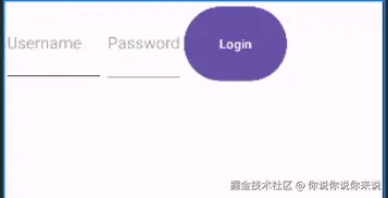
- 图示:horizontal
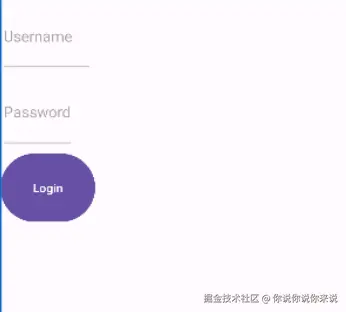
- 图示:vertical
3. FrameLayout(帧布局)
- 特点:所有子视图都堆叠在左上角,后添加的视图覆盖在先添加的视图之上。
- 重要属性 :通常直接使用默认属性,子视图的大小和位置通过
android:layout_width、android:layout_height以及android:layout_gravity等属性控制。例如,android:layout_gravity="center"可将子视图在帧布局中居中显示。 - 适用场景:常用于显示单个视图,或者需要叠加显示多个视图(如图片上叠加文字说明)的场景。
4. TableLayout(表格布局)
-
特点 :以表格形式排列子视图,由行和列组成。每一个
TableRow代表一行,TableRow中的子视图代表列。也可以直接添加子视图,这些子视图会被分配到不同的行。 -
重要属性:
- android:stretchColumns :指定哪些列将拉伸以填满可用空间,通过列索引指定,如
android:stretchColumns="0,2"表示第 1 列和第 3 列将拉伸。 - android:shrinkColumns:指定哪些列将收缩以适应可用空间。
- android:stretchColumns :指定哪些列将拉伸以填满可用空间,通过列索引指定,如
-
适用场景 :适用于需要以表格形式展示数据的场景,如简单的表格数据展示,但由于其性能问题,在复杂场景下逐渐被
RecyclerView等替代。 -
代码:
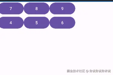
xml<TableLayout xmlns:android="http://schemas.android.com/apk/res/android" android:layout_width="match_parent" android:layout_height="match_parent"> <TableRow>//当向TableLayout中添加组件时,如果希望这些组件出现在同一行中,则必须将它们放在TableRow中。 <Button android:text="7"/> <Button android:text="8"/> <Button android:text="9"/> </TableRow> <TableRow> <Button android:text="4"/> <Button android:text="5"/> <Button android:text="6"/> </TableRow> <!-- 更多行... --> </TableLayout>
- 图示:
5. ConstraintLayout(约束布局)
-
特点:一种灵活且强大的布局,通过创建子视图之间的约束关系来定位和调整子视图的大小。可以减少布局嵌套,提高布局渲染效率。
-
重要属性:
-
约束属性:
- android:layout_constraintLeft_toLeftOf:将视图的左侧与指定视图的左侧对齐。
- android:layout_constraintTop_toBottomOf:将视图的顶部与指定视图的底部对齐,以此类推还有其他方向的约束属性。
-
偏移和间距属性:
- android:layout_margin:设置视图四周的外边距。
- android:layout_constraintHorizontal_bias 和 android:layout_constraintVertical_bias :用于控制视图在两个约束之间的水平和垂直偏移比例,取值范围为 0 - 1。例如,
android:layout_constraintHorizontal_bias="0.5"表示在水平方向上居中偏移。
-
-
适用场景:广泛适用于各种复杂布局,尤其是在需要适配不同屏幕尺寸时,通过合理设置约束关系,能在不同设备上保持一致的布局效果。 代码:
ini<androidx.constraintlayout.widget.ConstraintLayout xmlns:android="http://schemas.android.com/apk/res/android" android:layout_width="match_parent" android:layout_height="match_parent"> <ImageView android:id="@+id/profilePicture" android:layout_width="100dp" android:layout_height="100dp" android:src="@drawable/ic_launcher_background" app:layout_constraintTop_toTopOf="parent" app:layout_constraintStart_toStartOf="parent" app:layout_constraintEnd_toEndOf="parent"/> <EditText android:id="@+id/username" android:layout_width="0dp" android:layout_height="wrap_content" android:hint="Username" app:layout_constraintTop_toBottomOf="@id/profilePicture" app:layout_constraintStart_toStartOf="parent" app:layout_constraintEnd_toEndOf="parent"/> <!-- 更多控件... --></androidx.constraintlayout.widget.ConstraintLayout>
- 图示
6. CoordinatorLayout(协调布局)
-
特点 :作为
AppBarLayout、FloatingActionButton等设计支持库组件的容器,能够实现更复杂的布局和交互效果,如滚动时隐藏或显示某些视图等。它可以监听和响应子视图的各种事件,并协调子视图之间的交互。 -
重要属性:
- app:layout_behavior :为子视图指定一个
Behavior类,用于定义子视图的特殊行为,如app:layout_behavior="@string/appbar_scrolling_view_behavior"用于将子视图与AppBarLayout的滚动行为关联起来。
- app:layout_behavior :为子视图指定一个
-
适用场景 :常用于实现具有 Material Design 风格的界面,如带有可滚动
Toolbar和FAB(悬浮操作按钮)的主界面布局,这些组件之间的交互和布局调整可以通过CoordinatorLayout来协调。