目录
[2.1 实现导航栏](#2.1 实现导航栏)
[2.2 实现个人信息](#2.2 实现个人信息)
[2.3 实现博客列表](#2.3 实现博客列表)
[3.2 复用](#3.2 复用)
[3.4 实现博客正文](#3.4 实现博客正文)
[4.1 版心](#4.1 版心)
[4.2 登录框](#4.2 登录框)
[5.1 标题编辑项](#5.1 标题编辑项)
[5.2 编辑区](#5.2 编辑区)
[6.1 下载](#6.1 下载)
[6.2 引入](#6.2 引入)
[6.3 编写代码](#6.3 编写代码)
一,效果展示
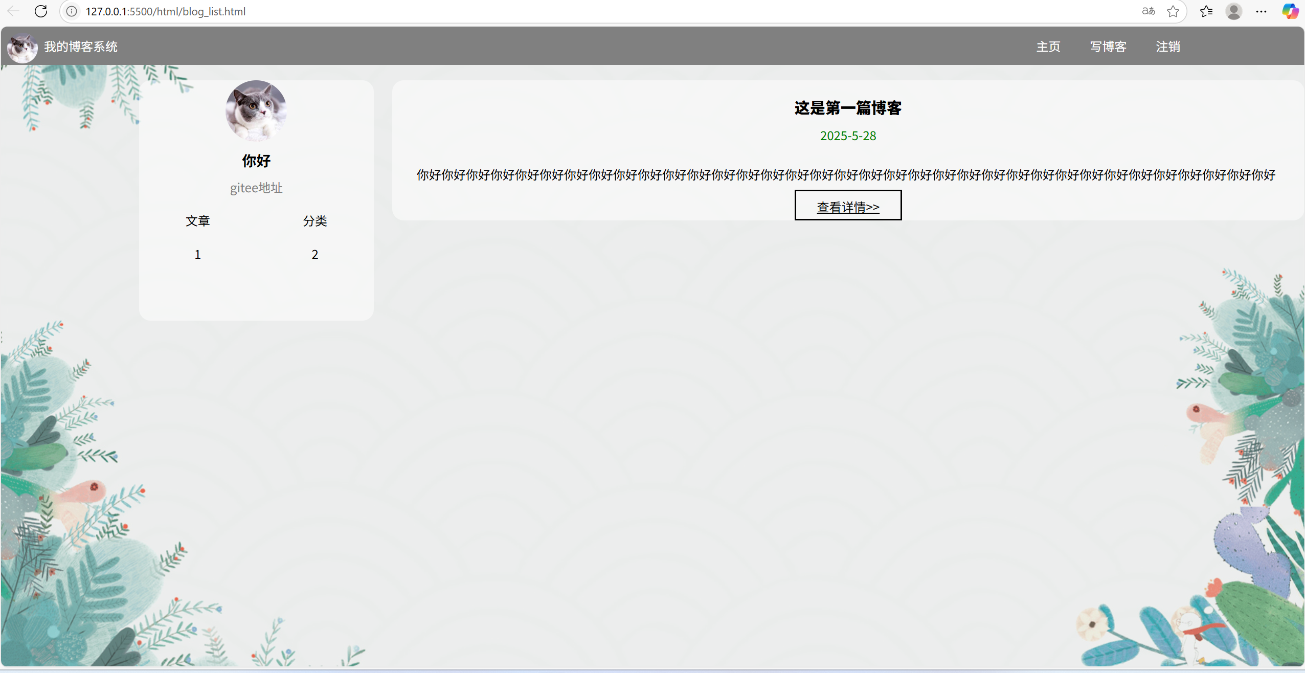
一共实现了三个页面:
首先是主页面:
然后是登录页面:
然后是博客编辑页面:
需要用到的文件如下,可以先创建好:
注:目前只实现了页面的展示,并没有使用js实现页面行为,因为账号管理、文章内容存储等需要后端服务器支持,我们以后再实现
该文章的代码码云:博客 · 小堃学编程/前端 - 码云 - 开源中国
二,实现博客列表页
2.1 实现导航栏
导航栏就是最上面那灰色的一条
①html结构设计
导航栏我们用一个div即可,其中包括左边的logo和标题,还有右边三个超链接:
html
    <!--上方导航栏-->
    <div class="nav">
        <img src="../img/logo.png" alt="">
        <span>我的博客系统</span>
        <span class="space"></span>
        <a href="blog_list.html">主页</a>
        <a href="blog_edit.html">写博客</a>
        <a href="https://www.baidu.com">注销</a>
    </div>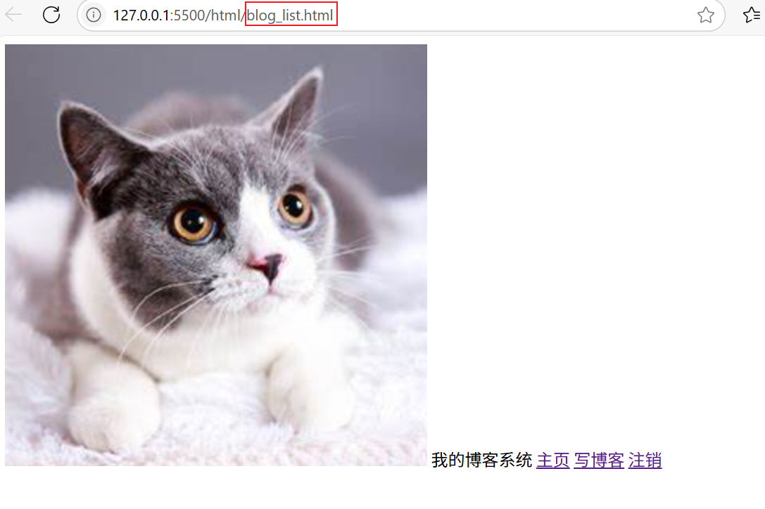
②css样式设计
css代码如下,包含在common.css文件里,其中部分代码作用已在注释中给出:
css
* {
    margin: 0; /*消除浏览器默认样式*/
    padding: 0px;
    box-sizing: border-box; /*让内部margin不要撑大盒子*/
}

/*导航栏样式---------------*/
html, body{
    height: 100%; /*让页面布满浏览器*/
    width: 100%;
    min-width: 1550px; /*设置最小px,防止浏览器页面缩小时导致内容混乱,会生成滑动条*/
    min-height: 700px;
    background-image: url(../img/1.png); /*设置背景*/
    background-repeat: no-repeat; /*取消背景图片平铺*/
    background-size: cover; /*背景铺满浏览器页面*/
    margin: 0 auto;
}

.nav{
    width: 100%;
    height: 50px;
    background-color: gray; /*设置灰色导航栏*/
    /*通过弹性布局,使文字显示在中间*/
    display: flex; /*水平方向的居中*/
    justify-content: left; /*让元素水平方向靠左布局*/
    align-items: center; /*垂直方向居中*/
    color:white; /*设置我的博客系统颜色为白色*/
}

.nav .space{
    width: 70%; /*让主题和右边三个链接分开*/
}

/* 设置logo图片大小 */
.nav img{
    width: 40px;
    height: 40px;
    border-radius: 50%; /*变成圆形*/
    /* 设置上下左右边距,让logo图标显示在中间 */
    margin-left: 8px;
    margin-right: 8px;
    margin-top: 6px;
}

.nav a{
    color: white;
    text-decoration: none; /*取消超链接下划线*/
    margin-left: 8px; /*设置内边距,让选项分开*/
    margin-right: 30px;
}
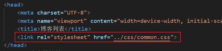
记得在html文件里包含CSS文件:
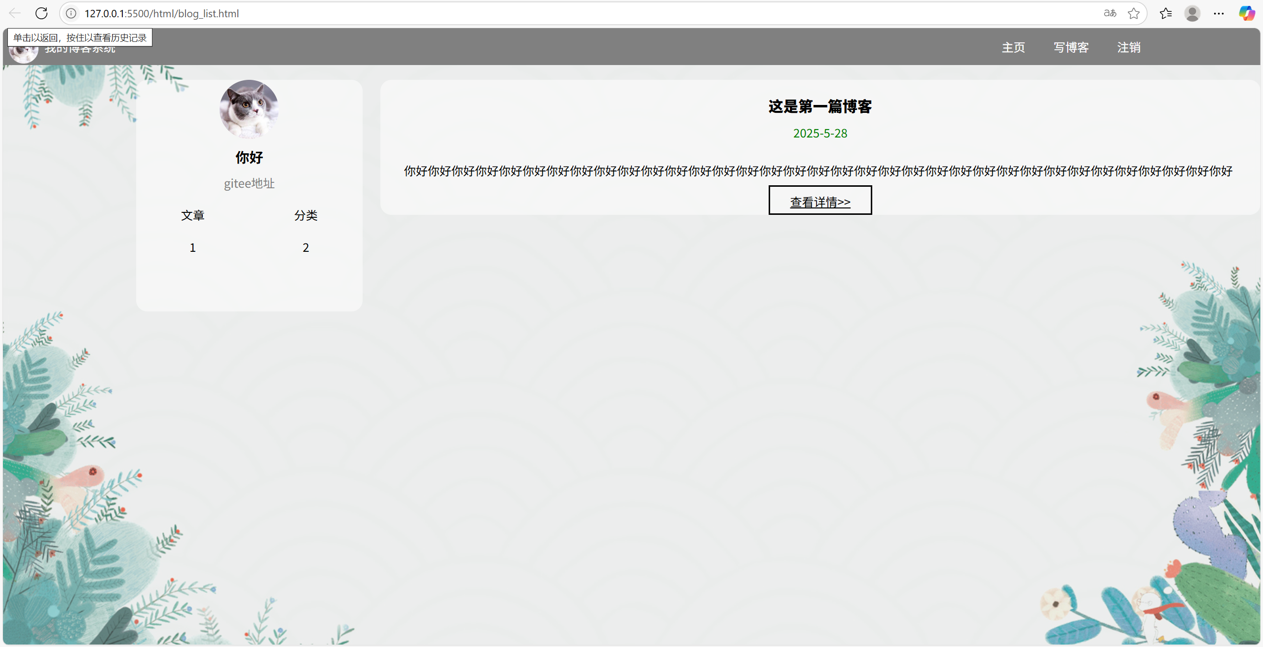
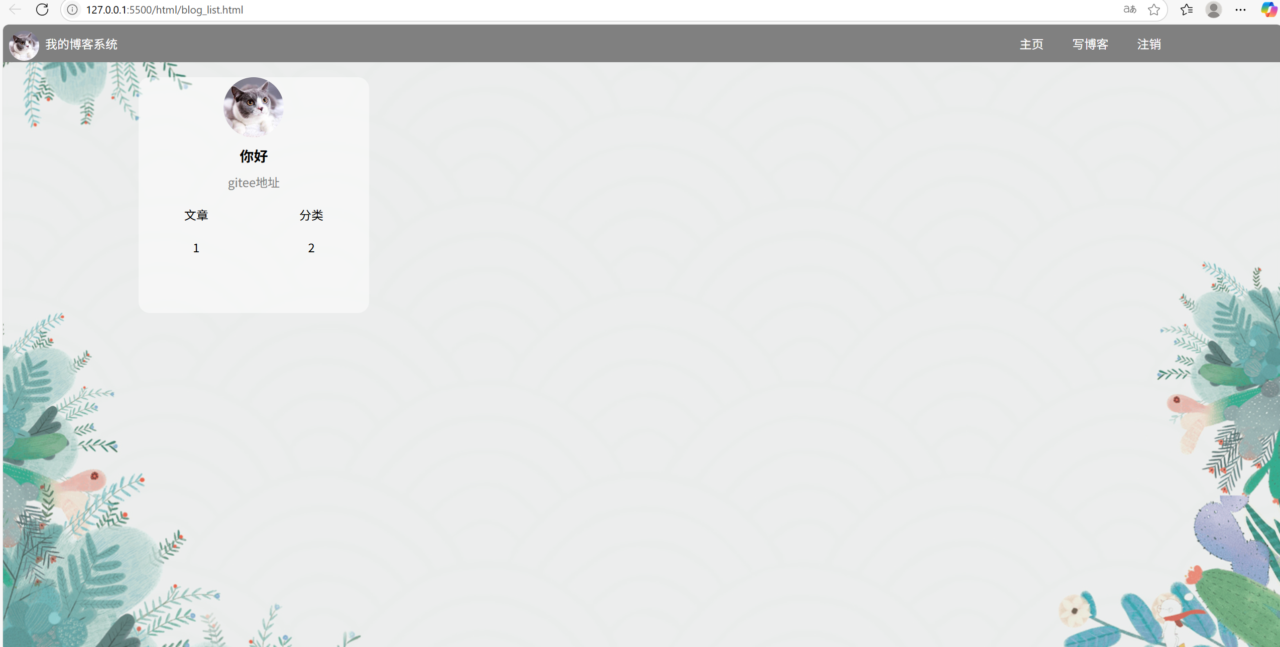
2.2 实现个人信息
①html结构设计
html
<!--个人信息和博客列表我们用一个div来搞-->
    <div class="container">
        <div class="container-left"> <!--个人信息-->
            <div class="card">
                <img src="../img/hello.png" alt="">
                <h3>你好</h3>
                <a href="https://gitee.com/start-coding-from-scratch">gitee地址</a>
                <div class="counter">
                    <span>文章</span>
                    <span>分类</span>
                </div>
                <div class="counter">
                    <span>1</span>
                    <span>2</span>
                </div>
            </div>
        </div>
        <div class="container-right"> <!--博客列表-->

        </div>
    </div>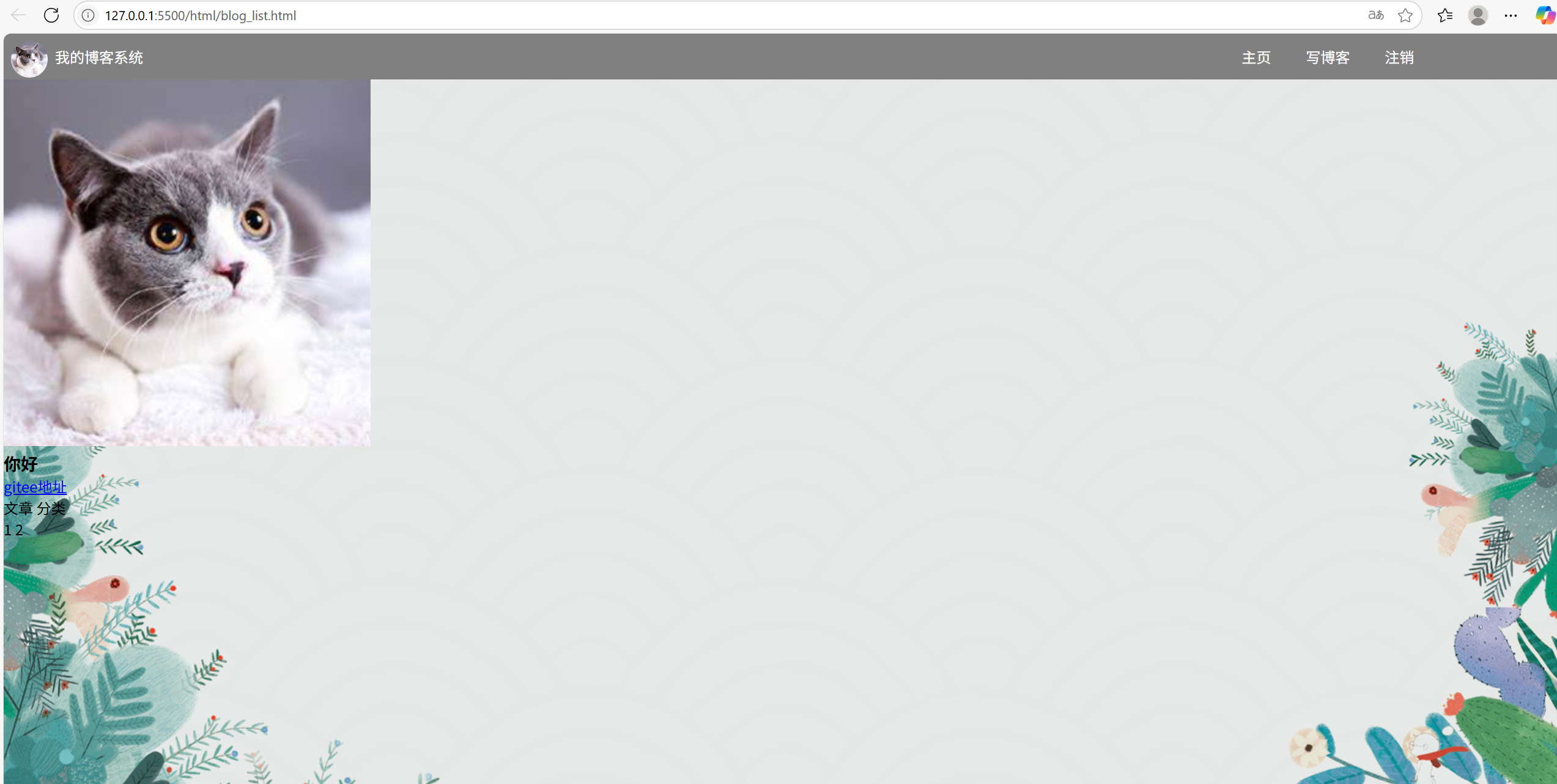
- 我们把个人卡片和博客列表用同一个div设置,然后再在这个div里面放左右两个div代表卡片和列表
②css样式设计
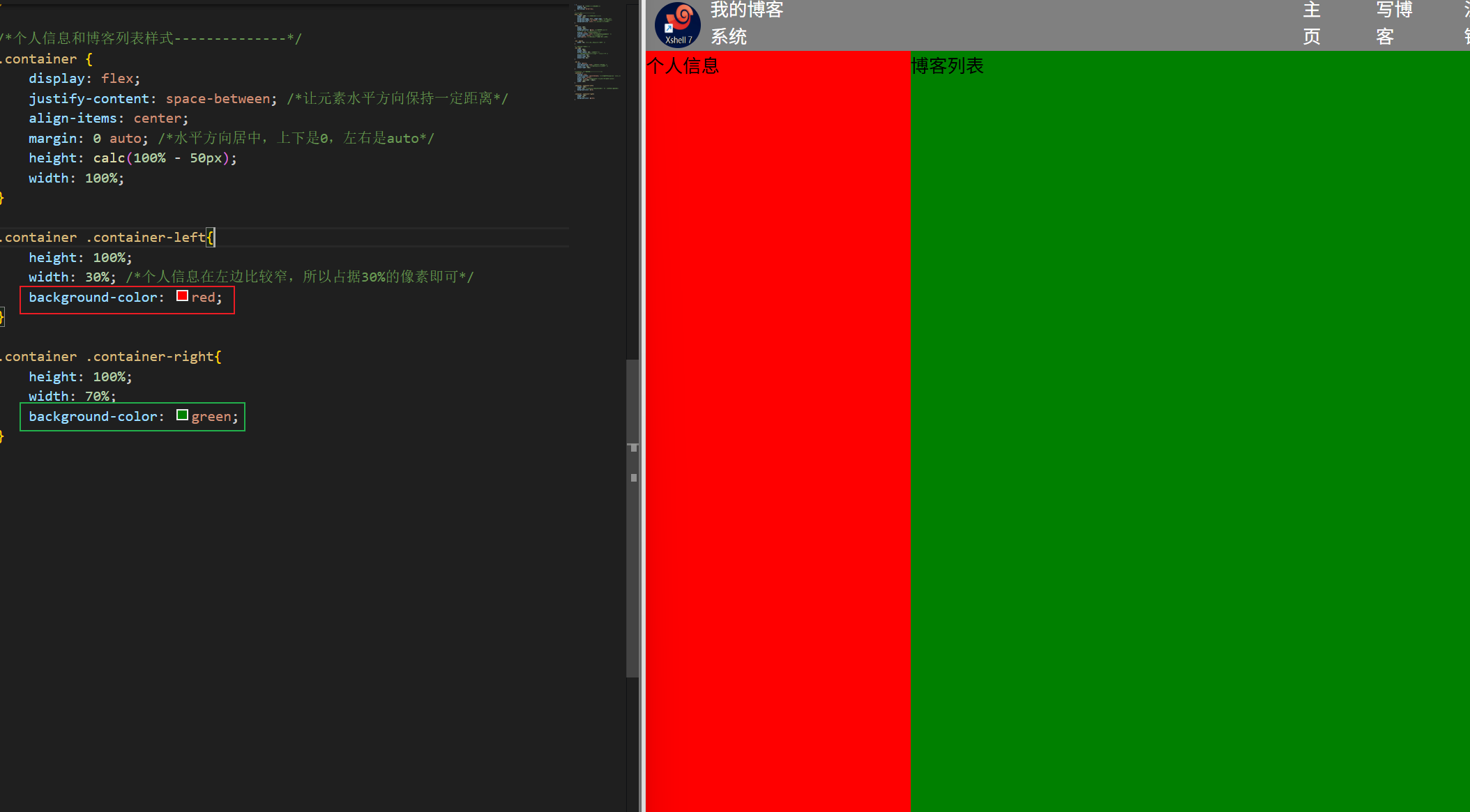
首先我们先搞清楚左右这两个区域是怎样安排的,可以使用颜色覆盖的办法先看下左右布局:
下面是个人卡片css代码,也是包含在common.css 文件里面
html
/* 2,设置个人信息卡片样式*/
.card{
    width: 60%; /*原来的card是把左边占完了的,但是实际效果中左边有一点留白,所以我们让card只占据60%的空间*/
    height: 40%;
    background-color: rgba(255, 255, 255, 0.5); /*最后一个数字表示透明度 */
    margin-left: 180px; /*设置左边距,让card靠右显示*/
    margin-right: 10px;
    border-radius: 15px; /*设置圆角*/
    margin-top: 10px;
}

.card img{
    width: 80px;
    height: 80px;
    border-radius: 50%;
    display: block;
    margin: 0 auto; /*让图片在浏览器的全屏和小屏环境下都居中显示*/
    margin-top: 20px;
}

.card h3{
    text-align: center;
    margin-top: 10px;
    margin-bottom: 10px;
}

.card a{
    display: block; /*把a链接变成一个块级元素,便于控制*/
    text-align: center;
    color:gray;
    text-decoration: none;
    margin-top: 10px;
    margin-bottom: 10px;
}

.card .counter{
    display: flex; /*进入弹性布局*/
    justify-content: space-around;
    margin-top: 20px;
}
2.3 实现博客列表
①html结构设计
html
<div class="container-right"> <!--博客列表-->
<div class="blog">
<div class="title">
这是第一篇博客
</div>
<div class="date">
2025-5-28
</div>
<div class="desc">
你好你好你好你好你好你好你好你好你好你好你好你好你好你好你好你好你好你好你好你好你好你好你好你好你好你好你好你好你好你好你好你好你好你好你好
</div>
<a class="detail" href="./blog_content.html?blog=1">查看详情>></a>
</div>
</div>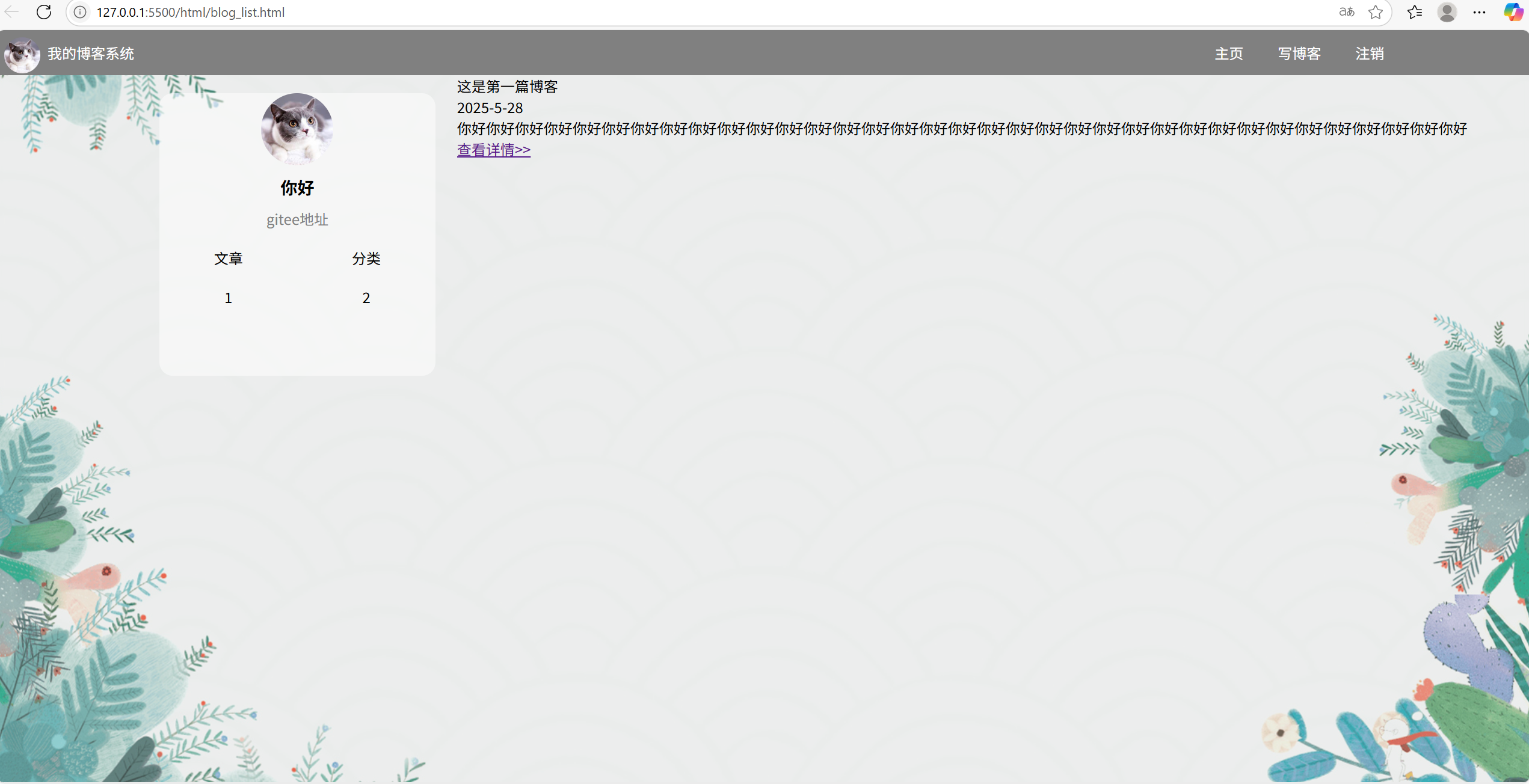
②css样式设计
css
.blog {
    width: 100%;
    background-color: rgba(255, 255, 255, 0.5);
    border-radius: 15px; /*设置圆角*/
    margin-top: 20px;
}

.blog .title{
    font-size:20px; /*设置博客标题大小得粗细*/
    font-weight: 900;
    text-align: center; /*让标题居中*/
    padding-top: 20px; /*设置上边距*/
}

.blog .date{
    color: green;
    padding-bottom: 10px; /*设置日期下边距*/
    padding-top: 10px;
    text-align: center; /*让日期也居中*/
}

.blog .desc{
    text-indent: 2em; /*设置缩进*/
    line-height: 20px; /*设置行高*/
    margin-top: 20px; /*设置上边距*/
}

.blog .detail{
    display: block; /*把超链接变成块级元素,方便操作*/
    color: black;
    text-align: center; /*使超链接居中*/
    width: 140px;
    height: 40px;
    margin: 10px auto 0px auto; /*上边距10px,右和左是auto,下边距是0px*/
    border: 2px solid black; /*设置边框为2px,使用实线,颜色是黑色*/
    line-height: 40px; /*让边框里的文字显示在距下位置,去掉这一行则显示在上面*/
}

.blog .detail:active{
    color:blue; /*使用伪类选择器给链接加上一些效果*/
}
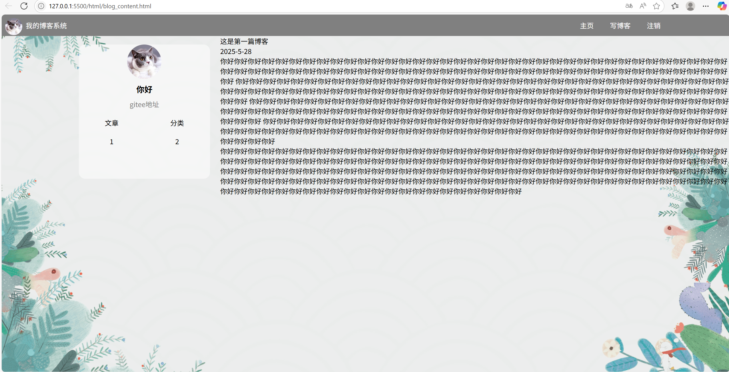
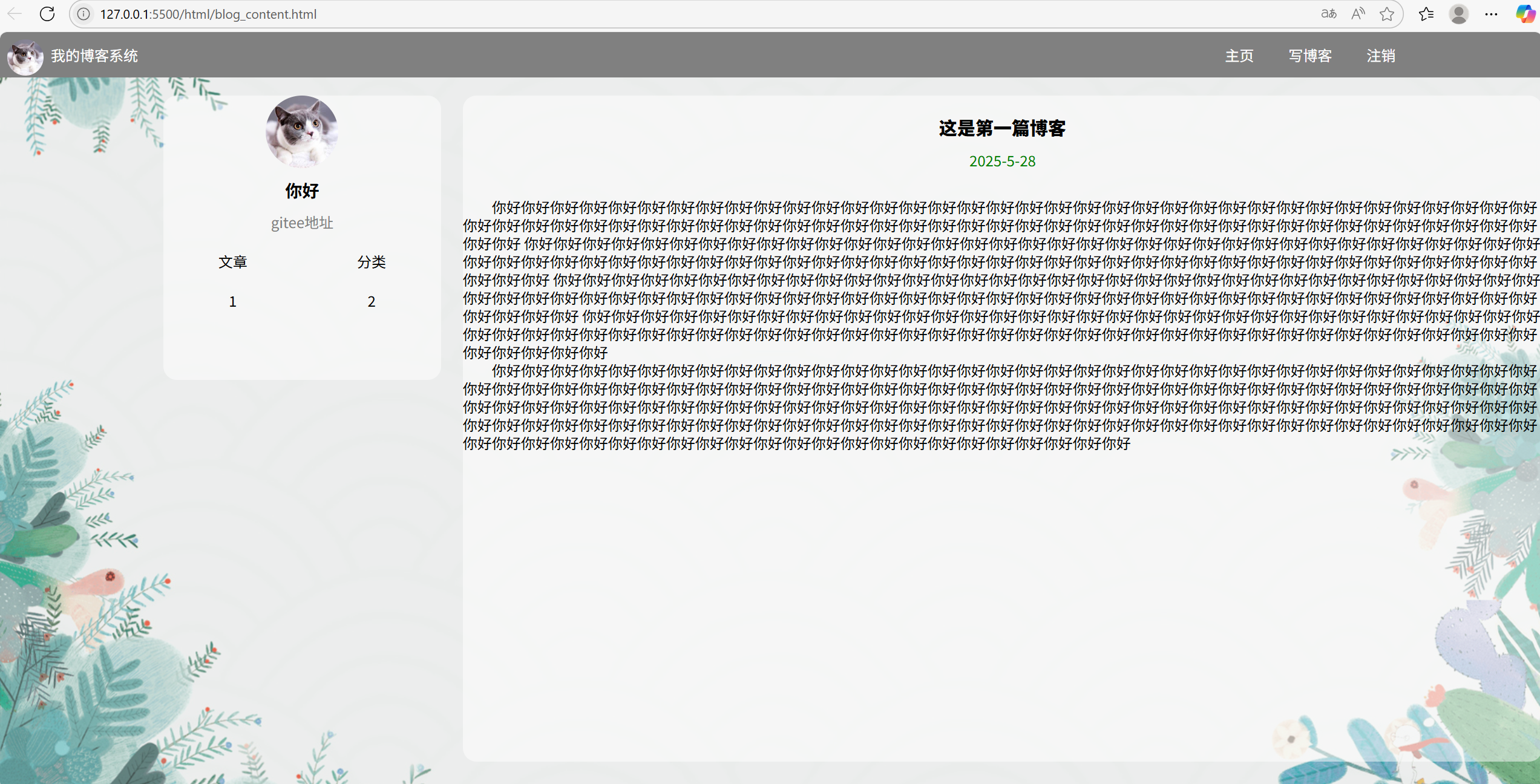
三,实现博客正文页
3.2 复用
首先看下效果:

背景,导航栏和左边个人信息卡片是和上面一样的,我们直接搬过来即可
主要是右边博客页面改变了,所以我们单独实现右边的博客页面即可
3.4 实现博客正文
①html结构设计
html
<div class="container-right"> <!--博客列表-->
            <div class="blog">
                <div class="title">
                    这是第一篇博客
                </div>
                <div class="date">
                    2025-5-28
                </div>
                <div class="desc">
                    <p>
                        你好你好你好你好你好你好你好你好你好你好你好你好你好你好你好你好你好你好你好你好你好你好你好你好你好你好你好你好你好你好你好你好你好你好你好你好你好你好你好你好你好你好你好你好你好你好你好你好你好你好你好你好你好你好你好你好你好你好你好你好你好你好你好你好你好你好你好你好你好你好你好你好你好你好你好
                        你好你好你好你好你好你好你好你好你好你好你好你好你好你好你好你好你好你好你好你好你好你好你好你好你好你好你好你好你好你好你好你好你好你好你好你好你好你好你好你好你好你好你好你好你好你好你好你好你好你好你好你好你好你好你好你好你好你好你好你好你好你好你好你好你好你好你好你好你好你好你好你好你好你好你好
                        你好你好你好你好你好你好你好你好你好你好你好你好你好你好你好你好你好你好你好你好你好你好你好你好你好你好你好你好你好你好你好你好你好你好你好你好你好你好你好你好你好你好你好你好你好你好你好你好你好你好你好你好你好你好你好你好你好你好你好你好你好你好你好你好你好你好你好你好你好你好你好你好你好你好你好
                        你好你好你好你好你好你好你好你好你好你好你好你好你好你好你好你好你好你好你好你好你好你好你好你好你好你好你好你好你好你好你好你好你好你好你好你好你好你好你好你好你好你好你好你好你好你好你好你好你好你好你好你好你好你好你好你好你好你好你好你好你好你好你好你好你好你好你好你好你好你好你好你好你好你好你好
                    </p>
                    <p>
                        你好你好你好你好你好你好你好你好你好你好你好你好你好你好你好你好你好你好你好你好你好你好你好你好你好你好你好你好你好你好你好你好你好你好你好你好你好你好你好你好你好你好你好你好你好你好你好你好你好你好你好你好你好你好你好你好你好你好你好你好你好你好你好你好你好你好你好你好你好你好你好你好你好你好你好你好你好你好你好你好你好你好你好你好你好你好你好你好你好你好你好你好你好你好你好你好你好你好你好你好你好你好你好你好你好你好你好你好你好你好你好你好你好你好你好你好你好你好你好你好你好你好你好你好你好你好你好你好你好你好你好你好你好你好你好你好你好你好你好你好你好你好你好你好你好你好你好你好你好你好你好你好你好你好你好你好你好你好你好你好你好你好你好你好你好你好你好你好你好你好
                    </p>
                </div>
            </div>
        </div>
html和前面是一样的,为了方便演示我们可以在正文位置多加一些内容,效果如下:
②css样式设计
下面代码在content.css文件中:
html
/* 3,设置博客列表样式*/
.blog {
    width: 100%;
    height: calc(100% - 50px); /*用整个页面得像素减去导航的像素即可*/
    background-color: rgba(255, 255, 255, 0.5);
    border-radius: 15px; /*设置圆角*/
    margin-top: 20px;
    overflow: auto; /*内容很多时出现滚动条*/
}

.blog .title{
    font-size:20px; /*设置博客标题大小得粗细*/
    font-weight: 900;
    text-align: center; /*让标题居中*/
    padding-top: 20px; /*设置上边距*/
}

.blog .date{
    color: green;
    padding-bottom: 10px; /*设置日期下边距*/
    padding-top: 10px;
    text-align: center; /*让日期也居中*/
}

.blog .desc{
    text-indent: 2em; /*设置缩进*/
    line-height: 20px; /*设置行高*/
    margin-top: 20px; /*设置上边距*/
}
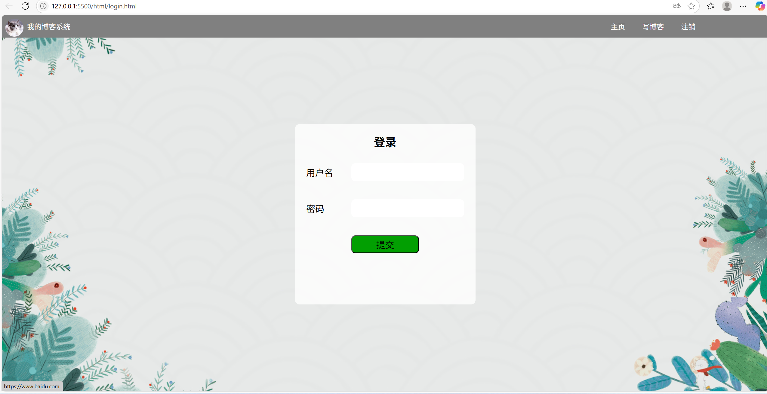
四,实现博客登录页
4.1 版心
首先看下效果:
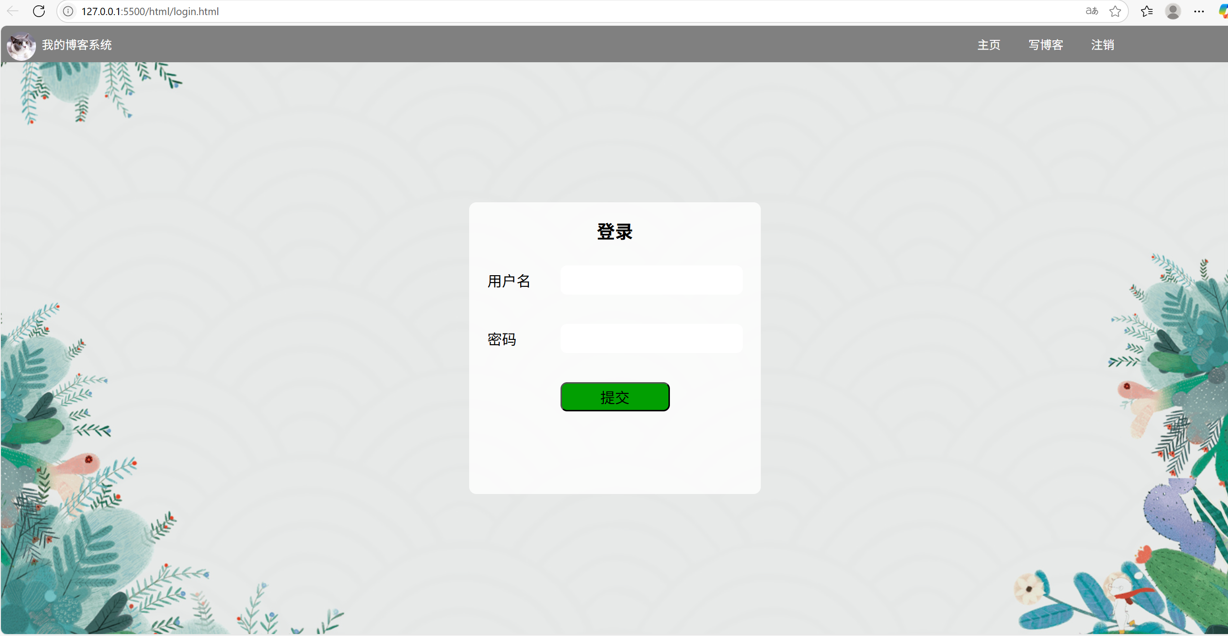
可以看到导航栏和背景啥的都没变,就是中间的登录框,我们需要单独实现一下,像导航栏和html和css代码也是直接复用即可
4.2 登录框
①html结构设计
html
 <div class="login-container">
        <div class="login-dialog"> <!--外面的大会话框-->
            <h3>登录</h3>
            <div class="row">
                <span>用户名</span>
                <input class="username" type="text" name="" id="">
            </div>
            <div class="row">
                <span>密码</span>
                <input class="password" type="text" name="" id="">
            </div>
            <div class="row">
                <button>提交</button>
            </div>
        </div>
    </div>
②css样式设计
css
* {
margin: 0; /*消除浏览器默认样式*/
padding: 0px;
box-sizing: border-box;
}
.login-container {
height: calc(100% - 50px);
width: 100%;
display: flex; /*进入弹性布局*/
justify-content: center; /*水平方向居中*/
align-items: center; /*垂直方向居中*/
}
.login-dialog{
width: 400px;
height: 400px;
background-color: rgba(255, 255, 255, 0.8);
border-radius: 10px;
}
h3{
text-align: center; /*直接让标题居中*/
margin-top: 20px;
margin-bottom: 10px;
font-size: 25px;
}
.row {
display: flex; /*进入弹性布局,好让元素在水平和垂直方向都居中*/
justify-content: center;
align-items: center;
height: 80px;
}
.row span{
font-size: 20px; /*设置字体大小*/
width: 100px
}
.row input {
height: 40px;
width: 250px;
border-radius: 9px;
font-size: 20px; /*设置输入时的字体大小*/
border: none; /*去掉边框*/
}
.row button{
background-color: rgb(2, 159, 2);
width: 150px;
height: 40px;
border-radius: 9px;
font-size: 20px;
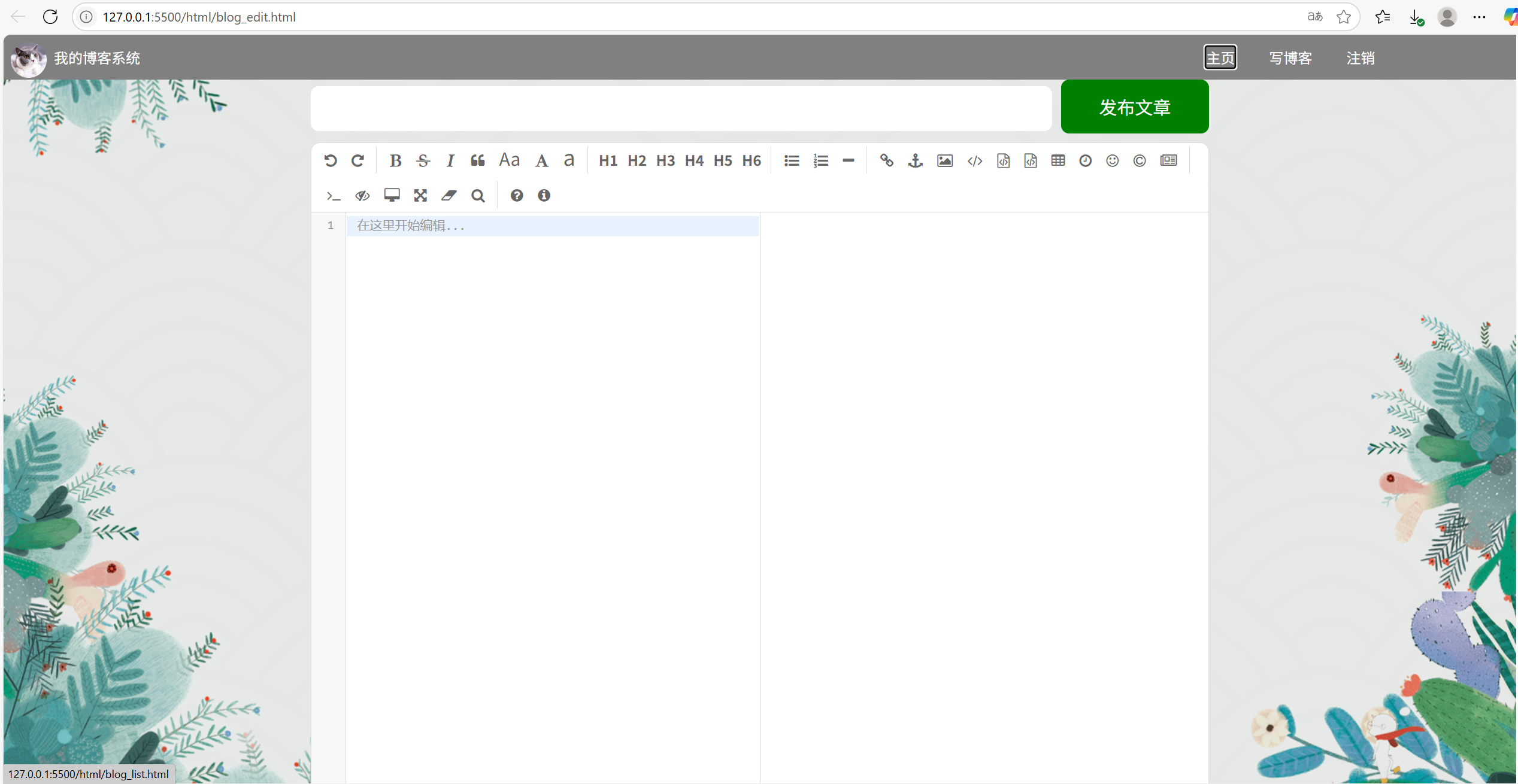
}五,实现博客编辑页
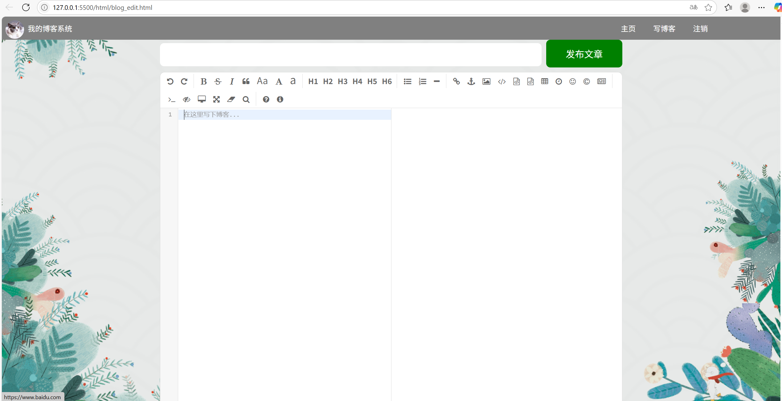
5.1 标题编辑项
导航栏是一样的,不再赘述,下面的编辑页面我们也先暂时不管,先来搞定标题编辑项:
①html结构设计
html
    <div class="edit-blog-container">
        <div class="title">
            <input type="text">
            <button>发布文章</button>
        </div>
        <div id="editor">
        </div>
    </div>
②css样式设计
css
* {
    margin: 0; /*消除浏览器默认样式*/
    padding: 0px;
    box-sizing: border-box;
}

.login-container {
    height: calc(100% - 50px);
    width: 100%;
    display: flex; /*进入弹性布局*/
    justify-content: center; /*水平方向居中*/
    align-items: center; /*垂直方向居中*/
}

.login-dialog{
    width: 400px;
    height: 400px;
    background-color: rgba(255, 255, 255, 0.8);
    border-radius: 10px;
}

h3{
    text-align: center; /*直接让标题居中*/
    margin-top: 20px;
    margin-bottom: 10px;
    font-size: 25px;
}

.row {
    display: flex; /*进入弹性布局,好让元素在水平和垂直方向都居中*/
    justify-content: center;
    align-items: center;
    height: 80px;
}

.row span{
    font-size: 20px; /*设置字体大小*/
    width: 100px
}

.row input {
    height: 40px;
    width: 250px;
    border-radius: 9px;
    font-size: 20px; /*设置输入时的字体大小*/
    border: none; /*去掉边框*/
}

.row button{
    background-color: rgb(2, 159, 2);
    width: 150px;
    height: 40px;
    border-radius: 9px;
    font-size: 20px;
}
5.2 编辑区
对于编辑区,我们其实没必要自己写一个,直接引入即可,可以先打开这个网站:Editor.md - 开源在线 Markdown 编辑器(可能需要梯子)
六,引入markdown编辑区
6.1 下载
首先打开上面的网页,打开后往下滑找到GitHub下载:
下载好后是一个压缩包,解压后是一个文件夹,然后将该文件夹命名为"editor.md",然后将该文件夹移到项目的html目录下:
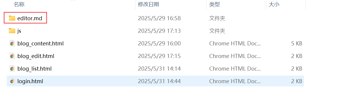
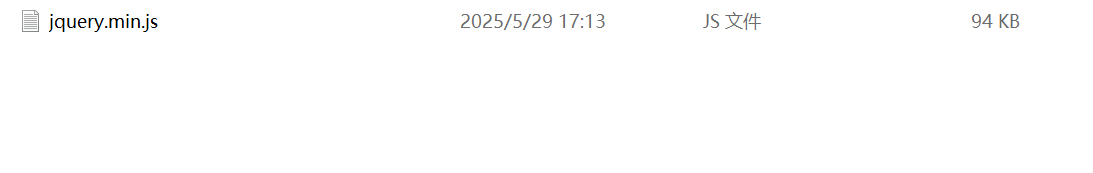
然后我们创建一个人js文件夹,就上面图片那个,然后在里面创建一个"jquery.min.js"文件:
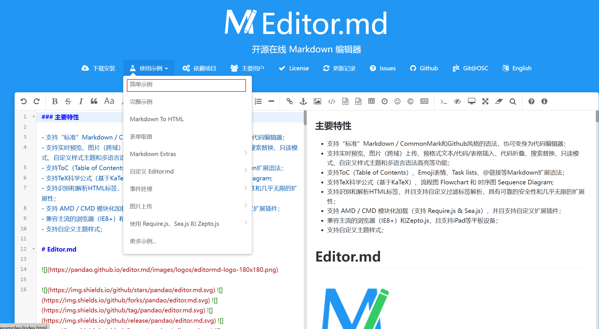
然后就是填充这个文件里的内容,首先回到上面的那个网站,滑倒最上,打开"简单示例":
然后就是这样一个页面,此时直接鼠标右键打开网页源代码:
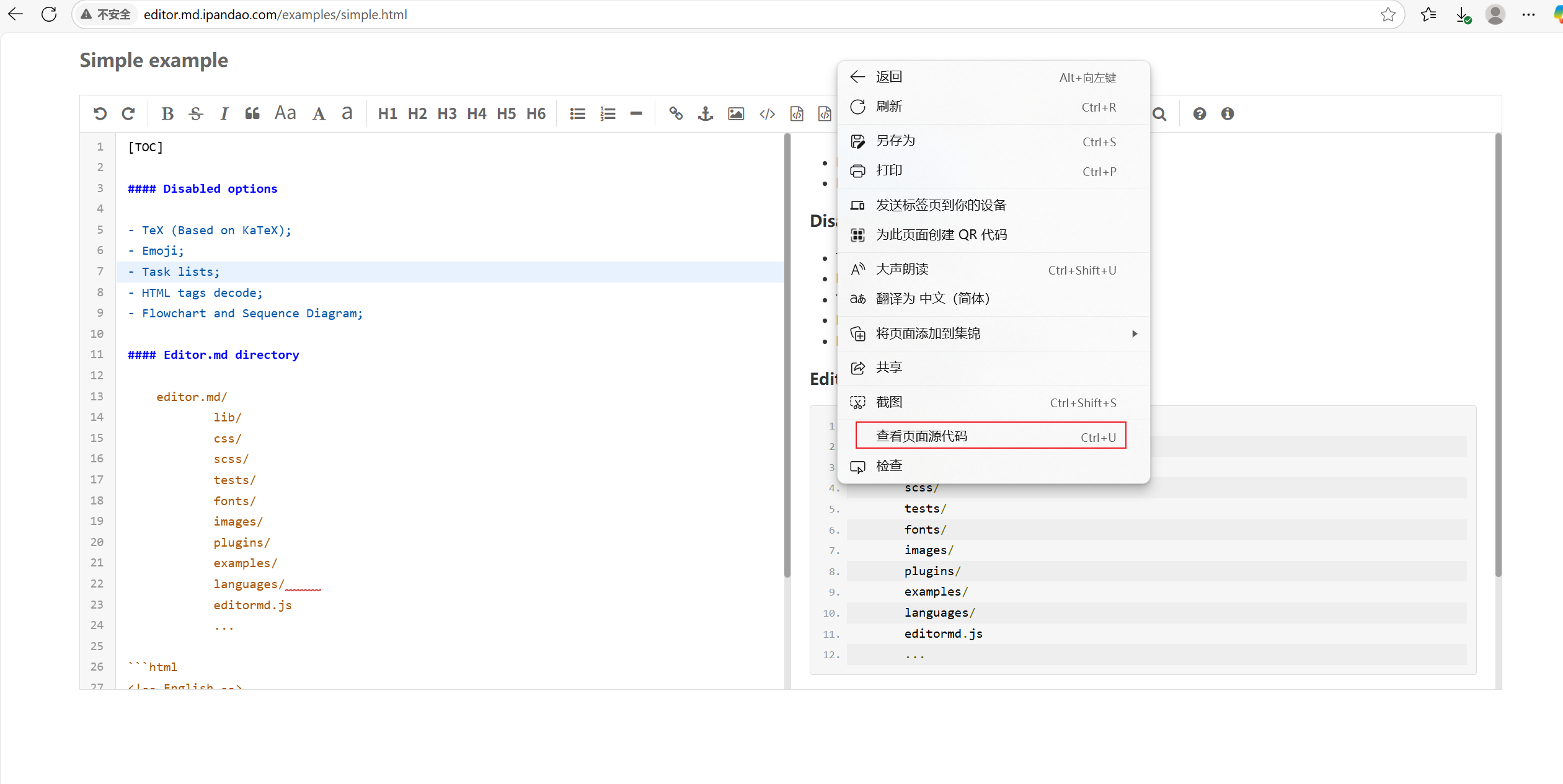
打开后找到下面内容:
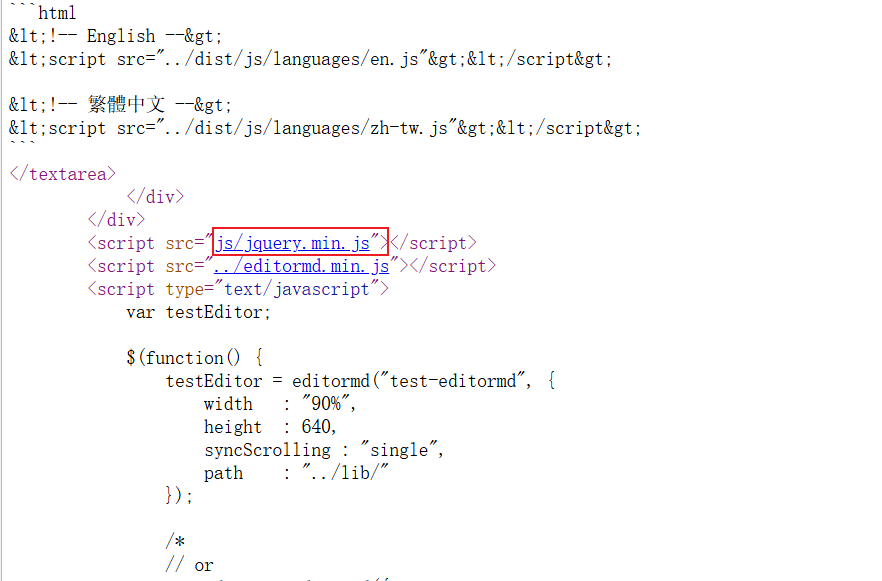
这个就是我们前面在js文件夹里创建的那个文件,点开后:
直接 Ctrl + A 选中全部内容,复制到我们本地的 jquery.min.js 文件中,就完成了下载步骤了
6.2 引入
直接在blog_edit.html文件中添加下列代码:
javascript
<link rel="stylesheet" href="editor.md/css/editormd.min.css" />
<script src="js/jquery.min.js"></script>
<script src="editor.md/lib/marked.min.js"></script>
<script src="editor.md/lib/prettify.min.js"></script>
<script src="editor.md/editormd.js"></script>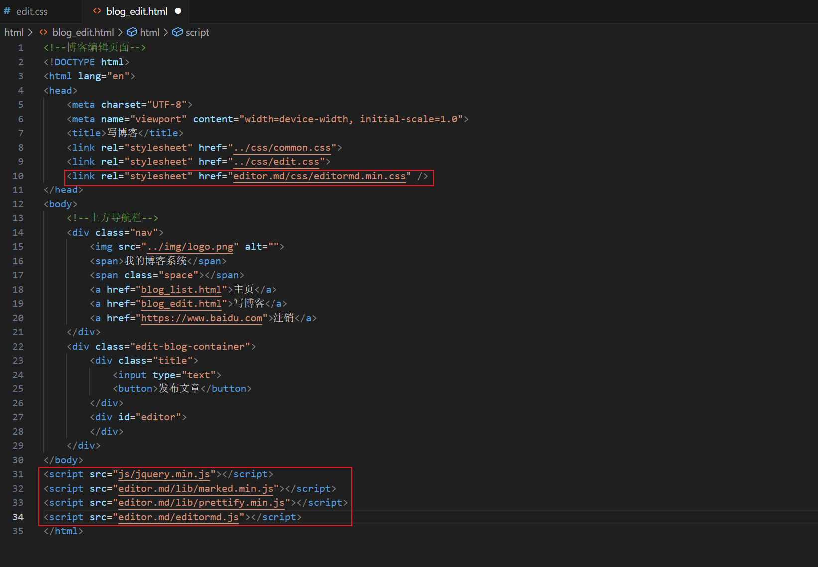
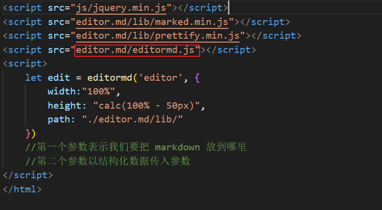
6.3 编写代码
引入之后就是使用了,添加下面代码即可:
javascript
<script>
    let edit = editormd('editor', {
        width:"100%",
        height: "calc(100% - 50px)",
        path: "./editor.md/lib/"
    })
    //第一个参数表示我们要把 markdown 放到哪里
    //第二个参数以结构化数据传入参数
</script>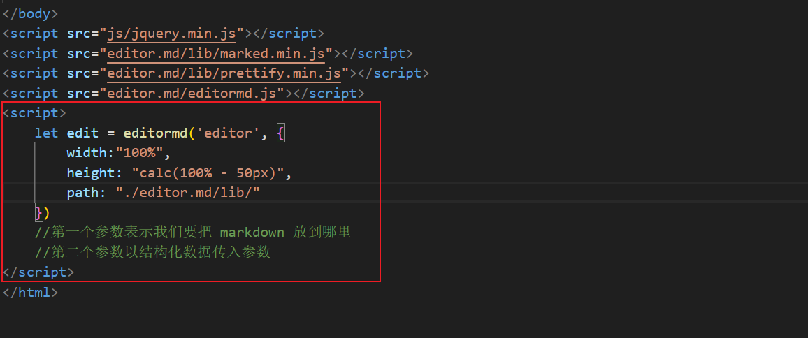
保存后就能在页面上显示markdown编辑区了:

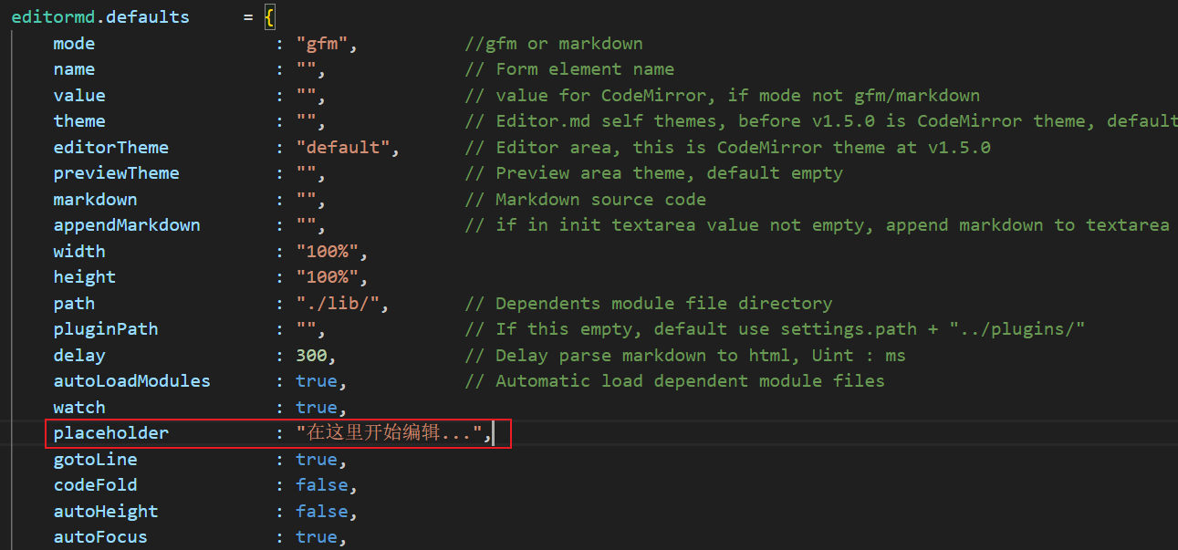
附:就是上面的"在这里开始编辑。。。"原版是英文,可以打开这个文件进行修改: