当我们需要环形展示数据进度,但是又不想使用一个完整的圆环时,Progress组件就不能满足我们的需求,例如汽车的速度表盘,这时我们就需要用引入Gauge组件,他可以满足环形进度展示的同时,设置起始角度,达到不封闭环形的数据展示。
看一下简单的实现效果:
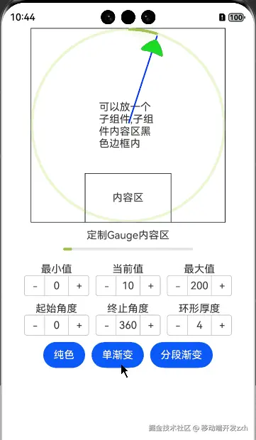
使用介绍:
1.Gauge使用时必须设置Gauge(options:{value: number, min?: number, max?: number}),其中,最小值默认0,最大值默认100
2.Gauge支持包含一个子组件,子组件的内容区为圆环外圆相切的矩形,如同大正方形区域,可以绘制表盘刻度,指针实现汽车表盘功能。
3.可以通过设置startAngle、endAngle,改变初始值角度
4.description设置内容区,如同小矩形区域,可以根据需求填充内容
5.背景色分段渐变环最大显示段数为9段
源码:
scss
@Entry
@ComponentV2
struct GaugeTest {
  @Local value: number = 10 //当前数据值
  @Local min: number = 0 //当前数据段最小值
  @Local max: number = 200 //当前数据段最大值
  @Local startAngle: number = 0 //起始角度位置
  @Local endAngle: number = 360 //终止角度位置
  @Local strokeWidth: number = 4 //环形厚度
  @Local colors: ResourceColor | LinearGradient | Array<[ResourceColor | LinearGradient, number]> = '#a5d61d'
  private settings: RenderingContextSettings = new RenderingContextSettings(true);
  private context: CanvasRenderingContext2D = new CanvasRenderingContext2D(this.settings);
  @Local centerX:number=0
  @Local centerY:number=0
  @Builder
  descriptionBuilder() {
    Stack() {
      Text('内容区')
    }
    .width('100%')
    .height("100%")
    .border({ width: 1 })
  }

  build() {
    Column({ space: 10 }) {
      Gauge({ value: this.value, min: this.min, max: this.max })
      {
        Stack(){
          Text('可以放一个子组件,子组件内容区黑色边框内').width('30%')
          Canvas(this.context)
            .width('100%')
            .height('100%')
            .onReady(() => {
              this.context.strokeStyle = '#0000ff';
              this.context.lineWidth = 2;
              this.context.moveTo(this.centerX, this.centerY);
              this.context.lineTo(this.centerX, this.strokeWidth);
              this.context.stroke();
          })
            .rotate({ centerX:this.centerX,centerY:this.centerY,angle:this.cacleAngle() })
            .animation({duration:300,iterations:1})
        }
        .onSizeChange((oldValue: SizeOptions, newValue: SizeOptions) => {
            this.centerX=(newValue.width as number)/2
            this.centerY=(newValue.height as number)/2-this.strokeWidth
        })
        .width('100%')
        .height("100%")
        .border({ width: 1 })
      }
        .width(300)
        .height(300)
        .startAngle(this.startAngle)
        .endAngle(this.endAngle)
        .colors(this.colors)
        .strokeWidth(this.strokeWidth)
        .description(this.descriptionBuilder)
        .indicator({  //指针样式
          icon:$r('app.media.svg_triangle')

        })
      Column(){
        Text('定制Gauge内容区')
        Gauge({ value: this.value, min: this.min, max: this.max })
          .contentModifier(new MyGaugeStyle())
      }
      Row({ space: 10 }) {
        Column() {
          Text("最小值")
          Counter() {
            Text(this.min.toString())
          }
          .onInc(() => {
            this.min += 10;
          })
          .onDec(() => {
            this.min -= 10;
          })
        }
        Column() {
          Text("当前值")
          Counter() {
            Text(this.value.toString())
          }
          .onInc(() => {
            if (this.value<this.max) {
              this.value+=10
            }
          })
          .onDec(() => {
            if (this.value > this.min) {
              this.value-= 10;
            }
          })
        }
        Column() {
          Text("最大值")
          Counter() {
            Text(this.max.toString())
          }
          .onInc(() => {
            this.max += 10;
          })
          .onDec(() => {
            this.max -= 10;
          })
        }
      }
      Row({ space: 10 }) {
        Column() {
          Text("起始角度")
          Counter() {
            Text(this.startAngle.toString())
          }
          .onInc(() => {
            this.startAngle+= 10
          })
          .onDec(() => {
            if (this.startAngle > 0) {
              this.startAngle-= 10;
            }
          })
        }
        Column() {
          Text("终止角度")
          Counter() {
            Text(this.endAngle.toString())
          }
          .onInc(() => {
            this.endAngle += 10;
          })
          .onDec(() => {
            this.endAngle -= 10;
          })
        }
        Column() {
          Text("环形厚度")
          Counter() {
            Text(this.strokeWidth.toString())
          }
          .onInc(() => {
            this.strokeWidth ++;
          })
          .onDec(() => {
            if (this.strokeWidth > 0) {
              this.strokeWidth--;
            }
          })
        }
      }

      Row({ space: 10 }){
        Button('纯色').onClick(()=>{
          this.colors = '#a5d61d'
        })
        Button('单渐变').onClick(()=>{
        this.colors=new LinearGradient([{ color: "#dbefa5", offset: 0 }, { color: "#a5d61d", offset: 1 }])
        })
        Button('分段渐变').onClick(()=>{
          this.colors=[            [new LinearGradient([{ color: "#dbefa5", offset: 0 }, { color: "#a5d61d", offset: 1 }]), 5],
            [new LinearGradient([{ color: "#fceb99", offset: 0 }, { color: "#f7ce00", offset: 1 }]), 3],
            [new LinearGradient([{ color: "#f8c5a6", offset: 0 }, { color: "#ed6f21", offset: 1 }]), 2]
            ]
        })
      }
    }
    .width('100%')
    .alignItems(HorizontalAlign.Center)
  }

  cacleAngle():number{
   let offsetAngle = Math.abs((360-this.startAngle)-(360-this.endAngle))
    if (offsetAngle==360) {
      offsetAngle=0
    }

    return (this.value*(360-offsetAngle)/this.max)+this.startAngle
  }
}
@Builder
function buildGauge(config: GaugeConfiguration) {
  Column() {
    Progress({ value: config.value, total: config.max, type: ProgressType.Linear  })
      .color("#a5d61d")
      .width(200)
  }
  .width("100%")
  .padding(10)
  .alignItems(HorizontalAlign.Center)
}
class MyGaugeStyle implements ContentModifier<GaugeConfiguration> {

  constructor() {
  }

  applyContent(): WrappedBuilder<[GaugeConfiguration]> {
    return wrapBuilder(buildGauge)
  }
}