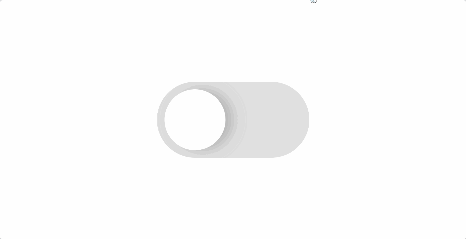
iOS开关效果
定义变量:
vue
<style scoped lang="scss">
    .layout {
        // 按钮宽度
        $button-width: 500px;
        //  按钮高度
        $button-height: 250px;
        //  按钮里面圆形直径
        $circle-diameter: 200px;
        //  按钮背景与里面圆形间距
        $button-circle-offset:calc(($button-height - $circle-diameter) / 2);
        //  里面圆形阴影大小
        $circle-shadow-size: 10px;
        //  里面圆形在长按情况下的宽度
        $circle-wider-size: 350px;
        //  浅灰色
        $light-gray: #e0e0e0;
        //  深灰色
        $dark-gray: #616161;
        //  绿色
        $green: #4caf50;
    }
</style>
绘制按钮图形:
vue
<template>
  <div class="layout">
    <div class="button">
    </div>
  </div>
</template>

<style scoped lang="scss">
.layout {
  // 上面👆定义的变量
  display: flex;
  justify-content: center;
  align-items: center;
  min-height: 100vh;

  .button{
    width: $button-width;
    height: $button-height;
    background: $light-gray;
    border-radius:calc($button-width / 2);
  }
}
</style>里面的圆形使用伪类选择器
vue
&:after{
    content: '';
    display: block;
    width: $circle-diameter;
    height: $circle-diameter;
    border-radius: $circle-diameter;
    background-color: #fff;
}
给元素添加上定位让圆形固定到指定位置:
vue
  .button{
   // ...其他效果;
    position: relative;
    &:after{
    // ...其他效果;
      position: absolute;
      top:$button-circle-offset;
      transform: translateX($button-circle-offset); // 为了后面方便做动画,所以使用translateX
box-shadow:$button-circle-offset 0 calc($circle-shadow-size * 4) $dark-gray ;
    }
  }
处理点击效果:
vue
<template>
<div class="layout">
    <div class="button" @click="clickBtn" :class="{ 'btnClick': isActive }" >
    </div>
    </div>
</template>

<script setup lang="ts">
    import {ref} from "vue";
    const isActive = ref(false)

    const clickBtn = () => {
        isActive.value = !isActive.value
    }
</script>

<style scoped lang="scss">
    .btnClick {
        background: $green;
        &:after{
            transform: translateX( calc( $button-width - $circle-diameter - $button-circle-offset ) );
            box-shadow: calc( $button-circle-offset * -1 ) 0 calc($circle-shadow-size * 4) $dark-gray ;
        }
    }
</style>加入transition动画:
vue
.button{
    transition:.3s all ease-in-out;
    &:after{
        transition:.3s all ease-in-out;
    }
}
接下来处理长按效果:
vue
.button{
	&:active:after{
      width: $circle-wider-size;
    }
}
.btnClick {
    &:active:after{
          transform: translateX( calc( $button-width - $circle-wider-size - $button-circle-offset ) );
        }
}
这样按钮效果就实现啦🎉
完整代码:
vue
<template>
  <div class="layout">
    <div class="button" @click="clickBtn" :class="{ 'btnClick': isActive }" >
    </div>
  </div>
</template>

<script setup lang="ts">
import {ref} from "vue";
const isActive = ref(false)

const clickBtn = () => {
    isActive.value = !isActive.value
}
</script>

<style scoped lang="scss">
.layout {
  // 按钮宽度
  $button-width: 500px;
  //  按钮高度
  $button-height: 250px;
  //  按钮里面圆形直径
    $circle-diameter: 200px;
  //  按钮背景与里面圆形间距
  $button-circle-offset:calc(($button-height - $circle-diameter) / 2);
  //  里面圆形阴影大小
  $circle-shadow-size: 10px;
  //  里面圆形在长按情况下的宽度
  $circle-wider-size: 350px;
  //  浅灰色
  $light-gray: #e0e0e0;
  //  深灰色
  $dark-gray: rgba(97, 97, 97, 0.34);
  //  绿色
  $green: #71d575;

  display: flex;
  justify-content: center;
  align-items: center;
  min-height: 100vh;

  .button{
    width: $button-width;
    height: $button-height;
    background: $light-gray;
    border-radius:calc($button-width / 2);
    position: relative;
    transition:.3s all ease-in-out;
    &:after{
      content: '';
      display: block;
      width: $circle-diameter;
      height: $circle-diameter;
      border-radius: $circle-diameter;
      background-color: #fff;
      position: absolute;
      top:$button-circle-offset;
      transform: translateX($button-circle-offset); // 为了后面方便做动画,所以使用translateX
      box-shadow:$button-circle-offset 0 calc($circle-shadow-size * 4) $dark-gray ;
      transition:.3s all ease-in-out;
    }
    &:active:after{
      width: $circle-wider-size;
    }
  }
  .btnClick {
    background: $green;
    &:after{
      transform: translateX( calc( $button-width - $circle-diameter - $button-circle-offset ) );
      box-shadow: calc( $button-circle-offset * -1 ) 0 calc($circle-shadow-size * 4) $dark-gray ;
    }
    &:active:after{
      transform: translateX( calc( $button-width - $circle-wider-size - $button-circle-offset ) );
    }
  }
}
</style>