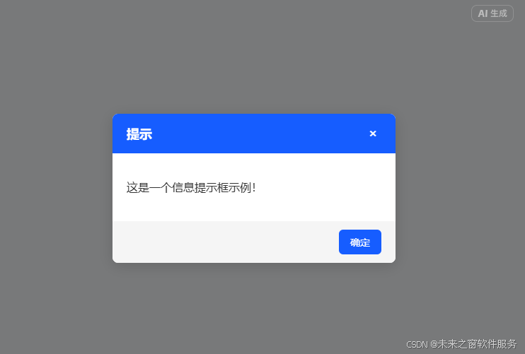
代码
<!DOCTYPE html>
<html lang="zh-CN">
<head>
<meta charset="UTF-8">
<meta name="viewport" content="width=device-width, initial-scale=1.0">
<title>原生动态提示框</title>
<style>
/* 基础样式 */
body {
font-family: -apple-system, BlinkMacSystemFont, "Segoe UI", Roboto, Helvetica, Arial, sans-serif;
min-height: 100vh;
margin: 0;
padding: 20px;
box-sizing: border-box;
display: flex;
justify-content: center;
align-items: center;
background-color: #f0f2f5;
}
button {
cursor: pointer;
font-size: 16px;
padding: 10px 20px;
border-radius: 6px;
border: none;
transition: all 0.3s ease;
}
/* 显示按钮样式 */
#showAlertBtn {
background-color: #165DFF;
color: white;
font-weight: 500;
}
#showAlertBtn:hover {
background-color: #0E42D2;
transform: translateY(-2px);
}
/* 遮罩层样式 */
.alert-overlay {
position: fixed;
top: 0;
left: 0;
right: 0;
bottom: 0;
background-color: rgba(0, 0, 0, 0.5);
display: flex;
justify-content: center;
align-items: center;
z-index: 1000;
}
/* 提示框样式 */
.alert-box {
background-color: white;
border-radius: 8px;
width: 90%;
max-width: 400px;
box-shadow: 0 4px 20px rgba(0, 0, 0, 0.15);
overflow: hidden;
}
/* 提示框头部 */
.alert-header {
padding: 16px 20px;
display: flex;
justify-content: space-between;
align-items: center;
color: white;
font-weight: 600;
font-size: 18px;
}
.alert-info .alert-header {
background-color: #165DFF;
}
.alert-success .alert-header {
background-color: #00B42A;
}
.alert-warning .alert-header {
background-color: #FF7D00;
}
.alert-error .alert-header {
background-color: #F53F3F;
}
/* 提示内容 */
.alert-content {
padding: 20px;
font-size: 16px;
color: #333;
line-height: 1.5;
}
/* 按钮区域 */
.alert-footer {
padding: 12px 20px;
background-color: #f5f5f5;
display: flex;
justify-content: flex-end;
}
.alert-footer button {
background-color: #165DFF;
color: white;
padding: 8px 16px;
font-size: 14px;
}
.alert-footer button:hover {
background-color: #0E42D2;
}
/* 关闭按钮 */
.close-btn {
background: none;
border: none;
color: inherit;
font-size: 20px;
cursor: pointer;
padding: 0;
width: 24px;
height: 24px;
display: flex;
align-items: center;
justify-content: center;
}
/* 动画效果 */
@keyframes fadeIn {
from {
opacity: 0;
transform: scale(0.95);
}
to {
opacity: 1;
transform: scale(1);
}
}
@keyframes fadeOut {
from {
opacity: 1;
transform: scale(1);
}
to {
opacity: 0;
transform: scale(0.95);
}
}
.alert-enter {
animation: fadeIn 0.3s ease-out forwards;
}
.alert-exit {
animation: fadeOut 0.3s ease-in forwards;
}
</style>
</head>
<body>
<button id="showAlertBtn">显示提示框</button>
<script>
// 提示框类型枚举
const AlertType = {
INFO: 'info',
SUCCESS: 'success',
WARNING: 'warning',
ERROR: 'error'
};
// 创建并显示提示框
function showAlert(message, type = AlertType.INFO, duration = 3000) {
// 移除已存在的提示框
const existingAlert = document.querySelector('.alert-overlay');
if (existingAlert) {
existingAlert.remove();
}
// 创建遮罩层
const overlay = document.createElement('div');
overlay.className = 'alert-overlay';
// 创建提示框容器
const alertBox = document.createElement('div');
alertBox.className = `alert-box alert-${type} alert-enter`;
// 设置标题文本
const titleText = type === AlertType.INFO ? '提示' :
type === AlertType.SUCCESS ? '成功' :
type === AlertType.WARNING ? '警告' : '错误';
// 设置提示框内容
alertBox.innerHTML = `
<div class="alert-header">
<span>${titleText}</span>
<button class="close-btn">×</button>
</div>
<div class="alert-content">
<p>${message}</p>
</div>
<div class="alert-footer">
<button class="confirm-btn">确定</button>
</div>
`;
// 添加到页面
overlay.appendChild(alertBox);
document.body.appendChild(overlay);
// 获取按钮元素
const closeBtn = alertBox.querySelector('.close-btn');
const confirmBtn = alertBox.querySelector('.confirm-btn');
// 关闭提示框函数
function closeAlert() {
alertBox.classList.remove('alert-enter');
alertBox.classList.add('alert-exit');
// 动画结束后移除元素
setTimeout(() => {
overlay.remove();
}, 300);
}
// 绑定关闭事件
closeBtn.addEventListener('click', closeAlert);
confirmBtn.addEventListener('click', closeAlert);
// 点击遮罩层关闭
overlay.addEventListener('click', (e) => {
if (e.target === overlay) {
closeAlert();
}
});
// 自动关闭
if (duration > 0) {
setTimeout(closeAlert, duration);
}
}
// 绑定显示按钮事件
document.getElementById('showAlertBtn').addEventListener('click', () => {
// 随机显示不同类型的提示框
const types = Object.values(AlertType);
const randomType = types[Math.floor(Math.random() * types.length)];
showAlert(`这是一个${
randomType === AlertType.INFO ? '信息' :
randomType === AlertType.SUCCESS ? '成功' :
randomType === AlertType.WARNING ? '警告' : '错误'
}提示框示例!`, randomType, 5000);
});
</script>
</body>
</html>论动态提示框的实用价值与初学者封装指南
在现代 Web 开发中,动态提示框(Dialog/Alert)作为用户交互的重要组成部分,其应用场景几乎覆盖了所有需要用户确认、提示或反馈的界面。从操作成功提示到错误警告,从确认对话框到信息展示,动态提示框已成为前端开发中最常用的组件之一。对于初学者而言,掌握提示框的封装技巧不仅能提升代码复用性,更是理解组件化思想的绝佳实践。
动态提示框的实用价值
动态提示框之所以成为前端开发的必备工具,源于其不可替代的实用价值:
-
即时反馈机制 - 在用户完成操作后提供明确的结果反馈,减少用户的不确定性焦虑。例如表单提交成功提示、文件上传进度提示等。
-
交互中断能力 - 关键操作(如删除数据)需要用户二次确认,防止误操作造成不可挽回的损失。
-
信息分层展示 - 非核心信息通过提示框展示,既不占用主界面空间,又能确保用户接收到必要信息。
-
用户体验统一 - 一致的提示框样式和交互逻辑,能降低用户的学习成本,提升产品的专业感。
相比浏览器原生的alert()、confirm()方法,自定义动态提示框具有样式可控、交互丰富、体验更佳等优势,已成为生产环境中的首选方案。
初学者封装提示框的核心思路
封装动态提示框本质上是将重复出现的 DOM 操作、样式定义和交互逻辑抽象为可复用的函数或类。对于初学者,建议采用 "从简单到复杂" 的渐进式封装思路:
1. 基础功能封装
首先实现最核心的功能:创建元素、显示提示、关闭提示。
javascript
运行
// 基础版提示框封装
function showAlert(message) {
  // 创建遮罩层
  const overlay = document.createElement('div');
  overlay.style.position = 'fixed';
  overlay.style.top = '0';
  overlay.style.left = '0';
  overlay.style.right = '0';
  overlay.style.bottom = '0';
  overlay.style.backgroundColor = 'rgba(0,0,0,0.5)';
  overlay.style.display = 'flex';
  overlay.style.alignItems = 'center';
  overlay.style.justifyContent = 'center';

  // 创建提示框
  const alertBox = document.createElement('div');
  alertBox.style.width = '300px';
  alertBox.style.backgroundColor = 'white';
  alertBox.style.padding = '20px';
  alertBox.style.borderRadius = '8px';

  // 设置内容
  alertBox.innerHTML = `
    <p>${message}</p>
    <button class="close-btn">确定</button>
  `;

  // 添加到页面
  overlay.appendChild(alertBox);
  document.body.appendChild(overlay);

  // 关闭功能
  const closeBtn = alertBox.querySelector('.close-btn');
  closeBtn.onclick = () => {
    document.body.removeChild(overlay);
  };
}
2. 功能扩展与参数化
在基础版之上,通过参数化设计增加灵活性:
javascript
运行
// 增强版提示框封装
function showAlert(options) {
  // 默认配置
  const defaults = {
    message: '操作完成',
    title: '提示',
    type: 'info', // info, success, warning, error
    duration: 0, // 0表示不自动关闭
    onConfirm: null // 确认回调函数
  };

  // 合并配置
  const settings = { ...defaults, ...options };

  // 创建元素(省略重复代码)
  // ...

  // 根据类型设置样式
  const typeStyles = {
    info: '#165DFF',
    success: '#00B42A',
    warning: '#FF7D00',
    error: '#F53F3F'
  };

  alertBox.querySelector('.alert-header').style.backgroundColor = typeStyles[settings.type];

  // 确认按钮事件
  closeBtn.onclick = () => {
    document.body.removeChild(overlay);
    // 执行回调函数
    if (typeof settings.onConfirm === 'function') {
      settings.onConfirm();
    }
  };

  // 自动关闭
  if (settings.duration > 0) {
    setTimeout(() => {
      document.body.removeChild(overlay);
    }, settings.duration);
  }
}

// 使用示例
showAlert({
  message: '数据保存成功',
  type: 'success',
  duration: 3000,
  onConfirm: () => console.log('用户确认了')
});
3. 面向对象封装(进阶)
对于更复杂的场景,使用类封装可以更好地管理状态和方法:
javascript
运行
class Alert {
  constructor(options) {
    this.defaults = {
      // 默认配置
    };
    this.settings = { ...this.defaults, ...options };
    this.init();
  }

  // 初始化
  init() {
    this.createElements();
    this.bindEvents();
    this.show();
  }

  // 创建DOM元素
  createElements() {
    // 创建遮罩层和提示框
    // ...
  }

  // 绑定事件
  bindEvents() {
    // 绑定关闭、确认等事件
    // ...
  }

  // 显示提示框
  show() {
    // 添加显示动画
    // ...
  }

  // 关闭提示框
  close() {
    // 添加关闭动画并移除元素
    // ...
  }
}

// 使用示例
new Alert({
  message: '这是一个面向对象封装的提示框',
  type: 'warning'
});
封装时需注意的关键细节
初学者在封装提示框时,往往容易忽略一些重要细节,导致组件不够健壮或用户体验不佳:
-
避免重复创建 - 每次显示提示框前,先检查页面中是否已有提示框实例,避免多层遮罩叠加。
javascript
运行
// 检查并移除已存在的提示框 const existingAlert = document.querySelector('.alert-overlay'); if (existingAlert) { existingAlert.remove(); } -
样式隔离 - 使用独特的类名前缀(如
my-alert-*),避免与页面其他样式冲突。 -
事件解绑 - 对于频繁创建和销毁的提示框,需要确保事件监听器被正确移除,防止内存泄漏。
-
动画过渡 - 加入淡入淡出动画让显示 / 隐藏更自然,但要注意动画结束后再移除元素。
-
响应式设计 - 确保在移动设备上提示框不会超出屏幕,可使用
max-width和百分比宽度。 -
内容安全 - 当提示内容包含用户输入时,需要进行 XSS 防护:
javascript
运行
// 安全设置文本内容,避免XSS攻击 const textNode = document.createTextNode(settings.message); alertContent.appendChild(textNode); -
键盘支持 - 支持 ESC 键关闭提示框,提升可访问性:
javascript
运行
document.addEventListener('keydown', (e) => { if (e.key === 'Escape') { this.close(); } }); -
滚动锁定 - 显示提示框时,可通过设置
body.style.overflow = 'hidden'防止背景滚动。 -
z-index 管理 - 合理设置 z-index 值,确保提示框始终显示在其他内容之上,但不要使用过大的值(如 999999)。
-
容错处理 - 对传入的参数进行类型检查和默认值处理,增强组件的健壮性。
总结
动态提示框作为前端开发中的基础组件,其封装过程虽简单却蕴含着丰富的编程思想。对于初学者而言,从简单功能实现到参数化设计,再到面向对象封装,这个过程不仅能掌握 DOM 操作、事件处理、样式控制等基础技能,更能培养抽象思维和代码组织能力。
封装的核心在于 "找到变化与不变"------ 将固定的结构和逻辑固化,将可变的内容和行为参数化。同时,注重细节处理是区分合格组件与优秀组件的关键,只有兼顾功能完整性、代码健壮性和用户体验,才能封装出真正实用的提示框组件。
随着前端技术的发展,提示框组件也在不断进化,从简单的文本提示到支持复杂表单、自定义模板的对话框,但万变不离其宗,掌握基础封装思想和细节处理原则,才能应对各种复杂需求。
阿雪技术观
在科技发展浪潮中,我们不妨积极投身技术共享。不满足于做受益者,更要主动担当贡献者。无论是分享代码、撰写技术博客,还是参与开源项目维护改进,每一个微小举动都可能蕴含推动技术进步的巨大能量。东方仙盟是汇聚力量的天地,我们携手在此探索硅基生命,为科技进步添砖加瓦。
Hey folks, in this wild tech - driven world, why not dive headfirst into the whole tech - sharing scene? Don't just be the one reaping all the benefits; step up and be a contributor too. Whether you're tossing out your code snippets, hammering out some tech blogs, or getting your hands dirty with maintaining and sprucing up open - source projects, every little thing you do might just end up being a massive force that pushes tech forward. And guess what? The Eastern FairyAlliance is this awesome place where we all come together. We're gonna team up and explore the whole silicon - based life thing, and in the process, we'll be fueling the growth of technology