可能存在兼容问题 不在乎的话可以随意使用
1html新增标签
1)新增语义标签
主要针对搜索引擎
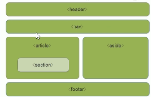
<header> 头部标签
<nav>:导航标签
<article>:内容标签
<section>:定义文档个区域
<aside>:测边栏标签
<footer>:尾部标签
注意:
这种语义化标准主要是针对搜索引擎的
这些新标签页面中可以使用多次
在ie9中,需要把这些元素转换为块级元素
其实,我们移动端更喜欢使用这些标签
html5还增加了很多其他标签,我划们启面再慢慢学
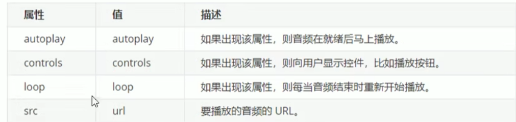
2)html5新增的多媒体标签
新增的多媒体标签主要包含两个:
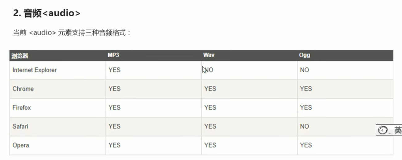
音频:<audio>
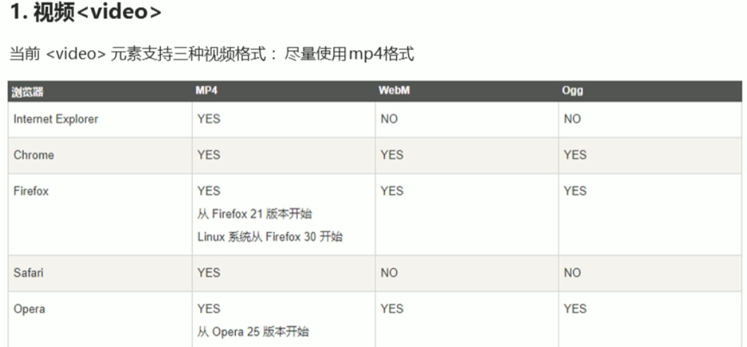
视频:<video>
用它们可以很方便的在页面中嵌入音频和视频,而不再去使用flash和其他浏览器插件。
<video src="<media/mi.mp4>" autoplay="autoplay" muted="muted" loop="loop" poster="media/mi9.jpg"></video>
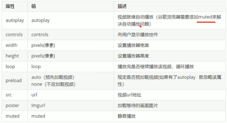
谷歌禁止自动播放
3多媒体标签总结
音频标签和视频标签使用方式基本致
浏览器支持情况不同
谷歌浏览器把音频和视频自动播放禁止了
我们可以给视频标签添加muted属性来静音播放视频,音频不可以(可以通过avascript解决)
视频标签是重点,我们常设置自动播放,不使用controls控件,循环和设置大小属性
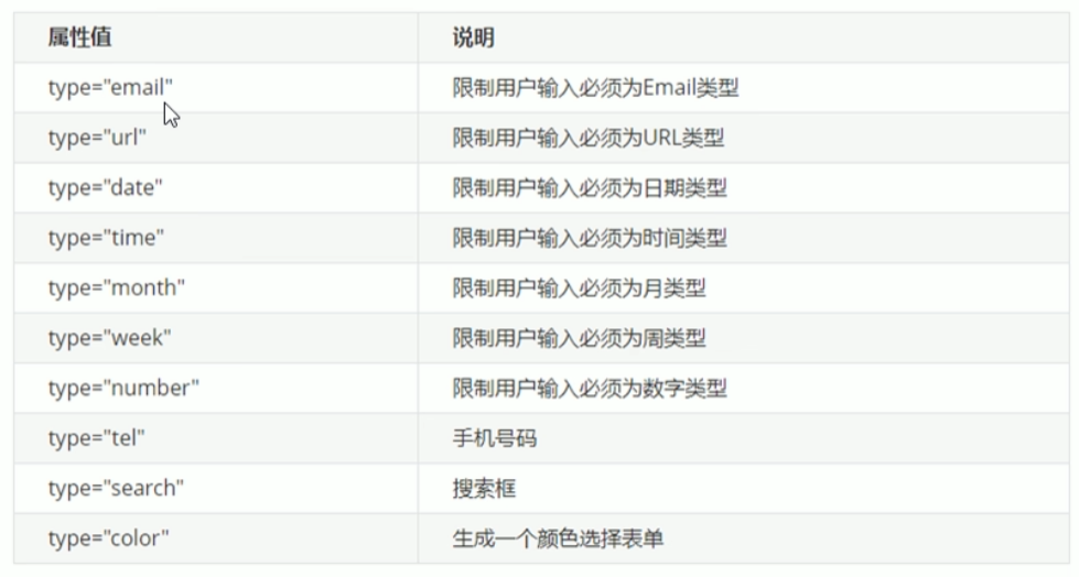
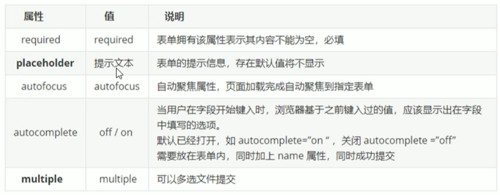
3)html新增input表单
提交可以验证是否符合要求,重点记住number tel search
新增type属性
html
<!DOCTYPE html>
<html lang="en">

<head>
    <meta charset="UTF-8">
    <meta name="viewport" content="width=device-width, initial-scale=1.0">
    <meta http-equiv="X-UA-Compatible" content="ie=edge">
    <title>Document</title>
</head>

<body>
    <form action="">
        <ul>
            <li>邮箱: <input type="email" /></li>
            <li>网址: <input type="url" /></li>
            <li>日期: <input type="date" /></li>
            <li>日期: <input type="time" /></li>
            <li>数量: <input type="number" /></li>
            <li>手机号码: <input type="tel" /></li>
            <li>搜索: <input type="search" /></li>
            <li>颜色: <input type="color" /></li>

            <li> <input type="submit" value="提交"></li>
        </ul>
    </form>
</body>

</html>
input
可以通过以下设置方式修改placeholder里面的字体颜色
input::placeholder{
color:pink;
}
html
<!DOCTYPE html>
<html lang="en">

<head>
    <meta charset="UTF-8">
    <meta name="viewport" content="width=device-width, initial-scale=1.0">
    <meta http-equiv="X-UA-Compatible" content="ie=edge">
    <title>Document</title>
  <style>
    input::placeholder{
        color:pink;
      }
  </style>

</head>

<body>
    <form action="">
        用户名:
      <input type="search" name="sear" id =" "required="required" placeholder="请输入用户名"
        autofocus="autofocus"  autocomplete="off">
      <input type="submit" value="提交"> 上传头像:
      <input type="file" name="" id="" multiple="multiple">
    </form>
</body>

</html>
2css3新增特性
新增的css3特性有兼容性问题,ie9+才支持
移动端支持优于pc端
不断改进中
应用相对广泛
现阶段主要学匀:新增选择器和盒子模型及其他特性
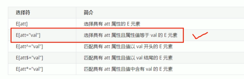
1.属性选择器
第二个最重要
html
<!DOCTYPE html>
<html lang="en">
<head>
<meta charset="UTF-8">
<meta name="viewport" content="width=device-width, initial-scale=1.0">
<meta http-equiv="X-UA-Compatible" content="ie=edge">
<title>Document</title>
<style>
/* 属性选择器使用方法 */
/* 选择的是: 既是button 又有 disabled 这个属性的元素 */
/* 属性选择器的权重是 10 */
/* 1.直接写属性 */
/* 选中botton中有disabled属性的 */
button[disabled] {
cursor: default;
}
button {
cursor: pointer;
}
/* 2. 属性等于值 */
/* 选中input中属性type="search"的 */
input[type="search"] {
color: pink;
}
/* 3. 以某个值开头的 属性值 */
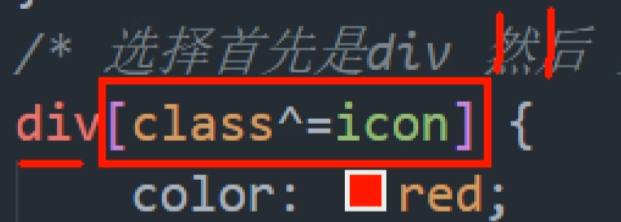
/* 选中div中属性class以icon开头的 */
div[class^="icon"] {
color: red;
}
/* 4. 以某个值结尾的 */
/* 选中div中属性class以icon结尾的 */
div[class$="icon"] {
color: green;
}
/* 5. 可以在任意位置的 */
/* /* 选中div中属性class含有icon的 */
/* div[class*="icon"] {
color: blue; */
}
</style>
</head>
<body>
<!-- disabled 是禁用我们的按钮 -->
<button>按钮</button>
<button>按钮</button>
<button disabled="disabled">按钮</button>
<button disabled="disabled">按钮</button>
<input type="text" name="" id="" value="文本框">
<input type="text" name="" id="" value="文本框">
<input type="text" name="" id="" value="文本框">
<input type="search" name="" id="" value="搜索框">
<input type="search" name="" id="" value="搜索框">
<input type="search" name="" id="" value="搜索框">
<div class="icon1">图标1</div>
<div class="icon2">图标2</div>
<div class="icon3">图标3</div>
<div class="iicon3">图标4</div>
<div class="absicon">图标5</div>
</body>
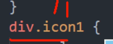
</html>注意:类选择器 属性选择器,伪类选择器,权重为10.
div是标签选择器1+class属性选择器10=11,div.icon1交集选择器11
2. 结构伪类选择器

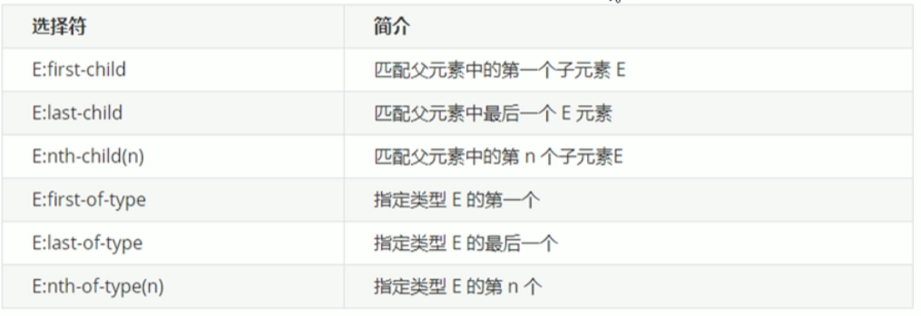
1)nth-child
html
<!DOCTYPE html>
<html lang="en">
<head>
    <meta charset="UTF-8">
    <meta name="viewport" content="width=device-width, initial-scale=1.0">
    <meta http-equiv="X-UA-Compatible" content="ie=edge">
    <title>CSS3新增结构伪类选择器</title>
    <style>
        /* 1. 选择ul里面的第一个孩子 小li */
        ul li:first-child {
            background-color: pink;
        }
        /* 2. 选择ul里面的最后一个孩子 小li */
        ul li:last-child {
            background-color: pink;
        }
         /* 3. 选择ul里面的第2个孩子 小li */
         ul li:nth-child(2) {
            background-color: skyblue;
        }
        ul li:nth-child(6) {
            background-color: skyblue;
        }
      /* 选中偶数行的 */
        /* ul li:nth-child(even) {
              background-color: gray;
          }
      /* 选中所有偶数行的 */
        ul li:nth-child(odd) {
              background-color: yellow;
        }
       */
    </style>
</head>
<body>
    <ul>
        <li>我是第1个孩子</li>
        <li>我是第2个孩子</li>
        <li>我是第3个孩子</li>
        <li>我是第4个孩子</li>
        <li>我是第5个孩子</li>
        <li>我是第6个孩子</li>
        <li>我是第7个孩子</li>
        <li>我是第8个孩子</li>
    </ul>
</body>
</html>
-child(n)选择某个父元素的一个或多个特定的子元素, 会把每个盒子都排列序号
n可以是数字,关键字和公式
n如果是数字,就是选择第n个子元素,里面数字从1开始。.
n可以是关键字:even偶数,odd奇数
n可以是公式:常见的公式如下(如果n 是公式,则从0 开始计算,但是第0个元素或者超出了元素的个数会被忽略)只能用n表示不能用别的字母a等
eg:2n选中所有偶数的包含0等价even
2n+1选中所有奇数的包含0等价odd
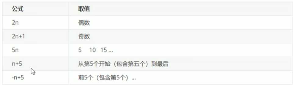
5n比如学成在线的课程页 第五个第十个单独设置右边距为0
2)nth-of-type
nth-child与nth-of-type 区别:
nth-child会把每个盒子都排列序号**;执行的时候首先看 :nth-child(1) 之后回去看 前面 di**
nth-of-type 会把指定元素 的盒子排列序号
执行的时候首先看div指定的元素 之后看:nth-of-type(1) 第几个孩子*/
html
<!DOCTYPE html>
<html lang="en">

<head>
    <meta charset="UTF-8">
    <meta name="viewport" content="width=device-width, initial-scale=1.0">
    <meta http-equiv="X-UA-Compatible" content="ie=edge">
    <title>CSS3新增选择器nth-type-of</title>
    <style>
        ul li:first-of-type {
            background-color: pink;
        }
        ul li:last-of-type {
            background-color: pink;
        }
        ul li:nth-of-type(even) {
            background-color: skyblue;
        }
        /* nth-child 会把所有的盒子都排列序号 */
        /* 执行的时候首先看  :nth-child(1) 之后回去看 前面 div   */
      /* 这里没有满足条件的盒子 */
        section div:nth-child(1) {
            background-color: red;
        }
         /* nth-of-type 会把指定元素的盒子排列序号 */
        /* 执行的时候首先看  div指定的元素  之后回去看 :nth-of-type(1) 第几个孩子 */
        section div:nth-of-type(1) {
            background-color: blue;
        }
    </style>
</head>

<body>
    <!-- 区别 -->
    <section>
        <p>光头强</p>
        <div>熊大</div>
        <div>熊二</div>
    </section>
</body>

</html>
总结
结构伪类选择器一般用于选择父级里面的第几个孩子
nthchild对父元素里面所有孩子排序选择(序号是固定的)先找到第n个孩子,然后看看是否和e匹配
nth-of-type对父元素里面指定子元素进行排序选择。先去匹配e,然后再根据e找第n个孩子
关于nth-child(n)我们要知道n是从0开始计算的,要记住常用的公式
如果是无序列表,我们肯定用nth-child更多
3. 伪元素选择器
伪元素选择器可以帮助我们利用css创建新标签元素,而不需要html标签,从而简化html结构。
比如右侧的小箭头和视频的遮罩层。
::before 在元素内部的前面 插入内容
::after 在元素内部的后面插入内容
注意
- before和after创建一个元素,但是属于行内元素
- 新创建的这个元素在文档树中是找不到的,所以我们称为伪元素
- 语法:element::before
- before和after必须有content属性 否则无效
- before在父元素内容的前面创建元素,after在父元素内容的后面插入元素
- 伪元素选择器和标签选择器一样,权重为1 ::after是1 div::after 是2
1)右侧箭头
html
<!DOCTYPE html>
<html lang="en">
<head>
<meta charset="UTF-8">
<meta name="viewport" content="width=device-width, initial-scale=1.0">
<meta http-equiv="X-UA-Compatible" content="ie=edge">
<title>伪元素选择器使用场景-字体图标</title>
<style>
@font-face {
font-family: 'icomoon';
src: url('fonts/icomoon.eot?1lv3na');
src: url('fonts/icomoon.eot?1lv3na#iefix') format('embedded-opentype'),
url('fonts/icomoon.ttf?1lv3na') format('truetype'),
url('fonts/icomoon.woff?1lv3na') format('woff'),
url('fonts/icomoon.svg?1lv3na#icomoon') format('svg');
font-weight: normal;
font-style: normal;
font-display: block;
}
div {
position: relative;
width: 200px;
height: 35px;
border: 1px solid red;
}
div::after {
position: absolute;
top: 10px;
right: 10px;
font-family: 'icomoon';
/* content: ''; */
content: '\e91e';
color: red;
font-size: 18px;
}
</style>
</head>
<body>
<div></div>
</body>
</html>2)遮罩层
html
.tudou::before {
/* 即使没有内容也要写content */
content: '';
/* 隐藏遮罩层 */
display: none;
position: absolute;
top: 0;
left: 0;
width: 100%;
height: 100%;
background: rgba(0, 0, 0, .4) url(images/arr.png) no-repeat center;
}
/* 当我们鼠标经过了 土豆这个盒子,就让里面before遮罩层显示出来 */
/* 不要有空格 */
.tudou:hover::before {
/* 而是显示元素 */
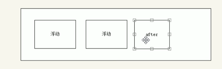
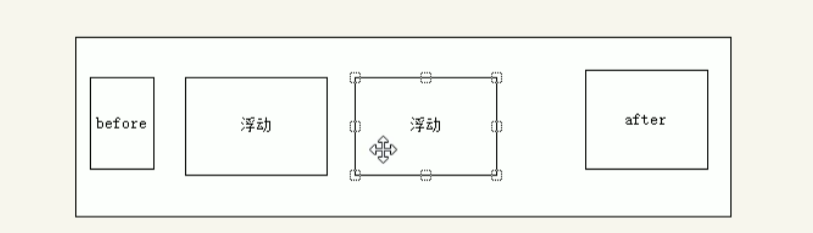
display: block;3)伪元素清除浮动
1,额外标签法也称为隔墙法,是w3c推荐的做法。
-
父级添加overflow属性
-
父级添加after伪元素:在浮动的盒子后面加一个盒子但是不显示
4.父级添加双伪元素:在浮动的盒子前后都加一个盒子但是不显示
        /* 父元素加after */
        .clearfix:after {
            content: "";
            display: block;
            height: 0;
            clear: both;
            visibility: hidden;
        }
      /* 兼容低版本浏览器 */
        .clearfix {
            /* IE6、7 专有 */
            *zoom: 1;
        }
4盒子模型
之前给盒子设置边框或者边距都会影响盒子的大小 还要计算
css3中可以通过box-sizing 来指定盒模型,有2个值:即可指定为content-box,border-box,这样我们计算盒子大小的方式就发生了改变。
可以分成两种情况:
box-sizina:content-box盒子大小为width+padding+border(以前默认的)
box-sizing:border-box 盒子大小为width
如果盒子模型我们改为了box-sizingborder-box,那padding和border就不会撑大盒子了(前提padding
和border不会超过width宽度)
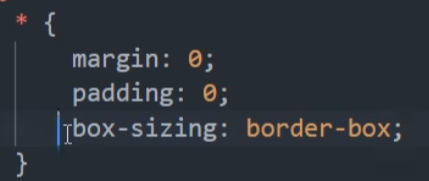
初始化
5其他特性
1图片模糊
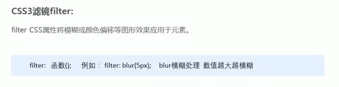
css3滤镜filter:
filtercss属性将模糊或颜色偏移等图效果应用于元素。
filter:函数();例如:filter:blur(5px);blur模糊处理数值越大越模糊
2盒子宽度calc
子盒子随父盒子自动变化不用自己计算
html
<!DOCTYPE html>
<html lang="en">
<head>
    <meta charset="UTF-8">
    <meta name="viewport" content="width=device-width, initial-scale=1.0">
    <meta http-equiv="X-UA-Compatible" content="ie=edge">
    <title>CSS3属性calc函数</title>
    <style>
        .father {
            width: 300px;
            height: 200px;
            background-color: pink;
        }
        .son {
            /* width: 150px; */
          /* 比父盒子小30 */
            /* width: calc(150px + 30px); */
            width: calc(100% - 30px);
            height: 30px;
            background-color: skyblue;
        }
    </style>
</head>
<body>
    <!-- 需求我们的子盒子宽度永远比父盒子小30像素 -->
    <div class="father">
        <div class="son"></div>
    </div>
</body>
</html>
3css过渡transition
过渡(transition)是css3中具有颠覆性的特征之一,我们可以在不使用flash动画或
avascript的情况下,当元素从一种样式变换为另一种样式时为元素添加效果 。
过渡动画:是从一个状态渐渐的过渡到另外一个状态
可以让我们页面更好看,更动感十足,虽然低版本浏览器不支持(ie9以下版本)但是不会影响
页面布局。
我们现在经常和:hover一起搭配使用。
transition:要过渡的属性 花费时间 运动曲线 何时开始;
1属性:想要变化的css属性,宽度高度背颜色内外边距都可以。如果想要所有的属性都
变化过渡,写一个all就可以。
2花费时间:单位是秒(必须写单位)比如0.5s
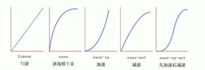
3运动曲线:默认是ease( 可以省略)
4何时开始:单位是秒(必须写单位)可以设置延迟触发时间默认是0s(可以省略)
谁来变化 过度就加给谁
html
<!DOCTYPE html>
<html lang="en">
<head>
    <meta charset="UTF-8">
    <meta name="viewport" content="width=device-width, initial-scale=1.0">
    <meta http-equiv="X-UA-Compatible" content="ie=edge">
    <title>CSS3 过渡效果</title>
    <style>
        div {
            width: 200px;
            height: 100px;
            background-color: pink;
            /* transition: 变化的属性 花费时间 运动曲线 何时开始; */
            /* transition: width .5s ease 0s, height .5s ease 1s; */
            /* 如果想要写多个属性,利用逗号进行分割 */
            /* transition: width .5s, height .5s; */
            /* 如果想要多个属性都变化,属性写all就可以了 */
            /* transition: height .5s ease 1s; */
            /* 谁做过渡,给谁加 */
            transition: all 0.5s;
        }
        div:hover {
            width: 400px;
            height: 200px;
            background-color: skyblue;
        }
    </style>
</head>
<body>
    <div></div>
</body>
</html>
练习:进度条 鼠标经过是 进度条拉满
html
<!DOCTYPE html>
<html lang="en">
<head>
    <meta charset="UTF-8">
    <meta name="viewport" content="width=device-width, initial-scale=1.0">
    <meta http-equiv="X-UA-Compatible" content="ie=edge">
    <title>CSS3过渡练习-进度条</title>
    <style>
        .bar {
            width: 150px;
            height: 8px;
            border: 1px solid red;
            border-radius: 7px;
            padding: 1px;
        }
        .bar_in {
            width: 50%;
            height: 100%;
            background-color: red;
          border-radius: 7px;
            /* 谁做过渡给谁加 */
            transition: all .7s;
        }
        .bar:hover .bar_in {
            width: 100%;
        }
    </style>
</head>
<body>
    <div class="bar">
        <div class="bar_in"></div>
    </div>
</body>
</html>