20个实用CSS小技巧
unsetunset1. 使用 :not() 选择器排除特定元素unsetunset
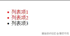
排除最后一个。
css
/* 排除最后一个子元素 */
li:not(:last-child) {
color:red;
}
/* 排除具有特定类的元素 */
button:not(.disabled) {
background-color: #007bff;
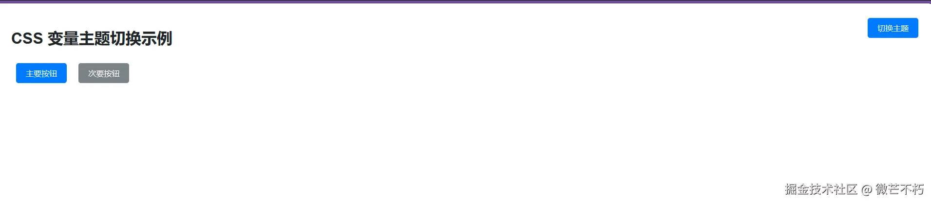
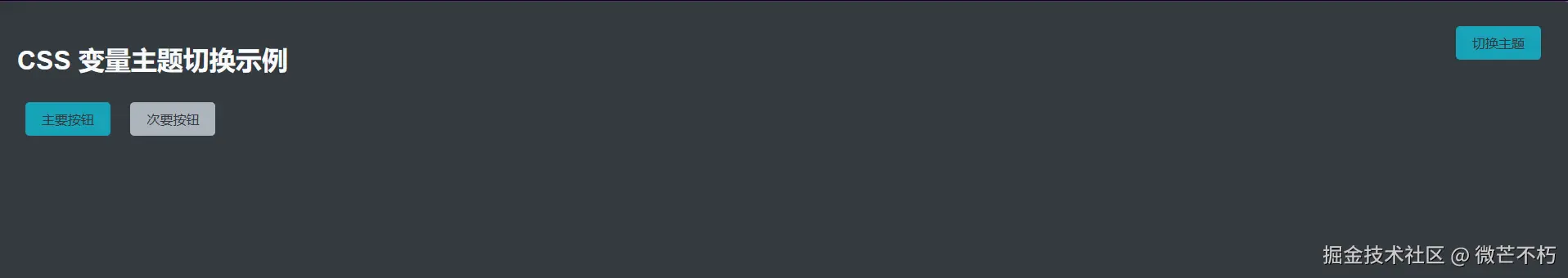
}unsetunset2. CSS变量实现主题切换unsetunset
css
:root {
  --primary-color: #007bff;
  --secondary-color: #6c757d;
  --background-color: #ffffff;
}


[data-theme="dark"] {
  --primary-color: #17a2b8;
  --secondary-color: #adb5bd;
  --background-color: #343a40;
}


.button {
  background-color: var(--primary-color);
  color: var(--background-color);
}
完整示例
xml
<!DOCTYPE html>
<html lang="zh-CN">
<head>
    <meta charset="UTF-8">
    <meta name="viewport" content="width=device-width, initial-scale=1.0">
    <style>
        :root {
            --primary-color: #007bff;
            --secondary-color: #6c757d;
            --background-color: #ffffff;
            --text-color: #212529;
        }

        [data-theme="dark"] {
            --primary-color: #17a2b8;
            --secondary-color: #adb5bd;
            --background-color: #343a40;
            --text-color: #f8f9fa;
        }

        body {
            background-color: var(--background-color);
            color: var(--text-color);
            font-family: Arial, sans-serif;
            transition: background-color 0.3s, color 0.3s;
            padding: 20px;
        }

        .button {
            background-color: var(--primary-color);
            color: var(--background-color);
            border: none;
            padding: 10px 20px;
            border-radius: 5px;
            cursor: pointer;
            font-size: 16px;
            margin: 10px;
            transition: background-color 0.3s;
        }

        .button:hover {
            opacity: 0.9;
        }

        .secondary-button {
            background-color: var(--secondary-color);
            color: var(--background-color);
        }

        .theme-switcher {
            position: fixed;
            top: 20px;
            right: 20px;
        }
    </style>
</head>
<body>
    <div class="theme-switcher">
        <button class="button" onclick="toggleTheme()">切换主题</button>
    </div>

    <h1>CSS 变量主题切换示例</h1>

    <button class="button">主要按钮</button>
    <button class="button secondary-button">次要按钮</button>

    <script>
        function toggleTheme() {
            const html = document.documentElement;
            const currentTheme = html.getAttribute('data-theme');
            const newTheme = currentTheme === 'dark' ? 'light' : 'dark';

            if (newTheme === 'dark') {
                html.setAttribute('data-theme', 'dark');
            } else {
                html.removeAttribute('data-theme');
            }
        }
    </script>
</body>
</html>
unsetunset3. 使用 clamp() 实现响应式字体大小unsetunset
css
h1 {
  font-size: clamp(1.5rem, 4vw, 3rem);
}


p {
  font-size: clamp(0.875rem, 2.5vw, 1.125rem);
}
完整示例
xml
<!DOCTYPE html>
<html lang="zh-CN">
<head>
<meta charset="UTF-8" />
<meta name="viewport" content="width=device-width, initial-scale=1" />
<title>clamp() 示例二</title>
<style>
/* 标题:在 400px~1200px 之间平滑缩放 */
h2 {
font-size: clamp(1.25rem, 1rem + 2vw, 2.5rem);
line-height: 1.2;
margin: 0.5em 0;
}
/* 正文:在 400px~1200px 之间平滑缩放 */
.text {
font-size: clamp(0.875rem, 0.75rem + 1vw, 1.125rem);
line-height: 1.6;
max-width: 65ch;
margin: 0 auto;
}
/* 装饰用 */
body {
font-family: system-ui, sans-serif;
padding: 5vw;
background: #f5f7fa;
color: #333;
}
</style>
</head>
<body>
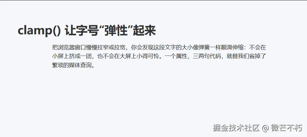
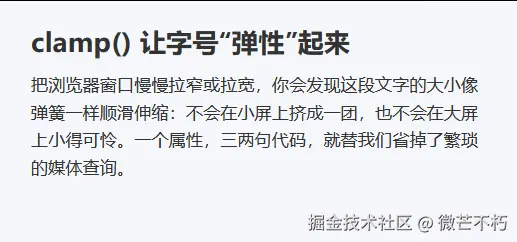
<h2>clamp() 让字号"弹性"起来</h2>
<p class="text">
把浏览器窗口慢慢拉窄或拉宽,你会发现这段文字的大小像弹簧一样顺滑伸缩:不会在小屏上挤成一团,也不会在大屏上小得可怜。一个属性,三两句代码,就替我们省掉了繁琐的媒体查询。
</p>
</body>
</html>unsetunset4. Flexbox居中对齐的终极解决方案unsetunset
css
.container {
  display: flex;
  justify-content: center;
  align-items: center;
  height: 100vh;
}


/* 或者使用更简洁的方式 */
.center {
  position: absolute;
  top: 50%;
  left: 50%;
  transform: translate(-50%, -50%);
}
unsetunset5. 使用 aspect-ratio 控制元素比例unsetunset
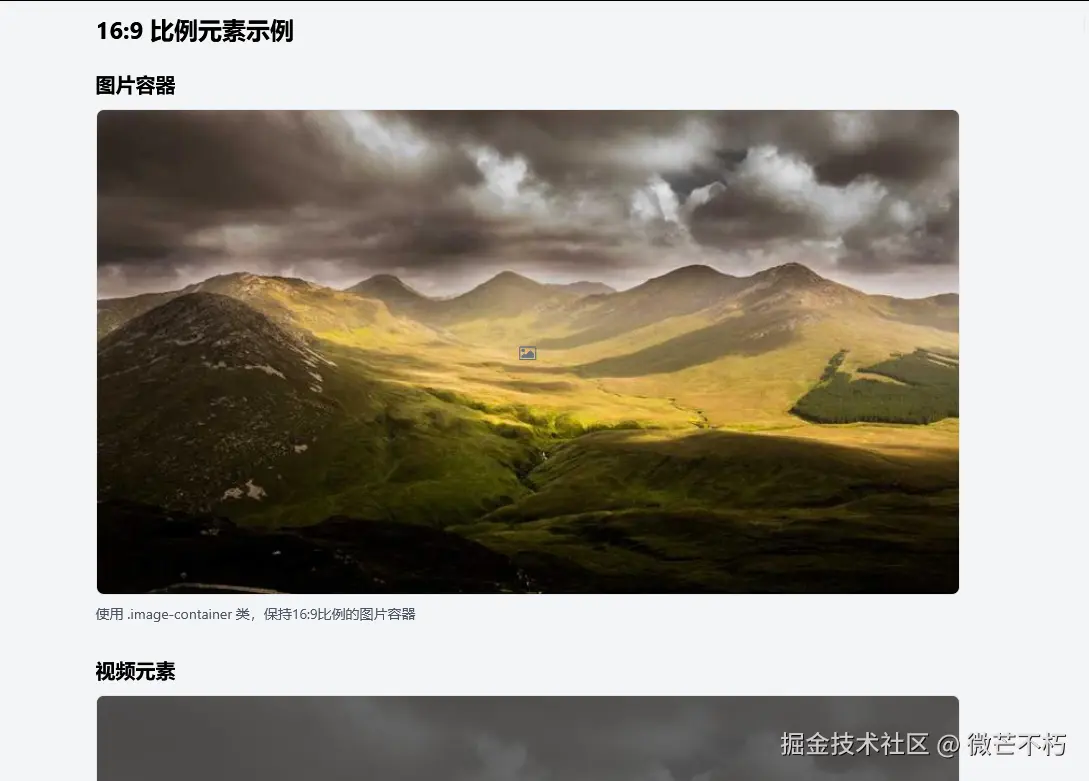
css
.image-container {
  aspect-ratio: 16 / 9;
  background-color: #f8f9fa;
}


.video {
  aspect-ratio: 16 / 9;
  width: 100%;
}
unsetunset6. CSS Grid 网格布局快速创建unsetunset
css
.grid-container {
  display: grid;
  grid-template-columns: repeat(auto-fit, minmax(300px, 1fr));
  gap: 20px;
}


.card {
  background: #fff;
  padding: 20px;
  border-radius: 8px;
  box-shadow: 0 2px 4px rgba(0,0,0,0.1);
}
完整示例
xml
<!DOCTYPE html>
<html lang="zh-CN">
<head>
<meta charset="UTF-8">
<meta name="viewport" content="width=device-width, initial-scale=1.0">
<title>简单网格卡片布局</title>
<link href="https://cdn.jsdelivr.net/npm/font-awesome@4.7.0/css/font-awesome.min.css" rel="stylesheet">
<style>
.grid-container {
display: grid;
grid-template-columns: repeat(auto-fit, minmax(300px, 1fr));
gap: 20px;
padding: 20px;
max-width: 1200px;
margin: 0 auto;
}
.card {
background: #fff;
padding: 20px;
border-radius: 8px;
box-shadow: 0 2px 4px rgba(0,0,0,0.1);
}
body {
background-color: #f5f5f5;
margin: 0;
font-family: Arial, sans-serif;
}
.card h3 {
margin-top: 0;
color: #333;
}
.card p {
color: #666;
line-height: 1.5;
}
.icon {
font-size: 24px;
color: #4285f4;
margin-bottom: 10px;
}
</style>
</head>
<body>
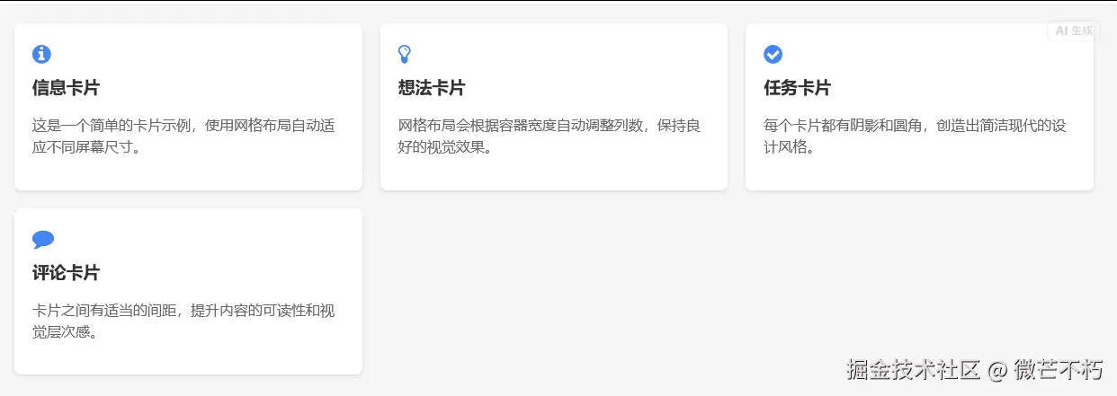
<div class="grid-container">
<div class="card">
<div class="icon">
<i class="fa fa-info-circle"></i>
</div>
<h3>信息卡片</h3>
<p>这是一个简单的卡片示例,使用网格布局自动适应不同屏幕尺寸。</p>
</div>
<div class="card">
<div class="icon">
<i class="fa fa-lightbulb-o"></i>
</div>
<h3>想法卡片</h3>
<p>网格布局会根据容器宽度自动调整列数,保持良好的视觉效果。</p>
</div>
<div class="card">
<div class="icon">
<i class="fa fa-check-circle"></i>
</div>
<h3>任务卡片</h3>
<p>每个卡片都有阴影和圆角,创造出简洁现代的设计风格。</p>
</div>
<div class="card">
<div class="icon">
<i class="fa fa-comment"></i>
</div>
<h3>评论卡片</h3>
<p>卡片之间有适当的间距,提升内容的可读性和视觉层次感。</p>
</div>
</div>
</body>
</html>unsetunset7. 使用 backdrop-filter 创建毛玻璃效果unsetunset
css
.glass {
  backdrop-filter: blur(10px);
  -webkit-backdrop-filter: blur(10px);
  background: rgba(255, 255, 255, 0.1);
  border: 1px solid rgba(255, 255, 255, 0.2);
}
完整示例
xml
<!DOCTYPE html>
<html>
<head>
<meta name="viewport" content="width=device-width, initial-scale=1">
<style>
.glass {
backdrop-filter: blur(10px);
-webkit-backdrop-filter: blur(10px);
background: rgba(255, 255, 255, 0.1);
border: 1px solid rgba(255, 255, 255, 0.2);
}
body {
margin: 0;
min-height: 100vh;
background: url(https://picsum.photos/1920/1080) center/cover fixed;
display: grid;
place-items: center;
}
.card {
padding: 2rem;
border-radius: 1rem;
color: white;
font-family: sans-serif;
}
</style>
</head>
<body>
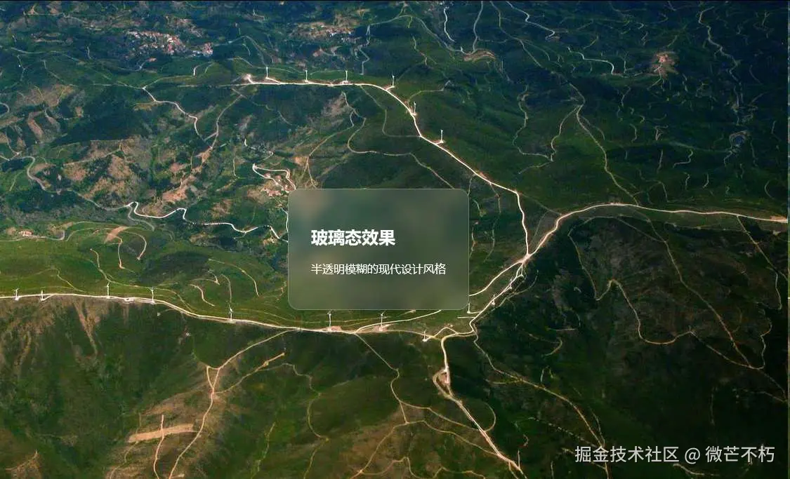
<div class="glass card">
<h2>玻璃态效果</h2>
<p>半透明模糊的现代设计风格</p>
</div>
</body>
</html>
unsetunset8. 隐藏元素的多种方法unsetunset
css
/* 方法1:display:none(完全移除) */
.hidden {
  display: none;
}


/* 方法2:visibility:hidden(保留空间) */
.invisible {
  visibility: hidden;
}


/* 方法3:opacity:0(透明但保留交互) */
.transparent {
  opacity: 0;
}


/* 方法4:clip-path隐藏 */
.clip-hidden {
  clip-path: inset(100%);
  position: absolute;
}
unsetunset9. 实现文字渐变效果unsetunset
css
.gradient-text {
  background: linear-gradient(45deg, #ff6b6b, #4ecdc4, #45b7d1);
  -webkit-background-clip: text;
  -webkit-text-fill-color: transparent;
  background-clip: text;
}
完整示例
xml
<!DOCTYPE html>
<html>
<head>
<meta name="viewport" content="width=device-width, initial-scale=1">
<style>
.gradient-text {
background: linear-gradient(45deg, #ff6b6b, #4ecdc4, #45b7d1);
-webkit-background-clip: text;
-webkit-text-fill-color: transparent;
background-clip: text;
}
body {
margin: 0;
padding: 2rem;
font-family: Arial, sans-serif;
text-align: center;
}
h1 {
font-size: 3rem;
margin: 1rem 0;
}
p {
font-size: 1.5rem;
}
</style>
</head>
<body>
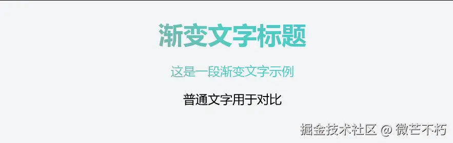
<h1 class="gradient-text">渐变文字标题</h1>
<p class="gradient-text">这是一段渐变文字示例</p>
<p>普通文字用于对比</p>
</body>
</html>unsetunset10. 使用 text-shadow 创造立体文字unsetunset
css
.stacked-text {
  text-shadow:
    2px 2px 4px rgba(0, 0, 0, 0.3),
    4px 4px 8px rgba(0, 0, 0, 0.2);
  font-weight: bold;
}
完整示例
xml
<!DOCTYPE html>
<html>
<head>
<meta name="viewport" content="width=device-width, initial-scale=1">
<style>
.stacked-text {
text-shadow:
2px 2px 4px rgba(0, 0, 0, 0.3),
4px 4px 8px rgba(0, 0, 0, 0.2);
font-weight: bold;
}
body {
margin: 0;
min-height: 100vh;
display: grid;
place-items: center;
background: #f0f0f0;
font-family: sans-serif;
}
h1 {
font-size: 4rem;
color: #333;
}
p {
font-size: 1.5rem;
color: #666;
}
</style>
</head>
<body>
<div>
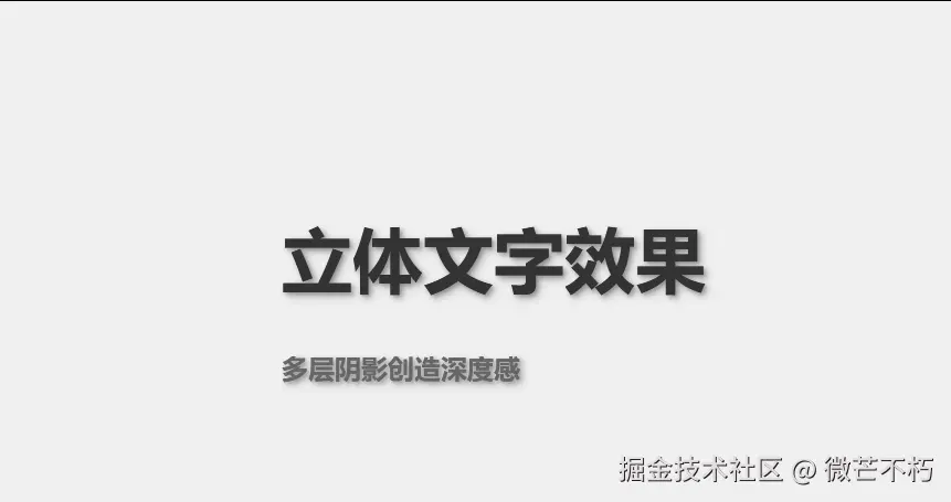
<h1 class="stacked-text">立体文字效果</h1>
<p class="stacked-text">多层阴影创造深度感</p>
</div>
</body>
</html>unsetunset11. 快速创建阴影效果unsetunset
css
.shadow-card {
  box-shadow:
    0 2px 10px rgba(0, 0, 0, 0.1),
    0 4px 20px rgba(0, 0, 0, 0.05);
}


.shadow-hover:hover {
  box-shadow:
    0 8px 25px rgba(0, 0, 0, 0.15),
    0 12px 40px rgba(0, 0, 0, 0.1);
}
完整示例
xml
<!DOCTYPE html>
<html>
<head>
<meta name="viewport" content="width=device-width, initial-scale=1">
<style>
.shadow-card {
box-shadow:
0 2px 10px rgba(0, 0, 0, 0.1),
0 4px 20px rgba(0, 0, 0, 0.05);
}
.shadow-hover:hover {
box-shadow:
0 8px 25px rgba(0, 0, 0, 0.15),
0 12px 40px rgba(0, 0, 0, 0.1);
}
body {
margin: 0;
padding: 2rem;
background: #f8f9fa;
font-family: sans-serif;
}
.card {
background: white;
padding: 1.5rem;
border-radius: 8px;
margin: 1rem;
transition: box-shadow 0.3s ease;
}
.container {
display: grid;
grid-template-columns: repeat(auto-fit, minmax(250px, 1fr));
gap: 1rem;
}
</style>
</head>
<body>
<div class="container">
<div class="card shadow-card shadow-hover">
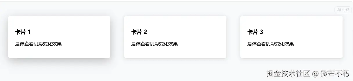
<h3>卡片 1</h3>
<p>悬停查看阴影变化效果</p>
</div>
<div class="card shadow-card shadow-hover">
<h3>卡片 2</h3>
<p>悬停查看阴影变化效果</p>
</div>
<div class="card shadow-card shadow-hover">
<h3>卡片 3</h3>
<p>悬停查看阴影变化效果</p>
</div>
</div>
</body>
</html>
unsetunset12. 优雅的过渡动画unsetunset
css
.transition-element {
  transition: all 0.3s ease-in-out;
  cursor: pointer;
}


.transition-element:hover {
  transform: scale(1.05);
  box-shadow: 0 10px 25px rgba(0, 0, 0, 0.15);
}
unsetunset13. 使用 :focus-visible 提升可访问性unsetunset
css
.button:focus-visible {
  outline: 2px solid #007bff;
  outline-offset: 2px;
}


.input:focus-visible {
  border-color: #007bff;
  box-shadow: 0 0 0 3px rgba(0, 123, 255, 0.25);
}
完整示例
xml
<!DOCTYPE html>
<html>
<head>
<meta name="viewport" content="width=device-width, initial-scale=1">
<style>
.button:focus-visible {
outline: 2px solid #007bff;
outline-offset: 2px;
}
.input:focus-visible {
border-color: #007bff;
box-shadow: 0 0 0 3px rgba(0, 123, 255, 0.25);
}
body {
padding: 2rem;
font-family: sans-serif;
}
.button {
padding: 8px 16px;
border: none;
background: #eee;
border-radius: 4px;
cursor: pointer;
margin-right: 10px;
}
.input {
padding: 8px;
border: 1px solid #ccc;
border-radius: 4px;
margin-top: 1rem;
}
.container {
max-width: 400px;
}
</style>
</head>
<body>
<div class="container">
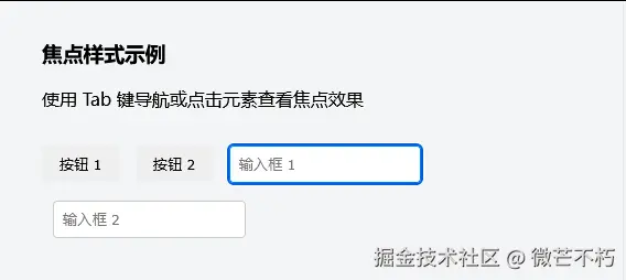
<h3>焦点样式示例</h3>
<p>使用 Tab 键导航或点击元素查看焦点效果</p>
<button class="button">按钮 1</button>
<button class="button">按钮 2</button>
<input type="text" class="input" placeholder="输入框 1">
<input type="text" class="input" placeholder="输入框 2" style="margin-left: 10px;">
</div>
</body>
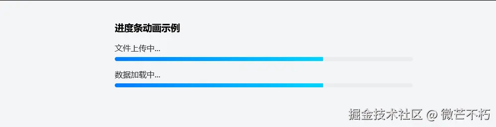
</html>unsetunset14. 实现进度条动画unsetunset
css
.progress-bar {
  width: 100%;
  height: 8px;
  background: #e9ecef;
  border-radius: 4px;
  overflow: hidden;
}


.progress-fill {
  height: 100%;
  background: linear-gradient(90deg, #007bff, #00d4ff);
  animation: progress 3s ease-in-out infinite;
  width: 0;
}


@keyframes progress {
  0% { width: 0; }
  50% { width: 70%; }
  100% { width: 100%; }
}
完整示例
xml
<!DOCTYPE html>
<html>
<head>
    <meta name="viewport" content="width=device-width, initial-scale=1">
    <style>
        .progress-bar {
            width: 100%;
            height: 8px;
            background: #e9ecef;
            border-radius: 4px;
            overflow: hidden;
        }

        .progress-fill {
            height: 100%;
            background: linear-gradient(90deg, #007bff, #00d4ff);
            animation: progress 3s ease-in-out infinite;
            width: 0;
        }

        @keyframes progress {
            0% { width: 0; }
            50% { width: 70%; }
            100% { width: 100%; }
        }

        body {
            padding: 2rem;
            font-family: sans-serif;
            max-width: 600px;
            margin: 0 auto;
        }

        .container {
            margin: 1rem 0;
        }

        label {
            display: block;
            margin-bottom: 8px;
            color: #333;
        }
    </style>
</head>
<body>
    <h3>进度条动画示例</h3>

    <div class="container">
        <label>文件上传中...</label>
        <div class="progress-bar">
            <div class="progress-fill"></div>
        </div>
    </div>

    <div class="container">
        <label>数据加载中...</label>
        <div class="progress-bar">
            <div class="progress-fill"></div>
        </div>
    </div>
</body>
</html>
unsetunset15. 多列布局实现杂志效果unsetunset
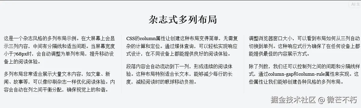
css
.magazine-layout {
  column-count: 3;
  column-gap: 2rem;
  column-rule: 1px solid #e9ecef;
}


@media (max-width: 768px) {
  .magazine-layout {
    column-count: 1;
  }
}
unsetunset16. 使用 object-fit 控制图片显示unsetunset
css
.image-cover {
  object-fit: cover;
  width: 100%;
  height: 200px;
}


.image-contain {
  object-fit: contain;
  max-width: 100%;
  height: auto;
}
unsetunset17. 创建自定义滚动条样式unsetunset
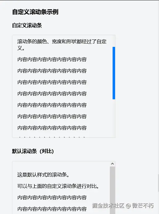
css
.custom-scrollbar {
  scrollbar-width: thin;
  scrollbar-color: #007bff #f1f1f1;
}


.custom-scrollbar::-webkit-scrollbar {
  width: 8px;
}


.custom-scrollbar::-webkit-scrollbar-track {
  background: #f1f1f1;
}


.custom-scrollbar::-webkit-scrollbar-thumb {
  background-color: #007bff;
  border-radius: 4px;
}
unsetunset18. 实现卡片悬停翻转效果unsetunset
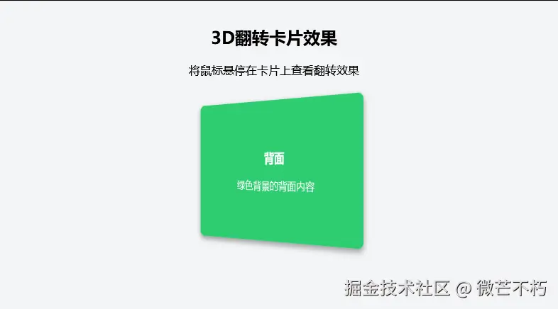
css
.flip-card {
  perspective: 1000px;
  width: 300px;
  height: 200px;
}


.flip-card-inner {
  position: relative;
  width: 100%;
  height: 100%;
  text-align: center;
  transition: transform 0.6s;
  transform-style: preserve-3d;
}


.flip-card:hover .flip-card-inner {
  transform: rotateY(180deg);
}


.flip-card-front, .flip-card-back {
  position: absolute;
  width: 100%;
  height: 100%;
  backface-visibility: hidden;
}


.flip-card-front {
  background-color: #3498db;
  color: white;
}


.flip-card-back {
  background-color: #2ecc71;
  color: white;
  transform: rotateY(180deg);
}
完整示例
xml
<!DOCTYPE html>
<html>
<head>
    <meta name="viewport" content="width=device-width, initial-scale=1">
    <style>
        .flip-card {
            perspective: 1000px;
            width: 300px;
            height: 200px;
            margin: 2rem auto;
        }

        .flip-card-inner {
            position: relative;
            width: 100%;
            height: 100%;
            text-align: center;
            transition: transform 0.6s;
            transform-style: preserve-3d;
        }

        .flip-card:hover .flip-card-inner {
            transform: rotateY(180deg);
        }

        .flip-card-front, .flip-card-back {
            position: absolute;
            width: 100%;
            height: 100%;
            backface-visibility: hidden;
            border-radius: 8px;
            display: flex;
            flex-direction: column;
            justify-content: center;
            align-items: center;
            box-shadow: 0 4px 8px rgba(0,0,0,0.2);
        }

        .flip-card-front {
            background-color: #3498db;
            color: white;
        }

        .flip-card-back {
            background-color: #2ecc71;
            color: white;
            transform: rotateY(180deg);
        }

        body {
            font-family: sans-serif;
            text-align: center;
            padding: 2rem;
        }

        h3 {
            margin: 0 0 1rem 0;
        }

        p {
            margin: 0;
            padding: 0 1rem;
        }
    </style>
</head>
<body>
    <h2>3D翻转卡片效果</h2>
    <p>将鼠标悬停在卡片上查看翻转效果</p>

    <div class="flip-card">
        <div class="flip-card-inner">
            <div class="flip-card-front">
                <h3>正面</h3>
                <p>蓝色背景的正面内容</p>
            </div>
            <div class="flip-card-back">
                <h3>背面</h3>
                <p>绿色背景的背面内容</p>
            </div>
        </div>
    </div>
</body>
</html>
unsetunset19. 使用伪元素创建装饰效果unsetunset
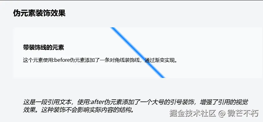
css
.decorative-element::before {
  content: "";
  position: absolute;
  top: 0;
  left: 0;
  right: 0;
  bottom: 0;
  background: linear-gradient(45deg, transparent 49%, #007bff 50%, transparent 51%);
  z-index: -1;
}


.quote::after {
  content: """;
  font-size: 4rem;
  line-height: 1;
  color: #007bff;
  opacity: 0.3;
  position: absolute;
  bottom: -20px;
  right: 20px;
}
unsetunset20. 响应式图片的最佳实践unsetunset
css
.responsive-image {
  max-width: 100%;
  height: auto;
  display: block;
}


.image-wrapper {
  position: relative;
  width: 100%;
  padding-top: 56.25%; /* 16:9 宽高比 */
}


.image-wrapper img {
  position: absolute;
  top: 0;
  left: 0;
  width: 100%;
  height: 100%;
  object-fit: cover;
}
总结
- 这些技巧可以组合使用,创造更丰富的视觉效果
- 注意浏览器兼容性,特别是新特性如
clamp()和aspect-ratio - 在实际项目中,建议使用CSS预处理器来更好地组织这些样式
- 记得测试不同设备上的显示效果,确保响应式设计的完整性