一、背景与目标
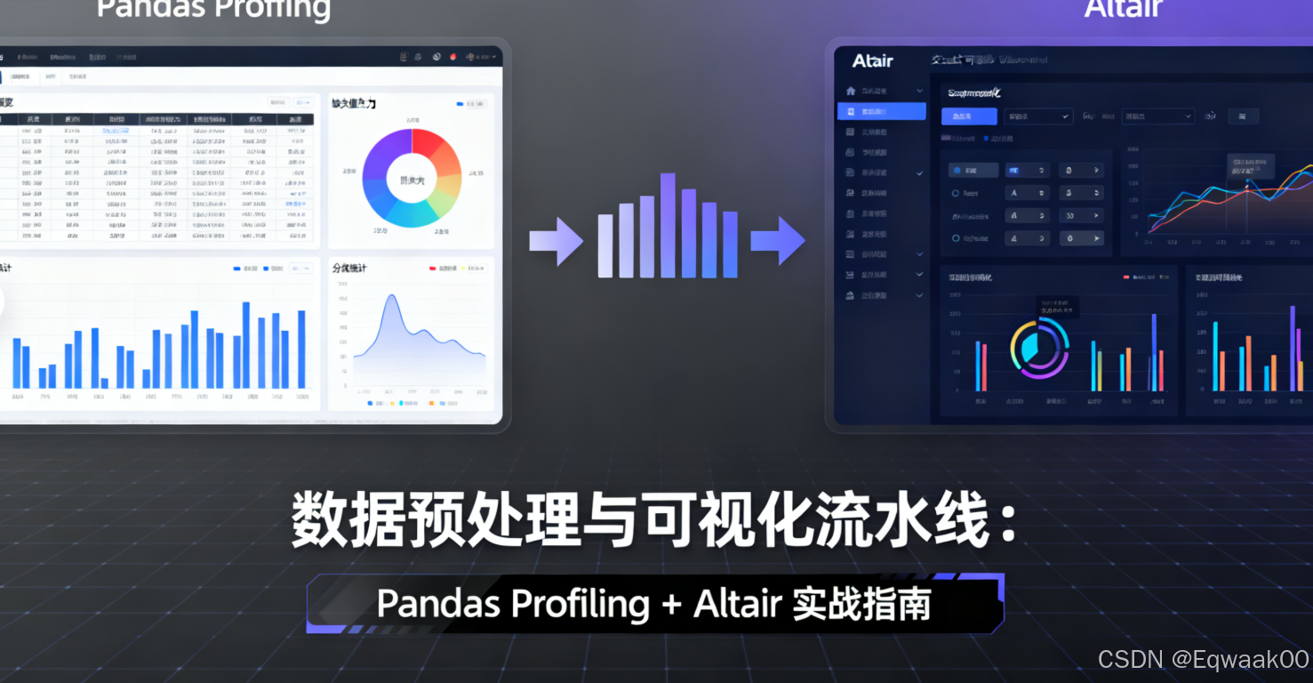
在数据科学项目中,数据预处理 和可视化分析 是核心环节。传统流程中,工程师需手动编写大量代码完成数据清洗、探索性分析(EDA)和图表生成,效率低且易出错。本指南将构建一个自动化流水线,结合:
- Pandas Profiling:自动生成数据质量报告
- Altair :声明式可视化库,快速生成交互式图表
实现从数据加载到可视化输出的端到端自动化。
二、工具链选择与优势
2.1 核心工具
| 工具 |
作用 |
优势 |
| Pandas Profiling |
数据质量分析与报告生成 |
一键生成统计摘要、缺失值/异常值检测、变量分布可视化 |
| Altair |
交互式数据可视化 |
语法简洁(基于Vega-Lite)、支持大规模数据、输出可交互HTML图表 |
2.2 替代方案对比
| 需求 |
Pandas Profiling + Altair |
其他方案(如Sweetviz + Matplotlib) |
| 数据质量报告 |
自动生成HTML报告 |
需手动编写统计代码 |
| 可视化交互性 |
原生支持缩放/悬停/筛选 |
需额外库(如Plotly) |
| 代码简洁性 |
5行代码生成完整报告 |
需20+行代码 |
| 扩展性 |
支持自定义分析模块 |
依赖库功能限制 |
三、数据预处理与质量分析:Pandas Profiling实战
3.1 数据加载与基础清洗
import pandas as pd
from pandas_profiling import ProfileReport

# 加载数据(示例:Titanic数据集)
df = pd.read_csv('titanic.csv')

# 基础清洗
df = df.dropna(subset=['Age', 'Embarked'])  # 删除关键列缺失值
df['Fare'] = df['Fare'].clip(0, 500)        # 截断异常值
3.2 生成数据质量报告
# 生成报告(自动检测数据质量)
profile = ProfileReport(
    df,
    title="Titanic Data Quality Report",
    explorative=True,  # 启用探索性分析
    config_file="config.yaml"  # 可选:自定义分析配置
)

# 保存为HTML报告
profile.to_file("titanic_report.html")
3.2.1 报告核心内容
| 模块 |
分析内容 |
| 概述 |
数据量、变量类型、缺失值占比 |
| 变量统计 |
数值型(均值/分位数)、类别型(频次/唯一值) |
| 缺失值检测 |
缺失值热力图、缺失模式分析(如"年龄和舱位同时缺失") |
| 异常值检测 |
箱线图、Z-score异常值标记 |
| 相关性分析 |
数值变量相关系数矩阵、类别变量Cramer's V |
3.2.2 自定义配置(config.yaml)
# 禁用部分分析模块
disable:
  - correlations
  - missing_diagrams

# 增强特定分析
variables:
  Age:
    bins: 20  # 年龄分布细分20个区间
  Fare:
    outliers:
      threshold: 3  # 3倍标准差定义异常值
四、可视化流水线:Altair自动化图表生成
4.1 Altair核心语法
import altair as alt

# 基础语法:数据 + 编码 + 图表类型
chart = alt.Chart(df).encode(
    x='Age:Q',  # Q:定量变量,N:名义变量,O:有序变量
    y='Fare:Q',
    color='Survived:N'
).mark_circle(size=60)
4.2 自动化图表生成策略
4.2.1 变量类型自动适配
def auto_chart(df, x_col, y_col, color_col=None):
    """根据变量类型自动选择图表类型"""
    # 检测变量类型
    x_type = df[x_col].dtype
    y_type = df[y_col].dtype

    # 基础编码
    encodings = {
        'x': alt.X(x_col, type='quantitative' if np.issubdtype(x_type, np.number) else 'nominal'),
        'y': alt.Y(y_col, type='quantitative' if np.issubdtype(y_type, np.number) else 'nominal')
    }

    # 添加颜色编码(如果提供)
    if color_col:
        color_type = df[color_col].dtype
        encodings['color'] = alt.Color(
            color_col,
            type='nominal' if color_type == 'object' else 'quantitative'
        )

    # 根据维度选择图表类型
    if x_type == 'object' and y_type != 'object':
        return alt.Chart(df).encode(**encodings).mark_bar()
    else:
        return alt.Chart(df).encode(**encodings).mark_circle(size=60)
4.2.2 批量生成图表
# 定义需要可视化的变量组合
chart_configs = [
    {'x': 'Age', 'y': 'Fare', 'color': 'Survived'},
    {'x': 'Pclass', 'y': 'Survived', 'color': 'Sex'},
    {'x': 'Embarked', 'y': 'Fare', 'color': 'Survived'}
]

# 批量生成并保存图表
for i, config in enumerate(chart_configs):
    chart = auto_chart(df, **config)
    chart.save(f'chart_{i}.html')  # 导出为交互式HTML
4.3 高级交互功能
4.3.1 动态筛选器
# 创建筛选器控件
select_sex = alt.selection_single(fields=['Sex'], name='Select Sex')
color = alt.condition(
    select_sex,
    alt.Color('Sex:N', legend=None),
    alt.value('lightgray')
)

# 基础图表
base = alt.Chart(df).encode(
    x='Age:Q',
    y='Fare:Q'
).mark_circle(size=60)

# 添加交互
chart = base.add_params(
    select_sex
).encode(
    color=color
).interactive()  # 启用缩放/平移

chart.save('interactive_chart.html')
4.3.2 动态数据更新
# 模拟实时数据(示例:按时间分组)
df['Time'] = pd.date_range(start='2023-01-01', periods=len(df), freq='H')
source = alt.data.Data(df)

# 动态折线图
line = alt.Chart(source).encode(
    x='Time:T',
    y='Fare:Q',
    color='Survived:N'
).mark_line()

# 绑定时间滑块
slider = alt.binding_range(min=0, max=len(df), step=1, name='Time Index')
select_time = alt.selection_single(fields=['Time'], bind=slider)

chart = line.add_params(
    select_time
).transform_filter(
    select_time
)

chart.save('dynamic_chart.html')
五、端到端流水线:自动化执行
5.1 完整脚本结构
# pipeline.py
import pandas as pd
from pandas_profiling import ProfileReport
import altair as alt

def load_data():
    return pd.read_csv('titanic.csv')

def preprocess_data(df):
    # 数据清洗逻辑
    df = df.dropna(subset=['Age', 'Embarked'])
    df['Fare'] = df['Fare'].clip(0, 500)
    return df

def generate_quality_report(df):
    profile = ProfileReport(df, title="Data Quality Report")
    profile.to_file("report.html")

def generate_visualizations(df):
    # 定义图表配置
    charts = [
        {'x': 'Age', 'y': 'Fare', 'color': 'Survived'},
        {'x': 'Pclass', 'y': 'Survived', 'color': 'Sex'}
    ]

    # 批量生成
    for i, config in enumerate(charts):
        chart = auto_chart(df, **config)
        chart.save(f'chart_{i}.html')

if __name__ == "__main__":
    df = load_data()
    df = preprocess_data(df)
    generate_quality_report(df)
    generate_visualizations(df)
5.2 自动化执行
# 运行流水线
python pipeline.py

# 输出文件
# - report.html:数据质量报告
# - chart_0.html:年龄 vs 票价(按生存状态)
# - chart_1.html:船舱等级 vs 生存率(按性别)
六、案例:电商用户行为分析
6.1 数据集描述
| 字段 |
类型 |
描述 |
| UserID |
整数 |
用户唯一标识 |
| Age |
整数 |
用户年龄 |
| PurchaseAmount |
浮点数 |
单次购买金额 |
| Category |
字符串 |
购买商品类别 |
| Time |
时间戳 |
购买时间 |
6.2 流水线执行
6.2.1 数据预处理
# 清洗逻辑
df = df.drop_duplicates()  # 去重
df['Age'] = df['Age'].fillna(df['Age'].median())  # 填充年龄缺失值
df = df[df['PurchaseAmount'] > 0]  # 过滤无效交易
6.2.2 质量报告重点
- 缺失值:Age列有5%缺失(已填充)
- 异常值:PurchaseAmount存在3笔超过$10,000的交易(需确认)
- 分布:Category列中"电子产品"占比70%
6.2.3 可视化输出
| 图表 |
作用 |
| 年龄 vs 购买金额 |
识别高价值用户年龄群体 |
| 类别分布饼图 |
优化商品库存策略 |
| 购买时间热力图 |
安排促销活动时间 |
七、扩展与优化
7.1 性能优化
- 大数据处理 :使用
dask替代Pandas处理超过内存的数据
- 并行生成图表 :通过
concurrent.futures并行化图表生成
- 缓存报告:定期生成报告而非每次运行
7.2 扩展功能
- 异常检测:在Pandas Profiling报告中添加自定义异常规则(如"单日购买超过$1,000")
- 自动化洞察:在报告中添加自然语言描述(如"80%高价值用户年龄在25-35岁")
- CI/CD集成:将流水线加入GitHub Actions,实现数据变更自动触发分析
八、总结
通过Pandas Profiling + Altair构建的自动化流水线,可实现:
- 数据质量监控:一键生成详细报告,定位缺失/异常值
- 高效可视化:声明式语法快速生成交互式图表
- 可重复流程:代码化流程避免手动操作错误
此方案适用于:
- 数据探索阶段快速生成洞察
- 定期数据监控(如周报/月报)
- 团队内部数据共享(HTML报告可在线查看)
掌握此流水线,可显著提升数据工程师的工作效率,将更多精力投入高级分析任务。