1、StackPanel布局作用:依次排列,默认垂直排序,里面有个属性Orientation可以控制是水平依次排序还是垂直依次排序
2、Grid:表格布局
默认情况下是一行一列的grid,我们可以动态分配多行多列,来达到我们的布局效果
行列是可以动态增加的,元素是可以归属于某一行列的
布局中的宽度和高度,除了通过Height= "60"直接赋值外,还可以按照比例分配,例如3*,表示的是按照比例为3来自动分配,还可以通过设置AUTO,如:Height= "AUTO",表示根据里面内容,自动调整;
3、网格布局,设置多行,下面一个设计了三行 ShowGridLines="true"属性能够显示网格布局的线条
<Grid.RowDefinitions>
<RowDefinition Height="40"/>
<RowDefinition/>
<RowDefinition/>
</Grid.RowDefinitions>
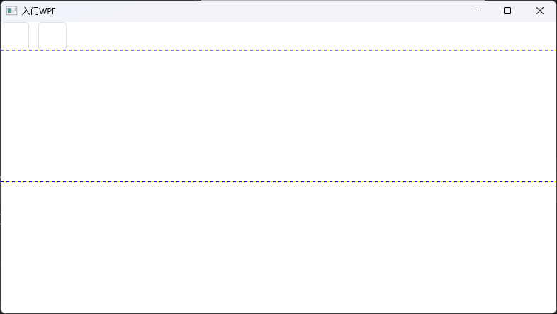
下面代码,用于向网格布局中增加控件,控件位置可以选择任意行列
<Button Grid.Column="0" Width="40" Height="40" HorizontalAlignment="Left" />
效果图:
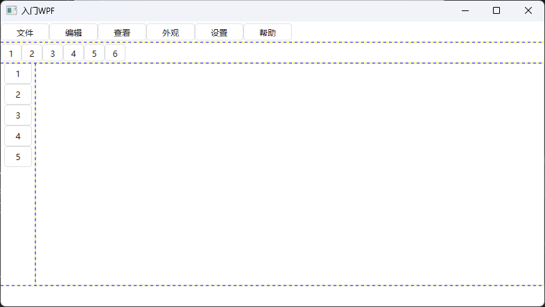
对应的xmal文件:【重要思想:通过grid进行模块分层设计,通过stackPanel进行自动依次排序】
cs
<Window x:Class="Clock.MainWindow"
        xmlns="http://schemas.microsoft.com/winfx/2006/xaml/presentation"
        xmlns:x="http://schemas.microsoft.com/winfx/2006/xaml"
        xmlns:d="http://schemas.microsoft.com/expression/blend/2008"
        xmlns:mc="http://schemas.openxmlformats.org/markup-compatibility/2006"
        xmlns:local="clr-namespace:Clock"
        mc:Ignorable="d"
        Title="入门WPF" Height="450" Width="800"  WindowStartupLocation="CenterScreen">

    <Grid ShowGridLines="true" >
        <Grid.RowDefinitions>
            <RowDefinition Height="30"/>
            <RowDefinition Height="30"/>
            <RowDefinition/>
            <RowDefinition Height="30"/>
        </Grid.RowDefinitions>

        <StackPanel Grid.Column="0" Grid.Row="0" Orientation="Horizontal"  >
            <Button Height="25" Width="70" Content="文件"/>
            <Button Height="25" Width="70" Content="编辑"/>
            <Button Height="25" Width="70" Content="查看"/>
            <Button Height="25" Width="70" Content="外观"/>
            <Button Height="25" Width="70" Content="设置"/>
            <Button Height="25" Width="70" Content="帮助"/>
        </StackPanel>

        <StackPanel Grid.Column="0" Grid.Row="1" Orientation="Horizontal"  >
            <Button Height="25" Width="30" Content="1"/>
            <Button Height="25" Width="30" Content="2"/>
            <Button Height="25" Width="30" Content="3"/>
            <Button Height="25" Width="30" Content="4"/>
            <Button Height="25" Width="30" Content="5"/>
            <Button Height="25" Width="30" Content="6"/>
        </StackPanel>
        <!--第三行加入grid布局,然后在grid里再增加两列-->
        <Grid Grid.Row="2" Grid.Column="0" ShowGridLines="true" >
            <Grid.ColumnDefinitions>
                <ColumnDefinition Width="50"/>
                <ColumnDefinition />
            </Grid.ColumnDefinitions>

            <StackPanel Grid.Row="0" Grid.Column="0">
                <Button Height="30" Width="40" Content="1"/>
                <Button Height="30" Width="40" Content="2"/>
                <Button Height="30" Width="40" Content="3"/>
                <Button Height="30" Width="40" Content="4"/>
                <Button Height="30" Width="40" Content="5"/>

            </StackPanel>
            <TextBox Grid.Row="0" Grid.Column="1" TextWrapping="Wrap"/>
        </Grid>
        <!--<Button Grid.Column="0" Grid.Row="0" Width="40" Height="40" HorizontalAlignment="Left"/>
        <Button Grid.Column="0" Width="40" Height="40" HorizontalAlignment="Left" Margin="53,0,0,0"/>-->

    </Grid>
</Window>