目录
[1. WPF动画集成概述🐱🏍](#1. WPF动画集成概述🐱🏍)
[2. 控件模板动画集成🐱👓](#2. 控件模板动画集成🐱👓)
[2.1 基础概念](#2.1 基础概念)
[2.2 完整示例:交互式标签动画](#2.2 完整示例:交互式标签动画)
[2.3 代码解析](#2.3 代码解析)
[3. 文本动画集成🐱🐉](#3. 文本动画集成🐱🐉)
[3.1 TextEffects深度解析](#3.1 TextEffects深度解析)
[3.2 完整示例:波浪式文本动画](#3.2 完整示例:波浪式文本动画)
[3.3 代码解析](#3.3 代码解析)
[3.4 TextEffectCollection 关键方法说明](#3.4 TextEffectCollection 关键方法说明)
[4. 动画集成技术对比🐱🚀](#4. 动画集成技术对比🐱🚀)
[5. 项目实践与性能优化💕](#5. 项目实践与性能优化💕)
[5.1 项目架构设计](#5.1 项目架构设计)
[5.1.1 整体架构模式](#5.1.1 整体架构模式)
[5.1.2 组件化设计思想](#5.1.2 组件化设计思想)
[5.2 核心技术实现解析](#5.2 核心技术实现解析)
[5.2.1 主窗口架构 (MainWindow.xaml)](#5.2.1 主窗口架构 (MainWindow.xaml))
[5.2.2 动态进度条组件深度解析](#5.2.2 动态进度条组件深度解析)
[5.2.3 粒子系统深度解析](#5.2.3 粒子系统深度解析)
[2.3.2 游戏循环实现](#2.3.2 游戏循环实现)
[5.2.4 加载动画系统解析](#5.2.4 加载动画系统解析)
[5.3 性能优化策略](#5.3 性能优化策略)
[5.3.1 动画性能优化](#5.3.1 动画性能优化)
[5.3.2 内存管理](#5.3.2 内存管理)
[5.4 设计模式应用](#5.4 设计模式应用)
[5.4.1 组件模式 (Component Pattern)](#5.4.1 组件模式 (Component Pattern))
[5.4.2 资源字典模式 (Resource Dictionary Pattern)](#5.4.2 资源字典模式 (Resource Dictionary Pattern))
[5.4.3 观察者模式 (Observer Pattern)](#5.4.3 观察者模式 (Observer Pattern))
[5.5 错误处理与健壮性](#5.5 错误处理与健壮性)
[5.5.1 异常处理策略](#5.5.1 异常处理策略)
[5.5.2 空值安全设计](#5.5.2 空值安全设计)
[5.6 扩展性设计](#5.6 扩展性设计)
[5.6.1 样式主题系统](#5.6.1 样式主题系统)
[5.6.2 参数化配置](#5.6.2 参数化配置)
[5.7 演示](#5.7 演示)
[6. 总结与展望🎬](#6. 总结与展望🎬)
引言
在WPF应用开发中,动画是提升用户体验的关键技术。通过将动画与控件模板、文本效果深度集成,我们可以创造出令人惊艳的交互效果。本文将深入探讨WPF动画集成的核心技术,通过实际案例展示如何实现控件模板动画和文本动画,帮助开发者掌握这一重要技能。
1. WPF动画集成概述🐱🏍
WPF动画系统提供了强大的集成能力,可以处理任何值类型的属性变化。与传统的Flash或GIF动画不同,WPF动画直接集成在应用程序的视觉树中,能够无缝地与控件模板、数据绑定、样式系统等WPF核心功能协作。
WPF动画集成的主要优势:
-
声明式编程:通过XAML直接定义动画,代码简洁直观
-
高性能:利用硬件加速,动画流畅自然
-
灵活控制:可以精确控制动画的每个细节
-
易于维护:动画逻辑与业务逻辑分离
2. 控件模板动画集成🐱👓
2.1 基础概念
控件模板定义了控件的外观结构,而动画则能为这个结构添加生命力。通过将Storyboard嵌入到ControlTemplate中,我们可以为控件的各个状态(如鼠标悬停、获得焦点等)创建平滑的过渡效果。
2.2 完整示例:交互式标签动画
下面是一个完整的可运行示例,展示如何创建具有悬停动画效果的标签:
XML
<Window x:Class="WpfAnimationDemo.MainWindow"
        xmlns="http://schemas.microsoft.com/winfx/2006/xaml/presentation"
        xmlns:x="http://schemas.microsoft.com/winfx/2006/xaml"
        Title="WPF动画集成演示" Height="400" Width="600"
        WindowStartupLocation="CenterScreen">

    <Window.Resources>
        <Style x:Key="AnimatedLabelStyle" TargetType="Label">
            <Setter Property="Template">
                <Setter.Value>
                    <ControlTemplate TargetType="{x:Type Label}">
                        <!-- 定义标签的视觉结构 -->
                        <Border Name="border1"
                                CornerRadius="8"
                                BorderBrush="#FF27AE60"
                                BorderThickness="2"
                                Background="#F8F9FA"
                                Padding="15,8">
                            <ContentPresenter HorizontalAlignment="Center"
                                            VerticalAlignment="Center"
                                            TextElement.FontWeight="SemiBold"/>
                        </Border>

                        <!-- 定义控件模板的触发器 -->
                        <ControlTemplate.Triggers>

                            <!-- 鼠标进入动画 -->
                            <EventTrigger RoutedEvent="Label.MouseEnter">
                                <BeginStoryboard>
                                    <Storyboard>
                                        <!-- 边框颜色从绿色渐变为天蓝色 -->
                                        <ColorAnimation
                                            To="#FF3498DB"
                                            Duration="0:0:0.3"
                                            Storyboard.TargetName="border1"
                                            Storyboard.TargetProperty="BorderBrush.Color"/>

                                        <!-- 边框粗细从2增加到4 -->
                                        <ThicknessAnimation
                                            To="4"
                                            Duration="0:0:0.2"
                                            Storyboard.TargetName="border1"
                                            Storyboard.TargetProperty="BorderThickness"/>

                                        <!-- 背景色变化 -->
                                        <ColorAnimation
                                            To="#FFEBF5FB"
                                            Duration="0:0:0.3"
                                            Storyboard.TargetName="border1"
                                            Storyboard.TargetProperty="Background.Color"/>
                                    </Storyboard>
                                </BeginStoryboard>
                            </EventTrigger>

                            <!-- 鼠标离开动画 -->
                            <EventTrigger RoutedEvent="Label.MouseLeave">
                                <BeginStoryboard>
                                    <Storyboard>
                                        <!-- 边框颜色恢复 -->
                                        <ColorAnimation
                                            To="#FF27AE60"
                                            Duration="0:0:0.3"
                                            Storyboard.TargetName="border1"
                                            Storyboard.TargetProperty="BorderBrush.Color"/>

                                        <!-- 边框粗细恢复 -->
                                        <ThicknessAnimation
                                            To="2"
                                            Duration="0:0:0.2"
                                            Storyboard.TargetName="border1"
                                            Storyboard.TargetProperty="BorderThickness"/>

                                        <!-- 背景色恢复 -->
                                        <ColorAnimation
                                            To="#FFF8F9FA"
                                            Duration="0:0:0.3"
                                            Storyboard.TargetName="border1"
                                            Storyboard.TargetProperty="Background.Color"/>
                                    </Storyboard>
                                </BeginStoryboard>
                            </EventTrigger>

                        </ControlTemplate.Triggers>
                    </ControlTemplate>
                </Setter.Value>
            </Setter>
        </Style>
    </Window.Resources>

    <Grid Background="#2C3E50">
        <!-- 修复:使用Margin替代Spacing,兼容所有WPF版本 -->
        <StackPanel VerticalAlignment="Center" HorizontalAlignment="Center" Margin="0,20,0,0">
            <Label Content="欢迎使用WPF动画"
                   Style="{StaticResource AnimatedLabelStyle}"
                   Foreground="#2C3E50"
                   FontSize="16"
                   Margin="0,0,0,20"/>

            <Label Content="鼠标悬停体验效果"
                   Style="{StaticResource AnimatedLabelStyle}"
                   Foreground="#2C3E50"
                   FontSize="14"/>
        </StackPanel>
    </Grid>
</Window>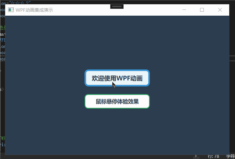
2.3 代码解析
视觉元素分析:
| 属性 | 值 | 效果说明 |
|---|---|---|
CornerRadius |
8 | 创建圆角边框,提升现代感 |
BorderBrush |
#FF27AE60 | 翠绿色边框,清新视觉 |
BorderThickness |
2 | 适中边框粗细 |
Background |
#F8F9FA | 浅灰色背景,专业感 |
Padding |
15,8 | 内边距确保内容舒适度 |
ContentPresenter作用:
-
自动显示Label的Content内容
-
保持内容居中对齐
-
设置半粗字体增强可读性
默认状态下呈现翠绿色边框和浅灰背景,当鼠标悬停时通过ColorAnimation和ThicknessAnimation实现边框颜色向天蓝色渐变、边框加粗及背景色淡化的三重动画效果,鼠标离开时平滑恢复初始状态。整个设计采用样式资源化封装,支持多处复用,动画时长设置在(0.2-0.3秒),在Grid与StackPanel的配合下实现居中布局。
3. 文本动画集成🐱🐉
3.1 TextEffects深度解析
WPF中的文本动画通过TextEffects实现,这比简单的字符变换更加精细。每个TextEffect对象包含三个关键属性:
-
Transform:应用于文本的变换效果
-
PositionStart:效果应用的起始字符位置
-
PositionCount:受影响的字符数量
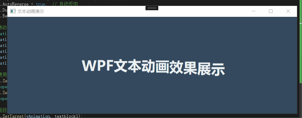
3.2 完整示例:波浪式文本动画
以下是完整的可运行文本动画示例:
xml
XML
  <Grid Background="#34495E">
        <TextBlock FontSize="28pt"
                   Name="textblock1"
                   Foreground="#ECF0F1"
                   FontWeight="SemiBold"
                   HorizontalAlignment="Center"
                   VerticalAlignment="Center"
                   Text="WPF文本动画效果展示"
                   TextAlignment="Center"/>
    </Grid>
cs
cpp
namespace WpfAnimationDemo
{
    public partial class TextAnimationWindow : Window
    {
        public TextAnimationWindow()
        {
            InitializeComponent();
            InitializeTextAnimation();
        }

        private void InitializeTextAnimation()
        {
            try
            {
                // 创建主故事板
                Storyboard perCharStoryboard = new Storyboard();
                textblock1.TextEffects = new TextEffectCollection();

                string text = textblock1.Text;
                int effectIndex = 0; // 用于跟踪实际添加的TextEffect索引

                // 为每个字符创建动画效果
                for (int i = 0; i < text.Length; i++)
                {
                    // 跳过空格字符
                    if (text[i] == ' ') continue;

                    // 创建文本效果
                    TextEffect textEffect = new TextEffect();
                    textEffect.Transform = new TranslateTransform();
                    textEffect.PositionStart = i; // 设置效果起始位置
                    textEffect.PositionCount = 1; // 影响一个字符

                    // 将文本效果添加到集合中[citation:1]
                    textblock1.TextEffects.Add(textEffect);

                    // 创建Y轴移动动画
                    DoubleAnimation yAnimation = new DoubleAnimation();
                    yAnimation.To = 15;  // 移动距离
                    yAnimation.AccelerationRatio = 0.4;  // 加速比率
                    yAnimation.DecelerationRatio = 0.4;  // 减速比率
                    yAnimation.RepeatBehavior = RepeatBehavior.Forever;  // 无限循环
                    yAnimation.AutoReverse = true;  // 自动反向
                    yAnimation.Duration = TimeSpan.FromSeconds(2.5);  // 动画周期
                    yAnimation.BeginTime = TimeSpan.FromMilliseconds(200 * i);  // 延迟开始

                    // 创建旋转动画
                    DoubleAnimation rotateAnimation = new DoubleAnimation();
                    rotateAnimation.To = 5;  // 旋转角度
                    rotateAnimation.RepeatBehavior = RepeatBehavior.Forever;
                    rotateAnimation.AutoReverse = true;
                    rotateAnimation.Duration = TimeSpan.FromSeconds(1.8);
                    rotateAnimation.BeginTime = TimeSpan.FromMilliseconds(150 * i);

                    // 修正:使用正确的属性路径格式[citation:3]
                    Storyboard.SetTargetProperty(yAnimation,
                        new PropertyPath($"TextEffects[{effectIndex}].Transform.Y"));
                    Storyboard.SetTargetProperty(rotateAnimation,
                        new PropertyPath($"TextEffects[{effectIndex}].Transform.X")); // 改为X轴旋转

                    // 设置动画目标
                    Storyboard.SetTarget(yAnimation, textblock1);
                    Storyboard.SetTarget(rotateAnimation, textblock1);

                    // 添加到故事板
                    perCharStoryboard.Children.Add(yAnimation);
                    perCharStoryboard.Children.Add(rotateAnimation);

                    effectIndex++; // 递增效果索引
                }

                // 启动动画
                perCharStoryboard.Begin();
            }
            catch (Exception ex)
            {
                MessageBox.Show($"动画初始化失败: {ex.Message}", "错误",
                    MessageBoxButton.OK, MessageBoxImage.Error);
            }
        }
    }
}
3.3 代码解析
TextEffect集合动态管理
textblock1.TextEffects = new TextEffectCollection();
通过创建TextEffectCollection,为每个字符建立独立的动画容器。使用effectIndex变量确保每个字符效果在集合中的正确定位,这种设计避免了动画绑定的混乱。
精密的时序控制机制
yAnimation.BeginTime = TimeSpan.FromMilliseconds(200 * i);
rotateAnimation.BeginTime = TimeSpan.FromMilliseconds(150 * i);
通过交错延迟设计,每个字符的动画启动时间依次递增,形成连续的波动传播。Y轴和X轴采用不同延迟系数(200ms vs 150ms),增加了动画的复杂性和视觉丰富度。
动态属性路径绑定
Storyboard.SetTargetProperty(yAnimation,
new PropertyPath($"TextEffects{effectIndex}.Transform.Y"));
这是技术难点所在。通过字符串插值动态构建属性路径,精确绑定到特定索引的TextEffect。这种运行时属性解析机制展示了WPF强大的反射和绑定能力。
循环与反向运动设计
yAnimation.RepeatBehavior = RepeatBehavior.Forever;
yAnimation.AutoReverse = true;
通过RepeatBehavior.Forever实现无限循环,AutoReverse=true确保动画平滑往返,避免了突兀的跳转,创造了流畅的永续运动效果。
3.4 TextEffectCollection 关键方法说明
| 方法 | 用途 | 说明 |
|---|---|---|
Insert(int index, TextEffect) |
在指定位置插入效果 | 零基索引 |
IndexOf(TextEffect) |
查找效果的索引 | 返回找到的索引,未找到返回-1 |
this[int index] |
索引器访问 | 获取或设置指定位置的元素 |
4. 动画集成技术对比🐱🚀
下表对比了两种动画集成方式的特点和适用场景:
| 特性 | 控件模板动画 | 文本动画 |
|---|---|---|
| 实现方式 | XAML声明式 | 代码动态创建 |
| 控制精度 | 元素级 | 字符级 |
| 性能开销 | 较低 | 较高(字符多时) |
| 适用场景 | 控件状态变化 | 文字特效、标题动画 |
| 维护难度 | 容易 | 中等 |
| 复用性 | 高(通过样式) | 中等 |
5. 项目实践与性能优化💕
5.1 项目架构设计
5.1.1 整体架构模式
WPFIntegratedAnimation/
├── 视图层 (View) - MainWindow.xaml
├── 视图逻辑层 (Code-Behind) - MainWindow.xaml.cs
├── 自定义组件层 (Components) - 可重用的动画组件
├── 样式资源层 (Styles) - 统一的动画和样式定义
└── 应用程序层 (App) - 应用程序入口和配置
5.1.2 组件化设计思想
项目采用组件化架构,每个动画效果都被封装为独立的自定义控件:
-
DynamicProgressBar: 动态进度条组件
-
ParticleEffect: 粒子效果组件
-
LoadingAnimation: 加载动画组件(内嵌在主窗口)
5.2 核心技术实现解析
5.2.1 主窗口架构 (MainWindow.xaml)
XML
<!-- 层次化布局结构 -->
<Grid>
    <Grid.RowDefinitions>
        <RowDefinition Height="Auto"/>  <!-- 标题栏 -->
        <RowDefinition Height="*"/>     <!-- 内容区域 -->
    </Grid.RowDefinitions>

    <!-- 现代化设计元素 -->
    <Border Background="#2d2d30" BorderBrush="#404040" BorderThickness="0,0,0,1">
        <!-- CSDN风格标题栏 -->
    </Border>

    <!-- 可滚动内容区域 -->
    <ScrollViewer VerticalScrollBarVisibility="Auto">
        <StackPanel>
            <!-- 卡片式布局 -->
            <Border Style="{StaticResource ModernCardStyle}">
                <!-- 每个功能模块 -->
            </Border>
        </StackPanel>
    </ScrollViewer>
</Grid>
设计特点:
-
卡片布局: 每个功能模块使用卡片式设计,增强视觉层次
-
响应式设计 : 使用
ScrollViewer和StackPanel适配不同屏幕尺寸
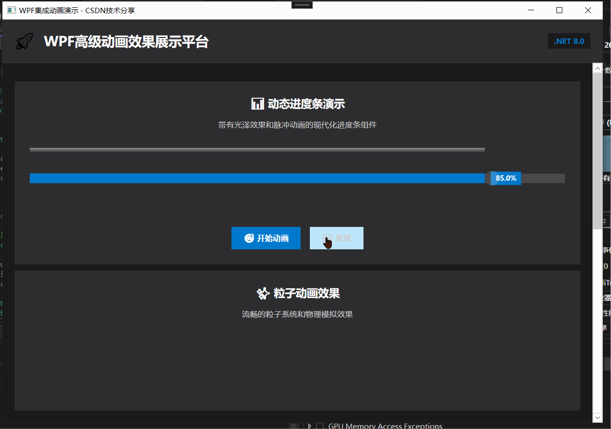
5.2.2 动态进度条组件深度解析
视觉层次设计
XML
<Grid>
    <!-- 第1层: 背景轨道 -->
    <Rectangle x:Name="BackgroundTrack" Fill="#404040"/>

    <!-- 第2层: 主进度条 -->
    <Rectangle x:Name="ProgressTrack" Fill="#007ACC"/>

    <!-- 第3层: 光泽效果 -->
    <Rectangle x:Name="ProgressGlow">
        <LinearGradientBrush> <!-- 模拟光照效果 -->
            <GradientStop Color="#80ffffff" Offset="0"/>
            <GradientStop Color="#00ffffff" Offset="1"/>
        </LinearGradientBrush>
    </Rectangle>

    <!-- 第4层: 脉冲动画 -->
    <Ellipse x:Name="PulseEffect" Fill="#80ffffff"/>

    <!-- 第5层: 进度文本 -->
    <Border x:Name="ProgressTextBackground">
        <TextBlock x:Name="ProgressText" Text="0%"/>
    </Border>
</Grid>
动画系统实现
cpp
public class DynamicProgressBar : UserControl
{
    // 多动画协同系统
    private void StartAnimation(double targetPercentage)
    {
        // 1. 主进度条动画
        DoubleAnimation progressAnimation = new DoubleAnimation
        {
            Duration = TimeSpan.FromSeconds(2.5),
            EasingFunction = new CubicEase { EasingMode = EasingMode.EaseOut }
        };

        // 2. 光泽同步动画
        DoubleAnimation glowAnimation = new DoubleAnimation
        {
            Duration = TimeSpan.FromSeconds(2.5),
            EasingFunction = new CubicEase { EasingMode = EasingMode.EaseOut }
        };

        // 3. 脉冲效果动画
        StartPulseAnimation(targetWidth);

        // 4. 文本更新系统
        progressTimer.Tick += (s, e) => UpdateProgressText();
    }

    private void StartPulseAnimation(double targetWidth)
    {
        // 三重动画组合:位移 + 缩放 + 透明度
        DoubleAnimation positionAnimation = new DoubleAnimation { To = targetWidth };
        DoubleAnimation scaleAnimation = new DoubleAnimation { To = 2.5, AutoReverse = true };
        DoubleAnimation opacityAnimation = new DoubleAnimation { From = 0.8, To = 0, AutoReverse = true };
    }
}
动画技术要点:
-
缓动函数 : 使用
CubicEase实现自然的加减速效果 -
动画同步: 多个动画使用相同时长确保同步性
-
自动反转 : 脉冲动画使用
AutoReverse创建呼吸效果 -
无限循环 :
RepeatBehavior.Forever实现持续动画
5.2.3 粒子系统深度解析
粒子数据结构
cpp
private class Particle
{
    public required Ellipse Shape { get; set; }      // 可视化元素
    public double VelocityX { get; set; }           // X轴速度
    public double VelocityY { get; set; }           // Y轴速度
    public double Life { get; set; }                // 剩余生命周期
    public double MaxLife { get; set; }             // 最大生命周期
}
2.3.2 游戏循环实现
cpp
private void UpdateParticles(object sender, EventArgs e)
{
    // 1. 粒子生成系统
    if (particles.Count < 50 && random.NextDouble() > 0.3)
    {
        CreateParticle(); // 控制生成频率和数量
    }

    // 2. 粒子更新循环
    for (int i = particles.Count - 1; i >= 0; i--)
    {
        var particle = particles[i];

        // 位置更新: 基础物理模拟
        Canvas.SetLeft(particle.Shape, Canvas.GetLeft(particle.Shape) + particle.VelocityX);
        Canvas.SetTop(particle.Shape, Canvas.GetTop(particle.Shape) + particle.VelocityY);

        // 生命周期管理
        particle.Life--;
        if (particle.Life <= 0)
        {
            RemoveParticle(i);
            continue;
        }

        // 视觉衰减效果
        particle.Shape.Opacity = particle.Life / particle.MaxLife;

        // 边界检测
        CheckBoundary(particle, i);
    }
}
粒子生成算法
cpp
private void CreateParticle()
{
    var particle = new Particle
    {
        Shape = new Ellipse
        {
            Width = random.Next(4, 12),           // 随机大小
            Height = random.Next(4, 12),
            Fill = new SolidColorBrush(GetRandomColor()), // 随机颜色
            Opacity = 0.8
        },
        VelocityX = (random.NextDouble() - 0.5) * 8,  // 随机速度 (-4 to 4)
        VelocityY = (random.NextDouble() - 0.5) * 8,
        Life = random.Next(30, 120),              // 随机生命周期
        MaxLife = 120
    };

    // 生成位置围绕中心点
    double x = ActualWidth / 2 + (random.NextDouble() - 0.5) * 100;
    double y = ActualHeight / 2 + (random.NextDouble() - 0.5) * 100;
}
5.2.4 加载动画系统解析
序列动画设计
cpp
private void CreateLoadingAnimation()
{
    loadingStoryboard = new Storyboard { RepeatBehavior = RepeatBehavior.Forever };

    for (int i = 1; i <= 4; i++)
    {
        // 每个点有3个同步动画
        DoubleAnimation opacityAnimation = new DoubleAnimation
        {
            From = 0.3, To = 1.0,
            Duration = TimeSpan.FromSeconds(0.5),
            AutoReverse = true,
            BeginTime = TimeSpan.FromSeconds(i * 0.1)  // 错开开始时间
        };

        DoubleAnimation scaleXAnimation = new DoubleAnimation { ... };
        DoubleAnimation scaleYAnimation = new DoubleAnimation { ... };

        // 应用到对应的点
        string dotName = $"LoadingDot{i}";
        Storyboard.SetTargetName(opacityAnimation, dotName);
        // ... 设置其他动画目标
    }
}
动画序列模式:
时间轴: 0.0s 0.1s 0.2s 0.3s 0.4s 0.5s 0.6s ...
点1: ┌───┬───┬───┬───┬───┬───┐
点2: ┌───┬───┬───┬───┬───┬───┐
点3: ┌───┬───┬───┬───┬───┬───┐
点4: ┌───┬───┬───┬───┬───┬───┐
5.3 性能优化策略
5.3.1 动画性能优化
帧率控制
cpp
particleTimer.Interval = TimeSpan.FromMilliseconds(16); // 精确控制60FPS对象池思想
cpp
// 粒子数量限制防止内存泄漏
if (particles.Count < 50 && random.NextDouble() > 0.3)
{
    CreateParticle(); // 控制生成频率
}
资源清理
cpp
protected override void OnClosed(EventArgs e)
{
    // 显式停止所有动画和计时器
    ParticleDemo?.StopParticleSystem();
    loadingStoryboard?.Stop();
    base.OnClosed(e);
}
5.3.2 内存管理
事件解绑
cpp
progressTimer.Tick += (s, e) => UpdateProgressText();
// 使用匿名方法,计时器停止后自动回收
粒子生命周期管理
cpp
for (int i = particles.Count - 1; i >= 0; i--)
{
    if (particle.Life <= 0)
    {
        ParticleCanvas.Children.Remove(particle.Shape);
        particles.RemoveAt(i); // 及时移除死亡粒子
    }
}
5.4 设计模式应用
5.4.1 组件模式 (Component Pattern)
cpp
// 每个动画效果都是独立组件
public partial class DynamicProgressBar : UserControl
{
    public void StartAnimation(double targetPercentage) { ... }
    public void Reset() { ... }
}

// 主窗口通过组件接口控制
ProgressBarDemo.StartAnimation(85);
ParticleDemo.StartParticleSystem();
5.4.2 资源字典模式 (Resource Dictionary Pattern)
XML
<Window.Resources>
    <Style x:Key="ModernCardStyle" TargetType="Border">
        <!-- 统一的外观定义 -->
    </Style>
    <Style x:Key="PrimaryButtonStyle" TargetType="Button">
        <!-- 统一的按钮样式 -->
    </Style>
</Window.Resources>
5.4.3 观察者模式 (Observer Pattern)
cpp
// 进度条使用计时器观察动画进度
progressTimer.Tick += (s, e) => UpdateProgressText();

// 粒子系统使用定时器观察时间流逝
particleTimer.Tick += UpdateParticles;
5.5 错误处理与健壮性
5.5.1 异常处理策略
cpp
private void StartProgressAnimation(object sender, RoutedEventArgs e)
{
    try
    {
        ProgressBarDemo.StartAnimation(85);
        UpdateAnimationStatus("进度条动画运行中...");
    }
    catch (Exception ex)
    {
        ShowErrorMessage("启动进度条动画时出错", ex);
    }
}

private void ShowErrorMessage(string message, Exception ex)
{
    MessageBox.Show($"{message}: {ex.Message}", "错误",
        MessageBoxButton.OK, MessageBoxImage.Error);
    UpdateAnimationStatus("发生错误");
}
5.5.2 空值安全设计
cpp
private void StopLoadingAnimation()
{
    if (loadingStoryboard != null)  // 空值检查
    {
        loadingStoryboard.Stop();
        isLoadingAnimationRunning = false;
    }
}
5.6 扩展性设计
5.6.1 样式主题系统
cpp
private void ApplyLoadingStyle(int styleIndex)
{
    Color primaryColor;
    switch (styleIndex)
    {
        case 0: primaryColor = Color.FromRgb(0, 122, 204); break; // 蓝色
        case 1: primaryColor = Color.FromRgb(0, 200, 83); break;  // 绿色
        case 2: primaryColor = Color.FromRgb(170, 0, 255); break; // 紫色
    }
    // 动态应用颜色
}
5.6.2 参数化配置
cpp
// 粒子系统可配置参数
private const int MAX_PARTICLES = 50;
private const double PARTICLE_GENERATION_RATE = 0.3;
private const int PARTICLE_LIFETIME_MIN = 30;
private const int PARTICLE_LIFETIME_MAX = 120;
5.7 演示
6. 总结与展望🎬
WPF通过其声明式架构让我们能够以最小代码量实现最大化的动态交互效果,真正做到了"动画即逻辑"的编程体验。
关键知识点回顾:
触发器动画是入口 :通过EventTrigger、DataTrigger和Trigger,我们实现了用户操作、数据状态变化到动画响应的直接映射,这是WPF动画集成的第一扇门。
样式与模板中的动画 :将动画嵌入ControlTemplate和DataTemplate,让控件在保持可复用性的同时获得了生动的视觉反馈,极大提升了UI组件库的交互品质。
数据绑定驱动动画 :利用ObjectAnimationUsingKeyFrames等工具,我们将数据变化直接映射为视觉动画,实现了数据可视化场景下的流畅过渡效果。
动画资源与复用 :通过将动画定义为StaticResource,我们建立了可跨组件共享的动画库,确保了项目动画风格的一致性,同时提升了开发效率。
复合动画时序控制:通过ParallelTimeline和SequenceTimeline的灵活组合,我们能够精确控制多个动画的并行与串行执行,构建出富有层次感的交互序列。
🚀 技术前瞻
随着.NET生态的持续演进,WPF动画体系正在与Windows 11设计语言深度整合,未来在Fluent Design动画效果、性能优化等方面将带来更多惊喜。掌握本节内容,将为你在现代化桌面开发领域奠定坚实竞争力。
💝 互动交流时刻
你在集成动画实践中遇到了哪些挑战?又是如何巧妙解决的?欢迎在评论区分享你的实战经验,让我们在交流中共同成长!
👍 点赞 · ⭐ 收藏 · ➕ 关注 · 🔔 开启推送
继续锁定《WPF编程进阶》系列,下一节我们将深入《媒体》,探索更智能的UI交互实现方案!