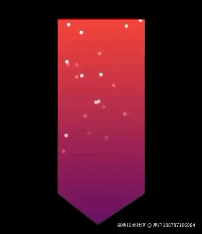
使用CSS3的clip-path实现不规则图形裁剪,结合CSS3 animation实现粒子下落动画效果,如下:
html: 创建不规则容器及下落的粒子节点;
ini
<div class="particle">
  <i v-for="item of 20" :key="item" class="particle-item"></i>
</div>
style: 1、此demo使用less实现样式;
css
/* 不规则容器样式 */
.particle {
  position: absolute;
  top: 90px;
  left: 110px;
  width: 200px;
  height: 236px;
  background: linear-gradient(180deg, #F44336 0%, rgba(250, 33, 245, 0.4) 100%);
  clip-path: polygon(0 0, 100px 0, 100px 200px, 46px 236px, 0 200px);
}

/* 下落粒子样式 */
.particle-item {
  &::before,
  &::after {
    position: absolute;
    width: 4px;
    height: 4px;
    background: #fff;
    border-radius: 50%;
    content: '';
    box-shadow: 0 0 5px 0 rgba(255, 255, 255, 0.5);
  }
  /* 调用粒子下落样式函数 */
  .particle-selectors(20);
}
2、粒子下落样式函数主要计算粒子的初始位置及下落路径;
less
.particle-selectors(@n, @i:1) when (@i <= @n) {
  &:nth-child(@{i}) {
    &::before ,
    &::after {
      @w: `Math.floor(Math.random() * 100) `;
      @h: `Math.floor(Math.random() * -100) `;
      @d: `Math.random() * 0.2 `;
      @du: calc(~'@{d}s + 5s');
      @t: `Math.random() * -10 `;
      @ti: calc(~'@{t} * 0.6s');

      left: calc(~'@{w} * 1px');
      transform: translateY(calc(~'@{h} * 2px'));
      .animation(@du, @ti);
    }
  }
  .particle-selectors(@n,(@i + 1));
}
3、粒子下落动画;
less
.animation(@du, @de) {
  @keyframes frame {
    from {
      transform: translateY(-20px);
    }
    to {
      opacity: 0;
      transform: translateY(280px);
    }
  }
  animation: frame 10s infinite;
  animation-delay: @de;
  animation-duration: @du;
}博客园地址:www.cnblogs.com/wttt123/p/1...
以上。