一、浮动
1、div块
<!DOCTYPE html>
<html lang="en">
<head>
    <meta charset="UTF-8" />
    <meta name="viewport" content="width=device-width, initial-scale=1.0" />
    <style>
        /* 样式内容省略 */
    </style>
    <link rel="stylesheet" href="./style.css" />
    <title>Flex布局</title>
</head>
<body class="container">
    <div class="item">1</div>
    <div class="item">2</div>
    <div class="item">3</div>
    <div class="item">4</div>
    <div class="item">5</div>
</body>
</html>
2、布局
body{
width: 500px;
height: 600px;
border: 3px solid red;
}
div{
width: 50px;
height: 50px;
border: 3px solid gold;
}
.container{
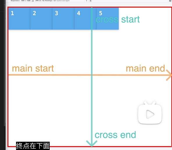
/*
主轴为水平方向 子元素从左到右依次排列 默认row
row-reverse;从右边开始
column垂直上下排
*/
flex-direction: column;
/**
* 打开开关
*/
display: flex;
/*
1. 水平移动
center居中 flex-start开始位置 flex-end水平右侧
2. 分配多余的空间
space-between开头没有空白均匀分配
space-around开头有空间结尾也有空间分配均匀|但是有缺陷开头短
space-evenly 解决上面的开头短缺陷
*/
justify-content: center;
/**
* 同justify-content参数一样
*/
align-items: center;
}
二、多个布局
1、div
<!DOCTYPE html>
<html lang="en">
<head>
    <meta charset="UTF-8" />
    <meta name="viewport" content="width=device-width, initial-scale=1.0" />
    <style>
        /* 样式内容省略 */
    </style>
    <link rel="stylesheet" href="./style.css" />
    <title>Flex布局</title>
</head>
<body class="container">
    <div class="item">1</div>
    <div class="item">2</div>
    <div class="item">3</div>
    <div class="item">4</div>
    <div class="item">5</div>
	<div class="item">6</div>
	<div class="item">7</div>
	<div class="item">8</div>
	<div class="item">9</div>
</body>
</html>
2、布局
body{
width: 400px;
height: 600px;
border: 3px solid red;
}
div{
width: 100px;
height: 100px;
border: 3px solid gold;
}
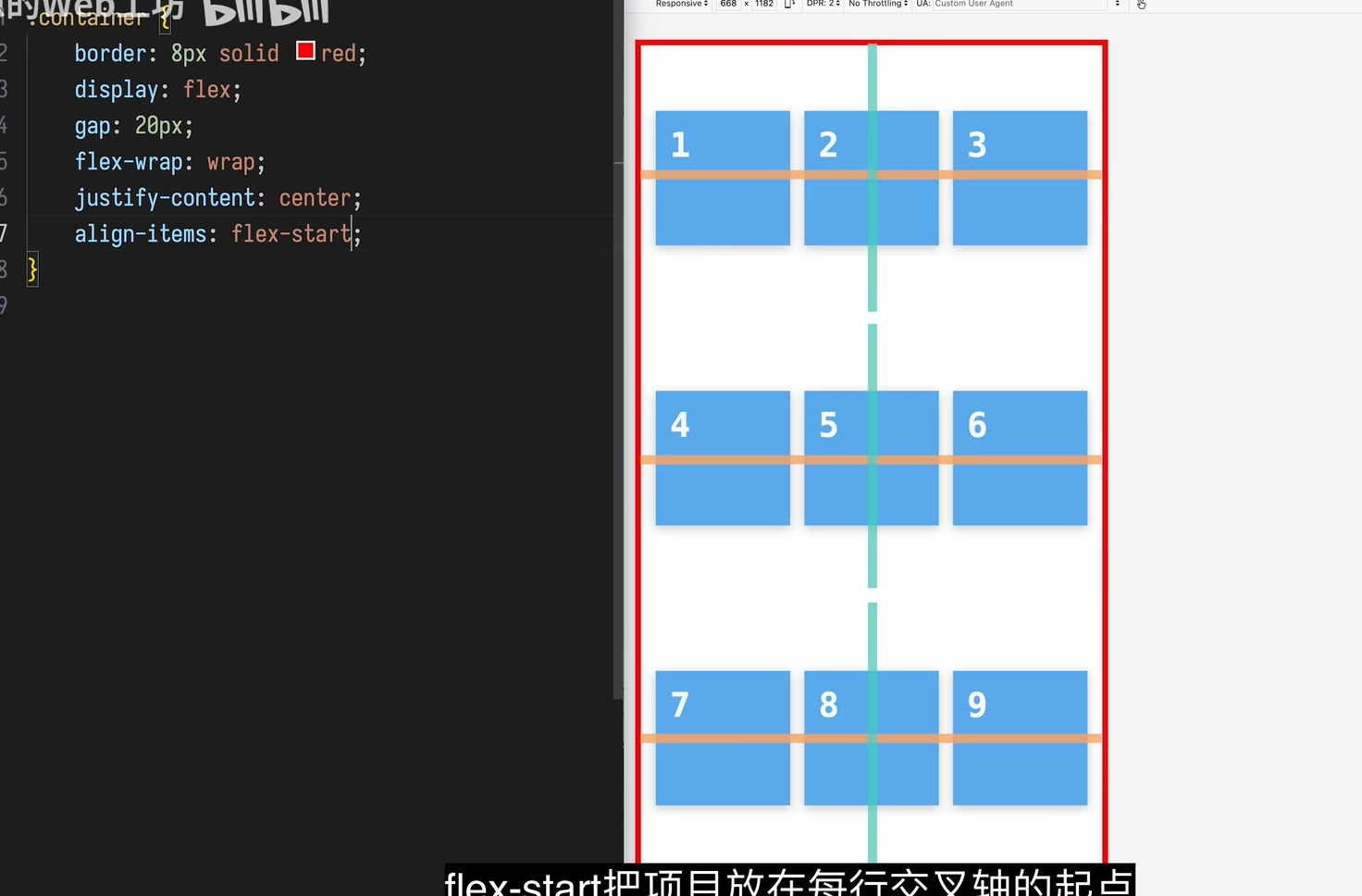
.container{
display: flex;
/*
块之间的边距
*/
gap: 20px;
/*
wrap拖动框框布局不够容下div自动向下换行
nowrap则不会换行,这个div会一直收缩
*/
flex-wrap: wrap;
justify-content: center;
align-items: center;
/**
* 多行容器中所有行在交叉轴上的对齐方式|跟align-items区别就是一个是一行一个是所有
* stretch所有 flex 行会在交叉轴上被拉伸,以填满整个容器的交叉轴空间(默认)。
* center所有行局中
*/
align-content: stretch;
}
三、拉伸是否变化
1、 flex-shrink元素收缩
<!DOCTYPE html>
<html lang="en">
<head>
    <meta charset="UTF-8" />
    <meta name="viewport" content="width=device-width, initial-scale=1.0" />
    <style>
        /* 样式内容省略 */
    </style>
    <link rel="stylesheet" href="./style.css" />
    <title>Flex布局</title>
</head>
<body class="container">
    <div id="item1">1</div>
    <div class="item">2</div>
    <div class="item">3</div>
    <div class="item">4</div>
    <div class="item">5</div>

</body>
</html>
body{
	width: 400px;
	height: 600px;
	border: 3px solid red;
}
div{
	width: 100px;
	height: 100px;
	border: 3px solid gold;
}

.container{
	display: flex;

	gap: 20px;
}

.item{
	/*
		是否缩小让容器变小,
		默认为1(自动收缩);
		0不可以被收缩
		当然可以设置更大的数字,是收缩的占比,可以其中一个div设置5,那么就是其他div设置为1的速度的五倍
	 */
	flex-shrink: 1;
		/**
	 * 最小只能缩小到10px
	 */
	min-width: 10px;
}
/* 可以单独在一个div块设置这个属性,比如的一个div块不收缩 */
#item{
	flex-shrink: 0;
}

/*
解决最小的时候,有内容被收缩遮盖,解决方案就是缩到最小的时候,然后自动换行
*/
@media (max-width: 800px) {
  .container {
    flex-wrap: wrap;
  }
}
2、 flex-grow填满容器内部
<!DOCTYPE html>
<html lang="en">
<head>
    <meta charset="UTF-8" />
    <meta name="viewport" content="width=device-width, initial-scale=1.0" />
    <style>
        /* 样式内容省略 */
    </style>
    <link rel="stylesheet" href="./style.css" />
    <title>Flex布局</title>
</head>
<body class="container">
    <div id="item1">1</div>
    <div class="item">2</div>
    <div class="item">3</div>
    <div class="item">4</div>
    <div class="item">5</div>

</body>
</html>
body{
	width: 400px;
	height: 600px;
	border: 3px solid red;
}
div{
	width: 100px;
	height: 100px;
	border: 3px solid gold;
}

.container{
	display: flex;

	gap: 20px;
}

.item{
	/*
		默认为0不填满
		1填满容器内部 容器元素有多余的空间,里面组件会自动放大,填满
		当然可以设置更大的数字,是增长的占比,可以其中一个div设置5,那么就是其他div设置为1的速度的五倍
	 */
	flex-grow: 1;
	/**
	 * 最大只能增大到120px
	 */
	max-width: 120px;
}
四、单独首个元素调位置
1、 调整的一个到最下面
<!DOCTYPE html>
<html lang="en">
<head>
    <meta charset="UTF-8" />
    <meta name="viewport" content="width=device-width, initial-scale=1.0" />
    <style>
        /* 样式内容省略 */
    </style>
    <link rel="stylesheet" href="./style.css" />
    <title>Flex布局</title>
</head>
<body class="container">
    <div id="item1">1</div>
    <div class="item">2</div>
    <div class="item">3</div>
    <div class="item">4</div>
    <div class="item">5</div>

</body>
</html>
body{
width: 600px;
height: 600px;
border: 3px solid red;
}
div{
width: 100px;
height: 100px;
border: 3px solid gold;
}
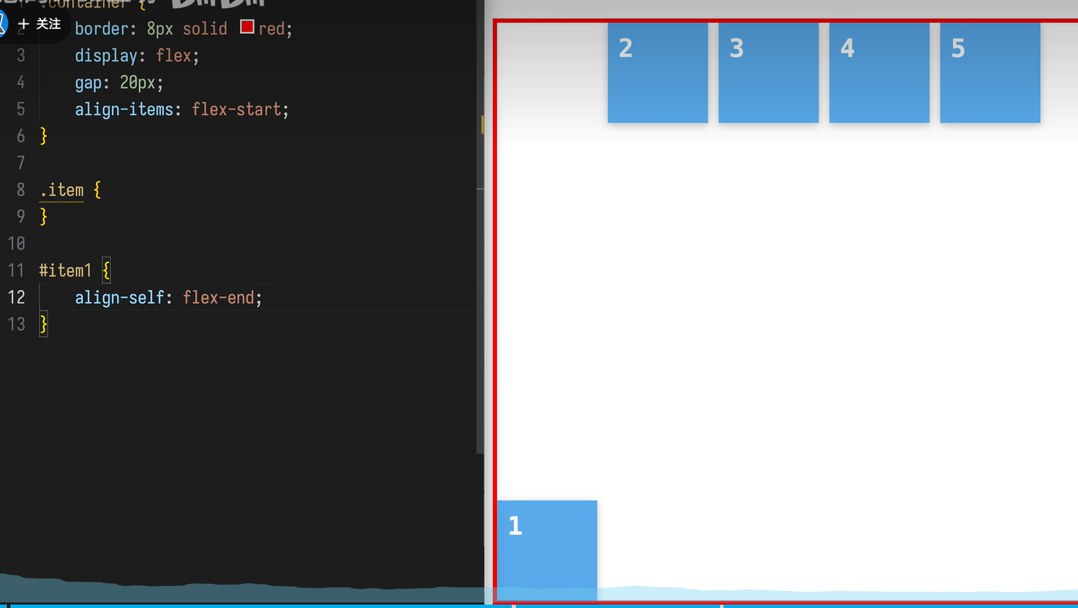
.container{
display: flex;
gap: 20px;
align-items: flex-start;
}
#item1 {
/*但是没有横着justify-self的调整
*/
align-self: flex-end;
}
2、调整的一个在最左侧
<!DOCTYPE html>
<html lang="en">
<head>
    <meta charset="UTF-8" />
    <meta name="viewport" content="width=device-width, initial-scale=1.0" />
    <style>
        /* 样式内容省略 */
    </style>
    <link rel="stylesheet" href="./style.css" />
    <title>Flex布局</title>
</head>
<body class="container">
    <div id="item1">1</div>
    <div class="item">2</div>
    <div class="item">3</div>
    <div class="item">4</div>
    <div class="item">5</div>

</body>
</html>
body{
width: 600px;
height: 600px;
border: 3px solid red;
}
div{
width: 50px;
height: 50px;
border: 3px solid gold;
}
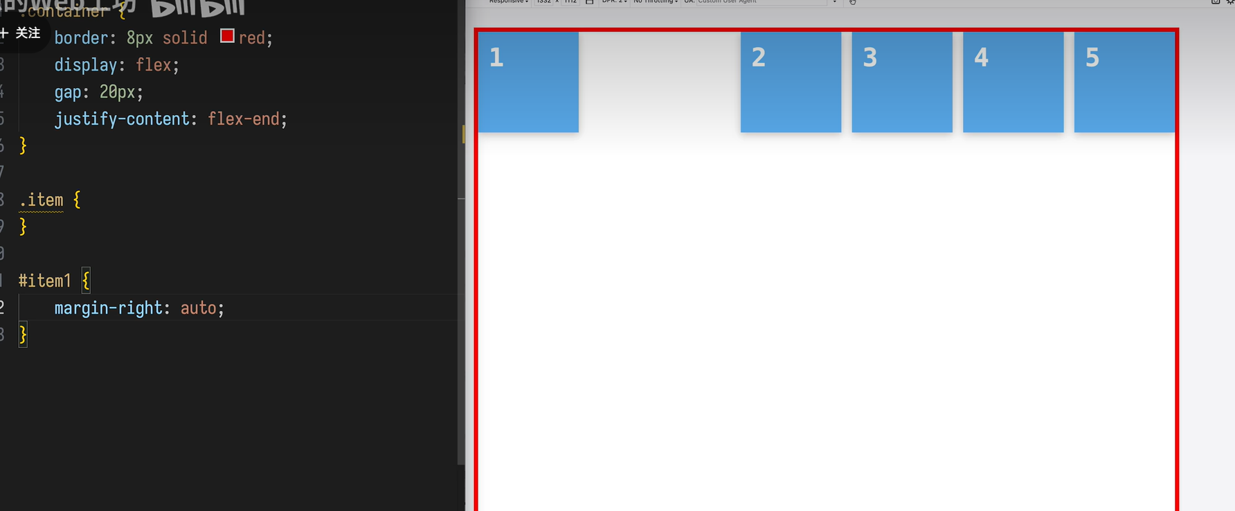
.container{
display: flex;
gap: 20px;
justify-items: flex-end;
}
#item1 {
/*在 Flex 容器中
*margin-left: auto会把元素 推到右边
margin-right: auto会把元素 推到左边
*/
margin-right: auto;
}
五、总结
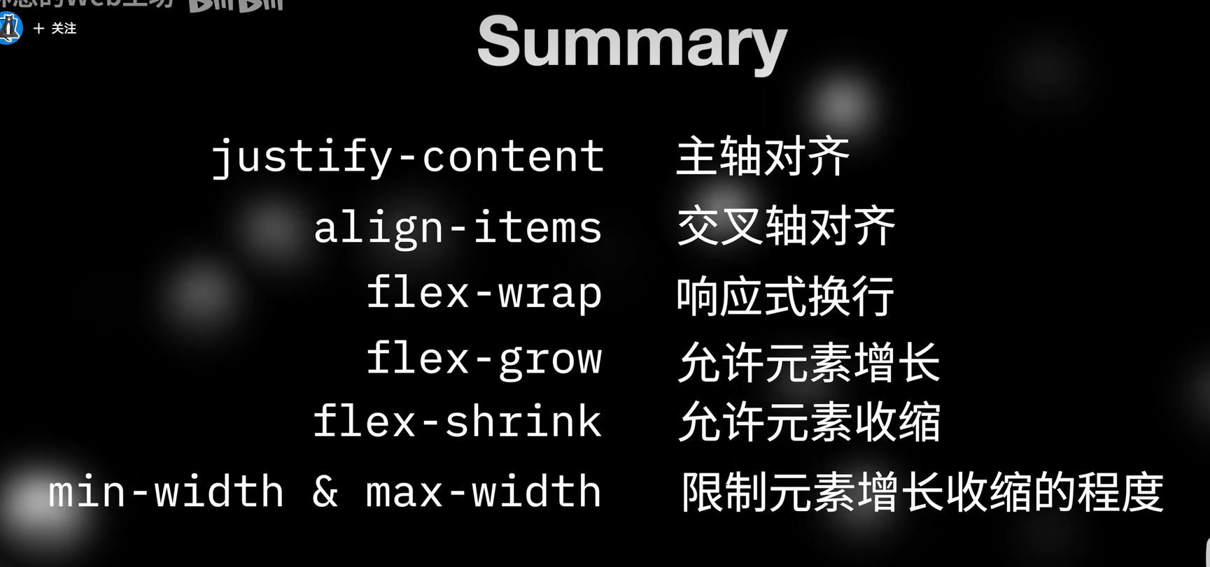
此文根据12分钟的B站学习