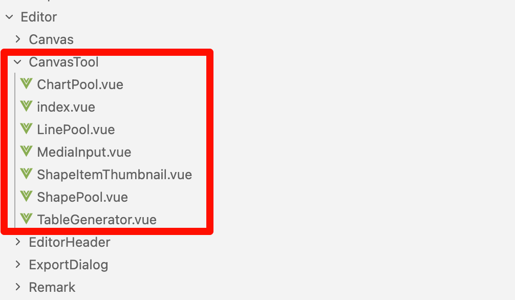
画布工具组件:
画布工具栏分类:

主要分布有左侧工具栏、中间插入元素工具栏以及右侧画布缩放工具栏三类
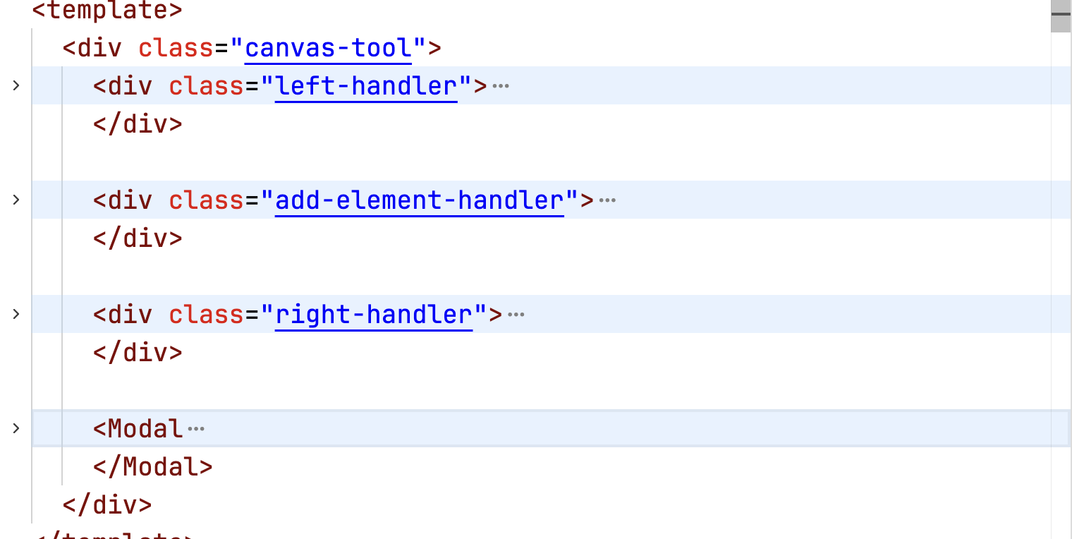
左侧工具栏
-
撤销/重做:通过 useHistorySnapshot 实现
-
面板切换:批注面板、选择窗格、查找替换
-
响应式:小屏时收起为"更多"菜单
//撤销重做批注面板 选择窗格 查找替换
中间插入元素工具栏
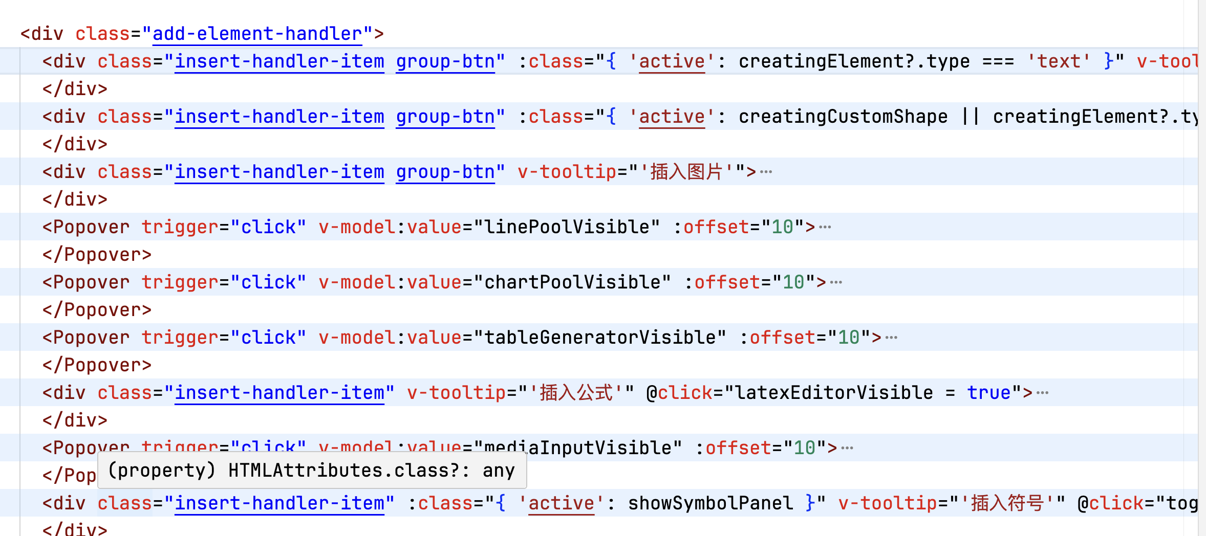
insert-handler-item类名的里面是有下拉弹窗和弹窗组成的,popover说明只是弹窗的样式
- 下拉框和弹窗构成
- 弹窗构成
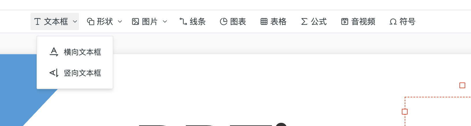
文本框
默认点击的时候选择横向文本框,vertical默认为false,点击垂直文本框的时候vertical为true,用来通知创建状态,这些方法设置创建状态,实际创建在画布上拖拽完成后触发。
<div class="insert-handler-item group-btn" :class="{ 'active': creatingElement?.type === 'text' }" v-tooltip="'插入文字'">
  <div class="group-btn-main" @click="drawText()"><IconFontSize class="icon" /> <span class="text">文本框</span></div>

  <Popover trigger="click" v-model:value="textTypeSelectVisible" style="height: 100%;" :offset="10">
    <template #content>
      <PopoverMenuItem center @click="() => { drawText(); textTypeSelectVisible = false }"><IconTextRotationNone class="icon" /> 横向文本框</PopoverMenuItem>
      <PopoverMenuItem center @click="() => { drawText(true); textTypeSelectVisible = false }"><IconTextRotationDown class="icon" /> 竖向文本框</PopoverMenuItem>
    </template>
    <IconDown class="arrow" />
  </Popover>
</div>

const drawText = (vertical = false) => {
  mainStore.setCreatingElement({
    type: 'text',
    vertical,
  })
}
形状的同上,下次可以针对mainStore单独讲解一期他的状态
// 绘制文字范围
const drawText = (vertical = false) => {
  mainStore.setCreatingElement({
    type: 'text',
    vertical,
  })
}

// 绘制形状范围
const drawShape = (shape: ShapePoolItem) => {
  mainStore.setCreatingElement({
    type: 'shape',
    data: shape,
  })
  shapePoolVisible.value = false
}

// 绘制自定义任意多边形
const drawCustomShape = () => {
  mainStore.setCreatingCustomShapeState(true)
  shapePoolVisible.value = false
}

// 绘制线条路径
const drawLine = (line: LinePoolItem) => {
  mainStore.setCreatingElement({
    type: 'line',
    data: line,
  })
  linePoolVisible.value = false
}
这是创建文本元素的几个状态:
export interface CreatingTextElement {
  type: 'text'
  vertical?: boolean
}
export interface CreatingShapeElement {
  type: 'shape'
  data: ShapePoolItem
}
export interface CreatingLineElement {
  type: 'line'
  data: LinePoolItem
}
export type CreatingElement = CreatingTextElement | CreatingShapeElement | CreatingLineElement
图片
const insertImageElement = (files: FileList) => {
  const imageFile = files[0]
  if (!imageFile) return
  getImageDataURL(imageFile).then(dataURL => createImageElement(dataURL))
}
线条
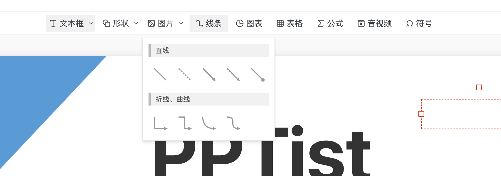
点击"线条"按钮会弹出 LinePool 组件,显示预设线条列表LinePool,LinePool 组件从 LINE_LIST 读取预设线条,将点击的线条传递给父组件。
// 子组件
const selectLine = (line: LinePoolItem) => {
  emit('select', line)
}

// 父组件
// 绘制线条路径
const drawLine = (line: LinePoolItem) => {
  mainStore.setCreatingElement({
    type: 'line',
    data: line,
  })
  linePoolVisible.value = false
}
图表
从 ChartPool 选择类型,立即创建并插入到画布中心
 <Popover trigger="click" v-model:value="chartPoolVisible" :offset="10">
    <template #content>
      <ChartPool @select="chart => { createChartElement(chart); chartPoolVisible = false }" />
    </template>
    <div class="insert-handler-item" v-tooltip="'插入图表'">
      <IconChartProportion class="icon" /> <span class="text">图表</span>
    </div>
  </Popover>
其他的都类似
右边工具栏
画布缩小和放大
  <IconMinus class="handler-item viewport-size" v-tooltip="'画布缩小(Ctrl + -)'" @click="scaleCanvas('-')" />
  <IconPlus class="handler-item viewport-size" v-tooltip="'画布放大(Ctrl + =)'" @click="scaleCanvas('+')" />
缩放比例显示与预设
-
功能:显示当前缩放比例,点击弹出预设菜单
-
预设:200%、150%、125%、100%、75%、50%
-
适应屏幕:一键重置到 90%
{{item}}% 适应屏幕 {{ canvasScalePercentage }}