前言
应用设置页面是用户自定义应用行为和偏好的重要入口。它通常包含账号管理、通知设置、隐私设置、缓存清理、关于应用等功能模块。本文将详细介绍如何在Flutter和OpenHarmony平台上实现一个功能完善的应用设置页面,这是本系列的最后一篇文章。
设置页面的设计需要清晰的分组、直观的控件、以及即时的反馈。用户应该能够快速找到并修改所需的设置项。
Flutter设置页面实现
页面结构设计
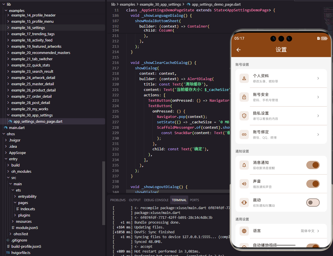
设置页面包含多个设置分组。
dart
class SettingsPage extends StatefulWidget {
  const SettingsPage({super.key});

  @override
  State<SettingsPage> createState() => _SettingsPageState();
}

class _SettingsPageState extends State<SettingsPage> {
  bool _notificationEnabled = true;
  bool _soundEnabled = true;
  bool _vibrationEnabled = false;
  String _cacheSize = '23.5 MB';
使用StatefulWidget管理各种开关状态。
账号设置分组
展示账号相关的设置项。
dart
  @override
  Widget build(BuildContext context) {
    return Scaffold(
      appBar: AppBar(
        title: const Text('设置', style: TextStyle(color: Colors.white)),
        backgroundColor: const Color(0xFF8B4513),
        leading: IconButton(
          icon: const Icon(Icons.arrow_back, color: Colors.white),
          onPressed: () => Navigator.pop(context),
        ),
      ),
      body: SingleChildScrollView(
        child: Column(
          crossAxisAlignment: CrossAxisAlignment.start,
          children: [
            _buildSectionTitle('账号设置'),
            _buildSettingCard([
              _buildNavigationItem(Icons.person_outline, '个人资料', '修改头像、昵称等'),
              _buildNavigationItem(Icons.lock_outline, '账号安全', '密码、手机号管理'),
              _buildNavigationItem(Icons.privacy_tip_outlined, '隐私设置', '谁可以看我的内容'),
            ]),
设置项按功能分组展示。_buildSectionTitle显示分组标题。
通知设置分组
展示通知相关的开关设置。
dart
            _buildSectionTitle('通知设置'),
            _buildSettingCard([
              _buildSwitchItem(Icons.notifications_outlined, '消息通知', '接收新消息提醒', _notificationEnabled, (value) => setState(() => _notificationEnabled = value)),
              _buildSwitchItem(Icons.volume_up_outlined, '声音', '播放通知声音', _soundEnabled, (value) => setState(() => _soundEnabled = value)),
              _buildSwitchItem(Icons.vibration, '震动', '收到通知时震动', _vibrationEnabled, (value) => setState(() => _vibrationEnabled = value)),
            ]),
开关设置项使用Switch组件控制状态。
通用设置分组
展示缓存清理、版本等通用设置。
dart
            _buildSectionTitle('通用设置'),
            _buildSettingCard([
              _buildNavigationItem(Icons.language, '语言', '简体中文'),
              _buildActionItem(Icons.cleaning_services_outlined, '清除缓存', _cacheSize, () {
                showDialog(
                  context: context,
                  builder: (context) => AlertDialog(
                    title: const Text('清除缓存'),
                    content: const Text('确定要清除所有缓存数据吗?'),
                    actions: [
                      TextButton(onPressed: () => Navigator.pop(context), child: const Text('取消')),
                      TextButton(
                        onPressed: () {
                          Navigator.pop(context);
                          setState(() => _cacheSize = '0 MB');
                          ScaffoldMessenger.of(context).showSnackBar(const SnackBar(content: Text('缓存已清除')));
                        },
                        child: const Text('确定'),
                      ),
                    ],
                  ),
                );
              }),
            ]),
清除缓存功能使用AlertDialog确认操作。清除后更新缓存大小显示。
关于与退出
展示关于应用和退出登录。
dart
            _buildSectionTitle('关于'),
            _buildSettingCard([
              _buildNavigationItem(Icons.info_outline, '关于我们', ''),
              _buildNavigationItem(Icons.description_outlined, '用户协议', ''),
              _buildNavigationItem(Icons.shield_outlined, '隐私政策', ''),
              _buildNavigationItem(Icons.star_outline, '给我们评分', ''),
            ]),
            const SizedBox(height: 16),
            Padding(
              padding: const EdgeInsets.symmetric(horizontal: 16),
              child: SizedBox(
                width: double.infinity,
                child: OutlinedButton(
                  onPressed: () {
                    showDialog(
                      context: context,
                      builder: (context) => AlertDialog(
                        title: const Text('退出登录'),
                        content: const Text('确定要退出当前账号吗?'),
                        actions: [
                          TextButton(onPressed: () => Navigator.pop(context), child: const Text('取消')),
                          TextButton(onPressed: () => Navigator.pop(context), child: const Text('确定', style: TextStyle(color: Colors.red))),
                        ],
                      ),
                    );
                  },
                  style: OutlinedButton.styleFrom(
                    side: const BorderSide(color: Colors.red),
                    padding: const EdgeInsets.symmetric(vertical: 12),
                  ),
                  child: const Text('退出登录', style: TextStyle(color: Colors.red)),
                ),
              ),
            ),
            const SizedBox(height: 16),
            Center(child: Text('版本 1.0.0', style: TextStyle(fontSize: 12, color: Colors.grey[500]))),
            const SizedBox(height: 24),
          ],
        ),
      ),
    );
  }
退出登录按钮使用红色突出显示。版本号显示在页面底部。
辅助构建方法
抽取重复的UI构建逻辑。
dart
  Widget _buildSectionTitle(String title) {
    return Padding(
      padding: const EdgeInsets.fromLTRB(16, 16, 16, 8),
      child: Text(title, style: TextStyle(fontSize: 13, fontWeight: FontWeight.bold, color: Colors.grey[600])),
    );
  }

  Widget _buildSettingCard(List<Widget> children) {
    return Container(
      margin: const EdgeInsets.symmetric(horizontal: 16),
      decoration: BoxDecoration(
        color: Colors.white,
        borderRadius: BorderRadius.circular(12),
        boxShadow: [BoxShadow(color: Colors.black.withOpacity(0.05), blurRadius: 5)],
      ),
      child: Column(children: children),
    );
  }

  Widget _buildNavigationItem(IconData icon, String title, String subtitle) {
    return ListTile(
      leading: Icon(icon, color: const Color(0xFF8B4513)),
      title: Text(title, style: const TextStyle(fontSize: 14)),
      subtitle: subtitle.isNotEmpty ? Text(subtitle, style: TextStyle(fontSize: 12, color: Colors.grey[500])) : null,
      trailing: const Icon(Icons.chevron_right, color: Colors.grey),
      onTap: () {},
    );
  }

  Widget _buildSwitchItem(IconData icon, String title, String subtitle, bool value, Function(bool) onChanged) {
    return SwitchListTile(
      secondary: Icon(icon, color: const Color(0xFF8B4513)),
      title: Text(title, style: const TextStyle(fontSize: 14)),
      subtitle: Text(subtitle, style: TextStyle(fontSize: 12, color: Colors.grey[500])),
      value: value,
      onChanged: onChanged,
      activeColor: const Color(0xFF8B4513),
    );
  }

  Widget _buildActionItem(IconData icon, String title, String value, VoidCallback onTap) {
    return ListTile(
      leading: Icon(icon, color: const Color(0xFF8B4513)),
      title: Text(title, style: const TextStyle(fontSize: 14)),
      trailing: Row(
        mainAxisSize: MainAxisSize.min,
        children: [
          Text(value, style: TextStyle(fontSize: 13, color: Colors.grey[500])),
          const SizedBox(width: 4),
          const Icon(Icons.chevron_right, color: Colors.grey),
        ],
      ),
      onTap: onTap,
    );
  }
}
辅助方法使代码更加简洁和可维护。
OpenHarmony鸿蒙实现
页面定义
鸿蒙平台使用@State管理开关状态。
typescript
@Entry
@Component
struct SettingsPage {
  @State notificationEnabled: boolean = true
  @State soundEnabled: boolean = true
  @State vibrationEnabled: boolean = false
  @State cacheSize: string = '23.5 MB'
页面布局实现
使用Scroll和Column构建设置页面。
typescript
  build() {
    Column() {
      Row() {
        Image($r('app.media.back'))
          .width(24)
          .height(24)
          .fillColor(Color.White)
          .onClick(() => router.back())
        Text('设置')
          .fontSize(18)
          .fontColor(Color.White)
          .layoutWeight(1)
          .textAlign(TextAlign.Center)
        Blank().width(24)
      }
      .width('100%')
      .height(56)
      .padding({ left: 16, right: 16 })
      .backgroundColor('#8B4513')

      Scroll() {
        Column() {
          this.SectionTitle('账号设置')
          Column() {
            this.NavigationItem($r('app.media.person'), '个人资料', '修改头像、昵称等')
            Divider().color('#EEEEEE').margin({ left: 50 })
            this.NavigationItem($r('app.media.lock'), '账号安全', '密码、手机号管理')
            Divider().color('#EEEEEE').margin({ left: 50 })
            this.NavigationItem($r('app.media.privacy'), '隐私设置', '谁可以看我的内容')
          }
          .width('90%')
          .backgroundColor(Color.White)
          .borderRadius(12)

          this.SectionTitle('通知设置')
          Column() {
            this.SwitchItem($r('app.media.notification'), '消息通知', '接收新消息提醒', this.notificationEnabled, (value: boolean) => { this.notificationEnabled = value })
            Divider().color('#EEEEEE').margin({ left: 50 })
            this.SwitchItem($r('app.media.volume'), '声音', '播放通知声音', this.soundEnabled, (value: boolean) => { this.soundEnabled = value })
            Divider().color('#EEEEEE').margin({ left: 50 })
            this.SwitchItem($r('app.media.vibration'), '震动', '收到通知时震动', this.vibrationEnabled, (value: boolean) => { this.vibrationEnabled = value })
          }
          .width('90%')
          .backgroundColor(Color.White)
          .borderRadius(12)

          this.SectionTitle('通用设置')
          Column() {
            this.NavigationItem($r('app.media.language'), '语言', '简体中文')
            Divider().color('#EEEEEE').margin({ left: 50 })
            this.ActionItem($r('app.media.clean'), '清除缓存', this.cacheSize, () => {
              AlertDialog.show({
                title: '清除缓存',
                message: '确定要清除所有缓存数据吗?',
                primaryButton: {
                  value: '取消',
                  action: () => {}
                },
                secondaryButton: {
                  value: '确定',
                  action: () => {
                    this.cacheSize = '0 MB'
                    promptAction.showToast({ message: '缓存已清除' })
                  }
                }
              })
            })
          }
          .width('90%')
          .backgroundColor(Color.White)
          .borderRadius(12)

          this.SectionTitle('关于')
          Column() {
            this.NavigationItem($r('app.media.info'), '关于我们', '')
            Divider().color('#EEEEEE').margin({ left: 50 })
            this.NavigationItem($r('app.media.document'), '用户协议', '')
            Divider().color('#EEEEEE').margin({ left: 50 })
            this.NavigationItem($r('app.media.shield'), '隐私政策', '')
          }
          .width('90%')
          .backgroundColor(Color.White)
          .borderRadius(12)

          Button('退出登录')
            .width('90%')
            .height(44)
            .fontSize(14)
            .fontColor('#F44336')
            .backgroundColor(Color.White)
            .border({ width: 1, color: '#F44336' })
            .borderRadius(22)
            .margin({ top: 24 })
            .onClick(() => {
              AlertDialog.show({
                title: '退出登录',
                message: '确定要退出当前账号吗?',
                primaryButton: { value: '取消', action: () => {} },
                secondaryButton: { value: '确定', action: () => {} }
              })
            })

          Text('版本 1.0.0')
            .fontSize(12)
            .fontColor('#999999')
            .margin({ top: 16, bottom: 24 })
        }
      }
      .layoutWeight(1)
    }
    .width('100%')
    .height('100%')
    .backgroundColor('#F5F5F5')
  }

  @Builder SectionTitle(title: string) {
    Text(title)
      .fontSize(13)
      .fontWeight(FontWeight.Bold)
      .fontColor('#666666')
      .width('90%')
      .margin({ top: 16, bottom: 8 })
  }

  @Builder NavigationItem(icon: Resource, title: string, subtitle: string) {
    Row() {
      Image(icon).width(22).height(22).fillColor('#8B4513')
      Column() {
        Text(title).fontSize(14).fontColor('#333333')
        if (subtitle) {
          Text(subtitle).fontSize(12).fontColor('#999999').margin({ top: 2 })
        }
      }
      .layoutWeight(1)
      .alignItems(HorizontalAlign.Start)
      .margin({ left: 12 })
      Image($r('app.media.arrow_right')).width(16).height(16).fillColor('#CCCCCC')
    }
    .width('100%')
    .padding(16)
  }

  @Builder SwitchItem(icon: Resource, title: string, subtitle: string, value: boolean, onChange: (value: boolean) => void) {
    Row() {
      Image(icon).width(22).height(22).fillColor('#8B4513')
      Column() {
        Text(title).fontSize(14).fontColor('#333333')
        Text(subtitle).fontSize(12).fontColor('#999999').margin({ top: 2 })
      }
      .layoutWeight(1)
      .alignItems(HorizontalAlign.Start)
      .margin({ left: 12 })
      Toggle({ type: ToggleType.Switch, isOn: value })
        .selectedColor('#8B4513')
        .onChange(onChange)
    }
    .width('100%')
    .padding(16)
  }

  @Builder ActionItem(icon: Resource, title: string, value: string, onClick: () => void) {
    Row() {
      Image(icon).width(22).height(22).fillColor('#8B4513')
      Text(title).fontSize(14).fontColor('#333333').layoutWeight(1).margin({ left: 12 })
      Text(value).fontSize(13).fontColor('#999999').margin({ right: 4 })
      Image($r('app.media.arrow_right')).width(16).height(16).fillColor('#CCCCCC')
    }
    .width('100%')
    .padding(16)
    .onClick(onClick)
  }
}
@Builder定义多个可复用的设置项构建函数。AlertDialog实现确认对话框。Toggle组件实现开关功能。
系列总结
本文是Flutter与OpenHarmony跨平台开发系列的第30篇文章。通过这30篇文章,我们系统地介绍了从基础组件到完整页面的开发方法,涵盖了轮播图、搜索栏、网格布局、列表组件、Tab切换、详情页面、设置页面等常见UI模块。
希望这个系列能够帮助开发者快速掌握Flutter和OpenHarmony的跨平台开发技术,在实际项目中灵活运用这些知识,打造出优秀的移动应用。欢迎加入开源鸿蒙跨平台社区:https://openharmonycrossplatform.csdn.net