目录
-
- [1. 引言](#1. 引言)
- [2. 演示效果](#2. 演示效果)
- [3. 代码说明](#3. 代码说明)
-
- [3.1 Pane容器](#3.1 Pane容器)
- [3.2 Frame容器](#3.2 Frame容器)
- [3.3 GroupBox容器](#3.3 GroupBox容器)
- [3.4 自定义GroupBox](#3.4 自定义GroupBox)
- [3.5 ScrollView容器](#3.5 ScrollView容器)
- [3.6 Page容器(嵌套示例)](#3.6 Page容器(嵌套示例))
- [4. 继承关系](#4. 继承关系)
- [5. 工程下载](#5. 工程下载)
1. 引言
在QML开发中,容器组件是构建复杂用户界面的基石。它们不仅提供了内容的组织结构,还能处理布局、滚动、分组等核心功能。
本文将历史文章中的示例进行整合,集中说明QML中各种基础容器视图的使用方法。
历史文章包括:
2. 演示效果
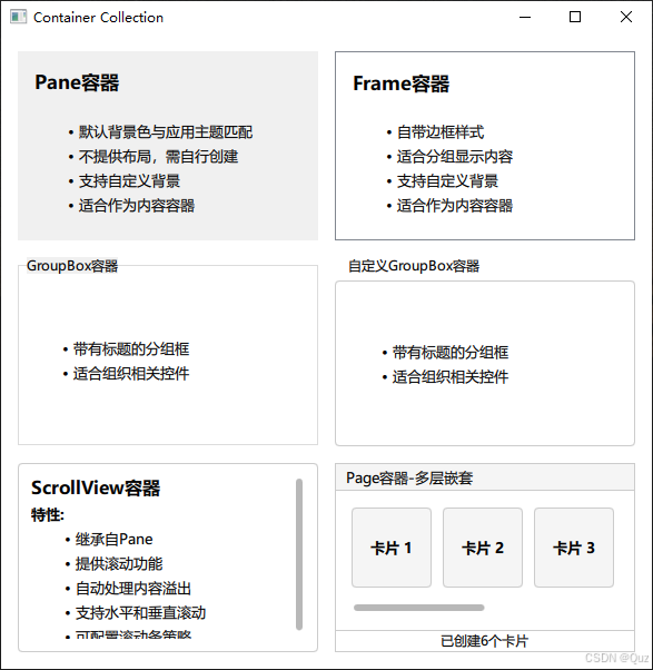
这个演示工程展示了QML中主要的容器组件,包括Pane、Frame、GroupBox、ScrollView和Page等。所有容器都以卡片形式展示,让用户能够直观地对比它们的外观和功能差异。
3. 代码说明
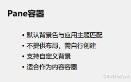
3.1 Pane容器
演示效果:
qml
// Demo_Pane.qml - 最基础的容器
Pane {
    property string title: "Pane容器"
    width: 270
    height: 170
    padding: 15

    ColumnLayout {
        anchors.fill: parent
        spacing: 15

        Label {
            text: title
            font.bold: true
            font.pointSize: 13
        }

        Label {
            text: "- 默认背景色与应用主题匹配\n- 不提供布局,需自行创建"
            font.pointSize: 10
            textFormat: Text.MarkdownText
            wrapMode: Text.WordWrap
        }
    }
}
特点:
- 提供基础背景和边框
- 背景色自动匹配应用主题
- 需要手动添加布局管理器
- 适合作为内容的基础容器
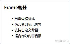
3.2 Frame容器
演示效果:
qml
// Demo_Frame.qml - 带边框的容器
Frame {
    property string title: "Frame容器"
    width: 270
    height: 170
    padding: 15

    ColumnLayout {
        anchors.fill: parent
        anchors.margins: 15
        spacing: 15

        // 内容区域...
    }
}
特点:
- 继承自Pane,增加边框样式
- 自带装饰性边框
- 适合分组显示内容
- 提供更好的视觉分隔效果
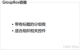
3.3 GroupBox容器
演示效果:
qml
// Demo_GroupBox.qml - 带标题的分组框
GroupBox {
    width: 270
    height: 170
    title: "GroupBox容器"

    ColumnLayout {
        anchors.fill: parent
        spacing: 15

        // 内容区域...
    }
}
特点:
- 继承自Frame,增加标题功能
- 自动显示分组标题
- 适合组织相关控件
- 提供清晰的逻辑分组
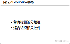
3.4 自定义GroupBox
演示效果:
qml
// CustomGroupBox.qml - 自定义样式的GroupBox
GroupBox {
    id: control
    title: "自定义GroupBox容器"

    background: Rectangle {
        y: control.topPadding - control.bottomPadding
        width: parent.width
        height: parent.height - control.topPadding + control.bottomPadding
        color: "transparent"
        border.color: "#ccc"
        radius: 4
    }

    label: Label {
        x: control.leftPadding
        width: control.availableWidth
        text: control.title
        elide: Text.ElideRight
    }
}
特点:
- 完全自定义背景和标签
- 支持圆角边框
- 可控制标题位置和样式
- 提供最大的自定义灵活性
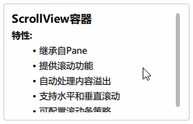
3.5 ScrollView容器
演示效果:
qml
// Demo_ScrollView.qml - 带滚动功能的容器
Rectangle {
    width: 270
    height: 170

    ScrollView {
        anchors.fill: parent
        anchors.margins: 12
        ScrollBar.vertical.policy: ScrollBar.AlwaysOn

        ColumnLayout {
            anchors.fill: parent
            spacing: 6

            Repeater {
                model: ["### ScrollView容器", "**特性:**", "- 继承自Pane"]
                Label {
                    required property string modelData
                    text: modelData
                    Layout.fillWidth: true
                    font.pointSize: 10
                    textFormat: Text.MarkdownText
                }
            }
        }
    }
}
特点:
- 继承自Pane,提供滚动功能
- 自动处理内容溢出
- 支持水平和垂直滚动
- 可配置滚动条显示策略
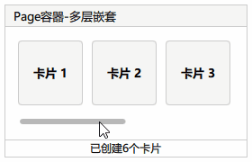
3.6 Page容器(嵌套示例)
演示效果:
qml
// Demo_Nested.qml - 多层嵌套的复杂容器
Page {
    width: 270
    height: 170

    property string demoTitle: "Page容器-多层嵌套"

    header: Rectangle {
        width: parent.width
        height: 25
        color: "#f5f5f5"
        border.color: "#ccc"

        Text {
            anchors.left: parent.left
            anchors.leftMargin: 10
            anchors.verticalCenter: parent.verticalCenter
            font.pointSize: 10
            text: demoTitle
        }
    }

    footer: Rectangle {
        width: parent.width
        height: 20
        border.color: "#ccc"

        Text {
            anchors.centerIn: parent
            font.pointSize: 9
            text: "已创建" + controlRepeater.count + "个卡片"
        }
    }

    ScrollView {
        id: scrollView
        anchors.fill: parent
        anchors.margins: 15
        ScrollBar.horizontal.policy: ScrollBar.AlwaysOn

        RowLayout {
            spacing: 10

            Repeater {
                id: controlRepeater
                model: 6
                delegate: Pane {
                    contentWidth: scrollView.height * 0.5
                    contentHeight: scrollView.height * 0.5

                    background: Rectangle {
                        color: "#f5f5f5"
                        border.color: "#ccc"
                        radius: 4
                    }

                    Label {
                        anchors.centerIn: parent
                        text: "卡片 " + (index + 1)
                        font.bold: true
                        font.pointSize: 10
                    }
                }
            }
        }
    }
}
特点:
- 提供header和footer区域
- 支持完整的页面布局
- 适合构建复杂的多区域界面
- 可与其他容器组件组合使用
4. 继承关系
根据工程中的关系说明,QML容器组件的继承层次如下:
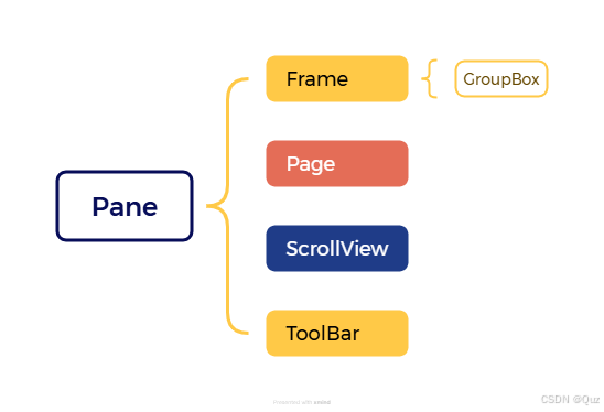
这个继承关系说明了各个容器的功能增强路径:
- Pane:最基础的容器,提供背景和基本属性
- Frame:在Pane基础上增加边框装饰
- GroupBox:在Frame基础上增加标题功能
- Page:在Pane基础上增加header/footer支持
- ScrollView:在Pane基础上增加滚动功能
- ToolBar:在Pane基础上增加滚动功能,通常与TabButton结合使用,本文未介绍
5. 工程下载
下载链接:QML 常用的基础容器组件(Pane、Frame、GroupBox、ScrollView 和 Page)