"关于我们"页面是 App 中最容易被忽视的一个页面,但它对于建立用户信任和展示 App 信息非常重要。这篇文章来实现一个专业的"关于我们"页面,展示 App 的基本信息、版本号、开发团队等内容。
页面内容的规划
在实现"关于我们"页面之前,需要先规划页面要展示哪些内容。一个完整的"关于我们"页面通常包含以下几部分:
- App 信息 - App 名称、版本号、开发者信息
- 功能介绍 - 简要介绍 App 的主要功能
- 技术栈 - 展示 App 使用的技术
- 联系方式 - 提供用户反馈的途径
- 法律信息 - 隐私政策、服务条款等链接
信息组织 - 通过合理的信息组织,用户可以快速了解 App 的相关信息。不要把所有信息堆在一起,而是要分类展示。
App 信息的定义
首先定义 App 的基本信息。这些信息可以存储在一个配置文件中,方便后续维护。
先看 App 信息的定义:
tsx
const APP_INFO = {
  name: 'Steam 资讯',
  version: '1.0.0',
  buildNumber: '1',
  developer: 'OpenHarmony 开发者',
  description: '一个专为 OpenHarmony 平台设计的 Steam 游戏资讯应用',
  website: 'https://openharmonycrossplatform.csdn.net',
  email: 'support@example.com',
};
这个对象定义了 App 的基本信息:
name- App 的名称version- App 的版本号,用于显示给用户buildNumber- 构建号,用于内部版本管理developer- 开发者或开发团队的名称description- App 的简要描述website- App 或开发者的网站email- 联系邮箱
配置管理 - 通过定义一个配置对象,可以集中管理 App 的信息。如果要更新版本号或其他信息,只需要改这个对象就行。
App 信息卡片
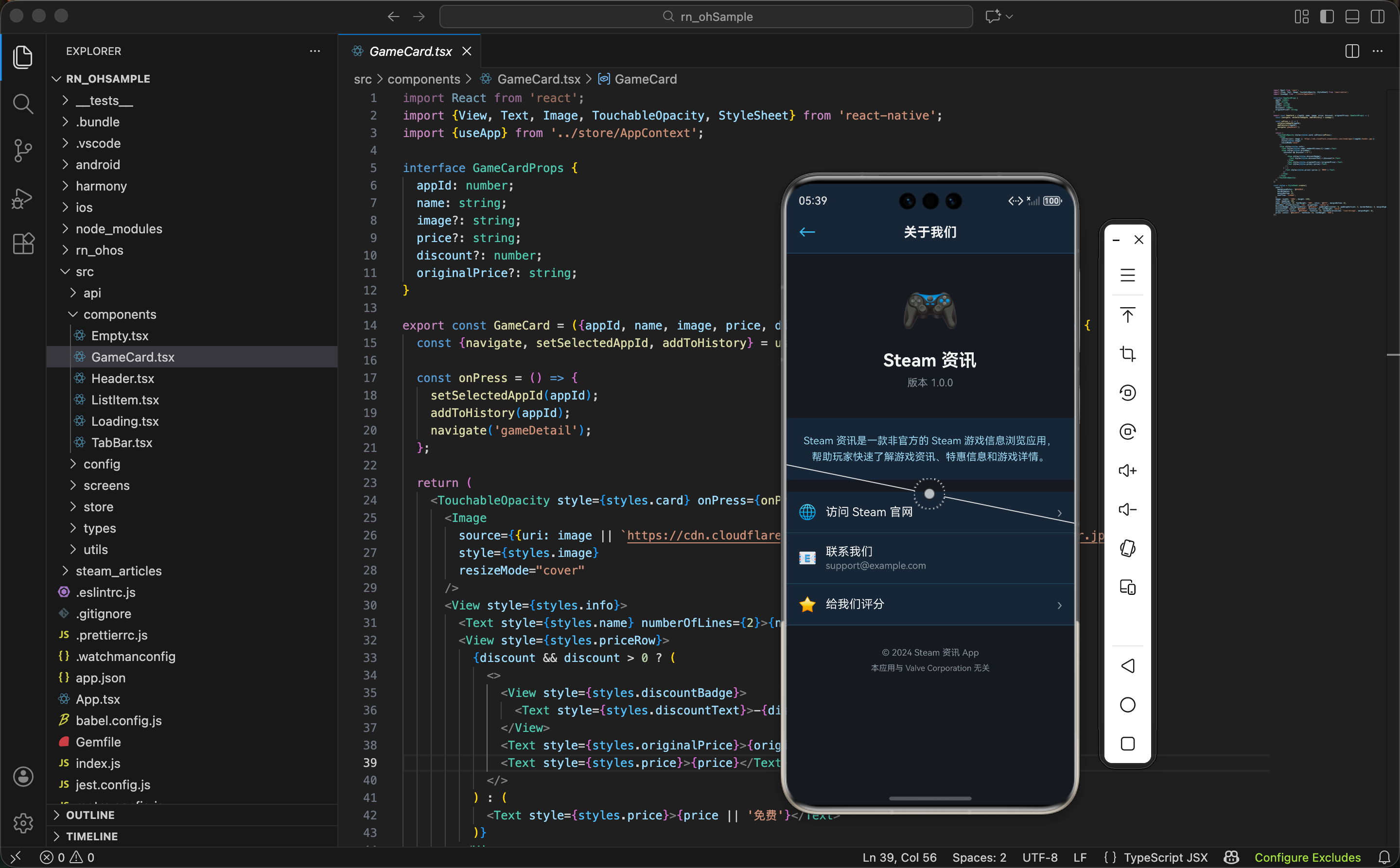
"关于我们"页面的顶部通常是一个 App 信息卡片,展示 App 的图标、名称和版本号。
先看 App 信息卡片的结构:
tsx
<View style={styles.appInfoCard}>
  <Image
    source={require('../assets/app-icon.png')}
    style={styles.appIcon}
  />
  <Text style={styles.appName}>{APP_INFO.name}</Text>
  <Text style={styles.appVersion}>版本 {APP_INFO.version}</Text>
  <Text style={styles.appDescription}>{APP_INFO.description}</Text>
</View>
这个卡片包含四个元素:
- App 图标 - 展示 App 的图标,让用户一眼认出这是什么 App
- App 名称 - 显示 App 的名称
- 版本号 - 显示当前 App 的版本
- App 描述 - 简要介绍 App 的功能
视觉设计 - 通过图标、名称、版本号和描述的组合,用户可以快速了解 App 的基本信息。这个卡片应该是页面上最醒目的部分。
然后看样式部分:
tsx
appInfoCard: {
  alignItems: 'center',
  paddingVertical: 32,
  paddingHorizontal: 16,
  backgroundColor: '#1b2838',
  borderBottomWidth: 1,
  borderBottomColor: '#2a475e',
},
appIcon: {width: 80, height: 80, borderRadius: 20, marginBottom: 16},
appName: {fontSize: 24, fontWeight: 'bold', color: '#fff', marginBottom: 4},
appVersion: {fontSize: 14, color: '#8f98a0', marginBottom: 12},
appDescription: {fontSize: 12, color: '#8f98a0', textAlign: 'center', lineHeight: 18},
样式设计的要点:
- 居中对齐 -
alignItems: 'center'让所有元素居中显示 - 图标大小 - 80x80 的图标大小适中,
borderRadius: 20让图标有圆角 - 文字层级 - 名称用最大的字体,版本号和描述用较小的字体,形成视觉层级
- 间距 - 各个元素之间有适当的间距,不会显得拥挤
功能介绍
在 App 信息卡片下面,可以添加一个功能介绍部分,简要说明 App 的主要功能。
先看功能介绍的定义:
tsx
const FEATURES = [
  {icon: '🎮', title: '游戏资讯', description: '获取最新的 Steam 游戏资讯'},
  {icon: '💰', title: '特惠信息', description: '及时了解游戏折扣信息'},
  {icon: '❤️', title: '收藏管理', description: '收藏喜欢的游戏,方便查看'},
  {icon: '📜', title: '浏览历史', description: '记录浏览过的游戏'},
];
这个数组定义了 App 的四个主要功能。每个功能包含三个信息:
icon- 功能的图标,用 emoji 表示title- 功能的名称description- 功能的简要描述
功能展示 - 通过列出主要功能,用户可以快速了解 App 能做什么。这对于新用户特别有帮助。
然后用 map 遍历这个数组来生成 UI:
tsx
<View style={styles.featuresSection}>
  <Text style={styles.sectionTitle}>主要功能</Text>
  <View style={styles.featuresList}>
    {FEATURES.map((feature, index) => (
      <View key={index} style={styles.featureItem}>
        <Text style={styles.featureIcon}>{feature.icon}</Text>
        <View style={styles.featureContent}>
          <Text style={styles.featureTitle}>{feature.title}</Text>
          <Text style={styles.featureDescription}>{feature.description}</Text>
        </View>
      </View>
    ))}
  </View>
</View>
这段代码的关键点:
- 遍历数组 -
map遍历功能数组,为每个功能生成一个 UI 项 - 图标显示 - 用 emoji 作为功能图标,简洁直观
- 内容布局 - 图标在左,标题和描述在右
可维护性 - 通过数组定义功能,如果要添加新的功能,只需要在数组中添加一项就行。
技术栈展示
为了展示 App 使用的技术,可以添加一个技术栈部分。这对于开发者和技术爱好者特别有吸引力。
先看技术栈的定义:
tsx
const TECH_STACK = [
  {name: 'React Native', version: '0.72.5'},
  {name: 'OpenHarmony', version: '4.0'},
  {name: 'TypeScript', version: '5.0'},
  {name: 'Steam API', version: 'v2'},
];
这个数组定义了 App 使用的主要技术。每个技术包含名称和版本号。
然后生成 UI:
tsx
<View style={styles.techSection}>
  <Text style={styles.sectionTitle}>技术栈</Text>
  <View style={styles.techList}>
    {TECH_STACK.map((tech, index) => (
      <View key={index} style={styles.techItem}>
        <Text style={styles.techName}>{tech.name}</Text>
        <Text style={styles.techVersion}>{tech.version}</Text>
      </View>
    ))}
  </View>
</View>
技术栈展示的好处:
- 展示专业性 - 列出使用的技术,展示 App 的专业性
- 吸引开发者 - 开发者可以了解 App 使用的技术栈
- 建立信任 - 使用知名的技术栈能增加用户的信任
技术透明 - 通过展示技术栈,App 显得更加透明和专业。用户能看到 App 是用什么技术开发的。
联系方式
在"关于我们"页面中,应该提供联系方式,让用户能够反馈问题或提出建议。
先看联系方式的 UI:
tsx
<View style={styles.contactSection}>
  <Text style={styles.sectionTitle}>联系我们</Text>
  <TouchableOpacity style={styles.contactItem} onPress={() => openEmail()}>
    <Text style={styles.contactIcon}>✉️</Text>
    <View style={styles.contactContent}>
      <Text style={styles.contactLabel}>发送邮件</Text>
      <Text style={styles.contactValue}>{APP_INFO.email}</Text>
    </View>
    <Text style={styles.contactArrow}>›</Text>
  </TouchableOpacity>
  <TouchableOpacity style={styles.contactItem} onPress={() => openWebsite()}>
    <Text style={styles.contactIcon}>🌐</Text>
    <View style={styles.contactContent}>
      <Text style={styles.contactLabel}>访问网站</Text>
      <Text style={styles.contactValue}>{APP_INFO.website}</Text>
    </View>
    <Text style={styles.contactArrow}>›</Text>
  </TouchableOpacity>
</View>
这个部分包含两个可点击的项:
- 发送邮件 - 用户可以点击发送邮件给开发者
- 访问网站 - 用户可以点击访问开发者的网站
用户互动 - 通过提供联系方式,用户可以方便地与开发者沟通。这能提高用户的满意度。
然后看打开邮件和网站的函数:
tsx
const openEmail = () => {
  Linking.openURL(`mailto:${APP_INFO.email}`);
};

const openWebsite = () => {
  Linking.openURL(APP_INFO.website);
};
这两个函数使用 React Native 的 Linking 模块来打开邮件和网站:
Linking.openURL()- 打开指定的 URLmailto:- 邮件协议,用于打开邮件应用
系统集成 - 通过
Linking模块,App 可以与系统的邮件应用和浏览器集成,提供更好的用户体验。
法律信息
在"关于我们"页面的底部,通常需要添加法律信息的链接,比如隐私政策和服务条款。
先看法律信息的 UI:
tsx
<View style={styles.legalSection}>
  <TouchableOpacity style={styles.legalItem} onPress={() => navigate('privacy')}>
    <Text style={styles.legalText}>隐私政策</Text>
    <Text style={styles.legalArrow}>›</Text>
  </TouchableOpacity>
  <TouchableOpacity style={styles.legalItem} onPress={() => navigate('terms')}>
    <Text style={styles.legalText}>服务条款</Text>
    <Text style={styles.legalArrow}>›</Text>
  </TouchableOpacity>
  <TouchableOpacity style={styles.legalItem} onPress={() => navigate('disclaimer')}>
    <Text style={styles.legalText}>免责声明</Text>
    <Text style={styles.legalArrow}>›</Text>
  </TouchableOpacity>
</View>
这个部分包含三个可点击的项:
- 隐私政策 - 说明 App 如何处理用户数据
- 服务条款 - 说明用户使用 App 的条款
- 免责声明 - 说明 App 的免责事项
法律保护 - 通过提供这些法律文件,App 和用户都能得到保护。用户知道自己的数据如何被处理,App 也能明确自己的责任。
页面的整体结构
"关于我们"页面的整体布局分为几部分:
tsx
return (
  <View style={styles.container}>
    <Header title="关于我们" showBack />
    <ScrollView style={styles.content}>
      {/* App 信息卡片 */}
      <AppInfoCard />

      {/* 功能介绍 */}
      <FeaturesSection />

      {/* 技术栈 */}
      <TechSection />

      {/* 联系方式 */}
      <ContactSection />

      {/* 法律信息 */}
      <LegalSection />

      {/* 版权信息 */}
      <CopyrightSection />
    </ScrollView>
    <TabBar />
  </View>
);
页面结构很清晰:
- Header - 顶部导航栏,显示"关于我们"标题
- App 信息卡片 - 展示 App 的基本信息
- 功能介绍 - 列出 App 的主要功能
- 技术栈 - 展示使用的技术
- 联系方式 - 提供联系方式
- 法律信息 - 提供法律文件链接
- 版权信息 - 显示版权信息
- TabBar - 底部导航栏
信息流 - 通过合理的信息流,用户可以从上到下逐步了解 App 的各个方面。
版权信息
在页面的最底部,应该显示版权信息。这是一个简单但重要的部分。
先看版权信息的 UI:
tsx
<View style={styles.copyrightSection}>
  <Text style={styles.copyrightText}>© 2024 Steam 资讯</Text>
  <Text style={styles.copyrightText}>All rights reserved</Text>
  <Text style={styles.copyrightText}>Powered by OpenHarmony</Text>
</View>
版权信息包含三行:
- 版权声明 - 显示版权年份和 App 名称
- 权利保留 - 显示"All rights reserved"
- 技术支持 - 显示 App 使用的平台
法律声明 - 版权信息是一个法律声明,表明 App 的所有权和权利。
然后看样式:
tsx
copyrightSection: {
  alignItems: 'center',
  paddingVertical: 24,
  paddingHorizontal: 16,
  borderTopWidth: 1,
  borderTopColor: '#2a475e',
},
copyrightText: {fontSize: 12, color: '#8f98a0', marginBottom: 4},
样式设计的要点:
- 居中对齐 - 版权信息应该居中显示
- 小字体 - 用较小的字体显示,不抢其他内容的风头
- 灰色文字 - 用灰色显示,表示这是次要信息
- 分割线 - 顶部加一条分割线,与上面的内容分开
样式汇总
"关于我们"页面的样式采用 Steam 的深色主题。先看容器和基本样式:
tsx
const styles = StyleSheet.create({
  container: {flex: 1, backgroundColor: '#171a21'},
  content: {flex: 1},
  sectionTitle: {fontSize: 16, fontWeight: 'bold', color: '#fff', marginBottom: 12, marginHorizontal: 16},
  appInfoCard: {
    alignItems: 'center',
    paddingVertical: 32,
    paddingHorizontal: 16,
    backgroundColor: '#1b2838',
    borderBottomWidth: 1,
    borderBottomColor: '#2a475e',
  },
  appIcon: {width: 80, height: 80, borderRadius: 20, marginBottom: 16},
  appName: {fontSize: 24, fontWeight: 'bold', color: '#fff', marginBottom: 4},
  appVersion: {fontSize: 14, color: '#8f98a0', marginBottom: 12},
  appDescription: {fontSize: 12, color: '#8f98a0', textAlign: 'center', lineHeight: 18},
然后是功能和技术栈的样式:
tsx
  featuresSection: {paddingVertical: 24, paddingHorizontal: 16},
  featuresList: {backgroundColor: '#1b2838', borderRadius: 8, overflow: 'hidden'},
  featureItem: {flexDirection: 'row', alignItems: 'center', paddingVertical: 12, paddingHorizontal: 12, borderBottomWidth: 1, borderBottomColor: '#2a475e'},
  featureIcon: {fontSize: 24, marginRight: 12},
  featureContent: {flex: 1},
  featureTitle: {fontSize: 14, fontWeight: '600', color: '#fff', marginBottom: 2},
  featureDescription: {fontSize: 12, color: '#8f98a0'},
  techSection: {paddingVertical: 24, paddingHorizontal: 16},
  techList: {backgroundColor: '#1b2838', borderRadius: 8, overflow: 'hidden'},
  techItem: {flexDirection: 'row', justifyContent: 'space-between', alignItems: 'center', paddingVertical: 12, paddingHorizontal: 12, borderBottomWidth: 1, borderBottomColor: '#2a475e'},
  techName: {fontSize: 14, color: '#fff'},
  techVersion: {fontSize: 12, color: '#8f98a0'},
最后是联系方式和法律信息的样式:
tsx
  contactSection: {paddingVertical: 24, paddingHorizontal: 16},
  contactItem: {flexDirection: 'row', alignItems: 'center', paddingVertical: 12, paddingHorizontal: 12, backgroundColor: '#1b2838', borderRadius: 8, marginBottom: 8},
  contactIcon: {fontSize: 20, marginRight: 12},
  contactContent: {flex: 1},
  contactLabel: {fontSize: 14, fontWeight: '600', color: '#fff', marginBottom: 2},
  contactValue: {fontSize: 12, color: '#8f98a0'},
  contactArrow: {fontSize: 18, color: '#8f98a0'},
  legalSection: {paddingVertical: 24, paddingHorizontal: 16},
  legalItem: {flexDirection: 'row', justifyContent: 'space-between', alignItems: 'center', paddingVertical: 12, paddingHorizontal: 12, borderBottomWidth: 1, borderBottomColor: '#2a475e'},
  legalText: {fontSize: 14, color: '#66c0f4'},
  legalArrow: {fontSize: 18, color: '#8f98a0'},
  copyrightSection: {alignItems: 'center', paddingVertical: 24, paddingHorizontal: 16, borderTopWidth: 1, borderTopColor: '#2a475e'},
  copyrightText: {fontSize: 12, color: '#8f98a0', marginBottom: 4},
});
配色说明:
#171a21- 最深的背景色,用于页面底色#1b2838- 卡片和列表背景色#2a475e- 分割线颜色#66c0f4- Steam 标志蓝,用于强调#8f98a0- 灰色,用于次要文字#fff- 白色,用于主要文字
小结
"关于我们"页面展示了如何创建一个专业的 App 信息页面:
- App 信息展示 - 清晰地展示 App 的基本信息
- 功能介绍 - 让用户快速了解 App 的功能
- 技术透明 - 展示使用的技术栈,增加专业性
- 用户沟通 - 提供联系方式,方便用户反馈
- 法律保护 - 提供法律文件链接,保护用户和 App
- 信息组织 - 通过合理的分组和排列,让页面看起来清晰有序
欢迎加入开源鸿蒙跨平台社区:https://openharmonycrossplatform.csdn.net