帮助中心是 App 中非常重要的一个功能。通过帮助中心,用户可以快速找到答案,解决遇到的问题,而不需要联系客服。这篇文章来实现一个完整的帮助中心,包括常见问题、搜索功能和分类浏览。
帮助内容的组织
首先需要规划帮助中心的内容结构。一个完整的帮助中心通常包含多个分类,每个分类下有多个常见问题。这样的结构能让用户快速找到想要的内容。
先定义帮助分类的接口:
tsx
interface HelpCategory {
  id: string;
  title: string;
  icon: string;
  description: string;
}
这个接口定义了帮助分类的结构:
id- 分类的唯一标识符,用于查询和过滤title- 分类的名称,显示给用户icon- 分类的图标,用 emoji 表示description- 分类的描述,帮助用户理解这个分类是干什么的
然后定义帮助文章的接口:
tsx
interface HelpArticle {
  id: string;
  categoryId: string;
  title: string;
  content: string;
  views: number;
}
这个接口定义了帮助文章的结构:
id- 文章的唯一标识符categoryId- 文章所属的分类 IDtitle- 文章的标题content- 文章的完整内容views- 文章被浏览的次数
数据结构设计 - 通过定义清晰的数据结构,可以方便地管理和扩展帮助内容。如果要添加新的分类或文章,只需要按照这个结构添加就行。这样的设计也便于后续从服务器动态加载内容。
帮助分类的定义
接下来定义帮助中心的分类。这些分类应该涵盖用户可能遇到的各种问题。
先看帮助分类的定义:
tsx
const HELP_CATEGORIES: HelpCategory[] = [
  {
    id: 'getting-started',
    title: '快速开始',
    icon: '🚀',
    description: '了解如何开始使用 Steam 资讯应用',
  },
  {
    id: 'features',
    title: '功能介绍',
    icon: '✨',
    description: '详细了解应用的各项功能',
  },
  {
    id: 'account',
    title: '账户相关',
    icon: '👤',
    description: '关于账户、登录和个人信息的问题',
  },
  {
    id: 'notifications',
    title: '通知设置',
    icon: '🔔',
    description: '如何管理和自定义通知',
  },
  {
    id: 'troubleshooting',
    title: '故障排除',
    icon: '🔧',
    description: '解决常见的技术问题',
  },
];
这个数组定义了五个帮助分类。每个分类都有一个图标,方便用户快速识别。
分类设计 - 通过合理的分类,用户可以快速找到相关的帮助内容。分类应该涵盖用户最常遇到的问题。用 emoji 作为图标既简洁又直观,不需要额外的图片资源。
帮助文章的定义
然后定义帮助文章。这些文章应该回答用户最常见的问题。
先看帮助文章的定义:
tsx
const HELP_ARTICLES: HelpArticle[] = [
  {
    id: 'gs-1',
    categoryId: 'getting-started',
    title: '如何下载和安装应用?',
    content: '您可以从应用商店下载 Steam 资讯应用。安装完成后,打开应用即可开始使用。',
    views: 1250,
  },
  {
    id: 'features-1',
    categoryId: 'features',
    title: '如何收藏游戏?',
    content: '在游戏详情页面,点击心形图标即可收藏游戏。收藏的游戏会显示在"我的收藏"页面。',
    views: 2100,
  },
];
这个数组定义了帮助文章,分别属于不同的分类。每篇文章都有一个浏览次数,可以用来显示热门文章。
文章定义的要点:
- 分类关联 - 每篇文章都通过
categoryId关联到一个分类 - 内容简洁 - 文章内容应该简洁明了,直接回答用户的问题
- 浏览统计 - 记录浏览次数,可以用来推荐热门文章
内容质量 - 帮助文章应该简洁明了,直接回答用户的问题。避免过于复杂的技术术语。好的帮助文章能显著降低用户的学习成本。
帮助中心首页的状态管理
帮助中心首页需要管理多个状态,包括选中的分类、搜索查询和搜索结果。
先看状态的定义:
tsx
export const HelpCenterScreen = () => {
  const [selectedCategory, setSelectedCategory] = useState<string | null>(null);
  const [searchQuery, setSearchQuery] = useState('');
  const [filteredArticles, setFilteredArticles] = useState<HelpArticle[]>([]);
这里定义了三个关键的状态:
selectedCategory- 当前选中的分类,用户点击分类时更新searchQuery- 搜索框中的查询字符串filteredArticles- 根据搜索查询过滤后的文章列表
然后实现搜索函数:
tsx
  const handleSearch = (query: string) => {
    setSearchQuery(query);
    if (query.trim() === '') {
      setFilteredArticles([]);
    } else {
      const results = HELP_ARTICLES.filter(article =>
        article.title.toLowerCase().includes(query.toLowerCase()) ||
        article.content.toLowerCase().includes(query.toLowerCase())
      );
      setFilteredArticles(results);
    }
  };
这个搜索函数的逻辑:
- 清空检查 - 如果查询字符串为空,清空搜索结果
- 模糊搜索 - 在文章标题和内容中搜索匹配的关键词
- 不区分大小写 - 用
toLowerCase()实现不区分大小写的搜索
搜索体验 - 通过实时搜索,用户可以立即看到搜索结果,而不需要点击搜索按钮。这提供了更好的用户体验。
搜索框的实现
帮助中心的顶部应该有一个搜索框,让用户可以快速搜索帮助内容。
先看搜索框的 UI:
tsx
<View style={styles.searchContainer}>
  <TextInput
    style={styles.searchInput}
    placeholder="搜索帮助内容..."
    placeholderTextColor="#8f98a0"
    value={searchQuery}
    onChangeText={handleSearch}
  />
  <Text style={styles.searchIcon}>🔍</Text>
</View>
这个搜索框包含两个元素:
- 输入框 - 用户可以输入搜索关键词,
onChangeText事件会实时触发搜索 - 搜索图标 - 显示搜索功能的图标,用 emoji 表示
用户体验 - 搜索框应该放在页面的顶部,让用户一眼就能看到。输入框应该有清晰的占位符文字,告诉用户可以搜索什么。实时搜索能提供更好的反馈。
然后看样式部分:
tsx
searchContainer: {
  flexDirection: 'row',
  alignItems: 'center',
  paddingHorizontal: 16,
  paddingVertical: 12,
  backgroundColor: '#1b2838',
  borderBottomWidth: 1,
  borderBottomColor: '#2a475e',
},
searchInput: {
  flex: 1,
  paddingVertical: 8,
  paddingHorizontal: 12,
  backgroundColor: '#2a475e',
  borderRadius: 6,
  color: '#fff',
  fontSize: 14,
},
searchIcon: {fontSize: 18, marginLeft: 8, color: '#8f98a0'},
样式设计的要点:
- 布局 -
flexDirection: 'row'让输入框和图标水平排列 - 输入框 - 背景色
#2a475e,圆角 6,让输入框看起来更现代 - 图标 - 放在输入框右侧,提示用户这是搜索功能
- 间距 - 各个元素之间有适当的间距,不会显得拥挤
分类浏览
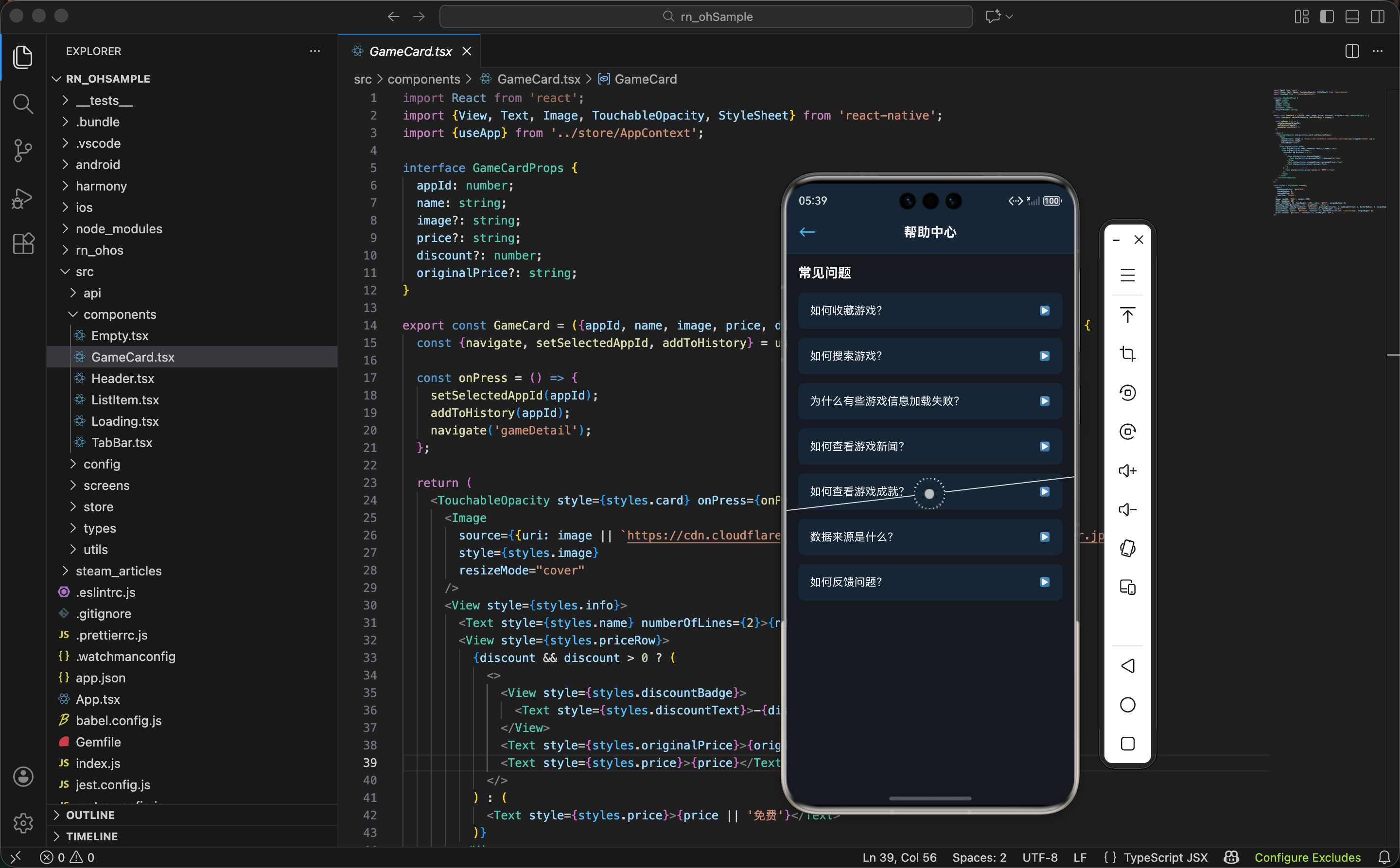
如果用户没有搜索,应该显示分类列表,让用户可以按分类浏览帮助内容。
先看分类列表的 UI:
tsx
{searchQuery === '' && (
  <View style={styles.categoriesSection}>
    <Text style={styles.sectionTitle}>浏览分类</Text>
    <View style={styles.categoriesList}>
      {HELP_CATEGORIES.map(category => (
        <TouchableOpacity
          key={category.id}
          style={styles.categoryItem}
          onPress={() => setSelectedCategory(category.id)}
        >
          <Text style={styles.categoryIcon}>{category.icon}</Text>
          <View style={styles.categoryContent}>
            <Text style={styles.categoryTitle}>{category.title}</Text>
            <Text style={styles.categoryDescription}>{category.description}</Text>
          </View>
          <Text style={styles.categoryArrow}>›</Text>
        </TouchableOpacity>
      ))}
    </View>
  </View>
)}
这段代码遍历分类数组,为每个分类生成一个可点击的项。关键点:
- 条件显示 - 只有当搜索框为空时才显示分类列表
- 点击处理 - 点击分类时设置
selectedCategory,显示该分类下的文章 - 图标显示 - 用 emoji 作为分类图标,简洁直观
交互设计 - 通过点击分类,用户可以查看该分类下的所有文章。这提供了一个清晰的浏览路径。
文章列表的显示
当用户选择了分类或进行了搜索后,应该显示相关的文章列表。
先看文章列表的 UI:
tsx
{selectedCategory && !searchQuery && (
  <View style={styles.articlesSection}>
    <TouchableOpacity
      style={styles.backButton}
      onPress={() => setSelectedCategory(null)}
    >
      <Text style={styles.backButtonText}>← 返回分类</Text>
    </TouchableOpacity>
    <FlatList
      data={HELP_ARTICLES.filter(article => article.categoryId === selectedCategory)}
      keyExtractor={item => item.id}
      renderItem={({item}) => (
        <TouchableOpacity style={styles.articleItem}>
          <Text style={styles.articleTitle}>{item.title}</Text>
          <Text style={styles.articleViews}>👁️ {item.views} 次浏览</Text>
        </TouchableOpacity>
      )}
    />
  </View>
)}
这段代码处理分类浏览的情况。关键点:
- 返回按钮 - 用户可以点击返回分类列表
- 过滤文章 - 只显示属于选中分类的文章
- 浏览次数 - 显示文章被浏览的次数
灵活显示 - 通过条件渲染,根据用户的操作显示不同的内容。这提供了更好的用户体验。
然后看搜索结果的显示:
tsx
{searchQuery && (
  <View style={styles.articlesSection}>
    <Text style={styles.searchResultsTitle}>搜索结果 ({filteredArticles.length})</Text>
    <FlatList
      data={filteredArticles}
      keyExtractor={item => item.id}
      renderItem={({item}) => (
        <TouchableOpacity style={styles.articleItem}>
          <Text style={styles.articleTitle}>{item.title}</Text>
          <Text style={styles.articleViews}>👁️ {item.views} 次浏览</Text>
        </TouchableOpacity>
      )}
    />
  </View>
)}
这段代码显示搜索结果。关键点:
- 结果数量 - 显示找到的文章数量
- 搜索结果列表 - 显示所有匹配的文章
- 统一样式 - 搜索结果和分类文章使用相同的样式
热门文章推荐
在帮助中心的首页,可以显示热门文章,让用户快速找到最有用的内容。
先看热门文章的 UI:
tsx
{!selectedCategory && !searchQuery && (
  <View style={styles.popularSection}>
    <Text style={styles.sectionTitle}>热门文章</Text>
    <FlatList
      data={HELP_ARTICLES.sort((a, b) => b.views - a.views).slice(0, 5)}
      keyExtractor={item => item.id}
      renderItem={({item, index}) => (
        <TouchableOpacity style={styles.popularItem}>
          <Text style={styles.popularRank}>#{index + 1}</Text>
          <View style={styles.popularContent}>
            <Text style={styles.popularTitle}>{item.title}</Text>
            <Text style={styles.popularViews}>👁️ {item.views}</Text>
          </View>
        </TouchableOpacity>
      )}
    />
  </View>
)}
这段代码显示浏览次数最多的五篇文章。关键点:
- 排序 - 按浏览次数从高到低排序
- 排名 - 显示文章的排名
- 浏览次数 - 显示文章的浏览次数
内容推荐 - 通过显示热门文章,可以帮助用户快速找到最有用的内容。这也能提高这些文章的可见性。
页面的整体结构
帮助中心页面的整体布局分为几部分:
tsx
return (
  <View style={styles.container}>
    <Header title="帮助中心" showBack />
    <ScrollView style={styles.content}>
      {/* 搜索框 */}
      <SearchBox />

      {/* 热门文章 */}
      {!selectedCategory && !searchQuery && <PopularArticles />}

      {/* 分类列表 */}
      {!selectedCategory && !searchQuery && <CategoriesList />}

      {/* 文章列表 */}
      {selectedCategory && <ArticlesList />}

      {/* 搜索结果 */}
      {searchQuery && <SearchResults />}
    </ScrollView>
    <TabBar />
  </View>
);
页面结构很清晰:
- Header - 顶部导航栏
- 搜索框 - 让用户可以搜索帮助内容
- 热门文章 - 显示最受欢迎的文章
- 分类列表 - 显示帮助分类
- 文章列表 - 显示选中分类下的文章
- 搜索结果 - 显示搜索到的文章
- TabBar - 底部导航栏
导航流 - 通过清晰的导航流,用户可以方便地在不同的视图之间切换。
样式汇总
帮助中心的样式采用 Steam 的深色主题。先看容器和基本样式:
tsx
const styles = StyleSheet.create({
  container: {flex: 1, backgroundColor: '#171a21'},
  content: {flex: 1},
  sectionTitle: {fontSize: 16, fontWeight: 'bold', color: '#fff', marginBottom: 12, marginHorizontal: 16},
  searchContainer: {
    flexDirection: 'row',
    alignItems: 'center',
    paddingHorizontal: 16,
    paddingVertical: 12,
    backgroundColor: '#1b2838',
    borderBottomWidth: 1,
    borderBottomColor: '#2a475e',
  },
  searchInput: {
    flex: 1,
    paddingVertical: 8,
    paddingHorizontal: 12,
    backgroundColor: '#2a475e',
    borderRadius: 6,
    color: '#fff',
    fontSize: 14,
  },
  searchIcon: {fontSize: 18, marginLeft: 8, color: '#8f98a0'},
然后是分类和文章的样式:
tsx
  categoriesSection: {paddingVertical: 24, paddingHorizontal: 16},
  categoriesList: {backgroundColor: '#1b2838', borderRadius: 8, overflow: 'hidden'},
  categoryItem: {
    flexDirection: 'row',
    alignItems: 'center',
    paddingVertical: 12,
    paddingHorizontal: 12,
    borderBottomWidth: 1,
    borderBottomColor: '#2a475e',
  },
  categoryIcon: {fontSize: 24, marginRight: 12},
  categoryContent: {flex: 1},
  categoryTitle: {fontSize: 14, fontWeight: '600', color: '#fff', marginBottom: 2},
  categoryDescription: {fontSize: 12, color: '#8f98a0'},
  categoryArrow: {fontSize: 18, color: '#8f98a0'},
  articlesSection: {paddingVertical: 24, paddingHorizontal: 16},
  backButton: {paddingVertical: 8, paddingHorizontal: 12, marginBottom: 12},
  backButtonText: {fontSize: 14, color: '#66c0f4'},
  articleItem: {
    paddingVertical: 12,
    paddingHorizontal: 12,
    backgroundColor: '#1b2838',
    borderRadius: 6,
    marginBottom: 8,
  },
  articleTitle: {fontSize: 14, fontWeight: '600', color: '#fff', marginBottom: 4},
  articleViews: {fontSize: 12, color: '#8f98a0'},
最后是热门文章的样式:
tsx
  popularSection: {paddingVertical: 24, paddingHorizontal: 16},
  popularItem: {
    flexDirection: 'row',
    alignItems: 'center',
    paddingVertical: 12,
    paddingHorizontal: 12,
    backgroundColor: '#1b2838',
    borderRadius: 6,
    marginBottom: 8,
  },
  popularRank: {fontSize: 16, fontWeight: 'bold', color: '#66c0f4', marginRight: 12},
  popularContent: {flex: 1},
  popularTitle: {fontSize: 14, fontWeight: '600', color: '#fff', marginBottom: 2},
  popularViews: {fontSize: 12, color: '#8f98a0'},
  searchResultsTitle: {fontSize: 14, fontWeight: 'bold', color: '#fff', marginBottom: 12},
});
配色说明:
#171a21- 最深的背景色,用于页面底色#1b2838- 卡片和列表背景色#2a475e- 分割线和输入框背景色#66c0f4- Steam 标志蓝,用于强调和按钮#8f98a0- 灰色,用于次要文字#fff- 白色,用于主要文字
小结
帮助中心页面展示了如何实现一个完整的自助服务系统:
- 搜索功能 - 让用户快速找到相关的帮助内容
- 分类浏览 - 通过分类让用户按需查找
- 热门文章 - 推荐最有用的文章
- 灵活导航 - 支持多种浏览方式,满足不同用户的需求
- 实时搜索 - 提供即时的搜索反馈
- 清晰结构 - 通过合理的信息组织让用户快速找到答案
欢迎加入开源鸿蒙跨平台社区:https://openharmonycrossplatform.csdn.net