目录
[1. Placeholder控件概述](#1. Placeholder控件概述)
[2. 鸿蒙平台对Placeholder控件的要求](#2. 鸿蒙平台对Placeholder控件的要求)
[3. Placeholder控件的使用场景](#3. Placeholder控件的使用场景)
[1. 基本Placeholder效果](#1. 基本Placeholder效果)
[2. 加载状态中的Placeholder效果](#2. 加载状态中的Placeholder效果)
[3. 布局占位场景效果](#3. 布局占位场景效果)
[4. 错误状态中的Placeholder效果](#4. 错误状态中的Placeholder效果)
[5. 自定义样式的Placeholder效果](#5. 自定义样式的Placeholder效果)
[1. color属性](#1. color属性)
[2. strokeWidth属性](#2. strokeWidth属性)
[3. fallbackWidth和fallbackHeight属性](#3. fallbackWidth和fallbackHeight属性)
一、前言
随着移动应用开发的快速发展,跨平台开发框架越来越受到开发者的青睐。在移动应用开发中,Placeholder控件是一个常用的UI组件,它主要用于在内容加载过程中或布局设计阶段显示占位效果,提升用户体验。本文将介绍在鸿蒙+Flutter跨平台开发中Placeholder控件的基础使用场景,包括控件介绍、效果展示、核心属性介绍和总结,帮助开发者更好地理解和使用Placeholder控件。
二、控件介绍
1. Placeholder控件概述
Placeholder控件是Flutter中的一个基础UI组件,用于在内容加载过程中或布局设计阶段显示占位效果。它可以显示一个带有斜向条纹的矩形区域,用于表示该位置将在后续显示实际内容。
Placeholder控件的主要特点包括:
- 简单易用,只需几行代码即可实现占位效果
- 支持自定义颜色、大小和条纹宽度
- 可以用于各种场景,如加载状态、布局占位、错误状态等
- 具有良好的视觉反馈,提升用户体验
2. 鸿蒙平台对Placeholder控件的要求
在鸿蒙平台上使用Placeholder控件时,需要遵循以下要求:
- 颜色:建议使用鸿蒙OS的核心色彩系统,保持与整体UI风格一致
- 大小:根据实际布局需求和屏幕尺寸进行调整,确保在不同设备上都能保持良好的显示效果
- 样式:遵循鸿蒙设计语言,保持简洁、清晰、统一
- 性能:确保Placeholder控件不会影响应用的性能,特别是在大量使用的情况下
3. Placeholder控件的使用场景
Placeholder控件的常见使用场景包括:
- 加载状态:在网络请求或数据加载过程中显示占位效果
- 布局占位:在布局设计阶段用于占位,方便调整布局结构
- 错误状态:当内容加载失败时,显示占位效果并提示用户
- 延迟加载:在内容延迟加载时,显示占位效果
- 列表和网格:在列表或网格中,当单个项的数据加载中时显示占位效果
三、效果展示
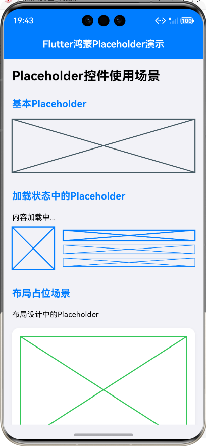
1. 基本Placeholder效果
基本Placeholder控件显示一个带有斜向条纹的矩形区域,默认颜色为灰色,条纹宽度为2.0。
const Placeholder(
  fallbackWidth: 200.0,
  fallbackHeight: 100.0,
);
2. 加载状态中的Placeholder效果
在内容加载过程中,Placeholder控件可以用于显示占位效果,提示用户内容正在加载中。
Row(
  children: [
    const Placeholder(
      fallbackWidth: 80.0,
      fallbackHeight: 80.0,
      color: Color(0xFF007DFF),
    ),
    const SizedBox(width: 16.0),
    Expanded(
      child: Column(
        crossAxisAlignment: CrossAxisAlignment.start,
        children: [
          const Placeholder(
            fallbackWidth: double.infinity,
            fallbackHeight: 20.0,
            color: Color(0xFF007DFF),
          ),
          const SizedBox(height: 8.0),
          const Placeholder(
            fallbackWidth: double.infinity,
            fallbackHeight: 16.0,
            color: Color(0xFF007DFF),
            strokeWidth: 1.0,
          ),
        ],
      ),
    ),
  ],
);
3. 布局占位场景效果
在布局设计阶段,Placeholder控件可以用于占位,方便调整布局结构。
Container(
padding: const EdgeInsets.all(16.0),
decoration: BoxDecoration(
color: Colors.white,
borderRadius: BorderRadius.circular(12.0),
boxShadow: [
BoxShadow(
color: Colors.black.withValues(alpha: 0.05),
blurRadius: 4,
offset: const Offset(0, 2),
),
],
),
child: Column(
crossAxisAlignment: CrossAxisAlignment.start,
children: [
const Placeholder(
fallbackWidth: double.infinity,
fallbackHeight: 200.0,
color: Color(0xFF34C759),
),
const SizedBox(height: 16.0),
const Placeholder(
fallbackWidth: double.infinity,
fallbackHeight: 24.0,
color: Color(0xFF007DFF),
),
const SizedBox(height: 8.0),
const Placeholder(
fallbackWidth: double.infinity,
fallbackHeight: 16.0,
color: Color(0xFF666666),
strokeWidth: 1.0,
),
],
),
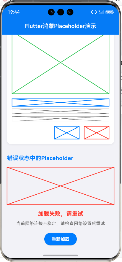
);4. 错误状态中的Placeholder效果
当内容加载失败时,Placeholder控件可以用于显示占位效果,并提示用户。
Column(
  crossAxisAlignment: CrossAxisAlignment.center,
  children: [
    const Placeholder(
      fallbackWidth: 120.0,
      fallbackHeight: 120.0,
      color: Color(0xFFFF3B30),
    ),
    const SizedBox(height: 16.0),
    const Text(
      '加载失败,请重试',
      style: TextStyle(
        fontSize: 18.0,
        fontWeight: FontWeight.bold,
        color: Color(0xFFFF3B30),
      ),
    ),
    const SizedBox(height: 8.0),
    const Text(
      '当前网络连接不稳定,请检查网络设置后重试',
      textAlign: TextAlign.center,
      style: TextStyle(
        fontSize: 14.0,
        color: Color(0xFF666666),
      ),
    ),
  ],
);
5. 自定义样式的Placeholder效果
Placeholder控件支持自定义颜色、大小和条纹宽度,可以根据实际需求进行调整。
Wrap(
  spacing: 16.0,
  runSpacing: 16.0,
  children: [
    const Placeholder(
      fallbackWidth: 100.0,
      fallbackHeight: 100.0,
      color: Colors.red,
      strokeWidth: 2.0,
    ),
    const Placeholder(
      fallbackWidth: 100.0,
      fallbackHeight: 100.0,
      color: Colors.green,
      strokeWidth: 4.0,
    ),
  ],
);
四、核心属性介绍
Placeholder控件的核心属性包括:
| 属性名 | 类型 | 默认值 | 说明 |
|---|---|---|---|
| color | Color | Color(0xFF404040) | 占位区域的颜色 |
| strokeWidth | double | 2.0 | 斜向条纹的宽度 |
| fallbackWidth | double | 400.0 | 占位区域的宽度 |
| fallbackHeight | double | 400.0 | 占位区域的高度 |
1. color属性
color属性用于设置占位区域的颜色,可以使用Color类的构造函数或预定义的颜色常量。
Dart
const Placeholder(
  color: Color(0xFF007DFF), // 鸿蒙蓝 - 主色调
);
2. strokeWidth属性
strokeWidth属性用于设置斜向条纹的宽度,可以根据实际需求进行调整。
Dart
const Placeholder(
  strokeWidth: 4.0,
);
3. fallbackWidth和fallbackHeight属性
fallbackWidth和fallbackHeight属性用于设置占位区域的宽度和高度,可以使用具体的数值或double.infinity表示自适应宽度或高度。
Dart
const Placeholder(
  fallbackWidth: double.infinity,
  fallbackHeight: 200.0,
);
总结
本文介绍了在鸿蒙+Flutter跨平台开发中Placeholder控件的基础使用场景,包括控件介绍、效果展示、核心属性介绍和总结。Placeholder控件是一个简单易用的UI组件,它可以用于各种场景,如加载状态、布局占位、错误状态等,提升用户体验。
在使用Placeholder控件时,需要遵循鸿蒙平台的设计要求,保持与整体UI风格一致。同时,需要根据实际需求调整控件的颜色、大小和条纹宽度,确保在不同设备上都能保持良好的显示效果。
通过本文的介绍,相信开发者对Placeholder控件有了更深入的理解和认识,能够在实际开发中更好地使用Placeholder控件,提升应用的用户体验。
欢迎加入开源鸿蒙跨平台社区:https://openharmonycrossplatform.csdn.net