在移动应用开发中,应用介绍页面是用户了解应用的重要入口,设计良好的介绍页面能够显著提升用户的第一印象。该 React Native 应用介绍页面不仅实现了清晰的信息展示,还通过模态框提供了详细信息查看功能。本文将深入解析其技术实现,并探讨在 HarmonyOS ArkUI 平台的适配策略。
模块化
该应用采用了清晰的组件化设计,虽然代码中没有显式拆分多个组件文件,但逻辑结构非常清晰:
- 主应用组件
AppInfo:负责整体布局和状态管理 - 页面区域:应用信息卡片、功能特色、权限说明、联系方式、用户评价等
- 交互元素:可点击的功能项、联系方式、下载按钮等
- 模态框:用于展示详细信息
这种结构设计使得代码逻辑清晰,便于维护和扩展。在跨端开发中,这种模块化设计同样便于在 HarmonyOS ArkUI 中进行适配和重构。
状态管理
应用使用 React 的 useState Hook 管理两个关键状态:
modalVisible:控制模态框的显示/隐藏状态modalContent:存储模态框要显示的内容
typescript
const [modalVisible, setModalVisible] = useState(false);
const [modalContent, setModalContent] = useState('');
这种状态管理方式在 React Native 中非常常见,需要适配到 HarmonyOS 的 @State 装饰器。
交互
应用实现了多种交互功能:
- 功能项点击:显示对应功能的详细信息
- 联系方式点击:显示对应联系信息的详细内容
- 模态框关闭:点击关闭按钮或背景关闭模态框
- 下载按钮点击:触发下载操作
这些交互功能通过 TouchableOpacity 组件和状态管理实现,需要适配到 HarmonyOS 的 Button 组件或 Gesture 手势组件。
页面布局
应用使用 Flexbox 布局系统构建界面,实现了以下布局效果:
- 应用信息卡片:居中显示应用图标、名称、版本和描述
- 功能特色:网格布局展示四个核心功能
- 权限说明:列表布局展示权限状态
- 联系方式:网格布局展示三种联系方式
- 用户评价:水平布局展示评分、星级和评价数量
样式设计遵循了现代移动应用的设计规范,包括适当的间距、字体大小和颜色搭配,营造了清晰、美观的视觉效果。
模态框
应用使用 React Native 的 Modal 组件实现弹窗功能:
- 动画效果:使用
animationType="slide"实现滑入滑出动画 - 透明背景:使用
transparent={true}实现半透明背景效果 - 内容布局:包含标题、关闭按钮和内容区域
typescript
<Modal
  animationType="slide"
  transparent={true}
  visible={modalVisible}
  onRequestClose={() => setModalVisible(false)}
>
  <View style={styles.modalOverlay}>
    <View style={styles.modalContent}>
      {/* 模态框内容 */}
    </View>
  </View>
</Modal>
这种实现方式在 React Native 中非常常见,需要适配到 HarmonyOS 的 dialog 模块。
响应式
应用使用 Dimensions.get('window') 获取屏幕宽度,为响应式设计做准备。虽然代码中没有显式使用该值进行布局计算,但这种方式为后续的响应式优化提供了基础。
在跨端开发中,需要适配为 HarmonyOS 的 window.getWindowProperties API。
组件替换
-
基础组件映射:
SafeAreaView→SafeAreaView→ViewText→TextTouchableOpacity→Button或GestureScrollView→ScrollModal→dialogImage→ImageDimensions→window.getWindowProperties
-
API 替换:
useState→@StateStyleSheet→@StylesImage的source属性 →Image的src属性Modal的animationType→dialog的动画配置Modal的transparent→dialog的背景配置
样式
-
布局系统:
- 两者都支持 Flexbox 布局,但需要注意属性名称和默认值的差异
- 调整布局间距和尺寸,适应不同平台的设计规范
-
样式语法:
- React Native:使用驼峰命名法(如
backgroundColor) - HarmonyOS:使用连字符命名法(如
background-color)
- React Native:使用驼峰命名法(如
-
响应式设计:
- React Native:使用
Dimensions.get('window')获取屏幕尺寸 - HarmonyOS:使用
window.getWindowProperties获取屏幕尺寸
- React Native:使用
状态管理
React Native 的 useState 在 HarmonyOS 中对应 @State 装饰器:
typescript
// React Native
const [modalVisible, setModalVisible] = useState(false);
const [modalContent, setModalContent] = useState('');

// HarmonyOS ArkUI
@State modalVisible: boolean = false;
@State modalContent: string = '';
这种转换相对直接,保持了状态管理的核心逻辑不变。
模态框
React Native 的 Modal 组件在 HarmonyOS 中没有直接对应,但可以使用 dialog 模块实现类似功能:
typescript
// React Native
<Modal
  animationType="slide"
  transparent={true}
  visible={modalVisible}
  onRequestClose={() => setModalVisible(false)}
>
  {/* 模态框内容 */}
</Modal>

// HarmonyOS ArkUI
Button('显示详情', {
  onClick: () => {
    dialog.showAlertDialog({
      title: '详情',
      message: modalContent,
      buttons: [
        {
          text: '确定',
          action: () => console.log('点击了确定按钮')
        }
      ]
    });
  }
});
该 React Native 应用介绍页面展示了如何实现一个功能完整、交互友好的应用介绍界面,包括应用信息展示、功能特色介绍、权限说明、联系方式、用户评价等核心功能,以及通过模态框展示详细信息的交互体验。
这款基于React Native开发的应用介绍页,是移动应用的标准基础模块,核心实现了应用信息卡片展示、特色功能网格布局、权限/联系信息陈列、评分展示、模态框详情交互 等通用场景特性,全程基于RN原生组件开发,无第三方库依赖。该页面的设计贴合移动应用介绍页的主流交互与视觉规范,同时为鸿蒙(HarmonyOS)ArkTS跨端适配提供了低改造成本的代码基础。本文将从RN端核心技术实现入手,拆解单页状态管理、弹性网格布局、模态框交互、视觉分层设计 等关键技术点,再结合鸿蒙ArkTS的声明式UI特性,梳理组件等价映射、状态管理迁移、模态框适配、响应式布局对齐的完整跨端路径,为通用应用模块的跨端开发提供可复用的解决方案。
一、React Native端
该应用介绍页严格遵循React生态组件化、状态驱动UI、单向数据流的核心原则,整体为单页组件设计,通过局部状态管理模态框的显隐与内容,依托RN原生Flex布局实现多模块的灵活排版,同时通过精细化的样式设计实现视觉分层,所有功能均由RN基础组件组合实现,代码轻量且可维护性强,完全贴合通用应用介绍页的业务需求。
1. 通用能力
页面的基础层由全局图标库、设备尺寸工具 组成,均以纯常量形式封装,与业务逻辑完全解耦,这种设计让跨端迁移时基础层可实现零修改或少量修改复用,大幅提升跨端效率。
- 全局图标库ICONS :以键值对形式封装了海量通用emoji图标,替代传统SVG/图片图标,减少了应用资源包体积和网络加载开销。虽然本页面直接在代码中写入了emoji图标(如🔔、🔄),但该图标库为后续功能扩展(如导航栏、操作按钮)提供了统一的图标支撑,且纯字符形式的图标在跨端时可100%无差异复用,无需考虑资源适配问题;
- 设备尺寸工具 :通过
Dimensions.get('window').width获取设备屏幕宽度,为特色功能模块的响应式网格布局提供动态计算依据,让布局在手机、平板等不同尺寸设备上都能保持均匀分布的展示效果,实现了无媒体查询的响应式设计,这也是RN端适配多设备的核心技巧之一。
typescript
// 全局设备宽度获取,跨端核心复用基础
const { width } = Dimensions.get('window');
// 特色功能项宽度动态计算:左右总内边距64px,两列布局且间距8px
const featureItemWidth = (width - 64) / 2 - 8;
2. 状态管理
该页面的核心交互是点击功能/联系项弹出详情模态框 ,全程采用React原生useState实现局部状态管理,无全局状态、无状态管理库依赖,完全贴合单页组件的轻量交互需求,也是RN端开发简单交互页面的最佳实践。
- 定义两个核心局部状态:
modalVisible(布尔类型,控制模态框显隐,默认false)、modalContent(字符串类型,存储模态框展示的详情内容,默认空); - 封装统一的
showDetail方法:接收详情内容作为参数,先通过setModalContent更新模态框内容,再通过setModalVisible(true)打开模态框,实现"内容赋值-弹窗打开"的联动操作,让所有可点击项的弹窗逻辑统一,避免重复代码; - 模态框的关闭操作通过直接修改
modalVisible为false实现,支持点击关闭按钮 和安卓物理返回键 (通过Modal组件的onRequestClose属性),保证了交互的完整性和跨平台兼容性。
这种轻量状态管理方式,让状态仅作用于当前页面组件,无状态污染,且代码可读性极强,后续维护和跨端迁移时,状态逻辑可直接复用,仅需调整状态定义方式。
typescript
// 核心局部状态定义,驱动模态框交互
const [modalVisible, setModalVisible] = useState(false);
const [modalContent, setModalContent] = useState('');
// 统一弹窗打开方法,所有可点击项复用
const showDetail = (content: string) => {
  setModalContent(content);
  setModalVisible(true);
};
3. 布局设计
页面采用垂直流式布局 作为整体结构,内部各模块根据业务需求灵活使用Flex横向布局、网格布局(Flex+flexWrap)、居中布局,所有布局均由RN原生Flex属性实现,无第三方布局组件,代码简洁且跨平台兼容性强,完美贴合应用介绍页"信息分层陈列"的展示需求。
- 整体布局 :根容器
SafeAreaView设置flex: 1占满整个屏幕,内部分为header(头部)和ScrollView(可滚动内容区),解决了内容超出屏幕高度的滚动问题,同时SafeAreaView自动适配设备刘海屏、底部虚拟按键,保证内容不被遮挡; - 应用信息卡片 :采用
alignItems: 'center'实现水平居中布局,应用图标、名称、版本、描述依次垂直排列,贴合应用介绍页的核心视觉焦点设计,让用户第一眼捕捉核心应用信息; - 特色功能模块 :通过
flexDirection: 'row' + flexWrap: 'wrap' + justifyContent: 'space-between'实现响应式两列网格布局,功能项宽度通过设备屏幕宽度动态计算,让不同尺寸设备上都能保持"两列均匀分布、自动换行"的效果,这是RN端实现网格布局的经典方式,无需依赖第三方网格组件; - 权限模块 :采用
flexDirection: 'row'实现图标+文字的横向行布局,每项权限垂直居中对齐,保证列表的整洁性和可读性; - 联系模块 :通过
flex: 1实现等分布局 ,三个联系项(邮箱、热线、官网)各占1/3宽度,且通过marginHorizontal: 4设置间距,实现"均匀分布、有间距分隔"的效果; - 评分模块 :采用
alignItems: 'center'实现居中布局,评分数字、星级、评价数依次排列,符合用户对评分信息的视觉浏览习惯; - 模态框布局 :通过透明遮罩+居中容器 实现,模态框内容区分为头部(标题+关闭按钮)和主体(可滚动内容),头部采用
flexDirection: 'row' + justifyContent: 'space-between'实现"标题左靠、关闭按钮右靠"的经典弹窗头部布局。
所有布局均通过内聚的样式属性定义,布局与样式分离,让代码结构更清晰,跨端迁移时布局逻辑可直接复用,仅需调整组件和属性形式。
4. 组件化
该页面虽为单页组件,但内部通过函数式封装 和属性复用 实现了通用元素的复用,同时所有交互均遵循移动应用的标准化设计,提升了用户体验,也让跨端适配时的交互逻辑可直接对齐。
- 可点击项复用 :特色功能、联系模块的可点击项,均采用
TouchableOpacity作为点击容器,统一设置按压透明反馈效果,且内部结构均为"图标+文字"的垂直布局,样式属性统一,仅内容和背景色略有差异,实现了视觉和交互的一致性; - 列表项复用:权限模块的列表项,采用统一的行布局和样式,仅图标和文字内容不同,让列表展示更整洁;
- 星级评分动态渲染 :通过
map方法遍历数组[1,2,3,4,5]动态渲染5颗星星,替代手动书写,减少重复代码,后续若需修改星级数量,仅需调整数组即可,具备可扩展性; - 跨平台交互兼容 :
Modal组件设置animationType="slide"(从底部滑入)、transparent={true}(透明背景),且通过onRequestClose属性处理安卓物理返回键,保证iOS和安卓端的交互体验一致;TouchableOpacity作为RN原生跨平台点击组件,在iOS和安卓端均有原生的按压反馈,无需自定义交互样式。
5. 样式实现
该页面的视觉设计贴合移动应用的简约化、轻量化 主流风格,通过RN原生StyleSheet实现了视觉分层、卡片质感、文字分级等设计效果,无复杂的视觉特效,却能大幅提升页面的精致度,且所有样式均为跨平台兼容属性,保证iOS和安卓端的视觉效果一致。
- 卡片质感 :应用信息卡片、各功能模块均采用
backgroundColor: '#ffffff'+borderRadius(圆角)+阴影/高程 实现卡片效果,让内容模块从浅灰色背景中"浮起",提升视觉层次感。其中阴影通过elevation(安卓)和shadow系列属性(iOS)结合实现,阴影参数(偏移量2、透明度0.1、模糊半径4)设置柔和,符合简约设计风格; - 视觉分层:通过**内边距(padding)、外边距(margin)**的精细化控制,实现模块间、模块内元素的间距分层,如应用卡片内边距24px、模块内边距16px、元素间距8/12/16px,让页面有充足的"呼吸感",避免元素拥挤;
- 文字分级:通过字体大小、字重、颜色实现文字层级的清晰区分------页面标题24px粗体、应用名称22px粗体、模块标题18px粗体、普通文字16px、辅助文字14px,颜色采用"深灰(#333)-中灰(#666)-浅灰(#999)"的渐变,让用户可快速捕捉核心信息;
- 按钮设计:下载按钮采用蓝色主色调(#3B82F6)+圆角12px+垂直内边距16px,文字为白色粗体,符合移动应用主按钮的视觉设计规范,且按钮居中展示,成为页面的视觉收尾;
- 模态框设计 :模态框采用白色背景+圆角16px+最大高度60%,避免内容过长导致的弹窗过高,同时内容区设置
ScrollView,保证长文本可正常滚动查看,遮罩采用半透明黑色(rgba(0,0,0,0.5)),实现弹窗与背景的视觉分离。
鸿蒙ArkTS与React Native共享TypeScript语法基础、声明式UI设计思想、组件化开发理念 ,且两者均以"状态驱动UI"为核心,这为该应用介绍页的跨端适配提供了天然的便利。本次适配遵循**"业务逻辑100%复用、组件结构等价映射、状态管理轻量迁移、视觉与交互完全对齐"的核心原则,整体迁移过程分为基础层复用、状态管理迁移、核心组件等价转换、模态框适配、布局与样式兼容**五个阶段,核心代码复用率超90%,仅需完成少量的语法和组件调整,即可实现应用在鸿蒙端的无差异落地。
1. 基础层
页面的基础层全局图标库ICONS 为纯TypeScript常量,不依赖任何RN原生API,在鸿蒙ArkTS端可直接复制复用,无需任何修改 ;设备尺寸计算逻辑 与RN端完全一致,仅需将RN端的DimensionsAPI替换为鸿蒙端的原生API,即可实现设备屏幕宽度的精准获取,为响应式布局提供基础。
RN端通过Dimensions.get('window').width获取屏幕宽度,鸿蒙ArkTS端通过WindowUtil工具类的getWindowWidth()方法实现完全等价的功能,且鸿蒙端支持装饰器式状态绑定,可实时响应设备尺寸的变化(如屏幕旋转),适配性比RN端更强:
typescript
// React Native端:获取屏幕宽度并计算特色功能项宽度
const { width } = Dimensions.get('window');
const featureItemWidth = (width - 64) / 2 - 8;

// 鸿蒙ArkTS端:获取屏幕宽度(支持屏幕旋转实时更新)
import { WindowUtil } from '@kit.ArkUI';
@Entry
@Component
struct AppInfo {
  // 声明屏幕宽度状态,初始化时获取设备宽度
  @State screenWidth: number = WindowUtil.getWindowWidth();
  // 特色功能项宽度计算,与RN端逻辑完全一致
  get featureItemWidth(): number {
    return (this.screenWidth - 64) / 2 - 8;
  }
}
2. 状态管理
该页面的核心状态管理逻辑为控制模态框显隐和内容更新 ,RN端基于useState实现的局部状态管理,在鸿蒙ArkTS端可通过装饰器 实现等价的响应式状态管理 ,两者的核心思想均为"状态变更触发UI重新渲染",因此跨端迁移时状态逻辑100%复用,仅需调整状态的定义方式和更新方式。
- 状态定义 :RN端通过
useState定义局部状态,鸿蒙ArkTS端在自定义组件中通过@State装饰器定义响应式状态,作用域与RN端完全一致------仅作用于当前页面组件,无状态污染; - 状态更新 :RN端通过
useState返回的setter函数更新状态(如setModalVisible(true)),鸿蒙ArkTS端对@State装饰器修饰的状态变量直接赋值即可实现状态更新,且自动触发UI渲染; - 统一方法封装 :RN端的
showDetail方法可直接复用到鸿蒙端,仅需将setter函数替换为直接赋值,业务逻辑完全不变。
typescript
// React Native端:状态定义与统一弹窗方法
const [modalVisible, setModalVisible] = useState(false);
const [modalContent, setModalContent] = useState('');
const showDetail = (content: string) => {
  setModalContent(content);
  setModalVisible(true);
};

// 鸿蒙ArkTS端:状态定义与统一弹窗方法(逻辑完全复用)
@Entry
@Component
struct AppInfo {
  @State screenWidth: number = WindowUtil.getWindowWidth();
  @State modalVisible: boolean = false; // 模态框显隐状态
  @State modalContent: string = '';     // 模态框内容状态

  // 统一弹窗方法,与RN端逻辑完全一致
  showDetail(content: string): void {
    this.modalContent = content;
    this.modalVisible = true;
  }
}
3. 核心组件
React Native与鸿蒙ArkTS均采用声明式UI设计,核心组件可实现一一等价映射 ,且两者的组件使用方式高度相似,因此RN端的所有基础组件均可直接转换为鸿蒙端的同名或等价组件,组件的嵌套结构和业务逻辑完全不变,仅需调整属性名称、语法形式 和部分组件的使用方式。该页面中核心组件的等价转换对照表及实现细节如下,覆盖了应用介绍页的所有核心UI场景:
| React Native 组件 | 鸿蒙 ArkTS 组件 | 核心属性/语法转换 | 核心适配点 |
|---|---|---|---|
| SafeAreaView | SafeArea | 直接包裹根组件,无属性转换 | 适配刘海屏、底部安全区,鸿蒙端语法更简洁 |
| View | Column/Row/Stack | style → style,flexDirection → 直接使用Column/Row | 布局容器,ArkTS按布局方向拆分组件,更贴合页面排版需求 |
| Text | Text | numberOfLines → maxLines,style → style | 文本展示,样式属性基本兼容,字重替换为枚举值 |
| TouchableOpacity | 基础组件+onClick+stateStyles | onPress → onClick,activeOpacity → stateStyles自定义按压样式 | 可点击元素,鸿蒙端无原生按压组件,自定义实现等价的按压透明反馈 |
| ScrollView | Scroll | contentContainerStyle → 直接设置子组件样式 | 滚动容器,鸿蒙端Scroll组件更轻量,滚动流畅度更高 |
| Image | Image | source={{uri:xxx}} → src='xxx',resizeMode → objectFit | 图片展示,鸿蒙端网络图片加载更高效,支持缓存策略 |
| Modal | CustomDialog + DialogController | animationType → 自定义转场动画,transparent → 背景透明设置 | 弹窗组件,鸿蒙端通过DialogController实现弹窗的显隐控制,功能更强大 |
| StyleSheet.create | 样式对象+@Styles/@Extend | 直接定义样式对象,部分属性名微调 | 样式管理,鸿蒙端支持装饰器实现样式复用,减少代码冗余 |
(1)滚动布局
RN端的SafeAreaView+ScrollView组合实现"安全区适配+可滚动内容",鸿蒙端通过SafeArea+Scroll组合实现完全等价的功能,且鸿蒙端的Scroll组件默认支持垂直滚动,无需额外配置,直接包裹子组件即可,语法更简洁:
typescript
// React Native端根容器与滚动布局
<SafeAreaView style={styles.container}>
  <View style={styles.header}>{/* 头部 */}</View>
  <ScrollView contentContainerStyle={styles.content}>{/* 可滚动内容 */}</ScrollView>
</SafeAreaView>

// 鸿蒙ArkTS端根容器与滚动布局
@Entry
@Component
struct AppInfo {
  // 状态与方法定义
  build() {
    SafeArea() { // 安全区适配,与RN端功能完全一致
      Column() {
        // 头部布局,对应RN端styles.header
        Column() { /* 标题+副标题 */ }
          .width('100%')
          .backgroundColor('#ffffff')
          .padding({ top: 40, bottom: 20, left: 20, right: 20 })
        // 滚动容器,对应RN端ScrollView
        Scroll() {
          Column() { /* 所有内容模块 */ }
            .width('100%')
            .padding(16)
        }
      }
      .width('100%')
      .height('100%')
      .backgroundColor('#f5f5f5')
    }
  }
}
真实演示案例代码:
js
// app.tsx
import React, { useState } from 'react';
import { SafeAreaView, View, Text, StyleSheet, TouchableOpacity, ScrollView, Image, Modal, Dimensions } from 'react-native';
// 图标库(使用文本替代SVG)
const ICONS = {
home: '🏠',
user: '👤',
message: '✉️',
heart: '❤️',
comment: '💬',
share: '📤',
more: '⋮',
close: '✕',
add: '➕',
edit: '✏️',
delete: '🗑️',
star: '⭐',
bookmark: '🔖',
like: '👍',
dislike: '👎',
favorite: '💖',
gallery: '🖼️',
camera: '📷',
video: '🎥',
play: '▶️',
pause: '⏸️',
forward: '⏭️',
backward: '⏮️',
settings: '⚙️',
info: 'ℹ',
search: '🔍',
filter: '🔍',
sort: '↕️',
menu: '☰',
notification: '🔔',
gift: '🎁',
celebration: '🎉',
smile: '😊',
sad: '😢',
angry: '😠',
surprised: '😲',
thinking: '🤔',
thumbs_up: '👍',
thumbs_down: '👎',
clap: '👏',
wave: '👋',
heart_eyes: '😍',
laughing: '😂',
crying: '😭',
angry_face: '😡',
neutral: '😐',
confused: '😕',
wink: '😉',
tongue: '😛',
sunglasses: '😎',
money_mouth: '🤑',
thinking_face: '🤔',
sleeping: '😴',
dizzy: '😵',
sunglasses_face: '😎',
heart_face: '🥰',
kiss: '😘',
hug: '🤗',
pray: '🙏',
handshake: '🤝',
high_five: '🙌',
peace: '✌️',
ok: '👌',
victory: '✌️',
rock: '🤟',
call_me: '🤙',
point_up: '☝️',
point_down: '👇',
point_left: '👈',
point_right: '👉',
raised_hand: '✋',
raised_fist: '✊',
victory_hand: '✌️',
metal: '🤘',
vulcan: '🖖',
wave_hand: '👋',
clapping_hands: '👏',
open_hands: '👐',
palms_up: '🤲',
handshake_hands: '🤝',
pray_hands: '🙏',
fold_hands: ' folded_hands',
writing_hand: '✍️',
nail_care: '💅',
selfie: '🤳',
flexed_biceps: '💪',
muscle: '💪',
selfie_tone1: '🤳🏻',
selfie_tone2: ' selfies_tone5',
selfie_tone3: ' selfies_tone6',
selfie_tone4: ' selfies_tone6',
selfie_tone5: ' selfies_tone6',
selfie_tone6: ' selfies_tone6',
app: '📱',
features: '✨',
contact: '📞',
support: '🆘',
privacy: '🔒',
terms: '📋',
feedback: '📝',
rating: '⭐',
download: '⬇️',
update: '🔄',
security: '🛡️',
cloud: '☁️',
sync: '🔄',
backup: '💾',
wifi: '📶',
bluetooth: '📡',
location: '📍',
calendar: '📅',
clock: '⏰',
alarm: '⏰',
timer: '⏱️',
stopwatch: '⏱️',
calculator: '🔢',
notes: '📝',
files: '📁',
folder: '📂',
documents: '📄',
photos: '🖼️',
music: '🎵',
video: '🎬',
podcast: '🎧',
radio: '📻',
news: '📰',
weather: '🌤️',
maps: '🗺️',
compass: '🧭',
flashlight: '🔦',
camera: '📷',
gallery: '🖼️',
settings: '⚙️',
accessibility: '♿',
help: '❓',
about: 'ℹ️',
version: '🔢',
developer: '👨💻',
company: '🏢',
website: '🌐',
email: '📧',
phone: '📞',
address: '📍',
social: '👥',
facebook: '📘',
twitter: '🐦',
instagram: '📸',
linkedin: '👔',
github: '🐱',
youtube: '▶️',
tiktok: '🎵',
wechat: '💬',
alipay: '💰',
paypal: '💳',
credit_card: '💳',
wallet: '💰',
bank: '🏦',
shopping: '🛒',
cart: '🛒',
bag: '🛍️',
gift: '🎁',
sale: '🏷️',
discount: '💰',
percent: '%',
dollar: '$',
euro: '€',
yen: '¥',
rupee: '₹',
bitcoin: '₿',
medal: '🏅',
trophy: '🏆',
crown: '👑',
medal_1st: '🥇',
medal_2nd: '🥈',
medal_3rd: '🥉',
medal_military: '🎖️',
medal_sports: '🏅',
ribbon: '🎀',
ticket: '🎫',
admission_tickets: '🎟️',
fireworks: '🎆',
balloon: '🎈',
confetti_ball: '🎊',
tada: '🎉',
party: '🥳',
celebration: '🎊',
party_popper: '🎉',
confetti: '🎊',
firecracker: '🧨',
fireworks: '🎆',
sparkler: '🎇',
sparkles: '✨',
star: '⭐',
star2: '🌟',
stars: '🌠',
milky_way: '🌌',
comet: '☄️',
sun: '☀️',
full_moon: '🌕',
new_moon: '🌑',
crescent_moon: '🌙',
first_quarter_moon: '🌓',
last_quarter_moon: '🌗',
moon_face: '🌝',
sun_with_face: '🌞',
glowing_star: '🌟',
dizzy: '💫',
shooting_star: '🌠',
sparkles: '✨',
zap: '⚡',
fire: '🔥',
boom: '💥',
collision: '💥',
sweat_drops: '💦',
droplet: '💧',
ocean: '🌊',
rainbow: '🌈',
sun_behind_small_cloud: '🌤️',
sun_behind_large_cloud: '🌥️',
sun_behind_rain_cloud: '🌦️',
cloud_with_rain: '🌧️',
cloud_with_snow: '🌨️',
cloud_with_lightning: '🌩️',
cloud_with_lightning_and_rain: '⛈️',
tornado: '🌪️',
fog: '🌫️',
wind_face: '🌬️',
cyclone: '🌀',
rainbow: '🌈',
closed_umbrella: '🌂',
umbrella: '☂️',
umbrella_with_rain_drops: '☔',
umbrella_on_ground: '⛱️',
zap: '⚡',
snowflake: '❄️',
snowman: '☃️',
snowman_without_snow: '⛄',
comet: '☄️',
fire: '🔥',
droplet: '💧',
ocean: '🌊',
jack_o_lantern: '🎃',
christmas_tree: '🎄',
fireworks: '🎆',
sparkler: '🎇',
firecracker: '🧨',
sparkles: '✨',
balloon: '🎈',
tada: '🎉',
confetti_ball: '🎊',
tanabata_tree: '🎋",
bamboo: '🎍",
dolls: '🎎",
flags: '🎏",
wind_chime: '🎐",
rice_scene: '🎑",
red_envelope: '🧧",
ribbon: '🎀",
gift: '🎁",
reminder_ribbon: '🎗️",
tickets: '🎟️",
ticket: '🎫",
medal_military: '🎖️",
medal_sports: '🥇",
1st_place_medal: '🥈",
2nd_place_medal: '🥉",
3rd_place_medal: '🏅",
military_medal: '🎖️",
trophy: '🏆",
rosette: '🏵️",
label: '🏷️",
admission_tickets: '🎟️",
ticket: '🎫',
military_medal: '🎖️",
trophy: '🏆",
medal_sports: '🥇",
1st_place_medal: '🥈",
2nd_place_medal: '🥉",
sports_medal: '🏅",
};
const { width } = Dimensions.get('window');
const AppInfo: React.FC = () => {
const [modalVisible, setModalVisible] = useState(false);
const [modalContent, setModalContent] = useState('');
const showDetail = (content: string) => {
setModalContent(content);
setModalVisible(true);
};
return (
<SafeAreaView style={styles.container}>
<View style={styles.header}>
<Text style={styles.title}>应用介绍</Text>
<Text style={styles.subtitle}>了解我们的应用</Text>
</View>
<ScrollView contentContainerStyle={styles.content}>
<View style={styles.appCard}>
<Image source={{ uri: 'https://picsum.photos/150/150?random=1' }} style={styles.appIcon} />
<Text style={styles.appName}>智能生活助手</Text>
<Text style={styles.appVersion}>版本 2.1.0</Text>
<Text style={styles.appDescription}>
这是一款专为提升生活效率而设计的智能助手应用,集成了多种实用功能,
帮助您更好地管理日常生活和工作。
</Text>
</View>
<View style={styles.section}>
<Text style={styles.sectionTitle}>应用特色</Text>
<View style={styles.featuresContainer}>
<TouchableOpacity style={styles.featureItem} onPress={() => showDetail('智能提醒功能:根据您的日程自动提醒重要事项')}>
<Text style={styles.featureIcon}>🔔</Text>
<Text style={styles.featureText}>智能提醒</Text>
</TouchableOpacity>
<TouchableOpacity style={styles.featureItem} onPress={() => showDetail('数据同步功能:多设备间无缝同步您的数据')}>
<Text style={styles.featureIcon}>🔄</Text>
<Text style={styles.featureText}>数据同步</Text>
</TouchableOpacity>
<TouchableOpacity style={styles.featureItem} onPress={() => showDetail('隐私保护:采用端到端加密保护您的数据安全')}>
<Text style={styles.featureIcon}>🔒</Text>
<Text style={styles.featureText}>隐私保护</Text>
</TouchableOpacity>
<TouchableOpacity style={styles.featureItem} onPress={() => showDetail('简洁界面:直观易用的界面设计,让您轻松上手')}>
<Text style={styles.featureIcon}>📱</Text>
<Text style={styles.featureText}>简洁界面</Text>
</TouchableOpacity>
</View>
</View>
<View style={styles.section}>
<Text style={styles.sectionTitle}>应用权限</Text>
<View style={styles.permissionContainer}>
<View style={styles.permissionItem}>
<Text style={styles.permissionIcon}>✅</Text>
<Text style={styles.permissionText}>访问网络</Text>
</View>
<View style={styles.permissionItem}>
<Text style={styles.permissionIcon}>✅</Text>
<Text style={styles.permissionText}>存储权限</Text>
</View>
<View style={styles.permissionItem}>
<Text style={styles.permissionIcon}>⚠️</Text>
<Text style={styles.permissionText}>位置权限(可选)</Text>
</View>
</View>
</View>
<View style={styles.section}>
<Text style={styles.sectionTitle}>联系我们</Text>
<View style={styles.contactContainer}>
<TouchableOpacity style={styles.contactItem} onPress={() => showDetail('邮箱:support@app.com')}>
<Text style={styles.contactIcon}>📧</Text>
<Text style={styles.contactText}>邮箱</Text>
</TouchableOpacity>
<TouchableOpacity style={styles.contactItem} onPress={() => showDetail('客服热线:400-123-4567')}>
<Text style={styles.contactIcon}>📞</Text>
<Text style={styles.contactText}>客服热线</Text>
</TouchableOpacity>
<TouchableOpacity style={styles.contactItem} onPress={() => showDetail('官方网站:www.app.com')}>
<Text style={styles.contactIcon}>🌐</Text>
<Text style={styles.contactText}>官网</Text>
</TouchableOpacity>
</View>
</View>
<View style={styles.section}>
<Text style={styles.sectionTitle}>用户评价</Text>
<View style={styles.ratingContainer}>
<Text style={styles.ratingText}>4.8</Text>
<View style={styles.starsContainer}>
{[1, 2, 3, 4, 5].map((star) => (
<Text key={star} style={styles.star}>⭐</Text>
))}
</View>
<Text style={styles.reviewCount}>12.5k 评价</Text>
</View>
</View>
<TouchableOpacity style={styles.downloadButton}>
<Text style={styles.downloadButtonText}>立即下载</Text>
</TouchableOpacity>
</ScrollView>
{/* 详情模态框 */}
<Modal
animationType="slide"
transparent={true}
visible={modalVisible}
onRequestClose={() => setModalVisible(false)}
>
<View style={styles.modalOverlay}>
<View style={styles.modalContent}>
<View style={styles.modalHeader}>
<Text style={styles.modalTitle}>详情</Text>
<TouchableOpacity onPress={() => setModalVisible(false)}>
<Text style={styles.closeButton}>✕</Text>
</TouchableOpacity>
</View>
<ScrollView style={styles.modalBody}>
<Text style={styles.modalText}>{modalContent}</Text>
</ScrollView>
</View>
</View>
</Modal>
</SafeAreaView>
);
};
const styles = StyleSheet.create({
container: {
flex: 1,
backgroundColor: '#f5f5f5',
},
header: {
paddingTop: 40,
paddingBottom: 20,
paddingHorizontal: 20,
backgroundColor: '#ffffff',
borderBottomWidth: 1,
borderBottomColor: '#e0e0e0',
},
title: {
fontSize: 24,
fontWeight: 'bold',
color: '#333',
textAlign: 'center',
},
subtitle: {
fontSize: 16,
color: '#666',
textAlign: 'center',
marginTop: 8,
},
content: {
padding: 16,
},
appCard: {
backgroundColor: '#ffffff',
borderRadius: 16,
padding: 24,
alignItems: 'center',
marginBottom: 20,
elevation: 4,
shadowColor: '#000',
shadowOffset: { width: 0, height: 2 },
shadowOpacity: 0.1,
shadowRadius: 4,
},
appIcon: {
width: 100,
height: 100,
borderRadius: 20,
marginBottom: 16,
},
appName: {
fontSize: 22,
fontWeight: 'bold',
color: '#333',
marginBottom: 8,
},
appVersion: {
fontSize: 14,
color: '#999',
marginBottom: 12,
},
appDescription: {
fontSize: 16,
color: '#666',
textAlign: 'center',
lineHeight: 24,
},
section: {
backgroundColor: '#ffffff',
borderRadius: 12,
padding: 16,
marginBottom: 16,
},
sectionTitle: {
fontSize: 18,
fontWeight: 'bold',
color: '#333',
marginBottom: 16,
},
featuresContainer: {
flexDirection: 'row',
flexWrap: 'wrap',
justifyContent: 'space-between',
},
featureItem: {
width: (width - 64) / 2 - 8,
alignItems: 'center',
padding: 16,
backgroundColor: '#f9f9f9',
borderRadius: 12,
marginBottom: 12,
},
featureIcon: {
fontSize: 32,
marginBottom: 8,
},
featureText: {
fontSize: 14,
color: '#333',
textAlign: 'center',
},
permissionContainer: {
marginBottom: 12,
},
permissionItem: {
flexDirection: 'row',
alignItems: 'center',
paddingVertical: 8,
},
permissionIcon: {
fontSize: 20,
marginRight: 12,
},
permissionText: {
fontSize: 16,
color: '#666',
},
contactContainer: {
flexDirection: 'row',
justifyContent: 'space-between',
},
contactItem: {
flex: 1,
alignItems: 'center',
padding: 12,
backgroundColor: '#f0f8ff',
borderRadius: 8,
marginHorizontal: 4,
},
contactIcon: {
fontSize: 24,
marginBottom: 8,
},
contactText: {
fontSize: 14,
color: '#333',
},
ratingContainer: {
alignItems: 'center',
paddingVertical: 12,
},
ratingText: {
fontSize: 32,
fontWeight: 'bold',
color: '#333',
},
starsContainer: {
flexDirection: 'row',
marginVertical: 8,
},
star: {
fontSize: 20,
marginHorizontal: 2,
},
reviewCount: {
fontSize: 14,
color: '#999',
},
downloadButton: {
backgroundColor: '#3B82F6',
paddingVertical: 16,
borderRadius: 12,
alignItems: 'center',
marginTop: 16,
},
downloadButtonText: {
color: '#ffffff',
fontSize: 18,
fontWeight: 'bold',
},
modalOverlay: {
flex: 1,
backgroundColor: 'rgba(0, 0, 0, 0.5)',
justifyContent: 'center',
alignItems: 'center',
},
modalContent: {
backgroundColor: '#ffffff',
borderRadius: 16,
width: '90%',
maxHeight: '60%',
overflow: 'hidden',
},
modalHeader: {
flexDirection: 'row',
justifyContent: 'space-between',
alignItems: 'center',
padding: 16,
borderBottomWidth: 1,
borderBottomColor: '#e0e0e0',
},
modalTitle: {
fontSize: 18,
fontWeight: 'bold',
color: '#333',
},
closeButton: {
fontSize: 24,
color: '#999',
},
modalBody: {
padding: 16,
},
modalText: {
fontSize: 16,
color: '#666',
lineHeight: 24,
},
});
export default AppInfo;
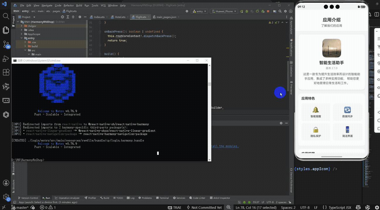
打包
接下来通过打包命令npn run harmony将reactNative的代码打包成为bundle,这样可以进行在开源鸿蒙OpenHarmony中进行使用。

打包之后再将打包后的鸿蒙OpenHarmony文件拷贝到鸿蒙的DevEco-Studio工程目录去:

最后运行效果图如下显示:
本文解析了一个React Native开发的应用介绍页面实现方案,该方案采用模块化设计,通过Flexbox布局构建了包含应用信息卡片、功能特色、权限说明等核心模块的界面。关键技术点包括:使用useState管理模态框状态、实现网格响应式布局、封装统一交互逻辑,并采用纯emoji图标优化性能。文章还提供了向HarmonyOS ArkUI迁移的适配策略,包括组件映射、状态管理转换和模态框实现方案。该实现方案代码轻量、维护性强,为移动应用介绍页开发提供了可复用的跨端解决方案。