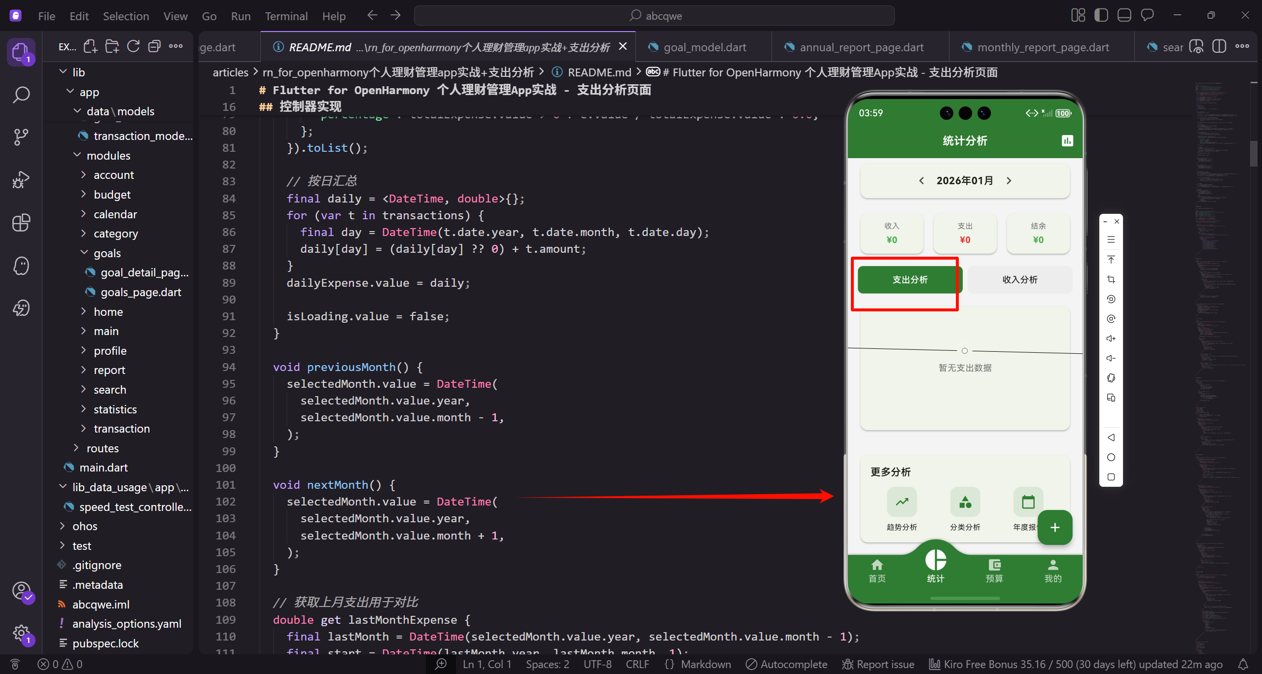
支出分析页面专注于分析用户的支出情况,展示本月总支出、各分类的支出占比和消费趋势。帮助用户了解钱都花在了哪里,为优化支出提供数据支持。
功能设计
支出分析页面包含以下功能:
- 本月总支出金额展示
- 支出构成饼图可视化
- 分类支出明细列表
- 月份切换查看历史数据
- 支出趋势对比
- 支出排行榜
控制器实现
创建 expense_analysis_controller.dart 管理页面状态:
dart
import 'package:get/get.dart';
import '../../core/services/transaction_service.dart';
import '../../core/services/category_service.dart';
import '../../core/services/storage_service.dart';
import '../../data/models/transaction_model.dart';

class ExpenseAnalysisController extends GetxController {
  final _transactionService = Get.find<TransactionService>();
  final _categoryService = Get.find<CategoryService>();
  final _storage = Get.find<StorageService>();
导入必要的依赖包和服务类。ExpenseAnalysisController 继承自 GetxController,负责管理支出分析页面的状态和业务逻辑。通过 Get.find 获取已注册的服务实例,包括交易服务、分类服务和存储服务。这种依赖注入方式让控制器与服务解耦,便于测试和维护。
dart
  final selectedMonth = DateTime.now().obs;
  final totalExpense = 0.0.obs;
  final categoryData = <Map<String, dynamic>>[].obs;
  final dailyExpense = <DateTime, double>{}.obs;
  final isLoading = true.obs;

  String get currency => _storage.currency;

  @override
  void onInit() {
定义响应式变量存储页面状态。selectedMonth 存储当前选择的月份,totalExpense 存储总支出金额,categoryData 存储各分类的支出数据,dailyExpense 存储每日支出数据。isLoading 标识数据加载状态。使用 .obs 后缀创建可观察对象,值改变时自动通知 UI 更新。currency 是 getter,从存储服务获取货币设置。
dart
    super.onInit();
    _loadData();
    ever(selectedMonth, (_) => _loadData());
  }

  void _loadData() {
    isLoading.value = true;

    final start = DateTime(selectedMonth.value.year, selectedMonth.value.month, 1);
    final end = DateTime(selectedMonth.value.year, selectedMonth.value.month + 1, 0);
onInit 生命周期方法在控制器初始化时调用。首先加载数据,然后使用 ever 监听 selectedMonth 变化,当月份改变时自动重新加载数据。_loadData 方法负责加载支出数据。先设置加载状态为 true,然后计算选中月份的起止日期。start 是月初第一天,end 是月末最后一天。
dart
    final transactions = _transactionService
        .getTransactionsByDateRange(start, end)
        .where((t) => t.type == TransactionType.expense)
        .toList();

    totalExpense.value = transactions.fold(0.0, (sum, t) => sum + t.amount);

    // 按分类汇总
    final byCategory = <String, double>{};
从交易服务获取指定日期范围内的交易记录,筛选出支出类型的交易。使用 fold 方法累加所有交易金额得到总支出。创建两个 Map 用于按分类汇总数据:byCategory 存储每个分类的总金额,countByCategory 存储每个分类的交易笔数。这种分组统计是数据分析的基础。
dart
    final countByCategory = <String, int>{};
    for (var t in transactions) {
      byCategory[t.categoryId] = (byCategory[t.categoryId] ?? 0) + t.amount;
      countByCategory[t.categoryId] = (countByCategory[t.categoryId] ?? 0) + 1;
    }

    // 排序并构建数据
    final sorted = byCategory.entries.toList()
      ..sort((a, b) => b.value.compareTo(a.value));
遍历所有交易记录,按分类 ID 累加金额和笔数。使用 ?? 运算符处理首次出现的分类,初始值为 0。将 byCategory 的条目转换为列表并按金额降序排序,这样支出最多的分类会排在前面。级联运算符 ... 让排序操作直接在列表上执行并返回列表本身。
dart
    categoryData.value = sorted.map((e) {
      final category = _categoryService.getCategoryById(e.key);
      return {
        'categoryId': e.key,
        'category': category,
        'amount': e.value,
        'count': countByCategory[e.key] ?? 0,
        'percentage': totalExpense.value > 0 ? e.value / totalExpense.value : 0.0,
      };
    }).toList();
将排序后的数据转换为包含完整信息的 Map 列表。对每个分类,从分类服务获取分类对象,构建包含分类 ID、分类对象、金额、笔数和占比的 Map。percentage 计算该分类占总支出的百分比,如果总支出为 0 则返回 0 避免除零错误。这个数据结构为 UI 展示提供了所需的全部信息。
dart
    // 按日汇总
    final daily = <DateTime, double>{};
    for (var t in transactions) {
      final day = DateTime(t.date.year, t.date.month, t.date.day);
      daily[day] = (daily[day] ?? 0) + t.amount;
    }
    dailyExpense.value = daily;

    isLoading.value = false;
创建 Map 存储每日支出数据。遍历交易记录,将日期时间标准化为只包含年月日的 DateTime 对象,然后累加该日的支出金额。这个数据可用于绘制支出趋势图。将汇总结果赋值给 dailyExpense 响应式变量。最后设置加载状态为 false,通知 UI 数据加载完成。
dart
  }

  void previousMonth() {
    selectedMonth.value = DateTime(
      selectedMonth.value.year,
      selectedMonth.value.month - 1,
    );
  }

  void nextMonth() {
previousMonth 方法切换到上一个月。创建新的 DateTime 对象,月份减 1。DateTime 构造函数会自动处理跨年情况,例如 2024年1月减1会变成2023年12月。selectedMonth 值改变会触发 ever 监听器,自动重新加载数据。nextMonth 方法类似,切换到下一个月。
dart
    selectedMonth.value = DateTime(
      selectedMonth.value.year,
      selectedMonth.value.month + 1,
    );
  }

  // 获取上月支出用于对比
  double get lastMonthExpense {
    final lastMonth = DateTime(selectedMonth.value.year, selectedMonth.value.month - 1);
    final start = DateTime(lastMonth.year, lastMonth.month, 1);
nextMonth 将月份加 1,DateTime 自动处理跨年。lastMonthExpense 是计算属性,获取上月总支出用于环比对比。首先计算上月的日期,然后确定上月的起止日期。这个方法每次访问时都会重新计算,确保数据是最新的。
dart
    final end = DateTime(lastMonth.year, lastMonth.month + 1, 0);

    return _transactionService
        .getTransactionsByDateRange(start, end)
        .where((t) => t.type == TransactionType.expense)
        .fold(0.0, (sum, t) => sum + t.amount);
  }

  // 环比变化
  double get monthOverMonthChange {
计算上月的结束日期。从交易服务获取上月的支出交易,筛选支出类型,累加金额得到上月总支出。这个值用于计算环比变化。monthOverMonthChange 计算属性返回环比变化百分比,反映支出的增长或下降趋势。
dart
    if (lastMonthExpense == 0) return 0;
    return (totalExpense.value - lastMonthExpense) / lastMonthExpense * 100;
  }

  // 日均支出
  double get dailyAverage {
    final daysInMonth = DateTime(
      selectedMonth.value.year,
      selectedMonth.value.month + 1,
      0,
如果上月支出为 0,返回 0 避免除零错误。否则计算环比变化:(本月支出 - 上月支出) / 上月支出 * 100,得到百分比。正值表示支出增加,负值表示支出减少。dailyAverage 计算属性返回日均支出。首先获取选中月份的天数,使用 DateTime 构造函数的技巧:月份加 1,日期设为 0,会得到上月最后一天,其 day 属性就是天数。
dart
    ).day;
    final now = DateTime.now();
    final currentDay = selectedMonth.value.year == now.year &&
            selectedMonth.value.month == now.month
        ? now.day
        : daysInMonth;
    return totalExpense.value / currentDay;
  }
}
获取当前日期。如果选中的是当前月份,使用当前日期作为天数(因为本月还没结束);否则使用整月天数。最后用总支出除以天数得到日均支出。这个指标帮助用户了解平均每天花费多少钱,便于控制日常开支。
页面实现
创建 expense_analysis_page.dart:
dart
import 'package:flutter/material.dart';
import 'package:flutter_screenutil/flutter_screenutil.dart';
import 'package:get/get.dart';
import 'package:fl_chart/fl_chart.dart';
import 'package:intl/intl.dart';
import 'expense_analysis_controller.dart';

const _expenseColor = Color(0xFFE53935);
const _textSecondary = Color(0xFF757575);

class ExpenseAnalysisPage extends StatelessWidget {
  const ExpenseAnalysisPage({super.key});

  @override
  Widget build(BuildContext context) {
    final controller = Get.put(ExpenseAnalysisController());

    return Scaffold(
      appBar: AppBar(
        title: const Text('支出分析'),
        centerTitle: true,
      ),
      body: Obx(() {
        if (controller.isLoading.value) {
          return const Center(child: CircularProgressIndicator());
        }
        return SingleChildScrollView(
          padding: EdgeInsets.all(16.w),
          child: Column(
            children: [
              _buildMonthSelector(controller),
              SizedBox(height: 16.h),
              _buildTotalCard(controller),
              SizedBox(height: 16.h),
              _buildStatsRow(controller),
              SizedBox(height: 16.h),
              _buildChartCard(controller),
              SizedBox(height: 16.h),
              _buildCategoryList(controller),
            ],
          ),
        );
      }),
    );
  }
}
月份选择器
dart
Widget _buildMonthSelector(ExpenseAnalysisController controller) {
  return Obx(() => Container(
    padding: EdgeInsets.symmetric(vertical: 8.h),
    child: Row(
      mainAxisAlignment: MainAxisAlignment.center,
      children: [
        IconButton(
          icon: const Icon(Icons.chevron_left),
          onPressed: controller.previousMonth,
_buildMonthSelector 方法构建月份选择器组件。Obx 包裹确保月份变化时自动更新显示。Container 添加垂直 8 像素内边距。Row 水平居中排列左箭头、月份显示和右箭头。IconButton 显示左箭头图标,点击时调用 previousMonth 方法切换到上一个月。这种左右箭头的设计符合用户对日期选择的认知习惯。
dart
        ),
        GestureDetector(
          onTap: () => _showMonthPicker(controller),
          child: Container(
            padding: EdgeInsets.symmetric(horizontal: 16.w, vertical: 8.h),
            decoration: BoxDecoration(
              color: _expenseColor.withOpacity(0.1),
              borderRadius: BorderRadius.circular(20.r),
            ),
GestureDetector 包裹月份显示区域,点击时弹出月份选择器。Container 添加水平 16 像素、垂直 8 像素的内边距。BoxDecoration 定义样式,背景色为支出红色的 10% 透明度,圆角半径 20 像素。这个圆角矩形背景让月份显示区域更突出,提示用户可以点击。
dart
            child: Row(
              children: [
                Icon(Icons.calendar_today, size: 16.sp, color: _expenseColor),
                SizedBox(width: 8.w),
                Text(
                  DateFormat('yyyy年MM月').format(controller.selectedMonth.value),
                  style: TextStyle(
                    fontSize: 16.sp,
                    fontWeight: FontWeight.w600,
Row 水平排列日历图标和月份文字。日历图标大小 16 像素,颜色为支出红色。SizedBox 添加 8 像素间距。Text 使用 DateFormat 格式化显示月份,格式为"yyyy年MM月",例如"2024年01月"。字体大小 16 像素,中等粗细,颜色为支出红色。这种格式化显示让日期更易读。
dart
                    color: _expenseColor,
                  ),
                ),
              ],
            ),
          ),
        ),
        IconButton(
          icon: const Icon(Icons.chevron_right),
          onPressed: controller.nextMonth,
        ),
      ],
    ),
  ));
}
完成月份显示区域的构建。IconButton 显示右箭头图标,点击时调用 nextMonth 方法切换到下一个月。整个月份选择器的设计简洁直观,用户可以通过左右箭头快速切换月份,也可以点击中间区域打开日期选择器跳转到任意月份。
dart
void _showMonthPicker(ExpenseAnalysisController controller) {
  showDatePicker(
    context: Get.context!,
    initialDate: controller.selectedMonth.value,
    firstDate: DateTime(2020),
    lastDate: DateTime.now(),
    initialDatePickerMode: DatePickerMode.year,
  ).then((date) {
_showMonthPicker 方法显示日期选择器对话框。使用 Flutter 内置的 showDatePicker 函数。context 从 GetX 获取,initialDate 设置为当前选中的月份。firstDate 设置为 2020年,限制最早可选日期。lastDate 设置为当前日期,不能选择未来月份。initialDatePickerMode 设置为 year,让选择器默认显示年份视图,方便快速选择月份。
dart
    if (date != null) {
      controller.selectedMonth.value = date;
    }
  });
}
showDatePicker 返回 Future,使用 then 处理选择结果。如果用户选择了日期(不是取消),将选中的日期赋值给 selectedMonth。这会触发 ever 监听器,自动重新加载该月份的数据。日期选择器提供了快速跳转到任意月份的能力,提升用户体验。
总支出卡片
dart
Widget _buildTotalCard(ExpenseAnalysisController controller) {
  return Card(
    elevation: 2,
    shape: RoundedRectangleBorder(
      borderRadius: BorderRadius.circular(16.r),
    ),
    child: Container(
      width: double.infinity,
      padding: EdgeInsets.all(24.w),
      decoration: BoxDecoration(
_buildTotalCard 方法构建总支出卡片。Card 组件提供卡片样式,elevation 设置阴影深度为 2。shape 定义圆角矩形边框,圆角半径 16 像素。Container 宽度设置为 double.infinity 占满父容器宽度,padding 添加 24 像素内边距。BoxDecoration 定义容器装饰样式,使用渐变背景增强视觉效果。
dart
        gradient: LinearGradient(
          colors: [_expenseColor, _expenseColor.withOpacity(0.8)],
          begin: Alignment.topLeft,
          end: Alignment.bottomRight,
        ),
        borderRadius: BorderRadius.circular(16.r),
      ),
      child: Column(
        children: [
          Row(
LinearGradient 创建线性渐变,从左上到右下,颜色从完全不透明的支出红色渐变到 80% 透明度。这种渐变效果让卡片更有层次感和现代感。borderRadius 设置圆角与 Card 保持一致。Column 垂直排列卡片内容,包括标题、金额和笔数。
dart
            mainAxisAlignment: MainAxisAlignment.center,
            children: [
              Icon(Icons.trending_down, color: Colors.white70, size: 20.sp),
              SizedBox(width: 8.w),
              Text(
                '本月总支出',
                style: TextStyle(
                  fontSize: 14.sp,
                  color: Colors.white70,
Row 水平居中排列图标和标题。trending_down 图标表示支出趋势,颜色为白色 70% 透明度,大小 20 像素。SizedBox 添加 8 像素间距。Text 显示"本月总支出"标题,字体大小 14 像素,颜色为白色 70% 透明度。在深色背景上使用半透明白色文字,视觉效果柔和舒适。
dart
                ),
              ),
            ],
          ),
          SizedBox(height: 12.h),
          Obx(() => Text(
            '${controller.currency}${controller.totalExpense.value.toStringAsFixed(2)}',
            style: TextStyle(
              fontSize: 36.sp,
              fontWeight: FontWeight.bold,
完成标题行。SizedBox 添加 12 像素垂直间距。Obx 包裹金额文本,确保总支出变化时自动更新。Text 显示货币符号和金额,保留两位小数。字体大小 36 像素,加粗显示,这是卡片的视觉焦点。大号字体让用户一眼就能看到本月花了多少钱。
dart
              color: Colors.white,
            ),
          )),
          SizedBox(height: 8.h),
          Obx(() => Text(
            '共 ${controller.categoryData.fold(0, (sum, item) => sum + (item['count'] as int))} 笔支出',
            style: TextStyle(
              fontSize: 12.sp,
              color: Colors.white70,
            ),
金额文字颜色为纯白色,在渐变背景上清晰可见。SizedBox 添加 8 像素间距。Obx 包裹笔数文本,确保数据变化时自动更新。使用 fold 方法累加所有分类的交易笔数,显示"共 X 笔支出"。字体大小 12 像素,颜色为白色 70% 透明度。这个辅助信息让用户了解支出的频率。
dart
          )),
        ],
      ),
    ),
  );
}
完成总支出卡片的构建。整个卡片使用红色渐变背景和白色文字,视觉上强调支出的警示性质。大号金额数字是视觉焦点,标题和笔数作为辅助信息。这种设计让用户快速了解本月的支出总额和交易频率,为后续的详细分析提供概览。
统计数据行
dart
Widget _buildStatsRow(ExpenseAnalysisController controller) {
  return Row(
    children: [
      Expanded(
        child: _buildStatCard(
          '日均支出',
          controller.dailyAverage,
          Icons.calendar_view_day,
          controller.currency,
        ),
_buildStatsRow 方法构建统计数据行,并排显示两个统计卡片。Row 水平排列子组件。第一个 Expanded 让日均支出卡片占据一半宽度。_buildStatCard 方法创建统计卡片,传入标题"日均支出"、日均金额、日历图标和货币符号。日均支出帮助用户了解平均每天花费多少钱。
dart
      ),
      SizedBox(width: 12.w),
      Expanded(
        child: _buildStatCard(
          '环比变化',
          controller.monthOverMonthChange,
          controller.monthOverMonthChange >= 0
              ? Icons.arrow_upward
              : Icons.arrow_downward,
          '%',
          isPercentage: true,
SizedBox 在两个卡片之间添加 12 像素间距。第二个 Expanded 让环比变化卡片占据另一半宽度。环比变化卡片显示与上月的对比,根据值的正负选择向上或向下箭头图标。后缀为百分号,isPercentage 参数设置为 true 表示这是百分比数据。环比变化帮助用户了解支出趋势。
dart
        ),
      ),
    ],
  );
}

Widget _buildStatCard(
  String label,
  double value,
  IconData icon,
  String suffix, {
  bool isPercentage = false,
}) {
完成统计数据行的构建。_buildStatCard 方法创建单个统计卡片。接收标题、数值、图标、后缀和是否为百分比五个参数。isPercentage 是可选命名参数,默认为 false。这个方法可以复用来创建不同类型的统计卡片,提高代码复用性。
dart
  final color = isPercentage
      ? (value >= 0 ? _expenseColor : Colors.green)
      : _textSecondary;

  return Card(
    shape: RoundedRectangleBorder(
      borderRadius: BorderRadius.circular(12.r),
    ),
    child: Padding(
      padding: EdgeInsets.all(16.w),
根据是否为百分比和值的正负确定颜色。如果是百分比,正值用红色(支出增加是坏事),负值用绿色(支出减少是好事);否则用次要文本灰色。Card 组件提供卡片样式,圆角半径 12 像素。Padding 为卡片内容添加 16 像素内边距。
dart
      child: Column(
        children: [
          Row(
            mainAxisAlignment: MainAxisAlignment.center,
            children: [
              Icon(icon, size: 16.sp, color: color),
              SizedBox(width: 4.w),
              Text(
                label,
                style: TextStyle(fontSize: 12.sp, color: _textSecondary),
Column 垂直排列标题和数值。Row 水平居中排列图标和标题文字。图标大小 16 像素,颜色根据前面的逻辑确定。SizedBox 添加 4 像素间距。Text 显示标题,字体大小 12 像素,颜色为次要文本灰色。标题和图标组合让用户快速理解这个统计项的含义。
dart
              ),
            ],
          ),
          SizedBox(height: 8.h),
          Text(
            isPercentage
                ? '${value >= 0 ? '+' : ''}${value.toStringAsFixed(1)}$suffix'
                : '$suffix${value.toStringAsFixed(2)}',
            style: TextStyle(
              fontSize: 18.sp,
              fontWeight: FontWeight.bold,
完成标题行。SizedBox 添加 8 像素垂直间距。Text 显示数值,根据是否为百分比使用不同格式。百分比格式:正值前加"+"号,保留一位小数,后缀为"%";普通格式:前缀为货币符号,保留两位小数。字体大小 18 像素,加粗显示,这是卡片的重点信息。
dart
              color: isPercentage ? color : Colors.black87,
            ),
          ),
        ],
      ),
    ),
  );
}
数值颜色根据类型确定。如果是百分比,使用前面计算的颜色(红色或绿色);否则使用黑色 87% 透明度。完成统计卡片的构建。这个设计让统计数据清晰易读,颜色编码帮助用户快速判断趋势好坏。两个统计卡片并排显示,充分利用屏幕宽度,提供更多有价值的信息。
支出构成图表
dart
Widget _buildChartCard(ExpenseAnalysisController controller) {
  return Obx(() {
    if (controller.categoryData.isEmpty) {
      return Card(
        shape: RoundedRectangleBorder(
          borderRadius: BorderRadius.circular(12.r),
        ),
        child: Padding(
          padding: EdgeInsets.all(32.w),
          child: Column(
_buildChartCard 方法构建支出构成图表卡片。Obx 包裹确保数据变化时自动更新。首先检查是否有数据,如果 categoryData 为空,显示空状态提示。Card 组件提供卡片样式,圆角半径 12 像素。Padding 添加 32 像素内边距。Column 垂直排列空状态的图标和文字。
dart
            children: [
              Icon(Icons.pie_chart_outline, size: 64.sp, color: Colors.grey[300]),
              SizedBox(height: 16.h),
              Text(
                '暂无支出数据',
                style: TextStyle(color: _textSecondary, fontSize: 16.sp),
              ),
              SizedBox(height: 8.h),
              Text(
显示饼图轮廓图标,大小 64 像素,颜色为浅灰色,表示空状态。SizedBox 添加 16 像素间距。Text 显示"暂无支出数据"提示,字体大小 16 像素,颜色为次要文本灰色。再添加 8 像素间距。第二个 Text 显示引导文字,鼓励用户开始记账。
dart
                '记录您的第一笔支出吧',
                style: TextStyle(color: _textSecondary.withOpacity(0.7), fontSize: 12.sp),
              ),
            ],
          ),
        ),
      );
    }

    return Card(
      shape: RoundedRectangleBorder(
        borderRadius: BorderRadius.circular(12.r),
引导文字字体较小,颜色更淡,视觉上弱化。完成空状态的构建。如果有数据,返回包含饼图的卡片。Card 组件提供卡片样式,圆角半径 12 像素。这种空状态设计友好地引导新用户开始使用应用。
dart
      ),
      child: Padding(
        padding: EdgeInsets.all(16.w),
        child: Column(
          crossAxisAlignment: CrossAxisAlignment.start,
          children: [
            Row(
              children: [
                Icon(Icons.pie_chart, color: _expenseColor, size: 20.sp),
                SizedBox(width: 8.w),
Padding 为卡片内容添加 16 像素内边距。Column 垂直排列标题、图表和图例,crossAxisAlignment 设置为 start 让内容左对齐。Row 水平排列图标和标题。饼图图标大小 20 像素,颜色为支出红色。SizedBox 添加 8 像素间距。
dart
                Text(
                  '支出构成',
                  style: TextStyle(
                    fontSize: 16.sp,
                    fontWeight: FontWeight.w600,
                  ),
                ),
              ],
            ),
            SizedBox(height: 24.h),
            SizedBox(
Text 显示"支出构成"标题,字体大小 16 像素,中等粗细。完成标题行。SizedBox 添加 24 像素垂直间距,为图表留出空间。第二个 SizedBox 设置图表容器的高度为 200 像素,确保饼图有足够的显示空间。
dart
              height: 200.h,
              child: PieChart(
                PieChartData(
                  sections: controller.categoryData.take(6).map((item) {
                    final category = item['category'];
                    final percentage = item['percentage'] as double;
                    return PieChartSectionData(
                      value: item['amount'] as double,
                      title: percentage >= 0.05
                          ? '${(percentage * 100).toStringAsFixed(0)}%'
PieChart 是 fl_chart 库提供的饼图组件。PieChartData 定义图表数据。sections 从 categoryData 取前 6 个分类(避免图表过于拥挤)。map 方法遍历每个分类,提取分类对象和占比。PieChartSectionData 定义饼图的一个扇区。value 是金额,title 是显示的文字,只有占比大于等于 5% 才显示百分比,避免小扇区文字重叠。
dart
                          : '',
                      color: category?.color ?? Colors.grey,
                      radius: 60.r,
                      titleStyle: TextStyle(
                        fontSize: 11.sp,
                        color: Colors.white,
                        fontWeight: FontWeight.bold,
                      ),
                    );
                  }).toList(),
如果占比小于 5%,title 为空字符串不显示。color 使用分类的颜色,如果分类为空则用灰色。radius 设置扇区半径为 60 像素。titleStyle 定义标题样式,字体大小 11 像素,白色,加粗。这些参数共同决定了饼图的视觉效果。
dart
                  sectionsSpace: 2,
                  centerSpaceRadius: 50.r,
                  centerSpaceColor: Colors.white,
                ),
              ),
            ),
            SizedBox(height: 16.h),
            _buildLegend(controller),
          ],
        ),
      ),
    );
sectionsSpace 设置扇区之间的间隙为 2 像素,让各扇区分隔更清晰。centerSpaceRadius 设置中心空白区域半径为 50 像素,创建环形图效果。centerSpaceColor 设置中心颜色为白色。完成饼图配置。SizedBox 添加 16 像素间距。_buildLegend 方法创建图例,说明各颜色代表的分类。
dart
  });
}

Widget _buildLegend(ExpenseAnalysisController controller) {
  return Wrap(
    spacing: 16.w,
    runSpacing: 8.h,
    children: controller.categoryData.take(6).map((item) {
      final category = item['category'];
      return Row(
        mainAxisSize: MainAxisSize.min,
完成图表卡片的构建。_buildLegend 方法创建图例组件。Wrap 是自动换行的布局组件,spacing 设置水平间距 16 像素,runSpacing 设置垂直间距 8 像素。从 categoryData 取前 6 个分类(与饼图一致)。map 方法遍历每个分类,提取分类对象。Row 的 mainAxisSize 设置为 min,让图例项宽度自适应内容。
dart
        children: [
          Container(
            width: 12.w,
            height: 12.w,
            decoration: BoxDecoration(
              color: category?.color ?? Colors.grey,
              shape: BoxShape.circle,
            ),
          ),
          SizedBox(width: 4.w),
Container 创建颜色指示器,宽高都是 12 像素。BoxDecoration 定义装饰,颜色使用分类的颜色,shape 设置为圆形。这个小圆点与饼图中的颜色对应。SizedBox 在圆点和文字之间添加 4 像素间距。
dart
          Text(
            category?.name ?? '未知',
            style: TextStyle(fontSize: 12.sp, color: _textSecondary),
          ),
        ],
      );
    }).toList(),
  );
}
Text 显示分类名称,如果分类为空显示"未知"。字体大小 12 像素,颜色为次要文本灰色。完成单个图例项的构建。Wrap 会自动排列所有图例项,必要时换行。图例让用户清楚知道饼图中各颜色代表的分类,提升图表的可读性。整个图表卡片通过饼图和图例的组合,直观展示支出构成。
分类支出列表
dart
Widget _buildCategoryList(ExpenseAnalysisController controller) {
  return Obx(() {
    if (controller.categoryData.isEmpty) {
      return const SizedBox.shrink();
    }

    return Card(
      shape: RoundedRectangleBorder(
        borderRadius: BorderRadius.circular(12.r),
      ),
_buildCategoryList 方法构建分类支出列表。Obx 包裹确保数据变化时自动更新。首先检查是否有数据,如果为空返回 SizedBox.shrink(),这是一个零尺寸的占位组件,不占用任何空间。如果有数据,返回包含列表的卡片。Card 组件提供卡片样式,圆角半径 12 像素。
dart
      child: Padding(
        padding: EdgeInsets.all(16.w),
        child: Column(
          crossAxisAlignment: CrossAxisAlignment.start,
          children: [
            Row(
              mainAxisAlignment: MainAxisAlignment.spaceBetween,
              children: [
                Row(
                  children: [
Padding 为卡片内容添加 16 像素内边距。Column 垂直排列标题和列表项,crossAxisAlignment 设置为 start 让内容左对齐。第一个 Row 在标题和分类数量之间留出空间,mainAxisAlignment 设置为 spaceBetween。第二个 Row 水平排列图标和标题文字。
dart
                    Icon(Icons.list, color: _expenseColor, size: 20.sp),
                    SizedBox(width: 8.w),
                    Text(
                      '支出明细',
                      style: TextStyle(
                        fontSize: 16.sp,
                        fontWeight: FontWeight.w600,
                      ),
                    ),
                  ],
列表图标大小 20 像素,颜色为支出红色。SizedBox 添加 8 像素间距。Text 显示"支出明细"标题,字体大小 16 像素,中等粗细。完成标题部分。这个标题让用户知道下面是详细的分类支出列表。
dart
                ),
                Text(
                  '共 ${controller.categoryData.length} 个分类',
                  style: TextStyle(fontSize: 12.sp, color: _textSecondary),
                ),
              ],
            ),
            SizedBox(height: 16.h),
            ...controller.categoryData.asMap().entries.map((entry) {
              final index = entry.key;
Text 显示分类总数,例如"共 5 个分类",字体大小 12 像素,颜色为次要文本灰色。这个统计信息让用户了解支出涉及多少个分类。SizedBox 添加 16 像素间距。使用扩展运算符 ... 将列表项展开到 Column 的 children 中。asMap().entries 将列表转换为带索引的条目,提取索引和数据项。
dart
              final item = entry.value;
              final category = item['category'];
              final amount = item['amount'] as double;
              final count = item['count'] as int;
              final percentage = item['percentage'] as double;

              return Column(
                children: [
                  _buildCategoryItem(
                    index + 1,
从数据项中提取各个字段:分类对象、金额、笔数和占比。这些数据将传递给 _buildCategoryItem 方法构建列表项。Column 包裹列表项和分隔线。_buildCategoryItem 方法创建单个分类项,第一个参数是排名(索引加 1,因为索引从 0 开始)。
dart
                    category,
                    amount,
                    count,
                    percentage,
                    controller.currency,
                  ),
                  if (index < controller.categoryData.length - 1)
                    Divider(height: 24.h),
                ],
              );
            }),
传递分类对象、金额、笔数、占比和货币符号给 _buildCategoryItem。使用 if 条件判断,只在非最后一项后面添加分隔线。Divider 是水平分隔线,height 设置为 24 像素(包含上下间距)。这样列表项之间有清晰的分隔,但最后一项后面没有多余的分隔线。
dart
          ],
        ),
      ),
    );
  });
}

Widget _buildCategoryItem(
  int rank,
  dynamic category,
  double amount,
  int count,
  double percentage,
  String currency,
) {
完成分类列表的构建。_buildCategoryItem 方法创建单个分类列表项。接收排名、分类对象、金额、笔数、占比和货币符号六个参数。这个方法将这些数据组织成一个清晰的列表项,展示分类的详细支出信息。
dart
  return Row(
    children: [
      // 排名
      Container(
        width: 24.w,
        height: 24.w,
        decoration: BoxDecoration(
          color: rank <= 3 ? _expenseColor : Colors.grey[200],
          shape: BoxShape.circle,
        ),
Row 水平排列排名、图标、名称和金额。Container 创建排名徽章,宽高都是 24 像素。BoxDecoration 定义装饰,前三名使用支出红色背景,其他使用浅灰色背景,shape 设置为圆形。这种颜色区分让前三名更突出,用户一眼就能看到主要支出去向。
dart
        child: Center(
          child: Text(
            '$rank',
            style: TextStyle(
              fontSize: 12.sp,
              color: rank <= 3 ? Colors.white : _textSecondary,
              fontWeight: FontWeight.bold,
            ),
          ),
        ),
      ),
      SizedBox(width: 12.w),
      // 分类图标
Center 让排名数字居中显示。Text 显示排名数字,字体大小 12 像素,前三名用白色文字,其他用次要文本灰色,加粗显示。完成排名徽章。SizedBox 添加 12 像素间距。接下来是分类图标部分。
dart
      CircleAvatar(
        radius: 18.r,
        backgroundColor: (category?.color ?? Colors.grey).withOpacity(0.2),
        child: Icon(
          category?.icon ?? Icons.help,
          size: 18.sp,
          color: category?.color ?? Colors.grey,
        ),
      ),
      SizedBox(width: 12.w),
      // 分类名称和笔数
CircleAvatar 创建圆形头像,半径 18 像素,背景色为分类颜色的 20% 透明度。Icon 显示分类图标,大小 18 像素,颜色为分类颜色。如果分类为空,使用问号图标和灰色。这个图标让用户快速识别分类。SizedBox 添加 12 像素间距。
dart
      Expanded(
        child: Column(
          crossAxisAlignment: CrossAxisAlignment.start,
          children: [
            Text(
              category?.name ?? '未知',
              style: TextStyle(
                fontSize: 14.sp,
                fontWeight: FontWeight.w500,
              ),
Expanded 让名称区域占据剩余空间。Column 垂直排列分类名称和笔数,crossAxisAlignment 设置为 start 左对齐。Text 显示分类名称,如果为空显示"未知",字体大小 14 像素,中等粗细。分类名称是列表项的主要信息。
dart
            ),
            Text(
              '$count 笔',
              style: TextStyle(
                fontSize: 12.sp,
                color: _textSecondary,
              ),
            ),
          ],
        ),
      ),
      // 金额和占比
      Column(
Text 显示交易笔数,例如"5 笔",字体大小 12 像素,颜色为次要文本灰色。这个辅助信息让用户了解该分类的交易频率。完成名称区域。Column 垂直排列金额和占比,右对齐显示。
dart
        crossAxisAlignment: CrossAxisAlignment.end,
        children: [
          Text(
            '$currency${amount.toStringAsFixed(2)}',
            style: TextStyle(
              fontSize: 14.sp,
              fontWeight: FontWeight.bold,
              color: _expenseColor,
            ),
          ),
          Text(
crossAxisAlignment 设置为 end 让文字右对齐。Text 显示金额,包含货币符号,保留两位小数。字体大小 14 像素,加粗,颜色为支出红色。金额是列表项的关键数据,使用醒目的颜色和加粗字体突出显示。
dart
            '${(percentage * 100).toStringAsFixed(1)}%',
            style: TextStyle(
              fontSize: 12.sp,
              color: _textSecondary,
            ),
          ),
        ],
      ),
    ],
  );
}
Text 显示占比百分比,保留一位小数,例如"25.5%"。字体大小 12 像素,颜色为次要文本灰色。占比让用户了解该分类在总支出中的比重。完成分类列表项的构建。整个列表项通过排名、图标、名称、笔数、金额和占比的组合,全面展示每个分类的支出情况,帮助用户清晰了解钱都花在了哪里。
设计要点
支出分析页面的设计考虑:
- 使用红色主题强调支出的警示性质
- 日均支出和环比变化帮助用户了解消费趋势
- 饼图直观展示各分类占比
- 排名显示让用户快速了解主要支出去向
- 支持月份切换查看历史数据
- 环比上升用红色,下降用绿色(支出减少是好事)
性能优化
- 使用
Obx包裹需要响应式更新的部分 - 数据计算在控制器中完成,避免在 build 中重复计算
- 图表使用 fl_chart 库,性能优秀
- 饼图最多显示6个分类,避免过于拥挤
小结
支出分析页面帮助用户了解钱都花在了哪里,通过直观的图表和详细的列表,用户可以清晰地看到自己的消费结构,为优化支出提供数据支持。下一篇将实现收入分析页面。
欢迎加入 OpenHarmony 跨平台开发社区,获取更多技术资源和交流机会: