数学建模从入门到入土 matplotlib例图
个人导航
知乎:https://www.zhihu.com/people/byzh_rc
CSDN:https://blog.csdn.net/qq_54636039
注:本文仅对所述内容做了框架性引导,具体细节可查询其余相关资料or源码
参考文章:https://www.matplotlib.net/stable/gallery/index.html
文章目录
- [数学建模从入门到入土 matplotlib例图](#[数学建模从入门到入土] matplotlib例图)
- 个人导航
- 全局风格
- [折线 Line plot](#折线 Line plot)
- [散点+图例 Scatter plot with a legend](#散点+图例 Scatter plot with a legend)
- [分组柱状图 Grouped Bar](#分组柱状图 Grouped Bar)
- [堆叠柱状图 Stacked Bar](#堆叠柱状图 Stacked Bar)
- [误差棒限值筛选 Errorbar limit selection](#误差棒限值筛选 Errorbar limit selection)
- [误差棒降采样 Errorbar subsampling](#误差棒降采样 Errorbar subsampling)
- [填充带 fill_between](#填充带 fill_between)
- [带注释的热力图 Annotated heatmap](#带注释的热力图 Annotated heatmap)
- 各种插值方法的imshow
- [可视化矩阵 matshow](#可视化矩阵 matshow)
- [色条 colorbar](#色条 colorbar)
- [等高线 contour](#等高线 contour)
- [填充等高线 contourf](#填充等高线 contourf)
- [网格场 pcolormesh](#网格场 pcolormesh)
- [直方图 Histograms](#直方图 Histograms)
- 箱线图
- 小提琴图
- [置信椭圆图 Confidence Ellipse](#置信椭圆图 Confidence Ellipse)
全局风格
py
plt.rcParams.update({
    "figure.dpi": 120,
    "savefig.dpi": 300,
    "font.size": 11,
    "axes.titlesize": 12,
    "axes.labelsize": 11,
    "legend.fontsize": 10,
    "xtick.labelsize": 10,
    "ytick.labelsize": 10,
    "axes.grid": True,          # 轻微网格,利于读数
    "grid.alpha": 0.25,
    "axes.spines.top": False,
    "axes.spines.right": False,
})
折线 Line plot
时间序列、收敛曲线、对比方法曲线(最核心)
py
import matplotlib.pyplot as plt
import numpy as np

t = np.linspace(-10, 10, 100)
sig = 1 / (1 + np.exp(-t))

fig, ax = plt.subplots()
# 黑色虚线
ax.axhline(y=0, color="black", linestyle="--")
# 黑色点线
ax.axhline(y=0.5, color="black", linestyle=":")
# 黑色虚线
ax.axhline(y=1.0, color="black", linestyle="--")
# 灰色参考线
ax.axvline(color="grey")
# 通过点(0,0.5)、斜率为0.25的黑色虚线
# linestyle=(0, (5, 5))表示使用自定义的虚线样式:5个单位的线段,5个单位的间隔
ax.axline((0, 0.5), slope=0.25, color="black", linestyle=(0, (5, 5)))

ax.plot(t, sig, linewidth=2, label=r"$\sigma(t) = \frac{1}{1 + e^{-t}}$")
ax.set(xlim=(-10, 10), xlabel="t")
ax.legend(fontsize=14)
plt.show()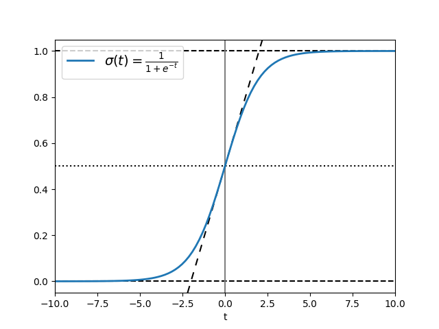
散点+图例 Scatter plot with a legend
相关性、聚类可视化、拟合效果
py
import matplotlib.pyplot as plt
import numpy as np

np.random.seed(19680801)

fig, ax = plt.subplots()
for color in ['tab:blue', 'tab:orange', 'tab:green']:
    n = 750
    x, y = np.random.rand(2, n)
    # 设置每个散点的大小/面积(0~200)
    scale = 200.0 * np.random.rand(n)
    # alpha设置透明度为0.3
    # edgecolors设置边框颜色
    ax.scatter(x, y, c=color, s=scale, label=color, alpha=0.3, edgecolors='none')

ax.legend()
ax.grid(True)

plt.show()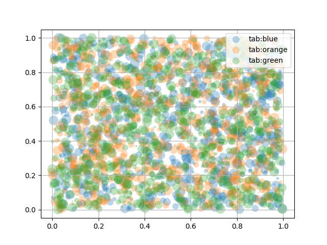
分组柱状图 Grouped Bar
消融实验、贡献占比、方案对比
py
import matplotlib.pyplot as plt
import numpy as np


def plot_grouped_bars(
    species,
    group_means,
    ylabel="Length (mm)",
    title="Grouped bar chart",
    ylim=None,
    layout="constrained",
    legend_loc="upper left",
    legend_ncols=None,
    bar_label_padding=3,
):
    """
    绘制分组柱状图

    species : sequence[str]
        x轴类别,如 ("Adelie", "Chinstrap", "Gentoo")
    group_means : dict[str, sequence[float]]
        多组数据,key 是组名(legend),value 是每个 species 的数值
        要求每个 value 长度 == len(species)
    ylabel, title : str
        y轴标签与标题
    ylim : tuple[float, float] | None
        y轴范围,不传则自动
    layout : str
        传给 plt.subplots(layout=...)
    legend_loc : str
        图例位置
    legend_ncols : int | None
        图例列数,不传则自动(<=3 用组数,否则 3)
    bar_label_padding : float
        bar_label 的 padding
    """
    species = list(species)
    x = np.arange(len(species))

    keys = list(group_means.keys())
    n_groups = len(keys)
    if n_groups == 0:
        raise ValueError("group_means 不能为空")

    # 检查数据长度一致
    for k in keys:
        vals = group_means[k]
        if len(vals) != len(species):
            raise ValueError(f"组 '{k}' 的数据长度为 {len(vals)},但 species 长度为 {len(species)}")

    # 自适应:总宽度保持 ~0.8,每组柱子均分
    total_width = 0.8
    width = total_width / n_groups

    fig, ax = plt.subplots(layout=layout)

    multiplier = 0
    for attribute, measurement in group_means.items():
        offset = width * multiplier
        rects = ax.bar(x + offset, measurement, width, label=attribute)
        ax.bar_label(rects, padding=bar_label_padding)
        multiplier += 1

    ax.set_ylabel(ylabel)
    ax.set_title(title)

    # x 轴刻度放在每个分组的中心
    ax.set_xticks(x + total_width / 2 - width / 2, species)

    if legend_ncols is None:
        legend_ncols = n_groups if n_groups <= 3 else 3
    ax.legend(loc=legend_loc, ncols=legend_ncols)

    if ylim is not None:
        ax.set_ylim(*ylim)

    return fig, ax


if __name__ == "__main__":
    # 例1
    species = ("Adelie", "Chinstrap", "Gentoo")
    penguin_means = {
        "Bill Depth": (18.35, 18.43, 14.98),
        "Bill Length": (38.79, 48.83, 47.50),
        "Flipper Length": (189.95, 195.82, 217.19),
    }

    plot_grouped_bars(
        species,
        penguin_means,
        ylabel="Length (mm)",
        title="Penguin attributes by species",
        ylim=(0, 250),
    )
    plt.show()

    # 例2
    species = ("awa", "qwq", "ovo", "ovO", "Ovo")
    penguin_means = {
        "Bill Depth": (18.35, 18.43, 14.98, 18.35, 17.35),
        "Bill Length": (38.79, 48.83, 47.50, 48.83, 47.35),
        "Flipper Length": (189.95, 195.82, 217.19, 230.05, 220.05),
        "Body Mass": (37.5, 38, 32.5, 37.5, 32.5),
        "Sex": (100, 0, 100, 0, 100),
        "Island": (0, 90, 0, 90, 0),
    }

    plot_grouped_bars(
        species,
        penguin_means,
        ylabel="Length (mm)",
        title="Penguin attributes by species",
        ylim=(0, 250),
    )
    plt.show()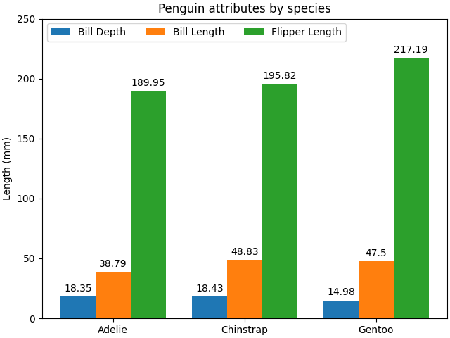
堆叠柱状图 Stacked Bar
消融实验、贡献占比、方案对比
py
import matplotlib.pyplot as plt
import numpy as np


def plot_stacked_bars(
    categories,
    stacked_counts,
    width=0.5,
    title="Stacked bar chart",
    legend_loc="upper right",
    layout=None,              # 你原来没用 layout,这里给个可选
):
    """
    绘制堆叠柱状图(自适应多组堆叠数据)

    categories : sequence[str]
        x轴类别,例如你的 species(可带换行/latex)
    stacked_counts : dict[str, array-like]
        堆叠段,key 是段名(legend),value 是每个 category 的计数
        要求每个 value 长度 == len(categories)
    width : float
        柱宽
    title : str
        标题
    legend_loc : str
        图例位置
    layout : str | None
        传给 plt.subplots(layout=...),不传则保持默认

    """
    categories = list(categories)
    n = len(categories)
    if n == 0:
        raise ValueError("categories 不能为空")

    keys = list(stacked_counts.keys())
    if len(keys) == 0:
        raise ValueError("stacked_counts 不能为空")

    # 统一成 numpy 数组并检查长度
    counts = {}
    for k in keys:
        v = np.asarray(stacked_counts[k])
        if v.shape[0] != n:
            raise ValueError(f"段 '{k}' 的长度为 {v.shape[0]},但 categories 长度为 {n}")
        counts[k] = v

    fig, ax = plt.subplots(layout=layout) if layout is not None else plt.subplots()

    bottom = np.zeros(n)
    for label, vals in counts.items():
        ax.bar(categories, vals, width, label=label, bottom=bottom)
        bottom += vals

    ax.set_title(title)
    ax.legend(loc=legend_loc)
    return fig, ax


if __name__ == "__main__":
    # 例1
    species = (
        "Adelie\n $\\mu=$3700.66g",
        "Chinstrap\n $\\mu=$3733.09g",
        "Gentoo\n $\\mu=5076.02g$",
    )
    weight_counts = {
        "Below": np.array([70, 31, 58]),
        "Above": np.array([82, 37, 66]),
    }

    plot_stacked_bars(
        species,
        weight_counts,
        width=0.5,
        title="Number of penguins with above average body mass",
        legend_loc="upper right",
    )
    plt.show()
    # 例2
    cities = (
        "Boston\n$\\mu=$12.1",
        "Seattle\n$\\mu=$10.4",
        "Austin\n$\\mu=$15.2",
        "Chicago\n$\\mu=$11.3",
        "Miami\n$\\mu=$18.7",
    )
    score_levels = {
        "Low": np.array([12, 8, 6, 10, 4]),
        "Medium": np.array([20, 16, 14, 18, 10]),
        "High": np.array([6, 9, 13, 7, 22]),
    }

    plot_stacked_bars(
        cities,
        score_levels,
        width=0.6,
        title="Example 2: Distribution of score levels across 5 cities",
        legend_loc="upper right",
    )
    plt.show()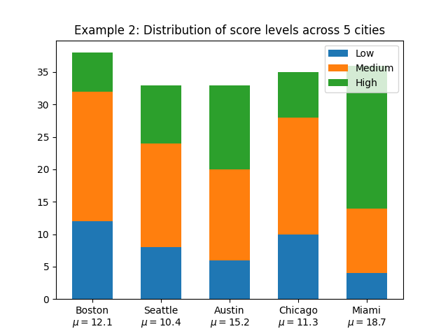
误差棒限值筛选 Errorbar limit selection
均值±标准差、bootstrap 置信区间
py
import matplotlib.pyplot as plt
import numpy as np

#### 竖轴方式 ####

fig = plt.figure()
x = np.arange(10)
y = 2.5 * np.sin(x / 20 * np.pi)
yerr = np.linspace(0.05, 0.2, 10)

# 上下都显示误差棒(默认样式)
plt.errorbar(x, y + 3, yerr=yerr, label='both limits (default)')
# 仅显示上限误差棒
plt.errorbar(x, y + 2, yerr=yerr, uplims=True, label='uplims=True')
# 上下误差棒都不显示(仅显示数据点)
# uplims=True 和 lolims=True 同时设置时,误差棒不显示,仅标记数据点
plt.errorbar(x, y + 1, yerr=yerr, uplims=True, lolims=True, label='uplims=True, lolims=True')

upperlimits = [True, False] * 5
lowerlimits = [False, True] * 5
# 按数组指定的规则显示上下误差棒
plt.errorbar(x, y, yerr=yerr, uplims=upperlimits, lolims=lowerlimits, label='subsets of uplims and lolims')

plt.legend(loc='lower right')

plt.show()

#### 横轴方式 ####

fig = plt.figure()
x = np.arange(10) / 10
y = (x + 0.1)**2

plt.errorbar(x, y, xerr=0.1, xlolims=True, label='xlolims=True')
y = (x + 0.1)**3

plt.errorbar(x + 0.6, y, xerr=0.1, xuplims=upperlimits, xlolims=lowerlimits, label='subsets of xuplims and xlolims')

y = (x + 0.1)**4
plt.errorbar(x + 1.2, y, xerr=0.1, xuplims=True, label='xuplims=True')

plt.legend()
plt.show()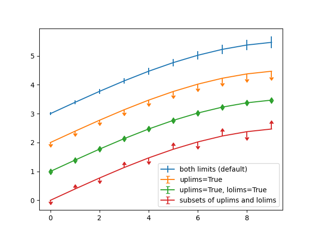
误差棒降采样 Errorbar subsampling
均值±标准差、bootstrap 置信区间
py
import matplotlib.pyplot as plt
import numpy as np

# 数据
x = np.arange(0.1, 4, 0.1)
y1 = np.exp(-1.0 * x)
y2 = np.exp(-0.5 * x)
# 数据的误差
y1err = 0.1 + 0.1 * np.sqrt(x)
y2err = 0.1 + 0.1 * np.sqrt(x/2)


fig, (ax0, ax1, ax2) = plt.subplots(nrows=1, ncols=3, sharex=True, figsize=(12, 6))

ax0.set_title('all errorbars')
ax0.errorbar(x, y1, yerr=y1err)
ax0.errorbar(x, y2, yerr=y2err)

ax1.set_title('only every 6th errorbar')
# errorevery控制误差棒的显示频率为6
ax1.errorbar(x, y1, yerr=y1err, errorevery=6)
ax1.errorbar(x, y2, yerr=y2err, errorevery=6)

ax2.set_title('second series shifted by 3')
# errorevery控制误差棒的显示频率为6
# 第一个值是起始偏移量,第二个值是频率
ax2.errorbar(x, y1, yerr=y1err, errorevery=(0, 6))
ax2.errorbar(x, y2, yerr=y2err, errorevery=(3, 6))

fig.suptitle('Errorbar subsampling')
plt.show()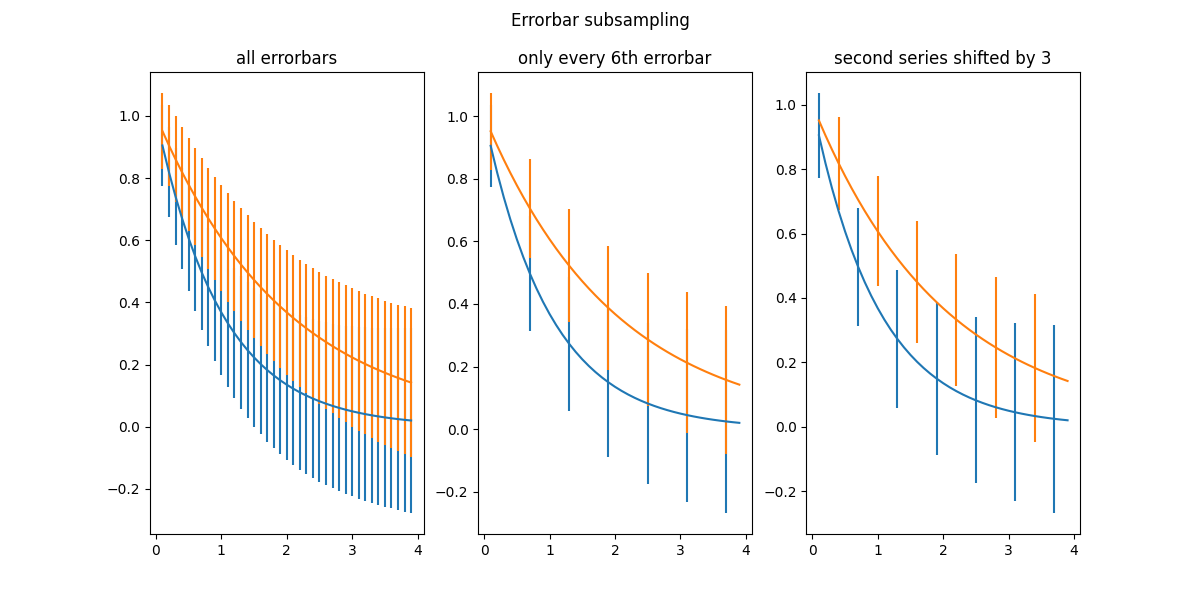
填充带 fill_between
区间、可行域、差距阴影
py
import matplotlib.pyplot as plt
import numpy as np

import matplotlib.cbook as cbook

# 加载样本财务数据
r = cbook.get_sample_data('goog.npz')['price_data']
# 创建两个子图,共享x和y轴
fig, (ax1, ax2) = plt.subplots(1, 2, sharex=True, sharey=True)

# 获取最低价
pricemin = r["close"].min() # 为100.01

# 绘制曲线(lw=2表示线宽为2)
ax1.plot(r["date"], r["close"], lw=2)
# 以r["date"]为横轴, 在pricemin, r["close"]之间填充
ax2.fill_between(r["date"], pricemin, r["close"], alpha=0.7)

for ax in ax1, ax2:
    ax.grid(True)
    ax.label_outer()

ax1.set_ylabel('price')

fig.suptitle('Google (GOOG) daily closing price')
fig.autofmt_xdate() # 自动优化 x 轴标签显示效果

plt.show()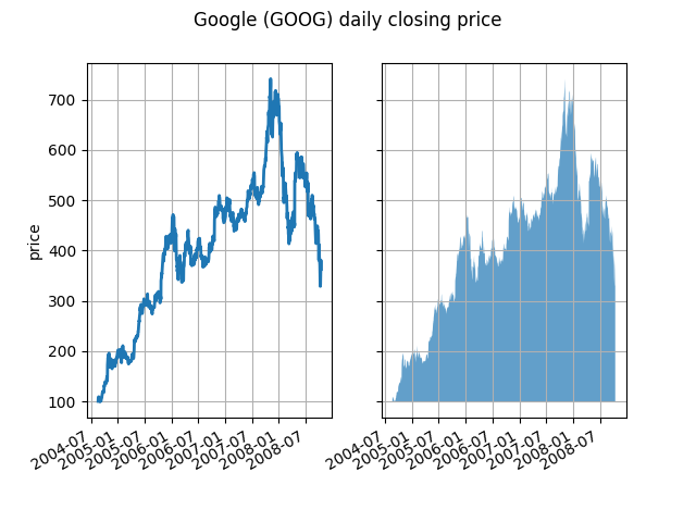
带注释的热力图 Annotated heatmap
相关系数矩阵、混淆矩阵、参数网格搜索结果
py
import matplotlib.pyplot as plt
import numpy as np

import matplotlib
import matplotlib as mpl

vegetables = [
    "cucumber", "tomato", "lettuce", "asparagus", "potato", "wheat", "barley"
]
farmers = [
    "Farmer Joe", "Upland Bros.", "Smith Gardening", "Agrifun", "Organiculture", "BioGoods Ltd.", "Cornylee Corp."
]

harvest = np.array(
    [[0.8, 2.4, 2.5, 3.9, 0.0, 4.0, 0.0],
     [2.4, 0.0, 4.0, 1.0, 2.7, 0.0, 0.0],
     [1.1, 2.4, 0.8, 4.3, 1.9, 4.4, 0.0],
     [0.6, 0.0, 0.3, 0.0, 3.1, 0.0, 0.0],
     [0.7, 1.7, 0.6, 2.6, 2.2, 6.2, 0.0],
     [1.3, 1.2, 0.0, 0.0, 0.0, 3.2, 5.1],
     [0.1, 2.0, 0.0, 1.4, 0.0, 1.9, 6.3]]
)

fig, ax = plt.subplots()
im = ax.imshow(harvest)

# 展示所有的刻度并且用相应的列表条目进行标记
# rotation: 刻度的旋转角度
# ha: 刻度标签的文本水平对齐方式
# rotation_mode: 刻度的旋转模式(anchor: 锚点)
ax.set_xticks(range(len(farmers)), labels=farmers, rotation=45, ha="right", rotation_mode="anchor")
ax.set_yticks(range(len(vegetables)), labels=vegetables)

# 循环数据维度并创建文本注释
for i in range(len(vegetables)):
    for j in range(len(farmers)):
        # ha: 文本水平对齐方式
        # va: 文本垂直对齐方式
        text = ax.text(j, i, harvest[i, j], ha="center", va="center", color="w")

ax.set_title("Harvest of local farmers (in tons/year)")
fig.tight_layout()
plt.show()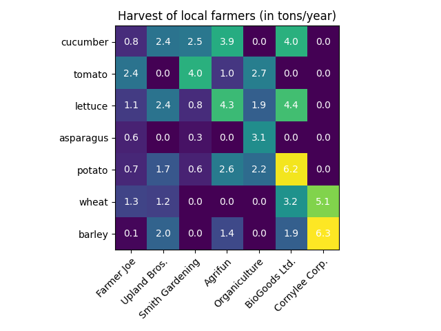
py
import matplotlib.pyplot as plt
import numpy as np

import matplotlib
import matplotlib as mpl


def heatmap(
    data,
    row_labels, col_labels,
    ax=None,
    cbar_kw=None,
    cbarlabel="",
    **kwargs
):
    """
    根据一个 numpy 数组 + 行/列标签创建热力图
    """

    if ax is None:
        ax = plt.gca()

    if cbar_kw is None:
        cbar_kw = {}

    # 绘制热力图主体
    im = ax.imshow(data, **kwargs)

    # 创建色条(colorbar)
    cbar = ax.figure.colorbar(im, ax=ax, **cbar_kw)
    cbar.ax.set_ylabel(cbarlabel, rotation=-90, va="bottom")

    # 显示所有刻度,并用对应的标签替换刻度文字
    ax.set_xticks(range(data.shape[1]), labels=col_labels,
                  rotation=-30, ha="right", rotation_mode="anchor")
    ax.set_yticks(range(data.shape[0]), labels=row_labels)

    # 让 x 轴刻度标签显示在上方(顶部),并隐藏底部标签
    ax.tick_params(top=True, bottom=False,
                   labeltop=True, labelbottom=False)

    # 关闭边框(spines),并绘制白色网格线,让格子更清晰
    ax.spines[:].set_visible(False)

    # 使用 minor ticks 来画网格线(在格子边界处)
    ax.set_xticks(np.arange(data.shape[1] + 1) - .5, minor=True)
    ax.set_yticks(np.arange(data.shape[0] + 1) - .5, minor=True)
    ax.grid(which="minor", color="w", linestyle='-', linewidth=3)

    # 隐藏 minor tick 的刻度线与标签
    ax.tick_params(which="minor", bottom=False, left=False)

    return im, cbar


def annotate_heatmap(
    im, data=None,
    valfmt="{x:.2f}",
    textcolors=("black", "white"),
    threshold=None,
    **textkw
):
    """
    给热力图每个格子加数值标注
    """

    # 如果没有显式传 data,就从 im 里把数据取出来
    if not isinstance(data, (list, np.ndarray)):
        data = im.get_array()

    # 将阈值映射到颜色归一化空间,用于决定文字颜色
    if threshold is not None:
        threshold = im.norm(threshold)
    else:
        threshold = im.norm(data.max()) / 2.

    # 默认文字居中显示(也允许通过 textkw 覆盖)
    kw = dict(horizontalalignment="center",
              verticalalignment="center")
    kw.update(textkw)

    # 如果 valfmt 是字符串,就转成 matplotlib 的格式化器
    if isinstance(valfmt, str):
        valfmt = matplotlib.ticker.StrMethodFormatter(valfmt)

    # 遍历每个格子,添加文本;并根据数值大小选择文字颜色
    texts = []
    for i in range(data.shape[0]):
        for j in range(data.shape[1]):
            kw.update(color=textcolors[int(im.norm(data[i, j]) > threshold)])
            text = im.axes.text(j, i, valfmt(data[i, j], None), **kw)
            texts.append(text)

    return texts

if __name__ == '__main__':
    vegetables = [
        "cucumber", "tomato", "lettuce", "asparagus", "potato", "wheat", "barley"
    ]
    farmers = [
        "Farmer Joe", "Upland Bros.", "Smith Gardening", "Agrifun", "Organiculture", "BioGoods Ltd.", "Cornylee Corp."
    ]

    harvest = np.array(
        [[0.8, 2.4, 2.5, 3.9, 0.0, 4.0, 0.0],
         [2.4, 0.0, 4.0, 1.0, 2.7, 0.0, 0.0],
         [1.1, 2.4, 0.8, 4.3, 1.9, 4.4, 0.0],
         [0.6, 0.0, 0.3, 0.0, 3.1, 0.0, 0.0],
         [0.7, 1.7, 0.6, 2.6, 2.2, 6.2, 0.0],
         [1.3, 1.2, 0.0, 0.0, 0.0, 3.2, 5.1],
         [0.1, 2.0, 0.0, 1.4, 0.0, 1.9, 6.3]]
    )

    fig, ax = plt.subplots(figsize=(8, 6), layout="constrained")

    # 画热力图
    im, cbar = heatmap(
        harvest,
        row_labels=vegetables,
        col_labels=farmers,
        ax=ax,
        cmap="YlGn",  # 色图(可改)
        cbarlabel="harvest [t/year]"  # 色条标签(可改)
    )

    # 给每个格子加数字标注
    annotate_heatmap(im, valfmt="{x:.1f}")

    ax.set_title("Harvest of local farmers (example heatmap)")

    plt.show()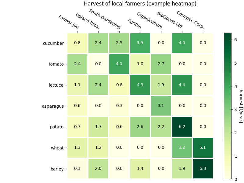
各种插值方法的imshow
相关系数矩阵、混淆矩阵、参数网格搜索结果
py
import matplotlib.pyplot as plt
import numpy as np

# 各种插值方法
methods = [
    None, 'none', 'nearest', 'bilinear', 'bicubic', 'spline16',
    'spline36', 'hanning', 'hamming', 'hermite', 'kaiser', 'quadric',
    'catrom', 'gaussian', 'bessel', 'mitchell', 'sinc', 'lanczos'
]

np.random.seed(19680801)

grid = np.random.rand(4, 4)

fig, axs = plt.subplots(
    nrows=3, ncols=6, figsize=(9, 6),
    subplot_kw={'xticks': [], 'yticks': []}
)

for ax, interp_method in zip(axs.flat, methods):
    # 使用不同的插值方法
    ax.imshow(grid, interpolation=interp_method, cmap='viridis')
    ax.set_title(str(interp_method))

plt.tight_layout()
plt.show()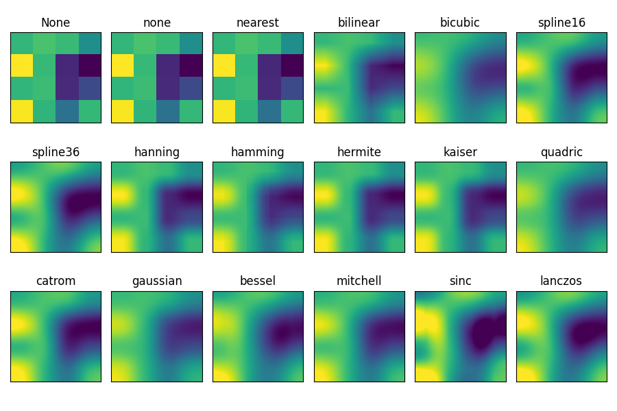
可视化矩阵 matshow
相关系数矩阵、混淆矩阵、参数网格搜索结果
py
import matplotlib.pyplot as plt
import numpy as np

# 一个2D数组,对角线上的元素是线性递增的
a = np.diag(range(15))

plt.matshow(a)

plt.show()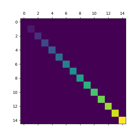
色条 colorbar
热力图/等值图必备
py
import matplotlib.pyplot as plt
import numpy as np

from matplotlib import colors

np.random.seed(19680801)

# 四种数据, 数值逐渐倍增
datasets = [
    (i+1)/10 * np.random.rand(10, 20)
    for i in range(4)
]

fig, axs = plt.subplots(2, 2)
fig.suptitle('Multiple images')

# 创造一个共享的norm
norm = colors.Normalize(vmin=np.min(datasets), vmax=np.max(datasets))

images = []
for ax, data in zip(axs.flat, datasets):
    images.append(ax.imshow(data, norm=norm))

# 根据images[0]确定数值→颜色的映射关系
# orientation使颜色条水平
# fraction=.1使颜色条占figure的1/10
fig.colorbar(images[0], ax=axs, orientation='horizontal', fraction=.1)

plt.show()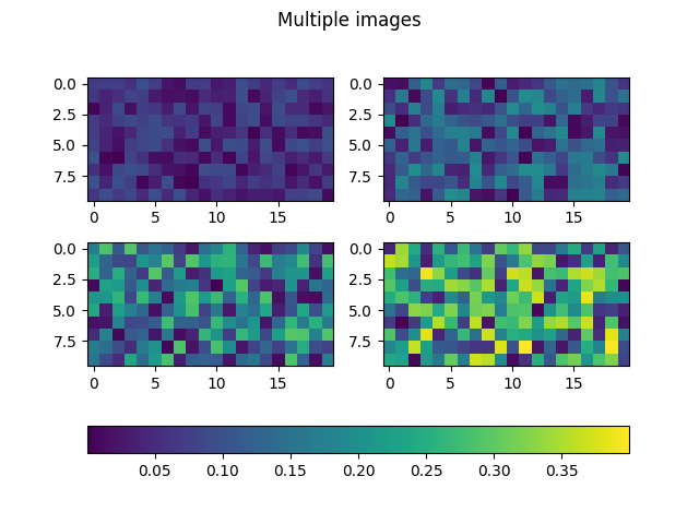
等高线 contour
目标函数地形、可行域、敏感性分析展示非常直观
py
import matplotlib.pyplot as plt
import numpy as np

import matplotlib.cm as cm

# 将负轮廓设置为实线
# plt.rcParams['contour.negative_linestyle'] = 'solid'

# 网格步长,越小网格越密,等高线更平滑但计算更慢
delta = 0.025
# 生成 x 轴坐标序列
x = np.arange(-3.0, 3.0, delta)
# 生成 y 轴坐标序列
y = np.arange(-2.0, 2.0, delta)

# 把一维的 x, y 扩展成二维网格坐标矩阵 X, Y
# X.shape == (len(y), len(x))
# Y.shape == (len(y), len(x))
X, Y = np.meshgrid(x, y)

# 计算第1个二维高斯函数
Z1 = np.exp(-X**2 - Y**2)
# 计算第2个二维高斯函数 - 中心移动到 (1, 1)
Z2 = np.exp(-(X - 1)**2 - (Y - 1)**2)
# 构造最终场 Z:两个高斯之差再乘 2,形成"山+谷"的形状
Z = (Z1 - Z2) * 2

fig, ax = plt.subplots()
# 绘制等高线图,返回 ContourSet 对象
# 若传入colors='k', 则只采用黑色实线虚线
CS = ax.contour(X, Y, Z)
# 手动指定"等高线标签"放置的坐标位置
manual_locations = [
    (-1, -1.4), (-0.62, -0.7), (-2, 0.5), (1.7, 1.2), (2.0, 1.7), (2.0, 0.8)
]
# 给等高线添加文字标签
ax.clabel(CS, fontsize=10, manual=manual_locations)

ax.set_title('labels at selected locations')

plt.show()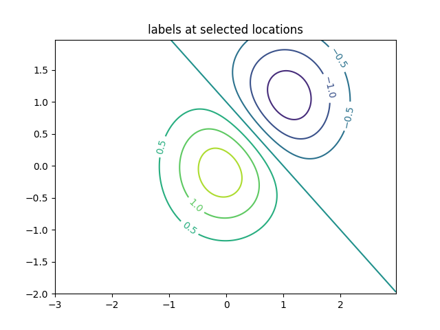
填充等高线 contourf
目标函数地形、可行域、敏感性分析展示非常直观
略
https://matplotlib.org/stable/gallery/images_contours_and_fields/contourf_demo.html
网格场 pcolormesh
二维网格上的指标分布,比 scatter 更干净
py
import matplotlib.pyplot as plt
import numpy as np
plt.rcParams['font.sans-serif'] = ['SimHei']
plt.rcParams['axes.unicode_minus'] = False
def _annotate(ax, x, y, title):
"""
在图上标出网格点的位置,帮助理解 x/y 是"网格边界点"还是"网格中心点"
"""
# meshgrid 会生成二维网格坐标矩阵
X, Y = np.meshgrid(x, y)
# X.flat / Y.flat:把二维数组摊平成一维,把所有网格点画成紫色小圆点
ax.plot(X.flat, Y.flat, 'o', color='m')
# 固定坐标轴范围,便于不同 shading 方式的对比
ax.set_xlim(-0.7, 5.2)
ax.set_ylim(-0.7, 3.2)
ax.set_title(title)
# =========================
# 基本数据:Z 是一个 3×5 的"格子值"
# =========================
nrows = 3
ncols = 5
Z = np.arange(nrows * ncols).reshape(nrows, ncols)
# x/y 用"边界点(edges)",因此长度要比列/行多 1
# Z 形状为 (nrows, ncols),则 edges 形状通常为:
# x: (ncols + 1,), y: (nrows + 1,)
x = np.arange(ncols + 1)
y = np.arange(nrows + 1)
# ============================================================
# 例1:shading='flat'(常用)
# 解释:Z 的每个值对应一个"格子块(cell)",用 x/y 的边界点围出来
# 形状要求:len(x)=ncols+1, len(y)=nrows+1, Z=(nrows,ncols)
# ============================================================
fig, ax = plt.subplots()
ax.pcolormesh(x, y, Z,
shading='flat', # flat:每个 cell 颜色常量
vmin=Z.min(), vmax=Z.max()) # 固定色域,便于不同图对比
_annotate(ax, x, y, "shading='flat':x/y 是边界点,长度比 Z 多 1")
plt.show()
# ============================================================
# 例2:仍然 shading='flat',但让 X/Y/Z "同形状"
# 核心:如果你只提供 x/y 的中心点(长度等于 ncols/nrows),
# 又想用 flat,则必须把 Z 裁剪成 (nrows-1, ncols-1)
# 因为 flat 本质上需要"边界点比 cell 多一圈"
# ============================================================
x = np.arange(ncols) # 注意:这里不是 ncols+1,而是 ncols
y = np.arange(nrows)
fig, ax = plt.subplots()
ax.pcolormesh(x, y,
Z[:-1, :-1], # 裁掉最后一行/列,使其变为 (nrows-1, ncols-1)
shading='flat',
vmin=Z.min(), vmax=Z.max())
_annotate(ax, x, y, "shading='flat':x/y 给的是点坐标时,需要裁 Z 以匹配")
plt.show()
# ============================================================
# 例3:shading='nearest'
# 解释:把 Z 看作"网格点的值",每个点的颜色扩展到最近的区域
# 形状要求:x, y 与 Z 维度一致(中心点模式)
# len(x)=ncols, len(y)=nrows, Z=(nrows,ncols)
# ============================================================
fig, ax = plt.subplots()
ax.pcolormesh(x, y, Z,
shading='nearest', # nearest:每个点取最近邻扩展为色块
vmin=Z.min(), vmax=Z.max())
_annotate(ax, x, y, "shading='nearest':x/y 与 Z 同形状(点值扩展)")
plt.show()
# ============================================================
# 例4:shading='auto'
# 解释:Matplotlib 自动判断该用 flat 还是 nearest
# 规则大致是:
# - 若 x/y 比 Z 多一圈(边界点),自动用 flat
# - 若 x/y 与 Z 同形状(中心点),自动用 nearest
# 美赛建议:不想纠结形状时,用 auto 很省心
# ============================================================
fig, axs = plt.subplots(2, 1, layout='constrained')
# 子图1:x/y 与 Z 同形状 -> auto 会选 nearest
ax = axs[0]
x = np.arange(ncols)
y = np.arange(nrows)
ax.pcolormesh(x, y, Z,
shading='auto',
vmin=Z.min(), vmax=Z.max())
_annotate(ax, x, y, "shading='auto':x/y 与 Z 同形状 -> 自动 nearest")
# 子图2:x/y 比 Z 多一圈 -> auto 会选 flat
ax = axs[1]
x = np.arange(ncols + 1)
y = np.arange(nrows + 1)
ax.pcolormesh(x, y, Z,
shading='auto',
vmin=Z.min(), vmax=Z.max())
_annotate(ax, x, y, "shading='auto':x/y 多一圈 -> 自动 flat")
plt.show()
# ============================================================
# 例5:shading='gouraud'
# 解释:对顶点颜色做平滑插值(渐变效果),看起来更"连续"
# 形状要求:x/y 与 Z 同形状(中心点模式)
# 注意:gouraud 会"模糊格子边界",不适合表达离散分区/网格单元
# ============================================================
fig, ax = plt.subplots(layout='constrained')
x = np.arange(ncols)
y = np.arange(nrows)
ax.pcolormesh(x, y, Z,
shading='gouraud', # gouraud:平滑插值
vmin=Z.min(), vmax=Z.max())
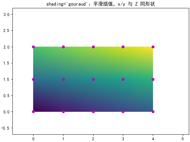
_annotate(ax, x, y, "shading='gouraud':平滑插值,x/y 与 Z 同形状")
plt.show()
直方图 Histograms
残差分布、模拟结果分布、蒙特卡洛输出
py
import matplotlib.pyplot as plt
import numpy as np

from matplotlib import colors
from matplotlib.ticker import PercentFormatter

rng = np.random.default_rng(19680801)

# 样本点数量
N_points = 100000
# 直方图分箱数量
n_bins = 20

# 生成两组正态分布数据
# dist1:标准正态分布 N(0, 1)
dist1 = rng.standard_normal(N_points)
# dist2:均值约为 5、标准差约为 0.4 的正态分布(这里只是演示,后面没用到)
dist2 = 0.4 * rng.standard_normal(N_points) + 5

# 创建 1 行 2 列子图,并启用 tight_layout 自动调整布局
fig, axs = plt.subplots(1, 2, tight_layout=True)

# -------------------------
# 左图:普通直方图 + 按柱子高度上色
# -------------------------

# N:每个 bin 的计数
# bins:每个 bin 的边界(长度为 n_bins+1)
# patches:每个柱子的矩形对象列表
N, bins, patches = axs[0].hist(dist1, bins=n_bins)

# 计算每个 bin 计数占最大计数的比例,用于颜色映射(范围大致在 0~1)
fracs = N / N.max()

# 将 fracs 归一化到 0..1,以便完整使用 colormap 映射
norm = colors.Normalize(fracs.min(), fracs.max())

# 遍历每个柱子,根据其高度比例设置颜色
for thisfrac, thispatch in zip(fracs, patches):
    # 选用 viridis 色图,并用 norm(thisfrac) 得到对应颜色
    color = plt.cm.viridis(norm(thisfrac))
    # 设置柱子的填充颜色
    thispatch.set_facecolor(color)

# -------------------------
# 右图:概率密度直方图 + y 轴显示百分比
# -------------------------

# density=True 表示把直方图归一化为"概率密度"(柱子面积总和为 1)
axs[1].hist(dist1, bins=n_bins, density=True)

# 将 y 轴刻度格式化为百分比显示
# 这里 xmax=1 表示 y=1 对应 100%
axs[1].yaxis.set_major_formatter(PercentFormatter(xmax=1))

# 显示图像
plt.show()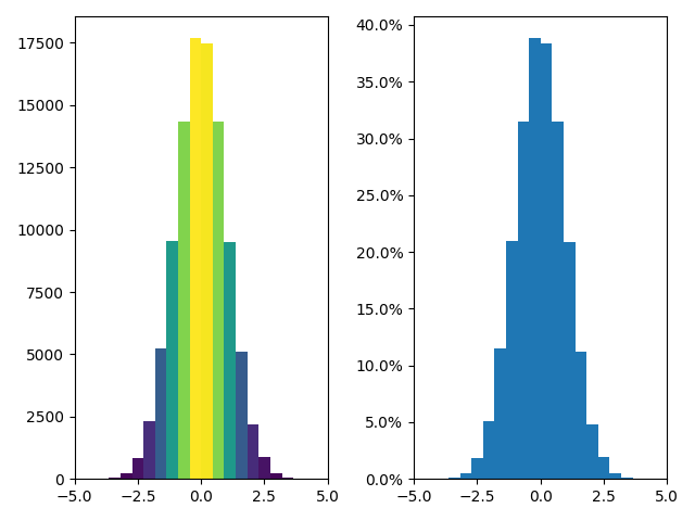
箱线图
不同方案分布对比、鲁棒性展示
py
import matplotlib.pyplot as plt
import numpy as np
np.random.seed(19680801)
# =========================
# 构造一组"带离群点"的一维数据 data
# =========================
spread = np.random.rand(50) * 100 # 50 个 [0,100) 的随机数,作为"主体分布"
center = np.ones(25) * 50 # 25 个恒为 50 的数,增加中间值密度
flier_high = np.random.rand(10) * 100 + 100 # 10 个 [100,200) 的高端离群点
flier_low = np.random.rand(10) * -100 # 10 个 (-100,0] 的低端离群点
# 拼接成一维数组
data = np.concatenate((spread, center, flier_high, flier_low))
# 创建 2 行 3 列的子图布局
fig, axs = plt.subplots(2, 3)
# =========================
# 第一张:基础箱线图
# =========================
axs[0, 0].boxplot(data) # 绘制箱线图(默认参数)
axs[0, 0].set_title('basic plot') # 设置子图标题
# =========================
# 第二张:带缺口(notch)的箱线图
# notch=True 会在箱体中间显示"缺口",常用于对比中位数差异
# =========================
axs[0, 1].boxplot(data, notch=True)
axs[0, 1].set_title('notched plot')
# =========================
# 第三张:修改离群点(outliers)的符号样式
# sym='gD' 表示绿色(g)菱形(D)
# =========================
axs[0, 2].boxplot(data, sym='gD')
axs[0, 2].set_title('change outlier\npoint symbols')
# =========================
# 第四张:不显示离群点
# sym='' 会关闭离群点的标记
# =========================
axs[1, 0].boxplot(data, sym='')
axs[1, 0].set_title("don't show\noutlier points")
# =========================
# 第五张:水平箱线图
# orientation='horizontal' 让箱体水平显示
# sym='rs' 表示红色(r)方块(s)
# =========================
axs[1, 1].boxplot(data, sym='rs', orientation='horizontal')
axs[1, 1].set_title('horizontal boxes')
# =========================
# 第六张:修改须(whisker)长度
# whis=0.75 会改变须的范围(默认通常是 1.5*IQR 的规则)
# 注意:不同 whis 参数含义在不同版本/设置下可能略有差别
# =========================
axs[1, 2].boxplot(data, sym='rs', orientation='horizontal', whis=0.75)
axs[1, 2].set_title('change whisker length')
# 调整整体布局:四周边距、子图间距(行间 hspace、列间 wspace)
fig.subplots_adjust(
left=0.08, right=0.98, bottom=0.05, top=0.9,
hspace=0.4, wspace=0.3
)
plt.show()
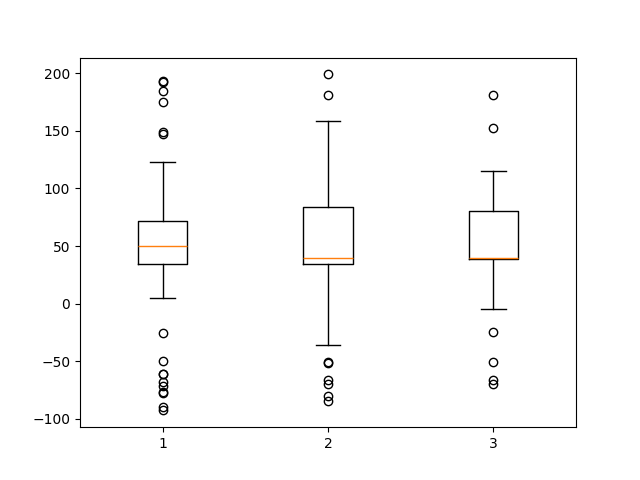
# =========================
# 再构造第二组数据 d2(类似,但中心值换成 40)
# =========================
spread = np.random.rand(50) * 100
center = np.ones(25) * 40
flier_high = np.random.rand(10) * 100 + 100
flier_low = np.random.rand(10) * -100
d2 = np.concatenate((spread, center, flier_high, flier_low))
# 这里把 data 组织成"列表",用于在同一个坐标轴上画多个箱线图
# - 第 1 组:原 data
# - 第 2 组:d2
# - 第 3 组:d2 的隔一个取一个(长度更短,但 boxplot 接受 list-of-arrays,长度不必一致)
data = [data, d2, d2[::2]]
# =========================
# 在同一个 Axes 上绘制多个箱线图
# =========================
fig, ax = plt.subplots()
ax.boxplot(data) # 会画出 3 个箱线图(对应 data 列表的三个向量)
plt.show()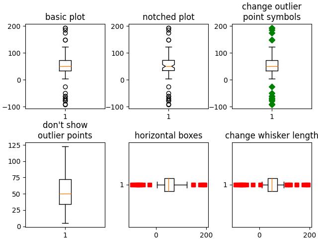
小提琴图
比箱线图信息更丰富(会更"高级")
py
import matplotlib.pyplot as plt
import numpy as np

fig, axs = plt.subplots(nrows=1, ncols=2, figsize=(9, 4))

np.random.seed(19680801)

all_data = [np.random.normal(0, std, 100) for std in range(6, 10)]

# 画小提琴图
axs[0].violinplot(all_data,
                  showmeans=False,
                  showmedians=True)
axs[0].set_title('Violin plot')

# 画箱线图
axs[1].boxplot(all_data)
axs[1].set_title('Box plot')


for ax in axs:
    ax.yaxis.grid(True) # 添加水平网格线
    ax.set_xticks(
        [y + 1 for y in range(len(all_data))],
        labels=['x1', 'x2', 'x3', 'x4']
    )
    ax.set_xlabel('Four separate samples')
    ax.set_ylabel('Observed values')

plt.show()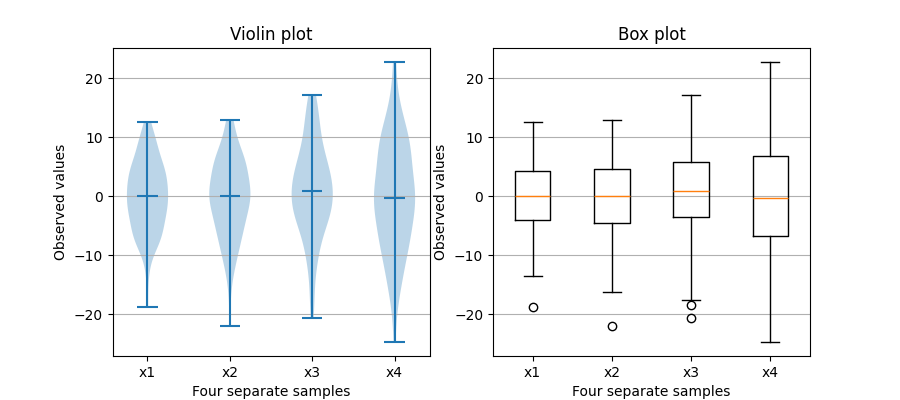
py
import matplotlib.pyplot as plt
import numpy as np

np.random.seed(19680801)

# =========================
# 1) 构造一些"假数据"
# =========================
fs = 10  # 标题字体大小(fontsize)
pos = [1, 2, 4, 5, 7, 8]  # 小提琴图在坐标轴上的位置(x 轴位置 / y 轴位置取决于方向)
# 为每个位置生成一组正态分布数据:均值 0,标准差为 pos 中对应的数,样本数 100
data = [np.random.normal(0, std, size=100) for std in pos]

# =========================
# 2) 创建 2 行 6 列子图
# =========================
fig, axs = plt.subplots(nrows=2, ncols=6, figsize=(10, 4))

# =========================
# 3) 第一行:竖向(默认)小提琴图示例
# =========================

# 示例1:points=20 控制核密度估计曲线的采样点数;widths 控制小提琴宽度
axs[0, 0].violinplot(
    data, pos, points=20, widths=0.3,
    showmeans=True, showextrema=True, showmedians=True
)
axs[0, 0].set_title('Custom violin 1', fontsize=fs)

# 示例2:使用 bw_method='silverman' 指定带宽估计方法(Silverman 法则)
axs[0, 1].violinplot(
    data, pos, points=40, widths=0.5,
    showmeans=True, showextrema=True, showmedians=True,
    bw_method='silverman'
)
axs[0, 1].set_title('Custom violin 2', fontsize=fs)

# 示例3:bw_method=0.5 直接指定带宽系数(数值越大曲线越平滑)
axs[0, 2].violinplot(
    data, pos, points=60, widths=0.7,
    showmeans=True, showextrema=True, showmedians=True,
    bw_method=0.5
)
axs[0, 2].set_title('Custom violin 3', fontsize=fs)

# 示例4:quantiles 为每个"小提琴"指定要画出来的分位数线
# 注意:quantiles 是一个列表,长度要与 data 相同;每个元素可以是一个分位数列表
axs[0, 3].violinplot(
    data, pos, points=60, widths=0.7,
    showmeans=True, showextrema=True, showmedians=True,
    bw_method=0.5,
    quantiles=[[0.1], [], [], [0.175, 0.954], [0.75], [0.25]]
)
axs[0, 3].set_title('Custom violin 4', fontsize=fs)

# 示例5:只画最后一个分布(data[-1:]),只放在最后一个位置(pos[-1:])
# quantiles 直接给一个分位数列表(此时只有一个小提琴,所以不需要嵌套列表)
axs[0, 4].violinplot(
    data[-1:], pos[-1:], points=60, widths=0.7,
    showmeans=True, showextrema=True, showmedians=True,
    quantiles=[0.05, 0.1, 0.8, 0.9],
    bw_method=0.5
)
axs[0, 4].set_title('Custom violin 5', fontsize=fs)

# 示例6:side='low' 只画"小提琴"的低侧(左侧/下侧,取决于方向)
axs[0, 5].violinplot(
    data[-1:], pos[-1:], points=60, widths=0.7,
    showmeans=True, showextrema=True, showmedians=True,
    quantiles=[0.05, 0.1, 0.8, 0.9],
    bw_method=0.5, side='low'
)
# side='high' 只画高侧;两次叠加可做"半边小提琴"对比的效果
axs[0, 5].violinplot(
    data[-1:], pos[-1:], points=60, widths=0.7,
    showmeans=True, showextrema=True, showmedians=True,
    quantiles=[0.05, 0.1, 0.8, 0.9],
    bw_method=0.5, side='high'
)
axs[0, 5].set_title('Custom violin 6', fontsize=fs)

# =========================
# 4) 第二行:横向小提琴图示例(orientation='horizontal')
# =========================

# 示例7:横向绘制(小提琴沿 x 方向展开)
axs[1, 0].violinplot(
    data, pos, points=80, orientation='horizontal', widths=0.7,
    showmeans=True, showextrema=True, showmedians=True
)
axs[1, 0].set_title('Custom violin 7', fontsize=fs)

# 示例8:横向 + Silverman 带宽
axs[1, 1].violinplot(
    data, pos, points=100, orientation='horizontal', widths=0.9,
    showmeans=True, showextrema=True, showmedians=True,
    bw_method='silverman'
)
axs[1, 1].set_title('Custom violin 8', fontsize=fs)

# 示例9:横向 + 指定带宽数值
axs[1, 2].violinplot(
    data, pos, points=200, orientation='horizontal', widths=1.1,
    showmeans=True, showextrema=True, showmedians=True,
    bw_method=0.5
)
axs[1, 2].set_title('Custom violin 9', fontsize=fs)

# 示例10:横向 + 指定每个小提琴的分位数线
axs[1, 3].violinplot(
    data, pos, points=200, orientation='horizontal', widths=1.1,
    showmeans=True, showextrema=True, showmedians=True,
    quantiles=[[0.1], [], [], [0.175, 0.954], [0.75], [0.25]],
    bw_method=0.5
)
axs[1, 3].set_title('Custom violin 10', fontsize=fs)

# 示例11:横向只画最后一个分布 + 分位数线
axs[1, 4].violinplot(
    data[-1:], pos[-1:], points=200, orientation='horizontal', widths=1.1,
    showmeans=True, showextrema=True, showmedians=True,
    quantiles=[0.05, 0.1, 0.8, 0.9],
    bw_method=0.5
)
axs[1, 4].set_title('Custom violin 11', fontsize=fs)

# 示例12:横向"半边小提琴"(low + high 叠加)
axs[1, 5].violinplot(
    data[-1:], pos[-1:], points=200, orientation='horizontal', widths=1.1,
    showmeans=True, showextrema=True, showmedians=True,
    quantiles=[0.05, 0.1, 0.8, 0.9],
    bw_method=0.5, side='low'
)
axs[1, 5].violinplot(
    data[-1:], pos[-1:], points=200, orientation='horizontal', widths=1.1,
    showmeans=True, showextrema=True, showmedians=True,
    quantiles=[0.05, 0.1, 0.8, 0.9],
    bw_method=0.5, side='high'
)
axs[1, 5].set_title('Custom violin 12', fontsize=fs)

# =========================
# 5) 统一做一些外观处理
# =========================
for ax in axs.flat:
    ax.set_yticklabels([])  # 去掉 y 轴刻度标签(这里只是为了示例更简洁)

fig.suptitle("Violin Plotting Examples")  # 整个画布的总标题
fig.subplots_adjust(hspace=0.4)          # 调整子图之间的竖向间距
plt.show()                               # 显示图像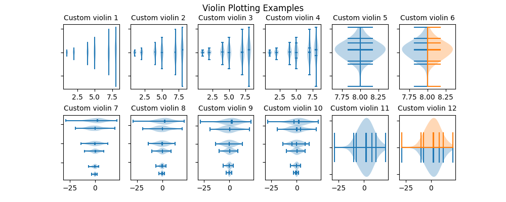
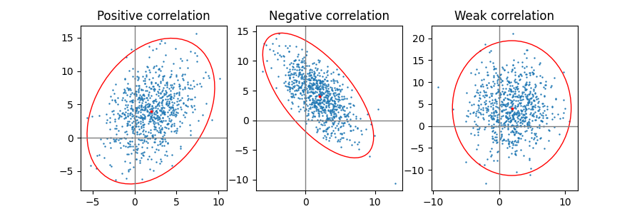
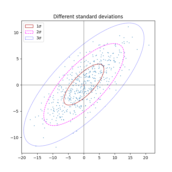
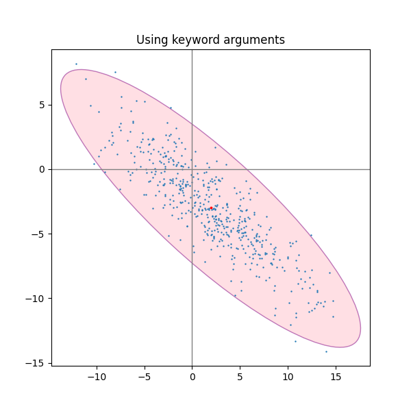
置信椭圆图 Confidence Ellipse
二维不确定性/协方差展示
py
import matplotlib.pyplot as plt
import numpy as np

from matplotlib.patches import Ellipse
import matplotlib.transforms as transforms


def confidence_ellipse(x, y, ax, n_std=3.0, facecolor='none', **kwargs):
    """
    在坐标轴 ax 上绘制 x 与 y 的"协方差置信椭圆"(confidence ellipse)

    参数
    ----
    x, y : array-like, shape (n,)
        输入数据(一维数组),表示二维点集的横纵坐标

    ax : matplotlib.axes.Axes
        要绘制到的坐标轴对象

    n_std : float
        用多少个标准差来确定椭圆的半径
        例如 n_std=1 表示 1σ 椭圆,n_std=2 表示 2σ 椭圆

    facecolor : str
        椭圆填充色,默认 'none' 表示不填充

    **kwargs
        其他参数会传给 matplotlib.patches.Ellipse
        比如 edgecolor、linestyle、alpha、label、zorder 等

    返回
    ----
    matplotlib.patches.Ellipse
        绘制在 ax 上的椭圆 patch 对象
    """
    # 基本检查:x 和 y 必须等长(每个点都有 x、y)
    if x.size != y.size:
        raise ValueError("x and y must be the same size")

    # 计算二维数据的协方差矩阵
    # cov = [[var(x), cov(x,y)],
    #        [cov(y,x), var(y)]]
    cov = np.cov(x, y)

    # 计算皮尔逊相关系数 rho = cov(x,y) / (std(x)*std(y))
    pearson = cov[0, 1] / np.sqrt(cov[0, 0] * cov[1, 1])

    # 利用一个特殊形式,把二维协方差的"主轴形状"参数化出来
    # 这里 ell_radius_x / ell_radius_y 先生成一个"标准椭圆"(中心在原点)
    # 随后再通过仿射变换旋转、缩放、平移到数据空间
    ell_radius_x = np.sqrt(1 + pearson)
    ell_radius_y = np.sqrt(1 - pearson)

    # 以原点为中心的椭圆(后面会通过 transform 放到正确位置/尺度)
    ellipse = Ellipse(
        (0, 0),
        width=ell_radius_x * 2,
        height=ell_radius_y * 2,
        facecolor=facecolor,
        **kwargs
    )

    # x 方向缩放:std(x) * n_std
    scale_x = np.sqrt(cov[0, 0]) * n_std
    mean_x = np.mean(x)  # x 的均值(平移到椭圆中心)

    # y 方向缩放:std(y) * n_std
    scale_y = np.sqrt(cov[1, 1]) * n_std
    mean_y = np.mean(y)  # y 的均值(平移到椭圆中心)

    # 构造仿射变换:先旋转、再缩放、再平移
    # 注意:这里用了 rotate_deg(45) 这一固定旋转角,是示例代码的做法
    # 更严格的做法通常会用协方差矩阵的特征向量来确定旋转角
    transf = (
        transforms.Affine2D()
        .rotate_deg(45)
        .scale(scale_x, scale_y)
        .translate(mean_x, mean_y)
    )

    # 把椭圆的 transform 叠加到 ax 的数据坐标系中
    ellipse.set_transform(transf + ax.transData)

    # 把椭圆 patch 添加到坐标轴并返回
    return ax.add_patch(ellipse)


def get_correlated_dataset(n, dependency, mu, scale):
    """
    生成一个"相关的二维数据集"(x, y)

    思路:
    1) 先采样 n 个二维标准正态 latent ~ N(0, I)
    2) 用 dependency 矩阵做线性变换得到相关性 dependent = latent @ dependency
    3) 再做尺度缩放 scale,并加上均值偏移 mu

    参数
    ----
    n : int
        样本点数量

    dependency : array-like, shape (2,2)
        控制相关结构的线性变换矩阵

    mu : tuple/list, (mu_x, mu_y)
        平移偏移(均值)

    scale : tuple/list, (s_x, s_y)
        在 x/y 方向的缩放系数(控制方差大小)

    返回
    ----
    x, y : ndarray, shape (n,), (n,)
        生成数据集的横纵坐标
    """
    # 生成 n 个二维标准正态点
    latent = np.random.randn(n, 2)

    # 线性变换:引入相关性(dependency 决定相关结构)
    dependent = latent.dot(dependency)

    # 做尺度缩放
    scaled = dependent * scale

    # 加上均值偏移
    scaled_with_offset = scaled + mu

    # 返回 x、y 两列
    return scaled_with_offset[:, 0], scaled_with_offset[:, 1]


# 固定随机种子,保证复现
np.random.seed(0)

# 三种不同相关性的 dependency 矩阵
PARAMETERS = {
    'Positive correlation': [[0.85, 0.35],
                             [0.15, -0.65]],
    'Negative correlation': [[0.9, -0.4],
                             [0.1, -0.6]],
    'Weak correlation': [[1, 0],
                         [0, 1]],
}

# 第一组示例的均值与缩放
mu = 2, 4
scale = 3, 5

# =========================================================
# 示例 1:一行三列,对比正相关/负相关/弱相关的置信椭圆
# =========================================================
fig, axs = plt.subplots(1, 3, figsize=(9, 3))

for ax, (title, dependency) in zip(axs, PARAMETERS.items()):
    # 生成相关数据
    x, y = get_correlated_dataset(800, dependency, mu, scale)

    # 画散点图(s 是点大小)
    ax.scatter(x, y, s=0.5)

    # 画参考坐标轴线(x=0 / y=0)
    ax.axvline(c='grey', lw=1)
    ax.axhline(c='grey', lw=1)

    # 绘制默认 n_std=3 的置信椭圆(边框红色)
    confidence_ellipse(x, y, ax, edgecolor='red')

    # 标出指定的均值点(这里用 mu 作为"中心点"标记)
    ax.scatter(mu[0], mu[1], c='red', s=3)

    # 标题
    ax.set_title(title)

plt.show()

# =========================================================
# 示例 2:同一数据集,画不同 n_std(1σ/2σ/3σ)的椭圆
# =========================================================
fig, ax_nstd = plt.subplots(figsize=(6, 6))

dependency_nstd = [[0.8, 0.75],
                   [-0.2, 0.35]]
mu = 0, 0
scale = 8, 5

# 参考坐标轴线
ax_nstd.axvline(c='grey', lw=1)
ax_nstd.axhline(c='grey', lw=1)

# 生成数据并画散点
x, y = get_correlated_dataset(500, dependency_nstd, mu, scale)
ax_nstd.scatter(x, y, s=0.5)

# 分别绘制 1σ / 2σ / 3σ 椭圆,并用不同线型和颜色区分
confidence_ellipse(
    x, y, ax_nstd, n_std=1,
    label=r'$1\sigma$', edgecolor='firebrick'
)
confidence_ellipse(
    x, y, ax_nstd, n_std=2,
    label=r'$2\sigma$', edgecolor='fuchsia', linestyle='--'
)
confidence_ellipse(
    x, y, ax_nstd, n_std=3,
    label=r'$3\sigma$', edgecolor='blue', linestyle=':'
)

# 标记均值点与标题、图例
ax_nstd.scatter(mu[0], mu[1], c='red', s=3)
ax_nstd.set_title('Different standard deviations')
ax_nstd.legend()
plt.show()

# =========================================================
# 示例 3:演示通过 kwargs(alpha/facecolor/zorder 等)控制外观
# =========================================================
fig, ax_kwargs = plt.subplots(figsize=(6, 6))

dependency_kwargs = [[-0.8, 0.5],
                     [-0.2, 0.5]]
mu = 2, -3
scale = 6, 5

# 参考坐标轴线
ax_kwargs.axvline(c='grey', lw=1)
ax_kwargs.axhline(c='grey', lw=1)

# 生成数据
x, y = get_correlated_dataset(500, dependency_kwargs, mu, scale)

# 先画椭圆(放在底层 zorder=0),并用 alpha 做透明填充
# 这样后画的散点可以压在椭圆上,展示透明效果
confidence_ellipse(
    x, y, ax_kwargs,
    alpha=0.5, facecolor='pink', edgecolor='purple', zorder=0
)

# 再画散点与均值点
ax_kwargs.scatter(x, y, s=0.5)
ax_kwargs.scatter(mu[0], mu[1], c='red', s=3)

# 标题与布局
ax_kwargs.set_title('Using keyword arguments')
fig.subplots_adjust(hspace=0.25)
plt.show()