欢迎加入开源鸿蒙跨平台社区:https://openharmonycrossplatform.csdn.net
一、进度指示器系统架构深度解析
在现代移动应用中,进度指示器是用户反馈系统的重要组成部分。从简单的线性进度条到复杂的动画进度效果,Flutter 提供了灵活的组件体系。理解这套体系的底层原理,是构建高性能进度指示器系统的基础。
📱 1.1 Flutter 进度指示器架构
Flutter 的进度指示器系统由多个核心层次组成,每一层都有其特定的职责:
┌─────────────────────────────────────────────────────────────────┐
│                      应用层 (Application Layer)                  │
│  ┌─────────────────────────────────────────────────────────┐    │
│  │  LinearProgressIndicator, CircularProgressIndicator,    │    │
│  │  RefreshIndicator, Custom Progress Widgets              │    │
│  └─────────────────────────────────────────────────────────┘    │
│                              │                                   │
│                              ▼                                   │
│  ┌─────────────────────────────────────────────────────────┐    │
│  │              动画控制层 (Animation Control Layer)         │    │
│  │  AnimationController, Tween, CurvedAnimation...         │    │
│  └─────────────────────────────────────────────────────────┘    │
│                              │                                   │
│                              ▼                                   │
│  ┌─────────────────────────────────────────────────────────┐    │
│  │              渲染层 (Rendering Layer)                     │    │
│  │  CustomPainter, Canvas, Paint, Shader...                │    │
│  └─────────────────────────────────────────────────────────┘    │
│                              │                                   │
│                              ▼                                   │
│  ┌─────────────────────────────────────────────────────────┐    │
│  │              状态管理层 (State Management Layer)          │    │
│  │  ValueNotifier, StreamController, ChangeNotifier...     │    │
│  └─────────────────────────────────────────────────────────┘    │
└─────────────────────────────────────────────────────────────────┘
🔬 1.2 进度指示器核心组件详解
Flutter 进度指示器系统的核心组件包括以下几个部分:
ProgressIndicator(进度指示器基类)
ProgressIndicator 是所有进度指示器的抽象基类,定义了进度指示器的基本属性和行为。
dart
// 线性进度指示器
LinearProgressIndicator(
  value: 0.7,                    // 当前进度值 (0.0 - 1.0)
  backgroundColor: Colors.grey,  // 背景颜色
  color: Colors.blue,            // 进度颜色
  minHeight: 8,                  // 最小高度
  borderRadius: BorderRadius.circular(4),
)

// 圆形进度指示器
CircularProgressIndicator(
  value: 0.5,                    // 当前进度值
  backgroundColor: Colors.grey,
  color: Colors.blue,
  strokeWidth: 4,                // 线条宽度
  strokeCap: StrokeCap.round,    // 线条端点样式
)
AnimationController(动画控制器)
动画控制器用于控制进度变化的动画效果,使进度更新更加平滑自然。
dart
final controller = AnimationController(
  duration: const Duration(milliseconds: 500),
  vsync: this,
);

// 平滑过渡到目标进度
controller.animateTo(targetProgress);
CustomPainter(自定义绘制)
CustomPainter 允许完全自定义进度指示器的外观,是实现复杂进度效果的核心。
dart
class CustomProgressPainter extends CustomPainter {
  final double progress;

  @override
  void paint(Canvas canvas, Size size) {
    // 自定义绘制逻辑
  }

  @override
  bool shouldRepaint(CustomProgressPainter oldDelegate) {
    return progress != oldDelegate.progress;
  }
}
🎯 1.3 进度指示器设计原则
设计优秀的进度指示器需要遵循以下原则:
视觉反馈原则:
┌─────────────────────────────────────────────────────────────┐
│                    进度指示器设计原则                        │
├─────────────────────────────────────────────────────────────┤
│  ┌─────────────────────────────────────────────────────┐   │
│  │  1. 即时反馈 - 用户操作后立即显示进度变化            │   │
│  └─────────────────────────────────────────────────────┘   │
│  ┌─────────────────────────────────────────────────────┐   │
│  │  2. 状态清晰 - 明确区分确定/不确定状态               │   │
│  └─────────────────────────────────────────────────────┘   │
│  ┌─────────────────────────────────────────────────────┐   │
│  │  3. 视觉层次 - 进度与背景形成对比                    │   │
│  └─────────────────────────────────────────────────────┘   │
│  ┌─────────────────────────────────────────────────────┐   │
│  │  4. 动画流畅 - 进度变化使用平滑过渡                  │   │
│  └─────────────────────────────────────────────────────┘   │
│  ┌─────────────────────────────────────────────────────┐   │
│  │  5. 信息完整 - 显示百分比或剩余时间                  │   │
│  └─────────────────────────────────────────────────────┘   │
└─────────────────────────────────────────────────────────────┘
进度状态类型:
| 状态类型 | 说明 | 适用场景 |
|---|---|---|
| 确定进度 | 显示具体百分比 | 文件下载、上传 |
| 不确定进度 | 显示加载动画 | 网络请求、初始化 |
| 分段进度 | 显示多个阶段 | 多步骤任务 |
| 缓冲进度 | 显示缓冲与播放进度 | 视频播放器 |
二、基础进度指示器实现
基础进度指示器包括线性进度条、圆形进度指示器和分段进度条。这些是构建复杂进度系统的基础组件。
👆 2.1 渐变线性进度条
渐变线性进度条通过颜色渐变增强视觉效果,使进度变化更加直观。
dart
import 'dart:math';
import 'package:flutter/material.dart';

/// 渐变线性进度条
class GradientLinearProgress extends StatelessWidget {
  final double progress;
  final List<Color> gradientColors;
  final double height;
  final Color backgroundColor;
  final double borderRadius;

  const GradientLinearProgress({
    super.key,
    required this.progress,
    this.gradientColors = const [Colors.blue, Colors.purple],
    this.height = 12,
    this.backgroundColor = Colors.grey,
    this.borderRadius = 6,
  });

  @override
  Widget build(BuildContext context) {
    return LayoutBuilder(
      builder: (context, constraints) {
        return Container(
          height: height,
          decoration: BoxDecoration(
            color: backgroundColor.withOpacity(0.2),
            borderRadius: BorderRadius.circular(borderRadius),
          ),
          child: Stack(
            children: [
              AnimatedContainer(
                duration: const Duration(milliseconds: 300),
                curve: Curves.easeOutCubic,
                width: constraints.maxWidth * progress.clamp(0.0, 1.0),
                decoration: BoxDecoration(
                  gradient: LinearGradient(
                    colors: gradientColors,
                  ),
                  borderRadius: BorderRadius.circular(borderRadius),
                  boxShadow: [
                    BoxShadow(
                      color: gradientColors.last.withOpacity(0.4),
                      blurRadius: 8,
                      offset: const Offset(0, 2),
                    ),
                  ],
                ),
              ),
              Center(
                child: Text(
                  '${(progress * 100).toStringAsFixed(0)}%',
                  style: TextStyle(
                    color: progress > 0.5 ? Colors.white : Colors.black54,
                    fontSize: height * 0.7,
                    fontWeight: FontWeight.bold,
                  ),
                ),
              ),
            ],
          ),
        );
      },
    );
  }
}
🔄 2.2 圆形进度指示器
圆形进度指示器适合显示在有限空间内,常用于按钮、卡片等组件中。
dart
/// 圆形进度指示器
class CircleProgressPainter extends CustomPainter {
  final double progress;
  final Color progressColor;
  final Color backgroundColor;
  final double strokeWidth;
  final List<Color>? gradientColors;

  CircleProgressPainter({
    required this.progress,
    this.progressColor = Colors.blue,
    this.backgroundColor = Colors.grey,
    this.strokeWidth = 8,
    this.gradientColors,
  });

  @override
  void paint(Canvas canvas, Size size) {
    final center = Offset(size.width / 2, size.height / 2);
    final radius = min(size.width, size.height) / 2 - strokeWidth / 2;

    // 绘制背景圆
    final bgPaint = Paint()
      ..color = backgroundColor.withOpacity(0.2)
      ..style = PaintingStyle.stroke
      ..strokeWidth = strokeWidth
      ..strokeCap = StrokeCap.round;
    canvas.drawCircle(center, radius, bgPaint);

    // 绘制进度弧
    final progressPaint = Paint()
      ..style = PaintingStyle.stroke
      ..strokeWidth = strokeWidth
      ..strokeCap = StrokeCap.round;

    if (gradientColors != null && gradientColors!.length >= 2) {
      progressPaint.shader = SweepGradient(
        center: Alignment.center,
        colors: gradientColors!,
        transform: const GradientRotation(-pi / 2),
      ).createShader(Rect.fromCircle(center: center, radius: radius));
    } else {
      progressPaint.color = progressColor;
    }

    final sweepAngle = 2 * pi * progress.clamp(0.0, 1.0);
    canvas.drawArc(
      Rect.fromCircle(center: center, radius: radius),
      -pi / 2,
      sweepAngle,
      false,
      progressPaint,
    );
  }

  @override
  bool shouldRepaint(CircleProgressPainter oldDelegate) {
    return progress != oldDelegate.progress;
  }
}

/// 带中心文字的圆形进度
class CircleProgressWithLabel extends StatelessWidget {
  final double progress;
  final double size;
  final double strokeWidth;
  final List<Color> gradientColors;
  final String? label;
  final TextStyle? labelStyle;

  const CircleProgressWithLabel({
    super.key,
    required this.progress,
    this.size = 120,
    this.strokeWidth = 10,
    this.gradientColors = const [Colors.blue, Colors.purple],
    this.label,
    this.labelStyle,
  });

  @override
  Widget build(BuildContext context) {
    return SizedBox(
      width: size,
      height: size,
      child: Stack(
        alignment: Alignment.center,
        children: [
          CustomPaint(
            size: Size(size, size),
            painter: CircleProgressPainter(
              progress: progress,
              strokeWidth: strokeWidth,
              gradientColors: gradientColors,
            ),
          ),
          Column(
            mainAxisSize: MainAxisSize.min,
            children: [
              Text(
                label ?? '${(progress * 100).toStringAsFixed(0)}%',
                style: labelStyle ??
                    TextStyle(
                      fontSize: size * 0.2,
                      fontWeight: FontWeight.bold,
                      color: gradientColors.last,
                    ),
              ),
            ],
          ),
        ],
      ),
    );
  }
}
🌊 2.3 波浪进度指示器
波浪进度指示器通过水波效果展示进度,视觉效果生动有趣。
dart
/// 波浪进度指示器
class WaveProgressPainter extends CustomPainter {
  final double progress;
  final Color waveColor;
  final Color backgroundColor;
  final double amplitude;
  final double frequency;
  final double phase;

  WaveProgressPainter({
    required this.progress,
    required this.phase,
    this.waveColor = Colors.blue,
    this.backgroundColor = Colors.grey,
    this.amplitude = 10,
    this.frequency = 2,
  });

  @override
  void paint(Canvas canvas, Size size) {
    final waterLevel = size.height * (1 - progress.clamp(0.0, 1.0));

    // 绘制背景圆
    final bgPaint = Paint()
      ..color = backgroundColor.withOpacity(0.2)
      ..style = PaintingStyle.fill;
    canvas.drawCircle(
      Offset(size.width / 2, size.height / 2),
      min(size.width, size.height) / 2,
      bgPaint,
    );

    // 绘制波浪
    final wavePath = Path();
    wavePath.moveTo(0, size.height);
    wavePath.lineTo(0, waterLevel);

    for (double x = 0; x <= size.width; x++) {
      final y = waterLevel +
          amplitude * sin((x / size.width * 2 * pi * frequency) + phase);
      wavePath.lineTo(x, y);
    }

    wavePath.lineTo(size.width, size.height);
    wavePath.close();

    // 裁剪为圆形
    canvas.save();
    canvas.clipPath(
      Path()
        ..addOval(Rect.fromLTWH(0, 0, size.width, size.height)),
    );

    final wavePaint = Paint()
      ..shader = LinearGradient(
        begin: Alignment.topCenter,
        end: Alignment.bottomCenter,
        colors: [
          waveColor.withOpacity(0.8),
          waveColor,
        ],
      ).createShader(Rect.fromLTWH(0, 0, size.width, size.height));
    canvas.drawPath(wavePath, wavePaint);
    canvas.restore();

    // 绘制边框
    final borderPaint = Paint()
      ..color = waveColor
      ..style = PaintingStyle.stroke
      ..strokeWidth = 3;
    canvas.drawCircle(
      Offset(size.width / 2, size.height / 2),
      min(size.width, size.height) / 2 - 1.5,
      borderPaint,
    );
  }

  @override
  bool shouldRepaint(WaveProgressPainter oldDelegate) {
    return progress != oldDelegate.progress || phase != oldDelegate.phase;
  }
}

/// 动画波浪进度
class AnimatedWaveProgress extends StatefulWidget {
  final double progress;
  final double size;
  final Color waveColor;

  const AnimatedWaveProgress({
    super.key,
    required this.progress,
    this.size = 150,
    this.waveColor = Colors.blue,
  });

  @override
  State<AnimatedWaveProgress> createState() => _AnimatedWaveProgressState();
}

class _AnimatedWaveProgressState extends State<AnimatedWaveProgress>
    with SingleTickerProviderStateMixin {
  late AnimationController _controller;

  @override
  void initState() {
    super.initState();
    _controller = AnimationController(
      duration: const Duration(seconds: 2),
      vsync: this,
    )..repeat();
  }

  @override
  void dispose() {
    _controller.dispose();
    super.dispose();
  }

  @override
  Widget build(BuildContext context) {
    return AnimatedBuilder(
      animation: _controller,
      builder: (context, child) {
        return SizedBox(
          width: widget.size,
          height: widget.size,
          child: Stack(
            alignment: Alignment.center,
            children: [
              CustomPaint(
                size: Size(widget.size, widget.size),
                painter: WaveProgressPainter(
                  progress: widget.progress,
                  phase: _controller.value * 2 * pi,
                  waveColor: widget.waveColor,
                ),
              ),
              Text(
                '${(widget.progress * 100).toStringAsFixed(0)}%',
                style: TextStyle(
                  fontSize: widget.size * 0.2,
                  fontWeight: FontWeight.bold,
                  color: Colors.white,
                  shadows: [
                    Shadow(
                      color: Colors.black.withOpacity(0.3),
                      blurRadius: 4,
                    ),
                  ],
                ),
              ),
            ],
          ),
        );
      },
    );
  }
}
三、高级进度指示器实现
高级进度指示器包括分段进度条、步骤进度、下载进度条和动画进度效果,满足复杂业务场景需求。
📊 3.1 分段进度条
分段进度条将进度分为多个阶段,每个阶段可以有不同的颜色和状态。
dart
/// 分段进度条
class SegmentedProgressPainter extends CustomPainter {
  final List<Segment> segments;
  final double spacing;
  final double borderRadius;

  SegmentedProgressPainter({
    required this.segments,
    this.spacing = 4,
    this.borderRadius = 8,
  });

  @override
  void paint(Canvas canvas, Size size) {
    final totalWeight = segments.fold<double>(0, (sum, s) => sum + s.weight);
    double currentX = 0;

    for (final segment in segments) {
      final segmentWidth =
          (size.width - spacing * (segments.length - 1)) * segment.weight / totalWeight;

      final rect = RRect.fromRectAndRadius(
        Rect.fromLTWH(currentX, 0, segmentWidth, size.height),
        Radius.circular(borderRadius),
      );

      final paint = Paint()
        ..color = segment.color
        ..style = PaintingStyle.fill;

      canvas.drawRRect(rect, paint);

      // 绘制标签
      if (segment.label != null) {
        final textPainter = TextPainter(
          text: TextSpan(
            text: segment.label!,
            style: TextStyle(
              color: Colors.white,
              fontSize: size.height * 0.5,
              fontWeight: FontWeight.bold,
            ),
          ),
          textDirection: TextDirection.ltr,
        )..layout();
        textPainter.paint(
          canvas,
          Offset(
            currentX + segmentWidth / 2 - textPainter.width / 2,
            size.height / 2 - textPainter.height / 2,
          ),
        );
      }

      currentX += segmentWidth + spacing;
    }
  }

  @override
  bool shouldRepaint(SegmentedProgressPainter oldDelegate) {
    if (segments.length != oldDelegate.segments.length) return true;
    for (int i = 0; i < segments.length; i++) {
      if (segments[i] != oldDelegate.segments[i]) return true;
    }
    return false;
  }
}

/// 分段数据模型
class Segment {
  final double weight;
  final Color color;
  final String? label;

  const Segment({
    required this.weight,
    required this.color,
    this.label,
  });

  @override
  bool operator ==(Object other) =>
      identical(this, other) ||
      other is Segment &&
          weight == other.weight &&
          color == other.color &&
          label == other.label;

  @override
  int get hashCode => Object.hash(weight, color, label);
}

/// 分段进度条组件
class SegmentedProgressBar extends StatelessWidget {
  final List<Segment> segments;
  final double height;
  final double spacing;

  const SegmentedProgressBar({
    super.key,
    required this.segments,
    this.height = 24,
    this.spacing = 4,
  });

  @override
  Widget build(BuildContext context) {
    return CustomPaint(
      size: Size.fromHeight(height),
      painter: SegmentedProgressPainter(
        segments: segments,
        spacing: spacing,
      ),
    );
  }
}
📝 3.2 步骤进度指示器
步骤进度指示器显示多步骤任务的当前进度,常用于表单、向导等场景。
dart
/// 步骤进度指示器
class StepProgressIndicator extends StatelessWidget {
  final int totalSteps;
  final int currentStep;
  final List<String>? stepLabels;
  final Color activeColor;
  final Color inactiveColor;
  final double stepSize;
  final double lineHeight;

  const StepProgressIndicator({
    super.key,
    required this.totalSteps,
    required this.currentStep,
    this.stepLabels,
    this.activeColor = Colors.blue,
    this.inactiveColor = Colors.grey,
    this.stepSize = 32,
    this.lineHeight = 3,
  });

  @override
  Widget build(BuildContext context) {
    return Column(
      children: [
        Row(
          children: List.generate(totalSteps, (index) {
            final isActive = index < currentStep;
            final isCurrent = index == currentStep - 1;

            return Expanded(
              child: Row(
                children: [
                  _buildStep(index, isActive, isCurrent),
                  if (index < totalSteps - 1)
                    Expanded(
                      child: AnimatedContainer(
                        duration: const Duration(milliseconds: 300),
                        height: lineHeight,
                        color: index < currentStep - 1
                            ? activeColor
                            : inactiveColor.withOpacity(0.3),
                      ),
                    ),
                ],
              ),
            );
          }),
        ),
        if (stepLabels != null && stepLabels!.isNotEmpty) ...[
          const SizedBox(height: 8),
          Row(
            mainAxisAlignment: MainAxisAlignment.spaceBetween,
            children: stepLabels!
                .map((label) => SizedBox(
                      width: stepSize,
                      child: Text(
                        label,
                        textAlign: TextAlign.center,
                        style: TextStyle(
                          fontSize: 12,
                          color: stepLabels!.indexOf(label) < currentStep
                              ? activeColor
                              : inactiveColor,
                        ),
                      ),
                    ))
                .toList(),
          ),
        ],
      ],
    );
  }

  Widget _buildStep(int index, bool isActive, bool isCurrent) {
    return Container(
      width: stepSize,
      height: stepSize,
      decoration: BoxDecoration(
        shape: BoxShape.circle,
        color: isActive ? activeColor : inactiveColor.withOpacity(0.2),
        border: Border.all(
          color: isActive ? activeColor : inactiveColor,
          width: 2,
        ),
        boxShadow: isCurrent
            ? [
                BoxShadow(
                  color: activeColor.withOpacity(0.4),
                  blurRadius: 8,
                  spreadRadius: 2,
                ),
              ]
            : null,
      ),
      child: Center(
        child: isActive
            ? const Icon(Icons.check, color: Colors.white, size: 18)
            : Text(
                '${index + 1}',
                style: TextStyle(
                  color: inactiveColor,
                  fontWeight: FontWeight.bold,
                ),
              ),
      ),
    );
  }
}
⬇️ 3.3 下载进度条
下载进度条显示文件下载进度,支持暂停、继续和取消操作。
dart
/// 下载进度条
class DownloadProgressBar extends StatefulWidget {
  final double progress;
  final String fileName;
  final String fileSize;
  final VoidCallback? onPause;
  final VoidCallback? onResume;
  final VoidCallback? onCancel;
  final DownloadStatus status;

  const DownloadProgressBar({
    super.key,
    required this.progress,
    required this.fileName,
    required this.fileSize,
    this.onPause,
    this.onResume,
    this.onCancel,
    this.status = DownloadStatus.downloading,
  });

  @override
  State<DownloadProgressBar> createState() => _DownloadProgressBarState();
}

class _DownloadProgressBarState extends State<DownloadProgressBar>
    with SingleTickerProviderStateMixin {
  late AnimationController _controller;

  @override
  void initState() {
    super.initState();
    _controller = AnimationController(
      duration: const Duration(milliseconds: 1500),
      vsync: this,
    );
  }

  @override
  void didUpdateWidget(DownloadProgressBar oldWidget) {
    super.didUpdateWidget(oldWidget);
    if (widget.status == DownloadStatus.downloading &&
        oldWidget.status != DownloadStatus.downloading) {
      _controller.repeat();
    } else if (widget.status != DownloadStatus.downloading) {
      _controller.stop();
    }
  }

  @override
  void dispose() {
    _controller.dispose();
    super.dispose();
  }

  @override
  Widget build(BuildContext context) {
    return Container(
      padding: const EdgeInsets.all(16),
      decoration: BoxDecoration(
        color: Colors.white,
        borderRadius: BorderRadius.circular(12),
        boxShadow: [
          BoxShadow(
            color: Colors.black.withOpacity(0.1),
            blurRadius: 10,
          ),
        ],
      ),
      child: Column(
        crossAxisAlignment: CrossAxisAlignment.start,
        children: [
          Row(
            children: [
              Container(
                width: 48,
                height: 48,
                decoration: BoxDecoration(
                  color: Colors.blue.withOpacity(0.1),
                  borderRadius: BorderRadius.circular(8),
                ),
                child: const Icon(Icons.insert_drive_file, color: Colors.blue),
              ),
              const SizedBox(width: 12),
              Expanded(
                child: Column(
                  crossAxisAlignment: CrossAxisAlignment.start,
                  children: [
                    Text(
                      widget.fileName,
                      style: const TextStyle(
                        fontWeight: FontWeight.bold,
                        fontSize: 14,
                      ),
                      maxLines: 1,
                      overflow: TextOverflow.ellipsis,
                    ),
                    const SizedBox(height: 4),
                    Text(
                      widget.fileSize,
                      style: TextStyle(
                        color: Colors.grey[600],
                        fontSize: 12,
                      ),
                    ),
                  ],
                ),
              ),
              _buildActionButton(),
            ],
          ),
          const SizedBox(height: 12),
          Stack(
            children: [
              Container(
                height: 8,
                decoration: BoxDecoration(
                  color: Colors.grey[200],
                  borderRadius: BorderRadius.circular(4),
                ),
              ),
              AnimatedBuilder(
                animation: _controller,
                builder: (context, child) {
                  return FractionallySizedBox(
                    widthFactor: widget.progress.clamp(0.0, 1.0),
                    child: Container(
                      height: 8,
                      decoration: BoxDecoration(
                        gradient: LinearGradient(
                          colors: [
                            Colors.blue,
                            Colors.blue.withOpacity(0.7),
                          ],
                        ),
                        borderRadius: BorderRadius.circular(4),
                      ),
                    ),
                  );
                },
              ),
            ],
          ),
          const SizedBox(height: 8),
          Row(
            mainAxisAlignment: MainAxisAlignment.spaceBetween,
            children: [
              Text(
                '${(widget.progress * 100).toStringAsFixed(1)}%',
                style: TextStyle(
                  color: Colors.grey[600],
                  fontSize: 12,
                ),
              ),
              Text(
                _getStatusText(),
                style: TextStyle(
                  color: Colors.blue,
                  fontSize: 12,
                ),
              ),
            ],
          ),
        ],
      ),
    );
  }

  Widget _buildActionButton() {
    IconData icon;
    VoidCallback? onTap;

    switch (widget.status) {
      case DownloadStatus.downloading:
        icon = Icons.pause;
        onTap = widget.onPause;
        break;
      case DownloadStatus.paused:
        icon = Icons.play_arrow;
        onTap = widget.onResume;
        break;
      case DownloadStatus.completed:
        icon = Icons.check_circle;
        onTap = null;
        break;
      case DownloadStatus.failed:
        icon = Icons.refresh;
        onTap = widget.onResume;
        break;
    }

    return GestureDetector(
      onTap: onTap,
      child: Container(
        width: 40,
        height: 40,
        decoration: BoxDecoration(
          color: Colors.grey[100],
          shape: BoxShape.circle,
        ),
        child: Icon(icon, color: Colors.blue),
      ),
    );
  }

  String _getStatusText() {
    switch (widget.status) {
      case DownloadStatus.downloading:
        return '正在下载...';
      case DownloadStatus.paused:
        return '已暂停';
      case DownloadStatus.completed:
        return '下载完成';
      case DownloadStatus.failed:
        return '下载失败';
    }
  }
}

enum DownloadStatus {
  downloading,
  paused,
  completed,
  failed,
}
✨ 3.4 闪光进度条
闪光进度条通过动画效果增强视觉吸引力,适合强调重要进度。
dart
/// 闪光进度条
class ShimmerProgressPainter extends CustomPainter {
  final double progress;
  final double shimmerPosition;
  final Color progressColor;
  final Color shimmerColor;

  ShimmerProgressPainter({
    required this.progress,
    required this.shimmerPosition,
    this.progressColor = Colors.blue,
    this.shimmerColor = Colors.white,
  });

  @override
  void paint(Canvas canvas, Size size) {
    // 背景轨道
    final bgPaint = Paint()
      ..color = Colors.grey.withOpacity(0.2)
      ..style = PaintingStyle.fill;
    canvas.drawRRect(
      RRect.fromRectAndRadius(
        Rect.fromLTWH(0, 0, size.width, size.height),
        const Radius.circular(4),
      ),
      bgPaint,
    );

    // 进度条
    final progressWidth = size.width * progress.clamp(0.0, 1.0);
    final progressRect = Rect.fromLTWH(0, 0, progressWidth, size.height);

    // 闪光效果
    final shimmerGradient = LinearGradient(
      begin: Alignment.centerLeft,
      end: Alignment.centerRight,
      colors: [
        progressColor,
        shimmerColor.withOpacity(0.5),
        progressColor,
      ],
      stops: [
        (shimmerPosition - 0.2).clamp(0.0, 1.0),
        shimmerPosition.clamp(0.0, 1.0),
        (shimmerPosition + 0.2).clamp(0.0, 1.0),
      ],
    );

    final progressPaint = Paint()
      ..shader = shimmerGradient.createShader(progressRect)
      ..style = PaintingStyle.fill;

    canvas.drawRRect(
      RRect.fromRectAndRadius(
        progressRect,
        const Radius.circular(4),
      ),
      progressPaint,
    );
  }

  @override
  bool shouldRepaint(ShimmerProgressPainter oldDelegate) {
    return progress != oldDelegate.progress ||
        shimmerPosition != oldDelegate.shimmerPosition;
  }
}

/// 动画闪光进度条
class AnimatedShimmerProgress extends StatefulWidget {
  final double progress;
  final double height;
  final Color progressColor;

  const AnimatedShimmerProgress({
    super.key,
    required this.progress,
    this.height = 12,
    this.progressColor = Colors.blue,
  });

  @override
  State<AnimatedShimmerProgress> createState() =>
      _AnimatedShimmerProgressState();
}

class _AnimatedShimmerProgressState extends State<AnimatedShimmerProgress>
    with SingleTickerProviderStateMixin {
  late AnimationController _controller;

  @override
  void initState() {
    super.initState();
    _controller = AnimationController(
      duration: const Duration(milliseconds: 1500),
      vsync: this,
    )..repeat();
  }

  @override
  void dispose() {
    _controller.dispose();
    super.dispose();
  }

  @override
  Widget build(BuildContext context) {
    return AnimatedBuilder(
      animation: _controller,
      builder: (context, child) {
        return CustomPaint(
          size: Size.fromHeight(widget.height),
          painter: ShimmerProgressPainter(
            progress: widget.progress,
            shimmerPosition: _controller.value,
            progressColor: widget.progressColor,
          ),
        );
      },
    );
  }
}
四、完整示例:进度指示器系统
下面是一个完整的进度指示器系统示例,整合了所有进度组件:
dart
import 'dart:math';
import 'package:flutter/material.dart';
void main() {
runApp(const MyApp());
}
class MyApp extends StatelessWidget {
const MyApp({super.key});
@override
Widget build(BuildContext context) {
return MaterialApp(
debugShowCheckedModeBanner: false,
theme: ThemeData(
colorScheme: ColorScheme.fromSeed(seedColor: Colors.indigo),
useMaterial3: true,
),
home: const ProgressHomePage(),
);
}
}
class ProgressHomePage extends StatelessWidget {
const ProgressHomePage({super.key});
@override
Widget build(BuildContext context) {
return Scaffold(
appBar: AppBar(title: const Text('📊 高级进度指示器系统')),
body: ListView(
padding: const EdgeInsets.all(16),
children: [
_buildSectionCard(context, title: '渐变进度条', description: '多彩渐变效果', icon: Icons.gradient, color: Colors.purple, onTap: () => Navigator.push(context, MaterialPageRoute(builder: (_) => const GradientProgressDemo()))),
_buildSectionCard(context, title: '圆形进度', description: '环形进度指示器', icon: Icons.circle, color: Colors.blue, onTap: () => Navigator.push(context, MaterialPageRoute(builder: (_) => const CircleProgressDemo()))),
_buildSectionCard(context, title: '波浪进度', description: '水波动画效果', icon: Icons.water_drop, color: Colors.cyan, onTap: () => Navigator.push(context, MaterialPageRoute(builder: (_) => const WaveProgressDemo()))),
_buildSectionCard(context, title: '分段进度', description: '多段进度展示', icon: Icons.view_module, color: Colors.orange, onTap: () => Navigator.push(context, MaterialPageRoute(builder: (_) => const SegmentedProgressDemo()))),
_buildSectionCard(context, title: '步骤进度', description: '步骤流程指示', icon: Icons.stairs, color: Colors.teal, onTap: () => Navigator.push(context, MaterialPageRoute(builder: (_) => const StepProgressDemo()))),
_buildSectionCard(context, title: '下载进度', description: '文件下载组件', icon: Icons.download, color: Colors.green, onTap: () => Navigator.push(context, MaterialPageRoute(builder: (_) => const DownloadProgressDemo()))),
_buildSectionCard(context, title: '闪光进度', description: '闪光动画效果', icon: Icons.auto_awesome, color: Colors.amber, onTap: () => Navigator.push(context, MaterialPageRoute(builder: (_) => const ShimmerProgressDemo()))),
],
),
);
}
Widget _buildSectionCard(BuildContext context, {required String title, required String description, required IconData icon, required Color color, required VoidCallback onTap}) {
return Card(
margin: const EdgeInsets.only(bottom: 12),
child: InkWell(
onTap: onTap,
borderRadius: BorderRadius.circular(12),
child: Padding(
padding: const EdgeInsets.all(16),
child: Row(
children: [
Container(width: 56, height: 56, decoration: BoxDecoration(color: color.withOpacity(0.1), borderRadius: BorderRadius.circular(12)), child: Icon(icon, color: color, size: 28)),
const SizedBox(width: 16),
Expanded(child: Column(crossAxisAlignment: CrossAxisAlignment.start, children: [Text(title, style: const TextStyle(fontSize: 16, fontWeight: FontWeight.bold)), const SizedBox(height: 4), Text(description, style: TextStyle(fontSize: 13, color: Colors.grey[600]))])),
Icon(Icons.chevron_right, color: Colors.grey[400]),
],
),
),
),
);
}
}
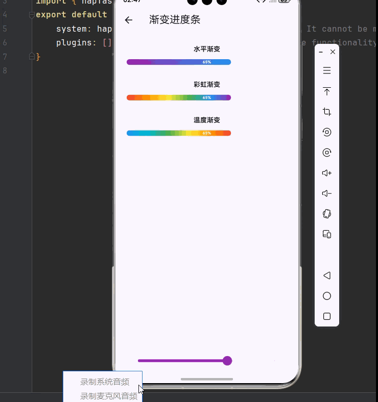
class GradientProgressDemo extends StatefulWidget {
const GradientProgressDemo({super.key});
@override
State<GradientProgressDemo> createState() => _GradientProgressDemoState();
}
class _GradientProgressDemoState extends State<GradientProgressDemo> {
double _progress = 0.65;
@override
Widget build(BuildContext context) {
return Scaffold(
appBar: AppBar(title: const Text('渐变进度条')),
body: Padding(
padding: const EdgeInsets.all(24),
child: Column(
children: [
const Text('水平渐变', style: TextStyle(fontWeight: FontWeight.bold)),
const SizedBox(height: 12),
GradientLinearProgress(progress: _progress, gradientColors: const [Colors.purple, Colors.blue]),
const SizedBox(height: 32),
const Text('彩虹渐变', style: TextStyle(fontWeight: FontWeight.bold)),
const SizedBox(height: 12),
GradientLinearProgress(progress: _progress, gradientColors: const [Colors.red, Colors.orange, Colors.yellow, Colors.green, Colors.blue, Colors.purple]),
const SizedBox(height: 32),
const Text('温度渐变', style: TextStyle(fontWeight: FontWeight.bold)),
const SizedBox(height: 12),
GradientLinearProgress(progress: _progress, gradientColors: const [Colors.blue, Colors.cyan, Colors.green, Colors.yellow, Colors.orange, Colors.red]),
const Spacer(),
Slider(value: _progress, min: 0, max: 1, divisions: 100, activeColor: Colors.purple, onChanged: (value) => setState(() => _progress = value)),
],
),
),
);
}
}
class GradientLinearProgress extends StatelessWidget {
final double progress;
final List<Color> gradientColors;
final double height;
const GradientLinearProgress({
super.key,
required this.progress,
this.gradientColors = const [Colors.blue, Colors.purple],
this.height = 12,
});
@override
Widget build(BuildContext context) {
return LayoutBuilder(
builder: (context, constraints) {
return Container(
height: height,
decoration: BoxDecoration(color: Colors.grey.withOpacity(0.2), borderRadius: BorderRadius.circular(6)),
child: Stack(
children: [
AnimatedContainer(
duration: const Duration(milliseconds: 300),
width: constraints.maxWidth * progress.clamp(0.0, 1.0),
decoration: BoxDecoration(gradient: LinearGradient(colors: gradientColors), borderRadius: BorderRadius.circular(6)),
),
Center(child: Text('${(progress * 100).toStringAsFixed(0)}%', style: TextStyle(color: progress > 0.5 ? Colors.white : Colors.black54, fontSize: height * 0.7, fontWeight: FontWeight.bold))),
],
),
);
},
);
}
}
class CircleProgressDemo extends StatefulWidget {
const CircleProgressDemo({super.key});
@override
State<CircleProgressDemo> createState() => _CircleProgressDemoState();
}
class _CircleProgressDemoState extends State<CircleProgressDemo> with SingleTickerProviderStateMixin {
double _progress = 0.75;
late AnimationController _controller;
late Animation<double> _animation;
@override
void initState() {
super.initState();
_controller = AnimationController(duration: const Duration(milliseconds: 1500), vsync: this);
_animation = Tween<double>(begin: 0, end: _progress).animate(CurvedAnimation(parent: _controller, curve: Curves.easeOutCubic))..addListener(() => setState(() => _progress = _animation.value));
_controller.forward();
}
@override
void dispose() { _controller.dispose(); super.dispose(); }
@override
Widget build(BuildContext context) {
return Scaffold(
appBar: AppBar(title: const Text('圆形进度')),
body: Center(
child: Column(
mainAxisAlignment: MainAxisAlignment.center,
children: [
SizedBox(width: 180, height: 180, child: CustomPaint(painter: CircleProgressPainter(progress: _progress, gradientColors: const [Colors.blue, Colors.purple]))),
const SizedBox(height: 16),
Text('${(_progress * 100).toStringAsFixed(0)}%', style: const TextStyle(fontSize: 48, fontWeight: FontWeight.bold)),
const SizedBox(height: 32),
SizedBox(width: 250, child: Slider(value: _progress, min: 0, max: 1, divisions: 100, activeColor: Colors.blue, onChanged: (value) => setState(() => _progress = value))),
],
),
),
);
}
}
class CircleProgressPainter extends CustomPainter {
final double progress;
final double strokeWidth;
final List<Color>? gradientColors;
CircleProgressPainter({required this.progress, this.strokeWidth = 12, this.gradientColors});
@override
void paint(Canvas canvas, Size size) {
final center = Offset(size.width / 2, size.height / 2);
final radius = min(size.width, size.height) / 2 - strokeWidth / 2;
final bgPaint = Paint()..color = Colors.grey.withOpacity(0.2)..style = PaintingStyle.stroke..strokeWidth = strokeWidth..strokeCap = StrokeCap.round;
canvas.drawCircle(center, radius, bgPaint);
final progressPaint = Paint()..style = PaintingStyle.stroke..strokeWidth = strokeWidth..strokeCap = StrokeCap.round;
if (gradientColors != null && gradientColors!.length >= 2) {
progressPaint.shader = SweepGradient(center: Alignment.center, colors: gradientColors!, transform: const GradientRotation(-pi / 2)).createShader(Rect.fromCircle(center: center, radius: radius));
} else {
progressPaint.color = Colors.blue;
}
canvas.drawArc(Rect.fromCircle(center: center, radius: radius), -pi / 2, 2 * pi * progress.clamp(0.0, 1.0), false, progressPaint);
}
@override
bool shouldRepaint(CircleProgressPainter oldDelegate) => progress != oldDelegate.progress;
}
class WaveProgressDemo extends StatefulWidget {
const WaveProgressDemo({super.key});
@override
State<WaveProgressDemo> createState() => _WaveProgressDemoState();
}
class _WaveProgressDemoState extends State<WaveProgressDemo> with SingleTickerProviderStateMixin {
double _progress = 0.6;
late AnimationController _waveController;
@override
void initState() {
super.initState();
_waveController = AnimationController(duration: const Duration(seconds: 2), vsync: this)..repeat();
}
@override
void dispose() { _waveController.dispose(); super.dispose(); }
@override
Widget build(BuildContext context) {
return Scaffold(
appBar: AppBar(title: const Text('波浪进度')),
body: Center(
child: Column(
mainAxisAlignment: MainAxisAlignment.center,
children: [
AnimatedBuilder(
animation: _waveController,
builder: (context, child) {
return SizedBox(width: 180, height: 180, child: CustomPaint(painter: WaveProgressPainter(progress: _progress, phase: _waveController.value * 2 * pi, waveColor: Colors.blue)));
},
),
const SizedBox(height: 32),
SizedBox(width: 250, child: Slider(value: _progress, min: 0, max: 1, divisions: 100, activeColor: Colors.blue, onChanged: (value) => setState(() => _progress = value))),
],
),
),
);
}
}
class WaveProgressPainter extends CustomPainter {
final double progress;
final double phase;
final Color waveColor;
WaveProgressPainter({required this.progress, required this.phase, this.waveColor = Colors.blue});
@override
void paint(Canvas canvas, Size size) {
final waterLevel = size.height * (1 - progress.clamp(0.0, 1.0));
final center = Offset(size.width / 2, size.height / 2);
final radius = min(size.width, size.height) / 2;
final bgPaint = Paint()..color = Colors.grey.withOpacity(0.1)..style = PaintingStyle.fill;
canvas.drawCircle(center, radius, bgPaint);
final wavePath = Path()..moveTo(0, size.height)..lineTo(0, waterLevel);
for (double x = 0; x <= size.width; x++) {
final y = waterLevel + 8 * sin((x / size.width * 4 * pi) + phase);
wavePath.lineTo(x, y);
}
wavePath.lineTo(size.width, size.height);
wavePath.close();
canvas.save();
canvas.clipPath(Path()..addOval(Rect.fromLTWH(0, 0, size.width, size.height)));
final wavePaint = Paint()..shader = LinearGradient(begin: Alignment.topCenter, end: Alignment.bottomCenter, colors: [waveColor.withOpacity(0.7), waveColor]).createShader(Rect.fromLTWH(0, 0, size.width, size.height));
canvas.drawPath(wavePath, wavePaint);
canvas.restore();
final borderPaint = Paint()..color = waveColor..style = PaintingStyle.stroke..strokeWidth = 3;
canvas.drawCircle(center, radius - 1.5, borderPaint);
}
@override
bool shouldRepaint(WaveProgressPainter oldDelegate) => progress != oldDelegate.progress || phase != oldDelegate.phase;
}
class SegmentedProgressDemo extends StatelessWidget {
const SegmentedProgressDemo({super.key});
@override
Widget build(BuildContext context) {
return Scaffold(
appBar: AppBar(title: const Text('分段进度')),
body: Padding(
padding: const EdgeInsets.all(24),
child: Column(
children: [
const Text('项目进度', style: TextStyle(fontWeight: FontWeight.bold, fontSize: 16)),
const SizedBox(height: 16),
SegmentedProgressBar(segments: const [Segment(weight: 3, color: Colors.green, label: '完成'), Segment(weight: 2, color: Colors.blue, label: '进行'), Segment(weight: 1, color: Colors.orange, label: '待办'), Segment(weight: 1, color: Colors.grey, label: '暂停')]),
const SizedBox(height: 32),
const Text('存储空间', style: TextStyle(fontWeight: FontWeight.bold, fontSize: 16)),
const SizedBox(height: 16),
SegmentedProgressBar(segments: const [Segment(weight: 45, color: Colors.blue), Segment(weight: 30, color: Colors.green), Segment(weight: 15, color: Colors.orange), Segment(weight: 10, color: Colors.grey)]),
],
),
),
);
}
}
class SegmentedProgressBar extends StatelessWidget {
final List<Segment> segments;
final double height;
const SegmentedProgressBar({super.key, required this.segments, this.height = 24});
@override
Widget build(BuildContext context) {
return CustomPaint(size: Size.fromHeight(height), painter: SegmentedProgressPainter(segments: segments));
}
}
class SegmentedProgressPainter extends CustomPainter {
final List<Segment> segments;
SegmentedProgressPainter({required this.segments});
@override
void paint(Canvas canvas, Size size) {
final totalWeight = segments.fold<double>(0, (sum, s) => sum + s.weight);
double currentX = 0;
const spacing = 4;
for (final segment in segments) {
final segmentWidth = (size.width - spacing * (segments.length - 1)) * segment.weight / totalWeight;
final rect = RRect.fromRectAndRadius(Rect.fromLTWH(currentX, 0, segmentWidth, size.height), const Radius.circular(8));
canvas.drawRRect(rect, Paint()..color = segment.color);
currentX += segmentWidth + spacing;
}
}
@override
bool shouldRepaint(SegmentedProgressPainter oldDelegate) => true;
}
class Segment {
final double weight;
final Color color;
final String? label;
const Segment({required this.weight, required this.color, this.label});
}
class StepProgressDemo extends StatefulWidget {
const StepProgressDemo({super.key});
@override
State<StepProgressDemo> createState() => _StepProgressDemoState();
}
class _StepProgressDemoState extends State<StepProgressDemo> {
int _currentStep = 2;
@override
Widget build(BuildContext context) {
return Scaffold(
appBar: AppBar(title: const Text('步骤进度')),
body: Padding(
padding: const EdgeInsets.all(24),
child: Column(
children: [
StepProgressIndicator(totalSteps: 4, currentStep: _currentStep, stepLabels: const ['购物车', '地址', '支付', '完成']),
const SizedBox(height: 32),
Row(mainAxisAlignment: MainAxisAlignment.spaceEvenly, children: [
ElevatedButton(onPressed: _currentStep > 1 ? () => setState(() => _currentStep--) : null, child: const Text('上一步')),
ElevatedButton(onPressed: _currentStep < 4 ? () => setState(() => _currentStep++) : null, child: const Text('下一步')),
]),
],
),
),
);
}
}
class StepProgressIndicator extends StatelessWidget {
final int totalSteps;
final int currentStep;
final List<String>? stepLabels;
const StepProgressIndicator({super.key, required this.totalSteps, required this.currentStep, this.stepLabels});
@override
Widget build(BuildContext context) {
return Column(
children: [
Row(children: List.generate(totalSteps, (index) {
final isActive = index < currentStep;
return Expanded(child: Row(children: [
Container(width: 32, height: 32, decoration: BoxDecoration(shape: BoxShape.circle, color: isActive ? Colors.blue : Colors.grey.withOpacity(0.2), border: Border.all(color: isActive ? Colors.blue : Colors.grey, width: 2)), child: Center(child: isActive ? const Icon(Icons.check, color: Colors.white, size: 18) : Text('${index + 1}', style: const TextStyle(color: Colors.grey, fontWeight: FontWeight.bold)))),
if (index < totalSteps - 1) Expanded(child: Container(height: 3, color: index < currentStep - 1 ? Colors.blue : Colors.grey.withOpacity(0.3))),
]));
})),
if (stepLabels != null) ...[
const SizedBox(height: 8),
Row(mainAxisAlignment: MainAxisAlignment.spaceBetween, children: stepLabels!.map((label) => SizedBox(width: 32, child: Text(label, textAlign: TextAlign.center, style: TextStyle(fontSize: 12, color: stepLabels!.indexOf(label) < currentStep ? Colors.blue : Colors.grey)))).toList()),
],
],
);
}
}
class DownloadProgressDemo extends StatefulWidget {
const DownloadProgressDemo({super.key});
@override
State<DownloadProgressDemo> createState() => _DownloadProgressDemoState();
}
class _DownloadProgressDemoState extends State<DownloadProgressDemo> {
double _progress = 0.45;
DownloadStatus _status = DownloadStatus.downloading;
@override
Widget build(BuildContext context) {
return Scaffold(
appBar: AppBar(title: const Text('下载进度')),
body: Padding(
padding: const EdgeInsets.all(16),
child: Column(
children: [
DownloadProgressBar(progress: _progress, fileName: 'flutter_sdk_v3.19.0.zip', fileSize: '1.2 GB', status: _status, onPause: () => setState(() => _status = DownloadStatus.paused), onResume: () => setState(() => _status = DownloadStatus.downloading)),
const SizedBox(height: 24),
Row(mainAxisAlignment: MainAxisAlignment.spaceEvenly, children: [
ElevatedButton(onPressed: () => setState(() => _progress = (_progress + 0.1).clamp(0.0, 1.0)), child: const Text('增加进度')),
ElevatedButton(onPressed: () => setState(() => _progress = (_progress - 0.1).clamp(0.0, 1.0)), child: const Text('减少进度')),
]),
],
),
),
);
}
}
class DownloadProgressBar extends StatelessWidget {
final double progress;
final String fileName;
final String fileSize;
final DownloadStatus status;
final VoidCallback? onPause;
final VoidCallback? onResume;
const DownloadProgressBar({super.key, required this.progress, required this.fileName, required this.fileSize, required this.status, this.onPause, this.onResume});
@override
Widget build(BuildContext context) {
return Container(
padding: const EdgeInsets.all(16),
decoration: BoxDecoration(color: Colors.white, borderRadius: BorderRadius.circular(12), boxShadow: [BoxShadow(color: Colors.black.withOpacity(0.1), blurRadius: 10)]),
child: Column(
crossAxisAlignment: CrossAxisAlignment.start,
children: [
Row(children: [
Container(width: 48, height: 48, decoration: BoxDecoration(color: Colors.blue.withOpacity(0.1), borderRadius: BorderRadius.circular(8)), child: const Icon(Icons.insert_drive_file, color: Colors.blue)),
const SizedBox(width: 12),
Expanded(child: Column(crossAxisAlignment: CrossAxisAlignment.start, children: [Text(fileName, style: const TextStyle(fontWeight: FontWeight.bold, fontSize: 14), maxLines: 1, overflow: TextOverflow.ellipsis), const SizedBox(height: 4), Text(fileSize, style: TextStyle(color: Colors.grey[600], fontSize: 12))])),
GestureDetector(onTap: status == DownloadStatus.downloading ? onPause : onResume, child: Container(width: 40, height: 40, decoration: BoxDecoration(color: Colors.grey[100], shape: BoxShape.circle), child: Icon(status == DownloadStatus.downloading ? Icons.pause : Icons.play_arrow, color: Colors.blue))),
]),
const SizedBox(height: 12),
Stack(children: [Container(height: 8, decoration: BoxDecoration(color: Colors.grey[200], borderRadius: BorderRadius.circular(4))), FractionallySizedBox(widthFactor: progress.clamp(0.0, 1.0), child: Container(height: 8, decoration: BoxDecoration(gradient: const LinearGradient(colors: [Colors.blue, Colors.lightBlue]), borderRadius: BorderRadius.circular(4))))]),
const SizedBox(height: 8),
Row(mainAxisAlignment: MainAxisAlignment.spaceBetween, children: [Text('${(progress * 100).toStringAsFixed(1)}%', style: TextStyle(color: Colors.grey[600], fontSize: 12)), Text(status == DownloadStatus.downloading ? '正在下载...' : '已暂停', style: const TextStyle(color: Colors.blue, fontSize: 12))]),
],
),
);
}
}
enum DownloadStatus { downloading, paused, completed, failed }
class ShimmerProgressDemo extends StatefulWidget {
const ShimmerProgressDemo({super.key});
@override
State<ShimmerProgressDemo> createState() => _ShimmerProgressDemoState();
}
class _ShimmerProgressDemoState extends State<ShimmerProgressDemo> with SingleTickerProviderStateMixin {
double _progress = 0.7;
late AnimationController _shimmerController;
@override
void initState() {
super.initState();
_shimmerController = AnimationController(duration: const Duration(milliseconds: 1500), vsync: this)..repeat();
}
@override
void dispose() { _shimmerController.dispose(); super.dispose(); }
@override
Widget build(BuildContext context) {
return Scaffold(
appBar: AppBar(title: const Text('闪光进度')),
body: Padding(
padding: const EdgeInsets.all(24),
child: Column(
children: [
const Text('闪光效果进度条', style: TextStyle(fontWeight: FontWeight.bold, fontSize: 16)),
const SizedBox(height: 24),
AnimatedBuilder(
animation: _shimmerController,
builder: (context, child) {
return CustomPaint(size: const Size.fromHeight(16), painter: ShimmerProgressPainter(progress: _progress, shimmerPosition: _shimmerController.value));
},
),
const Spacer(),
Slider(value: _progress, min: 0, max: 1, divisions: 100, activeColor: Colors.amber, onChanged: (value) => setState(() => _progress = value)),
],
),
),
);
}
}
class ShimmerProgressPainter extends CustomPainter {
final double progress;
final double shimmerPosition;
ShimmerProgressPainter({required this.progress, required this.shimmerPosition});
@override
void paint(Canvas canvas, Size size) {
canvas.drawRRect(RRect.fromRectAndRadius(Rect.fromLTWH(0, 0, size.width, size.height), const Radius.circular(8)), Paint()..color = Colors.grey.withOpacity(0.2));
final progressWidth = size.width * progress.clamp(0.0, 1.0);
final shimmerGradient = LinearGradient(colors: [Colors.amber, Colors.white.withOpacity(0.5), Colors.amber], stops: [(shimmerPosition - 0.2).clamp(0.0, 1.0), shimmerPosition.clamp(0.0, 1.0), (shimmerPosition + 0.2).clamp(0.0, 1.0)]);
canvas.drawRRect(RRect.fromRectAndRadius(Rect.fromLTWH(0, 0, progressWidth, size.height), const Radius.circular(8)), Paint()..shader = shimmerGradient.createShader(Rect.fromLTWH(0, 0, progressWidth, size.height)));
}
@override
bool shouldRepaint(ShimmerProgressPainter oldDelegate) => progress != oldDelegate.progress || shimmerPosition != oldDelegate.shimmerPosition;
}五、最佳实践与性能优化
🎨 5.1 性能优化建议
- 使用 const 构造函数:对于不变的组件使用 const 构造函数
- 避免过度重绘:在 shouldRepaint 中精确判断是否需要重绘
- 合理使用动画:避免创建过多的 AnimationController
- 状态管理优化:使用 ValueNotifier 替代 setState 进行局部更新
🔧 5.2 无障碍支持
dart
Semantics(
  label: '下载进度 ${progress * 100}%',
  value: progress.toStringAsFixed(2),
  child: CustomPaint(...),
)
📱 5.3 适配不同平台
在 OpenHarmony 平台上,需要注意:
- 使用平台原生字体
- 遵循平台设计规范
- 处理不同屏幕密度
六、总结
本文详细介绍了 Flutter for OpenHarmony 的高级进度指示器系统,包括:
| 组件类型 | 核心技术 | 应用场景 |
|---|---|---|
| 渐变进度条 | LinearGradient | 通用进度展示 |
| 圆形进度 | CustomPainter + SweepGradient | 按钮内进度 |
| 波浪进度 | Path + 动画控制器 | 液体/容量展示 |
| 分段进度 | 多段绘制 | 项目/存储分布 |
| 步骤进度 | 状态管理 | 表单/向导流程 |
| 下载进度 | 状态机 + 动画 | 文件下载 |
| 闪光进度 | Shader + 动画 | 强调/吸引注意 |
参考资料
- Flutter Animation 官方文档
- Flutter CustomPainter 指南
- Material Design Progress Indicators
- OpenHarmony 开发者文档
💡 提示:进度指示器是用户反馈系统的重要组成部分,合理使用可以显著提升用户体验。建议根据具体场景选择合适的进度类型,并注意动画性能优化。