双轴柱状图
python
import pandas as pd
import matplotlib.pyplot as plt
# 准备数据
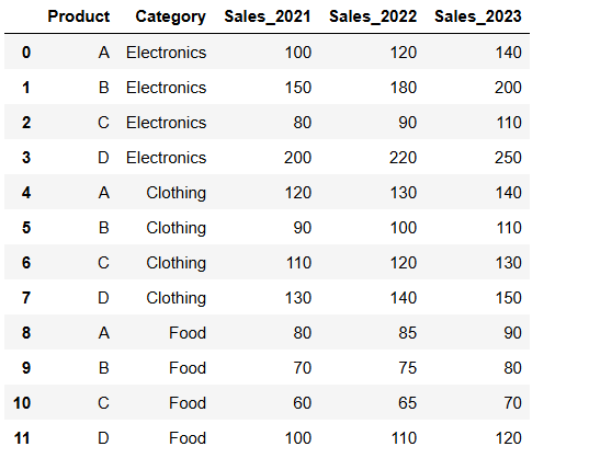
data = {
'Product': ['A', 'B', 'C', 'D'],
'Sales_2023': [140, 200, 110, 250],
'Growth_Rate': [0.15, 0.10, 0.22, 0.13]
}
df = pd.DataFrame(data)
# 设置图形大小
fig, ax1 = plt.subplots(figsize=(12, 6))
# ==================== 双Y轴的核心实现 ====================
# 第一个Y轴(左侧):绘制销售额柱状图
ax1.bar(df['Product'], df['Sales_2023'], color='#4C72B0', alpha=0.7, label='销量2023')
ax1.set_xlabel('产品')
ax1.set_ylabel('销量', color='#4C72B0')
ax1.tick_params(axis='y', labelcolor='#4C72B0') # 设置y轴刻度标签颜色
# 创建第二个Y轴(右侧):
# ax1.twinx():关键方法,创建一个与ax1共享x轴的新坐标轴ax2
ax2 = ax1.twinx()
# 第二个Y轴(右侧):绘制增长率折线图
ax2.plot(df['Product'], df['Growth_Rate'], color='#C44E52', marker='o',
linewidth=2, label='增长率')
ax2.set_ylabel('增长率', color='#C44E52')
ax2.tick_params(axis='y', labelcolor='#C44E52') # 设置y轴刻度标签颜色
# ==================== Y轴格式化设置 ====================
# 设置右侧y轴格式为百分比:
# plt.FuncFormatter:自定义格式化函数
ax2.yaxis.set_major_formatter(plt.FuncFormatter(lambda y, _: '{:.0%}'.format(y)))
# ==================== 标题设置 ====================
plt.title('销量与增长率对比图', fontsize=16)
# ==================== 合并图例的核心技巧 ====================
# 获取两个坐标轴的图例句柄和标签,动获取handles和labels
lines1, labels1 = ax1.get_legend_handles_labels() # handle是图形对象,label是字符串
lines2, labels2 = ax2.get_legend_handles_labels() # 右轴图例
print(lines2, labels2)# [<BarContainer object of 4 artists>] ['销量2023']
# 合并图例:
# lines1 + lines2:将两个坐标轴的图例句柄合并
# labels1 + labels2:将两个坐标轴的图例标签合并
# loc='upper left':图例位置在左上角
ax1.legend(lines1 + lines2, labels1 + labels2, loc='upper left')
# ==================== 数据标签添加 ====================
# 为销售额数据添加标签(使用左轴ax1)
for i, v in enumerate(df['Sales_2023']):
ax1.text(i, v, str(v), ha='center', va='bottom')
print(i,v)# 0 140 ....
# 为增长率数据添加标签(使用右轴ax2)
# f'{v:.1%}':格式化为百分比,保留1位小数
for i, v in enumerate(df['Growth_Rate']):
ax2.text(i, v, f'{v:.1%}', ha='center', va='bottom')
# 显示图形
plt.tight_layout()
plt.show()enumerate
enumerate() 是 Python 的内置函数,用于在遍历可迭代对象时同时获取索引和元素值。
python
fruits = ['apple', 'banana', 'cherry']

for index, fruit in enumerate(fruits):
    print(f"索引 {index}: {fruit}")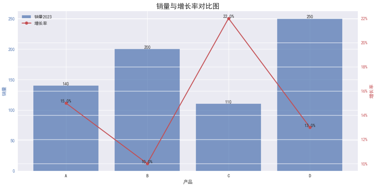
动态柱状图
但是在JupyterNotebook里不知道为啥就是不动
(1)每秒更新新的数据
python
import pandas as pd
import matplotlib.pyplot as plt
from matplotlib.animation import FuncAnimation

# 准备数据
data = {
    'Product': ['A', 'B', 'C', 'D'],
    'Sales_2021': [100, 150, 80, 200],
    'Sales_2022': [120, 180, 90, 220],
    'Sales_2023': [140, 200, 110, 250]
}
df = pd.DataFrame(data)

# 设置图形
fig, ax = plt.subplots(figsize=(12, 6))

# 初始化柱状图
bars = ax.bar(df['Product'], df['Sales_2021'])

# 设置坐标轴
ax.set_ylim(0, 300)
ax.set_xlabel('Product')
ax.set_ylabel('Sales')
ax.set_title('Dynamic Sales Chart - how2matplotlib.com')

# 更新函数
def update(frame):
    year = 2021 + frame
    data = df[f'Sales_{year}']
    for bar, height in zip(bars, data):
        bar.set_height(height)
    ax.set_title(f'Sales in {year} - how2matplotlib.com')

    # 更新数据标签
    for bar in bars:
        height = bar.get_height()
        ax.text(bar.get_x() + bar.get_width()/2., height,
                f'{height}', ha='center', va='bottom')

    return bars

# 创建动画
anim = FuncAnimation(fig, update, frames=3, interval=1000, repeat=True)

plt.tight_layout()
plt.show()
(2)逐个点画出折线图
python
fig, ax = plt.subplots() #生成轴和fig, 可迭代的对象
x, y= [], [] #用于接受后更新的数据
line, = plt.plot([], [], '.-') #绘制线对象,plot返回值类型,要加逗号
#------说明--------#
#核心函数包含两个:
#一个是用于初始化画布的函数init()
#另一个是用于更新数据做动态显示的update()
xlist=list(range(11))
ylist=list(range(0,200,20))+[110]
def init():
#初始化函数用于绘制一块干净的画布,为后续绘图做准备
ax.set_xlim(0, 100) #初始函数,设置绘图范围
ax.set_ylim(0, 300)
return line
def update(step): #通过帧数来不断更新新的数值
x.append(xlist[step])
y.append(ylist[step]) #计算y
line.set_data(x, y)
return line
#fig 是绘图的画布
#update 为更新绘图的函数,step数值是从frames 传入
#frames 数值是用于动画每一帧的数据
anim = FuncAnimation(fig, update, frames=xlist,
init_func=init,interval=20,repeat=False)
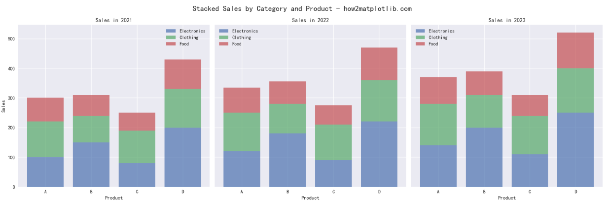
plt.show()分面柱状图
多个面有规律可以同时绘制
比如如下数据:
分3年形成不同品类的堆叠效果
python
import pandas as pd
import matplotlib.pyplot as plt
import numpy as np

# 准备数据
data = {
    'Product': ['A', 'B', 'C', 'D'] * 3,
    'Category': ['Electronics', 'Electronics', 'Electronics', 'Electronics',
                 'Clothing', 'Clothing', 'Clothing', 'Clothing',
                 'Food', 'Food', 'Food', 'Food'],
    'Sales_2021': [100, 150, 80, 200, 120, 90, 110, 130, 80, 70, 60, 100],
    'Sales_2022': [120, 180, 90, 220, 130, 100, 120, 140, 85, 75, 65, 110],
    'Sales_2023': [140, 200, 110, 250, 140, 110, 130, 150, 90, 80, 70, 120]
}
df = pd.DataFrame(data)

# 设置图形
fig, axes = plt.subplots(1, 3, figsize=(18, 6), sharey=True)
fig.suptitle('Stacked Sales by Category and Product - how2matplotlib.com', fontsize=16)

# 获取唯一值
categories = df['Category'].unique()  # ['Electronics', 'Clothing', 'Food']
products = df['Product'].unique()    # ['A', 'B', 'C', 'D']

# ==================== 核心修改:实现堆叠效果 ====================

for i, year in enumerate(['Sales_2021', 'Sales_2022', 'Sales_2023']):

    # 初始化 bottom 参数(每个子图都要重新初始化)
    bottom = np.zeros(len(products))

    for j, category in enumerate(categories):
        # 筛选当前类别的数据
        category_data = df[df['Category'] == category]

        # 获取当前类别的数据(按产品顺序)
        values = [category_data[category_data['Product'] == p][year].values[0]
                  for p in products]

        # 绘制堆叠柱状图(关键:使用 bottom 参数)
        axes[i].bar(products, values, bottom=bottom, label=category, alpha=0.7)

        # 更新 bottom 参数(累加当前类别的高度)
        bottom = bottom + np.array(values)
        print(bottom)

    # 设置子图标题
    axes[i].set_title(f'Sales in {year[-4:]}')
    axes[i].set_xlabel('Product')

    # 只在第一个子图设置y轴标签
    if i == 0:
        axes[i].set_ylabel('Sales')

    # 添加图例
    axes[i].legend()

# 调整布局
plt.tight_layout()
plt.show()