【学习目标】
- 精准区分Button、Radio、Toggle组件的核心定位与适用场景,掌握选型逻辑;
- 掌握各组件的基础创建、样式定制、状态控制,适配不同交互场景;
- 熟练绑定核心事件,实现"选择-确认"类业务逻辑;
- 掌握组件组合使用技巧,完成表单提交、功能开关等高频场景开发。
一、组件核心认知
1.1 定位与差异
三类组件同属表单交互核心组件,但能力边界和业务适配性明确区分,禁止跨场景混用:
| 组件 | 核心定位 | 核心特性 | 典型业务场景 |
|---|---|---|---|
| Button | 操作触发/指令提交 | 支持文本/复合样式、4种内置类型、点击反馈 | 表单提交、页面跳转、功能触发(确认/取消) |
| Radio | 单选项互斥选择 | 同一group仅选一个、支持自定义选中样式 | 性别选择、支付方式、模式切换(响铃/振动) |
| Toggle | 二元状态切换(开关/勾选) | 3种样式(Switch/Checkbox/Button)、状态持久化 | WiFi/蓝牙开关、协议勾选、夜间模式切换 |
二、工程基础配置
基于**HarmonyOS NEXT/API 20+**创建FormInteractionDemo工程,标准目录结构如下:
FormInteractionDemo/
├── AppScope/
│   └── app.json5  // 全局配置
├── entry/
│   ├── src/main/
│   │   ├── ets/
│   │   │   ├── entryability/
│   │   │   │   └── EntryAbility.ets  // 应用入口
│   │   │   ├── pages/
│   │   │   │   ├── Index.ets  // 导航主页面
│   │   │   │   ├── ButtonDemoPage.ets  // Button组件实战
│   │   │   │   ├── RadioDemoPage.ets   // Radio组件实战
│   │   │   │   └── ToggleDemoPage.ets  // Toggle组件实战
│   │   ├── resources/
│   │   │   └── media/  // 图标素材
│   │   └── module.json5  // 模块配置
2.1 导航主页面(Index.ets)
javascript
import { router } from '@kit.ArkUI';
interface RouterItem {
title: string;
url: string;
}
@Entry
@Component
struct Index {
private routerList: RouterItem[] = [
{ title: "Button按钮组件", url: 'pages/ButtonDemoPage' },
{ title: "Radio单选框组件", url: 'pages/RadioDemoPage' },
{ title: "Toggle切换组件", url: 'pages/ToggleDemoPage' }
];
build() {
Column({ space: 15 }) {
Text("表单交互组件实战")
.fontSize(30)
.fontWeight(FontWeight.Bold)
.margin({ bottom: 40 })
.textAlign(TextAlign.Center);
ForEach(
this.routerList,
(item: RouterItem) => {
Button(item.title)
.width('80%')
.height(45)
.backgroundColor($r('sys.color.brand'))
.fontColor(Color.White)
.fontSize(16)
.borderRadius(8)
.shadow({ radius: 3, color: '#00000015', offsetX: 0, offsetY: 2 })
.onClick(() => {
router.pushUrl({ url: item.url });
});
},
(item:RouterItem) => item.url
);
}
.width('100%')
.height('100%')
.justifyContent(FlexAlign.Center)
.backgroundColor('#F8F8F8')
.padding(20);
}
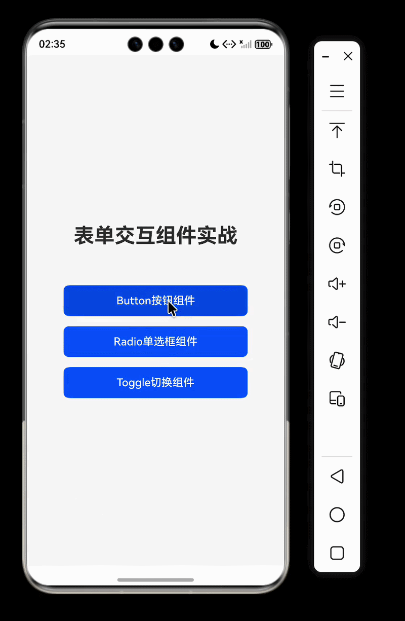
}运行效果
三、Button按钮组件
3.1 核心知识点
- 四种内置类型 :
Capsule(胶囊型):默认类型,圆角为高度的1/2,不支持自定义圆角;Circle(圆形):需设置宽高一致,适配悬浮操作按钮;Normal(普通型):默认无圆角,支持borderRadius自定义;ROUNDED_RECTANGLE(圆角矩形):默认圆角适配控件尺寸。
- 核心能力 :
- 复合内容:支持嵌套单个子组件(如Row+Image+Text实现图文按钮);
- 状态控制:
enabled(布尔值)控制禁用状态(true=启用,false=禁用)、stateEffect关闭点击反馈; - 事件绑定:核心
onClick事件,响应业务逻辑。
3.2 示例代码
javascript
import { promptAction } from '@kit.ArkUI';

@Entry
@Component
struct ButtonDemoPage {
  @State isDisabled: boolean = false; // true=禁用,false=启用

  build() {
    Scroll() {
      Column({ space: 20 }) {
        Text("Button核心类型演示")
          .fontSize(22)
          .fontWeight(FontWeight.Medium)
          .alignSelf(ItemAlign.Start);

        // 1. 胶囊按钮(默认类型)
        Button("胶囊按钮(默认)", { type: ButtonType.Capsule })
          .width('80%')
          .height(45)
          .backgroundColor($r('sys.color.brand'))
          .fontColor(Color.White)
          .onClick(() => {
            promptAction.showToast({ message: '胶囊按钮点击' });
          });

        // 2. 圆形按钮(需宽高一致)
        Button({ type: ButtonType.Circle, stateEffect: true }) {
          Image($r('app.media.icon_add')) // 需放入media目录
            .width(24)
            .height(24);
        }
        .width(60)
        .height(60)
        .backgroundColor($r('sys.color.brand'));

        // 3. 普通按钮(自定义圆角)
        Button("普通按钮(自定义圆角)", { type: ButtonType.Normal })
          .width('80%')
          .height(45)
          .borderRadius(4)
          .backgroundColor('#667788')
          .fontColor(Color.White);

        // 4. 圆角矩形按钮
        Button("圆角矩形按钮", { type: ButtonType.ROUNDED_RECTANGLE })
          .width('80%')
          .height(45)
          .backgroundColor($r('sys.color.brand'))
          .fontColor(Color.White);

        Divider().width('100%');

        Text("Button状态与交互")
          .fontSize(22)
          .fontWeight(FontWeight.Medium)
          .alignSelf(ItemAlign.Start);

        // 禁用状态切换按钮
        Button(this.isDisabled ? "启用按钮" : "禁用按钮")
          .width('80%')
          .height(45)
          .backgroundColor(this.isDisabled ? '#CCCCCC' : $r('sys.color.brand'))
          .fontColor(Color.White)
          .onClick(() => {
            this.isDisabled = !this.isDisabled;
          });

        // 可交互/禁用按钮(核心:使用enabled属性)
        Button("可点击按钮(带禁用)")
          .width('80%')
          .height(45)
          .enabled(!this.isDisabled) // enabled=false时禁用
          .backgroundColor($r('sys.color.brand'))
          .fontColor(Color.White)
          .onClick(() => {
            promptAction.showToast({ message: '可点击按钮触发' });
          });

        // 5. 复合按钮(文字+图标)
        Button({ type: ButtonType.Capsule }) {
          Row({ space: 8}) {
            Image($r('app.media.icon_search'))
              .width(20)
              .height(20);
            Text("搜索")
              .fontSize(16)
              .fontColor(Color.White);
          }.alignItems(VerticalAlign.Center)
        }
        .width('80%')
        .height(45)
        .backgroundColor('#6A5ACD');

        // 6. 无点击反馈按钮
        Button("无点击反馈按钮", { stateEffect: false })
          .width('80%')
          .height(45)
          .backgroundColor('#999999')
          .fontColor(Color.White);
      }
      .width('100%')
      .padding(20)
      .backgroundColor('#F8F8F8');
    }
    .width('100%')
    .height('100%')
    .backgroundColor('#F8F8F8');
  }
}
四、Radio单选框组件
4.1 核心知识点
- 核心属性
value:Radio的唯一标识,字符串类型;group:分组名称,同一group的Radio互斥,字符串类型;checked:是否选中,布尔类型(默认false);enabled:是否启用,布尔类型(默认true);indicatorType:选中指示器类型(如DOT/TICK/CUSTOM),枚举类型;indicatorBuilder:自定义指示器构建函数(仅indicatorType=CUSTOM时生效);radioStyle:Radio样式配置,包含checkedBackgroundColor(选中背景色)、indicatorColor(指示器颜色)等;
- 核心事件 :
onChange:选中状态变化时触发,返回参数为isChecked: boolean。
4.2 示例代码
javascript
import { promptAction } from '@kit.ArkUI';

@Entry
@Component
struct RadioDemoPage {
  // 绑定选中状态,默认值匹配Radio的value
  @State selectedSoundMode: string = 'ring';
  @State dataSource: Record<string, string> = {
    'ring': '响铃模式',
    'vibrate': '振动模式',
    'silent': '静音模式'
  }
  // 同一分组名称
  private soundGroup: string = 'soundModeGroup';

  // 自定义指示器构建函数
  @Builder
  customIndicatorBuilder() {
    Image($r('app.media.star')) // 需在media目录放入star图标
      .width(16)
      .height(16)
      .fillColor(Color.Yellow);
  }

  build() {
    Column({ space: 20 }) {
      Text("Radio单选框(分组互斥+自定义样式)")
        .fontSize(22)
        .fontWeight(FontWeight.Medium);

      // Radio分组容器
      Column({ space: 15 }) {
        // 1. 响铃模式(DOT类型指示器)
        Radio({ value: 'ring', group: this.soundGroup,indicatorType:RadioIndicatorType.DOT })
          .checked(this.selectedSoundMode === 'ring')
          .radioStyle({ // Radio样式配置(官方属性)
            checkedBackgroundColor: Color.Pink, // 选中背景色
            indicatorColor: Color.Blue // 指示器颜色
          })
          .onChange((isChecked: boolean) => {
            if (isChecked) {
              this.selectedSoundMode = 'ring';
              promptAction.showToast({ message: '选择了响铃模式' });
            }
          });
        Text("响铃模式")
          .fontSize(16);

        // 2. 振动模式(CUSTOM自定义指示器)
        Radio({ value: 'vibrate',
          group: this.soundGroup,
          indicatorType:RadioIndicatorType.CUSTOM,
          // 绑定自定义构建函数
           indicatorBuilder:() => this.customIndicatorBuilder()})
          .checked(this.selectedSoundMode === 'vibrate')
          .radioStyle({
            checkedBackgroundColor: Color.Pink
          })
          .onChange((isChecked: boolean) => {
            if (isChecked) {
              this.selectedSoundMode = 'vibrate';
              promptAction.showToast({ message: '选择了振动模式' });
            }
          });
        Text("振动模式")
          .fontSize(16);

        // 3. 静音模式(TICK对勾指示器)
        Radio({ value: 'silent', group: this.soundGroup,indicatorType:RadioIndicatorType.TICK })
          .checked(this.selectedSoundMode === 'silent')
          .radioStyle({
            checkedBackgroundColor: Color.Pink
          })
          .onChange((isChecked: boolean) => {
            if (isChecked) {
              this.selectedSoundMode = 'silent';
              promptAction.showToast({ message: '选择了静音模式' });
            }
          });
        Text("静音模式")
          .fontSize(16);
      }
      .padding(20)
      .backgroundColor('#F5F5F5')
      .borderRadius(8)
      .width('90%');

      // 展示选中结果
      Text(`当前选中:${this.dataSource[this.selectedSoundMode]}`)
        .fontSize(14)
        .fontColor('#666');
    }
    .width('100%')
    .height('100%')
    .padding(20)
    .backgroundColor('#F8F8F8')
    .justifyContent(FlexAlign.Center);
  }
}
五、Toggle切换组件
5.1 核心知识点
- 三种核心类型 :
ToggleType.Switch:开关样式(适配WiFi/蓝牙开关);ToggleType.Checkbox:勾选框样式;ToggleType.Button:状态按钮样式(支持嵌套单个子组件)。
- 核心能力 :
isOn:设置初始状态(开启/选中为true);selectedColor:设置选中/开启状态颜色(Toggle原生属性,非Radio);switchPointColor:仅Switch类型生效,设置滑块颜色;onChange:响应状态切换,返回当前状态值。
5.2 示例代码
javascript
import { promptAction } from '@kit.ArkUI';

@Entry
@Component
struct ToggleDemoPage {
  // Switch状态
  @State isBluetoothOn: boolean = false;
  // Checkbox状态
  @State isAgreeProtocol: boolean = false;
  // Button类型状态
  @State isNightMode: boolean = false;

  build() {
    Column({ space: 25 }) {
      Text("Toggle核心类型演示")
        .fontSize(22)
        .fontWeight(FontWeight.Medium);

      // 1. Switch开关(WiFi/蓝牙场景)
      Row({ space: 0}) {
        Text("蓝牙开关")
          .fontSize(16);
        Toggle({ type: ToggleType.Switch, isOn: this.isBluetoothOn })
          .selectedColor($r('sys.color.brand')) // Toggle原生属性
          .switchPointColor(Color.White)
          .onChange((isOn: boolean) => {
            this.isBluetoothOn = isOn;
            promptAction.showToast({ message: `蓝牙${isOn ? '开启' : '关闭'}` });
          });
      }.alignItems(VerticalAlign.Center)
      .width('90%')
      .padding(10)
      .backgroundColor('#F5F5F5')
      .borderRadius(8);

      // 2. Checkbox勾选框(协议勾选)
      Row({ space: 10 }) {
        Toggle({ type: ToggleType.Checkbox, isOn: this.isAgreeProtocol })
          .selectedColor($r('sys.color.brand'))
          .onChange((isOn: boolean) => {
            this.isAgreeProtocol = isOn;
          });
        Text("我已阅读并同意用户协议和隐私政策")
          .fontSize(14)
          .fontColor('#666');
      }
      .alignItems(VerticalAlign.Center)
      .width('90%')
      .padding(10)
      .backgroundColor('#F5F5F5')
      .borderRadius(8);

      // 3. Button类型(状态切换按钮)
      Toggle({ type: ToggleType.Button, isOn: this.isNightMode }) {
        Text(this.isNightMode ? '夜间模式(开启)' : '夜间模式(关闭)')
          .fontSize(16)
          .fontColor(this.isNightMode ? Color.White : Color.Black);
      }
      .selectedColor($r('sys.color.brand'))
      .width('90%')
      .height(45)
      .onChange((isOn: boolean) => {
        this.isNightMode = isOn;
        promptAction.showToast({ message: `夜间模式${isOn ? '开启' : '关闭'}` });
      });
    }
    .width('100%')
    .height('100%')
    .padding(20)
    .backgroundColor('#F8F8F8')
    .justifyContent(FlexAlign.Center);
  }
}
六、核心知识点总结
6.1 组件选型关键
- 触发操作选Button:表单提交、页面跳转、功能触发等"一次性操作"场景;
- 单选互斥选Radio:多选项中仅选一个,支持自定义选中样式(indicatorType/indicatorBuilder);
- 二元切换选Toggle :
- 功能开关→
Switch类型; - 协议勾选→
Checkbox类型; - 状态按钮→
Button类型。
- 功能开关→
6.2 开发避坑要点
- Button组件:
- 禁用状态用
enabled(true=启用,false=禁用);
- 禁用状态用
- Radio组件:
- 互斥依赖
group属性,同组必须保证group值一致; radioStyle可设置底框色indicatorType:可设置样式和自定义样式(关于自定义组件我们后边会讲到);
- 互斥依赖
- Toggle组件:
switchPointColor仅对Switch类型生效;selectedColor是其原生属性,用于设置选中颜色;
七、配套代码
- 工程名称:FormInteractionDemo
- 仓库地址:https://gitee.com/HarmonyOS-UI-Basics/harmony-os-ui-basics.git
八、下节预告
下一节我们将学习ArkTS 状态管理 V1 基础篇,系统掌握鸿蒙声明式 UI 开发中"数据驱动视图"的核心机制:
- 理解状态管理核心概念与运行原理,掌握依赖收集、最小化更新的底层逻辑,区分状态变量与普通变量的本质差异;
- 精通
@State、@Prop、@Link、@Watch四大基础装饰器的用法、核心差异与适用场景: - 解决"状态更新但 UI 不刷新""@Link 传值编译报错""@Watch 不触发"等高频问题。
学完本节,你将建立"数据驱动视图"的核心思维,掌握鸿蒙声明式 UI 开发的底层核心能力,为后续复杂交互场景开发筑牢基础。