多色路径需求
在HandyControl 中支持图标和图标+文本显示,图标主要是矢量路径也就是对应着svg的数据格式。而对于多图形GeometryGroup 虽然能够多路径组合,但是仅支持单色,并不支持多色,日常使用如下:

原始svg内容
svg
<svg xmlns="http://www.w3.org/2000/svg" xmlns:xlink="http://www.w3.org/1999/xlink" fill="none" version="1.1" width="16" height="16" viewBox="0 0 16 16"><defs><clipPath id="master_svg0_103_3747"><rect x="0" y="0" width="16" height="16" rx="0"/></clipPath></defs><g clip-path="url(#master_svg0_103_3747)"><path d="M10.832551042773437,1.59998178671875L2.8058843427734375,9.84051518671875C2.7448177427734377,9.90398218671875,2.7320177427734373,9.91651538671875,2.7082843427734375,9.97331528671875L2.6714843427734376,10.06851478671875L2.616551142773438,10.23118018671875L2.4133510427734377,10.86424728671875L2.0098843527734376,12.14691338671875L1.3573510647734375,14.24211338671875C1.2330844397734375,14.64291338671875,1.5976177427734375,15.01811338671875,1.9952178027734375,14.91758038671875L2.6701511427734372,14.69784638671875L5.239218042773437,13.85011338671875L5.939217542773438,13.61357938671875L6.079217442773437,13.56424738671875C6.099751042773438,13.55651238671875,6.116550942773437,13.55011238671875,6.131484042773438,13.54398038671875L6.192017542773438,13.51891438671875C6.248017742773437,13.49464738671875,6.260550942773437,13.48158038671875,6.321084042773437,13.42184638671875L14.353082342773437,5.17464708671875C14.756508342773438,4.760472786718751,14.756508342773438,4.10028838671875,14.353082342773437,3.68611358671875L12.341351342773438,1.61998176671875C11.930258342773438,1.19789707671875,11.254809342773438,1.18906152671875,10.832818042773438,1.60024842671875L10.832551042773437,1.59998178671875ZM3.6506848427734373,10.50264838671875L11.576818342773437,2.3642483867187503L13.589085342773437,4.430381786718749L5.645885442773437,12.58611438671875L5.209618542773438,12.73544738671875L3.7389519427734377,13.22344738671875L2.6826853427734374,13.57118138671875L3.3749520427734376,11.36104638671875L3.6157517427734374,10.60771468671875L3.6504187427734376,10.50238128671875L3.6506848427734373,10.50264838671875Z" fill="#FFFFFF" fill-opacity="1" style="mix-blend-mode:passthrough"/><path d="M9.0365343134375,3.750135658203125C9.2321443534375,3.554630756203125,9.5447464034375,3.541084766203125,9.7565345734375,3.718935728203125L9.7906675334375,3.750135658203125L12.190666923437501,6.150135558203125C12.3937263234375,6.3518721582031255,12.4013290234375,6.677928958203125,12.2078933234375,6.888910558203126C12.0144577234375,7.099892358203125,11.688966723437499,7.120558758203125,11.470400823437501,6.935735658203125L11.4365339234375,6.904535558203126L9.0365343134375,4.5045356782031245C8.8281536104375,4.296238418203125,8.8281536104375,3.958432908203125,9.0365343134375,3.750135658203125Z" fill="#FFFFFF" fill-opacity="1" style="mix-blend-mode:passthrough"/><path d="M13.599989443554687,13.333343505859375L13.599989443554687,13.866677345859374C13.599990343554687,14.161229195859375,13.361208443554688,14.400011205859375,13.066656543554688,14.400010105859375L8.266655443554688,14.400010105859375C7.9721040735546875,14.400011205859375,7.7333226203918475,14.161229195859375,7.7333221435546875,13.866677345859374L7.7333221435546875,13.333343505859375L13.599989443554687,13.333343505859375Z" fill="#00B386" fill-opacity="1" style="mix-blend-mode:passthrough"/></g></svg>Geometry转换
实际转换为GeometryGroup后如下:
xml
<GeometryGroup x:Key="InputGeometry">   <Geometry>M10.832551042773437,1.59998178671875L2.8058843427734375,9.84051518671875C2.7448177427734377,9.90398218671875,2.7320177427734373,9.91651538671875,2.7082843427734375,9.97331528671875L2.6714843427734376,10.06851478671875L2.616551142773438,10.23118018671875L2.4133510427734377,10.86424728671875L2.0098843527734376,12.14691338671875L1.3573510647734375,14.24211338671875C1.2330844397734375,14.64291338671875,1.5976177427734375,15.01811338671875,1.9952178027734375,14.91758038671875L2.6701511427734372,14.69784638671875L5.239218042773437,13.85011338671875L5.939217542773438,13.61357938671875L6.079217442773437,13.56424738671875C6.099751042773438,13.55651238671875,6.116550942773437,13.55011238671875,6.131484042773438,13.54398038671875L6.192017542773438,13.51891438671875C6.248017742773437,13.49464738671875,6.260550942773437,13.48158038671875,6.321084042773437,13.42184638671875L14.353082342773437,5.17464708671875C14.756508342773438,4.760472786718751,14.756508342773438,4.10028838671875,14.353082342773437,3.68611358671875L12.341351342773438,1.61998176671875C11.930258342773438,1.19789707671875,11.254809342773438,1.18906152671875,10.832818042773438,1.60024842671875L10.832551042773437,1.59998178671875ZM3.6506848427734373,10.50264838671875L11.576818342773437,2.3642483867187503L13.589085342773437,4.430381786718749L5.645885442773437,12.58611438671875L5.209618542773438,12.73544738671875L3.7389519427734377,13.22344738671875L2.6826853427734374,13.57118138671875L3.3749520427734376,11.36104638671875L3.6157517427734374,10.60771468671875L3.6504187427734376,10.50238128671875L3.6506848427734373,10.50264838671875Z</Geometry><Geometry>M9.0365343134375,3.750135658203125C9.2321443534375,3.554630756203125,9.5447464034375,3.541084766203125,9.7565345734375,3.718935728203125L9.7906675334375,3.750135658203125L12.190666923437501,6.150135558203125C12.3937263234375,6.3518721582031255,12.4013290234375,6.677928958203125,12.2078933234375,6.888910558203126C12.0144577234375,7.099892358203125,11.688966723437499,7.120558758203125,11.470400823437501,6.935735658203125L11.4365339234375,6.904535558203126L9.0365343134375,4.5045356782031245C8.8281536104375,4.296238418203125,8.8281536104375,3.958432908203125,9.0365343134375,3.750135658203125Z</Geometry>
<Geometry>M13.599989443554687,13.333343505859375L13.599989443554687,13.866677345859374C13.599990343554687,14.161229195859375,13.361208443554688,14.400011205859375,13.066656543554688,14.400010105859375L8.266655443554688,14.400010105859375C7.9721040735546875,14.400011205859375,7.7333226203918475,14.161229195859375,7.7333221435546875,13.866677345859374L7.7333221435546875,13.333343505859375L13.599989443554687,13.333343505859375Z</Geometry>
</GeometryGroup>
Xaml 页面使用
在Button 需要声明全局引入引入HandyControl 库并引入命名空间:
xml
<hc:Window x:Class="blog_hc_button.MainWindow"
xmlns="http://schemas.microsoft.com/winfx/2006/xaml/presentation"
xmlns:x="http://schemas.microsoft.com/winfx/2006/xaml"
xmlns:d="http://schemas.microsoft.com/expression/blend/2008"
xmlns:mc="http://schemas.openxmlformats.org/markup-compatibility/2006"
xmlns:local="clr-namespace:blog_hc_button"
xmlns:hc="https://handyorg.github.io/handycontrol"
mc:Ignorable="d"
Title="MainWindow" Height="450" Width="800">
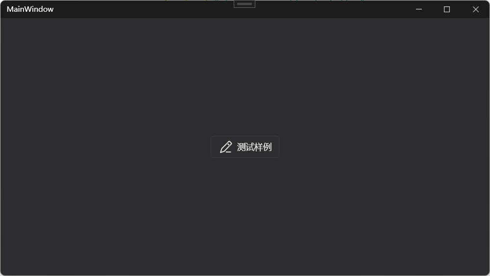
<UniformGrid>
<Button
Width="Auto"
Padding="12,6"
Height="36"
FontSize="14"
Content="测试样例"
hc:IconElement.Geometry="{StaticResource InputGeometry}"
hc:IconElement.Width="24" hc:IconElement.Height="20"></Button>
</UniformGrid>
</hc:Window>运行效果如下,字体色即为文本色:
源码细节分析
查看Button样式
通过查看HandyControl 中 ButtonBaseStyle 样式代码,去除无关部分,不能看出按钮的字体颜色即为路径的填充色<Path ... Fill="{TemplateBinding Foreground}"/>:
xml
<Style x:Key="ButtonBaseStyle" BasedOn="{StaticResource ButtonBaseBaseStyle}" TargetType="Button">
    <Setter Property="Template">
        <Setter.Value>
            <ControlTemplate TargetType="Button">
                <hc:SimplePanel>
                    <Border Background="{TemplateBinding Background}" CornerRadius="{Binding Path=(hc:BorderElement.CornerRadius),RelativeSource={RelativeSource TemplatedParent}}"/>
                    <Border BorderThickness="{TemplateBinding BorderThickness}" BorderBrush="{TemplateBinding BorderBrush}" CornerRadius="{Binding Path=(hc:BorderElement.CornerRadius),RelativeSource={RelativeSource TemplatedParent}}">
                        <StackPanel Orientation="Horizontal" HorizontalAlignment="{TemplateBinding HorizontalContentAlignment}" VerticalAlignment="{TemplateBinding VerticalContentAlignment}" Margin="{TemplateBinding Padding}">
                        <!--路径图标-->
                            <Path x:Name="PathMain" Width="{TemplateBinding hc:IconElement.Width}" Height="{TemplateBinding hc:IconElement.Height}" Fill="{TemplateBinding Foreground}" SnapsToDevicePixels="True" Stretch="Uniform" Data="{TemplateBinding hc:IconElement.Geometry}"/>
                        <!--文本内容-->
                            <ContentPresenter x:Name="ContentPresenterMain" RecognizesAccessKey="True" VerticalAlignment="Center" Margin="6,0,0,0" SnapsToDevicePixels="{TemplateBinding SnapsToDevicePixels}"/>
                        </StackPanel>
                    </Border>
                </hc:SimplePanel>
            </ControlTemplate>
        </Setter.Value>
    </Setter>
</Style>
查看DrawingBrush
如果需要多色,就需要将 Button 的 Foreground 与 Icon 的填充色进行分离,进而实现两者的独立配置,虽然 GeometryGroup 无法实现多色,但是Fill 本身可以支持DrawingBrush,可以通过单独设置DrawingBrush实现图形填充色,使用了DrawingGroup 以及 GeometryDrawing,如果不熟悉可以查阅微软文档。
xml
<DrawingBrush x:Key="Input2GeometryBrush">
    <DrawingBrush.Drawing>
        <DrawingGroup>
            <GeometryDrawing Brush="{DynamicResource PrimaryTextBrush}" Pen="{x:Null}" Geometry="M10.832551042773437,1.59998178671875L2.8058843427734375,9.84051518671875C2.7448177427734377,9.90398218671875,2.7320177427734373,9.91651538671875,2.7082843427734375,9.97331528671875L2.6714843427734376,10.06851478671875L2.616551142773438,10.23118018671875L2.4133510427734377,10.86424728671875L2.0098843527734376,12.14691338671875L1.3573510647734375,14.24211338671875C1.2330844397734375,14.64291338671875,1.5976177427734375,15.01811338671875,1.9952178027734375,14.91758038671875L2.6701511427734372,14.69784638671875L5.239218042773437,13.85011338671875L5.939217542773438,13.61357938671875L6.079217442773437,13.56424738671875C6.099751042773438,13.55651238671875,6.116550942773437,13.55011238671875,6.131484042773438,13.54398038671875L6.192017542773438,13.51891438671875C6.248017742773437,13.49464738671875,6.260550942773437,13.48158038671875,6.321084042773437,13.42184638671875L14.353082342773437,5.17464708671875C14.756508342773438,4.760472786718751,14.756508342773438,4.10028838671875,14.353082342773437,3.68611358671875L12.341351342773438,1.61998176671875C11.930258342773438,1.19789707671875,11.254809342773438,1.18906152671875,10.832818042773438,1.60024842671875L10.832551042773437,1.59998178671875ZM3.6506848427734373,10.50264838671875L11.576818342773437,2.3642483867187503L13.589085342773437,4.430381786718749L5.645885442773437,12.58611438671875L5.209618542773438,12.73544738671875L3.7389519427734377,13.22344738671875L2.6826853427734374,13.57118138671875L3.3749520427734376,11.36104638671875L3.6157517427734374,10.60771468671875L3.6504187427734376,10.50238128671875L3.6506848427734373,10.50264838671875Z"/>
            <GeometryDrawing Brush="{DynamicResource PrimaryTextBrush}" Pen="{x:Null}" Geometry="M9.0365343134375,3.750135658203125C9.2321443534375,3.554630756203125,9.5447464034375,3.541084766203125,9.7565345734375,3.718935728203125L9.7906675334375,3.750135658203125L12.190666923437501,6.150135558203125C12.3937263234375,6.3518721582031255,12.4013290234375,6.677928958203125,12.2078933234375,6.888910558203126C12.0144577234375,7.099892358203125,11.688966723437499,7.120558758203125,11.470400823437501,6.935735658203125L11.4365339234375,6.904535558203126L9.0365343134375,4.5045356782031245C8.8281536104375,4.296238418203125,8.8281536104375,3.958432908203125,9.0365343134375,3.750135658203125Z"/>
            <GeometryDrawing Brush="{DynamicResource PrimaryBrush}" Pen="{x:Null}" Geometry="M13.599989443554687,13.333343505859375L13.599989443554687,13.866677345859374C13.599990343554687,14.161229195859375,13.361208443554688,14.400011205859375,13.066656543554688,14.400010105859375L8.266655443554688,14.400010105859375C7.9721040735546875,14.400011205859375,7.7333226203918475,14.161229195859375,7.7333221435546875,13.866677345859374L7.7333221435546875,13.333343505859375L13.599989443554687,13.333343505859375Z"/>
        </DrawingGroup>
    </DrawingBrush.Drawing>
</DrawingBrush>
逻辑代码调整
创建附加属性
那又该如何在Button控件中使用?实际可以参考HandyControl 原有自带的附加属性IconElement 相关属性。本地构建一个IconElement 类增加一个Brush 类型的附加属性IconElement.Foreground。
cs
using System.Windows;
using System.Windows.Media;
namespace blog_hc_button
{
    public class IconElement
    {
        public static Brush GetForeground(DependencyObject obj)
        {
            return (Brush)obj.GetValue(ForegroundProperty);
        }
        public static void SetForeground(DependencyObject obj, Brush value)
        {
            obj.SetValue(ForegroundProperty, value);
        }
        public static readonly DependencyProperty ForegroundProperty =
            DependencyProperty.RegisterAttached("Foreground", typeof(Brush), typeof(IconElement), new PropertyMetadata(Brushes.Transparent));

    }
}需要重写原有ButtonBaseStyle 样式,添加IconElement.Foreground 这个附加属性,首先添加本地命名空间声明。
xml
xmlns:local="clr-namespace:blog_hc_button"重写Button样式
进行Button样式覆写,进而能够在控件使用时传入附加属性决定图标的颜色。
xml
<hc:Window x:Class="blog_hc_button.MainWindow"
        xmlns="http://schemas.microsoft.com/winfx/2006/xaml/presentation"
        xmlns:x="http://schemas.microsoft.com/winfx/2006/xaml"
        xmlns:d="http://schemas.microsoft.com/expression/blend/2008"
        xmlns:mc="http://schemas.openxmlformats.org/markup-compatibility/2006"
        xmlns:local="clr-namespace:blog_hc_button"
        xmlns:hc="https://handyorg.github.io/handycontrol"
        mc:Ignorable="d"
        Title="MainWindow" Height="450" Width="800">
    <hc:Window.Resources>
<Style x:Key="ButtonBaseStyleX" BasedOn="{StaticResource ButtonBaseBaseStyle}" TargetType="Button">
    <Setter Property="BorderThickness" Value="1"/>
    <Setter Property="Background" Value="{DynamicResource RegionBrush}"/>
    <Setter Property="hc:BorderElement.CornerRadius" Value="{StaticResource DefaultCornerRadius}"/>
    <!--给local:IconElement.Foreground设置一个默认颜色-->
    <Setter Property="local:IconElement.Foreground" Value="{DynamicResource PrimaryTextBrush}"/>
    <Setter Property="Template">
        <Setter.Value>
            <ControlTemplate TargetType="Button">
                <hc:SimplePanel>
                    <Border Background="{TemplateBinding Background}" CornerRadius="{Binding Path=(hc:BorderElement.CornerRadius),RelativeSource={RelativeSource TemplatedParent}}"/>
                    <Border BorderThickness="{TemplateBinding BorderThickness}" BorderBrush="{TemplateBinding BorderBrush}" CornerRadius="{Binding Path=(hc:BorderElement.CornerRadius),RelativeSource={RelativeSource TemplatedParent}}">
                        <StackPanel Orientation="Horizontal" HorizontalAlignment="{TemplateBinding HorizontalContentAlignment}" VerticalAlignment="{TemplateBinding VerticalContentAlignment}" Margin="{TemplateBinding Padding}">
		                    <!--路径图标,设置local:IconElement.Foreground为Path的填充色-->
                            <Path x:Name="PathMain" Width="{TemplateBinding hc:IconElement.Width}" Height="{TemplateBinding hc:IconElement.Height}" Fill="{TemplateBinding local:IconElement.Foreground}" SnapsToDevicePixels="True" Stretch="Uniform" Data="{TemplateBinding hc:IconElement.Geometry}"/>
                            <ContentPresenter x:Name="ContentPresenterMain" RecognizesAccessKey="True" VerticalAlignment="Center" Margin="6,0,0,0" SnapsToDevicePixels="{TemplateBinding SnapsToDevicePixels}"/>
                        </StackPanel>
                    </Border>
                </hc:SimplePanel>
                <ControlTemplate.Triggers>
                    <Trigger Property="Content" Value="{x:Null}">
                        <Setter Property="Visibility" Value="Collapsed" TargetName="ContentPresenterMain"/>
                    </Trigger>
                    <Trigger Property="hc:IconElement.Geometry" Value="{x:Null}">
                        <Setter Property="Visibility" Value="Collapsed" TargetName="PathMain"/>
                        <Setter Property="Margin" Value="0" TargetName="ContentPresenterMain"/>
                    </Trigger>
                </ControlTemplate.Triggers>
            </ControlTemplate>
        </Setter.Value>
    </Setter>
    <Style.Triggers>
        <Trigger Property="IsMouseOver" Value="True">
            <Setter Property="Opacity" Value=".9"/>
        </Trigger>
        <Trigger Property="IsPressed" Value="True">
            <Setter Property="Opacity" Value=".6"/>
        </Trigger>
        <Trigger Property="IsEnabled" Value="False">
            <Setter Property="Opacity" Value="0.4"/>
        </Trigger>
    </Style.Triggers>
</Style>
    </hc:Window.Resources>
</hc:Window>
其中样式中设置一个默认颜色。
xml
    <!--给local:IconElement.Foreground设置一个默认颜色-->
    <Setter Property="local:IconElement.Foreground" Value="{DynamicResource PrimaryTextBrush}"/>
页面使用附加属性
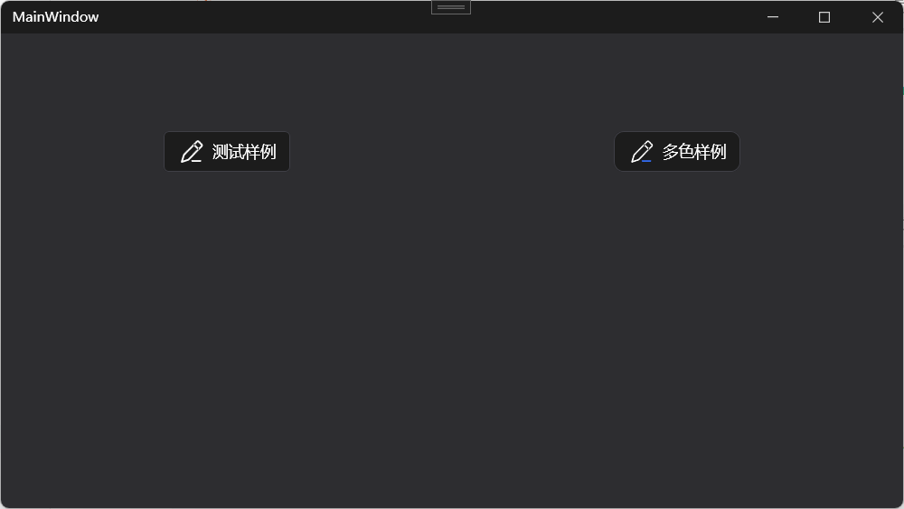
在案例项目中引入,并设置local:IconElement.Foreground 为 Input2GeometryBrush。
xml
<Button Style="{StaticResource ButtonBaseStyleX}"
        Width="Auto"
        Padding="12,6"
        Height="36"
        FontSize="14"
        Content="多色样例"
        hc:IconElement.Geometry="{StaticResource InputGeometry}"
        local:IconElement.Foreground="{StaticResource Input2GeometryBrush}"
        hc:IconElement.Width="24" hc:IconElement.Height="20"></Button>
比对效果如下:
当然,不这样弄行不行?也可以通过三方开源nuget 包 SharpVectors 直接使用svg 文件,减少重复Brush 对象的创建。
总结
以上就是在HandyControl 库中,不引入其他三方库时,实现多彩路径svg 按钮的解决方案,这里主要是对GeometryGroup 、Style 覆写、DrawingBrush、DrawingGroup、DrawingGeometry以及 附加属性 的整合应用,内容有点绕,目的也就是为了多彩路径。