首先输入制图的函数
python
# 加载所需库
library(Hmisc)
library(dplyr)
library(linkET)
library(ggplot2)
cor_image <- function(df,target_factors,env_factors) {
# df是数据库,df数据格式为dataframe格式
# target_factors是因变量
# env_factors是自变量
# 只保留数值型变量
df <- df %>% dplyr::select(where(is.numeric))
# 提取目标因子和环境因子
# 分离环境因子数据
env <- df[,env_factors]
# 计算相关性矩阵和 P 值矩阵
df_rcorr <- rcorr(as.matrix(df), type = "pearson")
r <- df_rcorr$r # 相关系数矩阵
p <- df_rcorr$P # P 值矩阵
# 初始化结果数据框
results <- data.frame(P = character(), R = numeric(), Y = character(), X = character(), sig = character(), type = character(), stringsAsFactors = FALSE)
# 遍历每个目标因子和环境因子的组合,计算相关性
for (y in target_factors) {
for (x in env_factors) {
r_value <- r[x, y]
p_value <- p[x, y]
# 确定显著性水平和相关性方向
significance <- ifelse(p_value < 0.05, "< 0.05", ">= 0.05")
sig <- ifelse(r_value > 0, ">0", "<0")
type <- ifelse(r_value > 0, "r > 0", "r < 0")
# 添加结果到数据框
results <- rbind(results, data.frame(P = significance, R = round(r_value, 2), Y = y, X = x, sig = sig, type = type))
}
}
# 查看结果
print(results)
# 设置颜色映射
cols <- c(">= 0.05" = "grey", "< 0.05" = "#1B9E77", "< 0.01" = "#D95F02")
# 绘制相关性图,带显著性标记
pxg <- qcorrplot(correlate(env),type = "lower", diag = FALSE) +
geom_square() +
# geom_text(aes(label = ifelse(p < 0.001, "***",
# ifelse(p < 0.01, "**",
# ifelse(p < 0.05, "*", "")))),
# size = 5, color = "black") + # 根据 p 值设置星号
geom_couple(aes(
colour = P, # 使用显著性 P 值来设置线的颜色
size = abs(R), # 根据相关系数 R 的绝对值调整线条粗细
linetype = type, # 根据 type 列选择实线或虚线
from = Y, to = X # from 和 to 指定因变量和环境因子
), data = results, curvature = 0.15) +
scale_fill_gradientn(colours = RColorBrewer::brewer.pal(3, "RdBu")) +
scale_size_continuous(range = c(0.1, 3)) + # 设置线条粗细范围 (0.5, 2)
scale_colour_manual(values = cols) +
scale_linetype_manual(values = c("r > 0" = "solid", "r < 0" = "dashed")) + # 设置线型映射
guides(
size = guide_legend(title = "Correlation Strength",
override.aes = list(colour = "grey35"), order = 2),
colour = guide_legend(title = "P value",
override.aes = list(size = 3), order = 1),
fill = guide_colorbar(title = "Pearson's r", order = 3),
linetype = guide_legend(title = "Correlation", order = 4) #因变量与自变量的相关性
) +
theme_minimal() +
theme(panel.grid = element_blank(), # 移除网格
axis.text.x = element_text(angle = 45, hjust = 1)) + # x轴标签旋转
labs(title = "",x = "", y = "")#Environmental and Social Factors Correlation with GEP
# 保存图形
#ggsave("images/相关性的图_人均.png", plot = pxg, width = 10, height = 8, dpi = 300)
return (pxg)
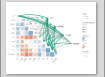
}第二步,直接生成图形。
python
library(Hmisc)
library(dplyr)
library(linkET)
library(ggplot2)
library(readxl)
source("02cor_djq.R")

df <- read_xlsx("data_all00_10_20.xlsx") %>%
  dplyr::select(2:17) %>%
  na.omit() %>%
  as.data.frame()

## 对数据进行处理
df$popD <- df$pop / df$area


## 对数据进行命名
names(df)[names(df) == "GEP"] <- "GEP"
names(df)[names(df) == "TJ"] <- "调节服务"
names(df)[names(df) == "WH"] <- "文化服务"
names(df)[names(df) == "WZ"] <- "物质供给"
names(df)[names(df) == "popD"] <- "人口密度"
names(df)[names(df) == "Traffic"] <- "道路密度"
names(df)[names(df) == "TEM"] <- "温度"
names(df)[names(df) == "PRE"] <- "降雨量"
names(df)[names(df) == "DL"] <- "DEM"
names(df)[names(df) == "Slope"] <- "坡度"
names(df)[names(df) == "nature"] <- "自然生境面积"

target_factors <- c("GEP", "调节服务", "文化服务", "物质供给")
env_factors <- c(  "人口密度", "道路密度", "温度","降雨量", "DEM", "坡度","NPP","FVC", "自然生境面积")


image <- cor_image(df, target_factors, env_factors)

ggsave("images/总量与变量的相关性_全样本.png", image, width = 10, height = 8, dpi = 300)
最终可以得到的图件