第十一章:数据可视化
📋 章节概述
本章将学习使用 Pandas 和 Matplotlib 进行数据可视化。掌握这些方法后,你将能够创建专业的数据图表,用于数据分析和报告展示。
🎯 学习目标
- 掌握 Pandas 内置绘图功能
- 掌握 Matplotlib 基础绘图
- 学会绘制常用图表类型(折线图、柱状图、散点图、饼图等)
- 掌握图表美化技巧(标题、标签、图例、样式)
- 学会多子图布局
- 掌握时间序列可视化
- 学会保存图表为图片文件
📊 知识结构图
数据可视化
Pandas绘图
plot
Matplotlib
底层控制
图表美化
样式/标签
折线图
柱状图
饼图
散点图
基础图表
高级图表
时间序列
多子图布局
样式主题
图表导出
🏢 实战场景
本章使用"销售数据分析"案例:
- 月度销售数据:月份、销售额、利润、订单数
- 产品类别数据:类别、销售额、销量、利润率
- 区域销售数据:区域、销售额、目标完成率
- 时间序列数据:日期、股价、成交量
python
import pandas as pd
import numpy as np
import matplotlib.pyplot as plt
import warnings
warnings.filterwarnings('ignore')

# 配置matplotlib支持中文字体
plt.rcParams['font.family'] = 'sans-serif'
plt.rcParams['font.sans-serif'] = ['SimHei', 'Microsoft YaHei', 'Arial Unicode MS']
plt.rcParams['axes.unicode_minus'] = False  # 解决负号显示为方块的问题
准备示例数据 - 数据可视化案例
python
np.random.seed(2026)

# 创建月度销售数据
df_monthly = pd.DataFrame({
    '月份': ['1月', '2月', '3月', '4月', '5月', '6月',
           '7月', '8月', '9月', '10月', '11月', '12月'],
    '销售额': [120, 135, 148, 162, 175, 188, 195, 210, 225, 240, 255, 280],
    '利润': [24, 27, 30, 35, 38, 42, 45, 48, 52, 58, 62, 70],
    '订单数': [450, 480, 520, 580, 620, 680, 720, 780, 850, 920, 980, 1050]
})

# 创建产品类别数据
df_category = pd.DataFrame({
    '类别': ['电子产品', '服装', '食品', '家居', '图书'],
    '销售额': [450, 320, 280, 190, 85],
    '销量': [1200, 2800, 4500, 1500, 900],
    '利润率': [0.25, 0.35, 0.15, 0.20, 0.30]
})

# 创建区域销售数据
df_region = pd.DataFrame({
    '区域': ['北京', '上海', '广州', '深圳', '杭州', '成都'],
    '销售额': [280, 320, 240, 210, 180, 150],
    '目标': [250, 300, 250, 200, 180, 160],
    '完成率': [1.12, 1.07, 0.96, 1.05, 1.00, 0.94]
})

# 创建时间序列数据(股价)
dates = pd.date_range('2026-01-01', periods=60, freq='D')
price_base = 100
prices = [price_base]
for i in range(1, 60):
    change = np.random.normal(0, 0.02)
    prices.append(prices[-1] * (1 + change))

df_stock = pd.DataFrame({
    '日期': dates,
    '收盘价': prices,
    '成交量': np.random.randint(1000000, 5000000, 60)
})
df_stock.set_index('日期', inplace=True)
df_stock['MA5'] = df_stock['收盘价'].rolling(window=5).mean()
df_stock['MA10'] = df_stock['收盘价'].rolling(window=10).mean()

print("数据表预览:")
print(f"\n1. 月度销售数据: {df_monthly.shape}")
print(f"2. 产品类别数据: {df_category.shape}")
print(f"3. 区域销售数据: {df_region.shape}")
print(f"4. 股价数据: {df_stock.shape}")数据表预览:
1. 月度销售数据: (12, 4)
2. 产品类别数据: (5, 4)
3. 区域销售数据: (6, 4)
4. 股价数据: (60, 4)
python
# 查看月度销售数据
df_monthly.head()
| | 月份 | 销售额 | 利润 | 订单数 |
| 0 | 1月 | 120 | 24 | 450 |
| 1 | 2月 | 135 | 27 | 480 |
| 2 | 3月 | 148 | 30 | 520 |
| 3 | 4月 | 162 | 35 | 580 |
| 4 | 5月 | 175 | 38 | 620 |
|---|
11.1 Pandas 内置绘图
Pandas 的 plot() 方法提供了快速绘图功能,适合快速数据探索。
常用参数
| 参数 | 说明 | 示例 |
|---|---|---|
kind |
图表类型 | 'line', 'bar', 'pie', 'scatter' |
title |
图表标题 | title='销售趋势' |
xlabel |
X轴标签 | xlabel='月份' |
ylabel |
Y轴标签 | ylabel='销售额' |
figsize |
图表大小 | figsize=(10, 6) |
grid |
显示网格 | grid=True |
color |
颜色 | color='red' |
alpha |
透明度 | alpha=0.7 |
11.1.1 基础折线图
python
# Pandas 内置折线图
fig, ax = plt.subplots(figsize=(10, 6))
df_monthly.plot(x='月份', y='销售额', kind='line',
                marker='o', linewidth=2, markersize=8,
                title='2026年月度销售额趋势',
                xlabel='月份', ylabel='销售额(万元)',
                grid=True, ax=ax)
plt.xticks(rotation=45)
plt.tight_layout()
plt.show()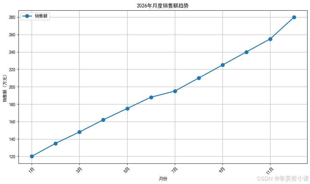
11.1.2 柱状图
python
# Pandas 内置柱状图
fig, ax = plt.subplots(figsize=(10, 6))
df_category.plot(x='类别', y='销售额', kind='bar',
                 color='steelblue', alpha=0.8,
                 title='各产品类别销售额对比',
                 xlabel='产品类别', ylabel='销售额(万元)',
                 ax=ax)
plt.xticks(rotation=45)
plt.tight_layout()
plt.show()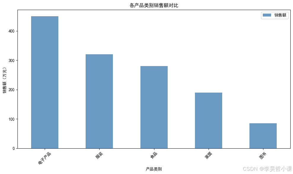
11.1.3 水平柱状图
python
# Pandas 内置水平柱状图
fig, ax = plt.subplots(figsize=(10, 6))
df_region_sorted = df_region.sort_values('销售额')
df_region_sorted.plot(x='区域', y='销售额', kind='barh',
                      color='coral', alpha=0.8,
                      title='各区域销售额排名',
                      xlabel='销售额(万元)', ylabel='区域',
                      ax=ax)
plt.tight_layout()
plt.show()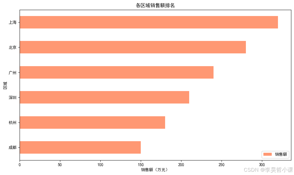
11.1.4 多列折线图
python
# 多列折线图
fig, ax = plt.subplots(figsize=(12, 6))
df_monthly.plot(x='月份', y=['销售额', '利润'], kind='line',
                marker='o', linewidth=2,
                title='2026年月度销售额与利润趋势',
                xlabel='月份', ylabel='金额(万元)',
                grid=True, ax=ax)
plt.xticks(rotation=45)
plt.legend(loc='upper left')
plt.tight_layout()
plt.show()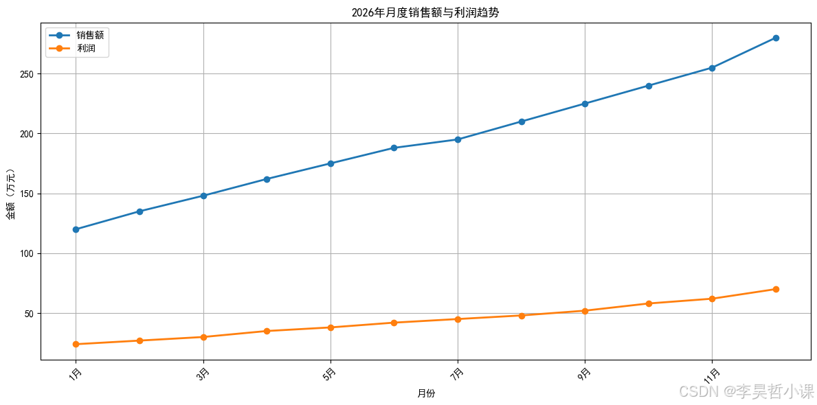
11.2 Matplotlib 基础绘图
Matplotlib 提供更灵活的图表控制,适合定制化需求。
Matplotlib
创建图形
绘制图表
美化设置
plt.subplots
plot/bar/scatter/pie
标题/标签/图例
网格/颜色/样式
11.2.1 基础折线图
python
# Matplotlib 基础折线图
fig, ax = plt.subplots(figsize=(10, 6))
ax.plot(df_monthly['月份'], df_monthly['销售额'],
        marker='o', linewidth=2, markersize=8,
        color='#2E86AB', label='销售额')
ax.set_title('2026年月度销售额趋势', fontsize=16, fontweight='bold')
ax.set_xlabel('月份', fontsize=12)
ax.set_ylabel('销售额(万元)', fontsize=12)
ax.grid(True, alpha=0.3)
ax.legend()
plt.xticks(rotation=45)
plt.tight_layout()
plt.show()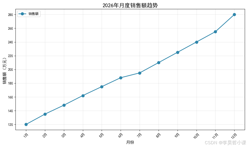
11.2.2 柱状图
python
# Matplotlib 柱状图
fig, ax = plt.subplots(figsize=(10, 6))
bars = ax.bar(df_category['类别'], df_category['销售额'],
              color=['#F18F01', '#C73E1D', '#6A994E', '#BC4B51', '#8B8C89'],
              alpha=0.8, edgecolor='black', linewidth=1)
ax.set_title('各产品类别销售额对比', fontsize=16, fontweight='bold')
ax.set_xlabel('产品类别', fontsize=12)
ax.set_ylabel('销售额(万元)', fontsize=12)
ax.grid(True, axis='y', alpha=0.3)

# 添加数值标签
for bar in bars:
    height = bar.get_height()
    ax.text(bar.get_x() + bar.get_width()/2., height,
            f'{height:.0f}',
            ha='center', va='bottom', fontsize=10)

plt.xticks(rotation=45)
plt.tight_layout()
plt.show()
11.2.3 散点图
python
# 散点图
fig, ax = plt.subplots(figsize=(10, 6))
scatter = ax.scatter(df_category['销量'], df_category['销售额'],
                     s=df_category['利润率']*1000,  # 气泡大小
                     c=df_category['利润率'],
                     cmap='viridis',
                     alpha=0.6, edgecolors='black')
ax.set_title('销量与销售额关系(气泡大小=利润率)', fontsize=16, fontweight='bold')
ax.set_xlabel('销量(件)', fontsize=12)
ax.set_ylabel('销售额(万元)', fontsize=12)
ax.grid(True, alpha=0.3)

# 添加类别标签
for i, txt in enumerate(df_category['类别']):
    ax.annotate(txt, (df_category['销量'].iloc[i], df_category['销售额'].iloc[i]),
                xytext=(5, 5), textcoords='offset points', fontsize=10)

plt.colorbar(scatter, label='利润率')
plt.tight_layout()
plt.show()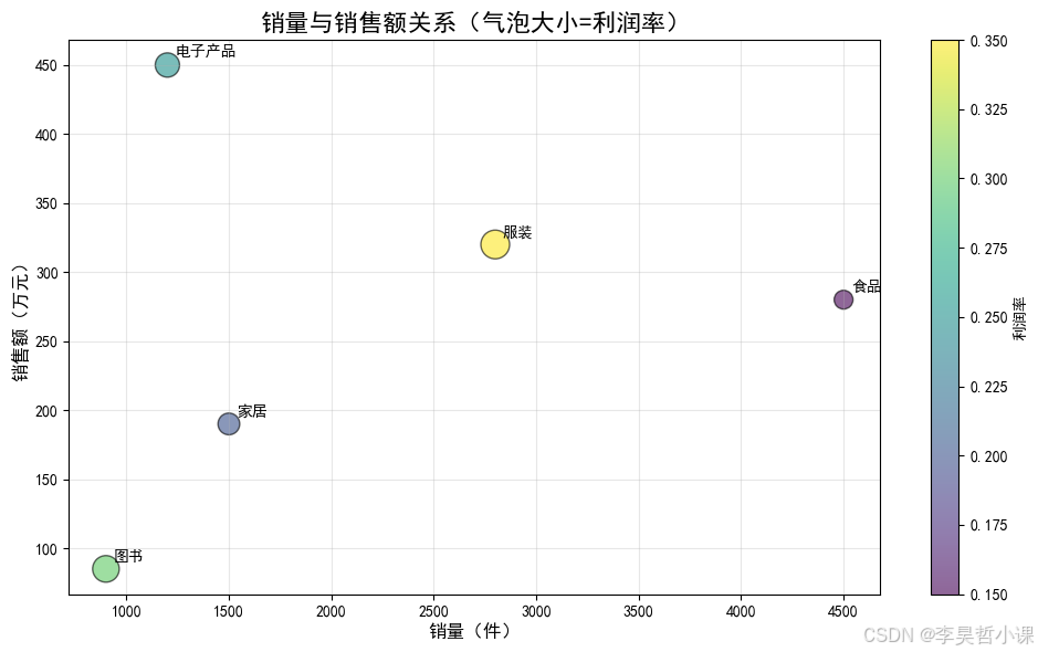
11.2.4 饼图
python
# 饼图
fig, ax = plt.subplots(figsize=(10, 8))
colors = ['#FF6B6B', '#4ECDC4', '#45B7D1', '#FFA07A', '#98D8C8']
wedges, texts, autotexts = ax.pie(df_category['销售额'],
                                    labels=df_category['类别'],
                                    autopct='%1.1f%%',
                                    colors=colors,
                                    explode=[0.05, 0, 0, 0, 0],
                                    shadow=True,
                                    startangle=90)
ax.set_title('各产品类别销售额占比', fontsize=16, fontweight='bold')

# 美化百分比文字
for autotext in autotexts:
    autotext.set_color('white')
    autotext.set_fontweight('bold')
    autotext.set_fontsize(11)

plt.tight_layout()
plt.show()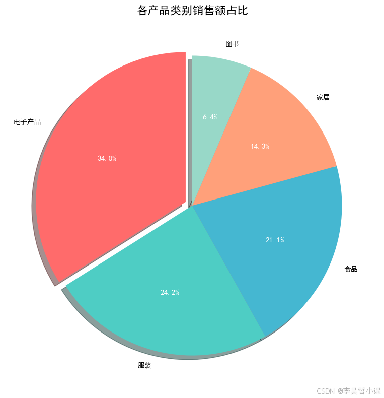
11.3 高级图表
常用图表类型
| 图表类型 | 方法 | 适用场景 |
|---|---|---|
| 折线图 | plot() |
趋势展示 |
| 柱状图 | bar() |
类别对比 |
| 水平柱状图 | barh() |
排名展示 |
| 散点图 | scatter() |
相关性分析 |
| 饼图 | pie() |
占比展示 |
| 直方图 | hist() |
分布展示 |
| 箱线图 | boxplot() |
统计分布 |
11.3.1 堆叠柱状图
python
# 堆叠柱状图
df_stack = pd.DataFrame({
    '月份': df_monthly['月份'],
    '线上销售': [x * 0.6 for x in df_monthly['销售额']],
    '线下销售': [x * 0.4 for x in df_monthly['销售额']]
})

fig, ax = plt.subplots(figsize=(12, 6))
ax.bar(df_stack['月份'], df_stack['线上销售'],
       label='线上销售', color='#3498DB', alpha=0.8)
ax.bar(df_stack['月份'], df_stack['线下销售'],
       bottom=df_stack['线上销售'],
       label='线下销售', color='#E74C3C', alpha=0.8)
ax.set_title('月度销售额构成(线上vs线下)', fontsize=16, fontweight='bold')
ax.set_xlabel('月份', fontsize=12)
ax.set_ylabel('销售额(万元)', fontsize=12)
ax.legend()
ax.grid(True, axis='y', alpha=0.3)
plt.xticks(rotation=45)
plt.tight_layout()
plt.show()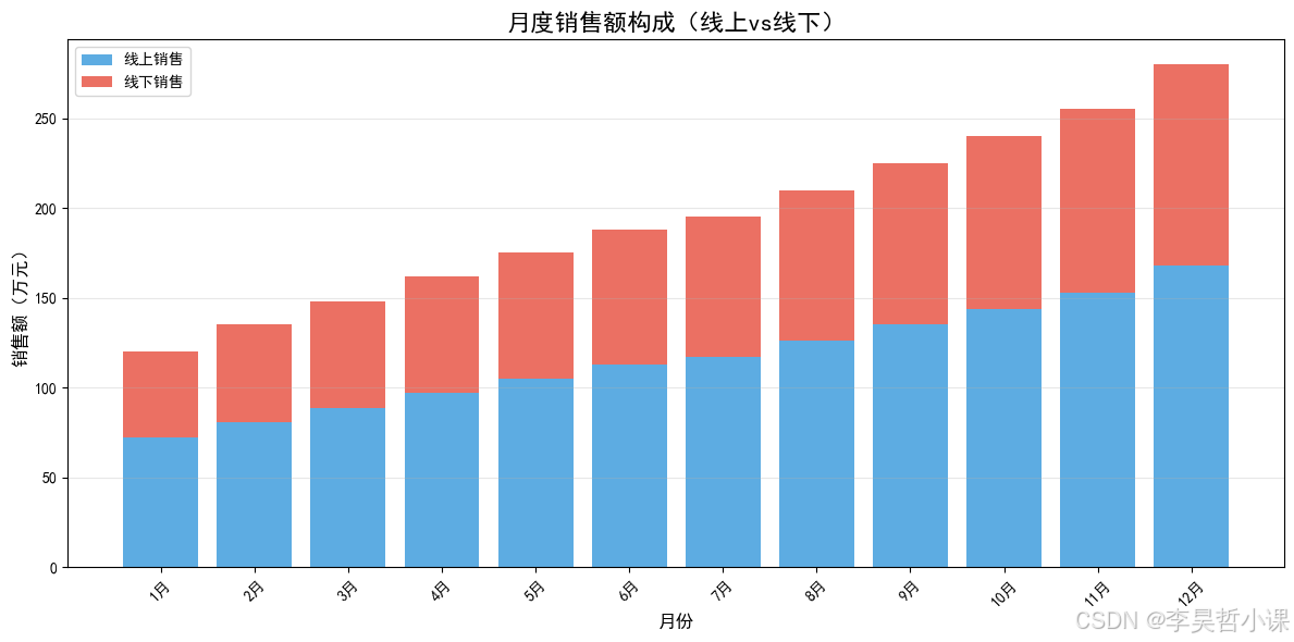
11.3.2 分组柱状图
python
# 分组柱状图
fig, ax = plt.subplots(figsize=(12, 6))
x = np.arange(len(df_region))
width = 0.35

bars1 = ax.bar(x - width/2, df_region['销售额'], width,
               label='实际销售额', color='#2ECC71', alpha=0.8)
bars2 = ax.bar(x + width/2, df_region['目标'], width,
               label='销售目标', color='#E74C3C', alpha=0.8)

ax.set_title('各区域销售额与目标对比', fontsize=16, fontweight='bold')
ax.set_xlabel('区域', fontsize=12)
ax.set_ylabel('金额(万元)', fontsize=12)
ax.set_xticks(x)
ax.set_xticklabels(df_region['区域'])
ax.legend()
ax.grid(True, axis='y', alpha=0.3)

# 添加数值标签
for bars in [bars1, bars2]:
    for bar in bars:
        height = bar.get_height()
        ax.text(bar.get_x() + bar.get_width()/2., height,
                f'{height:.0f}',
                ha='center', va='bottom', fontsize=9)

plt.tight_layout()
plt.show()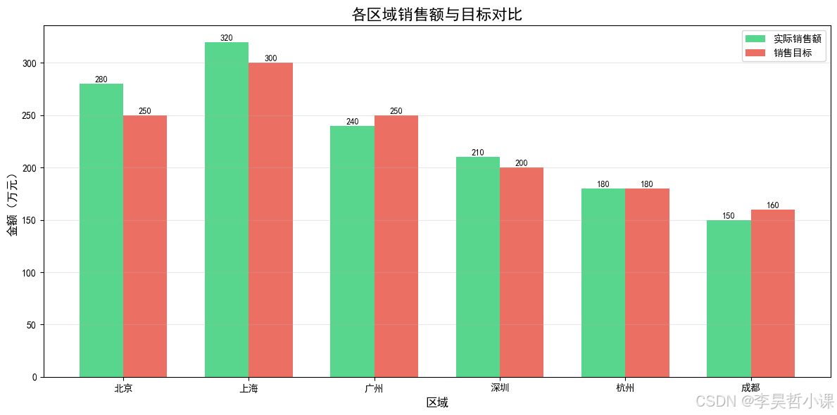
11.3.3 双Y轴图表
python
# 双Y轴图表
fig, ax1 = plt.subplots(figsize=(12, 6))

# 左Y轴 - 销售额
ax1.plot(df_monthly['月份'], df_monthly['销售额'],
         marker='o', linewidth=2, color='#3498DB', label='销售额')
ax1.set_xlabel('月份', fontsize=12)
ax1.set_ylabel('销售额(万元)', fontsize=12, color='#3498DB')
ax1.tick_params(axis='y', labelcolor='#3498DB')
ax1.grid(True, alpha=0.3)

# 右Y轴 - 订单数
ax2 = ax1.twinx()
ax2.bar(df_monthly['月份'], df_monthly['订单数'],
        alpha=0.3, color='#E74C3C', label='订单数')
ax2.set_ylabel('订单数', fontsize=12, color='#E74C3C')
ax2.tick_params(axis='y', labelcolor='#E74C3C')

ax1.set_title('月度销售额与订单数趋势', fontsize=16, fontweight='bold')
plt.xticks(rotation=45)

# 合并图例
lines1, labels1 = ax1.get_legend_handles_labels()
lines2, labels2 = ax2.get_legend_handles_labels()
ax1.legend(lines1 + lines2, labels1 + labels2, loc='upper left')

plt.tight_layout()
plt.show()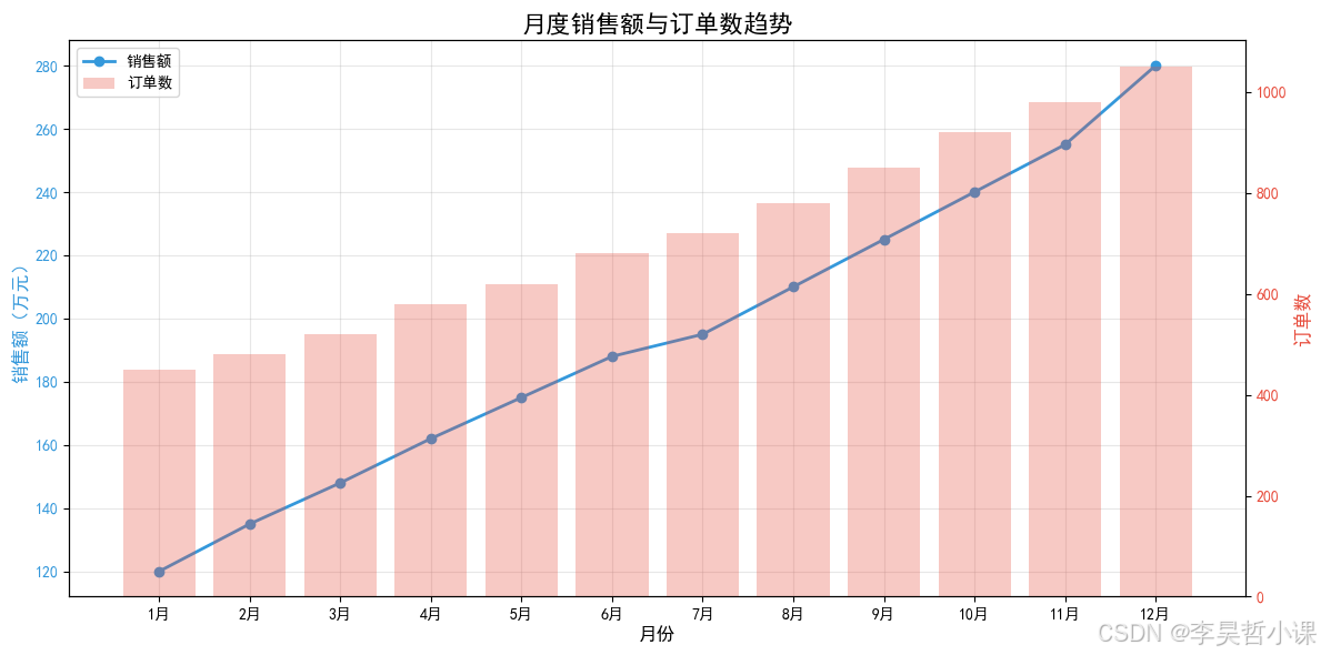
11.4 时间序列可视化
时间序列
股价走势
成交量
移动平均线
11.4.1 股价走势图
python
# 股价走势图
fig, ax = plt.subplots(figsize=(14, 6))
ax.plot(df_stock.index, df_stock['收盘价'],
        linewidth=1.5, color='#2C3E50', label='收盘价')
ax.plot(df_stock.index, df_stock['MA5'],
        linewidth=1, color='#E74C3C', label='MA5', linestyle='--')
ax.plot(df_stock.index, df_stock['MA10'],
        linewidth=1, color='#3498DB', label='MA10', linestyle='--')

ax.set_title('股价走势与移动平均线', fontsize=16, fontweight='bold')
ax.set_xlabel('日期', fontsize=12)
ax.set_ylabel('价格', fontsize=12)
ax.legend()
ax.grid(True, alpha=0.3)
plt.xticks(rotation=45)
plt.tight_layout()
plt.show()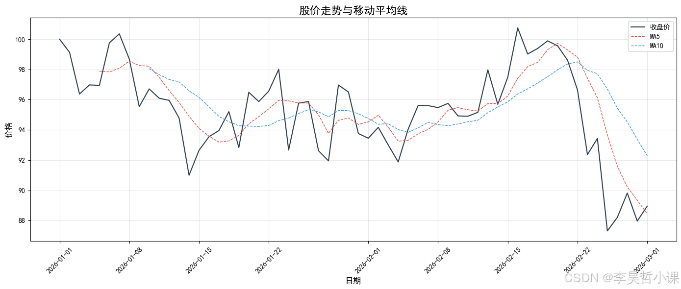
11.4.2 成交量柱状图
python
# 成交量柱状图
fig, ax = plt.subplots(figsize=(14, 4))
colors = ['#E74C3C' if df_stock['收盘价'].iloc[i] < df_stock['收盘价'].iloc[i-1]
          else '#2ECC71' for i in range(1, len(df_stock))]
colors.insert(0, '#2ECC71')

ax.bar(df_stock.index, df_stock['成交量']/10000, color=colors, alpha=0.7, width=0.8)
ax.set_title('成交量变化', fontsize=14, fontweight='bold')
ax.set_xlabel('日期', fontsize=12)
ax.set_ylabel('成交量(万手)', fontsize=12)
ax.grid(True, axis='y', alpha=0.3)
plt.xticks(rotation=45)
plt.tight_layout()
plt.show()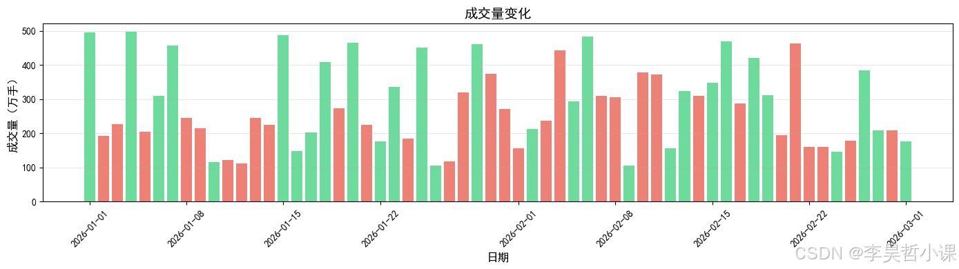
11.5 多子图布局
多子图布局
subplots
规则布局
GridSpec
灵活布局
综合仪表板
11.5.1 基础子图
python
# 2x2 子图
fig, axes = plt.subplots(2, 2, figsize=(14, 10))

# 子图1: 月度销售额
axes[0, 0].plot(df_monthly['月份'], df_monthly['销售额'], marker='o', color='#3498DB')
axes[0, 0].set_title('月度销售额趋势', fontsize=12, fontweight='bold')
axes[0, 0].set_ylabel('销售额(万元)')
axes[0, 0].grid(True, alpha=0.3)
axes[0, 0].tick_params(axis='x', rotation=45)

# 子图2: 产品类别
axes[0, 1].bar(df_category['类别'], df_category['销售额'], color='#E74C3C', alpha=0.8)
axes[0, 1].set_title('产品类别销售额', fontsize=12, fontweight='bold')
axes[0, 1].set_ylabel('销售额(万元)')
axes[0, 1].tick_params(axis='x', rotation=45)

# 子图3: 区域销售
axes[1, 0].barh(df_region['区域'], df_region['销售额'], color='#2ECC71', alpha=0.8)
axes[1, 0].set_title('区域销售额排名', fontsize=12, fontweight='bold')
axes[1, 0].set_xlabel('销售额(万元)')

# 子图4: 完成率
axes[1, 1].pie(df_region['完成率'], labels=df_region['区域'], autopct='%1.1f%%')
axes[1, 1].set_title('区域目标完成率', fontsize=12, fontweight='bold')

plt.suptitle('销售数据综合分析', fontsize=16, fontweight='bold')
plt.tight_layout()
plt.show()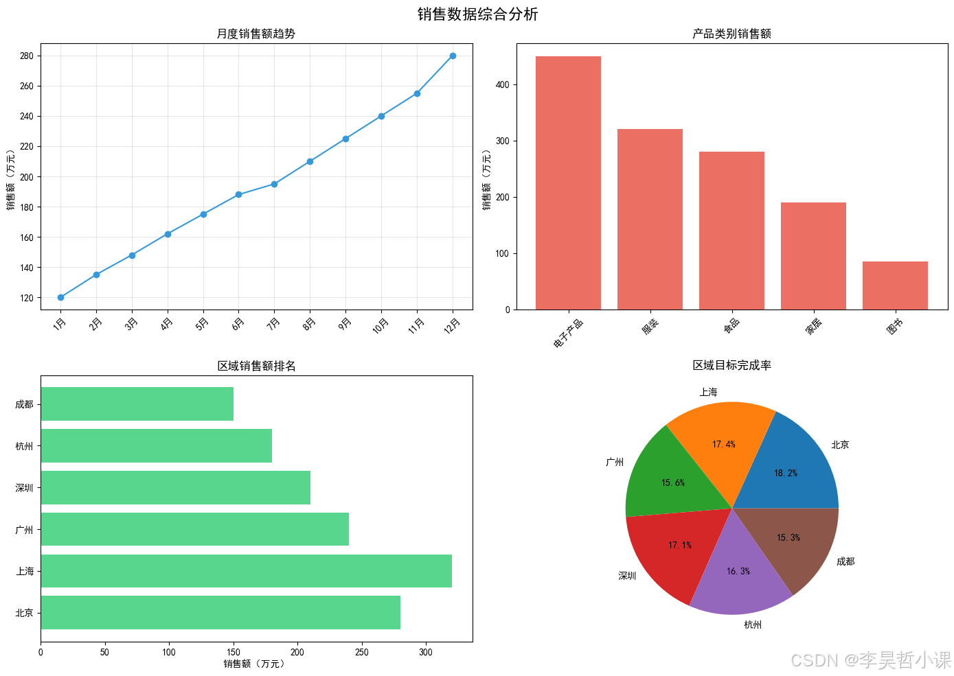
11.5.2 综合仪表板
python
# 综合仪表板
fig = plt.figure(figsize=(16, 12))
gs = fig.add_gridspec(3, 3, hspace=0.3, wspace=0.3)

# 股价走势(跨所有列)
ax1 = fig.add_subplot(gs[0, :])
ax1.plot(df_stock.index, df_stock['收盘价'], linewidth=1.5, color='#2C3E50', label='收盘价')
ax1.plot(df_stock.index, df_stock['MA5'], linewidth=1, color='#E74C3C', label='MA5', linestyle='--')
ax1.set_title('股价走势', fontsize=12, fontweight='bold')
ax1.set_ylabel('价格')
ax1.legend()
ax1.grid(True, alpha=0.3)

# 月度销售趋势
ax2 = fig.add_subplot(gs[1, :])
ax2.plot(df_monthly['月份'], df_monthly['销售额'], marker='o', color='#3498DB')
ax2.set_title('月度销售趋势', fontsize=12, fontweight='bold')
ax2.set_ylabel('销售额(万元)')
ax2.grid(True, alpha=0.3)
ax2.tick_params(axis='x', rotation=45)

# 产品类别
ax3 = fig.add_subplot(gs[2, 0])
wedges, texts, autotexts = ax3.pie(df_category['销售额'],
                                     labels=df_category['类别'],
                                     autopct='%1.1f%%',
                                     colors=plt.cm.Set3.colors)
ax3.set_title('产品类别销售占比', fontsize=12, fontweight='bold')

# 区域对比
ax4 = fig.add_subplot(gs[2, 1:])
bars = ax4.bar(df_region['区域'], df_region['销售额'],
               color=['#E74C3C' if x < 200 else '#27AE60'
                      for x in df_region['销售额']], alpha=0.8)
ax4.set_title('各区域销售额', fontsize=12, fontweight='bold')
ax4.set_ylabel('销售额(万元)')
ax4.tick_params(axis='x', rotation=45)
ax4.axhline(y=200, color='red', linestyle='--', linewidth=1, label='目标线')
ax4.legend()

plt.suptitle('2026年销售分析报告', fontsize=18, fontweight='bold')
plt.show()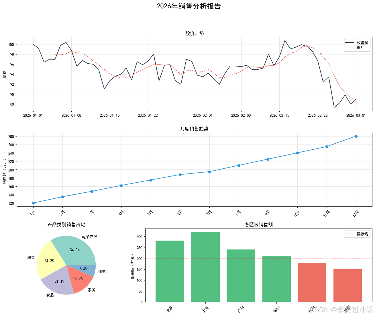
11.6 图表美化与导出
11.6.1 样式设置
python
# 查看可用样式
print("可用样式列表:")
for style in plt.style.available[:10]:
print(f" - {style}")可用样式列表:
- Solarize_Light2
- _classic_test_patch
- _mpl-gallery
- _mpl-gallery-nogrid
- bmh
- classic
- dark_background
- fast
- fivethirtyeight
- ggplot
python
# 使用预设样式
with plt.style.context('ggplot'):
    fig, ax = plt.subplots(figsize=(10, 6))
    ax.plot(df_monthly['月份'], df_monthly['销售额'], marker='o', linewidth=2)
    ax.set_title('使用ggplot样式的图表', fontsize=14, fontweight='bold')
    ax.set_xlabel('月份')
    ax.set_ylabel('销售额(万元)')
    plt.xticks(rotation=45)
    plt.tight_layout()
    plt.show()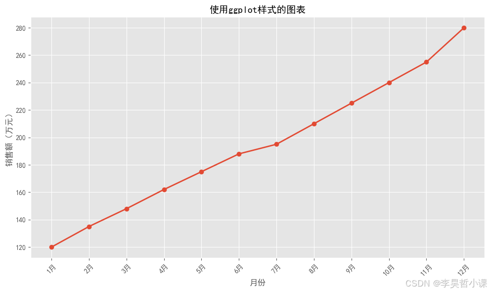
11.6.2 图表导出
python
# 创建示例图表并保存
fig, ax = plt.subplots(figsize=(10, 6))
ax.plot(df_monthly['月份'], df_monthly['销售额'],
        marker='o', linewidth=2, color='#3498DB', label='销售额')
ax.set_title('月度销售额趋势', fontsize=16, fontweight='bold')
ax.set_xlabel('月份', fontsize=12)
ax.set_ylabel('销售额(万元)', fontsize=12)
ax.legend()
ax.grid(True, alpha=0.3)
plt.xticks(rotation=45)
plt.tight_layout()

# 保存图表
# plt.savefig('monthly_sales.png', dpi=150, bbox_inches='tight')
# print("图表已保存: monthly_sales.png")

plt.show()
print("\n保存参数说明:")
print("  - dpi: 分辨率(每英寸点数)")
print("  - bbox_inches='tight': 自动调整边界")
print("  - format: 格式(png, pdf, svg, jpg等)")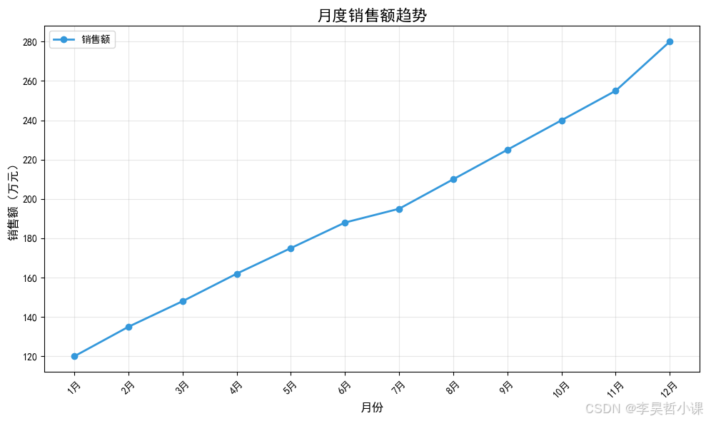
保存参数说明:
  - dpi: 分辨率(每英寸点数)
  - bbox_inches='tight': 自动调整边界
  - format: 格式(png, pdf, svg, jpg等)
本章小结
学习内容回顾
1. Pandas 内置绘图
| 图表类型 | kind参数 | 示例 |
|---|---|---|
| 折线图 | 'line' |
df.plot(kind='line') |
| 柱状图 | 'bar' |
df.plot(kind='bar') |
| 水平柱状图 | 'barh' |
df.plot(kind='barh') |
| 饼图 | 'pie' |
df.plot(kind='pie') |
| 散点图 | 'scatter' |
df.plot(kind='scatter') |
2. Matplotlib 基础绘图
| 操作 | 语法 |
|---|---|
| 创建图形 | fig, ax = plt.subplots(figsize=(10, 6)) |
| 折线图 | ax.plot(x, y) |
| 柱状图 | ax.bar(x, y) |
| 散点图 | ax.scatter(x, y) |
| 饼图 | ax.pie(values, labels=labels) |
| 设置标题 | ax.set_title('标题') |
| 设置标签 | ax.set_xlabel('X轴') |
| 显示图例 | ax.legend() |
| 显示网格 | ax.grid(True) |
3. 高级图表
| 图表类型 | 关键参数/方法 |
|---|---|
| 堆叠柱状图 | bottom 参数 |
| 分组柱状图 | 调整x位置 |
| 双Y轴图表 | twinx() |
4. 多子图布局
| 布局方式 | 语法 |
|---|---|
| 规则布局 | plt.subplots(2, 2) |
| 灵活布局 | fig.add_gridspec(3, 3) |
5. 图表导出
| 参数 | 说明 |
|---|---|
dpi |
分辨率 |
bbox_inches='tight' |
自动调整边界 |
format |
输出格式 |
下章预告
第十二章:性能优化
将学习 Pandas 性能优化的核心技巧,包括:
- 数据类型优化
- 向量化操作
- 内存管理
- 大数据处理策略
课后练习
练习1:基础图表绘制
- 使用 Pandas plot() 绘制月度销售额折线图
- 使用 Matplotlib 绘制产品类别柱状图
- 为图表添加标题、标签、图例和网格
练习2:高级图表
- 绘制堆叠柱状图展示线上/线下销售构成
- 绘制分组柱状图对比实际销售额与目标
- 绘制双Y轴图表展示销售额与订单数
练习3:时间序列可视化
- 绘制股价走势图并叠加移动平均线
- 绘制成交量柱状图(红涨绿跌)
- 创建综合股票分析图表
练习4:多子图布局
- 使用 subplots 创建 2x2 子图布局
- 使用 GridSpec 创建灵活的仪表板布局
- 设计一个完整的销售分析仪表板
练习5:图表美化与导出
- 尝试不同的预设样式
- 自定义颜色和主题
- 将图表保存为不同格式(PNG、PDF)
练习6:综合练习
- 创建一个包含多种图表的综合分析报告
- 包含折线图、柱状图、饼图、散点图
- 添加适当的标题、标签和注释
- 导出为高质量的图片文件