前言
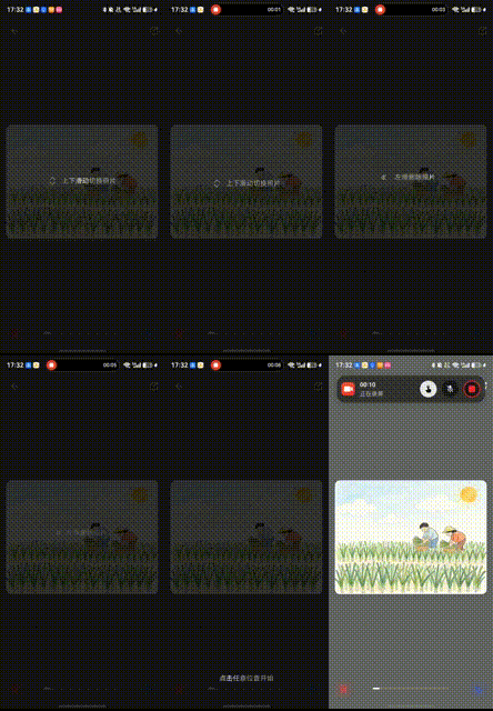
优秀的新手引导能显著降低用户学习成本,提升首次使用体验。本文将深入解析一个基于 HarmonyOS ArkUI 实现的新手引导系统,它具备:
- 扫光文字渐变光泽从左向右扫过,吸引注意力
- 箭头动画循环上下/左右移动,指示操作方向
- 分步引导3个步骤逐步展示,淡入淡出过渡
- 持久化状态只在首次使用时显示,避免重复打扰
- 全屏遮罩半透明黑色背景,聚焦引导内容
一、架构设计
1.1 引导状态管理
Good start. I'm introducing the guide system and its key features. Now I need to explain the state management architecture.
引导系统的核心状态:
typescript
@State private showGuide: boolean = false;           // 是否显示引导
@State private guideStep: number = 0;                // 当前步骤 0/1/2
@State private guideArrowOffset: number = 0;         // 箭头偏移量
@State private guideContentOpacity: number = 1;      // 内容透明度
@State private shimmerPos: number = -0.2;            // 扫光位置
private shimmerTimer: number = -1; // 扫光定时器状态说明:
showGuide: 控制整个引导层的显隐guideStep: 0=上下滑动提示, 1=左滑删除提示, 2=点击开始guideArrowOffset: 箭头动画的偏移量,循环变化 0→15→0guideContentOpacity: 步骤切换时的淡入淡出效果shimmerPos: 扫光位置,从 -0.2 循环到 1.4
1.2 引导流程
启动检查
    ↓
读取 Preferences
    ↓
首次使用? ──否→ 跳过引导
    ↓ 是
显示步骤0 (上下滑动)
    ↓ 点击
淡出 → 步骤1 (左滑删除) → 淡入
    ↓ 点击
淡出 → 步骤2 (点击开始) → 淡入
    ↓ 点击
保存状态 → 关闭引导
二、扫光动画原理
2.1 核心思想
扫光效果的本质是线性渐变在时间轴上的移动:
- 定义一个宽度约 0.4 的高亮带(纯白色)
- 高亮带两侧为半透明白色,形成渐变过渡
- 每帧移动高亮带的位置,从左向右扫过
- 循环播放,形成连续的扫光效果
位置映射:
shimmerPos: -0.2 → 0.0 → 0.5 → 1.0 → 1.4 (循环)
           ↓      ↓      ↓      ↓      ↓
文字位置:  左外   左边   中间   右边   右外
2.2 定时器驱动
使用 setInterval 以 60fps 更新扫光位置:
typescript
private startGuideAnimation(): void {
  // ... 箭头动画代码 ...

  // 文字光泽扫过效果
  this.shimmerTimer = setInterval(() => {
    this.shimmerPos = (this.shimmerPos + 0.008) % 1.4;
  }, 16); // 16ms ≈ 60fps
}参数说明:
0.008: 每帧移动步长,控制扫光速度% 1.4: 取模运算实现循环,到达 1.4 后回到 016ms: 约 60fps,保证动画流畅
速度计算:
- 完整扫过一次:
1.4 / 0.008 = 175帧 - 耗时:
175 × 16ms = 2.8秒
2.3 shaderStyle 渐变实现
使用 shaderStyle 属性实现文字渐变:
typescript
Text('上下滑动切换照片')
  .shaderStyle({
    angle: 90,
    colors: [
      ['#88FFFFFF', Math.max(0, this.shimmerPos - 0.2)],
      ['#FFFFFFFF', Math.min(1, this.shimmerPos)],
      ['#88FFFFFF', Math.min(1, this.shimmerPos + 0.2)]
    ]
} as LinearGradientOptions)渐变配置解析:
-
angle: 90 - 渐变角度90度(从左到右)
-
三色渐变:
- 第1色:
#88FFFFFF(半透明白) 位置shimmerPos - 0.2 - 第2色:
#FFFFFFFF(纯白) 位置shimmerPos - 第3色:
#88FFFFFF(半透明白) 位置shimmerPos + 0.2
- 第1色:
-
位置计算:
- 使用
Math.max(0, ...)和Math.min(1, ...)限制在 0, 1 范围 - 形成宽度 0.4 的高亮带(0.2 + 0.2)
- 使用
动画效果:
shimmerPos = 0.0 时:
  位置0.0: 半透明白
  位置0.0: 纯白 ← 高亮带在最左侧
  位置0.2: 半透明白

shimmerPos = 0.5 时:
  位置0.3: 半透明白
  位置0.5: 纯白 ← 高亮带在中间
  位置0.7: 半透明白

shimmerPos = 1.0 时:
  位置0.8: 半透明白
  位置1.0: 纯白 ← 高亮带在最右侧
  位置1.0: 半透明白
三、箭头动画实现
3.1 循环往复动画
箭头动画使用递归 animateTo 实现循环效果:
typescript
private startGuideAnimation(): void {
  // 箭头循环动画
  const animate = () => {
    if (!this.showGuide) return; // 引导关闭时停止

    // 第一段:向下/向左移动
    animateTo({ duration: 1200, curve: Curve.EaseInOut }, () => {
      this.guideArrowOffset = 15;
    });

    // 第二段:回到原位
    setTimeout(() => {
      if (!this.showGuide) return;
      animateTo({ duration: 1200, curve: Curve.EaseInOut }, () => {
        this.guideArrowOffset = 0;
      });

      // 递归调用,形成循环
      setTimeout(animate, 1200);
    }, 1200);
  };

  animate(); // 启动动画
}动画流程:
guideArrowOffset: 0 → 15 → 0 → 15 → 0 (循环)
                  ↑    ↑    ↑
时间轴: 0s 1.2s 2.4s 3.6s 4.8s关键点:
- 递归调用 :
setTimeout(animate, 1200)在动画结束后再次调用自己 - 停止条件 : 每次检查
showGuide,引导关闭时自动停止 - EaseInOut: 缓动曲线,开始和结束时速度慢,中间快
- 时序控制: 两段动画各 1.2s,总周期 2.4s
3.2 箭头应用
不同步骤使用不同的箭头方向:
步骤0 - 上下滑动提示:
typescript
if (this.guideStep === 0) {
  Row({ space: 12 }) {
    Image($r('app.media.ic_guide_updown')).width(20)
      .fillColor('#88FFFFFF')
    Text('上下滑动切换照片')
      .shaderStyle({ /* 扫光效果 */ })
  }
  .translate({ y: this.guideArrowOffset }) // 垂直移动
}
步骤1 - 左滑删除提示:
typescript
if (this.guideStep === 1) {
  Row({ space: 5 }) {
    Image($r('app.media.ic_guide_left')).width(16)
      .fillColor('#88FFFFFF')
      .translate({ x: -this.guideArrowOffset }) // 水平移动(负方向)
    Text('左滑删除照片')
      .shaderStyle({ /* 扫光效果 */ })
  }
}差异对比:
| 步骤 | 箭头图标 | 移动方向 | translate属性 |
|---|---|---|---|
| 步骤0 | 上下箭头 | 垂直向下 | { y: offset } |
| 步骤1 | 左箭头 | 水平向左 | { x: -offset } |
四、步骤切换逻辑
4.1 淡入淡出过渡
步骤切换时使用透明度动画实现平滑过渡:
typescript
private handleGuideClick(): void {
  // 第一阶段:淡出当前内容
  animateTo({ duration: 300 }, () => {
    this.guideContentOpacity = 0;
  });

  // 第二阶段:切换步骤 + 淡入新内容
  setTimeout(() => {
    if (this.guideStep < 2) {
      // 切换到下一步
      this.guideStep++;

      // 淡入新内容
      animateTo({ duration: 300 }, () => {
        this.guideContentOpacity = 1;
      });
    } else {
      // 第3步后关闭引导
      this.closeGuide();
    }
  }, 300); // 等待淡出完成
}时序图:
时间轴:  0ms        300ms       600ms
         ↓           ↓           ↓
opacity: 1.0 → 0.0   切换步骤   0.0 → 1.0
淡出 (瞬间) 淡入关键设计:
- 先淡出后切换: 避免内容突变,视觉更流畅
- 300ms延迟: 等待淡出动画完成再切换内容
- 对称时长: 淡出和淡入都是 300ms,节奏一致
4.2 内容渲染
根据 guideStep 和 guideContentOpacity 渲染不同内容:
typescript
Column({ space: 60 }) {
  // 步骤0:上下滑动提示
  if (this.guideStep === 0) {
    Row({ space: 12 }) {
      Image($r('app.media.ic_guide_updown')).width(20)
      Text('上下滑动切换照片')
        .shaderStyle({ /* 扫光 */ })
    }
    .translate({ y: this.guideArrowOffset })
  }

  // 步骤1:左滑删除提示
  if (this.guideStep === 1) {
    Row({ space: 5 }) {
      Image($r('app.media.ic_guide_left')).width(16)
      Text('左滑删除照片')
        .shaderStyle({ /* 扫光 */ })
    }
  }
}
.justifyContent(FlexAlign.Center)
.opacity(this.guideContentOpacity) // 统一控制透明度

// 步骤2:底部提示
if (this.guideStep === 2) {
  Text('点击任意位置开始')
    .shaderStyle({ /* 扫光 */ })
    .position({ x: '50%', y: '90%' })
    .translate({ x: '-50%' })
    .opacity(this.guideContentOpacity)
}布局策略:
- 步骤0/1: 居中显示,使用
Column包裹 - 步骤2: 底部显示,使用
position绝对定位 - 所有步骤共享
guideContentOpacity,统一淡入淡出
五、持久化状态
5.1 首次检查
启动时检查是否已显示过引导:
typescript
private async checkGuideStatus(): Promise<void> {
  const ctx = getContext() as common.UIAbilityContext;
  const prefs = await preferences.getPreferences(ctx, 'photo_manager');
  const hasShown = await prefs.get('photo_browser_guide_shown', false) as boolean;

  if (!hasShown) {
    this.showGuide = true;
    this.startGuideAnimation();
  }
}逻辑:
- 读取
photo_browser_guide_shown标志 - 如果为
false或不存在,显示引导 - 启动扫光和箭头动画
5.2 关闭并保存
用户完成引导后保存状态:
typescript
private async closeGuide(): Promise<void> {
  this.showGuide = false;

  // 停止扫光定时器
  if (this.shimmerTimer !== -1) {
    clearInterval(this.shimmerTimer);
    this.shimmerTimer = -1;
  }

  // 保存已展示标记
  const ctx = getContext() as common.UIAbilityContext;
  const prefs = await preferences.getPreferences(ctx, 'photo_manager');
  await prefs.put('photo_browser_guide_shown', true);
  await prefs.flush();
}清理工作:
- 隐藏引导层
showGuide = false - 清除定时器,停止扫光动画
- 保存标志到 Preferences
- 调用
flush()确保持久化
六、完整代码示例
6.1 引导层组件
typescript
@Builder
GuideOverlay() {
  Stack() {
    // 半透明遮罩
    Column()
      .width('100%')
      .height('100%')
      .backgroundColor('#CC000000')
      .onClick(() => {
        this.handleGuideClick();
      })

    // 引导内容
    Column({ space: 60 }) {
      // 步骤0:上下滑动提示
      if (this.guideStep === 0) {
        Row({ space: 12 }) {
          Image($r('app.media.ic_guide_updown')).width(20)
            .fillColor('#88FFFFFF')
          Text('上下滑动切换照片')
            .shaderStyle({
              angle: 90,
              colors: [
                ['#88FFFFFF', Math.max(0, this.shimmerPos - 0.2)],
                ['#FFFFFFFF', Math.min(1, this.shimmerPos)],
                ['#88FFFFFF', Math.min(1, this.shimmerPos + 0.2)]
              ]
            } as LinearGradientOptions)
        }
        .translate({ y: this.guideArrowOffset })
      }

      // 步骤1:左滑删除提示
      if (this.guideStep === 1) {
        Row({ space: 5 }) {
          Image($r('app.media.ic_guide_left')).width(16)
            .fillColor('#88FFFFFF')
            .translate({ x: -this.guideArrowOffset })
          Text('左滑删除照片')
            .shaderStyle({
              angle: 90,
              colors: [
                ['#88FFFFFF', Math.max(0, this.shimmerPos - 0.2)],
                ['#FFFFFFFF', Math.min(1, this.shimmerPos)],
                ['#88FFFFFF', Math.min(1, this.shimmerPos + 0.2)]
              ]
            } as LinearGradientOptions)
        }
      }
    }
    .justifyContent(FlexAlign.Center)
    .opacity(this.guideContentOpacity)

    // 步骤2:底部提示
    if (this.guideStep === 2) {
      Text('点击任意位置开始')
        .shaderStyle({
          angle: 90,
          colors: [
            ['#88FFFFFF', Math.max(0, this.shimmerPos - 0.2)],
            ['#FFFFFFFF', Math.min(1, this.shimmerPos)],
            ['#88FFFFFF', Math.min(1, this.shimmerPos + 0.2)]
          ]
        } as LinearGradientOptions)
        .position({ x: '50%', y: '90%' })
        .translate({ x: '-50%' })
        .opacity(this.guideContentOpacity)
    }
  }
  .width('100%')
  .height('100%')
}
6.2 使用方式
在主界面中条件渲染:
typescript
build() {
  Stack() {
    // 主界面内容
    Column() {
      // ...
    }

    // 新手引导层
    if (this.showGuide) {
      this.GuideOverlay()
    }
  }
}
七、性能优化
7.1 定时器管理
问题: 定时器未清理会导致内存泄漏
解决方案:
typescript
aboutToDisappear() {
  // 组件销毁时清理定时器
  if (this.shimmerTimer !== -1) {
    clearInterval(this.shimmerTimer);
    this.shimmerTimer = -1;
  }
}
7.2 动画停止条件
问题: 引导关闭后动画仍在运行
解决方案:
typescript
const animate = () => {
  if (!this.showGuide) return; // 检查标志,及时停止
  // ...
};
在每次递归调用前检查 showGuide,引导关闭时自动停止。
7.3 渐变计算优化
问题 : 每帧计算 Math.max/min 有性能开销
优化方案:
typescript
// 预计算位置,减少重复计算
private getShimmerColors(): [string, number][] {
  const pos1 = Math.max(0, this.shimmerPos - 0.2);
  const pos2 = Math.min(1, this.shimmerPos);
  const pos3 = Math.min(1, this.shimmerPos + 0.2);
  return [
    ['#88FFFFFF', pos1],
    ['#FFFFFFFF', pos2],
    ['#88FFFFFF', pos3]
  ];
}
八、扩展应用
8.1 自定义扫光速度
调整 setInterval 的步长:
typescript
// 慢速扫光
this.shimmerPos = (this.shimmerPos + 0.004) % 1.4; // 5.6秒一次

// 快速扫光
this.shimmerPos = (this.shimmerPos + 0.016) % 1.4; // 1.4秒一次
8.2 多色扫光
使用更多颜色创建彩虹效果:
typescript
.shaderStyle({
  angle: 90,
  colors: [
    ['#FF0000', Math.max(0, this.shimmerPos - 0.3)],
    ['#FFFF00', Math.max(0, this.shimmerPos - 0.15)],
    ['#00FF00', Math.min(1, this.shimmerPos)],
    ['#00FFFF', Math.min(1, this.shimmerPos + 0.15)],
    ['#0000FF', Math.min(1, this.shimmerPos + 0.3)]
  ]
})
8.3 应用到其他场景
扫光效果可用于:
- 按钮高亮: 引导用户点击关键按钮
- 标题装饰: 增强页面标题的视觉吸引力
- 加载提示: 配合骨架屏使用,提示内容加载中
- 成就解锁: 游戏化设计中的奖励展示
九、总结与思考
9.1 核心亮点
这个新手引导系统的设计有几个值得借鉴的地方:
✅ 扫光动画 : shaderStyle + setInterval 实现流畅的渐变扫过
✅ 箭头动画 : 递归 animateTo 实现循环往复,指示操作方向
✅ 分步引导 : 3个步骤逐步展示,淡入淡出过渡自然
✅ 持久化状态 : Preferences 存储,只在首次使用时显示
✅ 性能优化: 及时清理定时器,避免内存泄漏
9.2 技术要点回顾
| 技术点 | 实现方式 | 关键API |
|---|---|---|
| 扫光动画 | setInterval + shaderStyle | LinearGradientOptions |
| 箭头动画 | 递归animateTo | animateTo, translate |
| 步骤切换 | opacity淡入淡出 | animateTo, setTimeout |
| 持久化 | Preferences | preferences.getPreferences |
| 定时器管理 | aboutToDisappear清理 | clearInterval |
9.3 设计原则
- 非侵入性: 半透明遮罩,不完全遮挡主界面
- 渐进式: 分3步展示,避免信息过载
- 可跳过: 点击任意位置即可进入下一步
- 只显示一次: 持久化状态,避免重复打扰
9.4 可优化方向
- 动态步骤: 根据用户行为动态调整引导内容
- 跳过按钮: 提供明确的"跳过"按钮,而非点击任意位置
- 进度指示: 显示"1/3"、"2/3"等进度提示
- A/B测试: 对比不同引导方式的完成率
技术栈 : HarmonyOS Next | ArkTS | ArkUI | Preferences
关键词: 新手引导 | 扫光动画 | shaderStyle | 渐变动画 | 用户体验
如果这篇文章对你有帮助,欢迎点赞收藏。有问题可以在评论区交流~