OrgChart 是一个功能丰富的组织结构图控件,支持多种布局方向、节点样式自定义、展开收起功能,以及灵活的连接线样式配置。
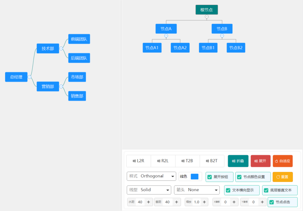
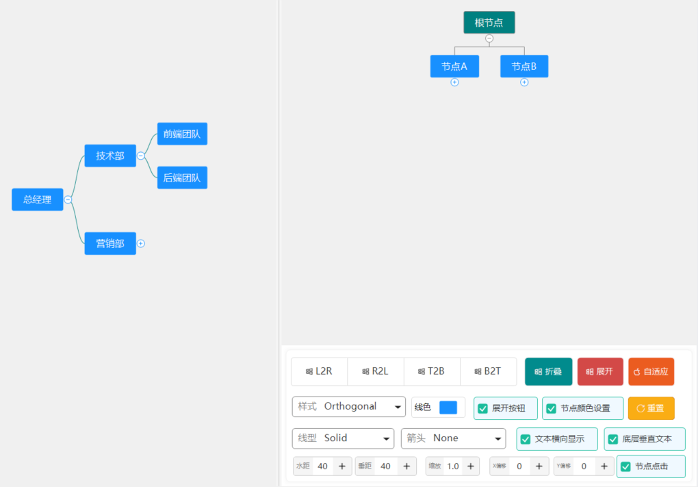
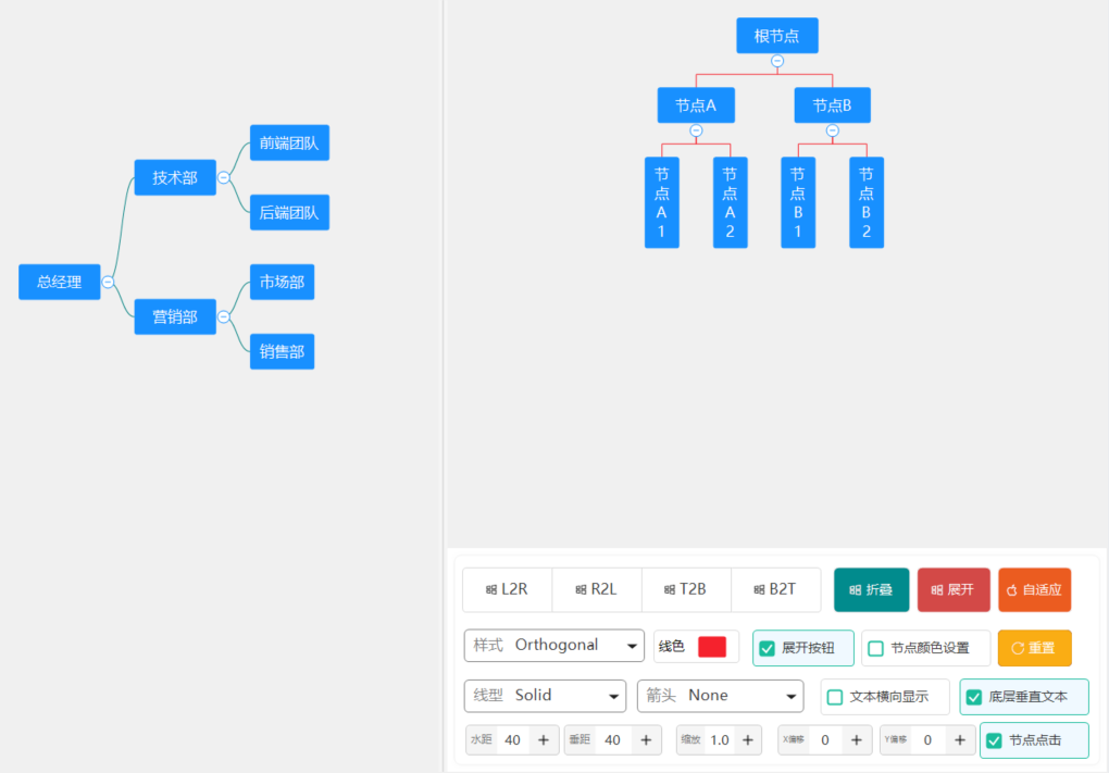
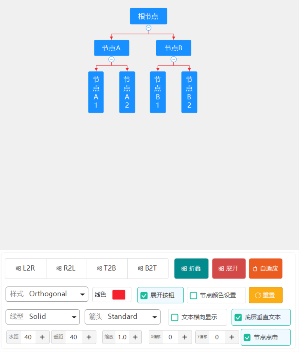
一、效果图
二、使用说明
OrgChart 组织结构图控件
控件名称
OrgChart
中文名称
组织结构图控件
控件优点
OrgChart 是一个功能丰富的组织结构图控件,支持多种布局方向、节点样式自定义、展开收起功能,以及灵活的连接线样式配置。
主要特性
- 多种布局方向:支持左到右、右到左、上到下、下到上四种布局
- 展开收起:节点支持展开和收起子节点,点击按钮切换
- 自定义节点样式:支持填充色、边框色、字体、圆角等
- 丰富的连接线样式:支持多种线宽、线型、箭头类型
- 事件支持:节点点击、展开收起事件
- 数据绑定:支持树形节点结构
重要参数说明
布局属性
| 属性名 |
类型 |
默认值 |
说明 |
Layout |
OrgChartLayout |
LeftToRight |
布局方向 |
HorizontalSpacing |
int |
40 |
水平间距 |
VerticalSpacing |
int |
20 |
垂直间距 |
布局方向(OrgChartLayout)
| 值 |
说明 |
LeftToRight |
从左到右布局(根节点在左) |
RightToLeft |
从右到左布局(根节点在右) |
TopToBottom |
从上到下布局(根节点在上) |
BottomToTop |
从下到上布局(根节点在下) |
节点属性
| 属性名 |
类型 |
默认值 |
说明 |
UseNodeColors |
bool |
true |
是否使用节点自定义颜色 |
DefaultFillColor |
Color |
(24,144,255) |
默认填充颜色 |
DefaultBorderColor |
Color |
(24,144,255) |
默认边框颜色 |
DefaultForeColor |
Color |
White |
默认字体颜色 |
DefaultFont |
Font |
微软雅黑, 10 |
默认字体 |
NodePadding |
int |
8 |
默认内边距 |
NodeBorderWidth |
int |
1 |
默认边框宽度 |
NodeCornerRadius |
int |
4 |
默认圆角半径 |
ShowExpandButtons |
bool |
true |
是否显示展开按钮 |
连接线样式(ConnectionStyle)
| 属性名 |
类型 |
默认值 |
说明 |
LineColor |
Color |
Black |
线条颜色 |
LineType |
LineType |
Solid |
线条类型(实线、虚线等) |
LineStyle |
ConnectionLineStyle |
Orthogonal |
连接线样式(直角、曲线等) |
LineWidth |
LineWidth |
W1 |
线宽 |
ArrowType |
ArrowType |
None |
箭头类型 |
ArrowColor |
Color |
Empty |
箭头颜色(默认与线条相同) |
连接线样式(ConnectionLineStyle)
| 值 |
说明 |
Orthogonal |
直角折线(默认) |
Curved |
贝塞尔曲线 |
Straight |
直线连接 |
Tree |
树形连接(分支线) |
Fishbone |
鱼骨图样式 |
Rounded |
圆角折线 |
线条类型(LineType)
| 值 |
说明 |
Solid |
实线 |
Dashed |
虚线 |
Dotted |
点线 |
DashDot |
点划线 |
DashDotDot |
双点划线 |
线宽选项(LineWidth)
| 值 |
实际宽度(px) |
W0_25 |
0.25 |
W0_5 |
0.5 |
W0_75 |
0.75 |
W1 |
1.0 |
W1_5 |
1.5 |
W2_25 |
2.25 |
W3 |
3.0 |
W4 |
4.0 |
W5 |
5.0 |
W6 |
6.0 |
箭头类型(ArrowType)
| 值 |
说明 |
None |
无箭头 |
Standard |
标准箭头 |
TriangleSolid |
实心三角形 |
TriangleHollow |
空心三角形 |
Circle |
圆形 |
Diamond |
菱形 |
Square |
方块 |
Dot |
圆点 |
节点数据结构(OrgChartNode)
| 属性名 |
类型 |
说明 |
Text |
string |
节点文本 |
FillColor |
Color |
填充颜色 |
BorderColor |
Color |
边框颜色 |
ForeColor |
Color |
字体颜色 |
Font |
Font |
字体 |
Expanded |
bool |
是否展开 |
Padding |
int |
内边距 |
BorderWidth |
int |
边框宽度 |
CornerRadius |
int |
圆角半径 |
ShowExpandButton |
bool |
是否显示展开按钮 |
Children |
List<OrgChartNode> |
子节点集合 |
Tag |
object |
自定义标签 |
重要事件
| 事件名 |
说明 |
参数 |
NodeClick |
节点被点击时触发 |
OrgChartNodeEventArgs |
NodeToggle |
节点展开/收起时触发 |
OrgChartNodeEventArgs |
PropertyChanged |
属性值改变时触发 |
PropertyChangedEventArgs |
使用示例
基本使用
// 创建组织结构图
OrgChart orgChart = new OrgChart();
orgChart.Dock = DockStyle.Fill;
orgChart.Layout = OrgChartLayout.LeftToRight;

// 创建节点
OrgChartNode root = new OrgChartNode();
root.Text = "CEO";
root.FillColor = Color.FromArgb(24, 144, 255);

// 添加子节点
OrgChartNode child1 = new OrgChartNode();
child1.Text = "技术部";
child1.FillColor = Color.FromArgb(64, 169, 131);
root.Children.Add(child1);

OrgChartNode child2 = new OrgChartNode();
child2.Text = "市场部";
child2.FillColor = Color.FromArgb(255, 193, 7);
root.Children.Add(child2);

// 设置根节点
orgChart.RootNode = root;

this.Controls.Add(orgChart);
多层结构
// 创建三层结构
OrgChartNode root = new OrgChartNode { Text = "公司总部" };

OrgChartNode dept1 = new OrgChartNode { Text = "研发中心" };
OrgChartNode team1 = new OrgChartNode { Text = "前端团队" };
OrgChartNode team2 = new OrgChartNode { Text = "后端团队" };
dept1.Children.Add(team1);
dept1.Children.Add(team2);
root.Children.Add(dept1);

OrgChartNode dept2 = new OrgChartNode { Text = "运营中心" };
OrgChartNode team3 = new OrgChartNode { Text = "产品运营" };
OrgChartNode team4 = new OrgChartNode { Text = "用户运营" };
dept2.Children.Add(team3);
dept2.Children.Add(team4);
root.Children.Add(dept2);

orgChart.RootNode = root;
自定义连接线样式
// 设置连接线样式
orgChart.ConnectionStyle.LineColor = Color.Gray;
orgChart.ConnectionStyle.LineType = LineType.Dashed;
orgChart.ConnectionStyle.LineWidth = LineWidth.W1_5;
orgChart.ConnectionStyle.ArrowType = ArrowType.TriangleSolid;
orgChart.ConnectionStyle.ArrowColor = Color.Red;
连接线样式
// 直角折线(默认)
orgChart.ConnectionStyle.LineStyle = ConnectionLineStyle.Orthogonal;

// 贝塞尔曲线
orgChart.ConnectionStyle.LineStyle = ConnectionLineStyle.Curved;

// 直线连接
orgChart.ConnectionStyle.LineStyle = ConnectionLineStyle.Straight;

// 树形连接(分支线)
orgChart.ConnectionStyle.LineStyle = ConnectionLineStyle.Tree;

// 圆角折线
orgChart.ConnectionStyle.LineStyle = ConnectionLineStyle.Rounded;
上下布局
// 从上到下布局
orgChart.Layout = OrgChartLayout.TopToBottom;
orgChart.HorizontalSpacing = 30;
orgChart.VerticalSpacing = 30;
事件处理
// 节点点击事件
orgChart.NodeClick += (sender, e) =>
{
    MessageBox.Show($"点击了节点: {e.Node.Text}");
};

// 节点展开/收起事件
orgChart.NodeToggle += (sender, e) =>
{
    Console.WriteLine($"节点 {e.Node.Text} 已{(e.Node.Expanded ? "展开" : "收起")}");
};
动态修改节点
// 动态添加子节点
OrgChartNode newNode = new OrgChartNode();
newNode.Text = "新部门";
newNode.FillColor = Color.Purple;
root.Children.Add(newNode);

// 切换节点状态
node.ToggleExpand();

// 修改节点样式
node.Text = "新名称";
node.FillColor = Color.Blue;
批量设置样式
// 设置所有节点使用默认样式
orgChart.UseNodeColors = false;
orgChart.DefaultFillColor = Color.Gray;
orgChart.DefaultForeColor = Color.White;
orgChart.DefaultFont = new Font("宋体", 12, FontStyle.Bold);
注意事项
- 布局计算:控件会自动计算布局,但节点过多时建议限制层级
- 性能优化:大量节点时考虑虚拟滚动或分页
- 颜色设置 :
UseNodeColors 为 false 时使用控件级默认颜色
- 展开按钮:只有有子节点的节点才显示展开按钮
- 尺寸自适应:建议将控件 Dock 设为 Fill 或设置合适的 Size
- 布局变化:展开/折叠子节点时,父节点到子节点的连接线位置会根据子树整体尺寸自动调整,这是标准树形布局的特性
已知限制
- 展开/折叠时布局变化:当展开或折叠子节点时,父节点到子节点的连接线位置可能会根据子树整体尺寸发生变化。这是由于标准树形布局算法会重新计算整个树的布局所致。如需保持连接线位置稳定,需要使用不同的布局策略(如固定子节点位置),当前版本未实现此功能。
- L2R/R2L 布局:LeftToRight 和 RightToLeft 布局方向在展开/折叠节点时,垂直方向的居中计算可能与预期略有差异。
- 文本垂直显示:当节点使用垂直文本显示时,节点高度会根据文本字符数量自动调整,如果节点内容过多可能导致节点过高。
使用建议
- 小型组织:直接使用控件显示完整结构
- 大型组织:配合展开收起功能,分层展示
- 自定义样式:根据部门类型设置不同颜色
- 交互增强:结合事件实现选中高亮、右键菜单等功能
三、后记
更多控件,敬请关注,如有需求、好的建议,请留言(xue5zhijing)
更多:https://blog.csdn.net/uaime/article/details/161663833