HarmonyOS ArkUI 背景设置完全指南
适用平台 :HarmonyOS NEXT API 23+
核心组件:所有支持通用属性的ArkUI组件
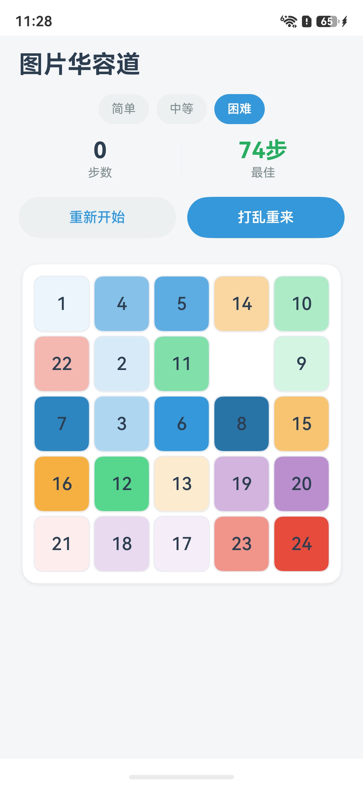
效果
一、背景设置概述
在HarmonyOS ArkUI开发中,背景设置是界面美化最基础也是最重要的手段之一。通过合理的背景设置,可以让应用界面从"能用"变成"好看"。HarmonyOS提供了丰富的背景相关属性,涵盖纯色、渐变、图片、模糊等多种效果。
1.1 背景属性全景图
| 属性 | 说明 | 适用场景 |
|---|---|---|
.backgroundColor() |
设置纯色背景 | 最常用,所有场景 |
.backgroundImage() |
设置背景图片 | 装饰性背景 |
.backgroundImagePosition() |
背景图片偏移位置 | 图片定位、拼图效果 |
.backgroundImageSize() |
背景图片尺寸控制 | cover/contain/自定义 |
.backgroundBlendMode() |
背景混合模式 | 叠加效果 |
.backgroundBrightness() |
背景亮度 | 暗化/提亮 |
.backgroundBlur() |
背景模糊 | 毛玻璃效果 |
linearGradient() |
线性渐变 | 渐变背景 |
1.2 属性链式调用规则
所有背景属性支持链式调用,多个属性会叠加生效。调用顺序影响最终渲染效果:
typescript
Column()
  .backgroundColor('#FFFFFF')          // 最底层:白色底色
  .backgroundImage($r('app.media.bg'))  // 中间层:背景图片
  .backgroundBlur(10)                   // 上层:模糊效果
二、backgroundColor - 纯色背景
2.1 基本用法
typescript
// 十六进制颜色
Column()
  .width('100%')
  .height(100)
  .backgroundColor('#3498DB')

// 内置颜色常量
Text('Hello')
  .backgroundColor(Color.White)

// rgba 格式
Row()
  .backgroundColor('rgba(52, 152, 219, 0.8)')

// 资源引用
Image($r('app.media.icon'))
  .backgroundColor($r('app.color.primary_bg'))
2.2 实践:状态切换背景色
typescript
@ComponentV2
struct StatusCard {
  @Param status: string = 'normal';  // 'normal' | 'warning' | 'error'

  @Computed
  get bgColor(): string {
    switch (this.status) {
      case 'warning': return '#F39C12';
      case 'error': return '#E74C3C';
      default: return '#2ECC71';
    }
  }

  build() {
    Row() {
      Text('当前状态')
        .fontColor(Color.White)
        .fontSize(16)
    }
    .width('100%')
    .height(44)
    .backgroundColor(this.bgColor)
    .borderRadius(8)
    .justifyContent(FlexAlign.Center)
  }
}
三、backgroundImage - 图片背景
3.1 基本用法
typescript
// 本地资源图片
Column()
  .width(200)
  .height(200)
  .backgroundImage($r('app.media.background'))

// 网络图片(需要申请网络权限)
Column()
  .width(200)
  .height(200)
  .backgroundImage('https://example.com/bg.jpg')

// 多个背景图片(逗号分隔,先写的在上层)
Column()
  .width(200)
  .height(200)
  .backgroundImage(
    $r('app.media.overlay'),
    $r('app.media.background')
  )
3.2 backgroundImagePosition - 图片位置控制
这是实现图片拼图(华容道)效果的核心属性。
typescript
// 语法:.backgroundImagePosition({ x: number, y: number })
// x/y 单位为vp,正值向右/下偏移,负值向左/上偏移

// 从左上角偏移50vp
Column()
  .width(100)
  .height(100)
  .backgroundImage($r('app.media.photo'))
  .backgroundImagePosition({ x: 50, y: 50 })

// 显示图片右下角部分(负值偏移)
Column()
  .width(100)
  .height(100)
  .backgroundImage($r('app.media.photo'))
  .backgroundImagePosition({ x: -100, y: -100 })
3.3 backgroundImageSize - 尺寸控制
typescript
// 按容器比例缩放
.backgroundImageSize(ImageSize.Cover)     // 覆盖容器,可能裁剪
.backgroundImageSize(ImageSize.Contain)   // 完整显示,可能留白
.backgroundImageSize(ImageSize.Auto)       // 原始尺寸

// 自定义宽高
.backgroundImageSize({ width: 300, height: 200 })
3.4 实践:图片拼图效果
typescript
/**
 * 将一张大图切割成3×3拼图块,每个块显示图片的不同部分
 * 这是华容道游戏的核心技术
 */
@ComponentV2
struct ImagePuzzle {
  @Param imageSource: ResourceStr = $r('app.media.full_photo');
  @Param rows: number = 3;
  @Param cols: number = 3;
  @Param pieceWidth: number = 100;
  @Param pieceHeight: number = 100;

  build() {
    // 背景图原始尺寸需要与容器总尺寸匹配
    // 容器总宽 = cols * pieceWidth, 总高 = rows * pieceHeight
    Grid() {
      ForEach(this.generatePieces(), (piece: PieceInfo) => {
        GridItem() {
          Column()
            .width(`${this.pieceWidth}vp`)
            .height(`${this.pieceHeight}vp`)
            .borderWidth(1)
            .borderColor(Color.White)
            // 关键:通过负偏移显示图片的不同区域
            .backgroundImage(this.imageSource)
            .backgroundImagePosition({
              x: -piece.col * this.pieceWidth,  // 负值向左偏移
              y: -piece.row * this.pieceHeight   // 负值向上偏移
            })
            .backgroundImageSize({
              width: this.cols * this.pieceWidth,
              height: this.rows * this.pieceHeight
            })
        }
      })
    }
    .columnsTemplate(`repeat(${this.cols}, 1fr)`)
    .rowsTemplate(`repeat(${this.rows}, 1fr)`)
    .width(`${this.cols * this.pieceWidth}vp`)
    .height(`${this.rows * this.pieceHeight}vp`)
  }

  generatePieces(): PieceInfo[] {
    const pieces: PieceInfo[] = [];
    for (let row = 0; row < this.rows; row++) {
      for (let col = 0; col < this.cols; col++) {
        pieces.push({ row, col });
      }
    }
    return pieces;
  }
}

interface PieceInfo {
  row: number;
  col: number;
}
四、渐变背景 - linearGradient
4.1 基本语法
typescript
// 线性渐变:从上到下
.linearGradient({
  direction: GradientDirection.Bottom,  // 渐变方向
  colors: [                              // 渐变色数组(支持多个色标)
    ['#FF6B6B', 0.0],                    // [颜色, 位置(0~1)]
    ['#4ECDC4', 1.0]
  ]
})

// 对角渐变(左上→右下)
.linearGradient({
  angle: 135,                            // 角度(顺时针,0=上,90=右)
  colors: [
    ['#667eea', 0.0],
    ['#764ba2', 1.0]
  ]
})
4.2 实践:简约风格界面背景
typescript
@ComponentV2
struct MinimalistHeader {
  build() {
    Column() {
      Text('简约之美')
        .fontSize(28)
        .fontWeight(700)
        .fontColor(Color.White)
        .margin({ top: 60, bottom: 20 })

      Text('Less is More')
        .fontSize(16)
        .fontColor('rgba(255, 255, 255, 0.8)')
        .margin({ bottom: 40 })
    }
    .width('100%')
    .height(200)
    .justifyContent(FlexAlign.Center)
    .alignItems(HorizontalAlign.Center)
    // 柔和的渐变背景
    .linearGradient({
      direction: GradientDirection.Bottom,
      colors: [
        ['#3498DB', 0.0],
        ['#2C3E50', 1.0]
      ]
    })
  }
}
五、backgroundBlur - 毛玻璃效果
5.1 基本用法
typescript
// 对背景进行高斯模糊
Column()
  .width('100%')
  .height(100)
  .backgroundBlur(20)          // 模糊半径,数值越大越模糊
  .backgroundColor('rgba(255, 255, 255, 0.7)')  // 半透明底色配合模糊效果
5.2 实践:毛玻璃导航栏
typescript
@ComponentV2
struct GlassNavBar {
  build() {
    Row() {
      Text('首页').fontColor('#333').fontSize(16)
      Text('发现').fontColor('#333').fontSize(16)
      Text('我的').fontColor('#333').fontSize(16)
    }
    .width('100%')
    .height(56)
    .justifyContent(FlexAlign.SpaceAround)
    .alignItems(VerticalAlign.Center)
    // 毛玻璃效果
    .backgroundBlur(30)
    .backgroundColor('rgba(255, 255, 255, 0.6)')
    // 底部位置固定在底部
    .position({ x: 0, y: '100%' })
    .translate({ y: -56 })
  }
}
六、backgroundBlendMode - 混合模式
6.1 常用混合模式
typescript
// 将背景与内容进行颜色混合
Column()
  .width(200)
  .height(200)
  .backgroundColor('#3498DB')
  .backgroundBlendMode(BlendMode.Multiply)     // 正片叠底
  // .backgroundBlendMode(BlendMode.Screen)      // 滤色
  // .backgroundBlendMode(BlendMode.Overlay)     // 叠加
  // .backgroundBlendMode(BlendMode.SoftLight)   // 柔光
七、完整综合示例
下面是一个综合运用多种背景属性的完整示例:
typescript
/**
 * 综合背景设置示例
 * 展示渐变 + 图片 + 模糊 + 混合的综合效果
 */
@Entry
@ComponentV2
struct BackgroundDemo {
  build() {
    Column({ space: 16 }) {
      // 1. 渐变色卡片
      Column() {
        Text('渐变背景')
          .fontSize(20)
          .fontColor(Color.White)
          .fontWeight(600)
      }
      .width('90%')
      .height(100)
      .borderRadius(12)
      .justifyContent(FlexAlign.Center)
      .linearGradient({
        angle: 135,
        colors: [
          ['#667eea', 0.0],
          ['#764ba2', 1.0]
        ]
      })

      // 2. 图片背景卡片
      Column() {
        Text('图片背景')
          .fontSize(20)
          .fontColor(Color.White)
          .fontWeight(600)
      }
      .width('90%')
      .height(100)
      .borderRadius(12)
      .justifyContent(FlexAlign.Center)
      .backgroundImage($r('app.media.background'))
      .backgroundImageSize(ImageSize.Cover)
      .backgroundBrightness(0.6)  // 压暗背景,让文字更清晰

      // 3. 毛玻璃效果卡片
      Column() {
        Text('毛玻璃效果')
          .fontSize(20)
          .fontColor('#333')
          .fontWeight(600)
      }
      .width('90%')
      .height(100)
      .borderRadius(12)
      .justifyContent(FlexAlign.Center)
      .backgroundBlur(15)
      .backgroundColor('rgba(255, 255, 255, 0.5)')

      // 4. 拼图块效果卡片
      Row({ space: 4 }) {
        // 显示图片的不同区域
        ForEach([0, 1, 2], (col: number) => {
          Column()
            .width(80)
            .height(80)
            .borderRadius(8)
            .border({ width: 2, color: Color.White })
            .backgroundImage($r('app.media.background'))
            .backgroundImagePosition({ x: -col * 80, y: 0 })
            .backgroundImageSize({ width: 240, height: 80 })
        })
      }
    }
    .width('100%')
    .height('100%')
    .backgroundColor('#F5F6F8')
    .justifyContent(FlexAlign.Center)
    .padding(16)
  }
}
八、背景设置最佳实践
8.1 性能建议
| 建议 | 说明 |
|---|---|
| 避免大图背景 | 背景图片过大会影响渲染性能,建议控制在200KB以内 |
| 合理使用缓存 | 频繁使用的背景色定义为常量或资源引用 |
| 减少嵌套背景 | 多层背景叠加会增加绘制开销 |
8.2 设计建议
| 建议 | 说明 |
|---|---|
| 对比度优先 | 背景色与文字色对比度至少达到4.5:1(WCAG AA标准) |
| 简约克制 | 背景不宜过于花哨,以免喧宾夺主 |
| 响应式适配 | 使用ImageSize.Cover确保不同屏幕尺寸的背景一致性 |
8.3 常见问题排查
| 问题 | 可能原因 | 解决方案 |
|---|---|---|
| 背景图片不显示 | 路径错误或资源未声明 | 检查$r()路径是否正确,确认资源文件存在 |
| 渐变不生效 | 颜色数组格式错误 | 确认每个色标格式为[color: string, position: number] |
| 模糊无效果 | 缺少底层内容 | 模糊效果需要下方有可模糊的内容,配合半透明底色使用 |
| 图片偏移无效 | 容器尺寸不够大 | backgroundImagePosition偏移后超出容器部分会被裁剪 |
九、总结
HarmonyOS ArkUI的背景设置体系功能完善且灵活,核心要点总结:
- 纯色背景 :最常用,使用
.backgroundColor() - 图片背景 :
.backgroundImage()配合.backgroundImagePosition()实现拼图等高级效果 - 渐变背景 :
.linearGradient()实现现代感的渐变设计 - 毛玻璃 :
.backgroundBlur()配合半透明底色实现iOS风格的毛玻璃 - 混合模式 :
.backgroundBlendMode()实现创意叠加效果
💡 小贴士 :在开发图片华容道类游戏时,
backgroundImage+backgroundImagePosition+backgroundImageSize三者的组合是实现拼图效果的关键技术。