最近要高考了,这里祝大家金榜题名,旗开得胜。
这是数据集,如果有需要的,可以私信我。
import pandas as pd
import numpy as np
import matplotlib.pyplot as plt
from pyecharts.charts import Line
from pyecharts.charts import Bar
from pyecharts.charts import PictorialBar
from pyecharts.charts import Map
from pyecharts.charts import Pie
from pyecharts.charts import Grid
from pyecharts.charts import WordCloud
from pyecharts import options as opts

plt.rcParams['font.family'] = ['sans-serif']
plt.rcParams['font.sans-serif'] = ['SimHei']
plt.rcParams['axes.unicode_minus'] = False
老规矩第一步将我们需要用到的库先导入,其次,我们可以将绘图时的字体设置好,
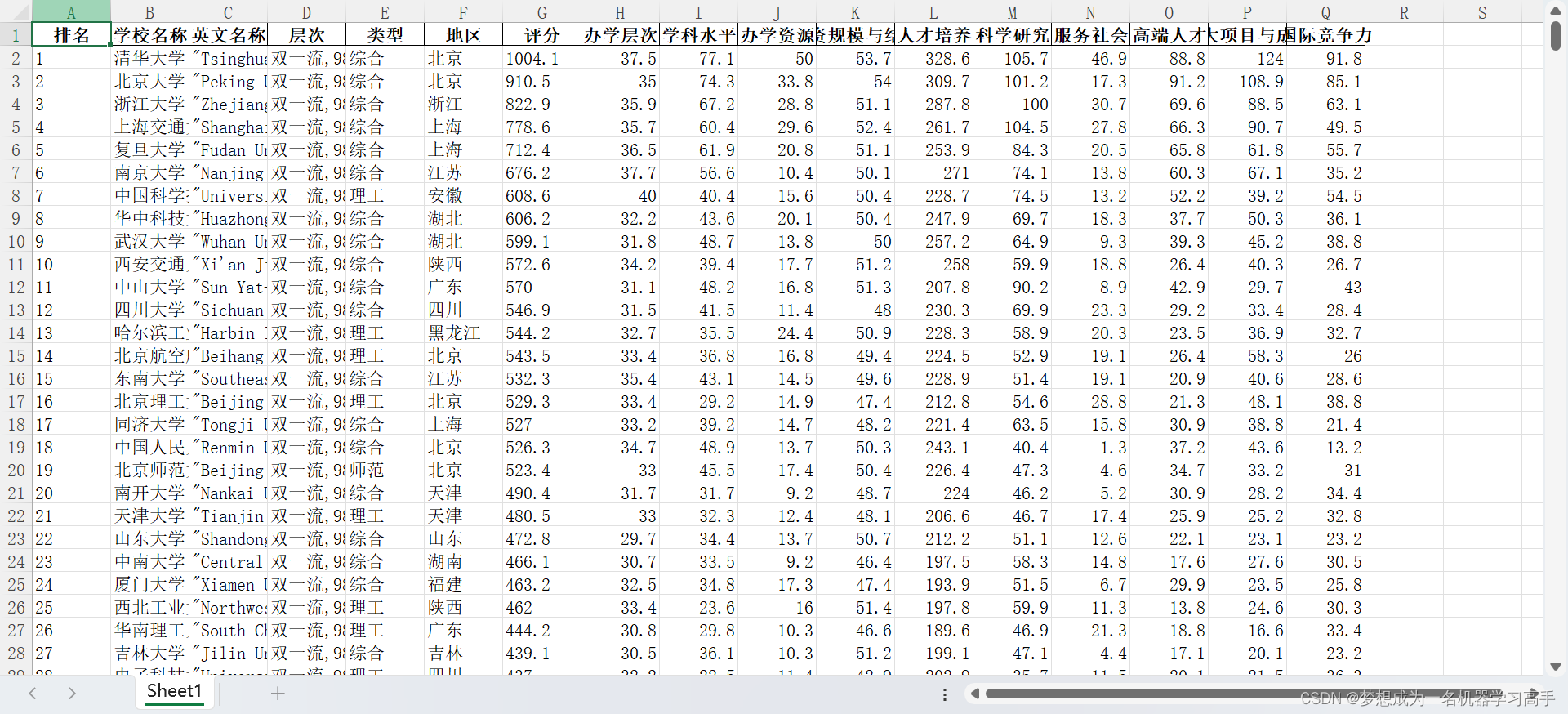
data = pd.read_excel("D:\\每周挑战\\中国大学综合排名2023.xlsx")
data.head()
导入数据
# data.info()
# 可以看出办学层次缺失数据集太多了,因此我们将其删除
data = data.drop("层次",axis=1)
data.info()<class 'pandas.core.frame.DataFrame'>
RangeIndex: 590 entries, 0 to 589
Data columns (total 16 columns):
# Column Non-Null Count Dtype
--- ------ -------------- -----
0 排名 590 non-null int64
1 学校名称 590 non-null object
2 英文名称 590 non-null object
3 类型 590 non-null object
4 地区 590 non-null object
5 评分 590 non-null float64
6 办学层次 590 non-null float64
7 学科水平 590 non-null float64
8 办学资源 590 non-null float64
9 师资规模与结构 590 non-null float64
10 人才培养 590 non-null float64
11 科学研究 590 non-null float64
12 服务社会 590 non-null float64
13 高端人才 590 non-null float64
14 重大项目与成果 590 non-null float64
15 国际竞争力 590 non-null float64
dtypes: float64(11), int64(1), object(4)
memory usage: 73.9+ KB首先,我们先对学校的分布进行分析,这里我们直接使用Map来绘图
school_data = data['地区'].value_counts().reset_index()
x = school_data['index'].tolist()
y = school_data['地区'].tolist()
df = []
for i in zip(x,y):
    df.append(i)

range_colors = ['#228be6','#1864ab','#8BC34A','#FFCA28','#D32F2F','#1DFFF5','#FF850E']
schoolmap = (
    Map().add("",df,"china",is_map_symbol_show=False,
             label_opts=opts.LabelOpts(is_show=False)
             )
         .set_global_opts(
             title_opts=opts.TitleOpts(
                  title="2023年各个地区高校数量分布情况",
                  pos_top='1%',
                  pos_left='center'
              ),
              legend_opts=opts.LegendOpts(is_show=False),
              visualmap_opts = opts.VisualMapOpts(
                  max_=40,split_number=8,is_piecewise=True,range_color=range_colors,
                  pos_bottom='5%',pos_left='10%'
              )
         )
)
# schoolmap.render_notebook()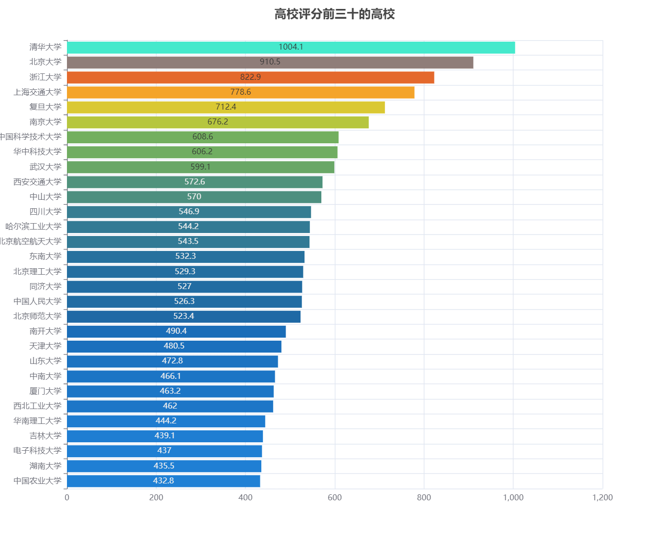
df = data['类型'].value_counts()
data_pair = [(index, value) for index, value in df.items()]
pie = (
    Pie(init_opts=opts.InitOpts(width='1000px',height='800px'))
    .add("",data_pair,radius=['30%','50%'])
    .set_global_opts(
        title_opts=opts.TitleOpts(
            title="各个类型高校的占比",
            pos_top="1%",
            pos_left='center',
            title_textstyle_opts=opts.TextStyleOpts(color='#1DFFF5',font_size=20)
        ),
        visualmap_opts=opts.VisualMapOpts(
            is_show=True,
            max_=200,
            range_color=['#228be6','#1864ab','#8BC34A','#1DFFF5','#FF850E']
        ),
        legend_opts=opts.LegendOpts(is_show=False)
    )
)
pie.render_notebook()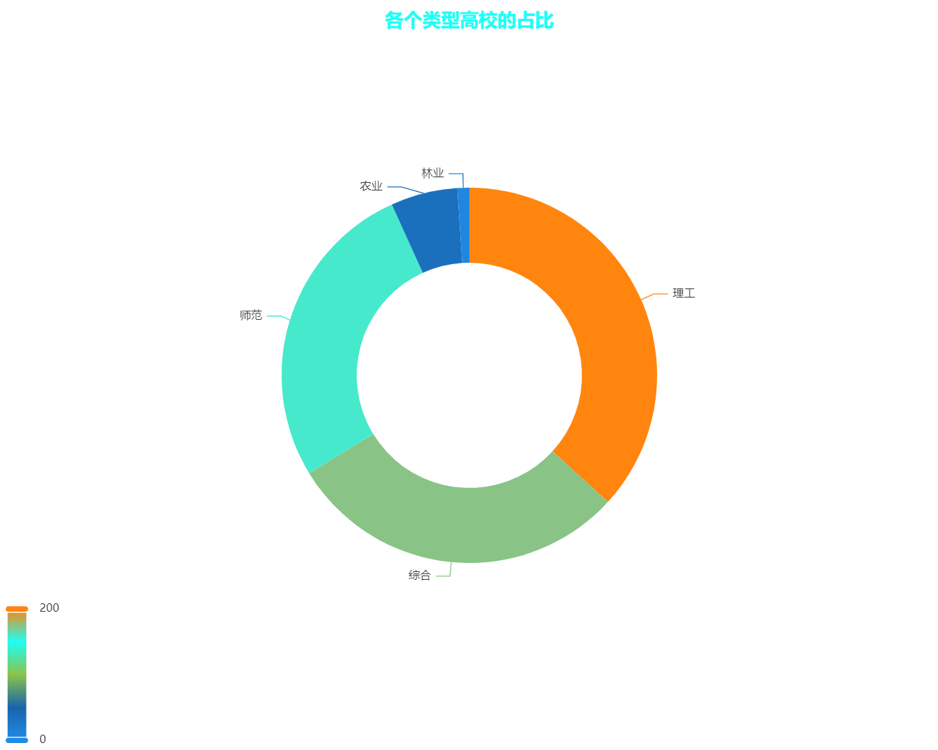
x_data = data.columns[6:].tolist()

line = (
    Line(init_opts = opts.InitOpts(width='1000px',height='800px'))
    .add_xaxis(x_data)
)

for i in range(len(data)):
    line.add_yaxis(data.iloc[i,:].values[1], data.iloc[i,:].values[7:])

line.set_global_opts(
    legend_opts=opts.LegendOpts(is_show=False, pos_top='15%', pos_right='20%', orient='vertical'),
    title_opts=opts.TitleOpts(
        title='中国高校各项评分',
        pos_top='1%',
        pos_left="1%",
        title_textstyle_opts=opts.TextStyleOpts(color='#fff200', font_size=20)
    ),
)
line.render_notebook()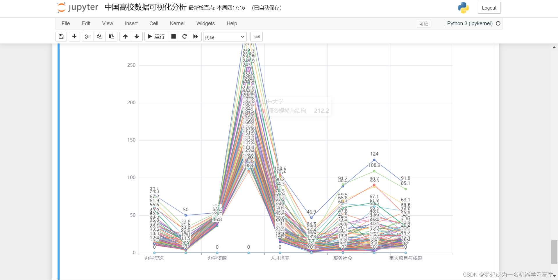
这个图像下载不下来,因此我这里截屏了。大家如果想看自己学校的,可以修改上面的代码 。(由于该数据集只有前100为学校有具体数据,其他学校无数据,因此这里只能改99之前的)
x_data = data.columns[6:].tolist()

line = (
    Line(init_opts = opts.InitOpts(width='1000px',height='800px'))
    .add_xaxis(x_data)
)

line.add_yaxis(data.iloc[0(数据集中你学校的位置比如清华学校是0这里就写0),:].values[1], data.iloc[0(数据集中你学校的位置比如清华学校是0这里就写0),:].values[7:])

line.set_global_opts(
    legend_opts=opts.LegendOpts(is_show=False, pos_top='15%', pos_right='20%', orient='vertical'),
    title_opts=opts.TitleOpts(
        title='中国高校各项评分',
        pos_top='1%',
        pos_left="1%",
        title_textstyle_opts=opts.TextStyleOpts(color='#fff200', font_size=20)
    ),
)
line.render_notebook()
我这里改为了50
